|
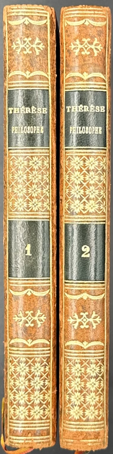
Thérèse philosophe, 1783. |
Late 18th century books |
 |
 |
 |
 |
 |
 |
 |
 |


|
Thérèse philosophe, 1783. |
Late 18th century books |
|
|
|
|
|
|
|
|
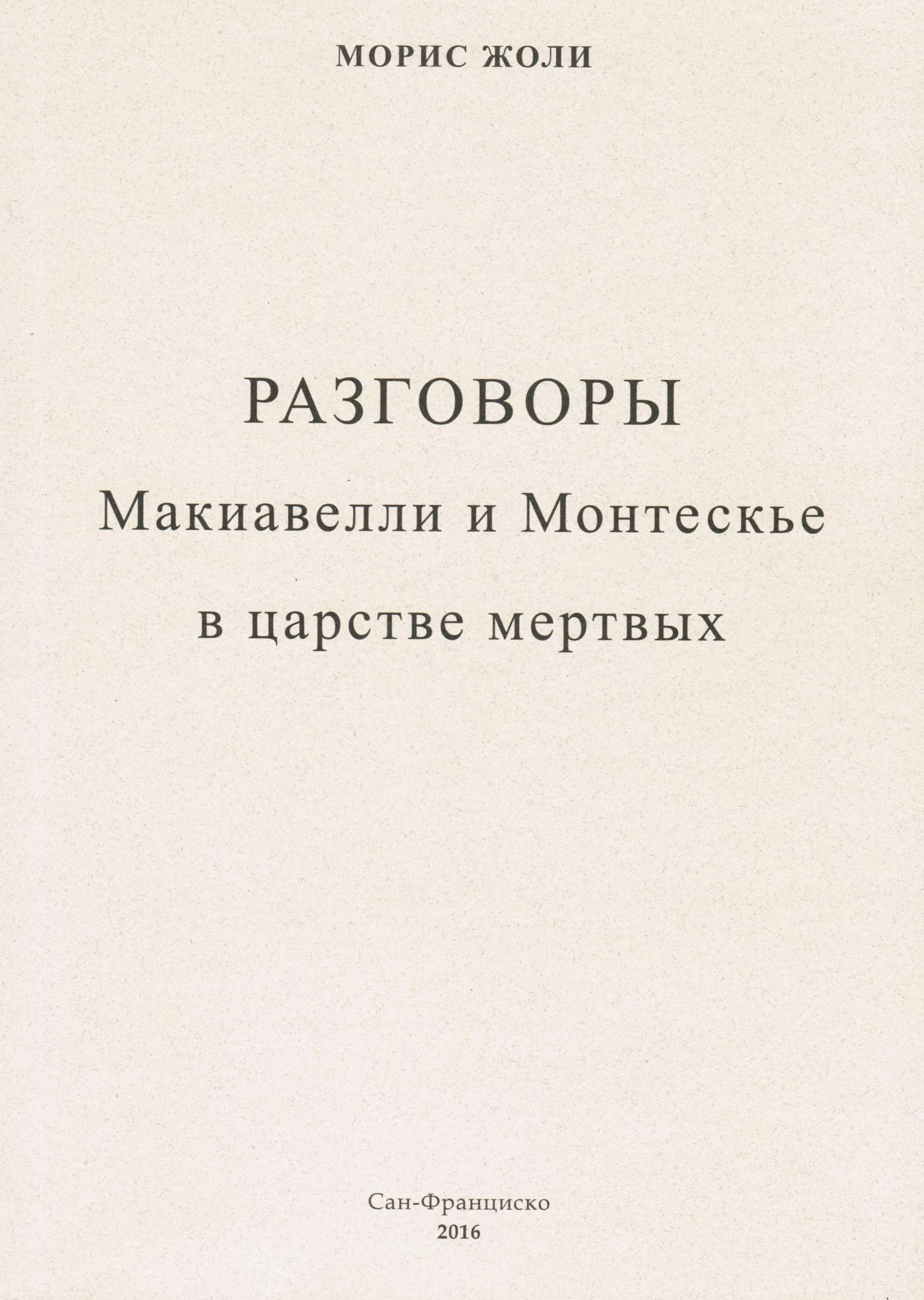
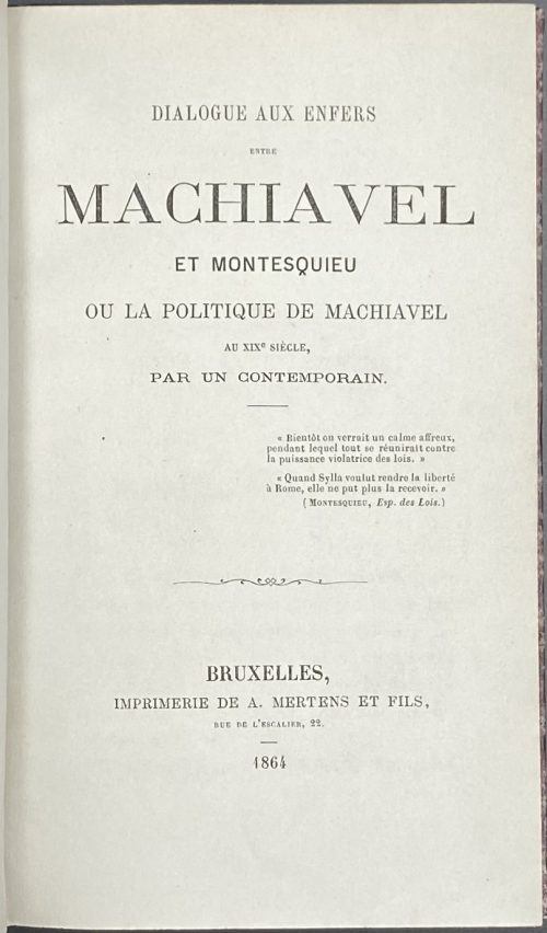
"Разговоры Макиавелли и Монтескье в царстве мертвых” (Dialogue aux Enfers entre Machiavel et Montesquieu) – это политический памфлет, направленный против Наполена III. В 25 диалогах представитель эпохи Просвещения благородный барон де Монтескье отстаивает позиции умеренного правления и соблюдения прав личности, а флорентийский политик Средневековья злокозненный Макиавелли берется доказать своему собеседнику, что управлять людьми можно только силой и хитростью, и что деспотия — это потребность современного общества. Собеседники заключают пари. Макиавелли шаг за шагом описывает те действия, которые предпринял Наполеон III для установления деспотии во Франции, и выигрывает пари.
В начале XX века «Разговоры» Жоли были использованы в царской России для изготовления антисемитской фальшивки — печально знаменитых «Протоколов сионских мудрецов», книги, переведенной на все языки мира и своими тиражами уступающей только Библии. Плагиат был разоблачен корреспондентом газеты «Таймс» Филипом Грейвсом в 1921 г. Сравнением текстов “Разговоров” и “Протоколов”, равно как и поиском автора плагиата, занималось не одно поколение исследователей. В наше время о “Разговорах” знают в основном благодаря “Протоколам”, но книга Жоли представляет интерес отнюдь не только в связи с означенными “Протоколами”. Единственный до сих пор перевод “Разговоров” на русский язык был выпущен в 2004 году издательством “МК-Трейд” под названием “Диалог в аду между Макиавелли и Монтескье”. Это был перевод с немецкого перевода с французского языка. Предлагаемое читателю новое издание книги Жоли является переводом с французского оригинала, хотя и достаточно вольным, что отражено в заголовке: Разговоры Макиавелли и Монтескье в царстве мертвых, записанные злосчастным французом Морисом Жоли в правление императора Людовика-Наполеона и пересказанные полтора века спустя для русского читателя нашим современником. Морис Жоли писал о “политике макиавеллизма в XIX веке”. Однако теперь очевидно, что и в XXI веке политика макиавеллизма не претерпела существенных изменений. Старинный рецепт установления деспотии “в одной, отдельно взятой стране” хорош и по сей день.Published in San Francisco, California.
Paperback, size: 110 x 148 x 10 mm
Поль Дельтуф. Жизнь и творения Макиавелли. // "Записки для чтения, издаваемые К. Трубниковым", 1867, NN 8-9, с. 73-77. Ежемесячное приложение к Биржевым ведомостям. Август и Сентябрь. Санктпетербург. Тип. Товарищества "Общественная польза".
"Essai sur les oeuvres et la doctrine de Machiavel, avec la traduction littérale du Prince et de quelques fragments historiques et littéraires", par Paul Deltuf, Paris, 1867.
Шамиссо, Адальбертъ фонъ. Петеръ Шлемиль. Чудесная исторiя. Пер. П.Потемкина. Рис., виньетки и перепет Эмиля Преторiуса по 1-му нѣм. изд. 1814 г. — СПб.: Книгоиздательство "Пантеонъ", 1910. — 107 стр. Отпечатано в типографии акц. о-ва типографск. дела в СПБ (Герольд), 7 рота, 26.
Cardboard binding, 8vo, 20 x 15 cm. Russian translation of Adelbert von Chamisso book Peter Schlemihl, from the German by Peter Potemkine. With illustrations from 1814 original German first edition by Emil Preetorius. [SV: the latest statement seems strange as Emil Preetorius lived from 1883 to 1973].
![Война мышей и лягушек. Батрахомиомахия / Пер. с древнегреческого, вводн. стат. и коммент. М.С.Альтмана. Иллюстр. А. И. Порет, переплет и обложка по ее же рисункам. С суперобложкой. — М.-Л.: Academia, 1936. — XV, [I], 21, [2] стр. (Античная литература под общей ред. Д. А. Горбова и В. О. Нилендера.](https://varshavskycollection.com/wp-content/uploads/2021/02/LIB-0985.2016-a-500x706.jpeg)
![Memoirs, Illustrating the History of Jacobinism, written in French by the Abbé Barruel, And Translated into English by the Hon. Robert Clifford, F. R. S. & A. S. / 2nd edition, revised and corrected. Printed for the Translator. — T. Burton. London, 1798. — Vol. 1-4. Vol. 1: Part I. The Antichristian Conspiracy: pp. (xvi) 401; Vol. 2: Part II. The Antimonarchical Conspiracy: pp.479; Vol. 3: Part III. The Antisocial Conspiracy: pp. (xviii) 414; Vol. 4: Part IV. Antisocial Conspiracy; Historical Part: pp. (xviii) 601 [50].](https://varshavskycollection.com/wp-content/uploads/2021/02/LIB-2195.2019-500x796.jpeg)
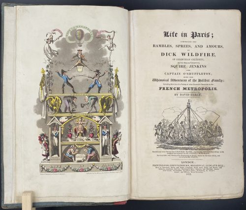
Title: Life in Paris ; | COMPRISING THE | RAMBLES, SPREES, AND AMOURS, | OF | DICK WILDFIRE, | OF CORINTHIAN CELEBRITY, | And his Bang-up Companions, SQUARE JENKINS | AND | CAPTAIN O’SHUFFLETON ; | WITH THE | Whimsical Adventures of the Halibut family ; | Including Sketches of a Variety of other Eccentric Characters in the | FRENCH METROPOLIS. | BY DAVID CAREY |[Vignette]| Embellished with Twenty-One COLOURED PLATES, representing SCENES from REAL LIFE, | designed and engraved by Mr. GEORGE CRUIKSHANK. | Enriched also with Twenty-Two Engravings on Wood, drawn by the same Artist, and | executed by Mr. WHITE. | LONDON : | PRINTED FOR JOHN FAIRBURN, BROADWAY, LUDGATE HILL; | Sold by Sherwood, Neely, and Jones ; Langman, Hurst, Rees, Orme, and Brown ; and | Baldwin, Craddoc, and Joy ; Paternoster-Row ; Simpkin and Marshall, Statio- | ners’ Court ; Whittakers Ave-Maria-Lane ; Humphrey, St. James’s | Street ; and Wilson, Royal Exchange. | 1822. ||
Edition: 1st edition in book form, 1st issue; large-paper copy bound from the parts in original blue paper boards, "most scarce" (Cohn).
Pagination: ffl, [i, ii] – h.t. ‘LIFE IN PARIS’ / ‘MARCHANT, Printer, Ingram-Court, London’, [2] – blank / Frontispiece (Ville la Bagatelle!!) hand-coloured, [iii, iv] – t.p. with vignette / blank, [v] vi-xxiv, [1] 2-489 [490 blank], [2] – 'TO THE BINDER' and 'Marchant, Printer, Ingram-Court, Fenchurch Street' "considered indispensable to a complete copy" (Cohn) / blank, bfl watermarked 1800; 21 hand-coloured aquatints and 22 wood-engraved text vignettes; cancelled leaves 143/4 and 335/6; pinholes from printing visible in most gatherings.
Collation: 4to; [a]-c4, B-Z4 Aa-Zz4 3A-3Q4 3R1 + [Ω]1
Binding: Original boards sometime re-backed with red paper, binder's end leaf watermarked 1800; red hard-grained morocco clamshell box.
Catalogue raisonné: Albert M. Cohn, 1924: № 109 p. 37/8; Abbey, J. R. (Life in England), 112; Tooley (Some English Books with Coloured Plates) 129; Hardie (English coloured books) 199.
Description of Shapero Rare Books, London: Of the copies that have come to auction since 1975 only one has been a large-paper copy in original boards. "The pictures are extremely spirited and true and are all the more wonderful in view of the fact that the artist’s continental experiences were limited to one day spent in Boulogne." (Hardie). In 1821, the journalist Pierce Egan published Life in London, an immediate success illustrated by the Cruikshank brothers, George and Robert. In order to capitalise on this success, another journalist, David Carey, decided to publish his own Life in Paris in monthly instalments (just like Life in London) and with a very similar frontispiece to the one that appears in Egan’s work; Life in Paris, however, was illustrated only by George Cruikshank. One of the earliest and most notable examples of the work of George Cruikshank, with fine, clean plates.
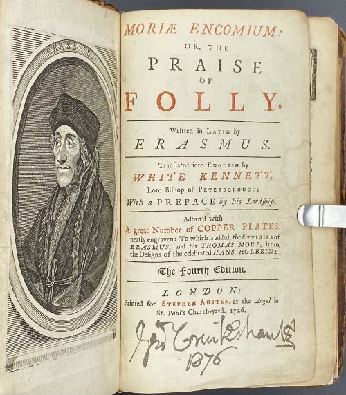
White Kennett (British, 1660 – 1728) – translator from Latin into English.
Hans Holbein the Younger (German, 1497/8 – 1543) – artist.
Stephen Austen (fl. c. 1727 – 1746) – publisher. Linked items: Engraved portrait of Erasmus of Rotterdam in an octagonal frame, 1757 by Flipart after Holbein.Эразм Роттердамский. Похвальное слово глупости. — М.-Л.: Academia, 1932.
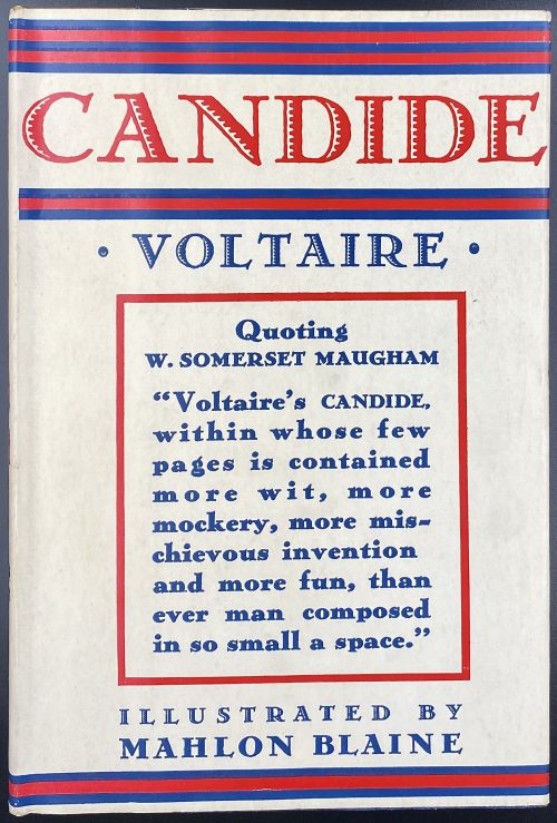
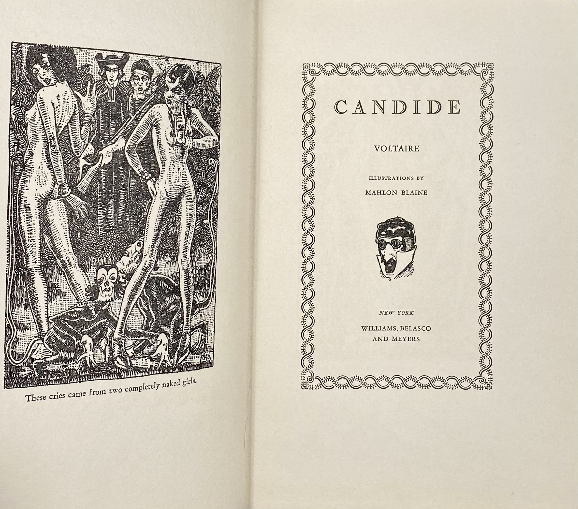
Williams, Belasco and Meyers

Illustrated Editions Company
Description:18.7 x 11.8 cm, quarter red morocco over marbled boards, spine with raised bands ruled in gilt, gilt lettering, marbled endpapers.
Collation: 12mo; fep, 1 blank, π4 1-2712, 292, 1 blank, fep.; total 176 leaves. Pagination: [2] [2 h.t] [2 t.p.] [i] ii-iii [iv] [1] 2-337 [338] [2 errata] [2]. Other copies: LIB-0460.2015 and LIB-1034.2016. Other related objects: SVVP-0062.2021. The publication was funded by the author and smuggled into France. Contributors: Maurice Joly (French, 1829 – 1878)