

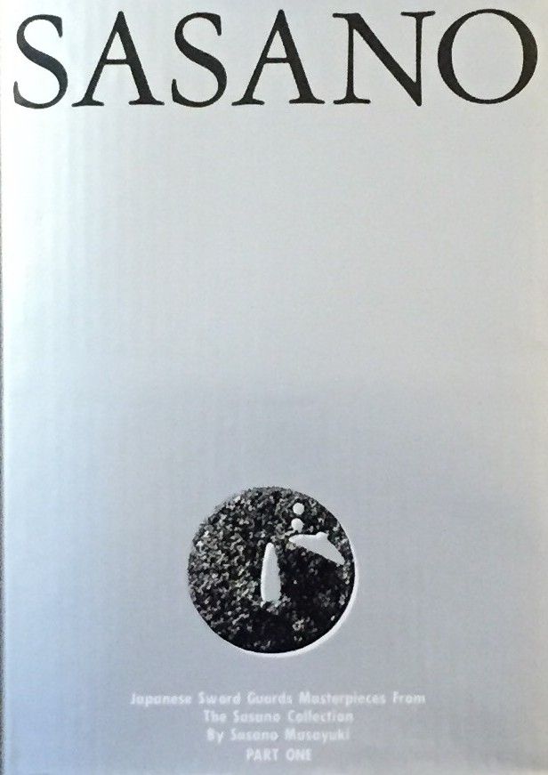
Sasano: Japanese Sword Guard Masterpieces from the Sasano Collection. By Sasano Masayuki. Part One. Published in Japan in 1994 by Daisuke Saito, Mega Co., Ltd. Translated by Tomoko Saro. Printed by Mitsumura Printing Co., Ltd. 304 x 217 x 30 mm
-
-
Bertrand Russell. A history of western philosophy. A Touchstone Book. Published by Symon & Schuster, 2007. [Reprint 1945].
ISBN-10: 1-4165-5477-7
ISBN-13: 978-4165-5477-6.
-
NAPOLEON IN CARICATURE 1795-1821. By A. M. Broadley with an introductory essay on pictorial satire as a factor in napoleonic history by J. Holland Rose, Litt. D. Cantab. with nearly 250 illustrations, 24 in colour. Published by in London: John Lane, the Bodley Head, and New York: John Lane Company, 1911 in Two Volumes. Vol. I with 391 pages, 13 color plates and 99 full page illustrations. Vol. II with 441 pages, 11 color plates and 108 full page illustrations.
-
The Heads of Illustrious Persons of Great Britain Engraven By Mr. Houbraken And Mr. Vertue. With Their Lives And Characters by Thomas Birch, A.M.F.R.S. Two Volumes in One. Published for John and Paul Knapton, London, 1747. 108 engraved portraits.
-
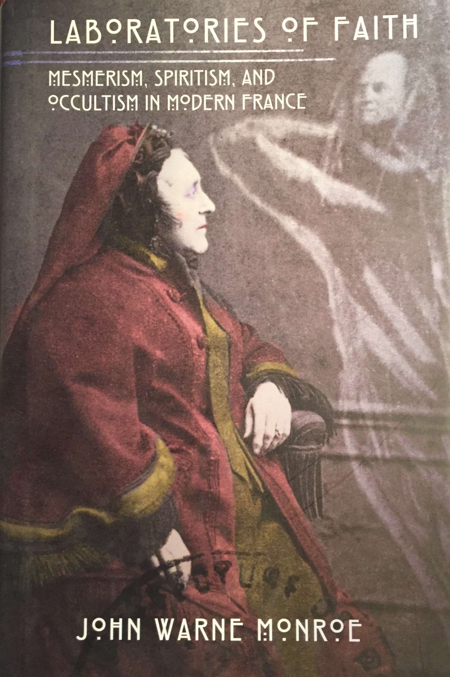
John Warne Monroe. Laboratories of Faith: Mesmerism, Spiritism, and Occultism in Modern France.
Cornel University Press, 2008.
ISBN: 9780801445620; Hardcover.
-
Hardcover, green cloth stamped with title to front cover and spine, pictorial DJ, pp.: [10] 1-206.
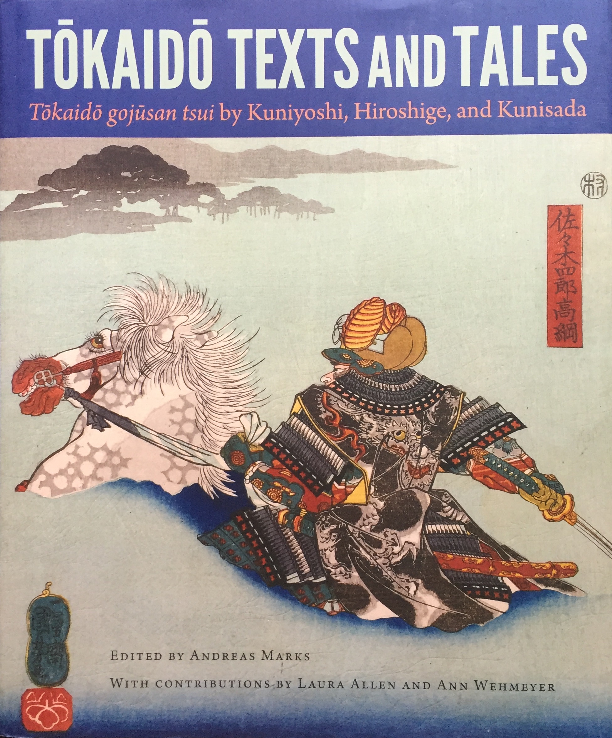
Introduction / Andreas Marks -- An artistic collaboration: travelling the Tōkaidō with Kuniyoshi, Hiroshige, and Kunisada / Laura W. Allen Folklore and legend in the fifty-three pairings along the Tōkaidō / Ann Wehmeyer The plates. Tōkaidō gojūsan tsui / transcription and translation by Ann Wehmeyer ; notes by Ann Wehmeyer and Andreas Marks.ISBN: 9780813060217
-
 Hardcover, white lettered boards, pictorial DJ, pp.: [1-8] 9-359 [360 blank].
ISBN: 9789004191464.
-
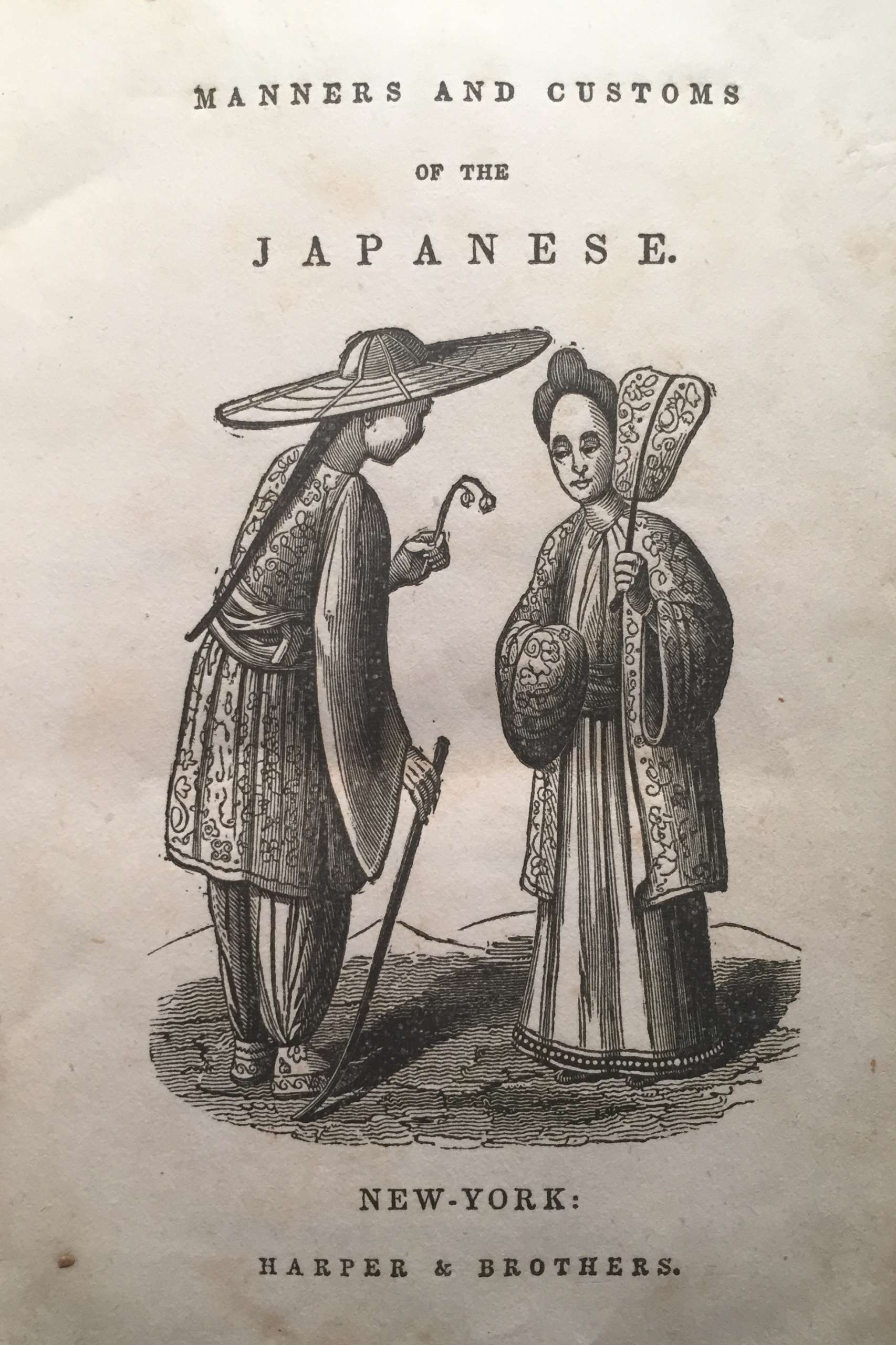
Manners and Customs of the Japanese, in the Nineteenth Century. From the Accounts of Recent Dutch Residents in Japan, and from the German Work of Dr. Ph. Fr. von Siebold.
Author: Siebold, Philipp Franz von et al.
Publisher: Harper & Brothers, New York, 1841.
-
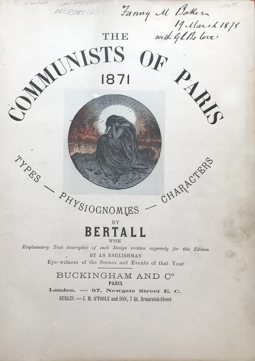 Folio (246 x 321 mm), hardbound in red-brown cloth with gilt lettering and decoration. Content, Introduction by J. E., September, 1873, Artist preface by Bertall, Paris, 1871-1873. Album with 40 hand-colored lithographs by Bertall, numbered 1 through 40, accompanied with extensive descriptions. Ex Libris: Baker. Carpe Diem. Markings: Janny M. Baker with J.L.B. Love, 19 March, 1878 in black ink.
 -
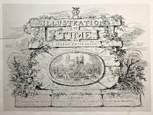
Engraved title page: ILLUSTRATION | OF | TIME. | GEORGE CRUIKSHANK. | "THERE IS A TIME FOR ALL THINGS". | TEMPUS EDAX RERUM. | LONDON | Published May 1st 1827 by the Artist - 22 Myddelton Terrace Pentonville. - Sold by Js. Robins & Co. Ivy Lane Paternoster Row.
Oblong folio, 33.5 x 44 cm. Engraved vignette title page and six not-coloured engraved plates with multiple images showing thirty-five humorous scenes.
First edition, first issue. Uncoloured. Pristine condition.
Half-leather bound in marbled cardboard and red morocco and gild lettering and arabesque. Frontispiece and 6 plates with protective tissues.
Content:1. Time-Called & Time-Come (five sketches)
2. Behind Time (seven sketches)
3. Time Thrown Away (six sketches)
4. Hard Times [&] Term Time (five sketches)
5. Time Badly Employed (five sketches)
6. Christmas Time (seven sketches)
British Museum № 1978,U.3026.1. BM description: "Frontispiece, the title on a background of symmetrical but dilapidated and grass-grown masonry. On the summit stands a little laughing gnome, with a wide hat and a body formed of an hour-glass; Inset is an oval bordered by a serpent with its tail in its mouth (emblem of eternity), in which is an aged and all-devouring Time (bald except for a forelock), seated behind a table whose surface is the base of the design. He puts to his mouth a fork on which is speared an elephant with a castle on its back containing tiny figures with spears. In his r. hand is a spoon containing a country church. His table is covered with dishes, and at his r. hand is a sickle. The central and biggest dish is heaped with a jumble of tiny objects: crown, table, chair, wheelbarrow, picture; round the room sit little figures: a soldier, parson, lady and child, &c. The ten other dishes contain: an antique glass coach with horses and footmen; an overladen camel beside a palm-tree; ruins of a castle; a farmhouse; a shepherd and sheep; a dismantled cannon and balls, cattle, a man-of-war in full sail; a ruinous Gothic cathedral; a clump of trees (the last two are dominated by a large decanter). Below Time are two (Egyptian) pyramids. Above: 'There Is A Time For All Things'; below: 'Tempus Edax Rerum'. 1 May 1827. Etching."Bibliography:- Reid, G W, A descriptive catalogue of the works of George Cruikshank, London, 1871.
- Stephens, Frederic George; George, Mary Dorothy, Catalogue of Political and Personal Satires in the Department of Prints and Drawings in the British Museum, 11 vols, London, BMP, 1870.
- Cohn, A M, George Cruikshank, catalogue raisonné, London, 1924.
-
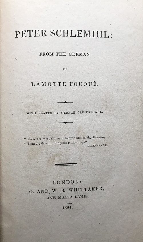 Title: PETER SCHLEMIHL: | FROM THE GERMAN | OF LAMOTTE FOUQUÉ | WITH PLATES BY GEORGE CRUICKSHANK. | "There are more things in heaven and earth, Horatio, | "Than are dreamt of in your philosophy." | SHAKESPEARE. | — | LONDON: | G. AND W. B. WHITTAKER, | AVE MARIA LANE. | 1824.|| Pagination: xii, 165 p. : ill. No Adelbert von Chamisso (German, 1781 – 1838) name on the title page. George Cruikshank's name printed with a typo 'Cruickshank'. The attribution on the title-page to Friedrich de La Motte-Fouqué (German, 1777 – 1843) is erroneous. The original German was edited by La Motte Fouqué. The translation was performed by Sir John Bowring (British, 1792 – 1872) First edition in English, third issue with no hyphen between "Ave" and 'Maria" in publisher's imprint.
In a cover box of red cloth over cardboard. Box: 21 x 13 x 2.3 cm; book: 19.3 x 11.8 x 1.7 cm; Crown 8vo. Red cardboard binding. Printed spine labels mounted on spine of the box and the book. Untrimmed edges.
Reference: Cohn 475. -
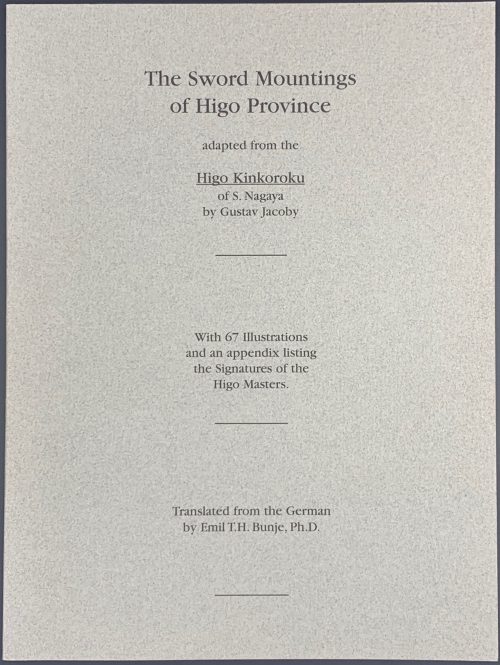
The sword mountings of Higo Province adapted from the Higo Kinkoroku of S. Nagaya by Gustav Jacoby, with 67 illustrations and an appendix listing the signatures of the Higo masters. Translated from the German by Emil T. H. Bunje, PhD.
Book size: 24.5 x 18.4 cm/
Softbound, original grey paper wrappers with black lettering.
Higo Kinkoroku, or Register of Metalworkers of Higo Province, published in 1902 in Tokyo by the Japanese Colonel Nagaya Shigena with a preface by viscount Nagaoka Moriyoshi, scion of the Hoshikawa family, Daimyo of Kumamoto in Higo Province.
Translated from the orignial: Die schwertzieraten der provinz Higo. Bearbeitet nach dem japanischen werke Higo Kinkoroku des S. Nagaya, von Gustav Jacoby. Mit 67 Abbildungen und einem Anhang: Die bezeichnungen der Higo-meister. 5. beiheft zum Jahrbuch der hamburgischen wissenschaftlichen anstalten. XXII. 1904. Hamburg, Lucas Gräfe & Sillem, 1905. - 62 p. illus., pl. [LIB-1947.2019] -
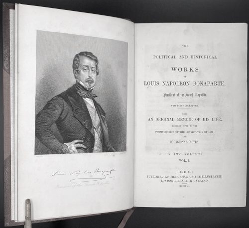 [Bonaparte, Louis Napoleon]. The Political and Historical Works of Louis Napoleon Bonaparte, President of the French Republic, Now First Collected With An Original Memoir of His Life, Brought Down to the Promulgation of the Constitution of 1852; and Occasional Notes, Complete in Two Volumes. London: Illustrated London Library, MDCCCLII [1852]. Collation: Vol. 1: [i-v] vi [vii-viii (blank)] [1] 2-462 [463,464 (blank)]; Vol. 2: [1-3] 4-439 [440]. Size: 22.8 x 14.8 cm (8vo), each. Binding: hardcover; half red morocco and cloth boards, five raised bands, gilt title and decoration, top edge gilt. Frontispiece portrait of Louis Napoleon Bonaparte in Vol. 1. Condition: Very good, rubbing to outer joints, leather corners, faint foxing to endpapers, ownership signature on half-title. Internally bright and unmarked. In binding by Brentano's, New York.
 -
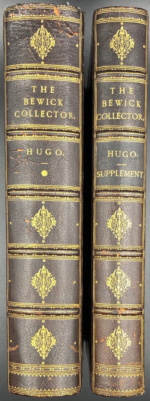 A two-volume set: (1) Thomas Hugo. The Bewick Collector. A Descriptive Catalogue of the Works of Thomas and John Bewick; Including cuts, in various states, for Books and Pamphlets, Private Gentlemen, Public Companies, Exhibitions, Races, Newspapers, Shop Cards, Invoice Heads, Bar Bills, Coal Certificates, Broadsides, and other miscellaneous purposes, and Wood Blocks. With an Appendix of Portraits, Autographs, Works of Pupils, etc., etc. The whole described from the Originals contained in the largest and most perfect collection ever formed, and illustrated with a hundred and twelve cuts. — London: Lovell Reeve and Co., MDCCCLXVI [1866]. — [Printed by] J. E. Taylor and Co., printers. — pp.: [i-v] vi-xxiii [xxiv], [1] 2-562. (2) Thomas Hugo. The Bewick Collector. A Supplement to a Descriptive Catalogue of the Works of Thomas and John Bewick; Consisting of additions to the various divisions of cuts, wood blocks. etc., enumerated in that work. The whole described from the Originals contained in the largest and most perfect collection ever formed, and illustrated with a hundred and eighty cuts. — London: L. Reeve and Co, MDCCCLXVIII [1868]. — [Printed by] J. E. Taylor and Co., printers. — pp.: [i-vii] viii-xxxii, [1] 2-353. Both volumes in 8vo, 22.5 x 14.5 cm, hardcover. Contemporary dark brown half morocco, gilt-ruled, with 5 raised bands, gilt titles and decoration to spine, and marbled paper over boards. Top edge gilt; marbled endpapers. Binding splitting at pp.80/81 of the 1st volume. Armorial bookplate of Ralph Hart Tweddle to front pastedown. Ralph Hart Tweddle (1843 – 1895) was a British mechanical engineer, known particularly for inventing the portable hydraulic riveter, which greatly facilitated the construction of boilers, bridges and ships.
 -
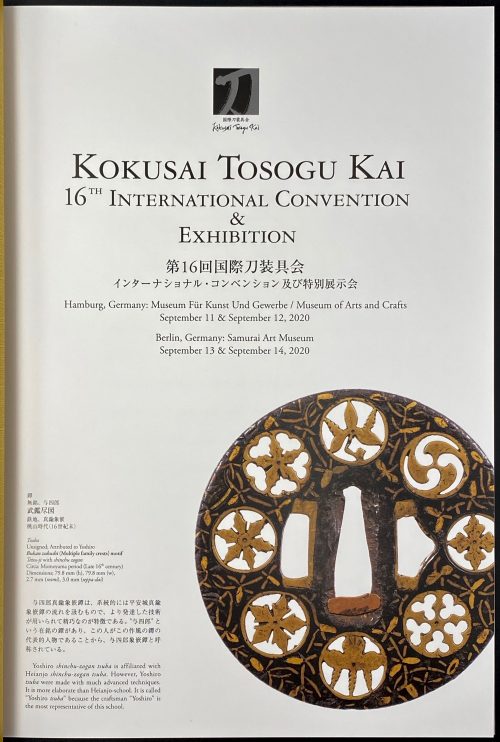 An annual publication of Kokusai Tosogu Kai / 16th International Convention & Exhibition in Hamburg, Germany: Museum Für Kunst Und Gewerbe / Museum of Arts and Crafts, September 11-12, 2020 and Berlin, Germany: Samurai Art Museum, September 13-14, 2020. Publisher: Tokyo: Kokusai Tosogu Kai, 2020. Pagination: [1-3] 4-103 [1]. Size: Medium 4to (30.3 x 21.6 cm), hardcover, original illustrated paper boards, in a slipcase. Tsuba from this collection depicted on the title page and pp. 59-60: TSU-0342.2017, TSU 0376.2018, and TSU 0379.2018. See also here.
 -
 Title (in a frame): THE TEMPTATION | OF ST. ANTHONY | BY | GUSTAVE FLAUBERT | TRANSLATED BY | LAFCADIO HEARN | ILLUSTRATED BY | MAHLON BLAINE | {vignette} | NEW YORK | WILLIAMS, BELASCO | AND MEYERS || Pagination: ffl, [1, 2 - ht, blank] [2 - blank, frontis.] [3, 4 - t.p., colophon] [5, 6 - plate, blank] [7, 8 - list of ill., blank] [9 'argument'] 10-189 [190] bfl; frontispiece and 4 plates reproduced from Blaine's pen drawings in "woodcut" manner. Binding:25.5 x 17 cm., original black cloth, front cover and spine stamped in gilt; printed on thick paper, margins trimmed unevenly; pink pictorial DJ. Contributors: Gustave Flaubert (French, 1821 – 1880) – author. Mahlon Blaine (American, 1894 – 1969) – artist. Patrick Lafcadio Hearn [Koizumi Yakumo; 小泉 八雲] ( Greek-Irish, 1850 – 1904) – translator. Williams, Belasco and Meyers – publisher. J. J. Little & Ives, Co., NY – printer.
 -
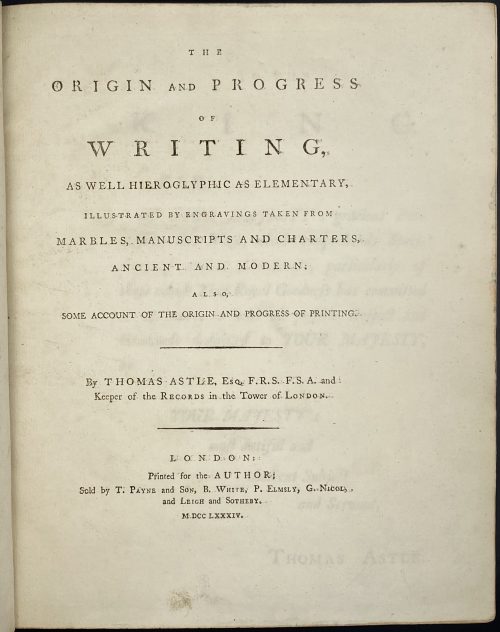 Full Title: THE | ORIGIN AND PROGRESS | OF | WRITING, | AS WELL HIEROGLYPHIC AS ELEMENTARY, | ILLUSTRATED BY ENGRAVINGS TAKEN FROM | MARBLES, MANUSCRIPTS AND CHARTERS, | ANCIENT AND MODERN. | ALSO, | SOME ACCOUNT OF THE ORIGIN AND PROGRESS OF PRINTING. | – | By THOMAS ASTLE, Esq. F.R.S. F.S.A. and | Keeper of the RECORDS in the Tower of LONDON. | – | LONDON: | Printed for the AUTHOR; | Sold by T. PAYNE and SON, B. White, P. Elmsly, G. Nicol, | and LEIGH and SOTHEBY. | M DCC LXXXIV. Pagination: ffl [i, ii] - t.p., blank, [iii, iv] - dedication, blank, [v] vi, vii - contents, [viii] - blank; [i] -xxv - introduction, [xxvi] blank; 1 - of the origin and progress... - 235 [236] blank (229-235 additions and corrections); on p. 235 imprint: FROM THE PRESS OF J. NICHOLS, MDCCLXXXIV; bfl; 31 plates: op. p. 64 (folding), 66, 70, 72 (2), 76, 80 (2, on recto and verso), 82 (2, on recto and verso), 84, 92, 94, 96 (folding), 98 (folding), 100, 102, 104 (folding), 106 (folding), 108 (folding), 112 (folding), 128 (folding), 140 (2, on recto and verso), 142, 146, 150 (folding), 158, 160, 176, 178, folding platessigned "B. T. Pouncy". Collation: [A4] a–c4 π1 B-Z4 Aa-Ff4 Gg2 Hh4. Size: 4to, 29.1 x 24.3 cm. Binding: contemporary full polished brown calf professionally re-backed, single-fillet gilt border to covers, raised bands, black title label with gilt lettering and gilt fillets, gilt year lettering to bottom. Printed on laid paper, margins marbled. Bookplates: "Alex-r Carlile" to front pastedown, "Nicholas Wall. Sometime his book" to back pastedown. To front pastedown: pencil inscriptions and pasted clipping about the book.
 -
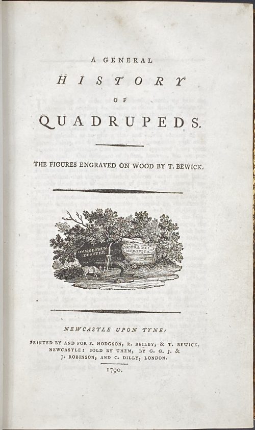 Title: A GENERAL | HISTORY | OF | QUADRUPEDS. | – | THE FIGURES ENGRAVED ON WOOD BY THOMAS BEWICK. | {vignette} | — | NEWCASTLE UPON TYNE : | PRINTED BY AND FOR S. HODGSON, R. BEILBY, & T. BEWICK, | NEWCASTLE: SOLD BY THEM, BY G. G. J. & | J. ROBINSON, AND C. DILLY, LONDON. | 1790. Pagination: [4 blanks], [i, ii] – t.p. / blank, [iii, iv] – advertisement / index, v-viii – index, [1] 2-456 [4 blanks]. Collation: demi 8vo; a⁴ A-Ee⁸ Ff⁴. A3 unsigned, catchword at p.375 THE instead of WE. Variant A (with a fly facing upward). Size: 21.8 x 14 cm; page 21.2 x 13 cm. Woodcuts: 260 descriptions of quadrupeds; 200 figures of quadrupeds, 104 vignettes, tailpieces, etc. Binding: Full marbled calf, gilt double border, black label with gilt lettering to flat spine. There were 1,500 copies Demy copies printed. Catalogue raisonné: S. Roscoe (1953): pp. 5-11; Hugo (1866): pp. 22-23.
 -
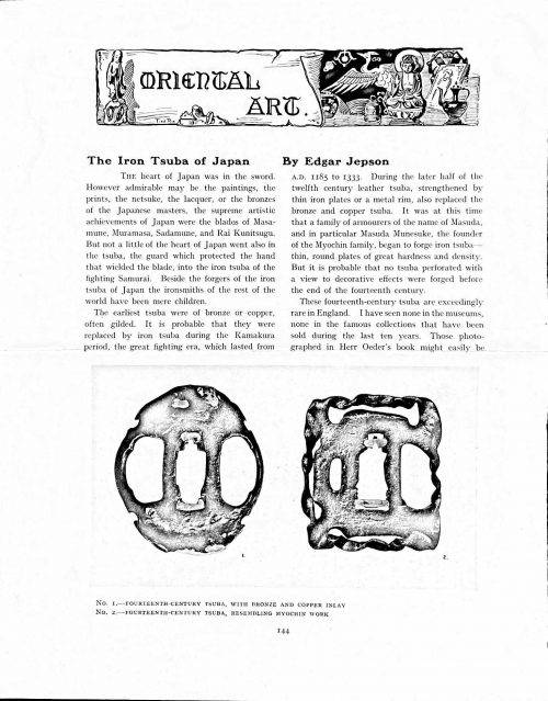 Magazine article by Edgar Jepson: The Iron Tsuba of Japan (Section: Oriental Art), published in volume Vol. 70 (September–December) of The Connoisseur: An Illustrated Magazine for Collectors, Vol. 70 (September–December); pp. 143-152 / C. Reginald Grundy [ed.] — London: Published by the Proprietor, W. CLAUSE JOHNSON, at the Editorial and Advertisement Offices of The Connoisseur, 1924. Owner's half black morocco, gilt lettering to spine, blue cloth boards. Two volumes bound together without original covers. Size 28.5 x 22 cm. Vol. 1: The Connoisseur | An Illustrated Magazine | For Collectors | Edited by C. Reginald Grundy | Vol. LXIX. | (MAY—AUGUST, 1924) | LONDON | Published by the Proprietor, W. CLAUSE JOHNSON, at the | Editorial and Advertisement Offices of The Connoisseur, | at 1, Duke Street, St. James's, S.W. 1 | 1924 || Pp.: [i-ii] iii-xviii [xix] [1, 2 - plate] 3-249 [250]. Vol. 2: The Connoisseur | An Illustrated Magazine | For Collectors | Edited by C. Reginald Grundy | Vol. LXX. | (SEPTEMBER—DECEMBER, 1924) | LONDON | Published by the Proprietor, W. CLAUSE JOHNSON, at the | Editorial and Advertisement Offices of The Connoisseur, | at 1, Duke Street, St. James's, S.W. 1 | 1924 || Pp.: [i-ii] iii-xxii [2 blanks] [1, 2 - plate] 3-261 [262]. The Iron Tsuba of Japan by Edgar Jepson The heart of Japan was in the sword. However admirable may be the paintings, the prints, the netsuke, the lacquer, or the bronzes of the Japanese masters, the supreme artistic achievements of Japan were the blades of Masamune, Muramasa, Sadamune, and Rai Kunitsugu. But not a little of the heart of Japan went also in the tsuba, the guard which protected the hand that wielded the blade, into the iron tsuba of the fighting Samurai. Beside the forgers of the iron tsuba of Japan the ironsmiths of the rest of the world have been mere children. The earliest tsuba were of bronze or copper, often gilded. It is probable that they were replaced by iron tsuba during the Kamakura period, the great fighting era, which lasted from A.D. 1185 to 1333. During the later half of the twelfth century leather tsuba, strengthened by thin iron plates or a metal rim, also replaced the bronze and copper tsuba. It was at this time that a family of armourers of the name of Masuda, and in particular Masuda Munesuke, the founder of the Myochin family, began to forge iron tsuba — thin, round plates of great hardness and density. But it is probable that no tsuba perforated with a view to decorative effects were forged before the end of the fourteenth century. These fourteenth-century tsuba are exceedingly rare in England. I have seen none in the museums, none in the famous collections that have been sold during the last ten years. Those photographed in Herr Oeder's book might easily be the fifteenth century. No. 1 is a curious cup-shape tsuba decorated with a bronze and copper inlay. No. 2, with its edges curiously twisted in the forging, looks like Myochin work. But it is not of the Myochin iron. The Myochin family produced some of the greatest ironsmiths of Japan. Armourers first of all, tsubasmiths, forgers of sake-kettles, articulated reptiles, crustacea, and insects — everything that can be done with iron they did; they pushed their medium to its limit. They were forging iron tsuba in 1160, and they were still forging them in 1860. And it was their own iron, or rather their own steel. They discovered the secret of it early, and they kept that secret in the family for all those hundreds of years. There is no mistaking a Myochin tsuba: balance it on your finger and tap it with a piece of metal, always it gives forth a clear bell-like ring that you get from the work of no other ironsmith, Japanese or European. Always the Myochin tsuba is before everything a protection to the hand of the swordsman; to that everything is, as it should be, subordinated. No. 3 is a Myochin tsuba of the fifteenth century, and probably of the early fifteenth century. No. 4, by Myochin Munetaka, perforated with a grotesque figure, is an example of that twisting and twisting of the iron in the forging till it forms a pattern like the grain of wood. The Myochin smiths invented these wood-grain tsuba, and no other smiths equalled them in their forging. In the sixteenth century, the fighting tsuba was probably at its best. It was a century of great tsubasmiths. Then the first Nobuiye, whose tsuba fetched £100 apiece, circa 1800, in Japan, and the first Kaneiye flourished. No. 5 is a tsuba forged by a great smith, Iyesada of Sotome, in the manner of Nobuiye I, decorated with the karakusa tendrils that Nobuiye delighted in, with lightning and clouds. No. 6 is a guard of Sanada Tembo, the chief smith of the Tembo family, stamped, punning fashion, with the character Tembo. Akin to the Tembo tsuba were those of the Kiami and Hoan smiths. Then also the Heianjo smiths and the Owari smiths, especially those of Nagoya and the Yamakichi family, forged their strongest tsuba. Those of the Yamakichi were tested after the forging by being pounded in iron mortars — at least, so the legend runs. But they were a sternly utilitarian family, and I have never seen a Yamakichi tsuba of any beauty. In the later half of the fifteenth century arose the fashion of decorating tsuba with an inlay, zogan, of bronze. The Heianjo tsuba, forged at Kyoto in the latter half of the fifteenth and the beginning of the sixteenth century, were often thus inlaid. The earliest of them were called "Onin", of which No. 7 is an example. In addition to the bronze inlay around the edge, it is inlaid with a representation, some say, of snow; others say, of the duckweed on a pond. No. 8 is probably a Heianjo tsuba, but I am not quite sure about it. The inlaid acacia branches might be very early Shoami work. But to judge by the iron, it is a fifteenth-century tsuba; and the authorities place the beginning of the Shoami school not later than early in the sixteenth century. No. 10 is an example of the Fushimi-zogan, a flat inlay of a light-coloured bronze. These tsuba took their name from the fact that they were first forged at Fushimi, in Yamashiro, in the sixteenth century. It is of the type known as Mon-zukashi, perforated with crests (mon) à jour. The Yoshiro-zogan tsuba were also first forged at Fushimi by Yoshiro Naomasa. They were distinguished from the Fushimi-zogan by the fact that their inlay was generally a little raised-not always-for the inlay of No. 9, a tsuba forged by a later nineteenth-century Yoshiro, is quite flat. It is an interesting tsuba, for, with its decoration grown florid and excessive, it marks the intermediate stage between the simple and delightful designs of the genuine fighting tsuba and the elaborate pictures in gold and silver on the tsuba of the eighteenth-century smiths of Awa and Kyoto, which have become mere ornaments of the goldsmith. The Gomoku-zogan (No. 11) tsuba were probably first forged earlier than the Fushimi and Yoshiro-zogan tsuba. This inlay, in slight relief, is a representation in a light-coloured bronze and copper of twigs caught in the eddies of streams. The seventeenth century and early eighteenth century were the great periods of perforated tsuba. The designs, and they are often admirable, are for the most part in plain fretwork; but they are also chased. No. 12, a crane under an acacia, is a tsuba of a Higo smith, great forgers of fighting tsuba during this period. These smiths also excelled in nunome zogan, a very thin gold and silver inlay, with which they further decorated their perforated guards. The smiths of the Umetada and Shoami families also forged iron tsuba during this period; but their designs, though sometimes pleasing enough, are rarely fine. The best work of Myoju Umetada is in sentoku, not iron. The Choshu smiths, coming later, surpass the perforated guards of both the Umetada and Shoami smiths in beauty of design. No. 13, a lotus in the round, not only fretwork, but also engraved, is a good example of the admirable balance they so often attained in their designs. It is a sufficiently realistic lotus, but yet of a delightful simplicity. In considerable contrast is No. 14, the dragon by Soheishi Soten — one of the only two authentic tsuba of his forging known — the first forger of hikone-bori tsuba, which were in extraordinary favour in Japan during the eighteenth century, and illustrated every important event in Japanese history. It is on the elaborate side, but fine, strong work, and an excellent guard to the hand, for the lighter and more open part, which gives the design its admirable balance, is on the inside, and not exposed to the full swing of an opponent's blade. A few years ago there was a tendency to decry the Namban tsuba as having sprung too directly from foreign sources. But though the original suggestion may have been Chinese, or, as some say, Portuguese, the Japanese made it entirely their own, as characteristically Japanese as anything can well be, but, it must be admitted, of a decadent period. The school took its rise at the beginning of the seventeenth century, and the early tsuba were forged of a specially hard iron, the Wootz, imported from Southern India. No. 15, the signs of the Zodiac, is an excellent tsuba from the fighting point of view. Both it and No. 16 are of quite charming, if elaborate, design, and both of them, with their delicate scroll-work, so astonishingly undercut, are the very last word in the work of the ironsmith-veritable iron lace. To return to the simpler perforated tsuba, the smiths of Akasaka, a suburb of Tokyo, produced probably the most charming designs. Their style derives considerably from the Higo smiths, and their earlier fighting tsuba are very like the Higo tsuba. But always their work was just a little lighter than that of the Higo smiths, and in the end they moved right away from them and became the forgers of very light guards indeed. No. 17, is a representation of the Hiyokudori, the fabulous double bird, in which were reincarnated the souls of the two lovers, Gompachi and Komurasaki; and No. 18, “the tsuba of a hundred ducks "— there are about forty — are characteristic designs of the school. In the work of the Akasaka smiths the balance, which makes the design of a good tsuba so admirable and delightful, attains its height. This admirable balance seems often to be obtained by a deliberate sacrifice of symmetry. About nine hundred and ninety-nine European ironsmiths out of a thousand would have made the right and left sides of the Hiyoku-dori line by line, and perforation by perforation, exactly alike; he would have cut out exactly as many ducks on the one side of “the tsuba of a hundred ducks” as on the other, and made each duck on the right side correspond exactly in position and attitude with a duck on the left side. By variations the tsubasmith attained a finer balance, almost a higher symmetry. No. 19, often called by collectors the "rose-window" tsuba, but really a stylised chrysanthemum, is a favourite design of the Akasaka smiths, but Hizen work and inlaid in the Hizen manner with gold nunome. No. 20 is a Satsuma tsuba of the middle period. The Satsuma smiths of the nineteenth century produced probably the most ornate of all the iron guards, for the most part calibashes and beans with their leaves and tendrils realistic in the extreme, but of charming design. Few crafts have been carried further than that of the tsubasmith; few crafts working in a difficult medium have handled more subjects with greater feeling for beauty or greater liveliness of fancy. It is interesting to note again and again how school influences school, and smith influences smith. But, as in all the applied arts, the finest tsuba were forged by men who never lost sight of the purpose of a tsuba, that it is before everything a protection to the hand, and never subjected that purpose to a passion for virtuosity. Illustrations: No 1. FOURTEENTH-CENTURY TSUBA, WITH BRONZE AND COPPER INLAY No. 2. FOURTEENTH-CENTURY TSUBA, RESEMBLING MYOCHIN WORK No. 3. MYOCHIN TSUBA, FIFTEENTH CENTURY No. 4. MYOCHIN TSUBA, NINETEENTH CENTURY No. 5. SIXTEENTH-CENTURY TSUBA No. 6. SIXTEENTH-CENTURY TSUBA BY IYESADA OF SOTOME BY SANADA TEMBO No. 7. ONIN TSUBA No. 8. HEIANJO (?) TSUBA No. 9. YOSHIRO TSUBA, NINETEENTH CENTURY No. 10. FUSHIMI-ZOGAN, NINETEENTH CENTURY No. 11.- GOMOKU-ZOGAN, SIXTEENTH CENTURY No. 12. HIGO TSUBA, SEVENTEENTH CENTURY No. 13. CHOSHU TSUBA, SEVENTEENTH CENTURY No. 14. SOTEN TSUBA, SEVENTEENTH CENTURY No. 15. NAMBAN TSUBA, EIGHTEENTH CENTURY No. 16. NAMBAN TSUBA, NINETEENTH CENTURY Nos. 17. AND 18. AKASAKA TSUBA, EIGHTEENTH CENTURY No. 19. HIZEN TSUBA, EIGHTEENTH CENTURY No. 20. SATSUMA TSUBA, EIGHTEENTH CENTURY
 -
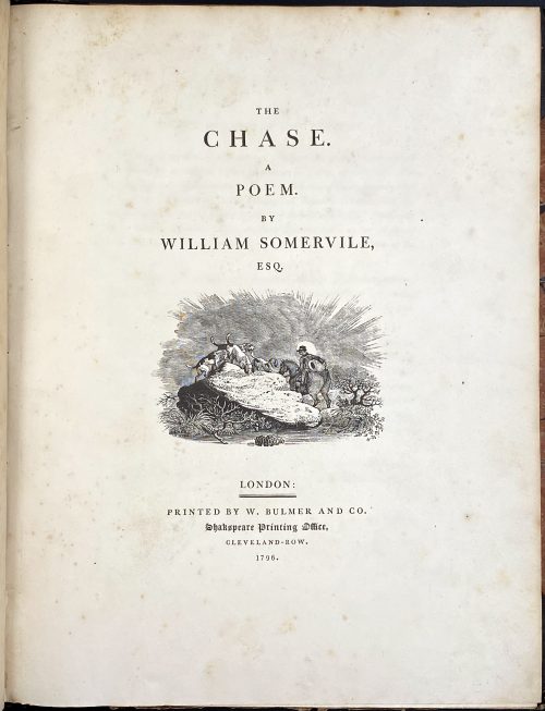 Royal 4to, 29.8 x 23.5 cm, contemporary half brown morocco, marbled boards gilt ruled, spine with gilt-ruled raised bands, gilt title lettering; "William Gore" armorial bookplate to front pastedown. Title page: THE | CHASE. | A | POEM. | BY | WILLIAM SOMERVILLE, | ESQ. | [VIGNETTE] | LONDON : | PRINTED BY W. BULMER AND CO. | Shakespeare Printing Office, | CLEVELAND-ROW. | 1796. Collation: without signatures. — Pagination: [i-v] vi-xv [xvi], [i] ii-vii [viii], [1-5] 6-126; illustrations: engraved title, 4 running titles, 4 headpieces, 4 tailpieces – 13 altogether, all drafted by John Bewick, 12 executed by Thomas Bewick and the last one by Charlton Nesbit. Catalogue Raisonné: Thomas Hugo. The Bewick Collector, vol. 1 (1866): p. 38, № 94: "The first edition... was printed in royal 4to". John Bewick made all the drawing on the blocks but was not able to execute the engravings himself "because of ill-health. They were engraved by Thomas Bewick, with the exception of the tail-piece at the end of the volume, which was engraved by Nesbit". Thomas Bewick (c. 11 August 1753 – 8 November 1828); John Bewick (1760 – 1795), the younger brother of Thomas, died at the age of 35. Christie's, who sold a similar copy on 29 Oct 2012, provides for the size 2°.
 -
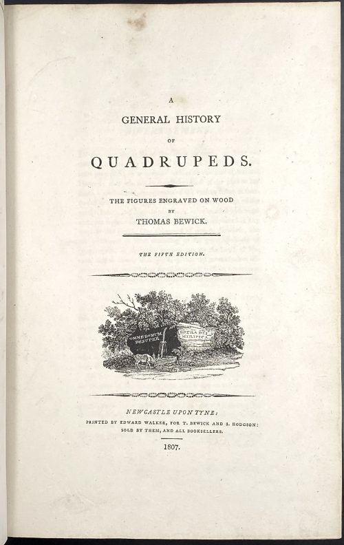 Title: A | GENERAL HISTORY | OF | QUADRUPEDS. | – | THE FIGURES ENGRAVED ON WOOD | BY | THOMAS BEWICK. | — | THE FIFTH EDITION | {vignette} | NEWCASTLE UPON TYNE: | PRINTED BY EDWARD WALKER, FOR T. BEWICK AND S. HODGSON: | SOLD BY THEM, AND ALL BOOKSELLERS. | 1807. Pagination: [2 blanks], [i, ii] – t.p. / blank], [iii, iv] – advertisement, [v] vi-x – index, [1] 2-525 [526 advert. of British Birds] [2 blanks]. Collation: Royal 8vo in fours; π (engraved title), a4 A-3T4 χ3T3. F2 signed 2F, 2E2 unsigned, p. 131 numbered correctly, p. 257 numbered 572. Size: 26 x 17 cm; page 24.5 x 16 cm (royal). Woodcuts: 302 descriptions of quadrupeds, 225 figures and 112 vignettes, tail-pieces, etc. Binding: Full diced brown calf, embossed blind corner fleurons, gilt-tooled border inside and outside, AEG, spine with raised bands, gilt in compartments, lettering; binding restored; armorial bookplate "Thorpe" to front pastedown. Likely to be Thomas Thorpe (1791 – 1851), a prominent bookseller in London: Bedford Street, Covent Garden; started in 1818, went bankrupt on Dec. 31, 1825. Thorpe's family coat of arms: stag standing on a crown and a lion rampant. Catalogue raisonné: S. Roscoe (1953): pp. 23-27. Hugo (1866): pp. 22-24.
 -
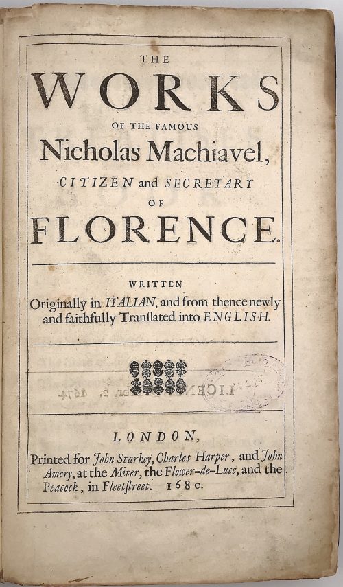 Title: THE | WORKS | OF THE FAMOUS | Nicholas Machiavel, | CITIZEN and SECRETARY | OF | FLORENCE. |—| WRITTEN | Originally in ITALIAN, and from thence newly | and faithfully Tranſlated into ENGLISH. |—|[ornament]|—| LONDON, | Printed for John Starkey, Charles Harper, and John | Amery, at the Miter, the Flower-de-Luce, and the | Peacock, in Fleetstreet. 1680. Content: (1) The history of Florence; (2) The Prince; (3) The Original of the Guelf and Ghibilin Factions; (4) The Life of Castruccio Castracani; (5) The Murther of Vitelli, etc. by Duke Valentino; (6) The State of France; (7) The State of Germany; (8) The Discourses on Titus Livius; (9) The Art of War; (10) The Marriage of Belphegor, a Novel; (11) Nicholas Machiavel's Letter in Vindication of Himself and His Writings. Pagination: ffl, 24 unnumbered pages before the first numbered: [2] – tp / license], [2] – contents / blank], [2] ftp “Florence” / blank, [3] – epistle to Clement VII, [3] – introduction, [12] – table; Misnumbering (X instead of Y format – X/Y): History of Florence: 1- 28/24, 19/91, 198/98, 180/108, 190/109, 174/164, 175/ 165, 179/169, 180/170, 185/175, 186/176, 188/178, 189/179, [190/180 blank]; The Prince, Lucca, State of France: [4] 199-262; State of Germany: 256/263, 266/264, 267/265 [268/266]; Discourses: [4] 267-314, 317-431 [432]; Art of War: [4] 433-528; [4] – publisher, [12] –Machiavelli’s letter, bfl. Collation: π3 Aa3 b-d2 B-Z4 Aa-Bb2 Cc-Zz4 Aaa-Yyy4 (*)-(**)4 Binding: Original mottled leather boards with embossing, later leather spine with 5 raised bands, crimson label with gilt lettering. Size: 32.4 x 21.0 x 4.0 cm Provenance: Bradford H. Gray This is the second edition; despite misnumbering, the collation is correct and all pages present. The first edition of this book was published in 1675 by Robert Bolter (British, fl. 1666 – 1683).
 -
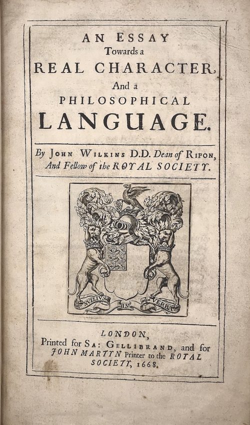 Title: AN ESSAY | Towards a | REAL CHARACTER, | And a | PHILOSOPHICAL | LANGUAGE. | By John Wilkins D.D. Dean of Ripon, | And Fellow of the ROYAL SOCIETY. |—| [armorial device] |—| LONDON, | Printed for Sa: Gellibrand, and for | JOHN MARTYN Printer to the ROYAL | SOCIETY, 1668. Pagination: [2] blank/order, [2] t.p./blank, [16], 1-454; + 79 leaves of Dictionary, unpaginated (158 pages); Illustrations: folding plates before pp. 167, 187, and two folding plates before p. 443. Collation: π2 a-d2 B-Z4 Aa-Zz4 Aaa-Lll4 Mmm3 aaa4 Aaa-Sss4 ttt3 Size: 4to, 32 x 20 x 5 cm; Binding: Full speckled calf, later polished calf spine with raised bands, double fillet ruled gilt compartments, crimson label with gilt lettering, margins sprinkled red. The work of John Wilkins is dedicated to the problem of the universal language. Wilkins was the Dean of Ripon from 1663 to 1672 and one of the founders of the Royal Society.
 -
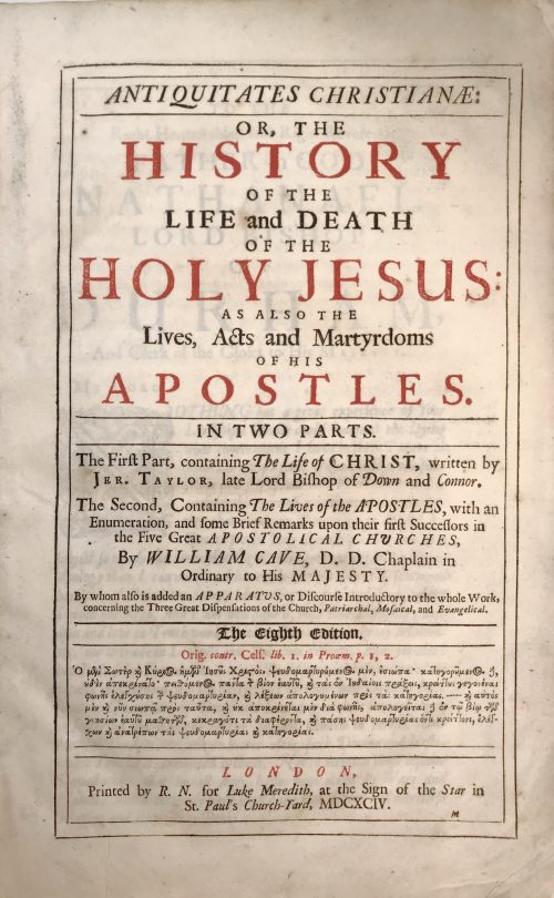 Title (black and red): ANTIQUITATES CHRISTIANÆ: |—| OR, THE | HISTORY | OF THE | LIFE AND DEATH | OF THE | HOLY JESUS: | AS ALSO THE Lives, Acts and Martyrdoms | OF HIS | APOSTLES. |—| IN TWO PARTS. |—| The Firƒt Part, containing The Life of CHRIST, written by | Jer. Taylor, Late Lord Bishop of Down and Connor. | The Second, Containing The Lives of the APOSTLES, with an | Enumeration, and ƒome Brief Remarks upon their firƒt Successors in | the Five Great APOSTOLICAL CHURCHES, | By WILLIAM CAVE, D. D. Chaplain in | Ordinary to His MAJESTY. | By whom alƒo is added an APPARATUS, or Diƒcourƒe Introductory to the whole Work, | concerning the Three Great Diƒpenƒations of the Church, Patriarchal, Moƒaical, and Evangelical. |—| THE EIGHTH EDITION. |—| Orig. contr. Celƒ. lib. 1. in Proœm. p. 1, 2. | [text in Greek] |—| LONDON, | Printed by R. N. for Luke Meredith, at the Sign of the Star in | St. Paul's Church-Yard, MDCXCIV. Collation of this book is unusual, it is called "Folio in 6s" (three sheets are folded in half to create a gathering of 6 leaves). Two unsigned leaves: (1) Engraved frontispiece "The Annunciation" by Willian Faithorne "the Elder" (British, 1616 – 1691), recto blank; (2) engraved title by the same engraver, verso blank; (*) gathering of 4: black and red title page, verso blank; epistle; to reader; imprim. (A6 to Sƒ6) Engraved portrait of Jeremy Taylor by Pierre Lombart (French, 1612 – 1682); faux title page: "The Great Exemplar of Sanctity and Holy Life... MDCXCIII"; dedication; contents, then to the end of the first book. (A-Z4 Aa-Bb4 Cc2) The second book has collation in quarto: Faux title page: "Antiquitates Christianæ: or the Lives, Acts and Martyrdoms... MDCXCIV", etc. to the end. Full formula: π2 *4 a-c6 d8 A-Z6 Aa-Sƒ6 A-Z4 Aa-Bb4 Cc2 Pagination: [12] I-LI [LII] [12] I-XXVIII, i-vi, (1st book): [2] I-145 [146-150] 151-432 [12]; (2nd book): [8] i-xiv, 1-188. 22 plates : frontis., t.p., portrait, one folding before p. 65, two after pp. [146], [150], 282, 304, 364, 386, 414, [422], and numerous head-pieces. Size: 36 x 23.5 x 5.7 cm Binding: full calf with the later spine, raised bands; front board with remnants of gilt ruling and blind stamped border, back bord probably original with a blind-stamped centre panel with fleurons.
 -
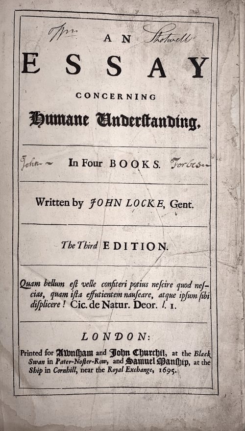 Title: AN | ESSAY | CONCERNING | HUMANE UNDERSTANDING, |—| In Four BOOKS. |—| Written by JOHN LOCKE, Gent. |—| The Third EDITION. |—| Quam bellum est velle confiteri potius nescire quod nes- | cias, quam ista effutientem nauseare, atque ipsum sibi | displicere! Cic. De Natur. Deor. l. I. |—| LONDON: | Printed for Awnsham and John Churchil, at the Black | Swan in Pater-Noster-Row, and Samuel Manship, at the | Ship in Cornhill, near the Royal Exchange, 1695. Collation: [π2]-b6, a-c4, B-Z4 Aa-Zz4 Aaa-Fff4 Ggg-Iii2 Pagination: [40] 1-407 [13]. Catalogue raisoné: The works of John Locke; a comprehensive bibliography from the seventeenth century to the present. Compiled by John C. Attig. Series: Bibliographies and Indexes in Philosophy, Number 1. Greenwood Press, Westport, CT & London, England, 1985. p. 42, №230 provides for pagination [40] 407, [13]p. Page by page reprint of 1694 edition. Regarding the epigraph on t.p.: The correct citation from , De Natura Deorum: "Quam bellum erat, Vellei, confiteri potius nescire, quod nescires, quam ista effutientem nauseare atque ipsum sibi displicere." [How delightful it would be, Velleius, if when you did not know a thing you would admit your ignorance, instead of uttering this drivel, which must make even your own gorge rise with disgust!] This life-time edition was presented as a gift to Dr Elisha Atkins (1949 – 2019), professor at Yale University School of Medicine, on July 1st, 1967, by his students, namely Carolyn Wells [Bush] (1923 – 2013), John Mooney (now a psychiatrist in Boston), and Charles Dinarello. Size: 32 x 23 cm Binding: Fill modern morocco, panelled and ruled gilt, raised bands, gilt in compartments, red label with gilt lettering; in a slipcase.
 -
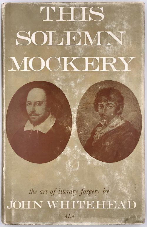 Title: This Solemn | Mockery | THE ART OF LITERARY FORGERY | John Whitehead, A.L.A. | Arlington Books {device} London Pagination: [2] – h.t. / blank, [2] – t.p. / imprint, [2] –contents / acknowledgement, 1-177 [178 blank]; 4 leaves of plates (total 96 leaves). Binding: 22.2 x 14.2 cm; hardcover, aubergine cloth, silver lettering to spine, pictorial dust jacket. ISBN-10: 0851402127
 -
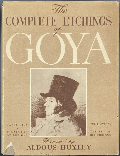 Title: THE COMPLETE ETCHINGS OF | Goya | With a Foreword by Aldous Huxley | CROWN PUBLISHERS. NEW YORK|| Pagination: [2 blank] [1-6] 7-16 [6], 234 plates on 118 leaves [2 blank] Contents: The capriccios [Los caprichos]. The disasters of the war [Los desastres de la guerra]. The art of bullfighting [La Tauromaquia]. The proverbs [Los disparates, Proverbios]. Miscellany. Binding: Hardcover, grey cloth, black lettering to cover and spine, pictorial DJ.
 -
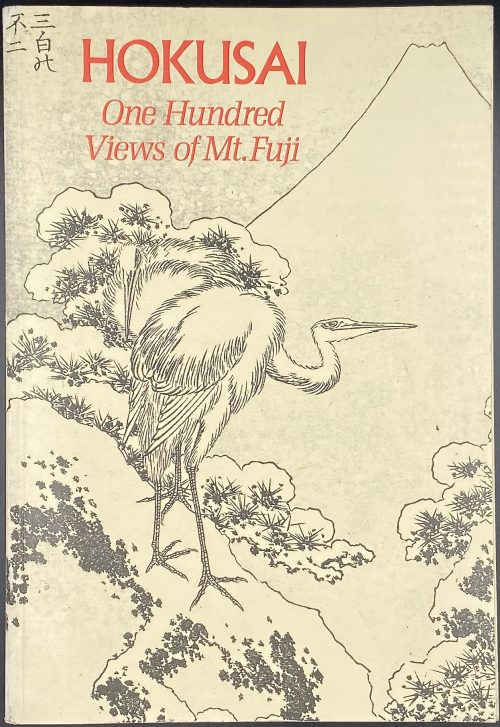 Softcover, 24 x 16.5 cm, publisher's pictorial wrappers, lettering to spine, pp.: [6] 7-224. Full reproduction of Katsushika Hokusai's [葛飾 北斎] (Japanese, 1760 – 1849) series of three illustrated books [絵本, e-hon] One Hundred Views of Mount Fuji [富嶽百景, Fugaku hyakkei], published in Japan in 1834-1849, with commentaries.
 -
![[ROSCOE, Thomas, translator]. Tales of Humour, Gallantry, & Romance, selected and translated from the Italian. With sixteen illustrative Drawings by George Cruikshank. London, Printed for Charles Baldwyn, 1827.](https://varshavskycollection.com/wp-content/uploads/2021/02/LIB-1079-2-500x839.jpg) Title: TALES | OF | Humour, Gallantry, & Romance, | SELECTED AND TRANSLATED | FROM THE ITALIAN. | Vignette "The Elopement, p. 183" | With sixteen illustrative Drawings by George Cruikshank. | — | LONDON : | PRINTED FOR CHARLES BALDWYN, | NEWGATE STREET. | MDCCCXXVII. Pagination: [2], [v]-vi [2] – Contents (Cohn's collation calls for this at the end) 3-253, [1]; title-page a cancel with vignette 'The Elopment', sixteen other plates by Cruikshank; as per HathiTrust: vi, 253, [3] p. (last p. blank), [16] leaves of plates: ill. Binding: 8vo, 20 x 13 cm, later polished calf, gilt, t.e.g. others untrimmed, by Rivière for H. Sotheran. Note: 1st edition, very rare 3rd issue, with a cancel title-page replacing that of 1824 issue when there were two issues and the work was entitled Italian Tales. Cohn notes the rarity of the 1827 edition, which restores one of the plates 'The Dead Rider', suppressed in the second issue, and also includes the plate done to replace it. "The rarest edition of this work is that published in 1827 in green paper boards [...]. This issue has no edition stated on the title. It has seventeen woodcuts, inclusive of the "Elopement" vignette upon the title. The suppressed plate "The Dear Rider" is restored, and the plate done to replace it is also included. The woodcut in other editions upon the title page is "The Pomegranate Seed". Probably compiled and translated by Thomas Roscoe (cf. National union catalog) from a variety of authors 'out of materials not generally accessible', but also ascribed to J. Y. Akerman and to one "Southern". Two or three tales that furnished plots for Shakespeare. Catalogue Raisonné: Cohn 444; this issue not found in OCLC or COPAC.
Title: TALES | OF | Humour, Gallantry, & Romance, | SELECTED AND TRANSLATED | FROM THE ITALIAN. | Vignette "The Elopement, p. 183" | With sixteen illustrative Drawings by George Cruikshank. | — | LONDON : | PRINTED FOR CHARLES BALDWYN, | NEWGATE STREET. | MDCCCXXVII. Pagination: [2], [v]-vi [2] – Contents (Cohn's collation calls for this at the end) 3-253, [1]; title-page a cancel with vignette 'The Elopment', sixteen other plates by Cruikshank; as per HathiTrust: vi, 253, [3] p. (last p. blank), [16] leaves of plates: ill. Binding: 8vo, 20 x 13 cm, later polished calf, gilt, t.e.g. others untrimmed, by Rivière for H. Sotheran. Note: 1st edition, very rare 3rd issue, with a cancel title-page replacing that of 1824 issue when there were two issues and the work was entitled Italian Tales. Cohn notes the rarity of the 1827 edition, which restores one of the plates 'The Dead Rider', suppressed in the second issue, and also includes the plate done to replace it. "The rarest edition of this work is that published in 1827 in green paper boards [...]. This issue has no edition stated on the title. It has seventeen woodcuts, inclusive of the "Elopement" vignette upon the title. The suppressed plate "The Dear Rider" is restored, and the plate done to replace it is also included. The woodcut in other editions upon the title page is "The Pomegranate Seed". Probably compiled and translated by Thomas Roscoe (cf. National union catalog) from a variety of authors 'out of materials not generally accessible', but also ascribed to J. Y. Akerman and to one "Southern". Two or three tales that furnished plots for Shakespeare. Catalogue Raisonné: Cohn 444; this issue not found in OCLC or COPAC. -
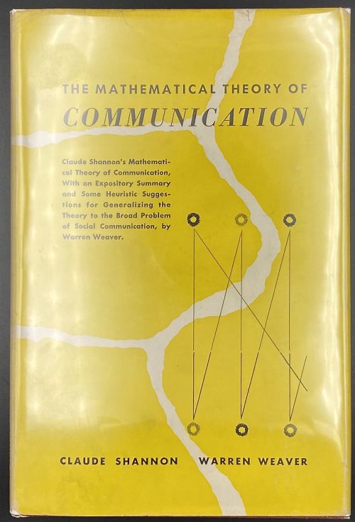 Title page: The Mathematical Theory | Of Communication | By CLAUDE E. SHANNON | and WARREN WEAVER | THE UNIVERSITY OF ILLINOIS PRESS: URBANA | 1949 || Pagination: [8] [2] 3-117 [3 blanks]. Size: 23.5 x 16 cm Binding: Publisher’s burgundy cloth, silver lettering to spine, yellow pictorial DJ with lettering: THE MATHEMATICAL THEORY OF | COMMUNICATION | {8 lines of text} {graph} | CLAUDE SHANNON WARREN WEAVER || Contributors: Shannon, Claude Elwood (American, 1916 – 2001) Weaver, Warren (American, 1894 – 1978)
 -
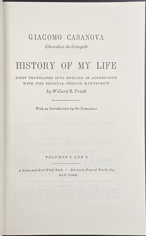 Title: GIACOMO CASANOVA | Chevalier de Seingalt | HISTORY OF MY LIFE | FIRST TRANSLATED INTO ENGLISH IN ACCORDANCE | WITH THE ORIGINAL FRENCH MANUSCRIPT | By Willard R. Trask | With an Introduction by the Translator | VOLUMES 1 AND 2 | A Helen and Kurt Wolff book • Harcourt, Brace & World, 1966 | NEW YORK || Stated 1st edition. Pagination: [2 blank] [i-iv] v-viii, [1, 2] 3-330 [8 blanks] + 32 ills. Two volumes in one.
 -
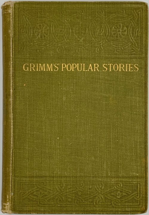 Title: OXFORD EDITION | POPULAR STORIES | COLLECTED BY | THE BROTHERS GRIMM | A REPRINT OF THE FIRST ENGLISH EDITION | WITH TWENTY-TWO ILLUSTRATIONS | BY GEORGE CRUIKSHANK | {publisher’s device} | HENRY FROWDE | LONDON, EDINBURGH, GLASGOW | NEW YORK AND TORONTO | 1905 || Pagination: [i, ii] – frontis., [iii-iv]– t.p. / imprint. [v] – preface, vi-xvii [xviii blank], [2] [1] 2-403 [404], plates included in pagination, pp. 379-403 – notes. Collation: a8 b2 B-Z8 Aa-Cc8 Dd2. Binding:1 9 x 13 cm, olive green cloth blind-stamped in art nouveau style and lettered in gilt to cover and spine: GRIMMS’ POPULAR STORIES. Aubergine pencil inscription to front pastedown: C. Grant Robertson | All Souls | 1905: Provenance: Sir Charles Grant Robertson CVO (British, 1869 – 1948) who was a British academic historian, a Fellow of All Souls College, Oxford, and Vice-chancellor of the University of Birmingham.
 -
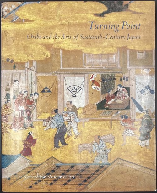 Catalogue of the exhibition held in The Metropolitan Museum of Art in NY from October 21, 2003, to January 11, 2004. Pagination: [i-vi] vii-xviii, [2]3-390, ils. Binding: 29 x 24 cm, grey cloth, gilt lettering to spine, pictorial dust jacket.
 -
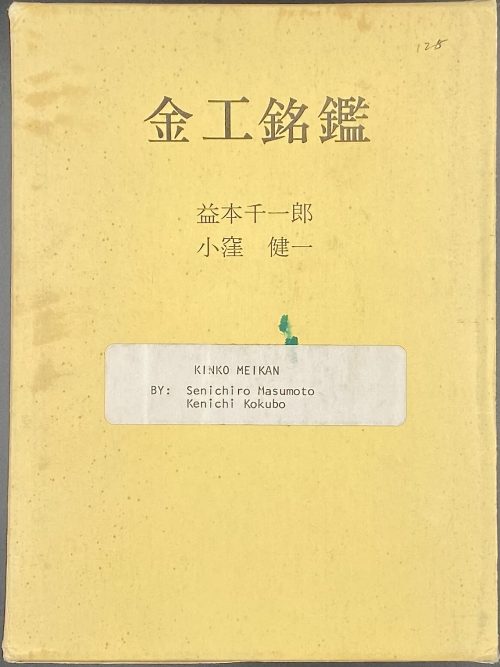 Publisher's brown cloth stamped in gilt, in a slipcase, 19 x 14 cm; pp.: [11] 1-657 [1] 1-12 [6]; in Japanese. With full English translation published in 1982 on letter-size writing paper in a separate folder, 29.5 x 23 cm, pp. [2] i-iii, 1-197, 1-52, 1-3. "Kinkō Meikan is a collection of photographs of signatures that appear on the tsuba and other fittings of the Japanese sword".
 -
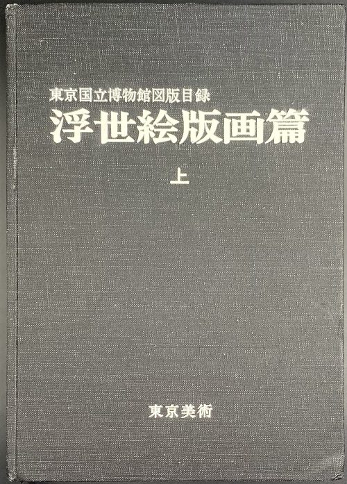 Title: Illustrated Catalogues of Tokyo National Museum: Ukiyo-e Prints [東京国立博物館図版目録 | 浮世絵版画編] (Tōkyō Kokuritsu Hakubutsukan zuhan mokuroku | Ukiyoe hanga hen); Publisher: Tokyo National Museum [東京国立博物館] (Tōkyō Kokuritsu Hakubutsukan). Three volumes, 26.3 x 18.7 cm, uniformly bound in black cloth with white characters to front cover and spine. Title-page: ILLUSTRATED CATALOGUES OF | TOKYO NATIONAL MUSEUM | UKIYO-E PRINTS | <1 (2, 3) > | 東京国立博物館図版目録 | 浮世絵版画編 | < 上 (中, 下) > || Volume 1 [上]: unpaginated 1 t.p., 2 colour plates, 1 contents, 70 (1-1354) – b/w plates, 1 + 48 paginated leaves (1-95 [96]) – text. Volume 2 [中]: unpaginated 1 t.p., 2 colour plates, 1 contents, 67 (1355-2493) – b/w plates + 33 paginated leaves (1-65 [66]) – text. Volume 3 [下]: unpaginated 1 t.p., 2 colour plates, 1 contents, 83 (2494-3926) – b/w plates + 35 paginated leaves (1-69 [70]) – text. Black and white photomechanical reproduction of almost four thousand woodblock prints with titles by the artist and in chronological order.
 -
![George Cruikshank : A Catalogue Raisonné Of The Work Executed During The Years 1806-1877; With Collations, Notes, Approximate Values, Facsimiles, And Illustrationsby Albert M. Cohn, author of a bibliographical catalogue of the printed works illustrated by George Cruikshank, etc. London : Office of "The Bookman's Jounral", 1924. [Cohn, Albert M.]](https://varshavskycollection.com/wp-content/uploads/2021/02/LIB-1650-c-500x630.jpg) GEORGE CRUIKSHANK | A CATALOGUE RAISONNÉ | OF THE WORK EXECUTED | DURING THE YEARS 1806-1877 | WITH COLLATIONS, NOTES, APPROXIMATE VALUES, | FACSIMILES, AND ILLUSTRATIONS | BY | ALBERT M. COHN | Author of A Bibliographical Catalogue of the Printed | Works Illustrated By George Cruikshank, etc. | LONDON |FROM THE OFFICE OF "THE BOOKMAN'S JOURNAL" | 7 HENRIETTA STREET, STRAND, W.C.2 | 1924. Pagination: ffl, [i, ii] – h.t. / Limited edition (122 of 500), [2] – blank / frontis. lith. portrait of G. Cruikshank w/guard, [iii, iv] – t.p. / printed in G.B., [v, vi] – dedicat. / blank, vii-xvi; [1, 2] – f.t. / blank, 3-375, [376] – Imprint., bfl; 31 leaves of plates, some mounted. Binding: size 30 x 24 x 5.5 cm, hardcover, bevelled boards, original brown cloth with gilded lettering to spine. Top edge gilt, other untrimmed; printed on laid paper. To front pastedown: "Ex libris – Fred Robison Heryer" (round, 55 mm, resembles a coin, printed on heavy gold-coloured foil with embossed lettering and an image of a seated man lettered ALEXANDROY in Greek. To back pastedown: Seller's sticker "From the book of J.W.Robinson Co., Seventh & Grand, Los Angeles." J. W. Robinson Co. – a chain of department stores, established by Joseph Winchester Robinson (American, 1846 – 1891). Some Fred Robison Heryer (American, 1907 – 1992) died in Kansas.
GEORGE CRUIKSHANK | A CATALOGUE RAISONNÉ | OF THE WORK EXECUTED | DURING THE YEARS 1806-1877 | WITH COLLATIONS, NOTES, APPROXIMATE VALUES, | FACSIMILES, AND ILLUSTRATIONS | BY | ALBERT M. COHN | Author of A Bibliographical Catalogue of the Printed | Works Illustrated By George Cruikshank, etc. | LONDON |FROM THE OFFICE OF "THE BOOKMAN'S JOURNAL" | 7 HENRIETTA STREET, STRAND, W.C.2 | 1924. Pagination: ffl, [i, ii] – h.t. / Limited edition (122 of 500), [2] – blank / frontis. lith. portrait of G. Cruikshank w/guard, [iii, iv] – t.p. / printed in G.B., [v, vi] – dedicat. / blank, vii-xvi; [1, 2] – f.t. / blank, 3-375, [376] – Imprint., bfl; 31 leaves of plates, some mounted. Binding: size 30 x 24 x 5.5 cm, hardcover, bevelled boards, original brown cloth with gilded lettering to spine. Top edge gilt, other untrimmed; printed on laid paper. To front pastedown: "Ex libris – Fred Robison Heryer" (round, 55 mm, resembles a coin, printed on heavy gold-coloured foil with embossed lettering and an image of a seated man lettered ALEXANDROY in Greek. To back pastedown: Seller's sticker "From the book of J.W.Robinson Co., Seventh & Grand, Los Angeles." J. W. Robinson Co. – a chain of department stores, established by Joseph Winchester Robinson (American, 1846 – 1891). Some Fred Robison Heryer (American, 1907 – 1992) died in Kansas.
