-
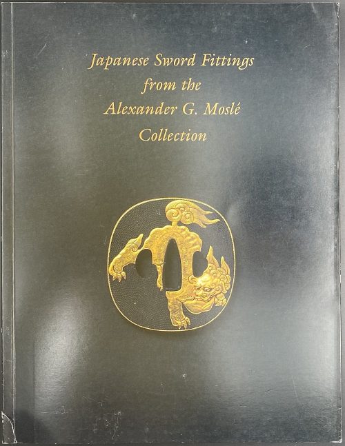 Softcover, in black pictorial flapped wrappers, 28 x 21.8 cm, 16 entries, with colour illustrations. Catalogue # 8 of the sales exhibition on March 23-30 2004 in NY; pagination: [1-3] 4-50 [2], ils., some folding. Front cover: gilt on a black background: Japanese Sword Fittings | from the | Alexander G. Moslé | Collection | {vignette ‘tsuba with shishi lion} || Contributor: Sebastian Izzard
 -
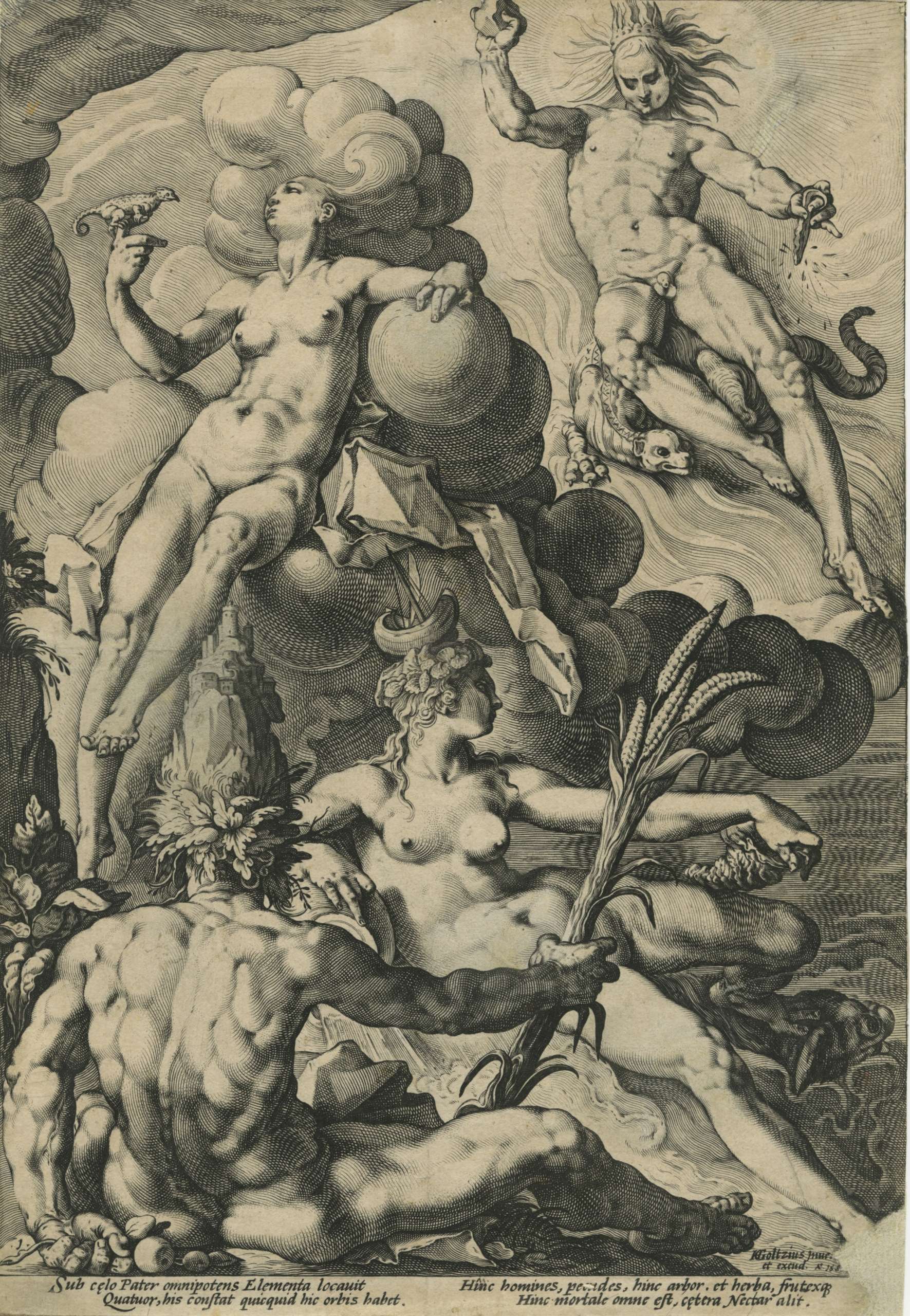
The Four Elements by Jacob Matham (Netherlandish, Haarlem 1571–1631 Haarlem) after Hendrick Goltzius (Netherlandish, Mühlbracht 1558–1617 Haarlem). Engraving on copper, printed on laid paper, 1588.
Dimensions: 298 mm × 206 mm.
-
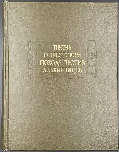 Title (black and red): ПЕСНЬ | О КРЕСТОВОМ | ПОХОДЕ ПРОТИВ | АЛЬБИГОЙЦЕВ | {device} | Издание подготовили | И.О. БЕЛАВИН, Е.В. МОРОЗОВА | Научно-издательский центр | «Ладомир» | «Наука» | Москва || Frontispiece (black and red): LA CHANSON DE | LA CROISADE | ALBIGEOISE | {device} || Pagination : [1-9] 10-437 [3] ; 79 illustr. on 20 leaves of colour plates between pp. 224/225, inset: folding double-sided map of the Albigensian Crusade43 x 64 cm; print run 2,000 copies. Binding: serial green buckram blind-stamped with a scroll adorned with gold lettering to board and spine. Отв. ред. М. Л. Андреев. Ред. изд-ва Л. А. Сифурова.
 -
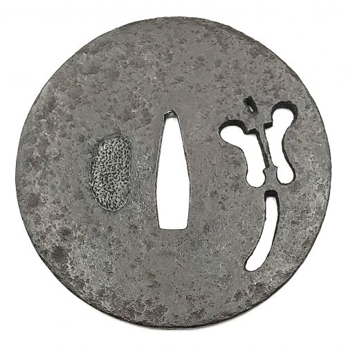 Iron tsuba of round form with design of military commander's fan (gunbai) in openwork (sukashi). Square rim. Hitsu-ana plugged with lead or tin. Ko-tosho school. Mid Muromachi period. Late 15th century: Entoku era [1489-92] / Meio era [1489-1501]. Height: 80.3 mm, Width: 81.5 mm, Rim thickness: 3.0 mm. Centre thickness: 3.5 mm. Provenance: Sasano Masayuki Collection, №23 in Japanese Sword Guard Masterpieces from the Sasano Collection, 1994: Ko-tosho. Sukashi design: Military commander's fan (gunbai). Mid Muromachi period. Late 15th century (Entoku / Meio era). The military commander's fan (gunbai) was cherished by samurai warriors. This tsuba is relatively thick, with the large fan nicely positioned on the plate.
 -
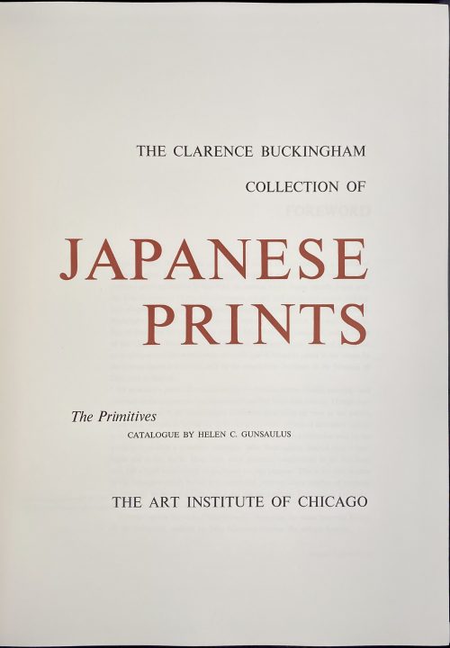 Two volumes, each bound in red cloth with gilt lettering to spine, black endpapers, TEG, and matching red cloth slipcases with black lettering to front. Vol. 1: The Clarence Buckingham collection of Japanese prints: The Primitives / Catalogue by Helen C. Gunsaulus. — [Chicago]: Art Institute of Chicago, 1955. Pagination: 1st leaf blank, 2nd leaf half-title, verso blank, [i, ii] – t.p. in red and black, copyright to verso, iii-vi, [vii] faux-title “The catalogue”, 1-284 [285] colophon, limitation: 500 numbered copies, this is № 476. Title-page: THE CLARENCE BUCKINGHAM | COLLECTION OF | JAPANESE PRINTS | The Primitives | CATALOGUE BY HELEN C. GUNSAULUS | THE ART INSTITUTE OF CHICAGO || Vol. 2: The Clarence Buckingham collection of Japanese prints: Volume 2 / Catalogue by Margaret O. Gentles. — [Chicago]: Art Institute of Chicago, 1965. Pagination: 1st leaf blank, 2nd leaf half-title, verso blank, [i, ii] – t.p. in red and black, copyright to verso, iii-vi, [vii] faux-title “The catalogue”,1-307 [2] blank/ colophon, limitation: 1000 copies (unnumbered). Title-page: VOLUME II | THE CLARENCE BUCKINGHAM | COLLECTION OF | JAPANESE PRINTS | Harunobu, Koryūsai, Shigemasa, their followers and contemporaries | Catalogue by Margaret O. Gentles | THE ART INSTITUTE OF CHICAGO 1965 || Contributors: Clarence Buckingham (American, 1854 – 1913) Helen C. Gunsaulus (American, 1886 – 1954) Margaret O. Gentles (American, 1905 – 1969)
 -
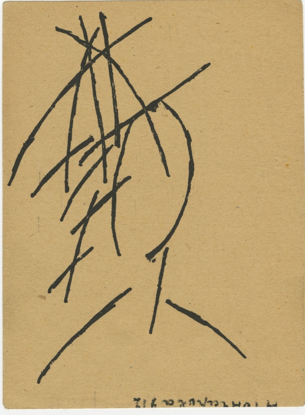
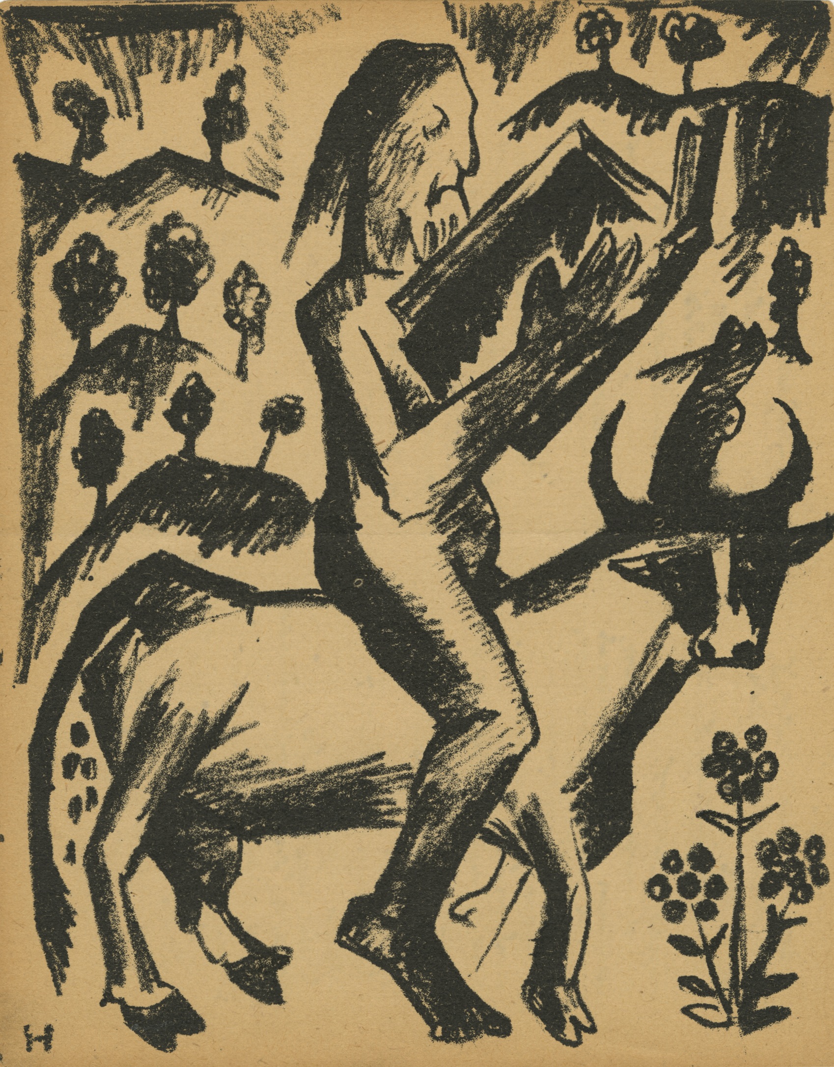 Artist: Natalia Goncharova (July 3, 1881 – October 17, 1962). Russian/French. Lithographic illustration "An elder astride a bull" for Aleksei Kruchenykh book "Two poems. The Hermit. The Hermitess", Moscow, Kuzmin and Dolinsky Publishers, 1913. This sheet is from the book "Natalia Goncharova / Mikhail Larionov" by Eli Eganbyuri (pen-name of Ilia Zdanevich), published by Z. A. Münster in 1913. Inscription on the back: hand-written copy (allegedly by the hand of Osip Brik) of Vladimir Mayakovsky verses for "Red Pepper" (Krasny peretz) magazine issue of 1924, included in the compilation "Ferocious laugh" (Grozny smekh) that was published after Mayakovsky death in 1931. Text of the manuscript on verso. Size: 18,5 х 14,3 cm. Наталия Гончарова (3 июля 1881 – 17 октября 1962). Россия/Франция. Автолитография "Старец верхом на быке" для книги А. Е. Крученых "Две поэмы. Пустынники. Пустынница"; - М.: Изд. Г.Л. Кузьмина, С.Д. Долинского, 1913. Данный лист из книги Эли Эганбюри (псевдоним Ильи Зданевича) "Наталия Гончарова / Михаил Ларионов"; - М. : Изд. Ц. Мюнстера, 1913. На обороте список стихов из подписей к "Красному перцу" 1924 г., которые вошли в сб. "Грозный смех" (вышел после смерти Маяковского в 1931). Вероятно список сделан рукой Осипа Брика. Текст манускрипта. Формат: 18,5 х 14,3 см.
Г. Л. Кузьмин и С. Д. Долинский знамениты, в частности, тем, что в 1912 году издали футуристский манифест "Пощечина общественному вкусу". О них можно найти дополнительную информацию в статье об Л. Л. Кузьмине. Издатель Цезарь Александрович Мюнстер был сыном знаменитого русского литографа Александра Эрнестовича Мюнстера, открывшего свое литографическое заведение в Санкт-Петербурге в 1850 году. Судьба Ц. А. Мюнстера и его издательства после революции 1917 года мне неизвестна.
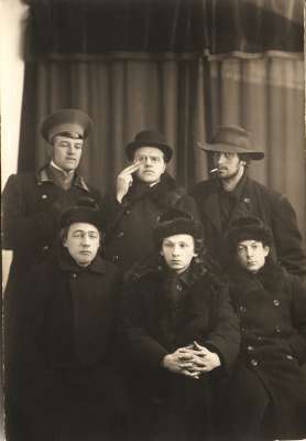
Сидят: В.В. Хлебников, Г.Л. Кузьмин, С.Д. Долинский Стоят: Н.Д. Бурлюк, Д.Д. Бурлюк, В.В. Маяковский. 1911.
-
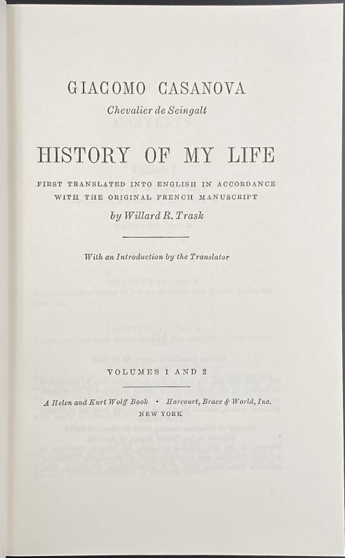 Title: GIACOMO CASANOVA | Chevalier de Seingalt | HISTORY OF MY LIFE | FIRST TRANSLATED INTO ENGLISH IN ACCORDANCE | WITH THE ORIGINAL FRENCH MANUSCRIPT | By Willard R. Trask | With an Introduction by the Translator | VOLUMES 1 AND 2 | A Helen and Kurt Wolff book • Harcourt, Brace & World, 1966 | NEW YORK || Stated 1st edition. Pagination: [2 blank] [i-iv] v-viii, [1, 2] 3-330 [8 blanks] + 32 ills. Two volumes in one.
 -
 Iron tsuba of round form decorated with two boar's eyes (inome) and two dragonflies (tombo) in small openwork (ko-sukashi) outlined with brass wire. The plate also decorated with 2 to 5 concentric circular rows of brass dots (nail heads) in ten-zōgan. Center of the plate outlined with the inlaid circular brass wire. The inlaid metal is of red-ish hue, so it may be copper, and not brass. The surface has remnants of lacquer. Ōnin school. Mid Muromachi period, middle of 15th century. Dimensions: Diameter: 90 mm, thickness: 3.2 mm. Notes regarding design: "According to various sources, the dragonfly (tombo) is emblematic of martial success, as various names for the insect are homophones for words meaning "victory". The dragonfly is also auspicious because references in the Kojiki and Nihongi link it in both name and shape to the old kingdom of Yamato." [Merrily Baird. Symbols of Japan. Thematic motifs in art and design. Rizzoli international publications, Inc., 2001, p. 108]. "The dragonfly (tonbo), was also called kachimushi in earlier times, and due to the auspicious literal meaning "victory bug" of the characters of this word it became a popular theme on sword fittings." [Iron tsuba. The works of the exhibition "Kurogane no hana", The Japanese Sword Museum, 2014, p. 13]. Two other cutouts - in the form of what in European tradition symbolizes the heart, on the top and in the bottom of tsuba disc - may have two different explanations. The most usual one, inome - "Heart-shaped pattern, which is said to go back to the shape of a wild boar's eye" [Markus Sesko. Encyclopedia of Japanese Swords. Print and publishing: Lulu Enterprises, Inc., 2014.]. This understanding is shared by Robert Haynes [Robert E. Haynes. Study Collection of Japanese Sword Fittings. Nihon Art Publishers, 2010.] and elsewhere, with an exception of Okabe-Kakuya [Okabe-Kakuya. JAPANESE SWORD GUARDS. Museum of Fine Arts, Boston. In cooperation with the department of Chinese and Japanese art; - 1908, p. 14], who provides the illustration of inome-shaped cut-outs with the following explanation: " The tsuba shown in Fig. 13 approaches a square form with rounded corners and is perforated with Aoi decoration. But this book was written long time ago, when people even at MFA might not know enough...
 The same interpretation of the said heart-like symbol (aoi leaf) is given at Helen C. Gunsaulus. Japanese sword-mounts in the collection of Field Museum. // Publication 216, Anthropological Series, Volume XVI; Chicago, 1923; p. 54: "This mokkō-formed tsuba recalls the aoi form, perforated as it is with the four aoi leaves." It is possible that the "wild boar's eye" theory was developed by later scholars.
 There is also a theory, supported by Graham Gemmell, saying that: “In simple terms Onin works are decorated Ko-Katchushi tsuba. … But, not content with iron alone, they began to decorate it with what was, in the early Muromachi period, a rare and valuable metal, brass. The Onin workers cut the design into the iron, using narrow channels, cast the brass, piece by piece, and then hammered it into the iron plate as though they were putting together a jigsaw. When complete the tsuba would be black lacquered exactly as the plain iron ones had been, the brass shining dully through it in a way that fulfilled the goal of shibui or restrained elegance.” [Tosogu. Treasure of the samurai. Fine Japanese Sword Fittings from The Muromachi to The Meiji Period, by Graham Gemmell. // Sarzi-Amadè Limited, London, 1991. An exhibition held in London from 21st March to 4th April, 1991]. The following illustration from Helen C. Gunsaulus. Japanese sword-mounts in the collection of Field Museum. // Publication 216, Anthropological Series, Volume XVI; Chicago, 1923; pp. 43 supports the idea.
 Helen C. Gunsaulus' description of the dragonfly emblem is as follows: "This motive, the dragon-fly (akitsu), is generally accepted as a symbol of the kingdom of Japan, and the origin of the idea is traced to the legend recounted in the Kojiki and Nihongo of the Emperor Jimmu's view of the island from mountain top. He is said to have thought the kingdom looked like a dragon-fly touching its tail with its mouth. From this it received its name Akitsu-shima... etc."
-
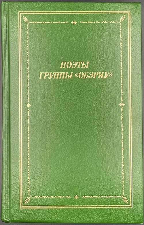 Collection of poems. Hardcover volume, 20.7 x 13.3 cm, bound in green buckram, gilt double-fillet border, gilt frame, gilt lettering to front, gilt stars, fillets and lettering to spine, blind lettering to back, matching endpapers, pp.: [1-4] 5-637 [638] [2], total 640 pages, collated in-16mo, [1]-1116, 8 leaves of plates, 13-2116. Title-page: ПОЭТЫ | ГРУППЫ «ОБЭРИУ» | С.-ПЕТЕРБУРГСКОЕ ОТДЕЛЕНИЕ • 1994 || Opposite to t.p.: БИБЛИОТЕКА ПОЭТА | ОСНОВАНА МАКСИМОМ ГОРЬКИМ В 1931 ГОДУ | БОЛЬШАЯ СЕРИЯ | ИЗДАНИЕ | ТРЕТЬЕ | СОВЕТСКИЙ ПИСАТЕЛЬ || Print run: 3,000 copies. Contributors: Михаил Борисович Мейлах (Russian-Jewish, b. 1944) Татьяна Львовна Никольская (Russian, b. 1945) Александр Николаевич Олейников (Russian, 1936 – 2013) Владимир Ибрагимович Эрль [Владимир Иванович Горбунов] (Russian, 1947 – 2020) ОБЭРИУ (Объединение Реального Искусства) Даниил Иванович Хармс [Ювачёв] (Russian, 1905 – 1942) Александр Иванович Введенский (Russian, 1904 – 1941) Николай Алексеевич Заболоцкий (Russian, 1903 – 1958) Игорь Владимирович Бахтерев (Russian, 1908 – 1996) Николай Макарович Олейников (Russian, 1898 – 1937) Константин Константинович Вагинов [Вагенгейм] (Russian, 1899 – 1934)
 -
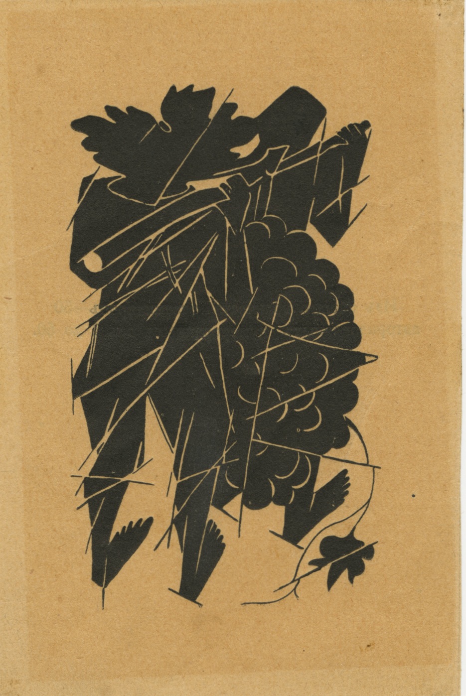 Artist: Natalia Goncharova (July 3, 1881 – October 17, 1962). Russian/French. Lithographic illustration (frontispiece) for Sergei Bobrov book of poetry "The gardeners upon the grapevines", Moscow, Lirika Publishers, 1913. Size: 18 х 11,5 cm.
Book was printed on May 20, 1913 for Lirika Publishers, by V. I. Voronov printshop in 500 copies, of them 50 authored and numbered. 10 lithographs by Natalia Goncharova printed at Kushneryov & Co. lithography in Moscow.
Наталия Гончарова (3 июля 1881 – 17 октября 1962). Россия/Франция. Литографическая иллюстрация (фронтиспис) к книге С. П. Боброва "Вертоградари над лозами" [Сергей Бобров. М.: /Лирика, 1913]. Формат: 18 х 11,5 см.Тираж 500 экз, из них 50 авторизованных и нумерованных. Десять цветных рисунков работы Н. Гончаровой исполнены в технике литографии на отдельных листах. Книга отпечатана 20 мая 1913 года в типографии В.И. Воронова для книгоиздательства «Лирика». В мягкой издательской обложке. На с. 162 после списка литографий: Отпечатаны литографией т-ва И.Н. Кушнерев и К° в Москве.
-
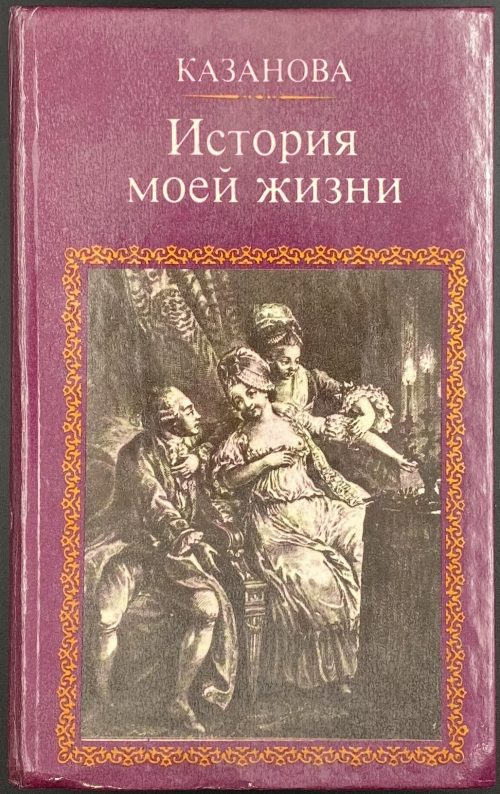 Казанова Д. Истрия моей жизни. — М.: Моск. рабочий, 1991. — 734 с. Составление, вступительная статья, комментарии А. Ф. Строева. Перевод И. К. Стаф, А. Ф. Строева, 1990. ISBN: 5—239—00590—7 Original title: Giacomo Casanova. Histoire de ma vie.
 -
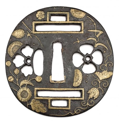 Iron tsuba of round form decorated with chrysanthemums, pine cones and needles, pampas grass, vines, cherry blossoms, and wild geese in brass inlay (suemon-zōgan) and pierced with designs of water clover (denjiso) and half bellflower (or karahana) to the left and to the right of nakago-ana as well as double bars above and below nakago-ana (possibly with the meaning of number 2 or ordinal 2nd). Most probably the sukashi elements here are the family crests (mon). Unsigned. Ōnin school. Muromachi period; 15th or 16th century. Height: 82.1 mm; Width: 80.9 mm; Thickness at seppa-dai: 2.4 mm NBTHK # 2003827: Tokubetsu Hozon Tosogu Kanteisho (特別保存刀装具鑑定書) - "Extraordinarily Worthy of Preservation".
 -
 Softcover, 21 x 14.8 cm, print on demand edition, pp.: 1-88 [2], total 90 pages, pp. 1, 2, 88, and 89 blanks, p. 90 colophon. Font cover: Markus Sesko | — | Handbook | {vignette} | of Sword Fittings related Terms | — || Title-page: Handbook | of Sword Fittings | related Terms | © 2011 Markus Sesko | Herstellung und Verlag: | Books on Demand GmbH, Norderstedt | ISBN 978-308423-6422-6 || On the back cover: Blurb, publisher’s device in blue and black, barcode, and web address. Lettering to spine. Printed in the USA.
 -
 Artist: Mikhail Larionov (June 3, 1881 – May 10, 1964) ). Russian/French. Lithographic illustration "Woman in a hat" for Aleksei Kruchenykh book "Lipstick", Moscow, Kuzmin and Dolinsky Publishers, 1913, 480 copies printed. Size: 11,3 х 8,2 cm. Михаил Ларионов (3 июня 1881 – 10 мая 1964). Россия/Франция. Литографическая иллюстрация "Женщина в шляпе" к книге Алексея Крученых "Помада"; М.: Изд. Г.Л. Кузьмина и С.Д. Долинского, 1913, отпечатана в 480 экз. Формат: 11,3 х 8,2 см.
 -
 Christie's Auction Catalog; Sale WALTER-15785; New York, September 26-27, 2017; Publisher's pictorial wrappers, front cover: THE COLLECTION OF | PAUL F. WALTER | NEW YORK 26–27 SEPTEMBER 2917 | {profile chest portrait of Paul F. Walter} | CHRISTIE'S || 26.8 x 21.2 x 3 cm; 662 lots, illustrations in colour and b/w, pictorial dust jacket; pp: [2] 3-462.
Paul F. Walter (American, 1935 – 2017) – "Collector. Following studies in history and history of art Oberlin College, Ohio, and Columbia University, he began to collect in the1960s, starting with prints by Whistler and moving on to the Aesthetic Movement and the Arts & Crafts in Britain, as well as the arts of the Indian subcontinent and modern American painting. He was Trustee of the Museum of Modern Art from 1992-2006, and a benefactor to the Metropolitan Museum of Art, the Cooper-Hewitt Design Museum, the Morgan Library and Museum, the Brooklyn Museum, the Allen Memorial Art Museum at Oberlin College, and the Los Angeles County Museum of Art."
-
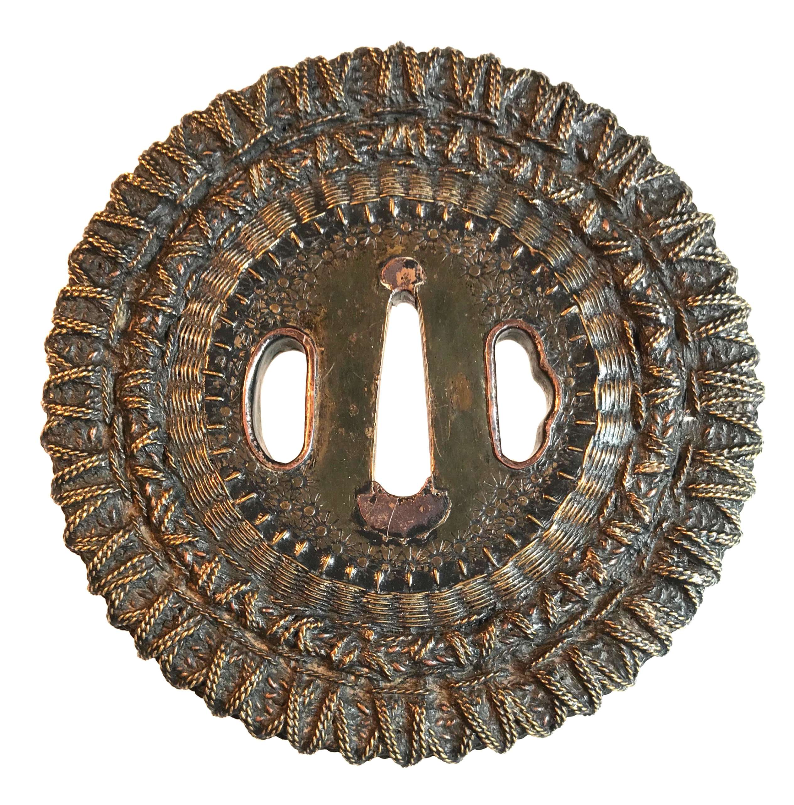 Shingen school (or style) tsuba of round form with an iron core of spoked-wheel shape, with its centre covered with a copper plate decorated with star-shaped punch marks. From this copper plate outward, the body is formed by brass and copper wire (flat and twisted) in a weave pattern. Both hitsu-ana are outlined in brass with a raised rim. Copper sekigane. Unsigned. Edo period, 18th century. SOLD Height: 98.0 mm, Width: 97.4 mm, Thickness at seppa-dai: 6.0 mm. Weight: 290 g. NBTHK certificate №436696: 'Hozon' attestation. Citing "JAPANESE SWORD-MOUNTS IN THE COLLECTIONS OF FIELD MUSEUM" by Helen C. Gunsaulus, Assistant Curator of Japanese Ethnology. 61 plates. Berthold Laufer, Curator of Anthropology. Field Museum of Natural History, Publication 216, Anthropological Series, Volume XVI; Chicago, 1923; p.45: "An unusual group of tsuba popular in the late sixteenth century and afterwards is made up of those guards known as Shingen tsuba, a name which was derived from a sixteenth-century warrior, Takeda Shingen (Takeda Harunobu, 1521-73), who is said to have preferred this style of guard, as it combined strength and lightness. Under the category of "Shingen", four different types abd generally listed, though a fifth appears in the drawings in the Boston Catalogue of Okabe Kakuya "Japanese Sword Guards" (p. 21). It is square, that form which is said to have been used in Ashikaga days for scaling walls, the sword having been set up as a step. [...] The following descriptions include, however, the Shingen tsuba usually met with.
- So-called Mukade ("centipede") tsuba are made of iron in which a centepede is inlaid in brass or copper wire. Mukade tsuba of Myōchin and Umetada warkmanship have been found with the inscription, "Made to the taste of Takeda Shingen".
- There are those of solid iron, with need centers of brass, to the edges of which is affixed a weaving of brass and copper wires which is bound to the foundation disk by a rim, usually decorated simply.
- Another type is of solid iron, bored at intervals and laced with braided or twisted wires of copper and brass.
- The fourth type is a chrysanthemoid form, chiselled in open work and laced or woven tightly with copper and brass wire."
Compton Collection, Part II, p.p. 26-27, №54.
-
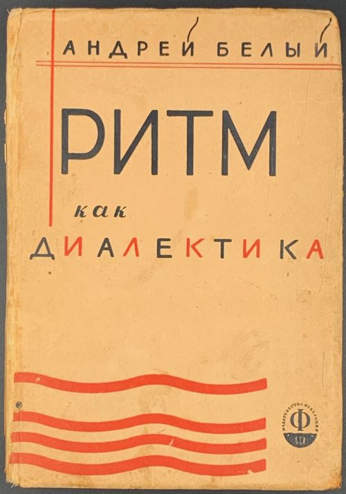 Hardcover, 19.8 x 14 cm, tan paper over cardboard with black and red lettering and design elements to front, black lettering to back and spine, pp.: fep, [1-8] (publ. device/blank, t.p./imprint, foreword, f.t./blank), [9] intro, 10-279 [280] contents, fep; blue crayon to fep recto Ф. Аншуков, ink mark to t.p. К. Collated 8vo: 1-178, 184, total 140 leaves. Title-page: АНДРЕЙ БЕЛЫЙ | РИТМ | КАК ДИАЛЕКТИКА | И | «МЕДНЫЙ ВСАДНИК» | ИССЛЕДОВАНИЕ | ИЗДАТЕЛЬСТВО | «ФЕДЕРАЦИЯ» | МОСКВА – 1929 || Contributors: Андрей Белый [Andrei Bely, Борис Николаевич Бугаев] (Russian, 1880 – 1934) – author.
 -
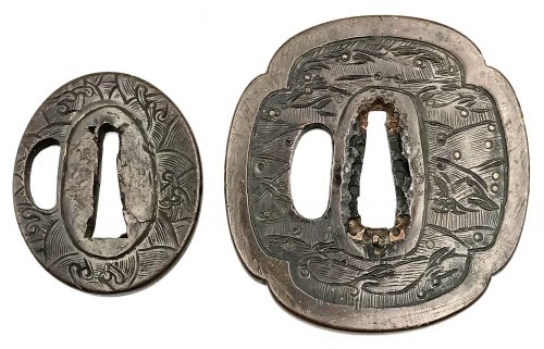 Two ymagane tsuba (daisho) with chiseled diaper pattern of waves. The larger tsuba (dai) is of mokkō form with a wide (4.6 mm) polished rim (fukurin?). Water spray is realized in copper ten-zōgan. Size: 75.0 x 71.6 x 3.2 (center), 4.0 (rim) mm. Copper sekigane. The smaller tsuba (sho) is of oval form, without a rim. No inlay. Size: 53.2 x 45.5 x 4.1 mm. Ko-kinko school. Muromachi period. In Kokusai Tosogu Kai; 5th International Convention & Exhibition, 2009 on page 51 under № 5-U8 there is a piece from George Gaucys collection, described as follows: Unsigned Tachi-Kanagushi tsuba, Yamagane base. Nami (wave) motif. Circa: Muromachi period (15th century). 6.88 x 6.81 x 0.45 (rim), 0.36 (center). The classic wave form is typically seen in Muromachi period tosogu. The patina is rich and rustic, which presents history and warmth. This tsuba may be interpreted as either tachi-kanagushi or ko-kinko work. Early tachi tsuba were symmetrical in design and also not very sophisticated, Design elements filled in up to seppadai as the waves do in this tsuba. There is a simple fikurin of the same metal and it is flat to the plate. On the ko-kinko side, the crests of the waves show more complexity than tachi works and less symmetry. A very intriguing tsuba from late Muromachi period."
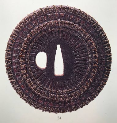
Kokusai Tosogu Kai 5th, 2009, p. 51, № 5-U8: ko-kinko or tachi-kanagushi tsuba.


,_17th_century_Japan,_brass_and_copper.JPG)