-
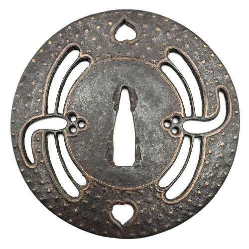
 Iron tsuba of round form decorated with chrysanthemums, pine cones and needles, pampas grass, vines, cherry blossoms, and wild geese in brass inlay (suemon-zōgan) and pierced with designs of water clover (denjiso) and half bellflower (or karahana) to the left and to the right of nakago-ana as well as double bars above and below nakago-ana (possibly with the meaning of number 2 or ordinal 2nd). Most probably the sukashi elements here are the family crests (mon). Unsigned. Ōnin school. Muromachi period; 15th or 16th century. Height: 82.1 mm; Width: 80.9 mm; Thickness at seppa-dai: 2.4 mm NBTHK # 2003827: Tokubetsu Hozon Tosogu Kanteisho (特別保存刀装具鑑定書) - "Extraordinarily Worthy of Preservation".
 -
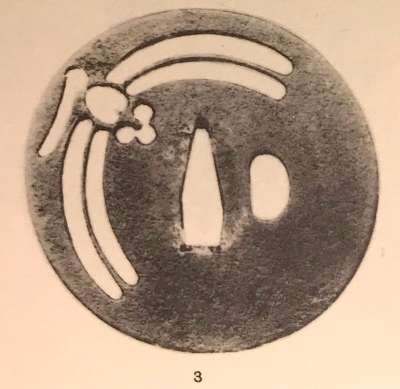
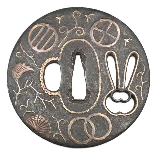 Iron tsuba of round form with design of rabbit (usagi) in openwork (sukashi) and inlaid with designs of plants and family crests (mon) in suemon-zōgan. A branch with lonely leaf, half chrysanthemum, and flying wild geese on the face represent autumnal connotations. The same motif is complemented by a clove (choji) on the reverse. The family crests (mon) include: interlocked rings (kanawa; wachigai), three encircled lines or stripes (hikiryo), bit or muzzle (kutsuwa - horse's harness element with possible christian symbolism), and encircled triangle (uroko, fish scale). Brass wire trim around the openwork elements and the seppa-dai, scalloped wire inlay around the hitsu-ana. Iron is dark, almost black. Brass or copper elements vary in shades of lighter and darker yellow with red-ish hue. Ōnin school. Late Muromachi period, 16th century. Height: 89.6 mm; Width: 89.3 mm; Thickness at seppa-dai: 3.0 mm. Weight: 129.7 g.
 -
 Iron tsuba of round form decorated with two boar's eyes (inome) and two dragonflies (tombo) in small openwork (ko-sukashi) outlined with brass wire. The plate also decorated with 2 to 5 concentric circular rows of brass dots (nail heads) in ten-zōgan. Center of the plate outlined with the inlaid circular brass wire. The inlaid metal is of red-ish hue, so it may be copper, and not brass. The surface has remnants of lacquer. Ōnin school. Mid Muromachi period, middle of 15th century. Dimensions: Diameter: 90 mm, thickness: 3.2 mm. Notes regarding design: "According to various sources, the dragonfly (tombo) is emblematic of martial success, as various names for the insect are homophones for words meaning "victory". The dragonfly is also auspicious because references in the Kojiki and Nihongi link it in both name and shape to the old kingdom of Yamato." [Merrily Baird. Symbols of Japan. Thematic motifs in art and design. Rizzoli international publications, Inc., 2001, p. 108]. "The dragonfly (tonbo), was also called kachimushi in earlier times, and due to the auspicious literal meaning "victory bug" of the characters of this word it became a popular theme on sword fittings." [Iron tsuba. The works of the exhibition "Kurogane no hana", The Japanese Sword Museum, 2014, p. 13]. Two other cutouts - in the form of what in European tradition symbolizes the heart, on the top and in the bottom of tsuba disc - may have two different explanations. The most usual one, inome - "Heart-shaped pattern, which is said to go back to the shape of a wild boar's eye" [Markus Sesko. Encyclopedia of Japanese Swords. Print and publishing: Lulu Enterprises, Inc., 2014.]. This understanding is shared by Robert Haynes [Robert E. Haynes. Study Collection of Japanese Sword Fittings. Nihon Art Publishers, 2010.] and elsewhere, with an exception of Okabe-Kakuya [Okabe-Kakuya. JAPANESE SWORD GUARDS. Museum of Fine Arts, Boston. In cooperation with the department of Chinese and Japanese art; - 1908, p. 14], who provides the illustration of inome-shaped cut-outs with the following explanation: " The tsuba shown in Fig. 13 approaches a square form with rounded corners and is perforated with Aoi decoration. But this book was written long time ago, when people even at MFA might not know enough...
 The same interpretation of the said heart-like symbol (aoi leaf) is given at Helen C. Gunsaulus. Japanese sword-mounts in the collection of Field Museum. // Publication 216, Anthropological Series, Volume XVI; Chicago, 1923; p. 54: "This mokkō-formed tsuba recalls the aoi form, perforated as it is with the four aoi leaves." It is possible that the "wild boar's eye" theory was developed by later scholars.
 There is also a theory, supported by Graham Gemmell, saying that: “In simple terms Onin works are decorated Ko-Katchushi tsuba. … But, not content with iron alone, they began to decorate it with what was, in the early Muromachi period, a rare and valuable metal, brass. The Onin workers cut the design into the iron, using narrow channels, cast the brass, piece by piece, and then hammered it into the iron plate as though they were putting together a jigsaw. When complete the tsuba would be black lacquered exactly as the plain iron ones had been, the brass shining dully through it in a way that fulfilled the goal of shibui or restrained elegance.” [Tosogu. Treasure of the samurai. Fine Japanese Sword Fittings from The Muromachi to The Meiji Period, by Graham Gemmell. // Sarzi-Amadè Limited, London, 1991. An exhibition held in London from 21st March to 4th April, 1991]. The following illustration from Helen C. Gunsaulus. Japanese sword-mounts in the collection of Field Museum. // Publication 216, Anthropological Series, Volume XVI; Chicago, 1923; pp. 43 supports the idea.
 Helen C. Gunsaulus' description of the dragonfly emblem is as follows: "This motive, the dragon-fly (akitsu), is generally accepted as a symbol of the kingdom of Japan, and the origin of the idea is traced to the legend recounted in the Kojiki and Nihongo of the Emperor Jimmu's view of the island from mountain top. He is said to have thought the kingdom looked like a dragon-fly touching its tail with its mouth. From this it received its name Akitsu-shima... etc."
-
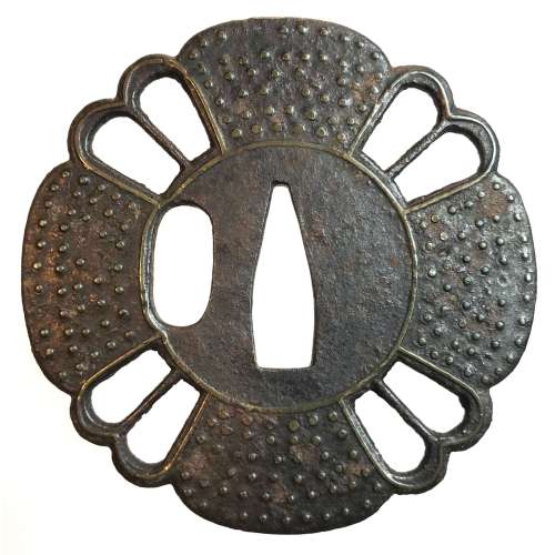 An iron tsuba of 12-lobed form with alternating four solid and four openwork areas, each with a central bar. Symbolism remains unclear, possibly - a gunbai, i.e. military leader's fan. The solid parts decorated with 5 to 6 rows of brass dots of nail heads inlaid in ten-zōgan. The center of the plate as well as the sukashi elements are outlined with brass wire. The kozuka-hitsu-ana seems original. Muromachi period. Dimensions: 77.9 x 77.5 x 3.2 mm.
 -
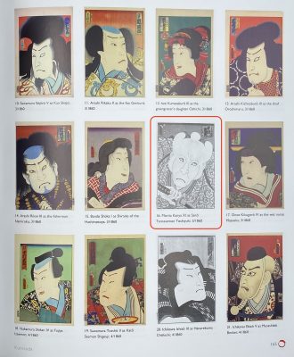
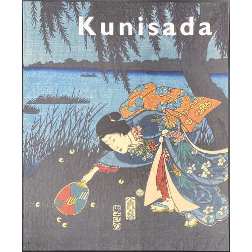 Softcover, publisher’s pictorial wrappers, 29.7 x 24.6 cm, pp.: [1-3] 4-174 [2 blank], ils.; total 88 leaves. Title-page: Kunisada | imaging | drama and beauty | Robert Schaap | with an introduction by Sebastian Izzard | and contributions by Paul Griffith and Henk. J. Herwig | {publisher’s device} Hotei Publishing || Contents: Preface / Robert Schaap & Chris Uhlenbeck; Lenders to the exhibition & catalogue: notes to readers; Utagawa Kunisada, the artist and his times / Sebastian Izzard; Catalogue / Robert Schaap with Paul Griffith, Henk J. Herwig & Sebastian Izzard. Subjects: Utagawa, Kunisada, — 1786-1864 — Catalogs; Color prints, Japanese — Edo period, 1600-1868 — Catalogs; Ukiyo-e — Catalogs. Contributors: Sebastian Izzard Paul Griffith Henk. J. Herwig Utagawa Kunisada [歌川 国貞] a.k.a. Utagawa Toyokuni III [三代歌川豊国] (Japanese, 1786 – 1865) Select illustrations (references in this collection):
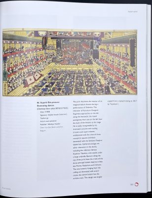
SVJP-0226.2016: Superb Edo pictures illustrating dances, 1858.
SVJP-0221.2016: Actor Morita Kan’ya XI as Saito Tarozaemon Toshiyuki, 1860.
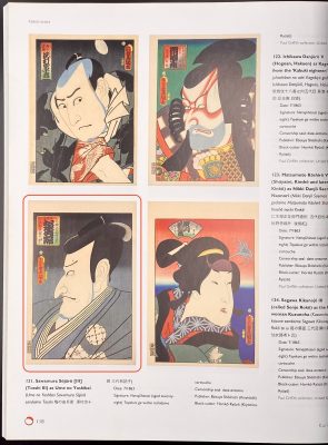
SVJP-0228.2017: Matsumoto Kōshirō V (Japanese, 1764-1838) as Nikki Danjō Saemon Naonori, 1863.
SVJP-0197.2015: Three Pleasures of Present-day Osaka (Tōsei Naniwa no sankō), 1821.
SVJP-0222.2016: A view of the dressing room of a Theater in Dōtonbori, Ōsaka, 1821-2.
-
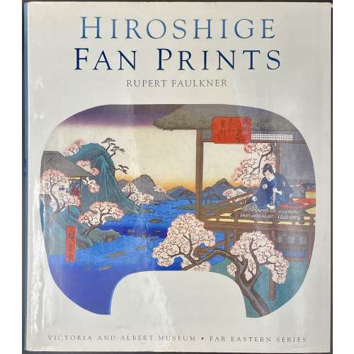 Hardbound, 25.3 x 22 cm, blue cloth, pictorial dust jacket lettered: HIROSHIGE | FAN PRINTS | RUPERT FAULKNER | {image} | VICTORIA AND ALBERT MUSEUM • FAR EASTERN SERIES ||; silver lettering to spine, green endpapers, description of 136 items with colour illustrations; pagination: [1-6] 7-160, ils. Utagawa Hiroshige [歌川 広重] a.k.a. Andō Hiroshige [安藤 広重] (Japanese, 1797 – 1858).
 -
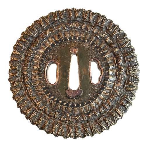 Shingen school (or style) tsuba of round form with an iron core of spoked-wheel shape, with its centre covered with a copper plate decorated with star-shaped punch marks. From this copper plate outward, the body is formed by brass and copper wire (flat and twisted) in a weave pattern. Both hitsu-ana are outlined in brass with a raised rim. Copper sekigane. Unsigned. Edo period, 18th century. SOLD Height: 98.0 mm, Width: 97.4 mm, Thickness at seppa-dai: 6.0 mm. Weight: 290 g. NBTHK certificate №436696: 'Hozon' attestation. Citing "JAPANESE SWORD-MOUNTS IN THE COLLECTIONS OF FIELD MUSEUM" by Helen C. Gunsaulus, Assistant Curator of Japanese Ethnology. 61 plates. Berthold Laufer, Curator of Anthropology. Field Museum of Natural History, Publication 216, Anthropological Series, Volume XVI; Chicago, 1923; p.45: "An unusual group of tsuba popular in the late sixteenth century and afterwards is made up of those guards known as Shingen tsuba, a name which was derived from a sixteenth-century warrior, Takeda Shingen (Takeda Harunobu, 1521-73), who is said to have preferred this style of guard, as it combined strength and lightness. Under the category of "Shingen", four different types abd generally listed, though a fifth appears in the drawings in the Boston Catalogue of Okabe Kakuya "Japanese Sword Guards" (p. 21). It is square, that form which is said to have been used in Ashikaga days for scaling walls, the sword having been set up as a step. [...] The following descriptions include, however, the Shingen tsuba usually met with.
- So-called Mukade ("centipede") tsuba are made of iron in which a centepede is inlaid in brass or copper wire. Mukade tsuba of Myōchin and Umetada warkmanship have been found with the inscription, "Made to the taste of Takeda Shingen".
- There are those of solid iron, with need centers of brass, to the edges of which is affixed a weaving of brass and copper wires which is bound to the foundation disk by a rim, usually decorated simply.
- Another type is of solid iron, bored at intervals and laced with braided or twisted wires of copper and brass.
- The fourth type is a chrysanthemoid form, chiselled in open work and laced or woven tightly with copper and brass wire."
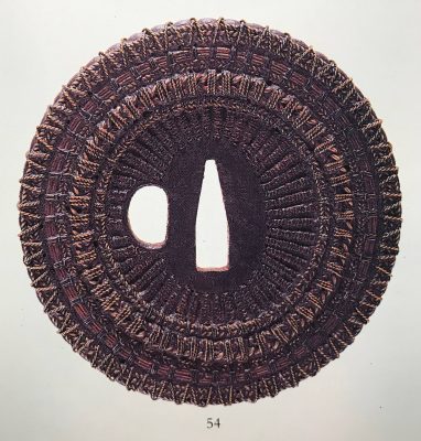
Compton Collection, Part II, p.p. 26-27, №54.
-
 Two volumes, each bound in red cloth with gilt lettering to spine, black endpapers, TEG, and matching red cloth slipcases with black lettering to front. Vol. 1: The Clarence Buckingham collection of Japanese prints: The Primitives / Catalogue by Helen C. Gunsaulus. — [Chicago]: Art Institute of Chicago, 1955. Pagination: 1st leaf blank, 2nd leaf half-title, verso blank, [i, ii] – t.p. in red and black, copyright to verso, iii-vi, [vii] faux-title “The catalogue”, 1-284 [285] colophon, limitation: 500 numbered copies, this is № 476. Title-page: THE CLARENCE BUCKINGHAM | COLLECTION OF | JAPANESE PRINTS | The Primitives | CATALOGUE BY HELEN C. GUNSAULUS | THE ART INSTITUTE OF CHICAGO || Vol. 2: The Clarence Buckingham collection of Japanese prints: Volume 2 / Catalogue by Margaret O. Gentles. — [Chicago]: Art Institute of Chicago, 1965. Pagination: 1st leaf blank, 2nd leaf half-title, verso blank, [i, ii] – t.p. in red and black, copyright to verso, iii-vi, [vii] faux-title “The catalogue”,1-307 [2] blank/ colophon, limitation: 1000 copies (unnumbered). Title-page: VOLUME II | THE CLARENCE BUCKINGHAM | COLLECTION OF | JAPANESE PRINTS | Harunobu, Koryūsai, Shigemasa, their followers and contemporaries | Catalogue by Margaret O. Gentles | THE ART INSTITUTE OF CHICAGO 1965 || Contributors: Clarence Buckingham (American, 1854 – 1913) Helen C. Gunsaulus (American, 1886 – 1954) Margaret O. Gentles (American, 1905 – 1969)
 -
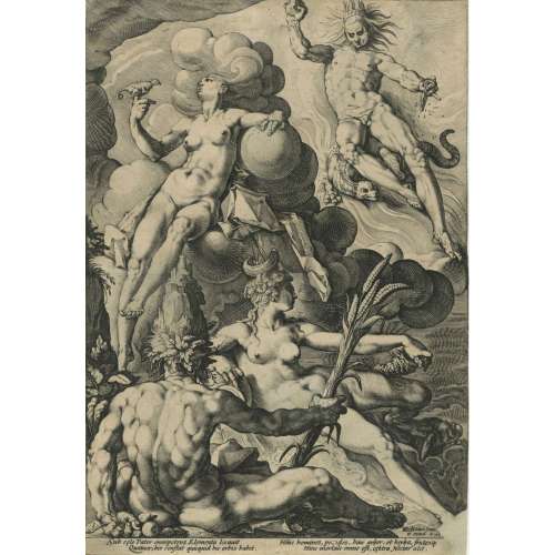
The Four Elements by Jacob Matham (Netherlandish, Haarlem 1571–1631 Haarlem) after Hendrick Goltzius (Netherlandish, Mühlbracht 1558–1617 Haarlem). Engraving on copper, printed on laid paper, 1588.
Dimensions: 298 mm × 206 mm.
-
 Artist: Utagawa Kuniyoshi [歌川 國芳] (Japanese, 1798 – 1861). Publisher: Ibaya Senzaburō [伊場屋仙三郎] (Japanese, c. 1815 – 1869). Published in c. 1845 (no seal). Possibly, from the "Untitled series of beauties reflected in mirrors", see Kunisada Project. However, this print does not have the seal of the censor Tanaka [田中].
 -
 Iron tsuba of round form decorated with eight roundels – circular emblems of flowers and/or family crests (mon) made of cast brass, pierced and chiseled in kebori, and with flat brass inlay (hira-zōgan) of vines or leaves all over the plate. Both hitsu-ana trimmed in brass. Nakago-ana of rectangular form, with copper sekigane. Four positive openwork (ji-sukashi) roundels at 12, 3, 6, and 9 o'clock; and four negative openwork (in-sukashi) roundels with cherry blossom, bellflower, and two variations on suhama theme. Yoshirō school (Kaga-Yoshirō). The Momoyama or early Edo period, late 16th to early 17th century. Size: diameter 81.4 mm, thickness 4.7 mmat seppa-dai, 4.0 mm at rim. Christie's lot description: AN IRON TSUBA; EDO PERIOD (17TH CENTURY). THE DOLPHYN COLLECTION OF SAMURAI ART. The round iron tsuba pierced with roundels of various floral motifs interspersed among scrolling foliage, all inlaid with brass. 8.1 cm. high. Provenance: Pabst Collection (no. 338).
 -
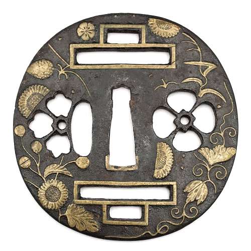
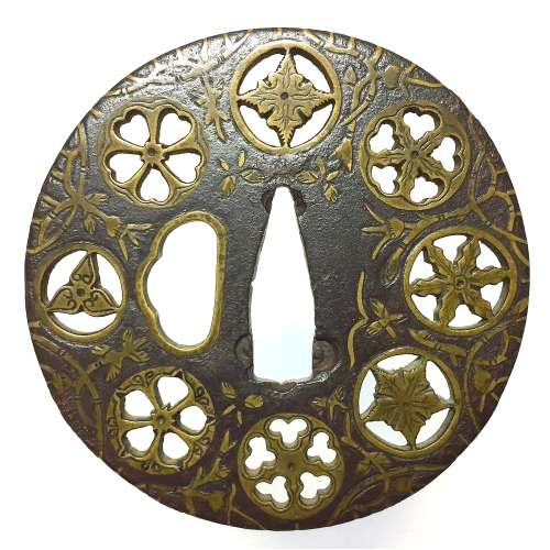
 Well-forged iron plate of round shape (maru-gata) is decorated with water weeds or arabesque (karakusa) in flat brass inlay (hira-zōgan) all over and eight family crests (mon) of round form in cast brass with delicate linear carving (kebori) and openwork (sukashi). Crests represent: [at 9 hours] three counter-clockwise commas or swirls (tomoe); [at 10:30] plum blossom (ume); [at 12:00, 1:130, and 7:30] - stylized flower made by cutting out five suhama symblos (flower-shaped suhama); [at 3:00] bellflower (kikyō); [at 4:30] seven-star crest (shichiyō-mon); [at 6:00] cherry blossom (sakura). Brass-trimmed ryo-hitsu. Copper sekigane. Yoshirō school. Momoyama or early Edo period, end of the 16th to first half of the 17th century (1574-1650). Inscription on seppa-dai: 八幡 - Hachiman. Size: height 89.6 mm, width 89.3 mm, thickness at seppa-dai 3,0 mm. Weight 129.7 g. NBTHK certificate № 4007685, June 27, 2015: HOZON (Worthy of Preservation). As for the inscription, Nihonto Message Board blog discussion provides the following explanation of the inscription: "An expression of conviction as to being the best under the sun". On the other hand, there may be more in this confluence of symbols: the tomoe crest at 9:00 is "the kamon of Hachiman, the war god" [Family Crests of Japan; Stone Bridge Press, Berkeley, CA, 2007, p. 108]. The character 八 in the inscription cut stronger than the other kanji, and may be by a different hand in different time. 八 (hachi, eight): "The numeral eight was appreciated because its shape broadens toward the bottom, symbolizing eternal expansion" [ibid, p. 119]. It may be said that this tsuba is dedicated to Hachiman. Other crests (suhama, bellflower, seven-stars, plum and cherry blossoms) collectively allude to "good old times" when Fijiwara and Taira clans were in full bloom. Markus Sesko believes that the inscriptions reads: Hachiman: "the inscription is/was HACHIMAN (八幡), the God of War and a relatively popular inscription for tsuba, swords and armor." Elliott Long and Robert Haynes provide the following explanation of the inscription: "...hachi is correct and represents the name of the HACHI SHRINE. The inscription reads 'YAWATA' which is the name of the mountain in Mino Province where the HACHI Shrine is located". Details on Hachiman Shrine in Yawata (八幡市) can be found elsewhere, including Historical and geographical dictionary of Japan by Edmond Papinot. Van Ham auction house provides the following description: MON-SUKASHI TSUBA. MARUGATA. Japan. Momoyama period. Yoshiro school. Iron with inlays of brass. In hira-zogan technique with kebori engraving eight different family emblems (mon). An old inscription is dedicated to the deity Hachiman. D.4.5mm, Ø 8.3cm. Condition A/B. Supplement: Wooden box and NBTHK certificate.
 -
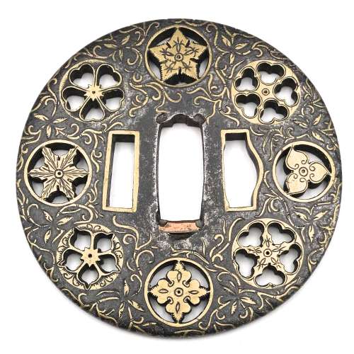
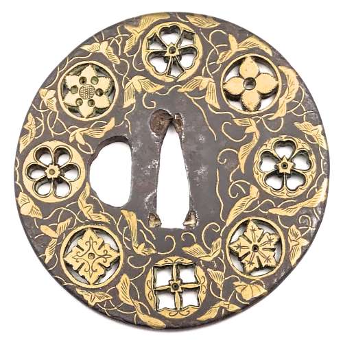 Iron tsuba of round form decorated with eight circular emblems of flowers and/or family crests (mon) made of cast brass, pierced and chiseled in kebori, as well as with flat brass inlay (hira-zōgan) of vines, leaves, and flowers all over the plate. Yoshirō school (Kaga-Yoshirō). The Momoyama or early Edo period, 17th century. Size: diameter 80 mm, thickness at seppa-dai 3,6 mm. Symbols: [12:00 o'clock] - Wood sorrel (katabami) and swords ; [9:00] - Cherry blossom (sakura); [7:30] - Bellflower (kikyō), kamon of Toki clan; [3:00] - possibly, a six-petal Chrysanthemum (kiku) or a Passion flower (tessen); [1:30] - Hemp (asanoha). The symbols at 6:00, 10:30, and 4:30 o'clock seem to be geometrical patterns of auspicious meaning: a cross in a square, a four pointing star, and a diamond, respectively. Alternatively, we may look at this piece as purely decorative, with patterns at 12:00, 3:00, 6:00, and 9:00 o'clock in negative openwork (in-sukashi), and at 1:30, 4:40, 7:20, and 10:30 o'clock - in positive openwork (ji-sukashi, or yō-sukashi). Markus Sesko in his Handbook of sword fittings related terms [Herstellung und Verlag: Books on Demand GmbH, Norderstedt, 2011] discriminates this type of openwork in a separate class: Ranma-sukashi: "This term is applied to circular sukashi with family crests to their inside, which are arranged running along the rim area. The description goes back to the opened boards (ranma) between the sliding doors and the ceiling of Japanese rooms. Ranma-sukashi are mostly seen on old Heianjō- or Yoshirō-zōgan-tsuba but also on works of Hayashi Matashichi" [page 30].
 -
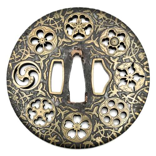
 Iron tsuba of round form decorated with eight roundels - circular emblems of flowers and/or family crests (mon) made of cast brass, pierced and chiseled in kebori, and with flat brass inlay (hira-zōgan) of vines or seaweed all over the plate. Hitsu-ana outlined in brass. Four positive silhouette roundels are 3-, 4-, 5-, and 6- pointing crests/flowers; four negative silhouette roundels are bellflower, cherry blossom, and suhama. Yoshirō school (Kaga-Yoshirō). The Momoyama or early Edo period, beginning of 17th century. Size: diameter 77 mm, thickness 3,8 mm
 -
 А. Тьюринг. Может ли машина мыслить? / С прил. ст. Дж. фон Неймана "Общая и логическая теория автоматов"; пер. с англ. Ю. А. Данилова; ред. и пред. С. А. Яновской. — М.: Физматгиз, 1960. Title page: А. ТЬЮРИНГ | МОЖЕТ ЛИ | МАШИНА МЫСЛИТЬ? | С приложением статьи ДЖ. фон НЕЙМАНА | ОБЩАЯ И ЛОГИЧЕСКАЯ ТЕОРИЯ АВТОМАТОВ | Перевод с английского | Ю. А. Данилова | Редакция и предисловие | проф. С. А. Яновской | {Publisher’s device «ФМ» | ГОСУДАРСТВЕННОЕ ИЗДАТЕЛЬСТВО | ФИЗИКО-МАТЕМАТИЧЕСКОЙ ЛИТЕРАТУРЫ | МОСКВА 1960 || Pagination: [2] 3-110 [2]. Collation: [1]8, 2-416; 11 (t.p./contents, imprint.) unsigned. Size: 20 x 13 cm Binding: Softcover, front pictorial wrapper – yellow background and radio lamp, lettering: А. Тьюринг. Может ли | машина | мыслить | ? | {publisher's device white on blue "ФМ"} || Contributors: Turing, Alan Mathison (British, 1912 – 1954) – author of the text. John von Neumann (American-Hungarian, 1903 – 1957) – author of the text. Данилов, Юлий Александрович (Russian, 1936 – 2003) – translator. Яновская [Неймарк], Софья Александровна (Russian-Jewish, 1896 – 1966) – author of preface, editor.
 -
![Манцони Алессандро. Обрученные. Повесть из истории Милана XVII века. Пер.и комм. И.И.Штица. Вст.ст А.К.Дживелегова. Илл. Е.Д.Белухи // Серия: Итальянская лит-ра. — М.-Л.: Academia, 1936. — XXXVIII, 952 стр., 15 илл. Тираж: 5300 экз. [том выходил без супера].](https://varshavskycollection.com/wp-content/uploads/2021/02/LIB-1333-a-scaled-500x500.jpg) Title page: АЛЕССАНДРО МАНЦОНИ | ОБРУЧЕННЫЕ | ПОВЕСТЬ ИЗ ИСТОРИИ | МИЛАНА XVII ВЕКА | ПЕРЕВОД И КОММЕНТАРИИ | И. И. ШИТЦА | ВСТУПИТЕЛЬНАЯ СТАТЬЯ | А. К ДЖИВЕЛЕГОВА | ACADEMIA | 1936 || Frontispiece: ИТАЛЬЯНСКАЯ ЛИТЕРАТУРА | ПОД ОБЩЕЙ РЕДАКЦИЕЙ А. К ДЖИВЕЛЕГОВА | АЛЕССАНДРО | МАНЦОНИ | 1785 — 1873 | ACADEMIA | МОСКВА ЛЕНИНГРАД || Title verso: ALESSANDRO MANZONI | I PROMESSI SPOSI | Иллюстрации — автолитография | Е. Д. Белухи | Титула и переплет | по его же рисунку || Pagination: [i-vii] viii-xxxviii [2] [2] 3-946 [8] + 15 leaves of illustrations. Collation: [I]8 II8 III4 1-598 ⅛605 + 5 leaves of plates + 10 leaves of plates (lithography by Е. Д. Белуха). Binding: 19.5 x 14.5 cm; Publisher’s blue cloth, lettering and design to cover and spine (by Е. Д. Белуха). Print run: 5300 copies. Catalogue raisonné: Крылов-Кичатова (2004): №832, p. 279. Contributors: Мандзони, Алессандро [Manzoni, Alessandro] (Italian, 1785 – 1873) – author of the original text. Шитц, Иван Иванович (Russian, 1874—1942) – translator from the Italian into Russian. Дживелегов, Алексей Карпович (Russian, 1875 – 1952) – editor. Белуха, Евгений Дмитриевич (Russian, 1889 – 1943) – artist. For the first English edition see: [LIB-1332.2017]: Alessandro Manzoni. The betrothed / (Standard novels). — London: R. Bentley, 1834.
Title page: АЛЕССАНДРО МАНЦОНИ | ОБРУЧЕННЫЕ | ПОВЕСТЬ ИЗ ИСТОРИИ | МИЛАНА XVII ВЕКА | ПЕРЕВОД И КОММЕНТАРИИ | И. И. ШИТЦА | ВСТУПИТЕЛЬНАЯ СТАТЬЯ | А. К ДЖИВЕЛЕГОВА | ACADEMIA | 1936 || Frontispiece: ИТАЛЬЯНСКАЯ ЛИТЕРАТУРА | ПОД ОБЩЕЙ РЕДАКЦИЕЙ А. К ДЖИВЕЛЕГОВА | АЛЕССАНДРО | МАНЦОНИ | 1785 — 1873 | ACADEMIA | МОСКВА ЛЕНИНГРАД || Title verso: ALESSANDRO MANZONI | I PROMESSI SPOSI | Иллюстрации — автолитография | Е. Д. Белухи | Титула и переплет | по его же рисунку || Pagination: [i-vii] viii-xxxviii [2] [2] 3-946 [8] + 15 leaves of illustrations. Collation: [I]8 II8 III4 1-598 ⅛605 + 5 leaves of plates + 10 leaves of plates (lithography by Е. Д. Белуха). Binding: 19.5 x 14.5 cm; Publisher’s blue cloth, lettering and design to cover and spine (by Е. Д. Белуха). Print run: 5300 copies. Catalogue raisonné: Крылов-Кичатова (2004): №832, p. 279. Contributors: Мандзони, Алессандро [Manzoni, Alessandro] (Italian, 1785 – 1873) – author of the original text. Шитц, Иван Иванович (Russian, 1874—1942) – translator from the Italian into Russian. Дживелегов, Алексей Карпович (Russian, 1875 – 1952) – editor. Белуха, Евгений Дмитриевич (Russian, 1889 – 1943) – artist. For the first English edition see: [LIB-1332.2017]: Alessandro Manzoni. The betrothed / (Standard novels). — London: R. Bentley, 1834. -
 Hardcover, 19.8 x 14 cm, tan paper over cardboard with black and red lettering and design elements to front, black lettering to back and spine, pp.: fep, [1-8] (publ. device/blank, t.p./imprint, foreword, f.t./blank), [9] intro, 10-279 [280] contents, fep; blue crayon to fep recto Ф. Аншуков, ink mark to t.p. К. Collated 8vo: 1-178, 184, total 140 leaves. Title-page: АНДРЕЙ БЕЛЫЙ | РИТМ | КАК ДИАЛЕКТИКА | И | «МЕДНЫЙ ВСАДНИК» | ИССЛЕДОВАНИЕ | ИЗДАТЕЛЬСТВО | «ФЕДЕРАЦИЯ» | МОСКВА – 1929 || Contributors: Андрей Белый [Andrei Bely, Борис Николаевич Бугаев] (Russian, 1880 – 1934) – author.
 -
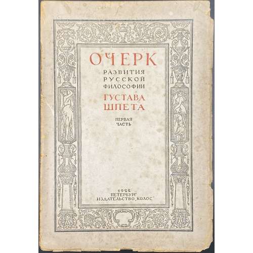 Paperback, 25 x 17 cm, publisher’s wrappers with red and black lettering in a pictorial frame by Vysheslavstev; pp.: [i-vii] viii-xv [xvi blank], [1-5] 6-348 [4]; collated 8vo: π8 1-228, total 184 leaves, 368 pages; gatherings 1-22 uncut. Because the author was banned, lettering on the spine was covered by a glued strip of blank paper; only the year 1922 was left visible. Front wrapper: ОЧЕРК | РАЗВИТИЯ | РУССКОЙ | ФИЛОСОФИИ | ГУСТАВА | ШПЕТА | ПЕРВАЯ | ЧАСТЬ | 1922 | ПЕТЕРБУРГ | ИЗДАТЕЛЬСТВО “КОЛОС” || Title-page: similar lettering in black only with no frame. Design of the front wrapper and the publisher’s device (π1) by Николай Николаевич Вышеславцев [N. Vysheslavstev] (Russian, 1890 – 1952). Title: Sketch on the development of Russian philosophy, Part one. [Part two was never published]. Author: Густав Густавович Шпет [Gustav Shpet] (Russian, 1879 – 1937) – executed by fire squad on 16 November 1937.


,_17th_century_Japan,_brass_and_copper.JPG)