-
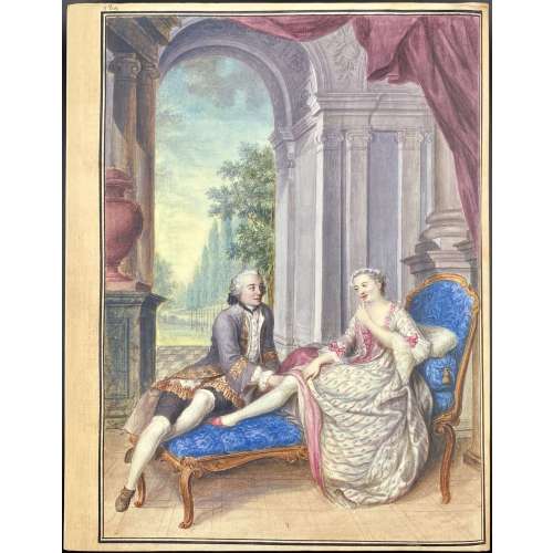 Description: One volume 32.5 x 25.5 cm, in crimson cloth, blind lettering to front cover and spine, pictorial DJ, lettered (similar to t.p.) in the back. Pagination: [2 blank] [1-9] 10-337 [338] [4] [4 notes], total 174 leaves, 137 entries. Title-page (in red and black): Eros invaincu | LA BIBLIOTHÉQUE GÉRARD NORDMANN | Florilège | établi sous la direction de Monique Nordmann | commente par Laurent Adert • Saba Bahar • Françoise Bléchet • Arto Clerc | (5 more lines of names) | & | édité par Rainer Michael Mason | FONDATION MARTIN BODMER | EDITIONS CERCLE D'ART | GENÈVE • MMIV • PARIS || Gérard Nordmann (Swiss, 1930 – 1992) Bibliothèque érotique: Gérard Nordmann; Livres, manuscrits, dessins, photographies du XVIe au XXe siècle / Catalogues de ventes (two parts) — Paris: Christie’s, 2006, see LIB-2828.2021 and [LIB-2810.2021].
 -
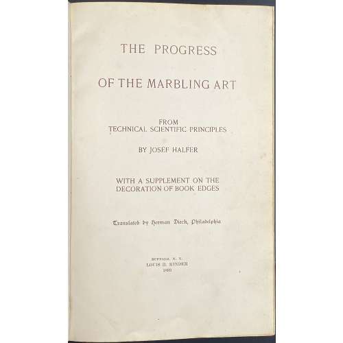 Description: One volume 22.8 x 25.4 cm, in contemporary gilt-ruled brown half morocco over green buckram boards, spine with raised bands, gilt in compartments, lettered in gilt, marbled endpapers, all edges marbled, printed in sanguine; pp. [6] [1-3] 4-234 [4], 36 blank leaves ruled red, 12 blank leaves; total 170 leaves; 35 mounted marbled paper samples on 10 sheets. Title-page: THE PROGRESS | OF THE MARBLING ART | FROM | TECHNICAL SCIENTIFIC PRINCIPLES | BY JOSEF HALFER | WITH A SUPPLEMENT ON THE | DECORATION OF BOOK EDGES | Translated by Herman Dieck, Philadelphia {gothic} | BUFFALO, N. Y. | LOUIS H. KINDER | 1893 || Edition: 1st American edition (and first edition in English) after two editions in Budapest (Austro-Hungary) in 1884 and 1890. Contributors: Josef Halfer (Austrian, 1846 – 1916) – author. Herman Dieck (American, fl. 1883 – 1896) – translator. Louis H. Kinder (American, 1867 – 1938) – publisher.
 -
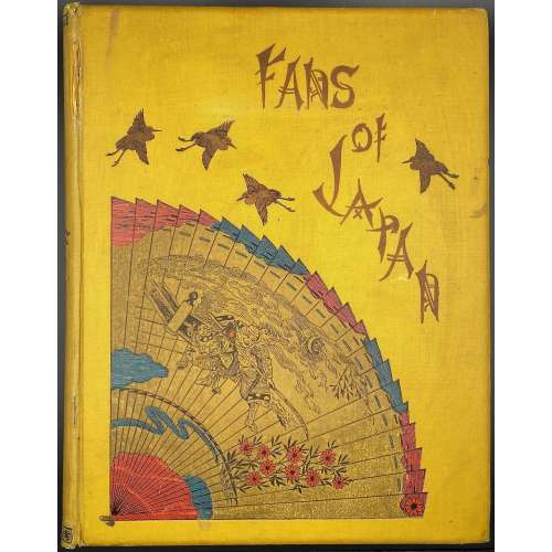 Description: Hardcover, 31.5 x 25 cm, yellow cloth adorned with stylized lettering and coloured design elements, blue endpapers, all margins red; Errata slip tipped in p.1. Lacks dust jacket. Inset: newspaper clipping titled "Facsimile of the fan distributed after the Tien-Tsin Massacre". Title-page: Fans of Japan | BY | CHARLOTTE M. SALWEY | née BIRCH | WITH INTRODUCTION BY | WILLIAM ANDERSON, F.R.C.S. | LATE OF H. M’S. LEGATION, JAPAN | AND | WITH TEN FULL-PAGE COLOURED PLATES, AND THIRTY-NINE | ILLUSTRATIONS IN BLACK AND WHITE | {publisher’s device} | LONDON | KEGAN PAUL, TRENCH, TRÜBNER & CO. LTD | PATERNOSTER HOUSE, CHARRING CROSS ROAD | 1894 || Pagination: [i-vi] vii-xix [xx] [1] 2-148 [4]; total 172 pages. Collation: 4to; π10 A-T4 (total 86 leaves) plus 10 colour plates with tissue guards and 39 b/w in-text illustrations. Plate I pasted in a kind of matt, though with red margins as all other pages. Printer: Ballantyne, Hanson and Co. Chromo-lithographer: McLagan and Cumming (Edinburgh) Publisher: Kegan Paul, Trench, Trübner & Co. Charles Kegan Paul (British, 1828 – 1902) – publisher. Author: Charlotte Maria Salwey [née Birch] (British, b. 1847 – after 1919). Introduction: William Anderson (British, 1842 – 1900) Dedicatee: Dr. Samuel Birch (British, 1813 – 1885)
 -
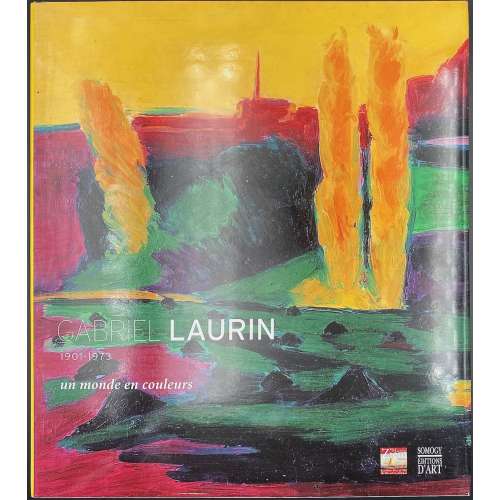 Hardcover volume, 28.5 x 25.5 cm, green lettered boards, pictorial dust jacket, pp.: [1-13] 14-143 [144], ils., inset: double-sheet 29.7 x 21 cm, “Exposition du 4 novembre 2006 au 4 février 2007”. Published on the occasion of the exhibition "Gabriel Laurin d'Aix (1901-1973)" held at the Musée Ziem, Martigues, Nov. 3, 2006 — Feb. 4, 2007. Title-page: GABRIEL LAURIN | un monde en couleurs | 1901-1973 | Sous la direction de Gérard Fabre | Texte de Jeanine Warnod | {publishers devices} || Contributors: Gabriel Laurin (French, 1901 – 1973) Jeanine Warnod (French, b. 1921) Gérard Fabre (French, b. 1963)
 -
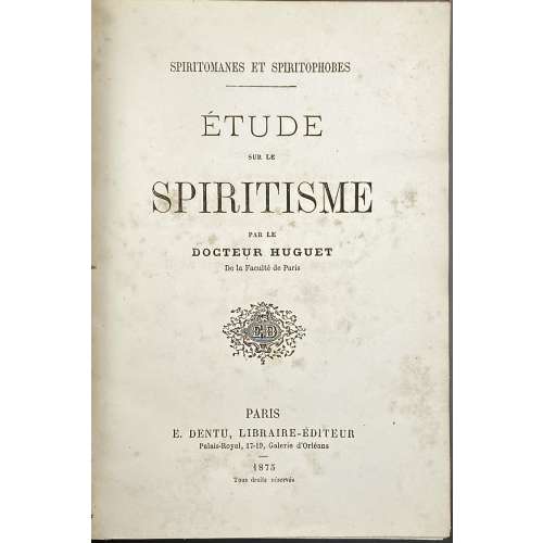 Hardcover volume 20 x 14 cm, bound in burgundy half faux chagrin over brown faux chagrin boards, gilt lettering to spine, marbled endpapers, all margins sprinkled blue. Convolute: 1) SPIRITOMANES ET SPIRITOPHOBES |— | ÉTUDE | SUR LE | SPIRITISME | PAR LE | DOCTEUR HUGUET | De la Faculté de Paris | {« ED » publsiher’s device} | PARIS | E. DENTU, LIBRAIRE-ÉDUTEUR | Palais-Royal, 17-19, Galerie d’Orléans | – | 1875 | Tous droits réservés ||; pp. [1-7] 8-48, with Dr Huguet signature to h.t. verso. Contents: Introduction. I. Le procès du 16 juin 1875; MM. Firman, Buguet, Leymarie. II. Le Spiritisme dans ses rapports avec le dogme, l’histoire, la science. Conclusion. 2) Same, pp. [1-7] 8-48, with Dr Huguet signature to h.t. verso. 3) FÉDÉRATION SPIRITE BELGE | — | Étude critique | DU LIVRE INTITULÉ | L'Hypnotisme | et le Spiritisme | du Docteur Joseph LAPPONI | Médecin de L. L. S. S. LÉON XIII et PIE X. | * | CONFÉRENCE | PAR | J. FRAIKIN | Président de la Fédération Spirite de Liége, | Vice-Président de la Fédération Spirite Belge. | * | Imp. Emile Dumon | Rue Haute-Marexhe, 27, Herstal-Liége. ||; pp. [1-3] 4-50 [51] errata/blank. 4) BUREAU PERMANENT D’ÉTUDE | DES | PHÉNOMÈNES SPIRITES | ANVERS | * | Cours De Doctrine Spirite | — | Imprimerie et Publicité « LA GÉNÉRALE » (SOC. AN.) Anvers. ||; 6 leaves, pagination trimmed out with partly visible numbers 13 and 18 ; includes Deuxième leçon « Du passage de la vie… », t.p., 7 pp. of text, last three pages blank. 5) LA PSYCHOLOGIE EXPERIMENTALE || Manifeste adresse par le « Syndicat de la Presse spiritualiste de France » | au Congres spiritualiste de Londres (Juin 1898); pp. [1] 2-31 [32]. Contents: I. Prolégomènes. II. Télépathie. III. Médiumnité. Conclusion. 6) LE FLUIDE HUMAIN | Son existence/ | Ses lois * Ses propriétés | — | CONFÉRENCE | DONNÉE PAR LE | Sous-Lieutenant DE BACKERE | — ||; pp. [1-3] 4-28. Contributors: Hilarion Huguet (French, ? – ?) Alfred-Henri Firman (American, ? – ?) Édouard Isidore Buguet (1840 – 1901) Pierre-Gaëtan Leymarie (1827 – 1901) Giuseppe Lapponi (Italian, 1851 – 1906) Jacques Fraikin (Belgian, ? – ?) Franz de Backere (Belgian, ? – ?)
 -
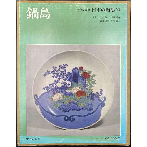 Hardcover volume, 35 x 26.8 cm, bound in grey cloth, blind stamped characters to front, brown characters to spine, in a double slipcase, the outer case pictorial paper over cardboard, 36 x 28.2 cm, pp.: [4] [1] 2-144 (plates with photographs of 332 items), [2] 147-182 [4]. 鍋島 – Nabeshima – book title. 日本の陶磁 – Japanese ceramics, series title. Contributors: Yasunari Kawabata [川端 康成] (Japanese, 1924 – 1972) – author. Tetsuzo Tanikawa [谷川 徹三] (Japanese, 1895 – 1989) – author. Seizo Hayashiya [林屋晴三] (Japanese, 1928 – 2017) – editor. Chūōkōron-sha [中央公論社] – publisher.
 -
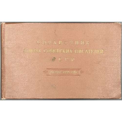 Oblong hardcover volume, 13.3 x 21 cm, bound in brown buckram with embossed gilt lettering to front, pp.: [1-4] 5-482 [2] errata leaf tipped-in. Title-page: СОЮЗ СОВЕТСКИХ ПИСАТЕЛЕЙ СССР | СПРАВОЧНИК | на 1954 — 1955 годы | ИЗДАТЕЛЬСТВО «Советский писатель» | МОСКВА 1954 || On page 71, second from bottom: Варшавский Сергей Петрович, г. Ленинград, Ропшинская ул., д. 1/32, кв. 18, тел. В 3-56-00. Print run: 3,000 copies.
 -
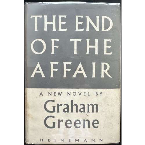 Hardcover volume, 19 x 13 cm, grey cloth with gilt lettering to spine, grey/cream dust jacket lettered throughout, price “10s 6d | NET” unclipped. Covers rubbed, dust jacket has a purple ink stain on the back bottom. Black ink inscription to recto ffl. Collation: a-o8 p10, total 122 leaves; pp.: [6] 1-237 [238]. 1st edition, 1st issue / Great Britain. Title-page: THE END OF THE | AFFAIR | by | GRAHAM GREENE | {publisher’s device} | — | WILLIAM HEINEMANN LTD | MELBOURNE :: LONDON :: TORONTO || Imprint: FIRST PUBLISHED 1951 | PRINTED IN GREAT BRITAIN | AT THE WINDMILL PRESS | KINGSWOOD, SURREY || Dedication: To C. (Catherine Walston, nee Crompton, American, 1925 – 1978) Contributors: Graham Greene (British, 1904 – 1991) William Henry Heinemann (Jewish-British, 1863 – 1920)
 -
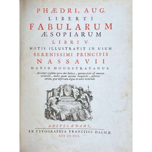 Phaedri, Aug. Liberti Fabularum Aesopiarum libri V / notis illustravit in usum serenissimi principis Nassavii David Hoogstratanus. Accedunt ejusdem opera duo indices, quorum prior est omnium verborum, multo quam antehac locupletior, posterior eorum, quae observatu digna in notis occurunt. — Amstelaedami : Ex Typographia Francisci Halmae, MDCCI [1701]. — pp.: [1] title, [1] (portr.), [32] 160, [84], 18 leaves of plates. Vita Phaedri is written by Johannes Schefferus (February 2, 1621 – March 26, 1679). Appendix fabularum is written by Marquard Gude (Gudius) (1 February 1635 – 26 November 1689). Gaius Julius Phaedrus was a 1st-century CE Roman fabulist and the first versifier of a collection of Aesop's fables into Latin. David van Hoogstraten (Rotterdam, March 14, 1658 - Amsterdam, November 21, 1724), a physician, poet and linguist, annotated the fables and dedicated them to Johan Willem Friso van Oranje-Nassau (14 August 1687 – 14 July 1711). The book was published in Amsterdam by François Halma (Langerak, January 3, 1653 - Leeuwarden, January 13, 1722), a Dutch printer, publisher and bookseller, with a portrait of Prince of Orange-Nassau, engraved by Pieter van Gunst (Dutch, Amsterdam 1659–1724) after Bernard Vaillant (Dutch, Lille 1632–1698 Leyden). The title page was engraved by P. Boutats after Jan Goeree (Dutch, Middelburg 1670–1731 Amsterdam). The edition is adorned throughout with 18 plates, each with 8 médaillons, designed and engraved by Jan van Vianen (Dutch, 1660–1726), and with vignettes, head- and tailpieces, inhabited initials, etc. Contemporary vellum over boards, title in red and back, red edges, 4to, 26 x 20 cm. Seller's description:4to, engraved general title, letterpress red & black title page with allegorical engraved vignette. 18 full-page copper-engraved plates by Jan van Vianen, each featuring six circular images, and 38 in-text reproductions, engraved decorative initials, and head- and tailpieces. Phaedrus (15 BC - 50 AD, Italy), was a "Roman fabulist, the first writer to Latinize whole books of fables, producing free versions in the iambic metre of Greek prose fables then circulating under the name of Aesop." (Ency. Brit.). This deluxe edition was specially created for the Prince of Nassau, profusely illustrated with fine engravings. Dibdin spoke highly of it in his Greek and Latin Classics (4th edition): "I have always considered this as a correct and very sumptuous edition. It is ornamented with a great number of small plates, or medallions, in which the subject of the fable is very ably and spiritedly executed.Ref.: Metropolitan Museum; Musée Médard
 -
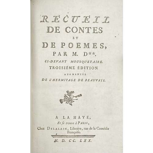 Title page: RECUEIL | DE CONTES | ET | DE POEMES, | PAR M. D**. | CI-DEVANT MOUSQUETAIRE. | TROSIÉME ÉDITION | AUGUMENTÉE | DE L'HERMITAGE DE BEAUVAIS. | [device] | A LA HAYE, | Et se trouve à Paris, | Chez Delalain, Libraire, rue de la Comédie | Française. | — | M. D. CC. LXX. IRZA | ET MARSIS , | POËME, includes: L'isle merveilleuse, Poëme, Chant 1re et Chant 2nd, Invocation a La Fontaine, and Alphonse, Conte – Cohen and De Ricci (#317) describe 2nd edition by the same publisher, 1769, 77 p., with similar illustrations after Charles Eisen: (1) engraved title by Louis Claude Legrand (2) L’Isle 1er: Frontispiece by Joseph de Longueil, (3) headpiece and (4) tailpiece by Emmanuel de Ghendt, and (5) L’Isle 2nd: Frontispiece by Jean Massard, (6) headpiece by Emmanuel de Ghendt + (7) tailpiece unsigned. Les Cerises et la Méprise, Contes en vers – Cohen and De Ricci (#311) also describe the 2nd edition of 1769, with the same (8) frontispiece by De Longueil after Eisen. Sélim et Sélima, Poeme imité de l'allemand; L'hermitage de beauvais, Conte –Cohen and De Ricci (#322) describe edition of 1769 by Sébastien Jorry, with the same (9) frontispiece by Emmanuel de Ghendt after Eisen. Size: 18.6 x 12.3 cm, small 8vo. Binding: polished, multi-coloured stained calf with gilt triple fillet border to boards; gilt floral arabesque and gilt lettering to flat spine: "Oeuvres de Dorat | Contes"; all edges gilt; blue-and-white marbled endpapers. Pagination: ffl, [2] IRZA ET MARSIS engraved half-title / blank, [1-2] - RECUEIL title page / blank, 3-8 (avis sur cette édition); [1 - L'Isle...] 2-184, bfl; Illustrations (copperplate engravings): 5 plates, 2 headpieces and 2 tailpieces. Collation: Octavo; a8 (title and avis sur cette édition); A-L8, M4. Author of the text: Claude Joseph Dorat, (French, 1734 – 1780) Artist: Charles-Dominique-JosephEisen (French, 1720 – 1778) Engravers: Emmanuel Jean Nepomucène de Ghendt (French, 1738 – 1815) Louis Claude Legrand (French, 1723 – 1807) Joseph de Longueil (French, 1730 – 1792) Jean Massard (French, 1740 – 1822)
 -
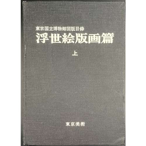 Title: Illustrated Catalogues of Tokyo National Museum: Ukiyo-e Prints [東京国立博物館図版目録 | 浮世絵版画編] (Tōkyō Kokuritsu Hakubutsukan zuhan mokuroku | Ukiyoe hanga hen); Publisher: Tokyo National Museum [東京国立博物館] (Tōkyō Kokuritsu Hakubutsukan). Three volumes, 26.3 x 18.7 cm, uniformly bound in black cloth with white characters to front cover and spine. Title-page: ILLUSTRATED CATALOGUES OF | TOKYO NATIONAL MUSEUM | UKIYO-E PRINTS | <1 (2, 3) > | 東京国立博物館図版目録 | 浮世絵版画編 | < 上 (中, 下) > || Volume 1 [上]: unpaginated 1 t.p., 2 colour plates, 1 contents, 70 (1-1354) – b/w plates, 1 + 48 paginated leaves (1-95 [96]) – text. Volume 2 [中]: unpaginated 1 t.p., 2 colour plates, 1 contents, 67 (1355-2493) – b/w plates + 33 paginated leaves (1-65 [66]) – text. Volume 3 [下]: unpaginated 1 t.p., 2 colour plates, 1 contents, 83 (2494-3926) – b/w plates + 35 paginated leaves (1-69 [70]) – text. Black and white photomechanical reproduction of almost four thousand woodblock prints with titles by the artist and in chronological order.
 -
![[Barham, Richard Harris]. The Ingoldsby Legends or Mirth and Marvels by Thomas Ingoldsby, esquire / First, Second and Third Series - 3 volumes; Illustr.: George Cruikshank and John Leech. — London: Richard Bentley, 1840-1847. — Vol. 1: Printed by London: Samuel Bentley, 1840. pp.: ff, [2 blank] [i ht] [ii colophon] [title, verso blank] [iii] iv-v [vi blank] [contents, list of ill.] [blank, etching on verso] [1] 2-338 [339] [7, incl. orig. FC and Sp.] bf, 6 plates: 1 by Buss, 3 by Leech, 2 by Cruikshank. — Vol. 2: Printed by London: S. & J. Bentley, Wilson, and Fley, 1842. pp.: ff, [2 blank] [i ht] [ii colophon] [title, verso blank] [v] vi-vii [viii blank] [contents, verso blank] [blank, etching on verso] [1] 2-288 [6, incl. orig. FC and Sp.] bf, 7 plates: 3 by Leech, 4 by Cruikshank. — Vol. 3: Printed by London: S. & J. Bentley, Wilson, and Fley, 1847. pp.: ff, [2 blank] [i ht] [ii colophon] [title, verso blank] [iii] iv-vi [contents, list of ill.] [blank, portrait on verso] [1] 2-364 [6, incl. orig. FC and Sp.] bf, 6 plates: 2 portraits, 2 by Leech, 2 by Cruikshank.](https://varshavskycollection.com/wp-content/uploads/2021/02/LIB-2483-1.2020-c-1-500x500.jpeg) 3-volume set, 1st edition, with original wrappers. Vol. 1: Half-title: THE | INGLODSBY LEGENDS. Title (in black and red, emblematic, engraved): THE | Ingoldsby Legends | OR | MIRTH AND MARVELS | by | THOMAS INGOLDSBY | ESQUIRE | In frame: | LONDON. | RICHARD BENTLEY. | MDCCCXL. | Under the frame: J. S. GWILT. | INV. Pagination: ffl, [2] – blanks, [i, ii] – h.t./ colophon, [2] – t.p. / verso blank, [iii] iv-v [vi] – blank, contents / list of ill., blank / etching, [1] 2-338 [339], [7] incl. orig. covers and spine bound in, bfl; 6 plates: 1 by Buss, 3 by Leech, 2 by Cruikshank. Vol. 2: Half-title: THE | INGLODSBY LEGENDS. |—| SECOND SERIES.|| Title (in black and red, emblematic, engraved): THE | Ingoldsby Legends | OR | MIRTH AND MARVELS | by | THOMAS INGOLDSBY | ESQUIRE | SECOND SERIES | In frame: | LONDON | RICHARD BENTLEY. | MDCCCXLII. | Under the frame: G. COOK SCULPo|| Pagination: ffl, [2] – blanks, [i, ii] – h.t. / colophon, [iii, iv] – t.p. / verso blank, [v] vi-vii [viii ] – blank, contents / blank, blank / etching, [1] 2-288 [6], incl. orig. covers and spine bound in, bfl; 7 plates: 3 by Leech, 4 by Cruikshank. Vol. 3: Half-title: THE | INGLODSBY LEGENDS. |—| THIRD SERIES.|| Title (in black and red, emblematic, engraved): THE | Ingoldsby Legends | OR | MIRTH AND MARVELS | by | THOMAS INGOLDSBY | ESQUIRE | THIRD SERIES | In frame: | LONDON | RICHARD BENTLEY. | MDCCCXLVII. | Under the frame: COOK || Pagination: ffl, [2] – blanks] [i, ii] – h.t. / colophon, [2] – t.p. / verso blank], [iii] iv-vi – contents / list of ill., blank / portrait, [1] 2-364 [6], incl. orig. covers and spine bound in, bfl; 6 plates: 2 portraits, 2 by Leech, 2 by Cruikshank. Binding: 3 volumes, 8vo, 20.5 x 13.5 cm, hardcover, full carmine morocco, triple ruled in gilt, top edge gilt, slightly raised bands, gilt lettering and double fillet gilt panels to spine by T. W. Morrell & Co. (London) for Brentano's bookstore in New York. 6, 7, and 6 (19 total) plates inset. The original brown figured cloth covers and spines preserved at the end of each volume. Catalogue raisonné: Albert M. Cohn, 1924: №50, p.20. Contrary to A. Cohn's description, the first etching in the first series is signed “Dalton del.” bottom left and “Buss sculp.” bottom right. It has been suggested that the name Dalton might refer to Richard Harris Dalton Barham (British, 1815-1886). Robert William Buss (1804 – 1875). Portrait (v.3, p.1): John William Cook (fl.1819 - 1862) after Richard James Lane (British, 1800 – 1872). Portrait (v.3, p.127): Henry Griffiths after Dalton. Seller's description: First editions, mixed states, in full crimson levant morocco by Morrel for Brentanos, New York. Vol.1, p. 236 is NOT blank, but unpaginated; Vol. 2 does NOT have a list of ill's on verso of contents; Vol. 3, p. 351 'to pot' NOT run together. Cloth spine and front cover bound in the back of each volume, all volumes have half-titles, with engraved titles and 19 plates by Cruikshank, Leech, et al. Conforms in the main to Sadlier 156b, 156e, and 156f.
3-volume set, 1st edition, with original wrappers. Vol. 1: Half-title: THE | INGLODSBY LEGENDS. Title (in black and red, emblematic, engraved): THE | Ingoldsby Legends | OR | MIRTH AND MARVELS | by | THOMAS INGOLDSBY | ESQUIRE | In frame: | LONDON. | RICHARD BENTLEY. | MDCCCXL. | Under the frame: J. S. GWILT. | INV. Pagination: ffl, [2] – blanks, [i, ii] – h.t./ colophon, [2] – t.p. / verso blank, [iii] iv-v [vi] – blank, contents / list of ill., blank / etching, [1] 2-338 [339], [7] incl. orig. covers and spine bound in, bfl; 6 plates: 1 by Buss, 3 by Leech, 2 by Cruikshank. Vol. 2: Half-title: THE | INGLODSBY LEGENDS. |—| SECOND SERIES.|| Title (in black and red, emblematic, engraved): THE | Ingoldsby Legends | OR | MIRTH AND MARVELS | by | THOMAS INGOLDSBY | ESQUIRE | SECOND SERIES | In frame: | LONDON | RICHARD BENTLEY. | MDCCCXLII. | Under the frame: G. COOK SCULPo|| Pagination: ffl, [2] – blanks, [i, ii] – h.t. / colophon, [iii, iv] – t.p. / verso blank, [v] vi-vii [viii ] – blank, contents / blank, blank / etching, [1] 2-288 [6], incl. orig. covers and spine bound in, bfl; 7 plates: 3 by Leech, 4 by Cruikshank. Vol. 3: Half-title: THE | INGLODSBY LEGENDS. |—| THIRD SERIES.|| Title (in black and red, emblematic, engraved): THE | Ingoldsby Legends | OR | MIRTH AND MARVELS | by | THOMAS INGOLDSBY | ESQUIRE | THIRD SERIES | In frame: | LONDON | RICHARD BENTLEY. | MDCCCXLVII. | Under the frame: COOK || Pagination: ffl, [2] – blanks] [i, ii] – h.t. / colophon, [2] – t.p. / verso blank], [iii] iv-vi – contents / list of ill., blank / portrait, [1] 2-364 [6], incl. orig. covers and spine bound in, bfl; 6 plates: 2 portraits, 2 by Leech, 2 by Cruikshank. Binding: 3 volumes, 8vo, 20.5 x 13.5 cm, hardcover, full carmine morocco, triple ruled in gilt, top edge gilt, slightly raised bands, gilt lettering and double fillet gilt panels to spine by T. W. Morrell & Co. (London) for Brentano's bookstore in New York. 6, 7, and 6 (19 total) plates inset. The original brown figured cloth covers and spines preserved at the end of each volume. Catalogue raisonné: Albert M. Cohn, 1924: №50, p.20. Contrary to A. Cohn's description, the first etching in the first series is signed “Dalton del.” bottom left and “Buss sculp.” bottom right. It has been suggested that the name Dalton might refer to Richard Harris Dalton Barham (British, 1815-1886). Robert William Buss (1804 – 1875). Portrait (v.3, p.1): John William Cook (fl.1819 - 1862) after Richard James Lane (British, 1800 – 1872). Portrait (v.3, p.127): Henry Griffiths after Dalton. Seller's description: First editions, mixed states, in full crimson levant morocco by Morrel for Brentanos, New York. Vol.1, p. 236 is NOT blank, but unpaginated; Vol. 2 does NOT have a list of ill's on verso of contents; Vol. 3, p. 351 'to pot' NOT run together. Cloth spine and front cover bound in the back of each volume, all volumes have half-titles, with engraved titles and 19 plates by Cruikshank, Leech, et al. Conforms in the main to Sadlier 156b, 156e, and 156f. -
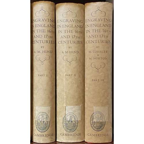 A three-volume set. VOL. 1: ENGRAVING IN ENGLAND | IN THE | SIXTEENTH AND SEVENTEENTH CENTURIES | A DESCRIPTIVE CATALOGUE | WITH INTRODUCTIONS | BY | ARTHUR M HIND | Sometime Keeper of Prints and Drawings in the British Museum | and Slade Professor of Fine Art in the University of Oxford | PART I | THE TUDOR PERIOD | WITH 319 ILLUSTRATIONS | {The coat of arms of the University of Cambridge} | CAMBRIDGE | AT THE UNIVERSITY PRESS | 1952|| Pagination: ffl, [i-vi] – h.t. / blank, frontis., t.p. / colophon, dedication / blank; vii-xxx; 1-333 [334 blank] [2] – the plates / blank; 1-156 pp. of plates. Collation: a-b8, 1-218 + 78 leaves of plates at the end. VOL. 2: ENGRAVING IN ENGLAND | IN THE | SIXTEENTH AND SEVENTEENTH CENTURIES | A DESCRIPTIVE CATALOGUE | WITH INTRODUCTIONS | BY | ARTHUR M HIND | Sometime Keeper of Prints and Drawings in the British Museum | and Slade Professor of Fine Art in the University of Oxford | PART II | THE REIGN OF JAMES I | WITH 618 ILLUSTRATIONS| {The coat of arms of the University of Cambridge} | CAMBRIDGE | AT THE UNIVERSITY PRESS | 1955|| Pagination: [i-iv] – h.t. / blank, t.p. / colophon; v-xiv [xv] [xvi blank]; 1-396 [397] [398 blank] [2] – the plates / blank; 1-252 pp. of plates. Collation: a-b8, 1-268 + 126 leaves of plates at the end. VOL. 3: ENGRAVING IN ENGLAND | IN THE | SIXTEENTH AND SEVENTEENTH CENTURIES | A DESCRIPTIVE CATALOGUE | WITH INTRODUCTIONS | PART III | THE REIGN OF CHARLES I | WITH 466 ILLUSTRATIONS | COMPILED FROM THE NOTES OF | THE LATE A. M. HIND | BY | MARGERY CORBETT & MICHAEL NORTON | {The coat of arms of the University of Cambridge} | CAMBRIDGE | AT THE UNIVERSITY PRESS | 1964|| Pagination: [i-vi] – h.t. / blank, frontis., t.p. / colophon, dedication / blank; vii-xxx; 1-333 [334 blank] [2] – the plates / blank; 1-214 pp. of plates. Collation: [a]8, 1-258 + 107 leaves of plates at the end. Each of three volumes bound in red cloth with gilt lettering to spine, residuals of library stickers, dark spotting to the top and lateral edges; tan DJ with title lettering in a frame to front, lettering to spine, advert. to back, with cut off stickers to spine; ‘The Francis Bacon Foundation’ ink stamp to front pastedown.
 -
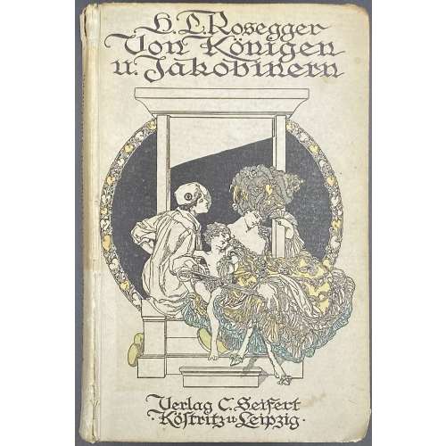 Cover (in blackletter): H. L. Rosegger. | Von Königen u. Jakobinern | {vignette by von Bayros} | Verlag C. Seifert | • Köstritz u Leipzig • || Title (blackletter): Von Königen | und Jakobinern | Von | Hans Ludwig Rosegger | mit vier Vollbildern und Buchschmuck | von Marquis F. von Bayros | {publisher’s device} | 1913 | C. Seifert Verlag, G.m.b.H. | Köstritz und Leipzig || Pagination: [2] – t.p. / blank, [2] – contents / blank, [1-3] 4-263 [264 vignette, colophon], 4 plates extraneous to collation, 2 vignettes. Collation: 8vo; 1-168 174. Binding: Hardcover, pictorial paper boards, lettering to spine, lettering and vignette by von Bayros to cover. Owner's inscription to ffl: "T. Lewe. März, 1919."
 -
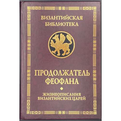 Title: ПРОДОЛЖАТЕЛЬ ФЕОФАНА | ЖИЗНЕОПИСАНИЯ | ВИЗАНТИЙСКИХ ЦАРЕЙ | Издание второе, исправленное и дополненное | Санкт-Петербург | АЛЕТЕЙЯ | 2009 || Pagination: [108] 9-398 [2]. Binding: 21.5 x 15 cm; hardcover, crimson buckram, gilt lettering in the border, gilt serial device on black, pictorial endpapers. Print run: 1,000 copies. ISBN: 978-5-91419-146-4. Theophanes Continuatus [Продолжатель Феофана; συνεχισταί Θεοφάνους] (Byzantine, 9th century). Любарский, Яков Николаевич (Russian, 1929 – 2003).
 -
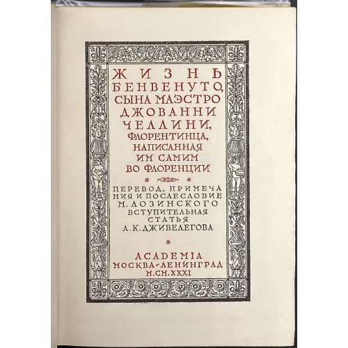 Dust jacket: Pictorial floral ornament, lettering in a central medallion: ЖИЗНЬ | БЕНВЕНУТО | ЧЕЛЛИНИ | {ACADEMIA} || Title page in black and red in a pictorial frame: ЖИЗНЬ | БЕНВЕНУТО, | СЫНА МАЭСТРО | ДЖОВАННИ | ЧЕЛЛИНИ, | ФЛОРЕНТИНЦА, | НАПИСАННАЯ | ИМ САМИМ | ВО ФЛОРЕНЦИИ |{√}| ПЕРЕВОД, ПРИМЕЧА | НИЯ И ПОСЛЕСЛОВИЕ | М. ЛОЗИНСКОГО | ВСТУПИТЕЛЬНАЯ | СТАТЬЯ | А. К. ДЖИВЕЛЕГОВА | ACADEMIA | МОСКВА~ЛЕНИНГРАД | M.CM.XXXI || Frontispiece: ПАМЯТНИКИ | ХУДОЖЕСТВЕННОГО | И ОБЩЕСТВЕННОГО | БЫТА |{√}| ЖИЗНЬ | БЕНВЕНУТО | ЧЕЛЛИНИ |{√}| ACADEMIA | МОСКВА~ЛЕНИНГРАД | M.CM.XXXI || Title verso: LA VITA DI BENVENUTO DI Mo GIOVANNI | CELLINI FIORENTINO | scritta per lui medesimo in Firenze | […] | Рисунки титулов, переплета и супер-обложки И. Ф. Реберга |[…]| 6 – 10 тысяча || Pagination: [1-5] 6-735 [736], 30 photomechanical plates (incl. portrait) Collation : [1]8 2-468 + 15 leaves of plates extraneous to collation, total 383 leaves. Binding: publisher’s burgundy cloth, gilt-stamped to front, blind-stamped to back board, gilt lettering to spine, pictorial DJ. Print run: 5,250 copies. Catalogue raisonné: Крылов-Кичатова (2004): №473, p. 220 (in 1932 section). Contributors: Benvenuto Cellini (Italian, 1500 – 1571) – author. Алексей Карпович Дживелегов (Russian, 1875 – 1952) – editor. Михаил Леонидович Лозинский (Russian, 1886 – 1955) – translator. Иван Фёдорович Рерберг (Russian, 1892 – 1957) – artist.
 -
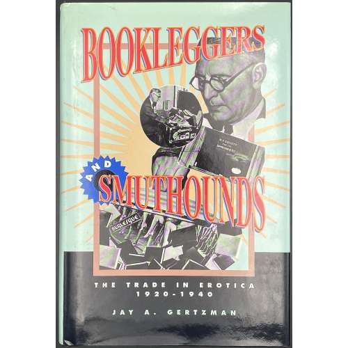 Title page: BOOKLEGGERS | AND | SMUTHOUNDS | THE TRADE IN EROTICA, 1920-1940 | JAY A. GERTZMAN | UNIVERSITY OF PENNSYLVANIA PRESS • PHILADELPHIA || Pagination: [8] [1] 2-418 [6] blanks, total 216 leaves. Binding: 24.5 x 16 cm; black cloth, silver lettering to spine, pictorial dust jacket.
 -
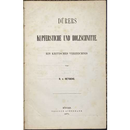 Publisher’s blue wrapper: DÜRERS | KUPFERSTICHE UND HOLZSCHNITTE. | EIN KRITISCHES VERZEICHNIS | VON | R. v. RETBERG. | MÜNCHEN. | THEODOR ACKERMANN. | 1871. || Title page: similar to front wrapper, 2.5 cm cut at the bottom, text not affected. Pagination: front wrapper with lettering in a frame, flyleaf, [4] 1-169 [170 blank] [2], flyleaf, back wrapper with imprint plus 2 plates (frontis., Il. entry №129, and op. p., il. entry 100 № 260, printed on laid paper without watermark). Collation: π2 1-88 9-134 142, plus 2 plates extraneous to collation, incl. frontispiece. Binding: 26.4 x 17.5 cm, quarter green morocco over marbled boards, black compartment fillets and lettering to spine, publisher’s wrappers preserved. Marks: bookplate 6 x 9 cm to front pastedown: “БИБЛИОТЕКА | ГОСУДАРСТВЕННОГО | ЭРМИТАЖА ИЗ СОБРАНИЯ | СТЕПАНА ПЕТРОВИЧА | ЯРЕМИЧА | (1869 – 1939)”, purple ink stamp “В ПРОДАЖУ”. To front wrapper: Ink manuscript on top “Dr. Lichtenstein”… etc., black ink seal of rampant lion and pencil number “949” in the middle; pencil marks to p. 162.
Contents: Inhalt - Berichtigungen - Vorwort und Einleitendes - Dürers Lebenskizze - [Text] - Nachtrag zu Dürers "Lebenskizze". A critical directory of Albrecht Dürer (German, 1471 – 1528) copperplate engravings and woodcuts by Ralf von Retberg (German, 1812 – 1885): the description of 167 woodcuts and 103 copperplate engravings.
Provenance: From the collection of a Russian artist Stepan Petrovich Yaremich, sold by Hermitage Museum in St. Petersburg. Ref: Royal Academy.