-
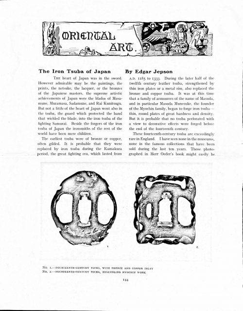 Magazine article by Edgar Jepson: The Iron Tsuba of Japan (Section: Oriental Art), published in volume Vol. 70 (September–December) of The Connoisseur: An Illustrated Magazine for Collectors, Vol. 70 (September–December); pp. 143-152 / C. Reginald Grundy [ed.] — London: Published by the Proprietor, W. CLAUSE JOHNSON, at the Editorial and Advertisement Offices of The Connoisseur, 1924. Owner's half black morocco, gilt lettering to spine, blue cloth boards. Two volumes bound together without original covers. Size 28.5 x 22 cm. Vol. 1: The Connoisseur | An Illustrated Magazine | For Collectors | Edited by C. Reginald Grundy | Vol. LXIX. | (MAY—AUGUST, 1924) | LONDON | Published by the Proprietor, W. CLAUSE JOHNSON, at the | Editorial and Advertisement Offices of The Connoisseur, | at 1, Duke Street, St. James's, S.W. 1 | 1924 || Pp.: [i-ii] iii-xviii [xix] [1, 2 - plate] 3-249 [250]. Vol. 2: The Connoisseur | An Illustrated Magazine | For Collectors | Edited by C. Reginald Grundy | Vol. LXX. | (SEPTEMBER—DECEMBER, 1924) | LONDON | Published by the Proprietor, W. CLAUSE JOHNSON, at the | Editorial and Advertisement Offices of The Connoisseur, | at 1, Duke Street, St. James's, S.W. 1 | 1924 || Pp.: [i-ii] iii-xxii [2 blanks] [1, 2 - plate] 3-261 [262]. The Iron Tsuba of Japan by Edgar Jepson The heart of Japan was in the sword. However admirable may be the paintings, the prints, the netsuke, the lacquer, or the bronzes of the Japanese masters, the supreme artistic achievements of Japan were the blades of Masamune, Muramasa, Sadamune, and Rai Kunitsugu. But not a little of the heart of Japan went also in the tsuba, the guard which protected the hand that wielded the blade, into the iron tsuba of the fighting Samurai. Beside the forgers of the iron tsuba of Japan the ironsmiths of the rest of the world have been mere children. The earliest tsuba were of bronze or copper, often gilded. It is probable that they were replaced by iron tsuba during the Kamakura period, the great fighting era, which lasted from A.D. 1185 to 1333. During the later half of the twelfth century leather tsuba, strengthened by thin iron plates or a metal rim, also replaced the bronze and copper tsuba. It was at this time that a family of armourers of the name of Masuda, and in particular Masuda Munesuke, the founder of the Myochin family, began to forge iron tsuba — thin, round plates of great hardness and density. But it is probable that no tsuba perforated with a view to decorative effects were forged before the end of the fourteenth century. These fourteenth-century tsuba are exceedingly rare in England. I have seen none in the museums, none in the famous collections that have been sold during the last ten years. Those photographed in Herr Oeder's book might easily be the fifteenth century. No. 1 is a curious cup-shape tsuba decorated with a bronze and copper inlay. No. 2, with its edges curiously twisted in the forging, looks like Myochin work. But it is not of the Myochin iron. The Myochin family produced some of the greatest ironsmiths of Japan. Armourers first of all, tsubasmiths, forgers of sake-kettles, articulated reptiles, crustacea, and insects — everything that can be done with iron they did; they pushed their medium to its limit. They were forging iron tsuba in 1160, and they were still forging them in 1860. And it was their own iron, or rather their own steel. They discovered the secret of it early, and they kept that secret in the family for all those hundreds of years. There is no mistaking a Myochin tsuba: balance it on your finger and tap it with a piece of metal, always it gives forth a clear bell-like ring that you get from the work of no other ironsmith, Japanese or European. Always the Myochin tsuba is before everything a protection to the hand of the swordsman; to that everything is, as it should be, subordinated. No. 3 is a Myochin tsuba of the fifteenth century, and probably of the early fifteenth century. No. 4, by Myochin Munetaka, perforated with a grotesque figure, is an example of that twisting and twisting of the iron in the forging till it forms a pattern like the grain of wood. The Myochin smiths invented these wood-grain tsuba, and no other smiths equalled them in their forging. In the sixteenth century, the fighting tsuba was probably at its best. It was a century of great tsubasmiths. Then the first Nobuiye, whose tsuba fetched £100 apiece, circa 1800, in Japan, and the first Kaneiye flourished. No. 5 is a tsuba forged by a great smith, Iyesada of Sotome, in the manner of Nobuiye I, decorated with the karakusa tendrils that Nobuiye delighted in, with lightning and clouds. No. 6 is a guard of Sanada Tembo, the chief smith of the Tembo family, stamped, punning fashion, with the character Tembo. Akin to the Tembo tsuba were those of the Kiami and Hoan smiths. Then also the Heianjo smiths and the Owari smiths, especially those of Nagoya and the Yamakichi family, forged their strongest tsuba. Those of the Yamakichi were tested after the forging by being pounded in iron mortars — at least, so the legend runs. But they were a sternly utilitarian family, and I have never seen a Yamakichi tsuba of any beauty. In the later half of the fifteenth century arose the fashion of decorating tsuba with an inlay, zogan, of bronze. The Heianjo tsuba, forged at Kyoto in the latter half of the fifteenth and the beginning of the sixteenth century, were often thus inlaid. The earliest of them were called "Onin", of which No. 7 is an example. In addition to the bronze inlay around the edge, it is inlaid with a representation, some say, of snow; others say, of the duckweed on a pond. No. 8 is probably a Heianjo tsuba, but I am not quite sure about it. The inlaid acacia branches might be very early Shoami work. But to judge by the iron, it is a fifteenth-century tsuba; and the authorities place the beginning of the Shoami school not later than early in the sixteenth century. No. 10 is an example of the Fushimi-zogan, a flat inlay of a light-coloured bronze. These tsuba took their name from the fact that they were first forged at Fushimi, in Yamashiro, in the sixteenth century. It is of the type known as Mon-zukashi, perforated with crests (mon) à jour. The Yoshiro-zogan tsuba were also first forged at Fushimi by Yoshiro Naomasa. They were distinguished from the Fushimi-zogan by the fact that their inlay was generally a little raised-not always-for the inlay of No. 9, a tsuba forged by a later nineteenth-century Yoshiro, is quite flat. It is an interesting tsuba, for, with its decoration grown florid and excessive, it marks the intermediate stage between the simple and delightful designs of the genuine fighting tsuba and the elaborate pictures in gold and silver on the tsuba of the eighteenth-century smiths of Awa and Kyoto, which have become mere ornaments of the goldsmith. The Gomoku-zogan (No. 11) tsuba were probably first forged earlier than the Fushimi and Yoshiro-zogan tsuba. This inlay, in slight relief, is a representation in a light-coloured bronze and copper of twigs caught in the eddies of streams. The seventeenth century and early eighteenth century were the great periods of perforated tsuba. The designs, and they are often admirable, are for the most part in plain fretwork; but they are also chased. No. 12, a crane under an acacia, is a tsuba of a Higo smith, great forgers of fighting tsuba during this period. These smiths also excelled in nunome zogan, a very thin gold and silver inlay, with which they further decorated their perforated guards. The smiths of the Umetada and Shoami families also forged iron tsuba during this period; but their designs, though sometimes pleasing enough, are rarely fine. The best work of Myoju Umetada is in sentoku, not iron. The Choshu smiths, coming later, surpass the perforated guards of both the Umetada and Shoami smiths in beauty of design. No. 13, a lotus in the round, not only fretwork, but also engraved, is a good example of the admirable balance they so often attained in their designs. It is a sufficiently realistic lotus, but yet of a delightful simplicity. In considerable contrast is No. 14, the dragon by Soheishi Soten — one of the only two authentic tsuba of his forging known — the first forger of hikone-bori tsuba, which were in extraordinary favour in Japan during the eighteenth century, and illustrated every important event in Japanese history. It is on the elaborate side, but fine, strong work, and an excellent guard to the hand, for the lighter and more open part, which gives the design its admirable balance, is on the inside, and not exposed to the full swing of an opponent's blade. A few years ago there was a tendency to decry the Namban tsuba as having sprung too directly from foreign sources. But though the original suggestion may have been Chinese, or, as some say, Portuguese, the Japanese made it entirely their own, as characteristically Japanese as anything can well be, but, it must be admitted, of a decadent period. The school took its rise at the beginning of the seventeenth century, and the early tsuba were forged of a specially hard iron, the Wootz, imported from Southern India. No. 15, the signs of the Zodiac, is an excellent tsuba from the fighting point of view. Both it and No. 16 are of quite charming, if elaborate, design, and both of them, with their delicate scroll-work, so astonishingly undercut, are the very last word in the work of the ironsmith-veritable iron lace. To return to the simpler perforated tsuba, the smiths of Akasaka, a suburb of Tokyo, produced probably the most charming designs. Their style derives considerably from the Higo smiths, and their earlier fighting tsuba are very like the Higo tsuba. But always their work was just a little lighter than that of the Higo smiths, and in the end they moved right away from them and became the forgers of very light guards indeed. No. 17, is a representation of the Hiyokudori, the fabulous double bird, in which were reincarnated the souls of the two lovers, Gompachi and Komurasaki; and No. 18, “the tsuba of a hundred ducks "— there are about forty — are characteristic designs of the school. In the work of the Akasaka smiths the balance, which makes the design of a good tsuba so admirable and delightful, attains its height. This admirable balance seems often to be obtained by a deliberate sacrifice of symmetry. About nine hundred and ninety-nine European ironsmiths out of a thousand would have made the right and left sides of the Hiyoku-dori line by line, and perforation by perforation, exactly alike; he would have cut out exactly as many ducks on the one side of “the tsuba of a hundred ducks” as on the other, and made each duck on the right side correspond exactly in position and attitude with a duck on the left side. By variations the tsubasmith attained a finer balance, almost a higher symmetry. No. 19, often called by collectors the "rose-window" tsuba, but really a stylised chrysanthemum, is a favourite design of the Akasaka smiths, but Hizen work and inlaid in the Hizen manner with gold nunome. No. 20 is a Satsuma tsuba of the middle period. The Satsuma smiths of the nineteenth century produced probably the most ornate of all the iron guards, for the most part calibashes and beans with their leaves and tendrils realistic in the extreme, but of charming design. Few crafts have been carried further than that of the tsubasmith; few crafts working in a difficult medium have handled more subjects with greater feeling for beauty or greater liveliness of fancy. It is interesting to note again and again how school influences school, and smith influences smith. But, as in all the applied arts, the finest tsuba were forged by men who never lost sight of the purpose of a tsuba, that it is before everything a protection to the hand, and never subjected that purpose to a passion for virtuosity. Illustrations: No 1. FOURTEENTH-CENTURY TSUBA, WITH BRONZE AND COPPER INLAY No. 2. FOURTEENTH-CENTURY TSUBA, RESEMBLING MYOCHIN WORK No. 3. MYOCHIN TSUBA, FIFTEENTH CENTURY No. 4. MYOCHIN TSUBA, NINETEENTH CENTURY No. 5. SIXTEENTH-CENTURY TSUBA No. 6. SIXTEENTH-CENTURY TSUBA BY IYESADA OF SOTOME BY SANADA TEMBO No. 7. ONIN TSUBA No. 8. HEIANJO (?) TSUBA No. 9. YOSHIRO TSUBA, NINETEENTH CENTURY No. 10. FUSHIMI-ZOGAN, NINETEENTH CENTURY No. 11.- GOMOKU-ZOGAN, SIXTEENTH CENTURY No. 12. HIGO TSUBA, SEVENTEENTH CENTURY No. 13. CHOSHU TSUBA, SEVENTEENTH CENTURY No. 14. SOTEN TSUBA, SEVENTEENTH CENTURY No. 15. NAMBAN TSUBA, EIGHTEENTH CENTURY No. 16. NAMBAN TSUBA, NINETEENTH CENTURY Nos. 17. AND 18. AKASAKA TSUBA, EIGHTEENTH CENTURY No. 19. HIZEN TSUBA, EIGHTEENTH CENTURY No. 20. SATSUMA TSUBA, EIGHTEENTH CENTURY
 -
 Title: GIACOMO CASANOVA | Chevalier de Seingalt | HISTORY OF MY LIFE | FIRST TRANSLATED INTO ENGLISH IN ACCORDANCE | WITH THE ORIGINAL FRENCH MANUSCRIPT | By Willard R. Trask | With an Introduction by the Translator | VOLUMES 1 AND 2 | A Helen and Kurt Wolff book • Harcourt, Brace & World, 1966 | NEW YORK || Stated 1st edition. Pagination: [2 blank] [i-iv] v-viii, [1, 2] 3-330 [8 blanks] + 32 ills. Two volumes in one.
 -
![George Cruikshank. George Cruikshank's Fairy Library. Hop-O'-My Thumb. Jack and the Bean-Stalk. Cinderella. Puss in Boots. — London: George Bell and Sons, 1885. — pp.: [2] blank, [2] first half-title with blank verso, [i-ii] second half-title with blank verso, [2] frontispiece plate with blank recto, [iii-viii] title, colophone, editor's note, list of illustr. [2] title with blank verso, [1] 2-101 [3] blank, 24 plates with protective tissue, unpag. — Colophon: This edition is limited to 500 copies, with India paper impressions. The former editions have been from lithographic transfers. The plates were retouched under Mr. Cruikshank's direction shortly before his death, and have not been used since until now.](https://varshavskycollection.com/wp-content/uploads/2021/02/LIB-2454.2020-f-1-500x659.jpeg) Title: GEORGE CRUIKSHANK'S FAIRY LIBRARY. | HOP-O'-MY THUMB. | JACK AND THE BEAN-STALK. | CINDERELLA. | PUSS IN BOOTS. | [DEVICE] | LONDON: | GEORGE BELL AND SONS, YORK STREET, COVENT GARDEN. Pagination: [2] – blanks, [2] – first half-title with blank verso, [i-ii] – second half-title with blank verso, [2] – blank / frontispiece, [iii-viii] title, colophon, editor's note, list of illustrations, [2] – title with blank verso, [1] 2-101 [3] – blank; 24 plates with protective tissue. Colophon: This edition is limited to 500 copies, with India paper impressions. The former editions have been from lithographic transfers. The plates were retouched under Mr. Cruikshank's direction shortly before his death, and have not been used since until now. Binding: 4to, 22.2 x 17.5 cm, hardcover; 3/4 black calf ruled in gilt, brown calf spine with raised bands decorated in gilt, with gilt title lettering. Green marbled boards and end-papers. Abel E. Berland's bookplate pasted to front pastedown. Professionally rebound, re-backed with the original spine laid down, corners bumped. Catalogue Raisonné: Not in Alan M. Cohen's. As writes the British Library: "George Cruikshank’s [...] illustrations for the first English translation of Grimm’s Fairy Tales were praised widely, but his own rewriting of fairytales was criticised, most prominently by Charles Dickens. This was not due to the quality of the illustrations, but because, in line with his temperance beliefs, Cruikshank rewrote aspects of the fairytales to warn the reader against the evils of alcohol. Thus, for instance, the preparations for Cinderella’s marriage include the court throwing all alcohol in the palace on a bonfire; and in ‘Jack and the Beanstalk’, the giant is an alcoholic. Dickens, a friend of Cruikshank, was outraged at what he considered to be a betrayal of the essence of fairytales and, in protest, he published an essay in his weekly magazine Household Words entitled ‘Frauds on the Fairies’ in protest (1853)."
Title: GEORGE CRUIKSHANK'S FAIRY LIBRARY. | HOP-O'-MY THUMB. | JACK AND THE BEAN-STALK. | CINDERELLA. | PUSS IN BOOTS. | [DEVICE] | LONDON: | GEORGE BELL AND SONS, YORK STREET, COVENT GARDEN. Pagination: [2] – blanks, [2] – first half-title with blank verso, [i-ii] – second half-title with blank verso, [2] – blank / frontispiece, [iii-viii] title, colophon, editor's note, list of illustrations, [2] – title with blank verso, [1] 2-101 [3] – blank; 24 plates with protective tissue. Colophon: This edition is limited to 500 copies, with India paper impressions. The former editions have been from lithographic transfers. The plates were retouched under Mr. Cruikshank's direction shortly before his death, and have not been used since until now. Binding: 4to, 22.2 x 17.5 cm, hardcover; 3/4 black calf ruled in gilt, brown calf spine with raised bands decorated in gilt, with gilt title lettering. Green marbled boards and end-papers. Abel E. Berland's bookplate pasted to front pastedown. Professionally rebound, re-backed with the original spine laid down, corners bumped. Catalogue Raisonné: Not in Alan M. Cohen's. As writes the British Library: "George Cruikshank’s [...] illustrations for the first English translation of Grimm’s Fairy Tales were praised widely, but his own rewriting of fairytales was criticised, most prominently by Charles Dickens. This was not due to the quality of the illustrations, but because, in line with his temperance beliefs, Cruikshank rewrote aspects of the fairytales to warn the reader against the evils of alcohol. Thus, for instance, the preparations for Cinderella’s marriage include the court throwing all alcohol in the palace on a bonfire; and in ‘Jack and the Beanstalk’, the giant is an alcoholic. Dickens, a friend of Cruikshank, was outraged at what he considered to be a betrayal of the essence of fairytales and, in protest, he published an essay in his weekly magazine Household Words entitled ‘Frauds on the Fairies’ in protest (1853)." -
 Title in black and red: AN HISTORICAL SKETCH | OF | BOOKBINDING | BY | S. T. PRIDEAUX | WITH A CHAPTER ON EARLY STAMPED BINDINGS | BY E. GORDON DUFF. | {Publisher’s device} | LONDON: LAWRENCE & BULLEN | 16 HENRIETTA STREET, COVENT GARDEN | 1893 || Pagination: [i, ii] – h.t. / blank, [2] – blank / frontis. w/guard, [iii, iv] – t.p. / colophon, [v], vi – preface, [vii, viii] – contents / blank, [1] 2-303 [304 blank]. Collation: 8vo; [A]4 B-U8. Binding: Grey cloth with gilt-stamped lettering and publisher’s device to front cover, gilt lettering to spine, blue floral ornamental endpapers, free margin untrimmed; printed on laid paper.
 -
 Pagination: [2] – letterpress title / blank, t.p. contents / to readers, [1] 2-368 [4 index], + 6 b/w (one folding) and 28 coloured plates (total 34). Collation: 4to; letterpress title, [A]1 B-Z4 Aa-Zz4 3A-3B4 3C3. Binding: 25 x 16 cm; gilt-ruled half-calf over marbled boards, flat spine, gilt-ruled compartments, gilt lettering. 5 aquatints by Thomas Rowlandson (British, 1757 – 1827): Table D'Hote; Consulting the Prophet; The Prophet discovering himself and exposing the deception; The Arrival in Paris; Liberality to infirm beggars on leaving Yrvi. References: Martin Hardie (1906), p.310 [LIB-2623.2021]; R. V. Tooley (1935), p. 26 [LIB-2641.2021]; J. R. Abbey (1953), Cat. № 212, p. 167 [LIB-2622.2021].
 -
 Title: OLD DUTCH | POTTERY AND TILES | BY ELISABETH | NEURDENBURG | LITT. D., READER IN THE HISTORY OF ART AT | THE UNIVERSITY OF GRONINGEN. TRANSLATED | WITH ANNOTATIONS BY | Bernard Rackham | DEPUTY KEEPER, DEPARTMENT | OF CERAMICS, VICTORIA AND | ALBERT MUSEUM | […] | WITH ONE HUNDRED AND TWELVE | ILLUSTRATIONS OF WHICH NINE | ARE IN COLOUR | LONDON: BENN BROTHERS, LIMITED | 8 BOUVERIE STREET, E.C. 4 | 1923 || Verso to half-title: Of this book 100 copies only for sale have been printed on English | hand-made paper, bound in pigskin and signed by the Authoress | and Translator. These copies also contain an extra colour plate. | This in Number “7” (in manuscript) | Two signatures (ink, manuscript) || Pagination: [i, ii] – h.t. / tirage, [iii, iv] – t.p. / imprint, [v, vi] – dedication to Dr. A. Pit / blank, vii-xv [xvi blank] [1, 2] 3-155 [156 blank], frontispiece (colour) and 59 leaves of plates (9 colour) with 112 figures, with lettered protective sheets. Collation: 4to in 8th; [A]8 [B]8 C-K8 L6; frontis., +59 leaves of plates. Binding: 30 x 24 cm, Full dark brown pigskin with gilt ornament to front board and gilt lettering to spine; printed on thick wove paper, top edge gilt, others untrimmed. Contributors: Neurdenburg, Elisabeth (Dutch, 1882 – 1957) – author [autograph]. Rackham, Bernard (British, 1876 – 1964) – translator [autograph]. Brendon, William (British, 1845 – 1928) – printer. Mayflower Press (Plymouth), William Brendon & Son, Ltd. – printer Benn Brothers Ltd. (British company, 1880 – 1987) Benn, Sir John, 1st Baronet (British, 1850 – 1922)
 -
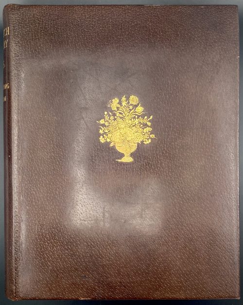
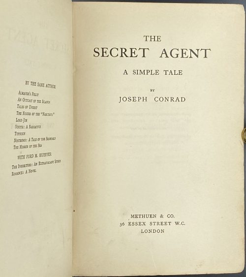 Title page: THE | SECRET AGENT | A SIMPLE TALE | BY | JOSEPH CONRAD | METHUEN & CO. | 36 ESSEX STREET W.C. | LONDON || Imprint on t.p. verso: First Published in 1907 Dedication: To H. G. Wells. Pagination: [2] – blank, [6] – h.t., t.p., dedication; 1-442, [2] colophon: THE RIVERSIDE PRESS LIMITED, EDINBURGH / blank; [1-2] 3-40 – Catalogue of books published by Methuen and company, September 1907; total 492 pages. Collation: 8vo; π4, A-Z8 2A-2D8, 2E6, + 20 leaves of advertisement: signed A2 on leaf 5 and A3 on leaf 9, other unsigned, 2E2 signed; total 246 leaves. Binding: Publisher’s burgundy cloth with gilt lettering and elements to spine, lower margin untrimmed, 19.5 x 13.5 cm. Edition: 1st edition, 1st printing ("be be" on the last line of page 117) of 2,500 copied printed. Contributors: Conrad, Joseph (Polish-British, 1857 – 1924) – author. Methuen & Co. (London) – publisher. The Riverside Press Limited (Edinburgh) – printer. Herbert George Wells (British, 1866 – 1946) – dedicatee.
 -
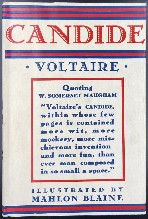 Title (chain border): CANDIDE | VOLTAIRE | ILLUSTRATIONS BY | MAHLON BLAINE | {vignette} | NEW YORK | Illustrated Editions Company | 220 FOURTH AVENUE || Title verso: (top) COPYRIGHT, 1930, BY WILLIAMS, BELASCO & MEYERS || (bottom) PRINTED IN THE UNITED STATES OF AMERICA | BY J. J. LITTLE & IVES COMPANY, NEW YORK || Pagination:[1-7] 8-144, headpiece, frontispiece and 5 plates after Blaine’s pen drawings, within the pagination; tailpieces by A. Zaidenberg. Binding: 21 x 14 cm; quarter beige buckram over blue cloth, stamped-gilt and red lettering and vignette to front board and spine. Binding in a way similar to Sterne's A sentimental journey published by Three Sirens Press in c. 1930 [LIB-2784.2021]. Not only that: tailpieces in this Illustrated Editions Company edition are the same as in Cameo Classic edition, with the only difference – here the name of the artist is stated, whether in the Cameo Classic it is not; see [LIB-2777.2021]. Bear in mind that Cameo Classic does not belong to Williams, Belasco and Meyers, it is a Grosset and Dunlap series; a cream dust-jacket lettered in red and blue, and with a citation from W. Somerset Maugham; all edges red. Compare with LIB-2791.2021. Illustrations in the current copy are exactly the same. Compare Williams, Belasco and Meyers Candide and Illustrated Editions Company Candide title pages:
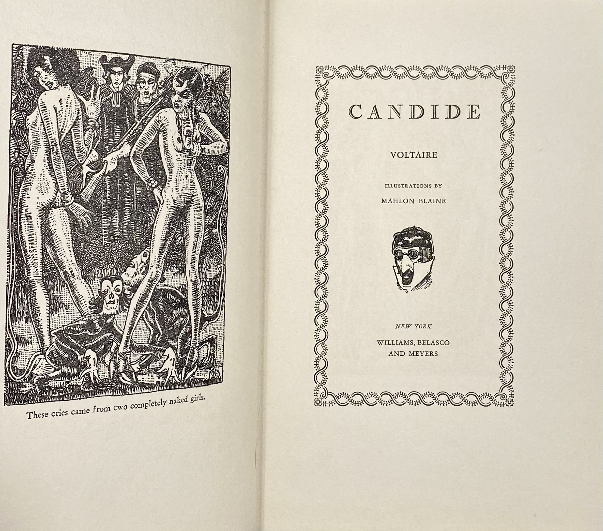
Williams, Belasco and Meyers
Arouet, François-Marie [Voltaire] (French, 1694 – 1778)– author. Woolf, Herman Irwell [Chambers, Dorset] (British, 1890 – 1958) – translator. Blaine, Mahlon [Hudson, G. Christopher] (American, 1894 – 1969) – illustrator. Zaidenberg, Arthur (American, 1902 – 1990) – illustrator. Williams, Belasco and Meyers (NY) – copyright holder. Illustrated Editions Company (1929-1942) – publisher. J. J. Little & Ives Company (NY) – printer. See the Cameo Classic reprint [LIB-2777.2021].
Illustrated Editions Company
-
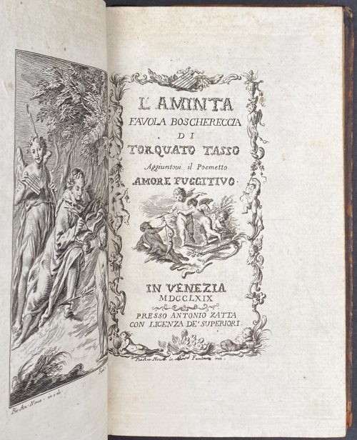 Engraved title-page: L'AMINTA | FAVOLA BOSCHERECCIA | DI | TORQUATO TASSO | Aggiuntovi il Poemetto | Amore Fugitivo |{vignette} | IN VENEZIA | MDCCLXIX |—| PRESSO ANTONIO ZATTA | CON LICENZA DE’ SUPERIORI || in historiated frame, signed below: “Pet. Ant. Novelli in — Fambrini inci.” Pagination: [i] ii-xxiv, [1-2] 3-84, total 108 pages, ils. Collation: 12mo; a12, A-C12 D6, last blank; first 6 leaves signed in 12-leave quires, first 3 in D; total 54 leaves plus 9 plates, incl. engraved title and frontispiece, and numerous head- and tailpieces by Fambrini after Novelli. Binding: 18.6 x 11 cm, contemporary tree calf, rebacked, crimson label with gilt lettering; clipping and bookplate of The Robin Collection to front pastedown; verso front flyleaf stamped “RESTORED BY MACDONALD CO. | NORWALK. CONN.” Additional blank leaves at front and back. Provenance: Satinsky, Robin F. (American, 1919 – 2008); The Robin Collection. Contributors: Torquato Tasso (Italian, 1544 –1595) – author. Pietro Antonio Novelli (Italian, 1729 – 1804) – artist. Ferdinando Fambrini (Italian (1764 – c.1793) – engraver. Antonio Zatta (Italian, c. 1722 – 1804) – printer, publisher.
 -
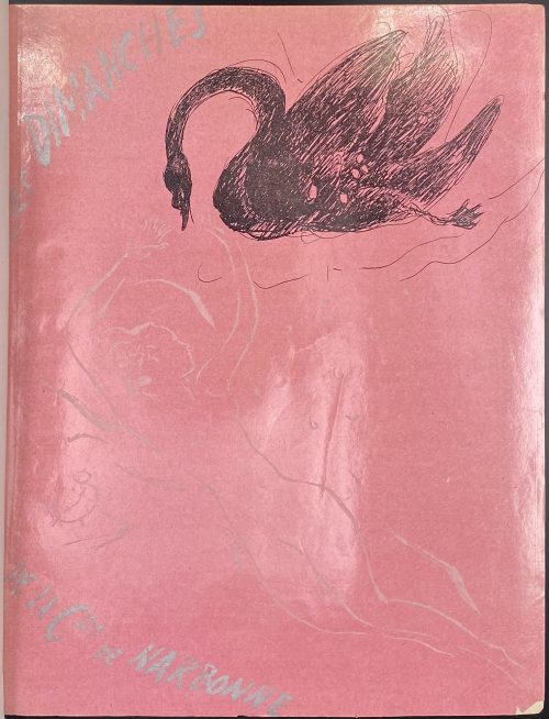 Description: Bound in brown ¾ morocco over marbled boards by R. et R. Mativet (ink stamp to ffep verso), collated 4to, 26.4 x 20.7 cm, raised bands, gilt arabesque and lettering to spine, original glossy pink pictorial wrappers preserved, marbled endpapers, bookplate to front pastedown “ML”, to front fep “EX-LIBRIS | Jacques | Crépineau”; A.L.s. of Marcel Vertès pasted to one of the feps: "Biblis [6] rue Jacques Callot. Cher Monsieur Le Bodo, Voudriez-vous avoir l’amabilité et de céder un exemplaire de « Dimanche » à M. Risler à un prix très réduit? Merci d’avance. Bien à vous, Vertès". Jean Le Bodo – abord gérant de la Librairie Biblis (20, rue du Vieux-Colombier, Paris 6e), et en 1946, libraire au Livre de France, Paris 16e; Risler – probablement Jean-François Risler (1910-1952), fils d’un pianiste Joseph-Édouard Risler (1873 – 1929). Title-page: DAISY FELLOWES | Les | Dimanches | de la | Csse de Narbonne | ILLUSTRATIONS | DE | VERTÈS | ÉDITIONS DE France | 20, AVENUE RAPP, PARIS || Collation: 1 blank, front wrapper, π4 (2 blanks with A.L.s. pasted to the 2nd, h.t., t.p.), 1-244 χ4 (table, colophon, 2 blanks) back wrapper, 1 blank; total 104 leaves within the wrappers, numerous in-text and 7 full-page prints after drawings by Marcel Vertès, within collation. Pagination: [8] [1-2] 3-191 [192] [8], total 208 pages, ils. Limitation: printed on June 25, 1935 by Coulouma (Argenteuil) under the direction of H. Barthélemy, 20 copies (№1-20) on Japon blanc super-nacré + two suites, 80 copies on Japon a la forme (№21-100) + one suite, 900 (№101-1000) on Vélin blanc. This is copy № 598. Catalogue raisonné: Vokaer (Vertès) № 34, p. 15. Provenance: Jacques Crepineau (French, 1932 – 2017). Contributors: Daisy Fellowes [Marguerite Séverine Philippine Decazes de Glücksberg] (French, 1890 – 1962) – author Marcel Vertès [Marcell Vértes] (Jewish-Hungarian-French, 1895 – 1961) – artist.
 -
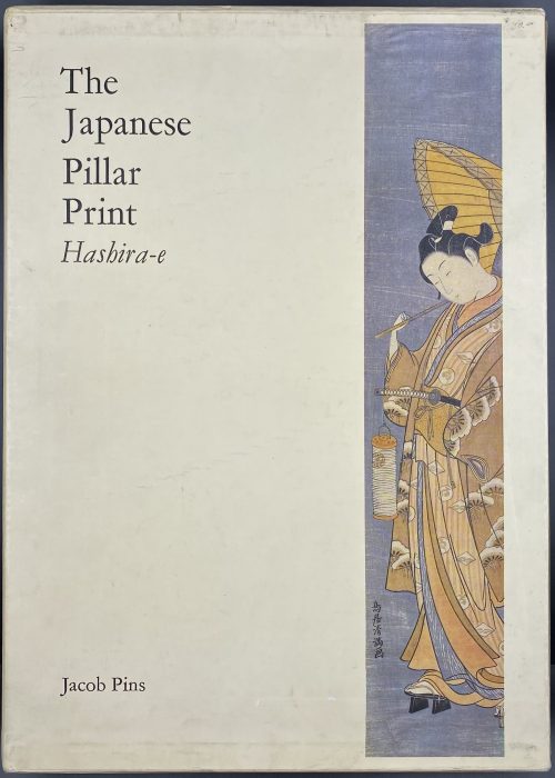 Description: Hardcover volume, 35 x 25.1 cm, ochre cloth with gilt lettering and vignette to spine; pp.: [1-6] 7-389 [3 blank], total 196 leaves, 16 illustrations in colour, 1067 in b/w; in a pictorial slipcase 36 x 26 cm. Title-page: The | Japanese | Pillar | Print | Hashira-e | — | Jacob Pins | Foreword by Roger Keyes | {publisher’s device} | Robert G. Sawers Publishing | 5 SOUTH VILLAS | LONDON NW I 9 BS || Edition: Limited edition of 1000 copies, this is copy № 520. Contributors: Jacob Otto Pins (German-Israeli, 1917 – 2005) Roger Keyes (American, 1942 – 2020)
 -
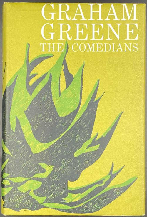 DJ: Graham Greene | THE COMEDIANS || Title page: THE COMEDIANS | Graham Greene | {four lines citation from Thomas Hardy} | {publisher’s device} | THE BODLEY HEAD| LONDON || Edition: 1st edition, 1st printing. Binding: bound in green cloth, 20.5 x 13.5 cm, with gilt lettering to spine, in green pictorial dust jacket with white lettering, price clipped; gift autograph to fep: “To. | Richard | From: gig | Xmas 1964.” (sic., the book was published in 1966!) Pagination: [1-4] 5-313 [314 blank] [6] blanks (total 320 pages). Collation: 16mo; [A]4 B-K16 L12 (total 160 leaves).
 -
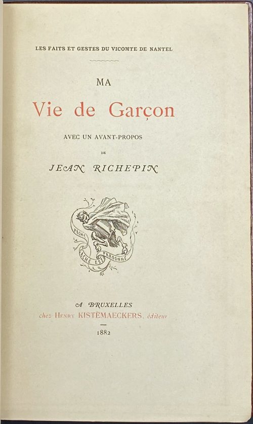 The text attributed to Claude-Prosper Jolyot de Crébillon, dit Crébillon fils (French, 1707 – 1777) or to Anne Claude de Caylus (French, 1692 – 1765). A hardcover volume, 21 x 13.5 cm, collated in-12mo, bound by H. Blanchetière in full crushed brown morocco, spine with raised bands, gilt lettering “VICOMTE | DE NANTEL | – | MA VIE | DE | GARÇON” and “BRUXELLES | 1882” in the bottom compartment; gilt double-fillet to cover margins, six gilt fillets inside, woven silk endpapers, marbled flyleaves, original publisher’s wrappers preserved; the bookplate of Henri Bosc to f.e.p. verso (monogrammed by Martin Van Maële), bookplate of J.-P. Dutel to flyleaf, 18 x 9 cm manuscript list of illustrations tipped in (lettered “12 aquarelles originales | de Martin Van Maële” on top), all margins gilt; printed on tinted paper. Collation: [1] front wrapper lettered in red and black, [1] half-title with limitation to verso, frontispiece by Amédée Lynen, verso inscribed by Van Maële to Bosc, meaning “A jewel for a most sympathetic and sensitive connoisseur Mr H. Bosc”, signed; [1] t.p. in red and black/blank, 06 (pp. [i]-xii) Avant-propos by Jean Richepin, 1-116 (pp. [5]-116) 124 (pp. 117-143, [144] colophon) [1] back wrapper w/advert (Extrait de Gil Blas), spine w/price 10 Fr.; 12 watercolours by Van Maële extraneous to collation, all signed “with his full name in a flowery script”, as per S. A. Perry. Title-page / Cover (red and black): LES FAITS ET GESTES DU VICOMTE DE NANTEL | ~ | MA | Vie de Garçon | AVEC UN AVANT-PROPOS | DE | JEAN RICHEPIN | {publisher’s device} | A BRUXELLES | Chez Henry KISTEMAECKERS, éditeur | – | 1882 || Worldcat : xii, 143 pages frontispiece 20 cm; OCLC Number / Unique Identifier: 5887998. Limitation: 300 copies on papier teinté, 10 copies on papeir du Japon. This is a unique copy enriched with 12 original watercolours by Martin Van Maële. Colophon: ACHEVÉ D’IMPIMER | le 30 mai 1882. | par A. LEFÈVRE, a BRUXELLES | {printer’s device} | POUR | Henry Kistemaeckers, Editeur | à Bruxelles. || Catalogue raisonné: S. A. Perry (2015) № 89 / [LIB-2920.2022] Sheryl A. Perry. Martin van Maële: An illustrated bibliographical checklist. — Las Vegas, 2021. Ref: The Erotica Bibliophile. Contributors: Jean Richepin (French, 1849 – 1926) – author (avant-propos). Maurice François Alfred Martin van Maële [Martin van Maële] (French, 1863 – 1926) – artist. Amédée Ernest Lynen (French, 1852 – 1938) – artist (frontispiece). Henry Kistemaeckers (Belgian, 1851–1934) – publisher. Henri Bosc [Henri Marie Joseph Danviolet] (French, 1884 – 1967) – provenance. J.-P. Dutel description: [Claude-Prosper Jolyot de CRÉBILLON ?]. LES FAITS ET GESTES DU VICOMTE DE NANTEL. MA VIE DE GARÇON. Avec un avant-propos de Jean Richepin. Bruxelles, Henry Kistemaeckers. 1882. In-8 (202 x 120 mm) de XII, 143 pp. et [1] p. Maroquin brun, dos à 5 nerfs, filets dorés sur les coupes et les bordures intérieures, tranches dorées, gardes en moire, double-gardes en papier, couverture et dos conservés. (H. Blanchetière). Le texte est attribué à Claude-Prosper Jolyot de Crébillon, dit Crébillon fils, (1707-1777). Cette édition fut publiée en 1882 à Bruxelles par Kistemaeckers et est ornée d’unfrontispice d’A. Lynen. TIRAGE : 10 ex. sur japon. 500 ex. sur papier teinté. UN DES 500 EXEMPLAIRES SUR PAPIER TEINTÉ ORNÉ DE 12 AQUARELLES ORIGINALES HORSTEXTE SIGNÉES PAR MARTIN VAN MAELE.
 -
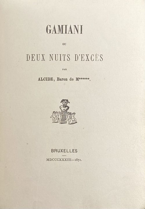 Single volume, 19.2 x 14.2 cm, bound in ¾ dark blue morocco over peacock marbled boards, gilt double-fillet border, spine with gilded raised bands, gilt fleurons and lettering, marbled endpapers, top margin gilt, outer margin uncut; text printed on watermarked laid paper; frontispiece by Félicien Rops, plates by Félix Lukkow after original lithographs by Devéria and Henri Grévedon or Octave Tassaert for the 1833 edition (1926 re-print LIB-3135.2023); the plate with the ape may be considered 'after edition of 1864' (LIB-3087.2022). Collation: π2 (h.t., t.p.) [a]8 1-712 96, total 64 leaves plus etched frontispiece in sanguine after page 8 and 12 engraved plates on India paper; illustrations include six burin engravings printed in two versions each, black and red, all six by Félix Lukkow after Devéria and Grévedon. Pagination: [4] [i] ii-viii, [1] 2-116, total 128 pages, ils. Title-page: GAMIANI | OU | DEUX NUITS D’EXCES | PAR | ALCIDE, Baron de M******. | {publisher's device} | — | BRUXELLES | MDCCCXXXIII—1871. || Limitation: Print run of 150 copies of which one unique on peau de vélin, 130 on laid paper (papier vergé), 5 on papier album jaune, 4 on papier de Chine, 10 on papier fort de Hollande. This is copy № 3, on Van Gelder laid paper, watermarked (possibly this is what they call ‘papier fort de Hollande’). Catalogue raisonné: Dutel I: A-472; Pia 520. Ref.: BNF Enfer 66. Contributors: Alfred de Musset (French, 1810 – 1857) – author. Félicien Rops (Belgian, 1833 – 1898) – artist. Félix Lukkow (French, fl. c. 1870 – 1875) – engraver. Vital Puissant (Belgian, 1835 – 1878) – publisher. Catalogue Poulet-Malassis & ses amis description: № 58. [Alfred de MUSSET - Félix LUKKOV] Alcide, baron de M******. Gamiani ou Deux nuits d’excès. Bruxelles, M DCCC XXXIII - 1871 [Vital Puissant]. In-8 de 2 .n.ch, viii, 116 pages, demi-chagrin bleu à coins, dos à nerfs orné, lets dorés et à froid sur les mors, tête dorée, tranches naturelles, non rogné (reliure de l’époque). Illustré de 7 gravures sur Chine, dont une en frontispice, en double état (sauf le frontispice) par Félix Lukkov, d’après les gravures de Félicien Rops. Tirage à 150 ex. L’un des 10 ex. tirés in-8, sur grand papier fort de Hollande (n° 3). Bibliographie : Pia 561, Per 16-14, Enfer 66, Dutel A-472.
 -
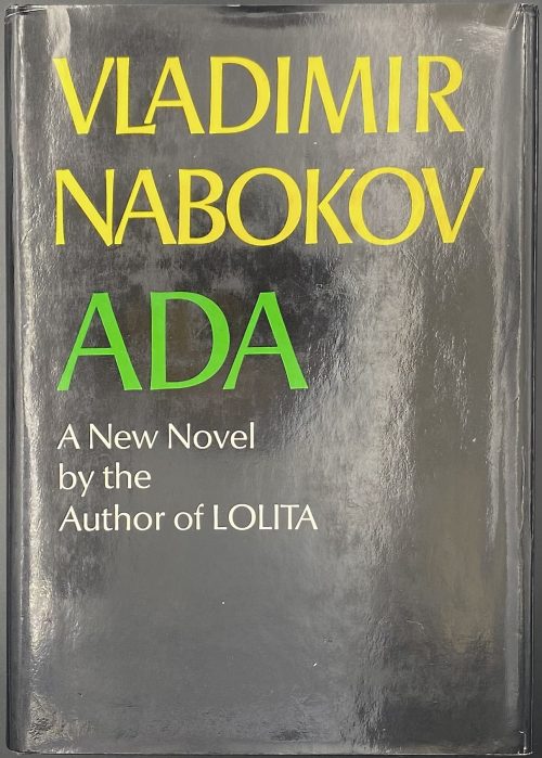 Hardcover volume, 21.8 x 15.5 x 6 cm, bound in black cloth with blind-stamped lettering to front and gilt lettering to spine, yellow endpapers, outer margin trimmed rough, pp.: [i-xiv] h.t./blank, advert./blank,t.p./copyright, dedicat./family, family/blank, edit./blank, [1-2] f.t./blank, 3-589 [5 blanks]; 608 pp (304 leaves) total; blue ink ms to fep “…from the Pembroke College Club of New York”; in a black dust jacket with yellow and green lettering to front and spine, portrait to back, unclipped $8.95. Title-page: VLADIMIR | NABOKOV | ADA | OR ARDOR: | A FAMILY | CHRONICLE | McGraw-Hill Book Company • New York • Toronto || Nabokov, Vladimir [Набоков, Владимир Владимирович] (Russian-American, 1899 – 1977)
 -
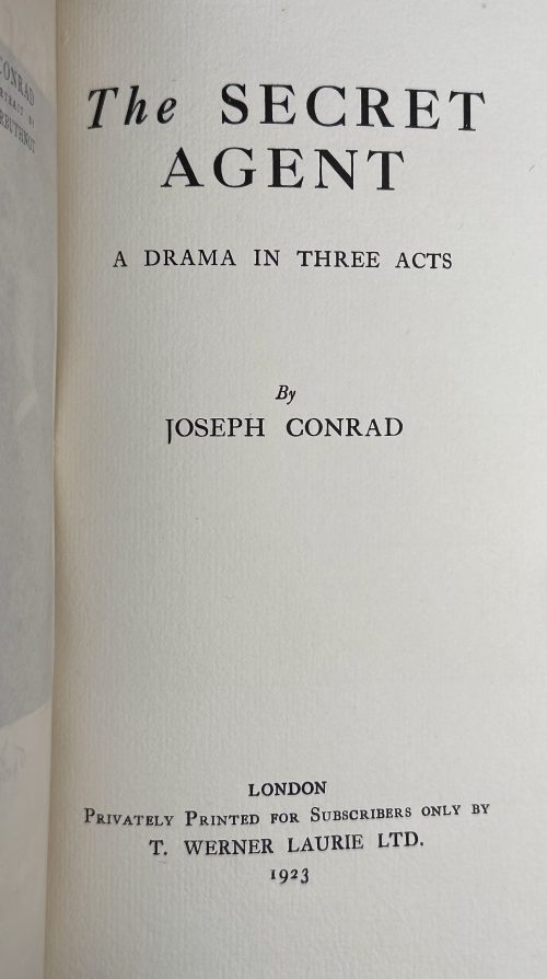 Hardcover volume, 24 x 15 cm, bound in quarter parchment over pale blue cloth, paper label to spine, pale blue dust jacket with a paper label, another label bound in at the end, printed on thick laid paper, untrimmed, uncut, pp. [4] blank, [2] blank/advert., [2] h.t./blank, t.p./imprint (riverside press Ltd.), [2] limitation/blank, [2] persons/blank, [1] 2-185 [3], photogravure portrait frontispiece by Emery Walker with captioned tissue guard. Title-page: The SECRET AGENT | A DRAMA IN THREE ACTS | by | JOSEPH CONRAD | LONDON | Privately Printed for Subscribers ONLY BY | T. WERNER LAURIE LTD. | 1923 || Edition: Limited edition of 1,000 copies sighed by the author; this is copy № 12. Catalogue Raisonné: Keating № 79 / p. 169. Seller’s Description: one of 1000 copies signed by the author, photogravure portrait frontispiece by Emery Walker, endpapers lightly browned, original parchment-backed boards, dust-jacket, spine lightly browned with 2 small staining spots, ends a little creased, uncut and unopened, overall an excellent copy, 8vo, 1923. Contributors: Joseph Conrad (Polish-British, 1857 – 1924) – author. Thomas Werner Laurie (British, 1866 – 1944) – publisher. Emery Walker (British, 1851 – 1933) – artist. The Riverside Press Limited (Edinburgh) – printer. First edition: [LIB-2762.2021] Joseph Conrad. The secret agent: a simple tale. — London: Methuen & Co., [1907]
 -
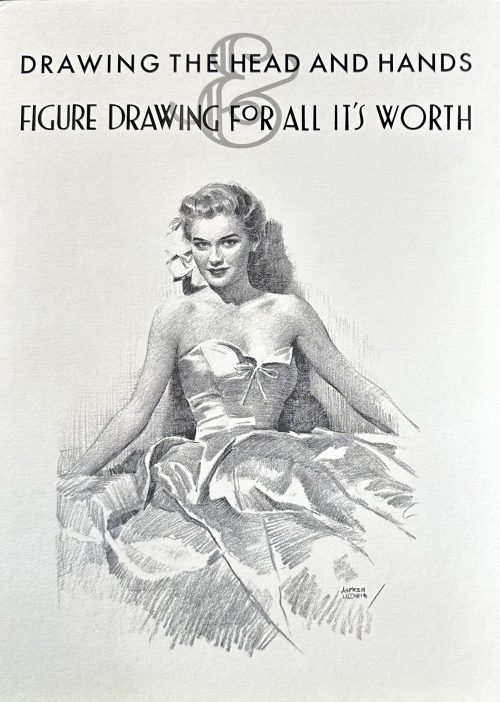 Cardboard box 32 x 23.7 cm with lettering and vignette to front, lettering to spine, and Loomis facsimile and Titan publisher's barcode label to back.
- Title-page: Drawing | THE HEAD AND HANDS | BY | ANDREW LOOMIS | {vignette} ||
- Title-page: FIGURE DRAWING | FOR ALL IT'S WORTH | ANDREW LOOMIS ||
-
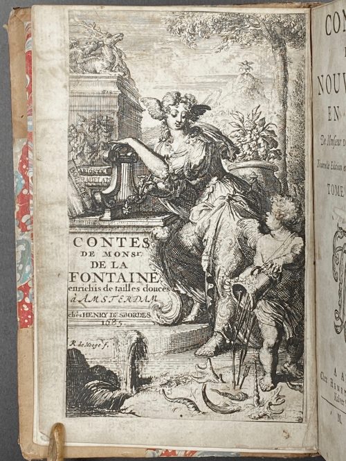 [Jean de LA FONTAINE]. Contes et nouvelles en vers. De Monsieur de La Fontaine. Nouvelle édition enrichie de tailles-douces. À Amsterdam | Chez Henry Desbordes, MDCLXXXV [1685]. — 2 vol. in 1. Pagination: [1] - frontispiece with pasted illustr., [*1] - title p. with blank verso, *2-*5 (only recto numbered) - advertisement, [1] - preface vol. 1, [2] table, 1-236; [6] - preface vol. 2, 1-216, illustr. (in text). Etched frontispiece plate and 58 half-page etchings at the head of each chapter as well as endpiece vignettes, all by R. de Hooge (Romeyn de Hooghe, 1645 – 1708, a Dutch painter, sculptor, engraver and caricaturist. First illustrated edition. "Publication of the scandalous fables was forbidden in France from 1674. According to Van Eeghen, this edition was published without the knowledge of La Fontaine. ...This is the edition with ‘Le Juge de Nêle’ (instead of Mesle) in the contents of the first volume, as well as page 211 for 'Dissertation sur la Joconde'; 16 lines of text on page 211; and 19 lines of text on the first page of the preface of volume 2" [1]. Pott 8vo (15.4 x 10 cm), hardcover; owner's later tan polished half-calf, marbled boards, marbled pastedowns and flyleaves, 5 raised bands, dark brown labels with gilt lettering and gilt roll patterns on spine, tail of the spine slightly damaged. Corners bumped, spotted stains on leather. Henri Desbordes (d. ca. 1722) was a Huguenot printer who was exiled from his business in France and set up as a publisher in Amsterdam in the 17th century.