-
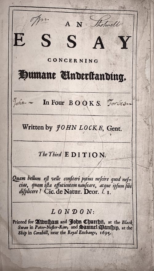 Title: AN | ESSAY | CONCERNING | HUMANE UNDERSTANDING, |—| In Four BOOKS. |—| Written by JOHN LOCKE, Gent. |—| The Third EDITION. |—| Quam bellum est velle confiteri potius nescire quod nes- | cias, quam ista effutientem nauseare, atque ipsum sibi | displicere! Cic. De Natur. Deor. l. I. |—| LONDON: | Printed for Awnsham and John Churchil, at the Black | Swan in Pater-Noster-Row, and Samuel Manship, at the | Ship in Cornhill, near the Royal Exchange, 1695. Collation: [π2]-b6, a-c4, B-Z4 Aa-Zz4 Aaa-Fff4 Ggg-Iii2 Pagination: [40] 1-407 [13]. Catalogue raisoné: The works of John Locke; a comprehensive bibliography from the seventeenth century to the present. Compiled by John C. Attig. Series: Bibliographies and Indexes in Philosophy, Number 1. Greenwood Press, Westport, CT & London, England, 1985. p. 42, №230 provides for pagination [40] 407, [13]p. Page by page reprint of 1694 edition. Regarding the epigraph on t.p.: The correct citation from , De Natura Deorum: "Quam bellum erat, Vellei, confiteri potius nescire, quod nescires, quam ista effutientem nauseare atque ipsum sibi displicere." [How delightful it would be, Velleius, if when you did not know a thing you would admit your ignorance, instead of uttering this drivel, which must make even your own gorge rise with disgust!] This life-time edition was presented as a gift to Dr Elisha Atkins (1949 – 2019), professor at Yale University School of Medicine, on July 1st, 1967, by his students, namely Carolyn Wells [Bush] (1923 – 2013), John Mooney (now a psychiatrist in Boston), and Charles Dinarello. Size: 32 x 23 cm Binding: Fill modern morocco, panelled and ruled gilt, raised bands, gilt in compartments, red label with gilt lettering; in a slipcase.
 -
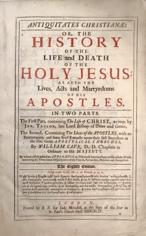 Title (black and red): ANTIQUITATES CHRISTIANÆ: |—| OR, THE | HISTORY | OF THE | LIFE AND DEATH | OF THE | HOLY JESUS: | AS ALSO THE Lives, Acts and Martyrdoms | OF HIS | APOSTLES. |—| IN TWO PARTS. |—| The Firƒt Part, containing The Life of CHRIST, written by | Jer. Taylor, Late Lord Bishop of Down and Connor. | The Second, Containing The Lives of the APOSTLES, with an | Enumeration, and ƒome Brief Remarks upon their firƒt Successors in | the Five Great APOSTOLICAL CHURCHES, | By WILLIAM CAVE, D. D. Chaplain in | Ordinary to His MAJESTY. | By whom alƒo is added an APPARATUS, or Diƒcourƒe Introductory to the whole Work, | concerning the Three Great Diƒpenƒations of the Church, Patriarchal, Moƒaical, and Evangelical. |—| THE EIGHTH EDITION. |—| Orig. contr. Celƒ. lib. 1. in Proœm. p. 1, 2. | [text in Greek] |—| LONDON, | Printed by R. N. for Luke Meredith, at the Sign of the Star in | St. Paul's Church-Yard, MDCXCIV. Collation of this book is unusual, it is called "Folio in 6s" (three sheets are folded in half to create a gathering of 6 leaves). Two unsigned leaves: (1) Engraved frontispiece "The Annunciation" by Willian Faithorne "the Elder" (British, 1616 – 1691), recto blank; (2) engraved title by the same engraver, verso blank; (*) gathering of 4: black and red title page, verso blank; epistle; to reader; imprim. (A6 to Sƒ6) Engraved portrait of Jeremy Taylor by Pierre Lombart (French, 1612 – 1682); faux title page: "The Great Exemplar of Sanctity and Holy Life... MDCXCIII"; dedication; contents, then to the end of the first book. (A-Z4 Aa-Bb4 Cc2) The second book has collation in quarto: Faux title page: "Antiquitates Christianæ: or the Lives, Acts and Martyrdoms... MDCXCIV", etc. to the end. Full formula: π2 *4 a-c6 d8 A-Z6 Aa-Sƒ6 A-Z4 Aa-Bb4 Cc2 Pagination: [12] I-LI [LII] [12] I-XXVIII, i-vi, (1st book): [2] I-145 [146-150] 151-432 [12]; (2nd book): [8] i-xiv, 1-188. 22 plates : frontis., t.p., portrait, one folding before p. 65, two after pp. [146], [150], 282, 304, 364, 386, 414, [422], and numerous head-pieces. Size: 36 x 23.5 x 5.7 cm Binding: full calf with the later spine, raised bands; front board with remnants of gilt ruling and blind stamped border, back bord probably original with a blind-stamped centre panel with fleurons.
 -
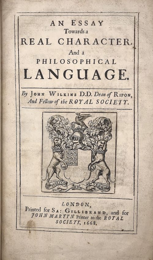 Title: AN ESSAY | Towards a | REAL CHARACTER, | And a | PHILOSOPHICAL | LANGUAGE. | By John Wilkins D.D. Dean of Ripon, | And Fellow of the ROYAL SOCIETY. |—| [armorial device] |—| LONDON, | Printed for Sa: Gellibrand, and for | JOHN MARTYN Printer to the ROYAL | SOCIETY, 1668. Pagination: [2] blank/order, [2] t.p./blank, [16], 1-454; + 79 leaves of Dictionary, unpaginated (158 pages); Illustrations: folding plates before pp. 167, 187, and two folding plates before p. 443. Collation: π2 a-d2 B-Z4 Aa-Zz4 Aaa-Lll4 Mmm3 aaa4 Aaa-Sss4 ttt3 Size: 4to, 32 x 20 x 5 cm; Binding: Full speckled calf, later polished calf spine with raised bands, double fillet ruled gilt compartments, crimson label with gilt lettering, margins sprinkled red. The work of John Wilkins is dedicated to the problem of the universal language. Wilkins was the Dean of Ripon from 1663 to 1672 and one of the founders of the Royal Society.
 -
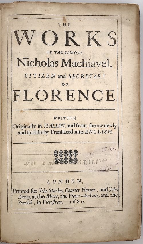 Title: THE | WORKS | OF THE FAMOUS | Nicholas Machiavel, | CITIZEN and SECRETARY | OF | FLORENCE. |—| WRITTEN | Originally in ITALIAN, and from thence newly | and faithfully Tranſlated into ENGLISH. |—|[ornament]|—| LONDON, | Printed for John Starkey, Charles Harper, and John | Amery, at the Miter, the Flower-de-Luce, and the | Peacock, in Fleetstreet. 1680. Content: (1) The history of Florence; (2) The Prince; (3) The Original of the Guelf and Ghibilin Factions; (4) The Life of Castruccio Castracani; (5) The Murther of Vitelli, etc. by Duke Valentino; (6) The State of France; (7) The State of Germany; (8) The Discourses on Titus Livius; (9) The Art of War; (10) The Marriage of Belphegor, a Novel; (11) Nicholas Machiavel's Letter in Vindication of Himself and His Writings. Pagination: ffl, 24 unnumbered pages before the first numbered: [2] – tp / license], [2] – contents / blank], [2] ftp “Florence” / blank, [3] – epistle to Clement VII, [3] – introduction, [12] – table; Misnumbering (X instead of Y format – X/Y): History of Florence: 1- 28/24, 19/91, 198/98, 180/108, 190/109, 174/164, 175/ 165, 179/169, 180/170, 185/175, 186/176, 188/178, 189/179, [190/180 blank]; The Prince, Lucca, State of France: [4] 199-262; State of Germany: 256/263, 266/264, 267/265 [268/266]; Discourses: [4] 267-314, 317-431 [432]; Art of War: [4] 433-528; [4] – publisher, [12] –Machiavelli’s letter, bfl. Collation: π3 Aa3 b-d2 B-Z4 Aa-Bb2 Cc-Zz4 Aaa-Yyy4 (*)-(**)4 Binding: Original mottled leather boards with embossing, later leather spine with 5 raised bands, crimson label with gilt lettering. Size: 32.4 x 21.0 x 4.0 cm Provenance: Bradford H. Gray This is the second edition; despite misnumbering, the collation is correct and all pages present. The first edition of this book was published in 1675 by Robert Bolter (British, fl. 1666 – 1683).
 -
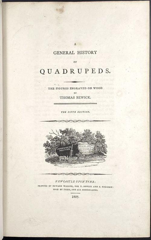 Title: A | GENERAL HISTORY | OF | QUADRUPEDS. | – | THE FIGURES ENGRAVED ON WOOD | BY | THOMAS BEWICK. | — | THE FIFTH EDITION | {vignette} | NEWCASTLE UPON TYNE: | PRINTED BY EDWARD WALKER, FOR T. BEWICK AND S. HODGSON: | SOLD BY THEM, AND ALL BOOKSELLERS. | 1807. Pagination: [2 blanks], [i, ii] – t.p. / blank], [iii, iv] – advertisement, [v] vi-x – index, [1] 2-525 [526 advert. of British Birds] [2 blanks]. Collation: Royal 8vo in fours; π (engraved title), a4 A-3T4 χ3T3. F2 signed 2F, 2E2 unsigned, p. 131 numbered correctly, p. 257 numbered 572. Size: 26 x 17 cm; page 24.5 x 16 cm (royal). Woodcuts: 302 descriptions of quadrupeds, 225 figures and 112 vignettes, tail-pieces, etc. Binding: Full diced brown calf, embossed blind corner fleurons, gilt-tooled border inside and outside, AEG, spine with raised bands, gilt in compartments, lettering; binding restored; armorial bookplate "Thorpe" to front pastedown. Likely to be Thomas Thorpe (1791 – 1851), a prominent bookseller in London: Bedford Street, Covent Garden; started in 1818, went bankrupt on Dec. 31, 1825. Thorpe's family coat of arms: stag standing on a crown and a lion rampant. Catalogue raisonné: S. Roscoe (1953): pp. 23-27. Hugo (1866): pp. 22-24.
 -
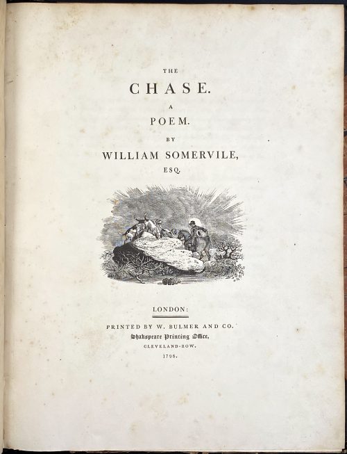 Royal 4to, 29.8 x 23.5 cm, contemporary half brown morocco, marbled boards gilt ruled, spine with gilt-ruled raised bands, gilt title lettering; "William Gore" armorial bookplate to front pastedown. Title page: THE | CHASE. | A | POEM. | BY | WILLIAM SOMERVILLE, | ESQ. | [VIGNETTE] | LONDON : | PRINTED BY W. BULMER AND CO. | Shakespeare Printing Office, | CLEVELAND-ROW. | 1796. Collation: without signatures. — Pagination: [i-v] vi-xv [xvi], [i] ii-vii [viii], [1-5] 6-126; illustrations: engraved title, 4 running titles, 4 headpieces, 4 tailpieces – 13 altogether, all drafted by John Bewick, 12 executed by Thomas Bewick and the last one by Charlton Nesbit. Catalogue Raisonné: Thomas Hugo. The Bewick Collector, vol. 1 (1866): p. 38, № 94: "The first edition... was printed in royal 4to". John Bewick made all the drawing on the blocks but was not able to execute the engravings himself "because of ill-health. They were engraved by Thomas Bewick, with the exception of the tail-piece at the end of the volume, which was engraved by Nesbit". Thomas Bewick (c. 11 August 1753 – 8 November 1828); John Bewick (1760 – 1795), the younger brother of Thomas, died at the age of 35. Christie's, who sold a similar copy on 29 Oct 2012, provides for the size 2°.
 -
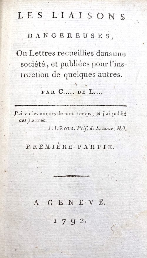 Four parts bound in two 18mo volumes (1-2 & 3-4), half polished brown calf, dot-ruled, flat spine with gilt bands and lettering, marbled boards, some plates with guard sheets, margins sparkled red. Title-page: LES LIAISONS | DANGEREUSES, | Ou Lettres recueillies dans une | société, et publiées pour l’ins- | truction de quelques autres. | par C….. de L… | — | J’ai vu les mœurs de mon temps, et j’ai publié | ces Lettres. | J. J. Rous. Préf. De la nouv. Hél. | PREMIÈRE PARTIE. | — | A GENEVE. | 1792. || Vol. 1: Pagination: ffep, blank, [2] – h.t., [i, ii] – t.p. part one, [iii] iv-xxij, [1] 2-245 [246] + 2 plates (p. 26 & p. 75); [1, 2] – h.t., [3, 4] – t.p. part two, [5] 6-233 [234], fep + 2 plates (p. 59 & p. 222). Collation: part 1: a12, A-M18 N5; part 2: A-M18 N9, plus four plates by various engravers after Le Barbier. Vol. 2: Pagination: ffep, blank, [1, 2] – h.t., [3, 4] – t.p. part three, [5] 6-225 [226] + 2 plates (p. 69 & p. 215); [1, 2] – h.t., [3, 4] – t.p. part four, [5] 6-250, fep + 2 plates (p. 25 & p. 201). Collation: part 3: A-M18 N5; part 4: A-N18 O5, plus four plates by various engravers after Le Barbier. Illustrations: After Le Barbier, engravers: Halbou (1), Simonet (1), N. Thomas (2), Dambrun (2), and Delignon (2). In the first illustration (vol. 1, part one, p. 26) Le Barbier signed “Le Barbier Jnv. 1794”, however, the edition was published (anonymously) in 1792. Cohen-De Ricci mentions an edition of 1794 (Paris: Maradan) and 1801 (Genéve) with the same plates. Lewine mentions a reprint of 1794 without naming the publisher. Catalogue raisonné: Cohen-De Ricci: 234-5, Ray: p. 79; Lewine: 109-10. Contributors: Choderlos de Laclos, Pierre Ambroise François (French, 1741 – 1803) – author. Le Barbier, Jean-Jacques-François (French, 1738 – 1826) – artist Engravers: Dambrun, Jean (French, 1741 – c. 1808) Delignon, Jean Louis (French, 1755 – 1804) Halbou, Louis Michel (1730 – 1809) Thomas, N. (French, c. 1750 – 1812) Simonet, Jean-Baptiste Blaise (French, 1742 – 1813)
 -
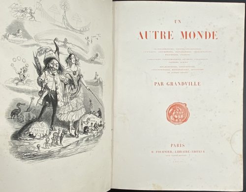 Description: One volume, collated 4t0, 27.3 x 20 cm, bound in contemporary quarter black chagrin, gilt ornaments and lettering to spine (reliure à l'époque romantique), marbled end-papers; printed on wove paper (vélin fort). Title-page (red): UN | AUTRE MONDE | TRANSFORMATIONS, VISIONS, INCARNATIONS | ASCENSIONS, LOCOMOTIONS, EXPLORATIONS, PÉRÉGRINATIONS | EXCURSIONS, STATIONS || COSMOGONIES, FANTASMAGORIES, RÈVERIES, FOLATRERIES | FACÉCIES, LUBIES || MÉTAMORPHOSES, ZOOMORPHOSES | LITHOMORPHOSES, MÉTEMPSYCHOSES, APOTHÉOSES | ET AUTRES CHOSES | PAR GRANDVILLE | [device] | PARIS | H. FOURNIER, LIBRAIRE-ÉDITEUR | RUE SAINT-BENOIT, 7 | M DCCC XLIV Pagination: ff, [2] half-title in red / imprim., [2] blank / frontis. in black, [2] title page in red / blank, [1] 2-295, [1] explication and erratum, bf, illustrations. Collation: 4to, (1)-(37)4 with frontispiece, 133 woodcut vignettes, 15 full-page black woodcuts, and 36 hand-coloured plates. Catalogue raisonné: Carteret (p. 285) describes the book as 'in-8', but the collation is actually in quarto (in-4, or 4to) with series signed in Arabic numerals. Ray (French): p. 275-7. The publication is anonymous, however, Grandville reveals the author's name (that's Taxile Delord) on the vignette on p. 292 at the bottom of the plate (under ICI).
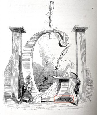
-
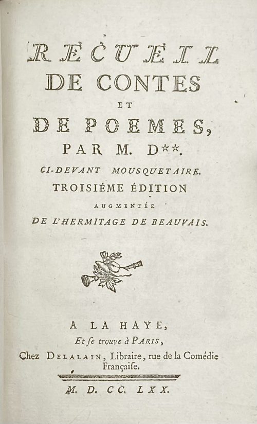 Title page: RECUEIL | DE CONTES | ET | DE POEMES, | PAR M. D**. | CI-DEVANT MOUSQUETAIRE. | TROSIÉME ÉDITION | AUGUMENTÉE | DE L'HERMITAGE DE BEAUVAIS. | [device] | A LA HAYE, | Et se trouve à Paris, | Chez Delalain, Libraire, rue de la Comédie | Française. | — | M. D. CC. LXX. IRZA | ET MARSIS , | POËME, includes: L'isle merveilleuse, Poëme, Chant 1re et Chant 2nd, Invocation a La Fontaine, and Alphonse, Conte – Cohen and De Ricci (#317) describe 2nd edition by the same publisher, 1769, 77 p., with similar illustrations after Charles Eisen: (1) engraved title by Louis Claude Legrand (2) L’Isle 1er: Frontispiece by Joseph de Longueil, (3) headpiece and (4) tailpiece by Emmanuel de Ghendt, and (5) L’Isle 2nd: Frontispiece by Jean Massard, (6) headpiece by Emmanuel de Ghendt + (7) tailpiece unsigned. Les Cerises et la Méprise, Contes en vers – Cohen and De Ricci (#311) also describe the 2nd edition of 1769, with the same (8) frontispiece by De Longueil after Eisen. Sélim et Sélima, Poeme imité de l'allemand; L'hermitage de beauvais, Conte –Cohen and De Ricci (#322) describe edition of 1769 by Sébastien Jorry, with the same (9) frontispiece by Emmanuel de Ghendt after Eisen. Size: 18.6 x 12.3 cm, small 8vo. Binding: polished, multi-coloured stained calf with gilt triple fillet border to boards; gilt floral arabesque and gilt lettering to flat spine: "Oeuvres de Dorat | Contes"; all edges gilt; blue-and-white marbled endpapers. Pagination: ffl, [2] IRZA ET MARSIS engraved half-title / blank, [1-2] - RECUEIL title page / blank, 3-8 (avis sur cette édition); [1 - L'Isle...] 2-184, bfl; Illustrations (copperplate engravings): 5 plates, 2 headpieces and 2 tailpieces. Collation: Octavo; a8 (title and avis sur cette édition); A-L8, M4. Author of the text: Claude Joseph Dorat, (French, 1734 – 1780) Artist: Charles-Dominique-JosephEisen (French, 1720 – 1778) Engravers: Emmanuel Jean Nepomucène de Ghendt (French, 1738 – 1815) Louis Claude Legrand (French, 1723 – 1807) Joseph de Longueil (French, 1730 – 1792) Jean Massard (French, 1740 – 1822)
 -
 Title page: LES | BAISERS , | PRÉCÉDES | DU MOIS DE MAI, | POËME. | [vignette] | A LA HAYE , | Et se trouve à Paris | Chez Lambert , Imprimeur, rue de la Harpe. | Et Delalain , rue de la Comédie Françoise. | M. DCC. LXX Size: 8vo; 24.5 x 15.5 cm; Binding by Hippolyte Duru – stamp at the back of the front end paper DURU, 1855; full red calf, boards decorated in gilt, raised bands and gilt decorations in compartments, gilt lettering, AEG, peacock marbled end papers, text and illustrations printed on Holland paper. Collation: 2 ffls, engraved half-title by N. Ponce after Ch. Eisen, frontispiece by Etienne Fessard after Claude-Jean-Baptiste Hoin (French, 1750 – 1817) w/guard tissue, t.p. by J. Aliamet after Ch. Eisen, Réflexions préliminaires: A8, B4; 'Le Mois de Mai' half-title, imprim. note on verso, frontispice by De Longueil after Ch. Eisen w/guard tissue, A4 C-F(8) H4; 2bfls. Frontispiece by Etienne Fessard is unique in this edition. Pagination: [2] 3-24, [27]/28, 5/6, 31/32 31/34 11/12 37-119 [120], 22 head-pieces after Ch. Eisen and 22 end-pieces after Marillier, engraved by Baquoy, Binet, Delaunay, Lingée, De Longueil, Masquelier, Massard, and Née. Mistakes in pagination likely confirms first printing first edition. Catalogue raisonné: Cohen, De Ricci (1912): 308-311). Artists: Charles Eisen (French, 1720–1778); Clément Pierre Marillier (French, 1740–1808), and Claude-Jean-Baptiste Hoin (French, 1750–1817). Engravers: Jacques Aliamet (French, 1726–1788); Jean Charles Baquoy (French, 1721–1777); Louis Binet (French, 1744–about 1800); Nicolas Delaunay (French, 1739–1792); Etienne Fessard (French, 1714–1777); Charles Louis Lingée (French, 1748–1819); Joseph de Longueil (French, 1730–1792); Louis Joseph Masquelier (French, 1741–1811); Jean Massard (1740–1822); François Denis Née (French, 1735–1818); Nicholas Ponce (French, 1746–1831).
 -
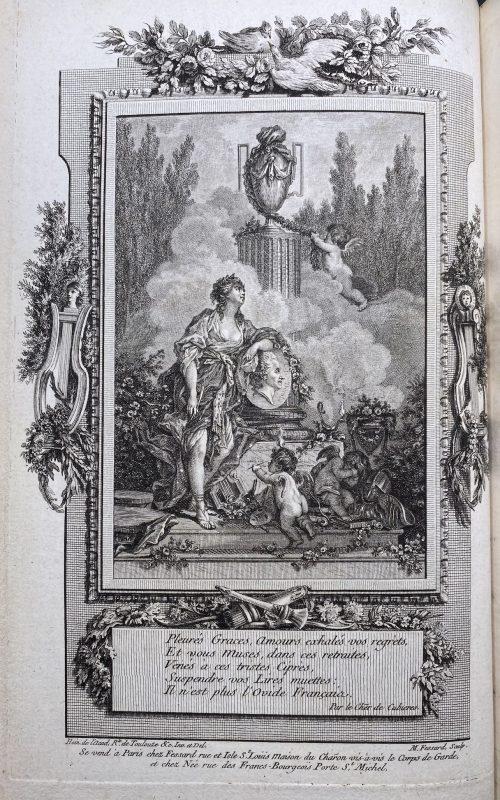
 Title: FABLES | DE | M. DE FLORIAN , | de l’académie françoise, de celles de Madrid , | Florence, etc. | — | Je tâche d'y tourner le vice ridicule , | Ne pouvant l'attaquer avec des bras d'Hercule. | La Font. Fables , liv. V , I. — | [publisher's device ] | A PARIS, | DE L'IMPRIMERIE DE P. DIDOT L'AINÉ, | 1792. Pagination: ffl, [2 - h.t. / Imp.] [2 - blank / frontis.] [2 - tp. / blank] [5] 6-224 [2 - advert. / blank], bfl. Collation: numbered 1(5), 2-18(6), 19(3); engarved frontispiece portrait of Florian after François Hüet-Villiers, 5 engraved plates by Longueil, Delignon, and Gaucher after Flouest. Binding: Contemporary full mottled calf, all margins red, gilt floral ornaments to flat spine, red label with gilt lettering. Catalogue raisonné: Cohen, de Ricci 1912: p. 398-9.
 -
 Title page: Text engraved within a vignette with two naked female torses in garlands: Plãs et profilz | des principales villes de | la prouince de L'ISLE DE | FRANCE, auec la carte gene~ | rale & les particulieres de chaf~ | cun gouuernement d'icelles. Below handwritten pencil inscription by a previous owner: "par ... Tassin ... 1634". Size: 17.6 x 23.7 cm, Binding: Italian style, green half-vellum, burgundy morocco title label with vertical gilt lettering to spine, peacock marbled boards. Pagination: Two blank flyleaves in the front and two in the back; 18 numbered engraved plates, including:
- Title page
- Table of Contents
- Normandie
- Environs de Paris
- Folding map of Paris – a simplified copy of Mathieu Merian's 1615 perspective plan, with minor updates, notably on the current housing estate of Ile Saint-Louis.
- Paris
- Gouvernment de Soissons
- Soissons
- Gouvernment de Beauvais
- Beauvais
- Gouvernment de Compiègne
- Compiègne
- Gouvernment de Noyon
- Noyon
- Gouvernment de Coussi
- Coussi
- Gouvernment de Senlis
- Senlis
-
 Vol. 1 title: OVID'S | METAMORPHOSES | IN LATIN AND ENGLISH, | TRANSLATED BY | THE MOST EMINENT HANDS. | With HISTORICAL EXPLICATIONS | Of the FABLES, | WRITTEN IN FRENCH BY | The ABBOT BANIER, | MEMBER OF THE ACADEMY OF INSCRIPTIONS | AND BELLES LETTRES. | TRANSLATED INTO ENGLISH. | Adorned with Sculptures, by B. Picart, and other able Masters. | VOLUME THE FIRST. | [Device] | AMSTERDAM, | Printed for the WETSTEINS and SMITH. | MD CC XXII || — Pagination: [26 – Half-title, frontis., t.p., dedic., The Bookseller's Preface To This Edition, Mr. Banier's Preface To The French Translation, Contents], [1] 2-247 – Text of books 1-7, with illus., [1 blank]. Vol. 2 half-title: OVID'S | METAMORPHOSES | IN LATIN AND ENGLISH | TWO VOLUMES || — Pagination: [2 – half-title / blank], 249-524 – Text of books 8-15, with illus., incl. 3 leaves of pl., [4 – Index]. Three leaves between pages 264 and 271 are included in the pagination as pp. [265-70] but do not carry page-numbers or letterpress text. They each carry two prints on their rectos and are blank on the verso. Vol. II without the engraved title page. The names of the translators are given in the list of Contents as Dryden, Addison, Eusden, Arthur Mainwaring, Croxall, Tate, Stonestreet, Vernon, Gay, Pope, Stephen Harvey, Congreve, Ozel, Temple Stanyan, , Catcot, Rowe, Samuel Garth, Welsted. The frontispiece is signed as made by B. Picart. The six plates on pages [265, 267, 269] are all signed as painted by C. Le Brun and engraved by Iakob Folkema. Of the 124 illustrations, most are unsigned by a draughtsman, but some are signed as designed by G. Maas, one as designed by Jul. Romain, two as designed by G. Maas and drawn by J. de Wit, one as drawn by 'HA', one as painted by C. le Brun, one as made by B. Picart, one as designed by P. Testa and drawn by B. Picart, one as designed by S. Le Clerc, one as designed by B. Picart. Many are signed by their engravers - Philip à Gunst (one as directed by B. Picart and engraved by Phil. à Gunst), J. Vandelaar (or I. Wandelaar), Martin Bouche, Jan Schenck, 'MB', Petr. Paul. Bouche, Iakob Folkema, W. Jongman, Fred. Bouttats. The title-page vignette of Volume I is signed as drawn by B. v. Overbeke and engraved by F. Mulder. Many tailpieces are signed 'VLS'. The book is dedicated by the publishers, R. and J. Wetstein and W. Smith, to the Countess of Pembroke. [Description is cited from the Royal Academy of Arts] Physical description: Two large 4to volumes, first title page printed in red and black, added engraved title in the first volume; half-title in the second volume; illustrated throughout with copperplate engravings in text; text printed in parallel columns in Latin and English; three leaves extraneous to collation each with two engravings in the second volume; bookplate pasted to the front endpaper in each volume: Ex Libris Theodore C. Tebbetts (Theodore Charles Tebbetts, American, 1871 – 1920) designed after Francis Carruthers Gould (British, 1844 – 1925); pages 517-520 of the second volume torn with loss of bottom blank corners and a word or two; original full leather, spines tooled elaborately in gilt; some boards detached, endcaps and corners rather worn, contents bright and fresh. Size: Large 4to; 47.5 x 31 cm.
 -
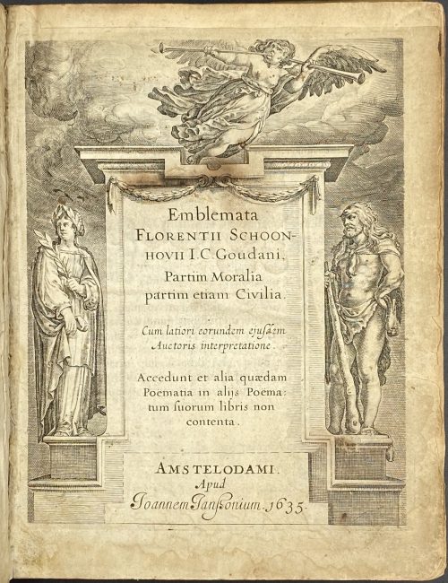 Title: Emblemata | Florentii Schoon~ | hovii I. C. Goudani, | Partim moralia | partim etiam Civilia. | Cum latiori eorundem ejusdem | Auctoris interpretatione. | Accedunt et alia quædam | Poëmatia in alijs Poëma | tum suorum libris non | contenta. | Amstelodami. | Apud | Joannem Janßonium •1635• Size: 20 x15.5 cm, small 4to Edition: 3rd edition (the first two editions being by Burier, Gouda, 1618 and by Elzevir, Leiden, 1626. Collation: ¶/*6, A-Z4, Aa-Ff4, Gg2. Pagination: [2] - enrgaved t.p. / blank, [6] - dedication, [2] - lectori benevolo, [2] - in commend. / frontis. engraved portrait of Gerardus Traudenius – academic/intellectual; author/poet (Dutch, fl. 1615 – 1623), 1-235. Illustrated with engraved title, portrait of dedicatee, and 74 engraved emblems by Crispijn van de Passe the Younger (1594/5 – 1670). Binding: bound in full contemporary Dutch blind-stamped parchment over thin boards, laced case construction, inked title to spine, no flyleaves, signature washed from the title, the blank margin of title trimmed away at head, slight marginal water stain to the first signature, front bottom board corner bumped.
 -
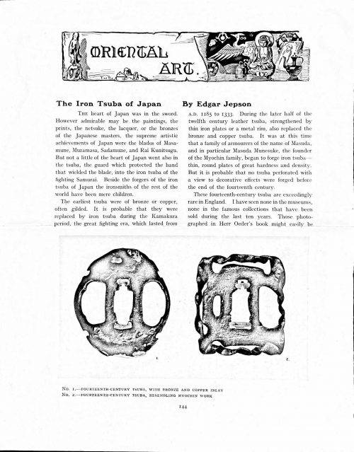 Magazine article by Edgar Jepson: The Iron Tsuba of Japan (Section: Oriental Art), published in volume Vol. 70 (September–December) of The Connoisseur: An Illustrated Magazine for Collectors, Vol. 70 (September–December); pp. 143-152 / C. Reginald Grundy [ed.] — London: Published by the Proprietor, W. CLAUSE JOHNSON, at the Editorial and Advertisement Offices of The Connoisseur, 1924. Owner's half black morocco, gilt lettering to spine, blue cloth boards. Two volumes bound together without original covers. Size 28.5 x 22 cm. Vol. 1: The Connoisseur | An Illustrated Magazine | For Collectors | Edited by C. Reginald Grundy | Vol. LXIX. | (MAY—AUGUST, 1924) | LONDON | Published by the Proprietor, W. CLAUSE JOHNSON, at the | Editorial and Advertisement Offices of The Connoisseur, | at 1, Duke Street, St. James's, S.W. 1 | 1924 || Pp.: [i-ii] iii-xviii [xix] [1, 2 - plate] 3-249 [250]. Vol. 2: The Connoisseur | An Illustrated Magazine | For Collectors | Edited by C. Reginald Grundy | Vol. LXX. | (SEPTEMBER—DECEMBER, 1924) | LONDON | Published by the Proprietor, W. CLAUSE JOHNSON, at the | Editorial and Advertisement Offices of The Connoisseur, | at 1, Duke Street, St. James's, S.W. 1 | 1924 || Pp.: [i-ii] iii-xxii [2 blanks] [1, 2 - plate] 3-261 [262]. The Iron Tsuba of Japan by Edgar Jepson The heart of Japan was in the sword. However admirable may be the paintings, the prints, the netsuke, the lacquer, or the bronzes of the Japanese masters, the supreme artistic achievements of Japan were the blades of Masamune, Muramasa, Sadamune, and Rai Kunitsugu. But not a little of the heart of Japan went also in the tsuba, the guard which protected the hand that wielded the blade, into the iron tsuba of the fighting Samurai. Beside the forgers of the iron tsuba of Japan the ironsmiths of the rest of the world have been mere children. The earliest tsuba were of bronze or copper, often gilded. It is probable that they were replaced by iron tsuba during the Kamakura period, the great fighting era, which lasted from A.D. 1185 to 1333. During the later half of the twelfth century leather tsuba, strengthened by thin iron plates or a metal rim, also replaced the bronze and copper tsuba. It was at this time that a family of armourers of the name of Masuda, and in particular Masuda Munesuke, the founder of the Myochin family, began to forge iron tsuba — thin, round plates of great hardness and density. But it is probable that no tsuba perforated with a view to decorative effects were forged before the end of the fourteenth century. These fourteenth-century tsuba are exceedingly rare in England. I have seen none in the museums, none in the famous collections that have been sold during the last ten years. Those photographed in Herr Oeder's book might easily be the fifteenth century. No. 1 is a curious cup-shape tsuba decorated with a bronze and copper inlay. No. 2, with its edges curiously twisted in the forging, looks like Myochin work. But it is not of the Myochin iron. The Myochin family produced some of the greatest ironsmiths of Japan. Armourers first of all, tsubasmiths, forgers of sake-kettles, articulated reptiles, crustacea, and insects — everything that can be done with iron they did; they pushed their medium to its limit. They were forging iron tsuba in 1160, and they were still forging them in 1860. And it was their own iron, or rather their own steel. They discovered the secret of it early, and they kept that secret in the family for all those hundreds of years. There is no mistaking a Myochin tsuba: balance it on your finger and tap it with a piece of metal, always it gives forth a clear bell-like ring that you get from the work of no other ironsmith, Japanese or European. Always the Myochin tsuba is before everything a protection to the hand of the swordsman; to that everything is, as it should be, subordinated. No. 3 is a Myochin tsuba of the fifteenth century, and probably of the early fifteenth century. No. 4, by Myochin Munetaka, perforated with a grotesque figure, is an example of that twisting and twisting of the iron in the forging till it forms a pattern like the grain of wood. The Myochin smiths invented these wood-grain tsuba, and no other smiths equalled them in their forging. In the sixteenth century, the fighting tsuba was probably at its best. It was a century of great tsubasmiths. Then the first Nobuiye, whose tsuba fetched £100 apiece, circa 1800, in Japan, and the first Kaneiye flourished. No. 5 is a tsuba forged by a great smith, Iyesada of Sotome, in the manner of Nobuiye I, decorated with the karakusa tendrils that Nobuiye delighted in, with lightning and clouds. No. 6 is a guard of Sanada Tembo, the chief smith of the Tembo family, stamped, punning fashion, with the character Tembo. Akin to the Tembo tsuba were those of the Kiami and Hoan smiths. Then also the Heianjo smiths and the Owari smiths, especially those of Nagoya and the Yamakichi family, forged their strongest tsuba. Those of the Yamakichi were tested after the forging by being pounded in iron mortars — at least, so the legend runs. But they were a sternly utilitarian family, and I have never seen a Yamakichi tsuba of any beauty. In the later half of the fifteenth century arose the fashion of decorating tsuba with an inlay, zogan, of bronze. The Heianjo tsuba, forged at Kyoto in the latter half of the fifteenth and the beginning of the sixteenth century, were often thus inlaid. The earliest of them were called "Onin", of which No. 7 is an example. In addition to the bronze inlay around the edge, it is inlaid with a representation, some say, of snow; others say, of the duckweed on a pond. No. 8 is probably a Heianjo tsuba, but I am not quite sure about it. The inlaid acacia branches might be very early Shoami work. But to judge by the iron, it is a fifteenth-century tsuba; and the authorities place the beginning of the Shoami school not later than early in the sixteenth century. No. 10 is an example of the Fushimi-zogan, a flat inlay of a light-coloured bronze. These tsuba took their name from the fact that they were first forged at Fushimi, in Yamashiro, in the sixteenth century. It is of the type known as Mon-zukashi, perforated with crests (mon) à jour. The Yoshiro-zogan tsuba were also first forged at Fushimi by Yoshiro Naomasa. They were distinguished from the Fushimi-zogan by the fact that their inlay was generally a little raised-not always-for the inlay of No. 9, a tsuba forged by a later nineteenth-century Yoshiro, is quite flat. It is an interesting tsuba, for, with its decoration grown florid and excessive, it marks the intermediate stage between the simple and delightful designs of the genuine fighting tsuba and the elaborate pictures in gold and silver on the tsuba of the eighteenth-century smiths of Awa and Kyoto, which have become mere ornaments of the goldsmith. The Gomoku-zogan (No. 11) tsuba were probably first forged earlier than the Fushimi and Yoshiro-zogan tsuba. This inlay, in slight relief, is a representation in a light-coloured bronze and copper of twigs caught in the eddies of streams. The seventeenth century and early eighteenth century were the great periods of perforated tsuba. The designs, and they are often admirable, are for the most part in plain fretwork; but they are also chased. No. 12, a crane under an acacia, is a tsuba of a Higo smith, great forgers of fighting tsuba during this period. These smiths also excelled in nunome zogan, a very thin gold and silver inlay, with which they further decorated their perforated guards. The smiths of the Umetada and Shoami families also forged iron tsuba during this period; but their designs, though sometimes pleasing enough, are rarely fine. The best work of Myoju Umetada is in sentoku, not iron. The Choshu smiths, coming later, surpass the perforated guards of both the Umetada and Shoami smiths in beauty of design. No. 13, a lotus in the round, not only fretwork, but also engraved, is a good example of the admirable balance they so often attained in their designs. It is a sufficiently realistic lotus, but yet of a delightful simplicity. In considerable contrast is No. 14, the dragon by Soheishi Soten — one of the only two authentic tsuba of his forging known — the first forger of hikone-bori tsuba, which were in extraordinary favour in Japan during the eighteenth century, and illustrated every important event in Japanese history. It is on the elaborate side, but fine, strong work, and an excellent guard to the hand, for the lighter and more open part, which gives the design its admirable balance, is on the inside, and not exposed to the full swing of an opponent's blade. A few years ago there was a tendency to decry the Namban tsuba as having sprung too directly from foreign sources. But though the original suggestion may have been Chinese, or, as some say, Portuguese, the Japanese made it entirely their own, as characteristically Japanese as anything can well be, but, it must be admitted, of a decadent period. The school took its rise at the beginning of the seventeenth century, and the early tsuba were forged of a specially hard iron, the Wootz, imported from Southern India. No. 15, the signs of the Zodiac, is an excellent tsuba from the fighting point of view. Both it and No. 16 are of quite charming, if elaborate, design, and both of them, with their delicate scroll-work, so astonishingly undercut, are the very last word in the work of the ironsmith-veritable iron lace. To return to the simpler perforated tsuba, the smiths of Akasaka, a suburb of Tokyo, produced probably the most charming designs. Their style derives considerably from the Higo smiths, and their earlier fighting tsuba are very like the Higo tsuba. But always their work was just a little lighter than that of the Higo smiths, and in the end they moved right away from them and became the forgers of very light guards indeed. No. 17, is a representation of the Hiyokudori, the fabulous double bird, in which were reincarnated the souls of the two lovers, Gompachi and Komurasaki; and No. 18, “the tsuba of a hundred ducks "— there are about forty — are characteristic designs of the school. In the work of the Akasaka smiths the balance, which makes the design of a good tsuba so admirable and delightful, attains its height. This admirable balance seems often to be obtained by a deliberate sacrifice of symmetry. About nine hundred and ninety-nine European ironsmiths out of a thousand would have made the right and left sides of the Hiyoku-dori line by line, and perforation by perforation, exactly alike; he would have cut out exactly as many ducks on the one side of “the tsuba of a hundred ducks” as on the other, and made each duck on the right side correspond exactly in position and attitude with a duck on the left side. By variations the tsubasmith attained a finer balance, almost a higher symmetry. No. 19, often called by collectors the "rose-window" tsuba, but really a stylised chrysanthemum, is a favourite design of the Akasaka smiths, but Hizen work and inlaid in the Hizen manner with gold nunome. No. 20 is a Satsuma tsuba of the middle period. The Satsuma smiths of the nineteenth century produced probably the most ornate of all the iron guards, for the most part calibashes and beans with their leaves and tendrils realistic in the extreme, but of charming design. Few crafts have been carried further than that of the tsubasmith; few crafts working in a difficult medium have handled more subjects with greater feeling for beauty or greater liveliness of fancy. It is interesting to note again and again how school influences school, and smith influences smith. But, as in all the applied arts, the finest tsuba were forged by men who never lost sight of the purpose of a tsuba, that it is before everything a protection to the hand, and never subjected that purpose to a passion for virtuosity. Illustrations: No 1. FOURTEENTH-CENTURY TSUBA, WITH BRONZE AND COPPER INLAY No. 2. FOURTEENTH-CENTURY TSUBA, RESEMBLING MYOCHIN WORK No. 3. MYOCHIN TSUBA, FIFTEENTH CENTURY No. 4. MYOCHIN TSUBA, NINETEENTH CENTURY No. 5. SIXTEENTH-CENTURY TSUBA No. 6. SIXTEENTH-CENTURY TSUBA BY IYESADA OF SOTOME BY SANADA TEMBO No. 7. ONIN TSUBA No. 8. HEIANJO (?) TSUBA No. 9. YOSHIRO TSUBA, NINETEENTH CENTURY No. 10. FUSHIMI-ZOGAN, NINETEENTH CENTURY No. 11.- GOMOKU-ZOGAN, SIXTEENTH CENTURY No. 12. HIGO TSUBA, SEVENTEENTH CENTURY No. 13. CHOSHU TSUBA, SEVENTEENTH CENTURY No. 14. SOTEN TSUBA, SEVENTEENTH CENTURY No. 15. NAMBAN TSUBA, EIGHTEENTH CENTURY No. 16. NAMBAN TSUBA, NINETEENTH CENTURY Nos. 17. AND 18. AKASAKA TSUBA, EIGHTEENTH CENTURY No. 19. HIZEN TSUBA, EIGHTEENTH CENTURY No. 20. SATSUMA TSUBA, EIGHTEENTH CENTURY
 -
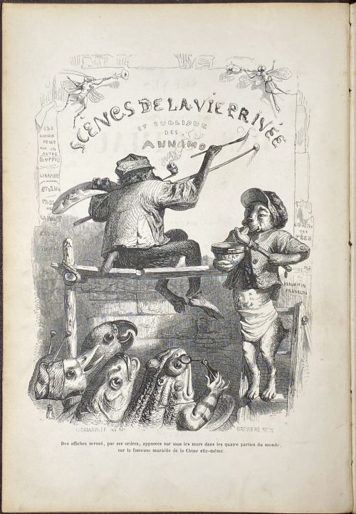 A two-volume set in the contemporary full calf, imitating the editorial cloth binding. Vol. 1: SCÈNES | DE LA | VIE PRIVÉE ET PUBLIQUE | DES ANIMAUX | VIGNETTES | PAR GRANDVILLE. | — | ÉTUDES DE MŒURS CONTEMPORAINES | PUBLIÉES | SOUS LA DIRECTION DE M. P. – J. STAHL , | AVEC LA COLLABORATION | DE MESSIEURS | DE BALZAC. – L. BAUDE. – E. DE LA BEDOLLIERE. – P. BERNARD. – J. JANIN. | ED. LEMOINE. – CHARLES NODIER. – GEORGE SAND. | [VIGNETTE] | PARIS. | J. HETZEL ET PAULIN , ÉDITEURS , | RUE DE SEINE-SAINT-GERMAIN , 33. | 1842 Pagination: [2 blanks] [2 - ht. / imprim.] [2 - blank / frontis.] [2 - t.p. / blank] [4] [1] 2-386 [6 - table] [2 blanks], 96 whole-page wood-engravings after Grandville, vignettes within the text including head and tailpieces, together with a frontispiece. VOL. 2: SCÈNES | DE LA | VIE PRIVÉE ET PUBLIQUE | DES ANIMAUX | VIGNETTES | PAR GRANDVILLE. | — | ÉTUDES DE MŒURS CONTEMPORAINES | PUBLIÉES | SOUS LA DIRECTION DE M. P. – J. STAHL , | AVEC LA COLLABORATION | DE | MM. DE BALZAC, – L' HERITIER (DE L' AIN), – ALFRED DE MUSSET – PAUL DE MUSSET, | CHARLES NODIER, – MADAME M. MENESSIER NODIER, – LOUIS VIARDOT. | [VIGNETTE] | PARIS, | J. HETZEL , ÉDITEUR , | RUE DE SEINE-SAINT-GERMAIN , 33. | 1842 Pagination: [2 - ht. / imprim.] [2 - blank / frontis.] [2 - t.p. / blank] [1] 2-390 [6 - table], 105 whole-page wood-engravings after Grandville, vignettes within the text including head and tailpieces, together with a frontispiece. Size: Each volume 27 x 18 cm; In-4to (usually classified as 8vo, however, the numeric signatures provide for gathering in-quarto). Binding: Full burgundy calf, gilt embossed Grandville's characters to boards and spine, lettering to spine, white moire end-papers to vol. 1, and yellow end-papers to vol. 2, all margins gilt. Combination of the 1st and 2nd print-runs of the 1st edition. Ref.: L. Carteret, 1927: pp. 552-558. Wikipedia; Gallica; Hathi Trust. In: British Museum, MET, RISD Museum, Fine Arts Museums of San Francisco.
 -
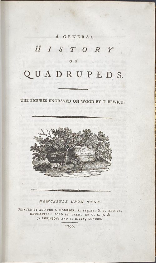 Title: A GENERAL | HISTORY | OF | QUADRUPEDS. | – | THE FIGURES ENGRAVED ON WOOD BY THOMAS BEWICK. | {vignette} | — | NEWCASTLE UPON TYNE : | PRINTED BY AND FOR S. HODGSON, R. BEILBY, & T. BEWICK, | NEWCASTLE: SOLD BY THEM, BY G. G. J. & | J. ROBINSON, AND C. DILLY, LONDON. | 1790. Pagination: [4 blanks], [i, ii] – t.p. / blank, [iii, iv] – advertisement / index, v-viii – index, [1] 2-456 [4 blanks]. Collation: demi 8vo; a⁴ A-Ee⁸ Ff⁴. A3 unsigned, catchword at p.375 THE instead of WE. Variant A (with a fly facing upward). Size: 21.8 x 14 cm; page 21.2 x 13 cm. Woodcuts: 260 descriptions of quadrupeds; 200 figures of quadrupeds, 104 vignettes, tailpieces, etc. Binding: Full marbled calf, gilt double border, black label with gilt lettering to flat spine. There were 1,500 copies Demy copies printed. Catalogue raisonné: S. Roscoe (1953): pp. 5-11; Hugo (1866): pp. 22-23.
 -
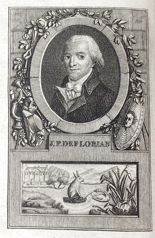
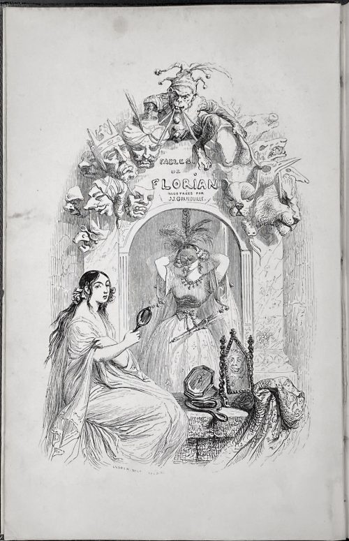 FABLES | DE FLORIAN | ILLUSTRÉES | PAR J.-J. GRANDVILLE , | SUIVIES | DE TOBIE ET RUTH , | Poëmes tirés de l'Ecriture Sainte | ET | PRECEDEES D'UNE NOTICE SUR LA VIE ET LES OUVRAGES DE FLORIAN , | PAR P.-J. STAHL. | [Vignette] PARIS. | J.-J. DUBOCHET ET Cie , ÉDITEURS , | 1842. Pagination: ffl, [2 blanks] [i, ii - ht/imp.] [2 - blank/engr. t.p. by Grandville] [iii, iv - t.p./blank] [v] vi-xx; 2 sheets of plates, [3] 4-292, bfl; engraved t.p. + [79] leaves of plates + 5 faux t.p. (total 85 plates) Size: In-8vo, 23.8 x 15 cm. Binding: Orig. blind-stamped navy cloth with gilt Grandville characters to boards and spine. First edition, first printing. Reference: Léopold Carteret (Le trésor du bibliophile. Epoque romantique. 1801-1875 / Livres illustrés du XIXe siècle. – Paris: L. Carteret; imprim. Lahure, 1927). Wood engravers: Adolphe Best (French, 1808 – 1860): 22 plates Louis-Henri Brévière (French, 1797 – 1869): 3 plates Brugnot (French, active 19th century): 7 plates Prosper-Adolphe-Léon Cherrier (French, born 1806): 6 + Tobie et Ruth + vignettes Louis Dujardin (French, 1808 – 1859): 2 plates Monogram GO–> (possibly for Godard) : 1 plate Halley-Hiback (French, 19th century): 1 + vignette Henri-Désiré Porret (French, 1800–1867): 2 + vignette Lacoste père et fils aîné et Auguste-Alexandre Guillaumot (French, 1815 – 1892): 5 plates Quichon (French, 19th century): 10 plates + Tobie et Ruth François Rouget (Belgian, born bef., 1825): 19 + vignette Unsigned or with an illegible signature: 6 plates