-
 Title page: GUIDE DE L’AMATEUR | BIBLIOGRAPHIE | DES | OUVRAGES ILLUSTRES | DU | XIXe SIÈCLE | PRINCIPALEMENT DES LIVRES A GRAVURES SUR BOIS | PAR | JULES BRIVOIS | AUTEUR DE LA BIBLIOGRAPHIE DE L’ŒUVRE DE P.-J. BÉRANGER | MEMBRE FONDATEUR DE LA SOCIÉTÉ DES AMIS DES LIVRES | — | PARIS | LIBRAIRIE L. CONQUET | 5, RUE DROUOT, 5 | 1883 || Justification: Il a été tire : | 900 exemplaires sur papier vergé. | Et 50 exemplaires sur grand papier de Hollande. | Tous sont numérotés et paraphes par l’auteur. | № {188 signature} | Les numéros pairs portent le nom de M. L. Conquet. | Et les numéros impairs celui de M. P. Rouquette. | — | Le dépôt légal sera fait en France et dans tous les pays avec lesquels il | existe des conventions pour la propriété littéraire. | Tous droits réservés. || Pagination : [2] blank, [i-v] vi-xiii [xiv], [1] 2-468; the total number of pages = 484. Collation: π8 1-288 2910, an asterisk on leaf 295; the total number of leaves 242; 3 blank leaves of wove paper before and after collation. Imprint to 11 : Imp. de Mme de Lacombe; Imprint to 2910 : Nancy, imprimerie Berger-Levrault et Cie. Binding: ¾ polished distressed calf over marbled boards by the previous owner "E.D", gilt-stamped spine with gilt-lettered black label, peacock marbled endpapers, printed on laid paper. Contributors: Jules Brivois (French, 1832 – 1920) – author. L. Conquet (Paris) – publisher. P. Rouquette (Paris) – publisher. Berger-Levrault et Cie – printer.
 -
 Title: A HISTORY OF | ENGRAVING & ETCHING | FROM THE 15TH CENTURY TO THE YEAR 1914 | BEING THE THIRD AND FULLY REVISED EDITION OF | “A SHORT HISTORY OF ENGRAVING AND ETCHING” | BY | ARTHUR M. HIND | OF THE BRITISH MUSEUM | SLADE PROFESSOR OF FINE ART IN THE UNIVERSITY OF OXFORD | WITH FRONTISPIECE IN PHOTOGRAVURE | AND 110 ILLUSTRATIONS IN THE TEXT | {publisher’s device} | BOSTON AND NEW YORK | HOUGHTON MIFFLIN COMPANY | 1923 || Pagination: [i-iv] v-xiii. [2] – blank / abbrev., [2] 3-487 [488], frontis. w/tissue guard, ills.; Appendices: I. Classified list of engravers (p. 343-392); II. General bibliography (p. 393-419); III. Index of engravers and individual bibliography (p. 420-487). Collation: π10 B-2H8 2I4, frontispiece (extr.), 110 in-text illustrations. Binding: 25.8 x 20 cm, crimson cloth, blind triple-fillet to top and bottom of the front board, same in gilt to spine, gilt lettering to spine, top edge gilt, fore-edge untrimmed. Contributors: Arthur Mayger Hind (British, 1880 – 1957) – author. Houghton Mifflin Company (Boston, 1864) – publisher. R & R. Clark, Ltd. (Edinburgh, 1846) – printer. Note: It is marked as the 3rd edition of A short history of engraving and etching. Indeed, A short history of engraving & etching for the use of collectors and students with full bibliography, classified list and index of engravers was published by Constable in London and Houghton Mifflin Co. in Boston, in 1908 and then in 1911. However, it is hard to consider an almost completely new book "a 3rd edition".
 -
 Title-page: DORAT | LES BAISERS | PRÉCÉDÉS | DU MOIS DE MAI | POÈME | COMPOSITIONS ORIGINALES | DE | BRUNELLESCHI | EDDIS | 1947 || Description: 23.3 x 19 cm, French slapped wrappers, sunned and heavy foxed, without a slipcase; [1-6] (h.t. with owner’s inscription / limitation with № 18, t.p., d.t.p.), 7-137 [138] [6] (colophon) plus 23 stencil-coloured (au pochoir) photogravure plates after Umberto Brunelleschi, his head- and tailpieces (total 60 designs). Printed by Gaston Maillet & Cie in Saint-Ouen on April 15, 1947. Photogravure by Deberni and Peignot under direction of R. Perrot. Limitation: 3,000 copies numbered 1 to 3,000 of which 500 copies on Vélin de Luxe (1–500) enriched with two suites of plates, one in colour and one toned, before letters; 2,500 on Vélin de Fabrication Spéciale of which copies numbered 500–1,000 enriched with one suite before letters, and 2,000 copies numbered 1,001–3,000. Besides, there are 200 additional copies numbered with Roman numbers reserved for foreign bibliophiles. This particular copy bears number 18, however, I don’t think it is printed on Vélin de Luxe, whatever it is, and does not have an extra suite of plates. Owner’s inscription pasted to h.t.: A Denise ce livre audacieux | mais qui par son art sait | tout faire pardonner — | Jane Darboy. Provenance: Jane Darboy (French, fl. 1932 – 1948) – a French writer.
 -
 Title-page: LUKAS ROTGANS | POËZY, | VAN VERSCHEIDE | MENGELSTOFFEN; | MET KONSTPLAATEN VERSIERT. | Tweede Druk | {vignette} | TE AMSTERDAM; | By ANTONI SCHOONENBURG, 1735. || Collation: 4to; fep, 1st blank, engraved t.p. by M. Pool, t.p., *3,4; 2*-9*4, 10*1, *LII2, *LII, 10*2 —> *-10*4 (40 leaves); A-Z4, 2A-2Z4, 3A-3Z4, 4A-4Q4, last blank, fep; (340 leaves), 2 plates extraneous to collation. Pagination: [2] [1-5] 6-14 [15-80] [1-3] 4-680 [2], 2 unsigned plates not included in pagination after pp. 634 and 652, 50 headpieces by Jacob Folkema after Arnold Houbraken, and 2 tailpieces by Jan de Ruijter. Marks: Armorial bookplate: “Ex Libris J. J. Mak | {coat of arms} | Inveni Intermanere Melius”. Oval ink stamp: “HOOGERE BURGERSCHOOL. | DELFT” Provenance: Johannes Jacobus Mak (Dutch, 1908 – 1975). Edition: 2nd, 1st edition published in 1715 in Leeuwarden by François Halma. Contributors: Lukas Rotgans (Dutch, 1653 – 1710) – author. Arnold Houbraken (Dutch, 1660 – 1719) – artist. Jacob Folkema (Dutch, 1692 – 1767) – engraver. Matthijs Pool (Dutch, 1676 – 1740) – engraver. Jan de Ruijter (Dutch, 1688 – 1744) – engraver. Antoni Schoonenburg (Dutch, 1682 – 1754) – publisher.
 -
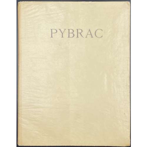 Description: One volume in French flapped cream wrappers, 25.5 x 19.5 cm, lettered “PYBRAC”, in glassine DJ, collated 4to, printed on watermarked Van Gelder laid paper, outer and bottom margins untrimmed, illustrated with 20 in-text drypoints on recto of each 1st and 3rd leaf of 1-10 gatherings, some with tipped-in tissue guards, unbound. This copy lacks the frontispiece, 10 full-page plates, and does not have any enrichment. It is one volume instead of two. Title-page: PYBRAC | ILLUSTRE DE TRENTE POINT SÈCHES | D’UN | ARTISTE INCONNU | PARIS | AUX DÉPENS D’UN AMATEUR | — | M. CM. XXVIII || Limitation: Edition limited to 30 copies, 1 copy unique on Japon Nacré with 30 original sketches, one suite in colour, two suites in black and 5 cancelled plates; 29 copies on Hollande Van Gelder, with one original watercolour, four original sketches, one suite in colour, two suites in black and 5 cancelled plates. This is copy № 8 (but without 11 full-page plates and with no enrichment). For a unique copy of the enriched edition in this collection, see LIB-3065.2022. Collation: π4 (2 blanks, h.t., t.p.), 1-104, χ2 (2 blanks), total 46 leaves. Pagination: [8] 1-78 [2] [4], total 92 pages. Catalogue raisonné: Dutel (1920-1970): № 2279, p. 334, Pia (Enfer):№ 1117, p. 586, Nordmann (I):№ 235; Vokaer № 23, p. 13; Fekete:№ 216. Contributors: Pierre Louÿs (French, 1870 – 1925) – author. Marcel Vertès [Marcell Vértes] (Jewish-Hungarian-French, 1895 – 1961) – artist.
 -
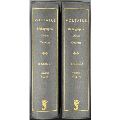 Reprint. Originally published in four volumes in Paris by Perrin, 1882-1890, limited edition of 550 copies: 50 exemplaires sur papier de Holland (nos. 1 à 50) 500 exemplaires sur papier vélin (nos. 51 à 550). Two volumes (992 and 1,056 pp.), 23.8 x 16.3 x 6 cm each, in black buckram, gilt lettering in a double fillet frame to spine: “VOLTAIRE | Bibliographie | De Ses | Oeuvres | X X | BENGESCO | Volumes | I & II (III & IV) | {publisher’s device} || pp: (1) [i-ix] x-xix [xx] [1] 2-494; (2) [12] [i] ii-xviii [1] 2-438 [10]; (3)[6] [i] ii-xv, [1] 2-609 [3] + one folding plate; (4) [8] [i] ii-xxii [2] [1] 2-391 [392]. Title-page: VOLTAIRE | — | BIBLIOGRAPHIE DE SES ŒUVRES | PAR | GEORGES BENGESCO | TOME PREMIER (DEUXIÈME; TROISIÈME; QUATRIÈME) | COURONNÉ PAR L’ACADEMIE FRANÇAISE | {piblisher’s device} | Martino Publishing | Mansfield Centre, CT | 2006 || In the original t.p. BIBLIOGRAPHIE DE SES ŒUVRES and GEORGES BENGESCO printed in red, after the publisher’s device: PARIS | ÉD. ROUVIERE & G. BLOND | ÉDITEURS | 98 RUE DE RICHELIEU 98 | 1882 (etc.) || Contents: — T.1. Théâtre. Poésies. Grands ouvrages historiques. Dictionnaire philosophique et questions sur l'Encyclopédie. Romans. — T. 2. Mélanges. Ouvrages édités par Voltaire. Ouvrages annotés par Voltaire. — T. 3. Correspondance. Cent lettres de Voltaire qui ne figurent dans aucune édition de ses œuvres et suivi du réperoire chronologique de sa correspondance de 1711 à 1778, avec l'indication des principales sources de chaque lettre." — T.4. Œuvres complètes de Voltaire. Principaux extraits de Voltaire. Ouvrages faussement attribués à Voltaire Georges Bengesco [Gheorghe Bengescu] (Romanian, 1848 – 1922) François-Marie Arouet [Voltaire] (French, 1694 – 1778)
 -
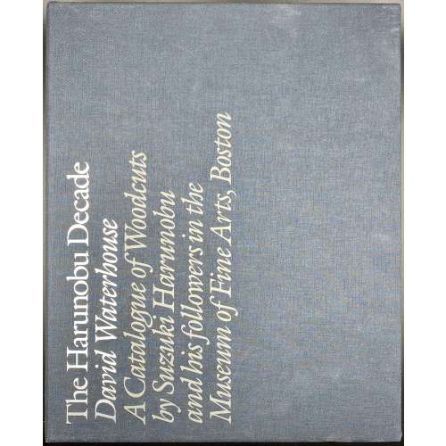 Two volumes in blue cloth, 30.3 x 25.2 cm each, in a matching slipcase 31.5 x 25.5 x 6.5 cm, with silver lettering. Vol. 1: Text, pp.: [1-8] 9-502 [2 blank]; Vol. 2: Plates, 240 unpaginated pages (721 entries). Suzuki Harunobu (Japanese, 1725 – 1770) David B. Waterhouse (British, 1936 – 2017)
 -
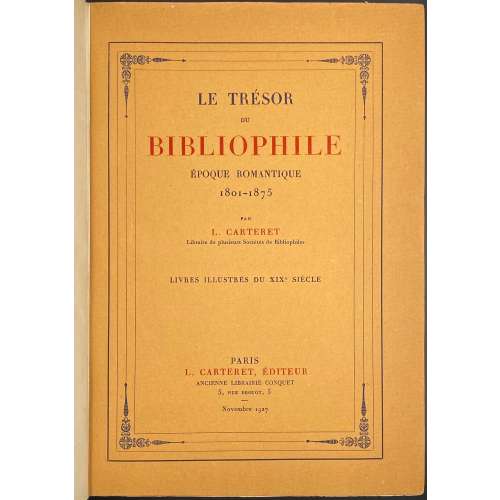 Description: One volume, collated 4to, 26.2 x 18.5 x 8 cm, ¾ calf over marbled boards, gilt decorated flat spine with gilt lettering, marbled endpapers, publisher’s wrappers preserved. Title-page (red and black): LE TRÉSOR | DU | BIBLIOPHILE | ÉPOQUE ROMANTIQUE | 1801–1875 | PAR | L. CARTERET | Libraire de plusieurs Sociétés de Bibliophiles | LIVRES ILLUSTRÉS DU XIXe SIÈCLE | PARIS | L. CARTERET, ÉDITEUR | ANCIENNE LIBRAIRIE CONQUET | 5, RUE DROUOT, 5 | Novembre 1927 || Publisher's wrapper similar, in a frame Collation: front wrapper, π4 (2 blanks, h.t./limit., t.p./copyright], [1] – 894, χ2 (colophon, 1 blank), back wrapper, orig. spine, ils. within collation; total 362 leaves within wrappers; 2 leaves of modern inset bound-in between pp. 106 and 107. Pagination: [8][1-3] 4-712 [4], total 724 pages plus 4 pp inset, ils. Content: pp. 1-25 – propos; 29-600 – bibliographie; 601-603 – table ills; 605-639 – table des ouvrages cités; 641-712 – table des artistes. Printed by Imp. Lahure on November 30, 1927. Contributors: Léopold Carteret (French, 1873 – 1948) Imprimerie Générale de A. Lahure (Paris) Alexis Lahure (French, 1849 – 1928)
 -
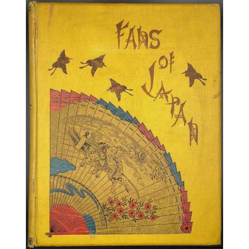 Description: Hardcover, 31.5 x 25 cm, yellow cloth adorned with stylized lettering and coloured design elements, blue endpapers, all margins red; Errata slip tipped in p.1. Lacks dust jacket. Inset: newspaper clipping titled "Facsimile of the fan distributed after the Tien-Tsin Massacre". Title-page: Fans of Japan | BY | CHARLOTTE M. SALWEY | née BIRCH | WITH INTRODUCTION BY | WILLIAM ANDERSON, F.R.C.S. | LATE OF H. M’S. LEGATION, JAPAN | AND | WITH TEN FULL-PAGE COLOURED PLATES, AND THIRTY-NINE | ILLUSTRATIONS IN BLACK AND WHITE | {publisher’s device} | LONDON | KEGAN PAUL, TRENCH, TRÜBNER & CO. LTD | PATERNOSTER HOUSE, CHARRING CROSS ROAD | 1894 || Pagination: [i-vi] vii-xix [xx] [1] 2-148 [4]; total 172 pages. Collation: 4to; π10 A-T4 (total 86 leaves) plus 10 colour plates with tissue guards and 39 b/w in-text illustrations. Plate I pasted in a kind of matt, though with red margins as all other pages. Printer: Ballantyne, Hanson and Co. Chromo-lithographer: McLagan and Cumming (Edinburgh) Publisher: Kegan Paul, Trench, Trübner & Co. Charles Kegan Paul (British, 1828 – 1902) – publisher. Author: Charlotte Maria Salwey [née Birch] (British, b. 1847 – after 1919). Introduction: William Anderson (British, 1842 – 1900) Dedicatee: Dr. Samuel Birch (British, 1813 – 1885)
 -
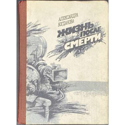 Hardcover, 17.2 x 12.5 cm, brown cloth-backed pictorial paper boards, lettering to front and spine, pictorial endpapers, pp.: [1-4] 5-430 [2], total 432 pages; collated in-16mo: [1]-1216 138 1416, total 216 leaves. Print run: 65,000 copies. A real history-based fiction about doctor Nikolai Sudzilovsky [Nicholas Russel] (Belarusian, 1850 – 1930). Title-page (pictorial): АЛЕКСАНДРА | БОГДАНОВА | ЖИЗНЬ | ПОСЛЕ | СМЕРТИ | Роман || Imprint: Рецензент доктор филилогических наук Н. Г. Жулинский. Редактор В. А. Лигостов. Богданова А. И. Жизнь после смерти: Роман. — К.: Рад. письменник, 1990. — 431 с. ISBN 5-333-00201-0. Colophon: Литературно-художественное издание. БОГДАНОВА АЛЕКСАНДРА ИВАНОВНА | Жизнь после смерти. Роман. Киев, издательство «Радяньский пысьмэннык». Author: Богданова, Александра Ивановна (b. c. 1950).
 -
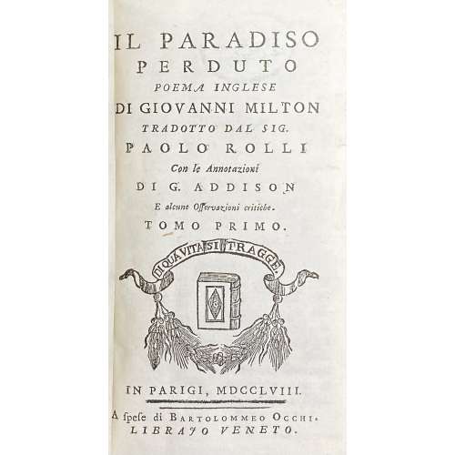 Quarter calf over marbled boards, 16 x 9 cm, spine with raised bands, gilt in compartments, gilt-lettered label, all margins red, two title-pages (one for each vol.), illustrated with engraved frontispiece by Antonio Baratti after Antonio Balestra; engraved portrait of John Milton by Antonio Baratti, 12 plates, one for each book, after “Piazzetta, Zucchi, Balestra, Tiepolo, and other Venetian artists”, unsigned; plate II signed ‘Antonio Barati scul.’ Title page: IL PARADISO | PERDUTO | POEMA INGLESE | DI GIOVANNI MILTON | TRADOTTO DAL SIG. | PAOLO ROLLI | Con le Annotazioni | DI G. ADDISON | E alcune Osservazioni critiche. | TOMO PRIMO (SECUNDO). | {publisher’s device} | IN PARIGI , MDCCLVIII. | — | A spese di Bartolommeo Occhi. | LIBRAJO VENETO. || Collation: *-**12 ***8 (dedication, vita), A-R12 (vol. 1) A-K12 L9 (vol.2); total 365 leaves plus 14 engraved plates, incl. frontispiece and portrait. Pagination: [i, ii] iii-lxiv 1-407 [408 blank], [2] 3-258; total 730 pages. Catalogue raisonné: Wickenheiser Collection 688 [LIB-2795.2021]. Though it states 228 pp., which does not seem right. “Scarce. Not in Coleridge”. Contributors: Milton, John (British, 1608 – 1674) – author. Joseph Addison (British, 1672 – 1719) – author / criticism Paolo Antonio Rolli (Italian, 1687 – 1765) – author / transaltion Bartolomeo Occhi (Italian, 1730 – 1781) – publisher. Antonio Baratti (Italian, 1724 – 1787) – engraver Antonio Balestra (Italian, 1666 – 1740) – artist. Giovanni Battista Piazzetta (Italian,1682/83 – 1754) – artist. Antonio Zucchi (Italian, 1726 – 1795) – artist. Giovanni Battista Tiepolo (Italian, 1696 – 1770) – artist.
 -
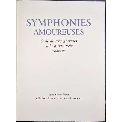 Description: Suite of 16 hand-coloured drypoints, in 39 x 29 cm, in cream French flapped wrappers with lavender lettering “SYMPHONIES AMOUREUSES” and a sanguine drypoint vignette (platemark 15 x 13 cm) to front, 17 leaves plus 2 leaves in the wrappers, 38.5 x 57 cm vertically folded once, lettering to one page, plate to another page, unbound, only the top margin trimmed, unpaginated, wove paper watermarked "BFK Rives", in a faux chagrin double slipcase 39.8 x 30 cm. Title-page (in lavender and black): SYMPHONIES AMOUREUSES | Suite de seize gravures | à la pointe sèche | rehaussées | {blank} | imprimé aux dépens | de Bibliophiles et non mis dans le commerce || Titles of the plates : 1. Ouverture. 2. Gamme. 3. Rêverie. 4. Pas redoublé. 5 Fantasia. 6. Pastorale. 7. Estudiantina. 8. Presto. 9. Arpège. 10. Menuet. 11 .Symphonie médiévale. 12. Jeux d’eau. 13. Galop. 14. Impromptu. 15. Variation. 16. Ariette. Limitation: Print run of 100 copies, 5 copies on Japon Manchou, numbered №№ 1-5, enriched; 11 copies on vélin à la forme de Rives, numbered №№ 6-16, enriched; 84 copies on vélin à la forme de Rives, numbered №№ 17-100, of which this is copy № 32. Cat. raisonné: Dutel III, № 2478. Contributors: André Collot (French, 1897 – 1976) – artist, engraver.
 -
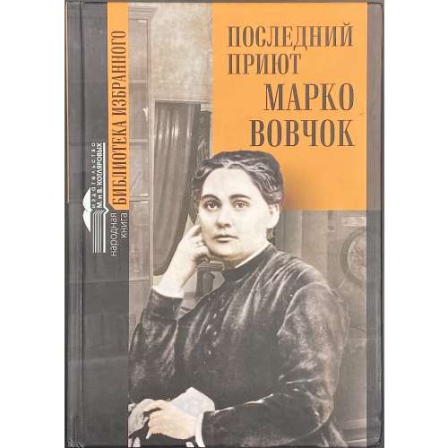 Hardcover volume, 22 x 15.5 cm, pictorial paper boards with black and white lettering to front and spine, a blurb in black on orange to back, pp.: [2] 3-437 [3], 3 ils. Title-page: ПОСЛЕДНИЙ | ПРИЮТ | МАРКО | ВОВЧОК | device {ИЗДАТЕЛЬСТВО | М. И В. КОТЛЯРОВЫХ} | Нальчик 2021 || Print run: 400 copies. Contributors: Марко Вовчок [Марія Олександрівна Вілінська, Marko Vovtchok] (Ukrainian, 1833 – 1907). Лобач-Жученко, Борис Борисович (Russian, 1899 – 1995). Collective: Мария и Виктор Котляровы, Александр Шепелев, Оксана Иваненко, Евгения Тютюнина, Наталья Смирнова, С. Л. Ращенко, Марина Лобач-Жученко.
 -
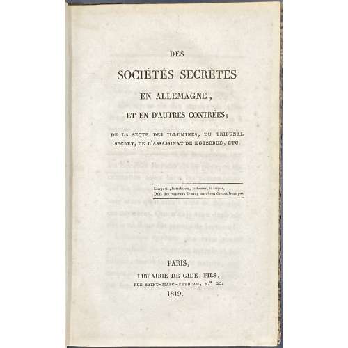 Hardcover volume, 20.4 x 13.1 cm, quarter contemporary calf over modern brown marbled board, printed on laid paper, pp.: [i-v] vi-xii, [13] 14-259 [260] blank; collated 8vo: 1-168 172; total 130 leaves. Title-page: DES | SOCIÉTÉS SECRÈTES | EN ALLEMAGNE, | ET EN D'AUTRES CONTREES; | DE LA SECTE DES ILLUMINÉS DU TRIBUNAL | SECRET, DE L'ASSASSINAT DE KOTZEBUE, ETC. | {two lines in rules} | PARIS, | LIBRAIRIE DE GIDE, FILS, | RUE SAINT–MARC–FEYDEAU, No. 20. | 1819. || Contributors: Vincent Lombard de Langres (French, 1765 – 1830) – author. Théophile-Étienne Gide (French, 1767 – 1837) – publisher. Seller's description: [LOMBARD DE LANGRES (Vincent)]. Des Sociétés secrètes en Allemagne, et en d'autres contrées. Paris, Gide fils, 1819 ; in 8°, demi basane fauve, dos lisse orné. Reliure de l'époque. Edition originale rare. L'auteur, révolutionnaire, fut ami de Danton et de Barras. Dans son ouvrage anti maçonnique, il dévoile les doctrines des sociétés secrètes, leurs principes, leur influence dans la société. Caillet 6770.
 -
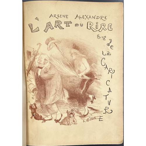 Hardcover volume 28.5 x 20.8 cm, quarter brown morocco over marbled boards, ruled in gilt, spine with raised bands, gilt in compartments, gilt lettering, marbled endpapers, top margin gilt, original lithographic wrappers designed by A. Willette preserved; pp.: [4] h.t., t.p., [1] 2-350 [2], 300 b/w ils in-text and 12 coloured photomechanical reproductions extraneous to collation; collated in-4o: π2 1-444; Title-page: L'ART DU RIRE | ET DE | LA CARICATURE | PAR ARSÈNE ALEXANDRE | 300 FAC-SIMILÉS EN NOIR ET 12 PLANCHES EN COULEURS | D’APRÈS LES ORIGINAUX | {vignette} | PARIS | ANCIENNE MAISON QUANIN | LIBRAIRIES-IMPRIMERIES RÉUNIES | 7, RUE ST-BENOIT | MAY & MOTTEROZ, DIRECTEURS || Contributors : Librairie-Imprimerie réunies (Paris, 1880-1908) – publisher. Arsène Alexandre (French, 1859 – 1937) – author. Adolphe Willette (French, 1857 – 1926) – artist (wrapper)
 -
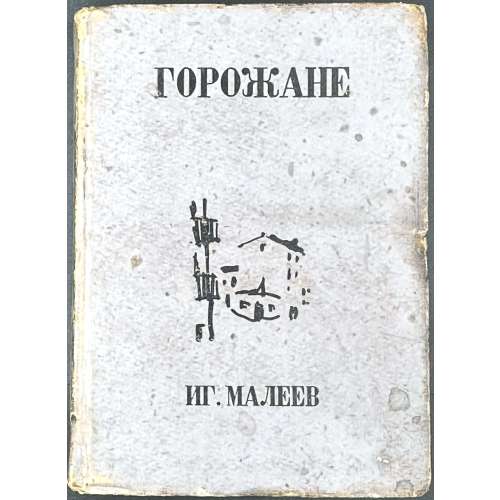 Hardcover volume, 17 x 12.5 cm, bound in lilac cardboard, lettering to covers and spine, vignette by Boris Rybchenkov to front board; pp.: [1-4] 5-188 [4]. Pencil ms to h.t. "Самалюк | Рай Кунцевское | Зав. роно" (Самалюк, зав. кунцевским районным отделом народного образования)ю Title-page: И. Г. МАЛЕЕВ | ГОРОЖАНЕ | МОСКОВСКОЕ | ТОВАРИЩЕСТВО | ПИСАТЕЛЕЙ || Print run: 5,200 copies. Contributors: Малеев, Игорь Александрович (Russian, 1904 – 1936?) – author. [Igor Maleyev] Рыбченков, Борис Федорович (Russian, 1899 – 1994) – artist. [Boris Rybchenkov]
 -

Кристофер Марло. Сочинения. Вступительная статья и комментарии А. Парфенова. Редакция переводов А. Смирнова. Оформление художника В. Носкова. - М.: Государственное издательство художественной литературы, 1961. 664 с.
А. Парфенов. Кристофер Марло.
Тамерлан Великий. Часть 1 - перевод Э. Линецкой; Часть 2 - перевод Е. Полонской.
Трагическая история доктора Фауста. Перевод Е. Бируковой.
Мальтийский еврей. Перевод В. Рождественского.
Эдуард II. Перевод А. Радловой.
Парижская резня. Перевод Ю. Корнева.
Геро и Леандр. Перевод Ю. Корнева.
Страстный пастух - своей возлюбленной. Перевод И. Жданова.
-
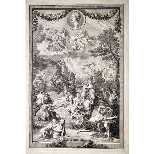 Vol. 1 title: OVID'S | METAMORPHOSES | IN LATIN AND ENGLISH, | TRANSLATED BY | THE MOST EMINENT HANDS. | With HISTORICAL EXPLICATIONS | Of the FABLES, | WRITTEN IN FRENCH BY | The ABBOT BANIER, | MEMBER OF THE ACADEMY OF INSCRIPTIONS | AND BELLES LETTRES. | TRANSLATED INTO ENGLISH. | Adorned with Sculptures, by B. Picart, and other able Masters. | VOLUME THE FIRST. | [Device] | AMSTERDAM, | Printed for the WETSTEINS and SMITH. | MD CC XXII || — Pagination: [26 – Half-title, frontis., t.p., dedic., The Bookseller's Preface To This Edition, Mr. Banier's Preface To The French Translation, Contents], [1] 2-247 – Text of books 1-7, with illus., [1 blank]. Vol. 2 half-title: OVID'S | METAMORPHOSES | IN LATIN AND ENGLISH | TWO VOLUMES || — Pagination: [2 – half-title / blank], 249-524 – Text of books 8-15, with illus., incl. 3 leaves of pl., [4 – Index]. Three leaves between pages 264 and 271 are included in the pagination as pp. [265-70] but do not carry page-numbers or letterpress text. They each carry two prints on their rectos and are blank on the verso. Vol. II without the engraved title page. The names of the translators are given in the list of Contents as Dryden, Addison, Eusden, Arthur Mainwaring, Croxall, Tate, Stonestreet, Vernon, Gay, Pope, Stephen Harvey, Congreve, Ozel, Temple Stanyan, , Catcot, Rowe, Samuel Garth, Welsted. The frontispiece is signed as made by B. Picart. The six plates on pages [265, 267, 269] are all signed as painted by C. Le Brun and engraved by Iakob Folkema. Of the 124 illustrations, most are unsigned by a draughtsman, but some are signed as designed by G. Maas, one as designed by Jul. Romain, two as designed by G. Maas and drawn by J. de Wit, one as drawn by 'HA', one as painted by C. le Brun, one as made by B. Picart, one as designed by P. Testa and drawn by B. Picart, one as designed by S. Le Clerc, one as designed by B. Picart. Many are signed by their engravers - Philip à Gunst (one as directed by B. Picart and engraved by Phil. à Gunst), J. Vandelaar (or I. Wandelaar), Martin Bouche, Jan Schenck, 'MB', Petr. Paul. Bouche, Iakob Folkema, W. Jongman, Fred. Bouttats. The title-page vignette of Volume I is signed as drawn by B. v. Overbeke and engraved by F. Mulder. Many tailpieces are signed 'VLS'. The book is dedicated by the publishers, R. and J. Wetstein and W. Smith, to the Countess of Pembroke. [Description is cited from the Royal Academy of Arts] Physical description: Two large 4to volumes, first title page printed in red and black, added engraved title in the first volume; half-title in the second volume; illustrated throughout with copperplate engravings in text; text printed in parallel columns in Latin and English; three leaves extraneous to collation each with two engravings in the second volume; bookplate pasted to the front endpaper in each volume: Ex Libris Theodore C. Tebbetts (Theodore Charles Tebbetts, American, 1871 – 1920) designed after Francis Carruthers Gould (British, 1844 – 1925); pages 517-520 of the second volume torn with loss of bottom blank corners and a word or two; original full leather, spines tooled elaborately in gilt; some boards detached, endcaps and corners rather worn, contents bright and fresh. Size: Large 4to; 47.5 x 31 cm.