-
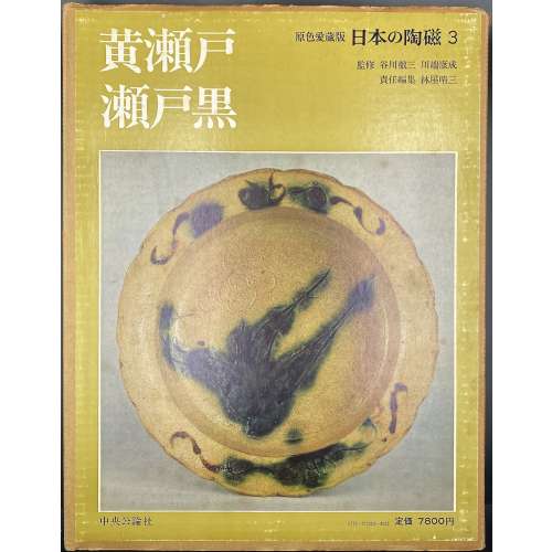 Hardcover volume, 35.3 x 27 cm, bound in grey cloth, blind stamped characters to front, brown characters to spine, in a glassine dust jacket, in a double slipcase, the outer case pictorial paper over cardboard, 36 x 28 cm, pp.: [4] [1] 2-88 (plates with photographs of 129 items), [2] 91-108 [3]. Seto ware [瀬戸焼] (Seto-yaki) – ceramics produced in and around the city of Seto in Aichi Prefecture. Yellow seto [黄瀬戸] (Kiseto) – a yellow glaze seto ware. Black seto [瀬戸黒] (Setoguro) – a black glaze seto ware. 日本の陶磁 – Japanese ceramics, series title. Contributors: Yasunari Kawabata [川端 康成] (Japanese, 1924 – 1972) – author. Tetsuzo Tanikawa [谷川 徹三] (Japanese, 1895 – 1989) – author. Seizo Hayashiya [林屋晴三] (Japanese, 1928 – 2017) – editor. Chūōkōron-sha [中央公論社] – publisher.
 -
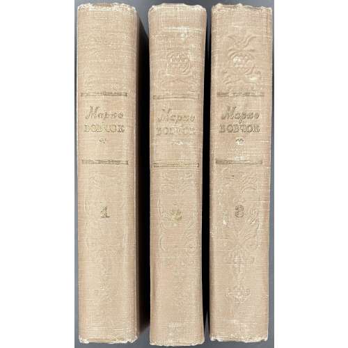 Three 8vo volumes, 20.8 x 13.8 cm each, uniformly bound in brown cloth with gilt lettering and embossed design to front and spine; v. 1: [1-4] 5-537 [3], total 540 pages plus frontispiece, two-colour woodcut portrait, by Ivan Nikolaevtsev; v. 2: [1-6] 7-537 [3], total 540 pages; v. 3: [1-6] 7-620 [4], total 624 pages. Waterstain throughout the third volume. Title-page (red and black): Марко Вовчок | СОБРАНИЕ СОЧИНЕНИЙ | ТОМ ПЕРВЫЙ (ВТОРОЙ, ТРЕТИЙ) | {fleuron} | ИЗДАТЕЛЬСТВО «ИЗВЕСТИЯ» | Москва | 1957 || Opposite t.p. (red and black): Марко Вовчок | СОБРАНИЕ СОЧИНЕНИЙ | В ТРЕХ | ТОМАХ | {fleuron} | ИЗДАТЕЛЬСТВО «ИЗВЕСТИЯ» | Москва | 1957 || Half-title (red and black): БИБЛИОТЕКА КЛАССИКОВ | ЛИТЕРАТУР | НАРОДОВ СССР | | {fleuron} || Imprint: Вступительная статья А. Белецкого. Подготовка текста и примечания С. Машинского. Print run: 30,000 copies. Contributors: Марко Вовчок [Marko Vovchok; Марія Олександрівна Вілінська] (Ukrainian, 1833 – 1907) – author. Other variants: Markowovzok and Marko Vovtchok. Олександр Іванович Білецький [Александр Иванович Белецкий] (Ukrainian, 1884 – 1961) – author/preface. Семен Иосифович Машинский (Ukrainian, 1914-1978) – author/editing and comments. Иван Григорьевич Николаевцев (Ukrainian, 1902–1960) – artist.
 -
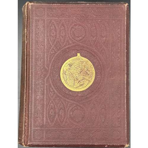 Hardcover, 23 x 17 x 4.7 cm, burgundy buckram, bevelled boards, blind geometrical design with a gilt medallion at the centre, gilt lettering and blind design elements to spine, text in frame, all edges red; pp.: [i-v] vi-xvi, [1] 2-494, [2 advert.], [1] 2-32 advert.], collation 4to: a-b4, B-3R4, a16. Title-page (red and black, in red frame): A HISTORY | OF | CARICATURE & GROTESQUE | {gothic letters} In Literature and Art. | By THOMAS WRIGHT, Esq., M.A., F.S.A., | Hon. M.R.S.L., &c.; | Corresponding Member of the Imperial Institute of France | (Académie des Inscriptions et Belles Lettres). |{double rules} | WITH | ILLUSTRATIONS FROM VARIOUS SOURCES, | DRAWN AND ENGRAVED BY | F. W. FAIRHOLT, Esq., F.S.A. | {double rules} | {gothic letters} London : | VIRTUE BROTHERS & CO., 1, AMEN CORNER, | PATERNOSTER ROW. | 1865. Contributors : Thomas Wright (British, 1792 – 1849) – author. Frederick William Fairholt (British, 1814 – 1866) – artist/engraver. Virtue Brothers & Co. (London) – publisher/printer.
 -
 Title page: УТОПИЧЕСКИЙ РОМАН XVI – XVII ВЕКОВ | ТОМАС МОР | УТОПИЯ |•| КАМПАНЕЛЛА | ГОРОД СОЛНЦА |•| ФРЭНСИС БЭКОН | НОВАЯ АТЛАНТИДА |•| СИРАНО ДЕ БЕРЖЕРАК | ГОСУДАРСТВА ЛУНЫ |•| ДЕНИ ВЕРАС | ИСТОРИЯ СЕВАРАМБОВ | {PUBLISHER’S DEVICE} | ИЗДАТЕЛЬСТВО | «ХУДОЖЕСТВЕННАЯ ЛИТЕРАТУРА» | МОСКВА • 1971 || Pagination: [1-4] 5-493 [494] [2], 10 plates extraneous to collation. Collation: 16mo; [1]16 2-1516 168. Binding: 20.5 x 15 cm, burgundy cloth, gilt serial device to cover, gilt lettering to spine, pictorial DJ. Colophon: БИБЛИОТЕКА ВСЕМИРНОЙ ЛИТЕРАТУРЫ | СЕРИЯ ПЕРВАЯ | Том 34 || Print run 300,000 copies
Вступительная статья: Л. Воробьев
Томас Мор: Утопия. Перевод А. Малеина и Ф. Петровского.
Томмазо Кампанелла: Город Солнца. Перевод Ф. Петровского.
Фрэнсис Бэкон: Новая Атлантида. Перевод З. Александровой.
Сирано де Бержерак: Государства Луны. Перевод Е. Гунста.
Дени Верас: История Севарамбов. Перевод Е. Дмитриевой.
Примечания А. Малеина, Ф. Петровского, Ф. Коган-Бернштейн, Ф. Шуваевой.
Художник: Селиверстов, Юрий Иванович (Russian, b. 1940) Authors, translators:More, Sir Thomas (British, 1478 –1535)
Campanella, Tommaso (Italian, 1568 – 1639) Bacon, Francis (British, 1561 –1626) Cyrano de Bergerac, Savinien de (French, 1619 – 1655) Vairasse d' Allais, Denis (French, c. 1630 – 1672) Малеин, Александр Иустинович (Russian, 1869 – 1938) Петровский, Фёдор Александрович (Russian, 1890 – 1978) Елизавета Ивановна Дмитриева [Васильева; Черубина де Габриак] (Russian, 1887 – 1928) Александрова, Зинаида Николаевна (Russian, 1907—1983) Гунст, Евгений Анатольевич (Russian, 1901 – 1983) Коган-Бернштейн, Фаина Абрамовна [Аронгауз] (Russian, 1899 – 1976) -
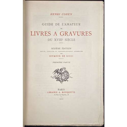 Herni Cohen. Guide de l'amateur de livres à gravures du XVIIIe siècle (6e édition) / Revue, corrigée et considérablement augmentée par Seymour de Ricci, préface par R. Portalis; 2 Volumes. – Paris: Librairie A. Rouquette, 1912. – Achevé d'Imprimer à Melun par Émile Legrand le 25 juin MDCCCCXII [1912]. Vol. 1, Première partie – ABAA-LUY: ffl [4 blanks] [2 - orig. grey front wrapper w/title, verso blank] [2 blanks] [2 - ht, tirage] [2 - blank, frontis. w/protect. sheet] [2 - blank, frontis. w/protect. sheet] (double frontis. - correct), [2 - t.p., blank] [i - avant-propos w/vignette] ii-vi, [vii - préface w/vignette] viii-xxvi; [1-2 - Tome 1, I] 2-668 (two numbers per page), [2 - fin, blank] [2 blanks] [2 - orig. grey back wrapper, recto blank] [orig. spine strip] [4 blanks] bfl. Vol. 2, Seconde partie – MAB-ZUR : ffl [4 blanks] [2 - orig. grey front wrapper w/title, verso blank] [2 blanks] [2 - ht, blank] [2 - t.p., blank] [2 - blank, frontis. w/protect. sheet] [2 - blank, frontis. w/protect. sheet] (double frontis. - correct), [1-2 - Tome II, 22] 671-1248 (two numbers per page), [2 - printer, blank] [2 blanks] [2 - orig. grey back wrapper, recto imprim.] [orig. spine strip] [4 blanks] bfl. Size: Super Royal 8vo, 26.2 x 17.2 x 5.1 cm. Binding: Contemporary blue half morocco over marbled boards, marbled end-papers, top margin gilt, gilt lettering to spine (title, owner: P. R.).; bookplate pasted to verso of the first blank leaf: " Ex Libris R. Decamps Scrive." – for bibliophile René Descamps-Scrive (French, 1853 –1924). Original wrappers preserved. Printed on Hollande paper, copy № 2 of the first 50; total print-run 1050 copies. Catalogue raisonné of French illustrated books of the 18th century.
 -
![Гроций. О праве войны и мира // Общедоступная философия в изложении Аркадия Пресса. - СПб.: П. П. Сойкин, [1902].](https://varshavskycollection.com/wp-content/uploads/2021/02/LIB-0905.2015-3-500x500.jpeg) Front wrapper, t.p.: Общедоступная философiя | ВЪ ИЗЛОЖЕНИИ | АРКАДIЯ ПРЕССА | — | ГРОЦIЙ. | О ПРАВѢ ВОЙНЫ И МИРА. | Цена 40 коп. | [two medals] С.-Петербург | Изданiе П. П. Сойкина [two medals] | Книжный Складъ / Стремянная, 12 | Книжный Магазинъ / Невский, 96 || Verso to front wrapper: publisher's advert.; verso to back wrapper: publisher's advert.; back wrapper: Series advert. Series: Общедоступная философия в изложении Аркадия Пресса Pagination: [1, 2] – t.p. /censor's approval dated September 30, 1902 г., imprint, [3] 4-50 [2] – publisher's advert. Collation: 8vo; [1]8 2-38 42. Inscriptions: Handwriting to front wrapper "1902"; to title page "1902" and in Russian: "Ензику от Тышки 19/III-26г." Size: 19.5 x 12.3 cm. Binding: original publisher's wrappers, lettering, pp. 35-46 loose. Author: Hugo Grotius [Huig or Hugo de Groot] (Dutch, 1583 – 1645). Originally published by Nicolas Buon in Paris in 1625 in Latin under the title: De iure belli ac pacis (English: On the Law of War and Peace). Compiler/translator: Аркадий Германович Пресс [Аркадиус Пресас or Arkadius Presas] (Russian-Finish, 1870 – 1952).
Front wrapper, t.p.: Общедоступная философiя | ВЪ ИЗЛОЖЕНИИ | АРКАДIЯ ПРЕССА | — | ГРОЦIЙ. | О ПРАВѢ ВОЙНЫ И МИРА. | Цена 40 коп. | [two medals] С.-Петербург | Изданiе П. П. Сойкина [two medals] | Книжный Складъ / Стремянная, 12 | Книжный Магазинъ / Невский, 96 || Verso to front wrapper: publisher's advert.; verso to back wrapper: publisher's advert.; back wrapper: Series advert. Series: Общедоступная философия в изложении Аркадия Пресса Pagination: [1, 2] – t.p. /censor's approval dated September 30, 1902 г., imprint, [3] 4-50 [2] – publisher's advert. Collation: 8vo; [1]8 2-38 42. Inscriptions: Handwriting to front wrapper "1902"; to title page "1902" and in Russian: "Ензику от Тышки 19/III-26г." Size: 19.5 x 12.3 cm. Binding: original publisher's wrappers, lettering, pp. 35-46 loose. Author: Hugo Grotius [Huig or Hugo de Groot] (Dutch, 1583 – 1645). Originally published by Nicolas Buon in Paris in 1625 in Latin under the title: De iure belli ac pacis (English: On the Law of War and Peace). Compiler/translator: Аркадий Германович Пресс [Аркадиус Пресас or Arkadius Presas] (Russian-Finish, 1870 – 1952). -
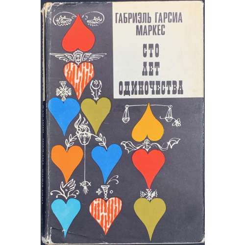 Hardcover, publisher's white cloth with a black imprint to cover, red and black lettering to spine, pictorial DJ, pp.: [1-4] 5-398 [2]. Послесловие В. Столбова, художник В. Юрлов. Russian translation of Cien años de soledad by Gabriel García Márquez.
 -
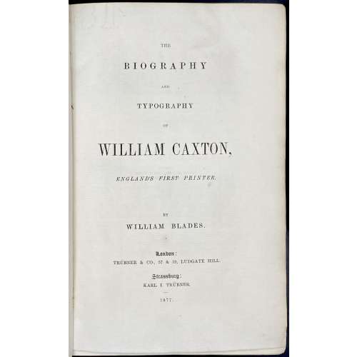 Title: THE | BIOGRAPHY AND | TYPOGRAPHY | OF | WILLIAM CAXTON, | ENGLAND'S FIRST PRINTER. | BY | WILLIAM BLADES. | LONDON : | TRÜBNER & CO, 57 & 59 LUDGATE HILL. | STRASSBURG : | KARL I. TRÜBNER. | 1877. || Pagination: ffl, [2] blank, [i, ii] - t.p., imprint, [iii], iv, v - preface, [vi] - cul-de-lampe, [vii], viii - contents; [1], 2-383 [384] - imprint, 2] - blanks, bfl.; 18 plates: op. p. 8, 22, 54 (3), 60, 126 (4), 283, [311], 336, 358 (5). Collation: 8vo; [A]4 B-Z8 AA8 BB7. Exterior: 22.6 x 14.8 cm, printed on watermarked Zanders laid paper, original brown decorated paper boards, spine with decoration and lettering, marbled end-papers, water stain to bottom of upper cover, slightly rubbed, upper margin marbled, other untrimmed, binder's mark to back pastedown: "Bound by Simpson & Renshaw". Bookplates to front pastedown: upper: F. Marcham | Tempora mutantur, nos et mutamur in illis. | Hornsey | 1907"; lower: (2) "From the library of | H. Harvey Frost". Caxton, William (British, c. 1422 – 1491). Blades, William (British, 1824-1890) Frank Marcham (1883 – 1934), motto: "Times are changed, we also are changed with them". This book is based on the author's The Life and Typography of William Caxton, London: J. Lilly, 1861-63, – "A new 'Life' in a more handy form".
 -
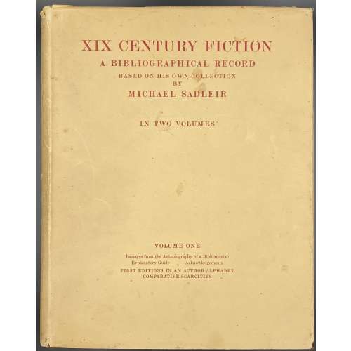 Title vol. 1: XIX CENTURY FICTION | A BIBLIOGRAPHICAL RECORD | BASED ON HIS OWN COLLECTION | BY | MICHAEL SADLEIR | IN TWO VOLUMES | VOLUME I | PRINTED AT THE UNIVERSITY PRESS, CAMBRIDGE | AND PUBLISHED | in Great Britain by | / CONSTABLE & CO LTD | 10–12 ORANGE STREET | LONDON W.C.2 / in the U.S.A. by the | CALIFORNIA UNIVERSITY | PRESS | LOS ANGELES, CAL.|| DJ vol. 1: XIX CENTURY FICTION | A BIBLIOGRAPHICAL RECORD | BASED ON HIS OWN COLLECTION | BY | MICHAEL SADLEIR | IN TWO VOLUMES | VOLUME ONE | Passages from the Autobiography of a Bibliomaniac | Explanatory Guide – Acknowledgements | FIRST EDITIONS IN AN AUTHOR-ALPHABET | COMPARATIVE SCARCITIES || Pagination: [4 blanks] ix-xxxiii, [2] 3-398 [399] [2 blanks] Collation: 4to; π2 [a]-d4 [1]-504. Title vol. 2: XIX CENTURY FICTION | A BIBLIOGRAPHICAL RECORD | BASED ON HIS OWN COLLECTION | BY | MICHAEL SADLEIR | IN TWO VOLUMES | VOLUME II | PRINTED AT THE UNIVERSITY PRESS, CAMBRIDGE | AND PUBLISHED | in Great Britain by | / CONSTABLE & CO LTD | 10–12 ORANGE STREET | LONDON W.C.2 / in the U.S.A. by the | CALIFORNIA UNIVERSITY | PRESS | LOS ANGELES, CAL.|| DJ vol. 2: XIX CENTURY FICTION | A BIBLIOGRAPHICAL RECORD | BASED ON HIS OWN COLLECTION | BY | MICHAEL SADLEIR | IN TWO VOLUMES | VOLUME TWO | “YELLOW-BACK” COLLECTION | FICTION SERIES || Pagination: [2 blanks] [8] [2] 3-195 [196 blank] [2 blanks]. Collation: 4to; π4 1-234 246. Binding: burgundy cloth, gilt vertical lettering to spine, Verity Hewitt (Canberra, AU) bookshop sticker to front pastedown; laid paper; cream DJ with lettering to front and spine. Edition: First limited edition of 1025 of which 1000 for sale. Unnumbered.
 -
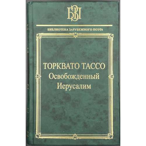 Hardcover, green publisher's paper boards, gilt lettering in the figural frame, black label with gilt lettering and gilt in compartments to spine. 21 x 13.5 cm, print run 2,500. pp.: [4] 5-714 [715/6] [4]. Title: ТОРКВАТО ТАССО | Освобожденный | Иерусалим | Перевод с итальянского | В. С. ЛИХАЧЕВА | Подготовка текста, предисловие, комментарии | А. О. ДЁМИНА | {publisher's device} | Санкт-Петербург | «НАУКА» | 2007 || ISBN 978-5-02-026954-5 Original: Torquato Tasso. La Gierusalemme Liberata.
 -
![Adelbert von Chamisso. Peter Schlemihl's wundersame Geschichte. Nach des Dichters Tode neu herausgegeben von Julius Eduard Hitzig. Stereotypausgabe mit Holzschnitten. — Nürnberg: Johann Leonhard Schrag, [o.J.], [1839]. — XVI + 83 S.](https://varshavskycollection.com/wp-content/uploads/2021/02/LIB-1100.2016-b-scaled-500x500.jpeg) Title page (in Gothic script): Peter Schlemihl's | wundersame Geschichte | mitgetheilt | von | Adelbert von Chamisso. | {vignette} | Nach des Dichters Tode neu herausgegeben | von Julius Eduard Hitzig. | Stereotypausgabe mit Holzschnitten. | Nürnberg, | Johann Leonhard Schrag. || Pagination: [i-iii] iv-xvi, [1] 2-82 [2], 15 woodcut vignettes by Unzelmann after Menzel. Collation: 8vo; π8 1-58 62. Binding: 21.5 x 13.5 cm, blind olive wrappers. Year of publication inferred from the foreword. This is the first posthumous edition of Chamisso's novel. Personae: Chamisso, Adelbert von (German, 1781 – 1838). — Author of the text. Hitzig, Julius Eduard [Itzig, Isaac Elias] (German-Jewish, 1780 – 1849). — Author of the foreword. Menzel, Adolph Friedrich Erdmann von (German, 1815 – 1905). — Artist of the vignettes. Unzelmann, Friedrich Ludwig (German, 1797 – 1854). — Engraver of the woodcuts. Schrag, Johann Leonhard (Germany, 1783 – 1858). — Publisher.
Title page (in Gothic script): Peter Schlemihl's | wundersame Geschichte | mitgetheilt | von | Adelbert von Chamisso. | {vignette} | Nach des Dichters Tode neu herausgegeben | von Julius Eduard Hitzig. | Stereotypausgabe mit Holzschnitten. | Nürnberg, | Johann Leonhard Schrag. || Pagination: [i-iii] iv-xvi, [1] 2-82 [2], 15 woodcut vignettes by Unzelmann after Menzel. Collation: 8vo; π8 1-58 62. Binding: 21.5 x 13.5 cm, blind olive wrappers. Year of publication inferred from the foreword. This is the first posthumous edition of Chamisso's novel. Personae: Chamisso, Adelbert von (German, 1781 – 1838). — Author of the text. Hitzig, Julius Eduard [Itzig, Isaac Elias] (German-Jewish, 1780 – 1849). — Author of the foreword. Menzel, Adolph Friedrich Erdmann von (German, 1815 – 1905). — Artist of the vignettes. Unzelmann, Friedrich Ludwig (German, 1797 – 1854). — Engraver of the woodcuts. Schrag, Johann Leonhard (Germany, 1783 – 1858). — Publisher. -
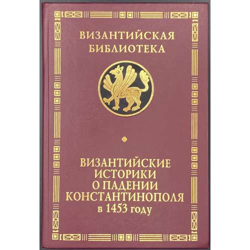 Title: К 550-летию великой трагедии | ВИЗАНТИЙСКИЕ | ИСТОРИКИ | О ПАДЕНИИ | КОНСТАНТИНОПОЛЯ | в 1453 году | Под редакцией | Я. Н. Любарского, | Т. И. Соболь | Санкт-Петербург | АЛЕТЕЙЯ | 2006 || Series: Византийская библиотека. Источники. Pagination: [1-5] 6-189 [3]. Binding: 21.5 x 15 cm; hardcover, crimson buckram, gilt lettering in the border, gilt serial device on black, map endpapers. Print run: 1,000 copies. ISBN: 5-89329-766-0. Michael Critobulus [Μιχαήλ Κριτόβουλος; Михаил Критовул] (Greek, c. 1410 – c. 1470). Doukas [Dukas; Дука; Δούκας] (Greek, c. 1400 – after 1462). Laonikos Chalkokondyles [Laonicus Chalcocondyles; Λαόνικος Χαλκοκονδύλης; Лаоник Халкокондил] (Greek, c. 1430 – c. 1470). Любарский, Яков Николаевич (Russian, 1929 – 2003).
 -
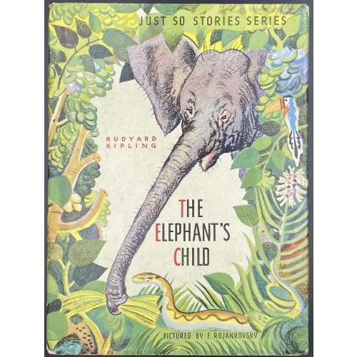 Hardcover volume, 24 x 18 cm, pictorial paper over cardboard boards, pictorial endpapers, and pictorial DJ; pp.: [2] – pictorial t.p. / copyrignt+imprint + [26] unpaginated pages (13 leaves); in-text photomechanical b/w and coloured illustrations after Feodor Rojankovsky. DJ and front cover (pictorial): JUST SO STORIES SERIES | RUDYARD KIPLING | THE | ELEPHANT'S | CHILD | PICTURED BY F. ROJANKOVSKY || Title-page (pictorial): JUST SO STORIES SERIES | THE | ELEPHANT'S | CHILD | RUDYARD KIPLING | ILLUSTRATED BY | F. ROJANKOVSKY | GARDEN CITY PUBLISHING COMPANY, INC., GARDEN CITY, N. Y. || Contributors: Rudyard Kipling (British, 1865 – 1936) Feodor Rojankovsky [Rojan; Фёдор Степанович Рожанковский] (Russian-American, 1891 – 1970)
 -
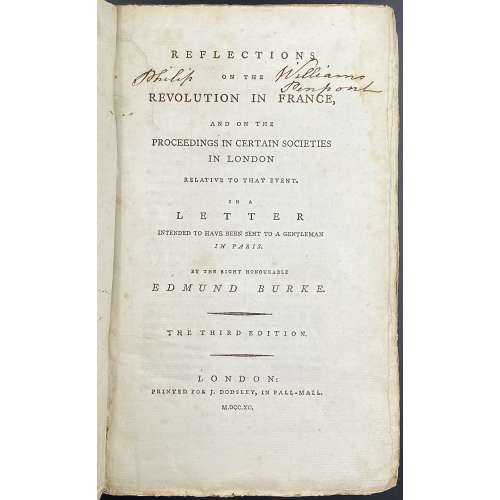 Title: REFLECTIONS | ON THE | REVOLUTION IN FRANCE, | AND ON THE | PROCEEDINGS IN CERTAIN SOCIETIES | IN LONDON | RELATIVE TO THAT EVENT. | IN A | LETTER | INTENDED TO HAVE BEEN SENT TO A GENTLEMAN | IN PARIS. | BY THE RIGHT HONOURABLE | EDMUND BURKE. | — | {in lozenges} THE THIRD EDITION. | —| LONDON: | PRINTED FOR J. DODSLEY, IN PALL-MALL. | M.DCC.XC. || Pagination: [i-iii] iv, [1] 2-364, total 368 pages. Collation: 8vo; π2 B-Z8 Aa6 (plus one blank flyleaf in the front and one in the back), total 184 leaves. Binding: 23 x 14.5 cm, publisher’s paper-backed binding in blue boards with handwritten title to spine (illegible), laid paper, margins untrimmed. Housed in a modern brown cloth clamshell box with brown gilt-lettered label. Note: The second edition same year has a total of 360 pages (iv, 356); see LIB-2590.2021. Inscription to title page: Philip [ON THE] Williams Penpont – that is probably of Philip Williams Esq., of Penpont, Breconshire, Wales. (c. 1742 – 1794).
 -
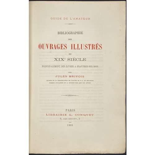 Title page: GUIDE DE L’AMATEUR | BIBLIOGRAPHIE | DES | OUVRAGES ILLUSTRES | DU | XIXe SIÈCLE | PRINCIPALEMENT DES LIVRES A GRAVURES SUR BOIS | PAR | JULES BRIVOIS | AUTEUR DE LA BIBLIOGRAPHIE DE L’ŒUVRE DE P.-J. BÉRANGER | MEMBRE FONDATEUR DE LA SOCIÉTÉ DES AMIS DES LIVRES | — | PARIS | LIBRAIRIE L. CONQUET | 5, RUE DROUOT, 5 | 1883 || Justification: Il a été tire : | 900 exemplaires sur papier vergé. | Et 50 exemplaires sur grand papier de Hollande. | Tous sont numérotés et paraphes par l’auteur. | № {188 signature} | Les numéros pairs portent le nom de M. L. Conquet. | Et les numéros impairs celui de M. P. Rouquette. | — | Le dépôt légal sera fait en France et dans tous les pays avec lesquels il | existe des conventions pour la propriété littéraire. | Tous droits réservés. || Pagination : [2] blank, [i-v] vi-xiii [xiv], [1] 2-468; the total number of pages = 484. Collation: π8 1-288 2910, an asterisk on leaf 295; the total number of leaves 242; 3 blank leaves of wove paper before and after collation. Imprint to 11 : Imp. de Mme de Lacombe; Imprint to 2910 : Nancy, imprimerie Berger-Levrault et Cie. Binding: ¾ polished distressed calf over marbled boards by the previous owner "E.D", gilt-stamped spine with gilt-lettered black label, peacock marbled endpapers, printed on laid paper. Contributors: Jules Brivois (French, 1832 – 1920) – author. L. Conquet (Paris) – publisher. P. Rouquette (Paris) – publisher. Berger-Levrault et Cie – printer.
 -
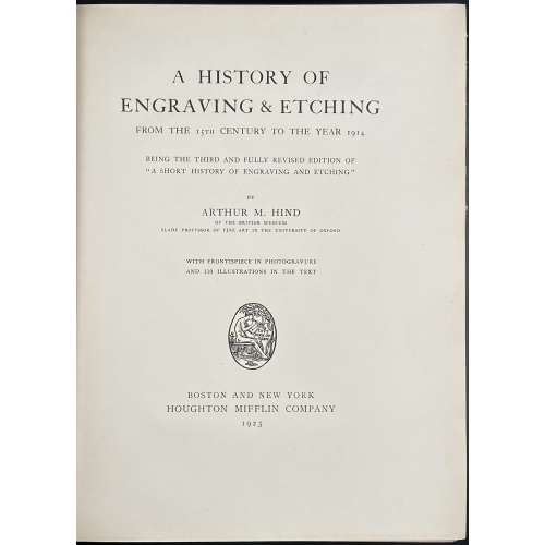 Title: A HISTORY OF | ENGRAVING & ETCHING | FROM THE 15TH CENTURY TO THE YEAR 1914 | BEING THE THIRD AND FULLY REVISED EDITION OF | “A SHORT HISTORY OF ENGRAVING AND ETCHING” | BY | ARTHUR M. HIND | OF THE BRITISH MUSEUM | SLADE PROFESSOR OF FINE ART IN THE UNIVERSITY OF OXFORD | WITH FRONTISPIECE IN PHOTOGRAVURE | AND 110 ILLUSTRATIONS IN THE TEXT | {publisher’s device} | BOSTON AND NEW YORK | HOUGHTON MIFFLIN COMPANY | 1923 || Pagination: [i-iv] v-xiii. [2] – blank / abbrev., [2] 3-487 [488], frontis. w/tissue guard, ills.; Appendices: I. Classified list of engravers (p. 343-392); II. General bibliography (p. 393-419); III. Index of engravers and individual bibliography (p. 420-487). Collation: π10 B-2H8 2I4, frontispiece (extr.), 110 in-text illustrations. Binding: 25.8 x 20 cm, crimson cloth, blind triple-fillet to top and bottom of the front board, same in gilt to spine, gilt lettering to spine, top edge gilt, fore-edge untrimmed. Contributors: Arthur Mayger Hind (British, 1880 – 1957) – author. Houghton Mifflin Company (Boston, 1864) – publisher. R & R. Clark, Ltd. (Edinburgh, 1846) – printer. Note: It is marked as the 3rd edition of A short history of engraving and etching. Indeed, A short history of engraving & etching for the use of collectors and students with full bibliography, classified list and index of engravers was published by Constable in London and Houghton Mifflin Co. in Boston, in 1908 and then in 1911. However, it is hard to consider an almost completely new book "a 3rd edition".
 -
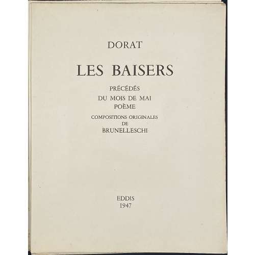 Title-page: DORAT | LES BAISERS | PRÉCÉDÉS | DU MOIS DE MAI | POÈME | COMPOSITIONS ORIGINALES | DE | BRUNELLESCHI | EDDIS | 1947 || Description: 23.3 x 19 cm, French slapped wrappers, sunned and heavy foxed, without a slipcase; [1-6] (h.t. with owner’s inscription / limitation with № 18, t.p., d.t.p.), 7-137 [138] [6] (colophon) plus 23 stencil-coloured (au pochoir) photogravure plates after Umberto Brunelleschi, his head- and tailpieces (total 60 designs). Printed by Gaston Maillet & Cie in Saint-Ouen on April 15, 1947. Photogravure by Deberni and Peignot under direction of R. Perrot. Limitation: 3,000 copies numbered 1 to 3,000 of which 500 copies on Vélin de Luxe (1–500) enriched with two suites of plates, one in colour and one toned, before letters; 2,500 on Vélin de Fabrication Spéciale of which copies numbered 500–1,000 enriched with one suite before letters, and 2,000 copies numbered 1,001–3,000. Besides, there are 200 additional copies numbered with Roman numbers reserved for foreign bibliophiles. This particular copy bears number 18, however, I don’t think it is printed on Vélin de Luxe, whatever it is, and does not have an extra suite of plates. Owner’s inscription pasted to h.t.: A Denise ce livre audacieux | mais qui par son art sait | tout faire pardonner — | Jane Darboy. Provenance: Jane Darboy (French, fl. 1932 – 1948) – a French writer.
 -
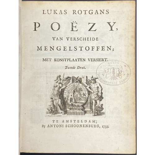 Title-page: LUKAS ROTGANS | POËZY, | VAN VERSCHEIDE | MENGELSTOFFEN; | MET KONSTPLAATEN VERSIERT. | Tweede Druk | {vignette} | TE AMSTERDAM; | By ANTONI SCHOONENBURG, 1735. || Collation: 4to; fep, 1st blank, engraved t.p. by M. Pool, t.p., *3,4; 2*-9*4, 10*1, *LII2, *LII, 10*2 —> *-10*4 (40 leaves); A-Z4, 2A-2Z4, 3A-3Z4, 4A-4Q4, last blank, fep; (340 leaves), 2 plates extraneous to collation. Pagination: [2] [1-5] 6-14 [15-80] [1-3] 4-680 [2], 2 unsigned plates not included in pagination after pp. 634 and 652, 50 headpieces by Jacob Folkema after Arnold Houbraken, and 2 tailpieces by Jan de Ruijter. Marks: Armorial bookplate: “Ex Libris J. J. Mak | {coat of arms} | Inveni Intermanere Melius”. Oval ink stamp: “HOOGERE BURGERSCHOOL. | DELFT” Provenance: Johannes Jacobus Mak (Dutch, 1908 – 1975). Edition: 2nd, 1st edition published in 1715 in Leeuwarden by François Halma. Contributors: Lukas Rotgans (Dutch, 1653 – 1710) – author. Arnold Houbraken (Dutch, 1660 – 1719) – artist. Jacob Folkema (Dutch, 1692 – 1767) – engraver. Matthijs Pool (Dutch, 1676 – 1740) – engraver. Jan de Ruijter (Dutch, 1688 – 1744) – engraver. Antoni Schoonenburg (Dutch, 1682 – 1754) – publisher.