-
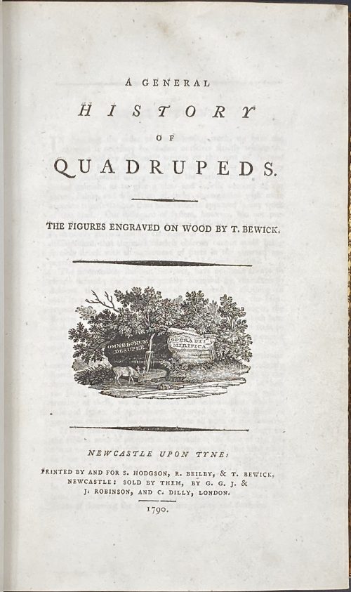 Title: A GENERAL | HISTORY | OF | QUADRUPEDS. | – | THE FIGURES ENGRAVED ON WOOD BY THOMAS BEWICK. | {vignette} | — | NEWCASTLE UPON TYNE : | PRINTED BY AND FOR S. HODGSON, R. BEILBY, & T. BEWICK, | NEWCASTLE: SOLD BY THEM, BY G. G. J. & | J. ROBINSON, AND C. DILLY, LONDON. | 1790. Pagination: [4 blanks], [i, ii] – t.p. / blank, [iii, iv] – advertisement / index, v-viii – index, [1] 2-456 [4 blanks]. Collation: demi 8vo; a⁴ A-Ee⁸ Ff⁴. A3 unsigned, catchword at p.375 THE instead of WE. Variant A (with a fly facing upward). Size: 21.8 x 14 cm; page 21.2 x 13 cm. Woodcuts: 260 descriptions of quadrupeds; 200 figures of quadrupeds, 104 vignettes, tailpieces, etc. Binding: Full marbled calf, gilt double border, black label with gilt lettering to flat spine. There were 1,500 copies Demy copies printed. Catalogue raisonné: S. Roscoe (1953): pp. 5-11; Hugo (1866): pp. 22-23.
 -
![[Barham, Richard Harris]. The Ingoldsby Legends or Mirth and Marvels by Thomas Ingoldsby, esquire / First, Second and Third Series - 3 volumes; Illustr.: George Cruikshank and John Leech. — London: Richard Bentley, 1840-1847. — Vol. 1: Printed by London: Samuel Bentley, 1840. pp.: ff, [2 blank] [i ht] [ii colophon] [title, verso blank] [iii] iv-v [vi blank] [contents, list of ill.] [blank, etching on verso] [1] 2-338 [339] [7, incl. orig. FC and Sp.] bf, 6 plates: 1 by Buss, 3 by Leech, 2 by Cruikshank. — Vol. 2: Printed by London: S. & J. Bentley, Wilson, and Fley, 1842. pp.: ff, [2 blank] [i ht] [ii colophon] [title, verso blank] [v] vi-vii [viii blank] [contents, verso blank] [blank, etching on verso] [1] 2-288 [6, incl. orig. FC and Sp.] bf, 7 plates: 3 by Leech, 4 by Cruikshank. — Vol. 3: Printed by London: S. & J. Bentley, Wilson, and Fley, 1847. pp.: ff, [2 blank] [i ht] [ii colophon] [title, verso blank] [iii] iv-vi [contents, list of ill.] [blank, portrait on verso] [1] 2-364 [6, incl. orig. FC and Sp.] bf, 6 plates: 2 portraits, 2 by Leech, 2 by Cruikshank.](https://varshavskycollection.com/wp-content/uploads/2021/02/LIB-2483-1.2020-c-1-500x790.jpeg) 3-volume set, 1st edition, with original wrappers. Vol. 1: Half-title: THE | INGLODSBY LEGENDS. Title (in black and red, emblematic, engraved): THE | Ingoldsby Legends | OR | MIRTH AND MARVELS | by | THOMAS INGOLDSBY | ESQUIRE | In frame: | LONDON. | RICHARD BENTLEY. | MDCCCXL. | Under the frame: J. S. GWILT. | INV. Pagination: ffl, [2] – blanks, [i, ii] – h.t./ colophon, [2] – t.p. / verso blank, [iii] iv-v [vi] – blank, contents / list of ill., blank / etching, [1] 2-338 [339], [7] incl. orig. covers and spine bound in, bfl; 6 plates: 1 by Buss, 3 by Leech, 2 by Cruikshank. Vol. 2: Half-title: THE | INGLODSBY LEGENDS. |—| SECOND SERIES.|| Title (in black and red, emblematic, engraved): THE | Ingoldsby Legends | OR | MIRTH AND MARVELS | by | THOMAS INGOLDSBY | ESQUIRE | SECOND SERIES | In frame: | LONDON | RICHARD BENTLEY. | MDCCCXLII. | Under the frame: G. COOK SCULPo|| Pagination: ffl, [2] – blanks, [i, ii] – h.t. / colophon, [iii, iv] – t.p. / verso blank, [v] vi-vii [viii ] – blank, contents / blank, blank / etching, [1] 2-288 [6], incl. orig. covers and spine bound in, bfl; 7 plates: 3 by Leech, 4 by Cruikshank. Vol. 3: Half-title: THE | INGLODSBY LEGENDS. |—| THIRD SERIES.|| Title (in black and red, emblematic, engraved): THE | Ingoldsby Legends | OR | MIRTH AND MARVELS | by | THOMAS INGOLDSBY | ESQUIRE | THIRD SERIES | In frame: | LONDON | RICHARD BENTLEY. | MDCCCXLVII. | Under the frame: COOK || Pagination: ffl, [2] – blanks] [i, ii] – h.t. / colophon, [2] – t.p. / verso blank], [iii] iv-vi – contents / list of ill., blank / portrait, [1] 2-364 [6], incl. orig. covers and spine bound in, bfl; 6 plates: 2 portraits, 2 by Leech, 2 by Cruikshank. Binding: 3 volumes, 8vo, 20.5 x 13.5 cm, hardcover, full carmine morocco, triple ruled in gilt, top edge gilt, slightly raised bands, gilt lettering and double fillet gilt panels to spine by T. W. Morrell & Co. (London) for Brentano's bookstore in New York. 6, 7, and 6 (19 total) plates inset. The original brown figured cloth covers and spines preserved at the end of each volume. Catalogue raisonné: Albert M. Cohn, 1924: №50, p.20. Contrary to A. Cohn's description, the first etching in the first series is signed “Dalton del.” bottom left and “Buss sculp.” bottom right. It has been suggested that the name Dalton might refer to Richard Harris Dalton Barham (British, 1815-1886). Robert William Buss (1804 – 1875). Portrait (v.3, p.1): John William Cook (fl.1819 - 1862) after Richard James Lane (British, 1800 – 1872). Portrait (v.3, p.127): Henry Griffiths after Dalton. Seller's description: First editions, mixed states, in full crimson levant morocco by Morrel for Brentanos, New York. Vol.1, p. 236 is NOT blank, but unpaginated; Vol. 2 does NOT have a list of ill's on verso of contents; Vol. 3, p. 351 'to pot' NOT run together. Cloth spine and front cover bound in the back of each volume, all volumes have half-titles, with engraved titles and 19 plates by Cruikshank, Leech, et al. Conforms in the main to Sadlier 156b, 156e, and 156f.
3-volume set, 1st edition, with original wrappers. Vol. 1: Half-title: THE | INGLODSBY LEGENDS. Title (in black and red, emblematic, engraved): THE | Ingoldsby Legends | OR | MIRTH AND MARVELS | by | THOMAS INGOLDSBY | ESQUIRE | In frame: | LONDON. | RICHARD BENTLEY. | MDCCCXL. | Under the frame: J. S. GWILT. | INV. Pagination: ffl, [2] – blanks, [i, ii] – h.t./ colophon, [2] – t.p. / verso blank, [iii] iv-v [vi] – blank, contents / list of ill., blank / etching, [1] 2-338 [339], [7] incl. orig. covers and spine bound in, bfl; 6 plates: 1 by Buss, 3 by Leech, 2 by Cruikshank. Vol. 2: Half-title: THE | INGLODSBY LEGENDS. |—| SECOND SERIES.|| Title (in black and red, emblematic, engraved): THE | Ingoldsby Legends | OR | MIRTH AND MARVELS | by | THOMAS INGOLDSBY | ESQUIRE | SECOND SERIES | In frame: | LONDON | RICHARD BENTLEY. | MDCCCXLII. | Under the frame: G. COOK SCULPo|| Pagination: ffl, [2] – blanks, [i, ii] – h.t. / colophon, [iii, iv] – t.p. / verso blank, [v] vi-vii [viii ] – blank, contents / blank, blank / etching, [1] 2-288 [6], incl. orig. covers and spine bound in, bfl; 7 plates: 3 by Leech, 4 by Cruikshank. Vol. 3: Half-title: THE | INGLODSBY LEGENDS. |—| THIRD SERIES.|| Title (in black and red, emblematic, engraved): THE | Ingoldsby Legends | OR | MIRTH AND MARVELS | by | THOMAS INGOLDSBY | ESQUIRE | THIRD SERIES | In frame: | LONDON | RICHARD BENTLEY. | MDCCCXLVII. | Under the frame: COOK || Pagination: ffl, [2] – blanks] [i, ii] – h.t. / colophon, [2] – t.p. / verso blank], [iii] iv-vi – contents / list of ill., blank / portrait, [1] 2-364 [6], incl. orig. covers and spine bound in, bfl; 6 plates: 2 portraits, 2 by Leech, 2 by Cruikshank. Binding: 3 volumes, 8vo, 20.5 x 13.5 cm, hardcover, full carmine morocco, triple ruled in gilt, top edge gilt, slightly raised bands, gilt lettering and double fillet gilt panels to spine by T. W. Morrell & Co. (London) for Brentano's bookstore in New York. 6, 7, and 6 (19 total) plates inset. The original brown figured cloth covers and spines preserved at the end of each volume. Catalogue raisonné: Albert M. Cohn, 1924: №50, p.20. Contrary to A. Cohn's description, the first etching in the first series is signed “Dalton del.” bottom left and “Buss sculp.” bottom right. It has been suggested that the name Dalton might refer to Richard Harris Dalton Barham (British, 1815-1886). Robert William Buss (1804 – 1875). Portrait (v.3, p.1): John William Cook (fl.1819 - 1862) after Richard James Lane (British, 1800 – 1872). Portrait (v.3, p.127): Henry Griffiths after Dalton. Seller's description: First editions, mixed states, in full crimson levant morocco by Morrel for Brentanos, New York. Vol.1, p. 236 is NOT blank, but unpaginated; Vol. 2 does NOT have a list of ill's on verso of contents; Vol. 3, p. 351 'to pot' NOT run together. Cloth spine and front cover bound in the back of each volume, all volumes have half-titles, with engraved titles and 19 plates by Cruikshank, Leech, et al. Conforms in the main to Sadlier 156b, 156e, and 156f. -
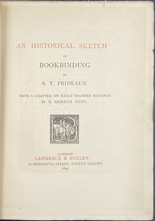 Title in black and red: AN HISTORICAL SKETCH | OF | BOOKBINDING | BY | S. T. PRIDEAUX | WITH A CHAPTER ON EARLY STAMPED BINDINGS | BY E. GORDON DUFF. | {Publisher’s device} | LONDON: LAWRENCE & BULLEN | 16 HENRIETTA STREET, COVENT GARDEN | 1893 || Pagination: [i, ii] – h.t. / blank, [2] – blank / frontis. w/guard, [iii, iv] – t.p. / colophon, [v], vi – preface, [vii, viii] – contents / blank, [1] 2-303 [304 blank]. Collation: 8vo; [A]4 B-U8. Binding: Grey cloth with gilt-stamped lettering and publisher’s device to front cover, gilt lettering to spine, blue floral ornamental endpapers, free margin untrimmed; printed on laid paper.
 -
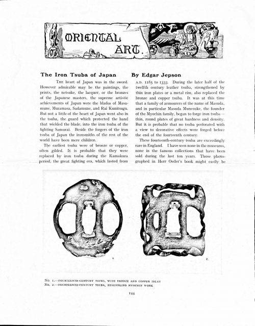 Magazine article by Edgar Jepson: The Iron Tsuba of Japan (Section: Oriental Art), published in volume Vol. 70 (September–December) of The Connoisseur: An Illustrated Magazine for Collectors, Vol. 70 (September–December); pp. 143-152 / C. Reginald Grundy [ed.] — London: Published by the Proprietor, W. CLAUSE JOHNSON, at the Editorial and Advertisement Offices of The Connoisseur, 1924. Owner's half black morocco, gilt lettering to spine, blue cloth boards. Two volumes bound together without original covers. Size 28.5 x 22 cm. Vol. 1: The Connoisseur | An Illustrated Magazine | For Collectors | Edited by C. Reginald Grundy | Vol. LXIX. | (MAY—AUGUST, 1924) | LONDON | Published by the Proprietor, W. CLAUSE JOHNSON, at the | Editorial and Advertisement Offices of The Connoisseur, | at 1, Duke Street, St. James's, S.W. 1 | 1924 || Pp.: [i-ii] iii-xviii [xix] [1, 2 - plate] 3-249 [250]. Vol. 2: The Connoisseur | An Illustrated Magazine | For Collectors | Edited by C. Reginald Grundy | Vol. LXX. | (SEPTEMBER—DECEMBER, 1924) | LONDON | Published by the Proprietor, W. CLAUSE JOHNSON, at the | Editorial and Advertisement Offices of The Connoisseur, | at 1, Duke Street, St. James's, S.W. 1 | 1924 || Pp.: [i-ii] iii-xxii [2 blanks] [1, 2 - plate] 3-261 [262]. The Iron Tsuba of Japan by Edgar Jepson The heart of Japan was in the sword. However admirable may be the paintings, the prints, the netsuke, the lacquer, or the bronzes of the Japanese masters, the supreme artistic achievements of Japan were the blades of Masamune, Muramasa, Sadamune, and Rai Kunitsugu. But not a little of the heart of Japan went also in the tsuba, the guard which protected the hand that wielded the blade, into the iron tsuba of the fighting Samurai. Beside the forgers of the iron tsuba of Japan the ironsmiths of the rest of the world have been mere children. The earliest tsuba were of bronze or copper, often gilded. It is probable that they were replaced by iron tsuba during the Kamakura period, the great fighting era, which lasted from A.D. 1185 to 1333. During the later half of the twelfth century leather tsuba, strengthened by thin iron plates or a metal rim, also replaced the bronze and copper tsuba. It was at this time that a family of armourers of the name of Masuda, and in particular Masuda Munesuke, the founder of the Myochin family, began to forge iron tsuba — thin, round plates of great hardness and density. But it is probable that no tsuba perforated with a view to decorative effects were forged before the end of the fourteenth century. These fourteenth-century tsuba are exceedingly rare in England. I have seen none in the museums, none in the famous collections that have been sold during the last ten years. Those photographed in Herr Oeder's book might easily be the fifteenth century. No. 1 is a curious cup-shape tsuba decorated with a bronze and copper inlay. No. 2, with its edges curiously twisted in the forging, looks like Myochin work. But it is not of the Myochin iron. The Myochin family produced some of the greatest ironsmiths of Japan. Armourers first of all, tsubasmiths, forgers of sake-kettles, articulated reptiles, crustacea, and insects — everything that can be done with iron they did; they pushed their medium to its limit. They were forging iron tsuba in 1160, and they were still forging them in 1860. And it was their own iron, or rather their own steel. They discovered the secret of it early, and they kept that secret in the family for all those hundreds of years. There is no mistaking a Myochin tsuba: balance it on your finger and tap it with a piece of metal, always it gives forth a clear bell-like ring that you get from the work of no other ironsmith, Japanese or European. Always the Myochin tsuba is before everything a protection to the hand of the swordsman; to that everything is, as it should be, subordinated. No. 3 is a Myochin tsuba of the fifteenth century, and probably of the early fifteenth century. No. 4, by Myochin Munetaka, perforated with a grotesque figure, is an example of that twisting and twisting of the iron in the forging till it forms a pattern like the grain of wood. The Myochin smiths invented these wood-grain tsuba, and no other smiths equalled them in their forging. In the sixteenth century, the fighting tsuba was probably at its best. It was a century of great tsubasmiths. Then the first Nobuiye, whose tsuba fetched £100 apiece, circa 1800, in Japan, and the first Kaneiye flourished. No. 5 is a tsuba forged by a great smith, Iyesada of Sotome, in the manner of Nobuiye I, decorated with the karakusa tendrils that Nobuiye delighted in, with lightning and clouds. No. 6 is a guard of Sanada Tembo, the chief smith of the Tembo family, stamped, punning fashion, with the character Tembo. Akin to the Tembo tsuba were those of the Kiami and Hoan smiths. Then also the Heianjo smiths and the Owari smiths, especially those of Nagoya and the Yamakichi family, forged their strongest tsuba. Those of the Yamakichi were tested after the forging by being pounded in iron mortars — at least, so the legend runs. But they were a sternly utilitarian family, and I have never seen a Yamakichi tsuba of any beauty. In the later half of the fifteenth century arose the fashion of decorating tsuba with an inlay, zogan, of bronze. The Heianjo tsuba, forged at Kyoto in the latter half of the fifteenth and the beginning of the sixteenth century, were often thus inlaid. The earliest of them were called "Onin", of which No. 7 is an example. In addition to the bronze inlay around the edge, it is inlaid with a representation, some say, of snow; others say, of the duckweed on a pond. No. 8 is probably a Heianjo tsuba, but I am not quite sure about it. The inlaid acacia branches might be very early Shoami work. But to judge by the iron, it is a fifteenth-century tsuba; and the authorities place the beginning of the Shoami school not later than early in the sixteenth century. No. 10 is an example of the Fushimi-zogan, a flat inlay of a light-coloured bronze. These tsuba took their name from the fact that they were first forged at Fushimi, in Yamashiro, in the sixteenth century. It is of the type known as Mon-zukashi, perforated with crests (mon) à jour. The Yoshiro-zogan tsuba were also first forged at Fushimi by Yoshiro Naomasa. They were distinguished from the Fushimi-zogan by the fact that their inlay was generally a little raised-not always-for the inlay of No. 9, a tsuba forged by a later nineteenth-century Yoshiro, is quite flat. It is an interesting tsuba, for, with its decoration grown florid and excessive, it marks the intermediate stage between the simple and delightful designs of the genuine fighting tsuba and the elaborate pictures in gold and silver on the tsuba of the eighteenth-century smiths of Awa and Kyoto, which have become mere ornaments of the goldsmith. The Gomoku-zogan (No. 11) tsuba were probably first forged earlier than the Fushimi and Yoshiro-zogan tsuba. This inlay, in slight relief, is a representation in a light-coloured bronze and copper of twigs caught in the eddies of streams. The seventeenth century and early eighteenth century were the great periods of perforated tsuba. The designs, and they are often admirable, are for the most part in plain fretwork; but they are also chased. No. 12, a crane under an acacia, is a tsuba of a Higo smith, great forgers of fighting tsuba during this period. These smiths also excelled in nunome zogan, a very thin gold and silver inlay, with which they further decorated their perforated guards. The smiths of the Umetada and Shoami families also forged iron tsuba during this period; but their designs, though sometimes pleasing enough, are rarely fine. The best work of Myoju Umetada is in sentoku, not iron. The Choshu smiths, coming later, surpass the perforated guards of both the Umetada and Shoami smiths in beauty of design. No. 13, a lotus in the round, not only fretwork, but also engraved, is a good example of the admirable balance they so often attained in their designs. It is a sufficiently realistic lotus, but yet of a delightful simplicity. In considerable contrast is No. 14, the dragon by Soheishi Soten — one of the only two authentic tsuba of his forging known — the first forger of hikone-bori tsuba, which were in extraordinary favour in Japan during the eighteenth century, and illustrated every important event in Japanese history. It is on the elaborate side, but fine, strong work, and an excellent guard to the hand, for the lighter and more open part, which gives the design its admirable balance, is on the inside, and not exposed to the full swing of an opponent's blade. A few years ago there was a tendency to decry the Namban tsuba as having sprung too directly from foreign sources. But though the original suggestion may have been Chinese, or, as some say, Portuguese, the Japanese made it entirely their own, as characteristically Japanese as anything can well be, but, it must be admitted, of a decadent period. The school took its rise at the beginning of the seventeenth century, and the early tsuba were forged of a specially hard iron, the Wootz, imported from Southern India. No. 15, the signs of the Zodiac, is an excellent tsuba from the fighting point of view. Both it and No. 16 are of quite charming, if elaborate, design, and both of them, with their delicate scroll-work, so astonishingly undercut, are the very last word in the work of the ironsmith-veritable iron lace. To return to the simpler perforated tsuba, the smiths of Akasaka, a suburb of Tokyo, produced probably the most charming designs. Their style derives considerably from the Higo smiths, and their earlier fighting tsuba are very like the Higo tsuba. But always their work was just a little lighter than that of the Higo smiths, and in the end they moved right away from them and became the forgers of very light guards indeed. No. 17, is a representation of the Hiyokudori, the fabulous double bird, in which were reincarnated the souls of the two lovers, Gompachi and Komurasaki; and No. 18, “the tsuba of a hundred ducks "— there are about forty — are characteristic designs of the school. In the work of the Akasaka smiths the balance, which makes the design of a good tsuba so admirable and delightful, attains its height. This admirable balance seems often to be obtained by a deliberate sacrifice of symmetry. About nine hundred and ninety-nine European ironsmiths out of a thousand would have made the right and left sides of the Hiyoku-dori line by line, and perforation by perforation, exactly alike; he would have cut out exactly as many ducks on the one side of “the tsuba of a hundred ducks” as on the other, and made each duck on the right side correspond exactly in position and attitude with a duck on the left side. By variations the tsubasmith attained a finer balance, almost a higher symmetry. No. 19, often called by collectors the "rose-window" tsuba, but really a stylised chrysanthemum, is a favourite design of the Akasaka smiths, but Hizen work and inlaid in the Hizen manner with gold nunome. No. 20 is a Satsuma tsuba of the middle period. The Satsuma smiths of the nineteenth century produced probably the most ornate of all the iron guards, for the most part calibashes and beans with their leaves and tendrils realistic in the extreme, but of charming design. Few crafts have been carried further than that of the tsubasmith; few crafts working in a difficult medium have handled more subjects with greater feeling for beauty or greater liveliness of fancy. It is interesting to note again and again how school influences school, and smith influences smith. But, as in all the applied arts, the finest tsuba were forged by men who never lost sight of the purpose of a tsuba, that it is before everything a protection to the hand, and never subjected that purpose to a passion for virtuosity. Illustrations: No 1. FOURTEENTH-CENTURY TSUBA, WITH BRONZE AND COPPER INLAY No. 2. FOURTEENTH-CENTURY TSUBA, RESEMBLING MYOCHIN WORK No. 3. MYOCHIN TSUBA, FIFTEENTH CENTURY No. 4. MYOCHIN TSUBA, NINETEENTH CENTURY No. 5. SIXTEENTH-CENTURY TSUBA No. 6. SIXTEENTH-CENTURY TSUBA BY IYESADA OF SOTOME BY SANADA TEMBO No. 7. ONIN TSUBA No. 8. HEIANJO (?) TSUBA No. 9. YOSHIRO TSUBA, NINETEENTH CENTURY No. 10. FUSHIMI-ZOGAN, NINETEENTH CENTURY No. 11.- GOMOKU-ZOGAN, SIXTEENTH CENTURY No. 12. HIGO TSUBA, SEVENTEENTH CENTURY No. 13. CHOSHU TSUBA, SEVENTEENTH CENTURY No. 14. SOTEN TSUBA, SEVENTEENTH CENTURY No. 15. NAMBAN TSUBA, EIGHTEENTH CENTURY No. 16. NAMBAN TSUBA, NINETEENTH CENTURY Nos. 17. AND 18. AKASAKA TSUBA, EIGHTEENTH CENTURY No. 19. HIZEN TSUBA, EIGHTEENTH CENTURY No. 20. SATSUMA TSUBA, EIGHTEENTH CENTURY
 -
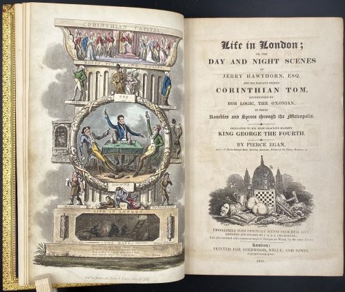
Title: Life in London ; | DAY AND NIGHT SCENES | OF | JERRY HAWTHORN, ESQ. | AND HIS ELEGANT FRIEND | CORINTHIAN TOM, | ACCOMPANIED BY | BOB LOGIC, THE OXONIAN, | IN THEIR |Rambles and Sprees through the Metropolis. | DEDICATED TO HIS MOST GRACIOUS MAJESTY | KING GEORGE THE FOURTH. | BY PIERCE EGAN, | Author of Walks through Bath, Sporting Anecdotes, Picture of the Fancy, Boxiana, &c. | [Vignette] | EMBELLISHED WITH THIRTY-SIX SCENES FROM REAL LIFE, | DESIGNED AND ETCHED BY I. R. & G. CRUIKSHANK ; | And also enriched with numerous original Designs on Wood, by the same Artists, | London: | PRINTED FOR SHERWOOD, NEELY, AND JONES, | PATERNOSTER-ROW. | 1821. ||
Edition: 1st edition, 1st issue: the first sheet of music is not numbered, absence of any footnote at page 9 (as per Cohn).
Pagination: 3 binder's flyleaves with a specimen of George Cruikshank's signature of Nov. 5th, 1860 to the first one; hand-coloured aquatint frontispiece facing the title page with blank recto, [iii-iv] – t.p. with vignette/ blank, [v] vi-viii – dedication, ix-xii – contents, [xiii]-xvi – list of illustrations; [1] 2-376; 35 hand-coloured aquatints, 3 folding leaves of music; bound without half-title [missing pp. i, ii], advertisements or 'to the subscribers' leaf.
Collation: 8vo; [A]7 B-Z8 Aa8-Bb4.
Binding: Full polished calf gilt by Rivière & Son, covers with triple gilt border, spine in 6 compartments, brown morocco lettering pieces to second and third, others richly gilt, raised bands, all edges gilt; neatly re-backed preserving spine.
Catalogue raisonné: Albert M. Cohn, 1924: № 262 p. 90; Abbey, J. R. (Life in England), 281; Tooley (Some English Books with Coloured Plates) 196; Prideaux (Aquatint Engraving) pp. 307, 310; Hardie (English coloured books) 197.
Description of Shapero Rare Books, London: There was a translation into French. At least six plays were based on Egan's characters, contributing to yet more sales. One of these was exported to America, launching the Tom and Jerry craze there. The version created by William Thomas Moncrieff was praised as The Beggar's Opera of its day. Moncrieff's production of Tom and Jerry, or Life in London ran continuously at the Adelphi Theatre for two seasons and it was the dramatist's work as much as the author's that did so much to popularise the book's trademark use of fashionable slang. In 1821 Egan announced the publication of a regular journal: Life in London, appearing monthly at a shilling a time. It was to be illustrated by George Cruikshank (1792 – 1878), and was dedicated to the King, George IV, who at one time had received Egan at court. The first edition of Life in London appeared on 15 July 1821. Egan's creation was an instant success. Pirate versions appeared, featuring such figures as 'Bob Tallyho', 'Dick Wildfire' and the like. Printmakers speedily knocked off cuts featuring the various 'stars' and the real-life public flocked to the 'sporting' addresses that Egan had his heroes frequent. -
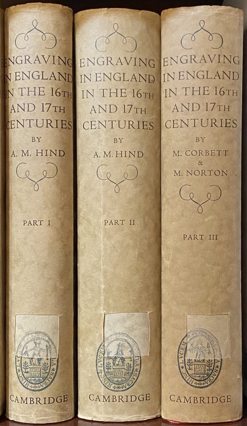 A three-volume set. VOL. 1: ENGRAVING IN ENGLAND | IN THE | SIXTEENTH AND SEVENTEENTH CENTURIES | A DESCRIPTIVE CATALOGUE | WITH INTRODUCTIONS | BY | ARTHUR M HIND | Sometime Keeper of Prints and Drawings in the British Museum | and Slade Professor of Fine Art in the University of Oxford | PART I | THE TUDOR PERIOD | WITH 319 ILLUSTRATIONS | {The coat of arms of the University of Cambridge} | CAMBRIDGE | AT THE UNIVERSITY PRESS | 1952|| Pagination: ffl, [i-vi] – h.t. / blank, frontis., t.p. / colophon, dedication / blank; vii-xxx; 1-333 [334 blank] [2] – the plates / blank; 1-156 pp. of plates. Collation: a-b8, 1-218 + 78 leaves of plates at the end. VOL. 2: ENGRAVING IN ENGLAND | IN THE | SIXTEENTH AND SEVENTEENTH CENTURIES | A DESCRIPTIVE CATALOGUE | WITH INTRODUCTIONS | BY | ARTHUR M HIND | Sometime Keeper of Prints and Drawings in the British Museum | and Slade Professor of Fine Art in the University of Oxford | PART II | THE REIGN OF JAMES I | WITH 618 ILLUSTRATIONS| {The coat of arms of the University of Cambridge} | CAMBRIDGE | AT THE UNIVERSITY PRESS | 1955|| Pagination: [i-iv] – h.t. / blank, t.p. / colophon; v-xiv [xv] [xvi blank]; 1-396 [397] [398 blank] [2] – the plates / blank; 1-252 pp. of plates. Collation: a-b8, 1-268 + 126 leaves of plates at the end. VOL. 3: ENGRAVING IN ENGLAND | IN THE | SIXTEENTH AND SEVENTEENTH CENTURIES | A DESCRIPTIVE CATALOGUE | WITH INTRODUCTIONS | PART III | THE REIGN OF CHARLES I | WITH 466 ILLUSTRATIONS | COMPILED FROM THE NOTES OF | THE LATE A. M. HIND | BY | MARGERY CORBETT & MICHAEL NORTON | {The coat of arms of the University of Cambridge} | CAMBRIDGE | AT THE UNIVERSITY PRESS | 1964|| Pagination: [i-vi] – h.t. / blank, frontis., t.p. / colophon, dedication / blank; vii-xxx; 1-333 [334 blank] [2] – the plates / blank; 1-214 pp. of plates. Collation: [a]8, 1-258 + 107 leaves of plates at the end. Each of three volumes bound in red cloth with gilt lettering to spine, residuals of library stickers, dark spotting to the top and lateral edges; tan DJ with title lettering in a frame to front, lettering to spine, advert. to back, with cut off stickers to spine; ‘The Francis Bacon Foundation’ ink stamp to front pastedown.
 -
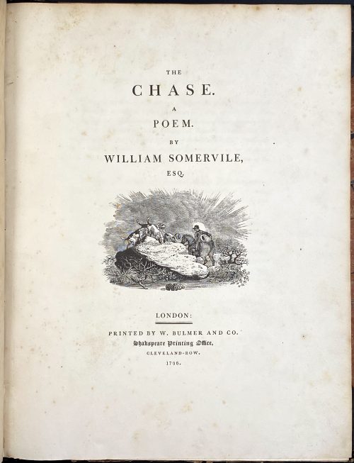 Royal 4to, 29.8 x 23.5 cm, contemporary half brown morocco, marbled boards gilt ruled, spine with gilt-ruled raised bands, gilt title lettering; "William Gore" armorial bookplate to front pastedown. Title page: THE | CHASE. | A | POEM. | BY | WILLIAM SOMERVILLE, | ESQ. | [VIGNETTE] | LONDON : | PRINTED BY W. BULMER AND CO. | Shakespeare Printing Office, | CLEVELAND-ROW. | 1796. Collation: without signatures. — Pagination: [i-v] vi-xv [xvi], [i] ii-vii [viii], [1-5] 6-126; illustrations: engraved title, 4 running titles, 4 headpieces, 4 tailpieces – 13 altogether, all drafted by John Bewick, 12 executed by Thomas Bewick and the last one by Charlton Nesbit. Catalogue Raisonné: Thomas Hugo. The Bewick Collector, vol. 1 (1866): p. 38, № 94: "The first edition... was printed in royal 4to". John Bewick made all the drawing on the blocks but was not able to execute the engravings himself "because of ill-health. They were engraved by Thomas Bewick, with the exception of the tail-piece at the end of the volume, which was engraved by Nesbit". Thomas Bewick (c. 11 August 1753 – 8 November 1828); John Bewick (1760 – 1795), the younger brother of Thomas, died at the age of 35. Christie's, who sold a similar copy on 29 Oct 2012, provides for the size 2°.
 -
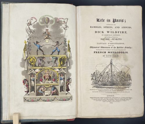
Title: Life in Paris ; | COMPRISING THE | RAMBLES, SPREES, AND AMOURS, | OF | DICK WILDFIRE, | OF CORINTHIAN CELEBRITY, | And his Bang-up Companions, SQUARE JENKINS | AND | CAPTAIN O’SHUFFLETON ; | WITH THE | Whimsical Adventures of the Halibut family ; | Including Sketches of a Variety of other Eccentric Characters in the | FRENCH METROPOLIS. | BY DAVID CAREY |[Vignette]| Embellished with Twenty-One COLOURED PLATES, representing SCENES from REAL LIFE, | designed and engraved by Mr. GEORGE CRUIKSHANK. | Enriched also with Twenty-Two Engravings on Wood, drawn by the same Artist, and | executed by Mr. WHITE. | LONDON : | PRINTED FOR JOHN FAIRBURN, BROADWAY, LUDGATE HILL; | Sold by Sherwood, Neely, and Jones ; Langman, Hurst, Rees, Orme, and Brown ; and | Baldwin, Craddoc, and Joy ; Paternoster-Row ; Simpkin and Marshall, Statio- | ners’ Court ; Whittakers Ave-Maria-Lane ; Humphrey, St. James’s | Street ; and Wilson, Royal Exchange. | 1822. ||
Edition: 1st edition in book form, 1st issue; large-paper copy bound from the parts in original blue paper boards, "most scarce" (Cohn).
Pagination: ffl, [i, ii] – h.t. ‘LIFE IN PARIS’ / ‘MARCHANT, Printer, Ingram-Court, London’, [2] – blank / Frontispiece (Ville la Bagatelle!!) hand-coloured, [iii, iv] – t.p. with vignette / blank, [v] vi-xxiv, [1] 2-489 [490 blank], [2] – 'TO THE BINDER' and 'Marchant, Printer, Ingram-Court, Fenchurch Street' "considered indispensable to a complete copy" (Cohn) / blank, bfl watermarked 1800; 21 hand-coloured aquatints and 22 wood-engraved text vignettes; cancelled leaves 143/4 and 335/6; pinholes from printing visible in most gatherings.
Collation: 4to; [a]-c4, B-Z4 Aa-Zz4 3A-3Q4 3R1 + [Ω]1
Binding: Original boards sometime re-backed with red paper, binder's end leaf watermarked 1800; red hard-grained morocco clamshell box.
Catalogue raisonné: Albert M. Cohn, 1924: № 109 p. 37/8; Abbey, J. R. (Life in England), 112; Tooley (Some English Books with Coloured Plates) 129; Hardie (English coloured books) 199.
Description of Shapero Rare Books, London: Of the copies that have come to auction since 1975 only one has been a large-paper copy in original boards. "The pictures are extremely spirited and true and are all the more wonderful in view of the fact that the artist’s continental experiences were limited to one day spent in Boulogne." (Hardie). In 1821, the journalist Pierce Egan published Life in London, an immediate success illustrated by the Cruikshank brothers, George and Robert. In order to capitalise on this success, another journalist, David Carey, decided to publish his own Life in Paris in monthly instalments (just like Life in London) and with a very similar frontispiece to the one that appears in Egan’s work; Life in Paris, however, was illustrated only by George Cruikshank. One of the earliest and most notable examples of the work of George Cruikshank, with fine, clean plates. -
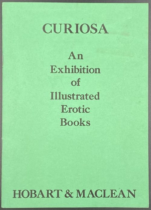 Title: CURIOSA | An | Exhibition | of | Illustrated | Erotic | Books | HOBART & MACLEAN || Pagination: 16 unpaginated pages with bibliography of 49 editions with prices and 51 images. Stapled softcover, original green wrappers with lettering to front and illustration to back. Size: 21 x 15 cm.
 -
 Title: A | GENERAL HISTORY | OF | QUADRUPEDS. | – | THE FIGURES ENGRAVED ON WOOD | BY | THOMAS BEWICK. | — | THE FIFTH EDITION | {vignette} | NEWCASTLE UPON TYNE: | PRINTED BY EDWARD WALKER, FOR T. BEWICK AND S. HODGSON: | SOLD BY THEM, AND ALL BOOKSELLERS. | 1807. Pagination: [2 blanks], [i, ii] – t.p. / blank], [iii, iv] – advertisement, [v] vi-x – index, [1] 2-525 [526 advert. of British Birds] [2 blanks]. Collation: Royal 8vo in fours; π (engraved title), a4 A-3T4 χ3T3. F2 signed 2F, 2E2 unsigned, p. 131 numbered correctly, p. 257 numbered 572. Size: 26 x 17 cm; page 24.5 x 16 cm (royal). Woodcuts: 302 descriptions of quadrupeds, 225 figures and 112 vignettes, tail-pieces, etc. Binding: Full diced brown calf, embossed blind corner fleurons, gilt-tooled border inside and outside, AEG, spine with raised bands, gilt in compartments, lettering; binding restored; armorial bookplate "Thorpe" to front pastedown. Likely to be Thomas Thorpe (1791 – 1851), a prominent bookseller in London: Bedford Street, Covent Garden; started in 1818, went bankrupt on Dec. 31, 1825. Thorpe's family coat of arms: stag standing on a crown and a lion rampant. Catalogue raisonné: S. Roscoe (1953): pp. 23-27. Hugo (1866): pp. 22-24.
 -
 Volume 1: Title: HISTORY | OF | BRITISH BIRDS. | THE FIGURES ENGRAVED ON WOOD BY T. BEWICK. | VOL. I. | CONTAINING THE | HISTORY AND DESCRIPTION OF LAND BIRDS. | [Vignette] | NEWCASTLE: | PRINTED BY SOL. HODGSON, FOR BEILBY & BEWICK : SOLD BY THEM, | AND G. G. & J. ROBINSON, LONDON. | [Price 10s 6d. in Boards] | 1797|| Pagination: [2 blanks], [i, ii] – t.p. / blank, [iii] iv-xxx, [2] – f.t. / blank, [1] 2-335 [336 advert.] [2 blanks]; vignettes on t.p.'s; head- and tail-pieces; publisher's advertisement on final p. of v. 1. Collation: demi 8vo; a-b8, B-Y8; no sigs. A, p. 279 numbered correctly. Woodcuts: 140 descriptions of birds, 117 figures of birds, 91 vignettes, tail-pieces, etc. 1,000 copies printed. Variant B with a vignette at p. 22 printed vertically. Vignette at p. 285 without bars. Volume 2: Title: HISTORY | OF | BRITISH BIRDS. | THE FIGURES ENGRAVED ON WOOD BY T. BEWICK. | VOL. I. | CONTAINING THE | HISTORY AND DESCRIPTION OF WATER BIRDS. | [Vignette] | NEWCASTLE: | PRINTED BY EDWARD WALKER, FOR T. BEWICK : SOLD BY HIM, AND | LONGMAN AND REES, LONDON. | [Price 12s in Boards] | 1804|| Pagination: [2 blanks], [i, ii] – t.p. / blank; [iii] iv-xx, [1] 2-400, [2 blanks]. Collation: Demy 8vo in fours; a2 b-c4, A-3D4; E2, P2, Cc2 insigned. Woodcuts: 144 descriptions of birds, 101 figures of birds, 136 vignettes, tail-pieces, etc. Variant C: Vignette on p. 136 in 1st state, vignettes on pp. 269 and 359 in 2nd state. Binding: speckled full brown calf (restored), contemporary boards ruled in gilt, later spine with raised bands, gilt lettering and florets in compartments, marbled endpapers; 261 woodcut illustrations; printed on wove paper. In both volumes: armorial bookplate of "Clark, Knedlington, Yorks." with the motto "The time will come" on the front pastedown. Size: 21.5 x 14 cm, page: 20.6 x 12.6 cm, demi 8vo. Catalogue raisonné: Hugo (1866): № (99) 94 –120 (108) / pp. 40-58; Roscoe (1953): № 14 a-d, 17 a-d / pp. 46-52 and 65-76. See later edition in this collection: LIB-0860.2015.
 -
 Folio (246 x 321 mm), hardbound in red-brown cloth with gilt lettering and decoration. Content, Introduction by J. E., September, 1873, Artist preface by Bertall, Paris, 1871-1873. Album with 40 hand-colored lithographs by Bertall, numbered 1 through 40, accompanied with extensive descriptions. Ex Libris: Baker. Carpe Diem. Markings: Janny M. Baker with J.L.B. Love, 19 March, 1878 in black ink.
 -
![Adelbert von Chamisso. Peter Schlemihl's wundersame Geschichte. Nach des Dichters Tode neu herausgegeben von Julius Eduard Hitzig. Stereotypausgabe mit Holzschnitten. — Nürnberg: Johann Leonhard Schrag, [o.J.], [1839]. — XVI + 83 S.](https://varshavskycollection.com/wp-content/uploads/2021/02/LIB-1100.2016-b-500x826.jpeg) Title page (in Gothic script): Peter Schlemihl's | wundersame Geschichte | mitgetheilt | von | Adelbert von Chamisso. | {vignette} | Nach des Dichters Tode neu herausgegeben | von Julius Eduard Hitzig. | Stereotypausgabe mit Holzschnitten. | Nürnberg, | Johann Leonhard Schrag. || Pagination: [i-iii] iv-xvi, [1] 2-82 [2], 15 woodcut vignettes by Unzelmann after Menzel. Collation: 8vo; π8 1-58 62. Binding: 21.5 x 13.5 cm, blind olive wrappers. Year of publication inferred from the foreword. This is the first posthumous edition of Chamisso's novel. Personae: Chamisso, Adelbert von (German, 1781 – 1838). — Author of the text. Hitzig, Julius Eduard [Itzig, Isaac Elias] (German-Jewish, 1780 – 1849). — Author of the foreword. Menzel, Adolph Friedrich Erdmann von (German, 1815 – 1905). — Artist of the vignettes. Unzelmann, Friedrich Ludwig (German, 1797 – 1854). — Engraver of the woodcuts. Schrag, Johann Leonhard (Germany, 1783 – 1858). — Publisher.
Title page (in Gothic script): Peter Schlemihl's | wundersame Geschichte | mitgetheilt | von | Adelbert von Chamisso. | {vignette} | Nach des Dichters Tode neu herausgegeben | von Julius Eduard Hitzig. | Stereotypausgabe mit Holzschnitten. | Nürnberg, | Johann Leonhard Schrag. || Pagination: [i-iii] iv-xvi, [1] 2-82 [2], 15 woodcut vignettes by Unzelmann after Menzel. Collation: 8vo; π8 1-58 62. Binding: 21.5 x 13.5 cm, blind olive wrappers. Year of publication inferred from the foreword. This is the first posthumous edition of Chamisso's novel. Personae: Chamisso, Adelbert von (German, 1781 – 1838). — Author of the text. Hitzig, Julius Eduard [Itzig, Isaac Elias] (German-Jewish, 1780 – 1849). — Author of the foreword. Menzel, Adolph Friedrich Erdmann von (German, 1815 – 1905). — Artist of the vignettes. Unzelmann, Friedrich Ludwig (German, 1797 – 1854). — Engraver of the woodcuts. Schrag, Johann Leonhard (Germany, 1783 – 1858). — Publisher. -
 Title: THE | WORKS | OF THE FAMOUS | Nicholas Machiavel, | CITIZEN and SECRETARY | OF | FLORENCE. |—| WRITTEN | Originally in ITALIAN, and from thence newly | and faithfully Tranſlated into ENGLISH. |—|[ornament]|—| LONDON, | Printed for John Starkey, Charles Harper, and John | Amery, at the Miter, the Flower-de-Luce, and the | Peacock, in Fleetstreet. 1680. Content: (1) The history of Florence; (2) The Prince; (3) The Original of the Guelf and Ghibilin Factions; (4) The Life of Castruccio Castracani; (5) The Murther of Vitelli, etc. by Duke Valentino; (6) The State of France; (7) The State of Germany; (8) The Discourses on Titus Livius; (9) The Art of War; (10) The Marriage of Belphegor, a Novel; (11) Nicholas Machiavel's Letter in Vindication of Himself and His Writings. Pagination: ffl, 24 unnumbered pages before the first numbered: [2] – tp / license], [2] – contents / blank], [2] ftp “Florence” / blank, [3] – epistle to Clement VII, [3] – introduction, [12] – table; Misnumbering (X instead of Y format – X/Y): History of Florence: 1- 28/24, 19/91, 198/98, 180/108, 190/109, 174/164, 175/ 165, 179/169, 180/170, 185/175, 186/176, 188/178, 189/179, [190/180 blank]; The Prince, Lucca, State of France: [4] 199-262; State of Germany: 256/263, 266/264, 267/265 [268/266]; Discourses: [4] 267-314, 317-431 [432]; Art of War: [4] 433-528; [4] – publisher, [12] –Machiavelli’s letter, bfl. Collation: π3 Aa3 b-d2 B-Z4 Aa-Bb2 Cc-Zz4 Aaa-Yyy4 (*)-(**)4 Binding: Original mottled leather boards with embossing, later leather spine with 5 raised bands, crimson label with gilt lettering. Size: 32.4 x 21.0 x 4.0 cm Provenance: Bradford H. Gray This is the second edition; despite misnumbering, the collation is correct and all pages present. The first edition of this book was published in 1675 by Robert Bolter (British, fl. 1666 – 1683).
 -
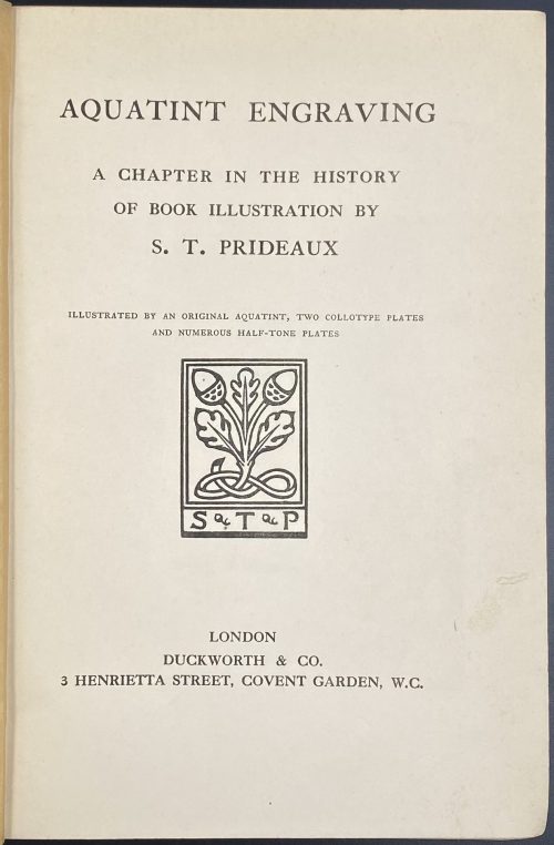 Half-title: AQUATINT ENGRAVING || Title: AQUATINT ENGRAVING | A CHAPTER IN THE HISTORY | OF BOOK ILLUSTRATION BY | S. T. PRIDEAUX | ILLUSTRATED BY AN ORIGINAL AQUATINT, TWO COLLOTYPE PLATES | AND NUMEROUS HALF-TONE PLATES | [Prideaux device] | LONDON | DUCKWORTH & CO. | 3 HENRIETTA STREET, COVENT GARDEN, W.C. || Pagination: ffl, [i, ii] – h.t. / blank, [2] – blank / frontis. w/guard, [iii, iv] – t.p. / coloph. "First Published, December 1909", [v, vi] – dedication "TO MY FATHER" / blank, vii-xv [xvi], [1] 2-434, bfl, + 24 pl. (incl. port). Collation: [a]6 b8 A-Z8 2A-2C8 2D4 Binding: Original navy cloth, gilt-ruled and lettered front board, gilt lettering to spine, a blind device to back board; upper margin gilt, free margin untrimmed. Author: Sarah Prideaux. "Engravers and the books they illustrated": p. 388-405. "Publications by Ackermann with aquatint plates": p. 374-378. "Biographical notices of engravers whose names appear on the plates": p. 358-371. "Books published before 1830 with aquatint plates": p. 325-357.
 -
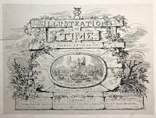
Engraved title page: ILLUSTRATION | OF | TIME. | GEORGE CRUIKSHANK. | "THERE IS A TIME FOR ALL THINGS". | TEMPUS EDAX RERUM. | LONDON | Published May 1st 1827 by the Artist - 22 Myddelton Terrace Pentonville. - Sold by Js. Robins & Co. Ivy Lane Paternoster Row.
Oblong folio, 33.5 x 44 cm. Engraved vignette title page and six not-coloured engraved plates with multiple images showing thirty-five humorous scenes.
First edition, first issue. Uncoloured. Pristine condition.
Half-leather bound in marbled cardboard and red morocco and gild lettering and arabesque. Frontispiece and 6 plates with protective tissues.
Content:1. Time-Called & Time-Come (five sketches)
2. Behind Time (seven sketches)
3. Time Thrown Away (six sketches)
4. Hard Times [&] Term Time (five sketches)
5. Time Badly Employed (five sketches)
6. Christmas Time (seven sketches)
British Museum № 1978,U.3026.1. BM description: "Frontispiece, the title on a background of symmetrical but dilapidated and grass-grown masonry. On the summit stands a little laughing gnome, with a wide hat and a body formed of an hour-glass; Inset is an oval bordered by a serpent with its tail in its mouth (emblem of eternity), in which is an aged and all-devouring Time (bald except for a forelock), seated behind a table whose surface is the base of the design. He puts to his mouth a fork on which is speared an elephant with a castle on its back containing tiny figures with spears. In his r. hand is a spoon containing a country church. His table is covered with dishes, and at his r. hand is a sickle. The central and biggest dish is heaped with a jumble of tiny objects: crown, table, chair, wheelbarrow, picture; round the room sit little figures: a soldier, parson, lady and child, &c. The ten other dishes contain: an antique glass coach with horses and footmen; an overladen camel beside a palm-tree; ruins of a castle; a farmhouse; a shepherd and sheep; a dismantled cannon and balls, cattle, a man-of-war in full sail; a ruinous Gothic cathedral; a clump of trees (the last two are dominated by a large decanter). Below Time are two (Egyptian) pyramids. Above: 'There Is A Time For All Things'; below: 'Tempus Edax Rerum'. 1 May 1827. Etching."Bibliography:- Reid, G W, A descriptive catalogue of the works of George Cruikshank, London, 1871.
- Stephens, Frederic George; George, Mary Dorothy, Catalogue of Political and Personal Satires in the Department of Prints and Drawings in the British Museum, 11 vols, London, BMP, 1870.
- Cohn, A M, George Cruikshank, catalogue raisonné, London, 1924.
-
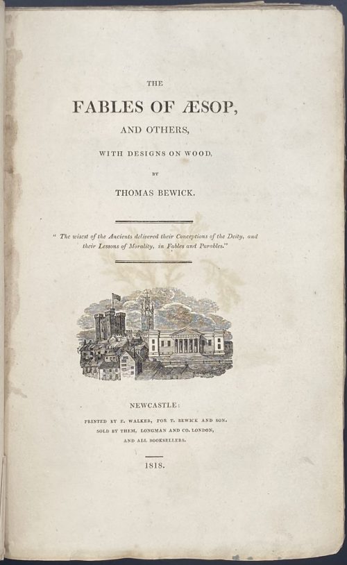 Title: THE | FABLES OF ÆSOP, | AND OTHERS, | WITH DESIGNS ON WOOD, | BY | THOMAS BEWICK. | “The wisest of the Ancients delivered their Conceptions of the Deity, and their Lessons of Morality, in Fables and Parables.” | {vignette} | NEWCASTLE: | PRINTED BY E. WALKER, FOR T. BEWICK AND SON. | SOLD BY THEM, LONGMAN AND CO. LONDON, AND ALL BOOKSELLERS. | 1818. || Pagination: [2] – blank / receipt with thumbprint, [i, ii] – t.p. / blank, [iii] iv-xvi – introduction with “Auld Clouty” vignette, [xvii] xviii-xxiv – table of contents, [1] 2-376; 188 wood-engraved head-pieces to the fables and 136 other vignettes, tail-pieces, etc. Collation: demy 8vo( octavo in fours); π1 (receipt), a-c4, B-3B4; A and 2P2 unsigned. Binding: Original blue boards, rebacked, original spine laid down, with original paper spine label ("Demy Paper/Price 15 s."); wove paper, top edge trimmed, the others are not; round book-plate to front paste-down “TWM, The Whitehead Library”; in a clamshell case, also book-plated inside. Size: case: 24.2 x 16.2 cm; boards: 22.8 x 14.2 cm; 22 x 14 cm. Note from seller: First copy in boards to ever appear at auction. Edition: First edition (one of 1,000 copies printed in demy 8vo), with Bewick's thumbprint and signature in facsimile, “Demy” and “15” in manuscript on receipt (page facing title-page), variant A (with "Auld Clouty" wood-engraving at bottom of p. XVI, and with the last line in p. 248 reading "road of honour and honesty"). "According to Roscoe, demy 8vo copies were apparently the first to be issued". There is 1 copy at the University Library, Cambridge and 1 at Liverpool public libraries. Catalogue raisonné: Roscoe: pp. 155-165, 45c for Variant A [see LIB-2714.2021]; Hugo (I vol.): p. 261; Ray: p. 35; Steedman: №№ 99-104, pp. 34-35 (№ 103 for Variant A).
 -
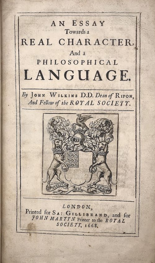 Title: AN ESSAY | Towards a | REAL CHARACTER, | And a | PHILOSOPHICAL | LANGUAGE. | By John Wilkins D.D. Dean of Ripon, | And Fellow of the ROYAL SOCIETY. |—| [armorial device] |—| LONDON, | Printed for Sa: Gellibrand, and for | JOHN MARTYN Printer to the ROYAL | SOCIETY, 1668. Pagination: [2] blank/order, [2] t.p./blank, [16], 1-454; + 79 leaves of Dictionary, unpaginated (158 pages); Illustrations: folding plates before pp. 167, 187, and two folding plates before p. 443. Collation: π2 a-d2 B-Z4 Aa-Zz4 Aaa-Lll4 Mmm3 aaa4 Aaa-Sss4 ttt3 Size: 4to, 32 x 20 x 5 cm; Binding: Full speckled calf, later polished calf spine with raised bands, double fillet ruled gilt compartments, crimson label with gilt lettering, margins sprinkled red. The work of John Wilkins is dedicated to the problem of the universal language. Wilkins was the Dean of Ripon from 1663 to 1672 and one of the founders of the Royal Society.