-
![[Barham, Richard Harris]. The Ingoldsby Legends or Mirth and Marvels by Thomas Ingoldsby, esquire / First, Second and Third Series - 3 volumes; Illustr.: George Cruikshank and John Leech. — London: Richard Bentley, 1840-1847. — Vol. 1: Printed by London: Samuel Bentley, 1840. pp.: ff, [2 blank] [i ht] [ii colophon] [title, verso blank] [iii] iv-v [vi blank] [contents, list of ill.] [blank, etching on verso] [1] 2-338 [339] [7, incl. orig. FC and Sp.] bf, 6 plates: 1 by Buss, 3 by Leech, 2 by Cruikshank. — Vol. 2: Printed by London: S. & J. Bentley, Wilson, and Fley, 1842. pp.: ff, [2 blank] [i ht] [ii colophon] [title, verso blank] [v] vi-vii [viii blank] [contents, verso blank] [blank, etching on verso] [1] 2-288 [6, incl. orig. FC and Sp.] bf, 7 plates: 3 by Leech, 4 by Cruikshank. — Vol. 3: Printed by London: S. & J. Bentley, Wilson, and Fley, 1847. pp.: ff, [2 blank] [i ht] [ii colophon] [title, verso blank] [iii] iv-vi [contents, list of ill.] [blank, portrait on verso] [1] 2-364 [6, incl. orig. FC and Sp.] bf, 6 plates: 2 portraits, 2 by Leech, 2 by Cruikshank.](https://varshavskycollection.com/wp-content/uploads/2021/02/LIB-2483-1.2020-c-1-500x500.jpeg) 3-volume set, 1st edition, with original wrappers. Vol. 1: Half-title: THE | INGLODSBY LEGENDS. Title (in black and red, emblematic, engraved): THE | Ingoldsby Legends | OR | MIRTH AND MARVELS | by | THOMAS INGOLDSBY | ESQUIRE | In frame: | LONDON. | RICHARD BENTLEY. | MDCCCXL. | Under the frame: J. S. GWILT. | INV. Pagination: ffl, [2] – blanks, [i, ii] – h.t./ colophon, [2] – t.p. / verso blank, [iii] iv-v [vi] – blank, contents / list of ill., blank / etching, [1] 2-338 [339], [7] incl. orig. covers and spine bound in, bfl; 6 plates: 1 by Buss, 3 by Leech, 2 by Cruikshank. Vol. 2: Half-title: THE | INGLODSBY LEGENDS. |—| SECOND SERIES.|| Title (in black and red, emblematic, engraved): THE | Ingoldsby Legends | OR | MIRTH AND MARVELS | by | THOMAS INGOLDSBY | ESQUIRE | SECOND SERIES | In frame: | LONDON | RICHARD BENTLEY. | MDCCCXLII. | Under the frame: G. COOK SCULPo|| Pagination: ffl, [2] – blanks, [i, ii] – h.t. / colophon, [iii, iv] – t.p. / verso blank, [v] vi-vii [viii ] – blank, contents / blank, blank / etching, [1] 2-288 [6], incl. orig. covers and spine bound in, bfl; 7 plates: 3 by Leech, 4 by Cruikshank. Vol. 3: Half-title: THE | INGLODSBY LEGENDS. |—| THIRD SERIES.|| Title (in black and red, emblematic, engraved): THE | Ingoldsby Legends | OR | MIRTH AND MARVELS | by | THOMAS INGOLDSBY | ESQUIRE | THIRD SERIES | In frame: | LONDON | RICHARD BENTLEY. | MDCCCXLVII. | Under the frame: COOK || Pagination: ffl, [2] – blanks] [i, ii] – h.t. / colophon, [2] – t.p. / verso blank], [iii] iv-vi – contents / list of ill., blank / portrait, [1] 2-364 [6], incl. orig. covers and spine bound in, bfl; 6 plates: 2 portraits, 2 by Leech, 2 by Cruikshank. Binding: 3 volumes, 8vo, 20.5 x 13.5 cm, hardcover, full carmine morocco, triple ruled in gilt, top edge gilt, slightly raised bands, gilt lettering and double fillet gilt panels to spine by T. W. Morrell & Co. (London) for Brentano's bookstore in New York. 6, 7, and 6 (19 total) plates inset. The original brown figured cloth covers and spines preserved at the end of each volume. Catalogue raisonné: Albert M. Cohn, 1924: №50, p.20. Contrary to A. Cohn's description, the first etching in the first series is signed “Dalton del.” bottom left and “Buss sculp.” bottom right. It has been suggested that the name Dalton might refer to Richard Harris Dalton Barham (British, 1815-1886). Robert William Buss (1804 – 1875). Portrait (v.3, p.1): John William Cook (fl.1819 - 1862) after Richard James Lane (British, 1800 – 1872). Portrait (v.3, p.127): Henry Griffiths after Dalton. Seller's description: First editions, mixed states, in full crimson levant morocco by Morrel for Brentanos, New York. Vol.1, p. 236 is NOT blank, but unpaginated; Vol. 2 does NOT have a list of ill's on verso of contents; Vol. 3, p. 351 'to pot' NOT run together. Cloth spine and front cover bound in the back of each volume, all volumes have half-titles, with engraved titles and 19 plates by Cruikshank, Leech, et al. Conforms in the main to Sadlier 156b, 156e, and 156f.
3-volume set, 1st edition, with original wrappers. Vol. 1: Half-title: THE | INGLODSBY LEGENDS. Title (in black and red, emblematic, engraved): THE | Ingoldsby Legends | OR | MIRTH AND MARVELS | by | THOMAS INGOLDSBY | ESQUIRE | In frame: | LONDON. | RICHARD BENTLEY. | MDCCCXL. | Under the frame: J. S. GWILT. | INV. Pagination: ffl, [2] – blanks, [i, ii] – h.t./ colophon, [2] – t.p. / verso blank, [iii] iv-v [vi] – blank, contents / list of ill., blank / etching, [1] 2-338 [339], [7] incl. orig. covers and spine bound in, bfl; 6 plates: 1 by Buss, 3 by Leech, 2 by Cruikshank. Vol. 2: Half-title: THE | INGLODSBY LEGENDS. |—| SECOND SERIES.|| Title (in black and red, emblematic, engraved): THE | Ingoldsby Legends | OR | MIRTH AND MARVELS | by | THOMAS INGOLDSBY | ESQUIRE | SECOND SERIES | In frame: | LONDON | RICHARD BENTLEY. | MDCCCXLII. | Under the frame: G. COOK SCULPo|| Pagination: ffl, [2] – blanks, [i, ii] – h.t. / colophon, [iii, iv] – t.p. / verso blank, [v] vi-vii [viii ] – blank, contents / blank, blank / etching, [1] 2-288 [6], incl. orig. covers and spine bound in, bfl; 7 plates: 3 by Leech, 4 by Cruikshank. Vol. 3: Half-title: THE | INGLODSBY LEGENDS. |—| THIRD SERIES.|| Title (in black and red, emblematic, engraved): THE | Ingoldsby Legends | OR | MIRTH AND MARVELS | by | THOMAS INGOLDSBY | ESQUIRE | THIRD SERIES | In frame: | LONDON | RICHARD BENTLEY. | MDCCCXLVII. | Under the frame: COOK || Pagination: ffl, [2] – blanks] [i, ii] – h.t. / colophon, [2] – t.p. / verso blank], [iii] iv-vi – contents / list of ill., blank / portrait, [1] 2-364 [6], incl. orig. covers and spine bound in, bfl; 6 plates: 2 portraits, 2 by Leech, 2 by Cruikshank. Binding: 3 volumes, 8vo, 20.5 x 13.5 cm, hardcover, full carmine morocco, triple ruled in gilt, top edge gilt, slightly raised bands, gilt lettering and double fillet gilt panels to spine by T. W. Morrell & Co. (London) for Brentano's bookstore in New York. 6, 7, and 6 (19 total) plates inset. The original brown figured cloth covers and spines preserved at the end of each volume. Catalogue raisonné: Albert M. Cohn, 1924: №50, p.20. Contrary to A. Cohn's description, the first etching in the first series is signed “Dalton del.” bottom left and “Buss sculp.” bottom right. It has been suggested that the name Dalton might refer to Richard Harris Dalton Barham (British, 1815-1886). Robert William Buss (1804 – 1875). Portrait (v.3, p.1): John William Cook (fl.1819 - 1862) after Richard James Lane (British, 1800 – 1872). Portrait (v.3, p.127): Henry Griffiths after Dalton. Seller's description: First editions, mixed states, in full crimson levant morocco by Morrel for Brentanos, New York. Vol.1, p. 236 is NOT blank, but unpaginated; Vol. 2 does NOT have a list of ill's on verso of contents; Vol. 3, p. 351 'to pot' NOT run together. Cloth spine and front cover bound in the back of each volume, all volumes have half-titles, with engraved titles and 19 plates by Cruikshank, Leech, et al. Conforms in the main to Sadlier 156b, 156e, and 156f. -
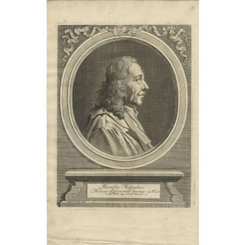
A portrait of Marcello Malpighi from his book Opera posthuma: figuris aeneis illustrata, quibus praefixa est ejusdem vita a seipso scripta, Londini:Churchill, 1697. Inscription: Marcellus Malpighius | Medicus Bononiensis mortuus 29 Novemb. Anno Dom. 1694. Anno aetatis 67. I. Kip. sculp.
Marcello Malpighi (10 March 1628 – 29 November 1694) was an Italian biologist and physician, who is referred to as the "Father of microscopical anatomy, histology, physiology and embryology" [Wikipedia].
From European Journal of Anatomy 22(5):433-439 · September 2018, an article by Sanjib Ghosh and Ashutosh Kumar 'Marcello Malpighi (1628-1694): Pioneer of microscopic anatomy and exponent of the scientific revolution of the 17th Century': Italian anatomist and an eminent scientist who significantly contributed to the advancement of the anatomical sciences in the 17th century. Malpighi was one of the first to use the compound microscope (an instrument designed by Galileo in 1609) and made the most important discovery of his life in 1661 when he identified capillaries as connecting vessels between small arteries and veins in the lungs. Malpighi thus provided the missing link in William Harvey's theory of blood circulation. He made significant contributions in the field of embryology based on his observations on chick embryo, and his efforts provided deep insights into the development of the heart and the nervous system. His communications based on microscopic studies scripted valuable details on the structural organization of organs like the liver, kidney and spleen. He identified the hepatic lobule as the fundamental unit of the liver and noted that bile was being secreted by these lobules and not from the gall bladder (the popular belief then). In the kidney, he discovered the glomerulus (Malpighian Corpuscle) and was the first to observe the convoluted tubules in the renal cortex. He was the first to describe the presence of lymphatic bodies (Malpighi's Corpuscle) in the spleen. Although he was exceedingly successful in his scientific activities, his life was fraught with unfortunate events and savage criticism from detractors arising out of professional jealousy and personal feuds. Nevertheless, his exploits were instrumental in understanding the human microscopic anatomy (histology) and his accomplishments have etched his name in the pages of medical science forever.
The portrait was engraved by Johannes "Jan" Kip (1652/53, Amsterdam – 1722, Westminster) - a Dutch draftsman, engraver and print dealer.
-
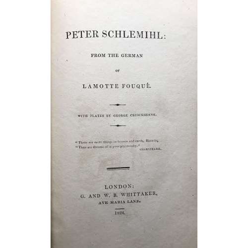 Title: PETER SCHLEMIHL: | FROM THE GERMAN | OF LAMOTTE FOUQUÉ | WITH PLATES BY GEORGE CRUICKSHANK. | "There are more things in heaven and earth, Horatio, | "Than are dreamt of in your philosophy." | SHAKESPEARE. | — | LONDON: | G. AND W. B. WHITTAKER, | AVE MARIA LANE. | 1824.|| Pagination: xii, 165 p. : ill. No Adelbert von Chamisso (German, 1781 – 1838) name on the title page. George Cruikshank's name printed with a typo 'Cruickshank'. The attribution on the title-page to Friedrich de La Motte-Fouqué (German, 1777 – 1843) is erroneous. The original German was edited by La Motte Fouqué. The translation was performed by Sir John Bowring (British, 1792 – 1872) First edition in English, third issue with no hyphen between "Ave" and 'Maria" in publisher's imprint.
In a cover box of red cloth over cardboard. Box: 21 x 13 x 2.3 cm; book: 19.3 x 11.8 x 1.7 cm; Crown 8vo. Red cardboard binding. Printed spine labels mounted on spine of the box and the book. Untrimmed edges.
Reference: Cohn 475. -
![Adelbert von Chamisso. Peter Schlemihl's wundersame Geschichte. Nach des Dichters Tode neu herausgegeben von Julius Eduard Hitzig. Stereotypausgabe mit Holzschnitten. — Nürnberg: Johann Leonhard Schrag, [o.J.], [1839]. — XVI + 83 S.](https://varshavskycollection.com/wp-content/uploads/2021/02/LIB-1100.2016-b-scaled-500x500.jpeg) Title page (in Gothic script): Peter Schlemihl's | wundersame Geschichte | mitgetheilt | von | Adelbert von Chamisso. | {vignette} | Nach des Dichters Tode neu herausgegeben | von Julius Eduard Hitzig. | Stereotypausgabe mit Holzschnitten. | Nürnberg, | Johann Leonhard Schrag. || Pagination: [i-iii] iv-xvi, [1] 2-82 [2], 15 woodcut vignettes by Unzelmann after Menzel. Collation: 8vo; π8 1-58 62. Binding: 21.5 x 13.5 cm, blind olive wrappers. Year of publication inferred from the foreword. This is the first posthumous edition of Chamisso's novel. Personae: Chamisso, Adelbert von (German, 1781 – 1838). — Author of the text. Hitzig, Julius Eduard [Itzig, Isaac Elias] (German-Jewish, 1780 – 1849). — Author of the foreword. Menzel, Adolph Friedrich Erdmann von (German, 1815 – 1905). — Artist of the vignettes. Unzelmann, Friedrich Ludwig (German, 1797 – 1854). — Engraver of the woodcuts. Schrag, Johann Leonhard (Germany, 1783 – 1858). — Publisher.
Title page (in Gothic script): Peter Schlemihl's | wundersame Geschichte | mitgetheilt | von | Adelbert von Chamisso. | {vignette} | Nach des Dichters Tode neu herausgegeben | von Julius Eduard Hitzig. | Stereotypausgabe mit Holzschnitten. | Nürnberg, | Johann Leonhard Schrag. || Pagination: [i-iii] iv-xvi, [1] 2-82 [2], 15 woodcut vignettes by Unzelmann after Menzel. Collation: 8vo; π8 1-58 62. Binding: 21.5 x 13.5 cm, blind olive wrappers. Year of publication inferred from the foreword. This is the first posthumous edition of Chamisso's novel. Personae: Chamisso, Adelbert von (German, 1781 – 1838). — Author of the text. Hitzig, Julius Eduard [Itzig, Isaac Elias] (German-Jewish, 1780 – 1849). — Author of the foreword. Menzel, Adolph Friedrich Erdmann von (German, 1815 – 1905). — Artist of the vignettes. Unzelmann, Friedrich Ludwig (German, 1797 – 1854). — Engraver of the woodcuts. Schrag, Johann Leonhard (Germany, 1783 – 1858). — Publisher. -
![George Cruikshank : A Catalogue Raisonné Of The Work Executed During The Years 1806-1877; With Collations, Notes, Approximate Values, Facsimiles, And Illustrationsby Albert M. Cohn, author of a bibliographical catalogue of the printed works illustrated by George Cruikshank, etc. London : Office of "The Bookman's Jounral", 1924. [Cohn, Albert M.]](https://varshavskycollection.com/wp-content/uploads/2021/02/LIB-1650-c-scaled-500x500.jpg) GEORGE CRUIKSHANK | A CATALOGUE RAISONNÉ | OF THE WORK EXECUTED | DURING THE YEARS 1806-1877 | WITH COLLATIONS, NOTES, APPROXIMATE VALUES, | FACSIMILES, AND ILLUSTRATIONS | BY | ALBERT M. COHN | Author of A Bibliographical Catalogue of the Printed | Works Illustrated By George Cruikshank, etc. | LONDON |FROM THE OFFICE OF "THE BOOKMAN'S JOURNAL" | 7 HENRIETTA STREET, STRAND, W.C.2 | 1924. Pagination: ffl, [i, ii] – h.t. / Limited edition (122 of 500), [2] – blank / frontis. lith. portrait of G. Cruikshank w/guard, [iii, iv] – t.p. / printed in G.B., [v, vi] – dedicat. / blank, vii-xvi; [1, 2] – f.t. / blank, 3-375, [376] – Imprint., bfl; 31 leaves of plates, some mounted. Binding: size 30 x 24 x 5.5 cm, hardcover, bevelled boards, original brown cloth with gilded lettering to spine. Top edge gilt, other untrimmed; printed on laid paper. To front pastedown: "Ex libris – Fred Robison Heryer" (round, 55 mm, resembles a coin, printed on heavy gold-coloured foil with embossed lettering and an image of a seated man lettered ALEXANDROY in Greek. To back pastedown: Seller's sticker "From the book of J.W.Robinson Co., Seventh & Grand, Los Angeles." J. W. Robinson Co. – a chain of department stores, established by Joseph Winchester Robinson (American, 1846 – 1891). Some Fred Robison Heryer (American, 1907 – 1992) died in Kansas.
GEORGE CRUIKSHANK | A CATALOGUE RAISONNÉ | OF THE WORK EXECUTED | DURING THE YEARS 1806-1877 | WITH COLLATIONS, NOTES, APPROXIMATE VALUES, | FACSIMILES, AND ILLUSTRATIONS | BY | ALBERT M. COHN | Author of A Bibliographical Catalogue of the Printed | Works Illustrated By George Cruikshank, etc. | LONDON |FROM THE OFFICE OF "THE BOOKMAN'S JOURNAL" | 7 HENRIETTA STREET, STRAND, W.C.2 | 1924. Pagination: ffl, [i, ii] – h.t. / Limited edition (122 of 500), [2] – blank / frontis. lith. portrait of G. Cruikshank w/guard, [iii, iv] – t.p. / printed in G.B., [v, vi] – dedicat. / blank, vii-xvi; [1, 2] – f.t. / blank, 3-375, [376] – Imprint., bfl; 31 leaves of plates, some mounted. Binding: size 30 x 24 x 5.5 cm, hardcover, bevelled boards, original brown cloth with gilded lettering to spine. Top edge gilt, other untrimmed; printed on laid paper. To front pastedown: "Ex libris – Fred Robison Heryer" (round, 55 mm, resembles a coin, printed on heavy gold-coloured foil with embossed lettering and an image of a seated man lettered ALEXANDROY in Greek. To back pastedown: Seller's sticker "From the book of J.W.Robinson Co., Seventh & Grand, Los Angeles." J. W. Robinson Co. – a chain of department stores, established by Joseph Winchester Robinson (American, 1846 – 1891). Some Fred Robison Heryer (American, 1907 – 1992) died in Kansas. -
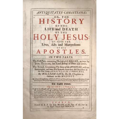 Title (black and red): ANTIQUITATES CHRISTIANÆ: |—| OR, THE | HISTORY | OF THE | LIFE AND DEATH | OF THE | HOLY JESUS: | AS ALSO THE Lives, Acts and Martyrdoms | OF HIS | APOSTLES. |—| IN TWO PARTS. |—| The Firƒt Part, containing The Life of CHRIST, written by | Jer. Taylor, Late Lord Bishop of Down and Connor. | The Second, Containing The Lives of the APOSTLES, with an | Enumeration, and ƒome Brief Remarks upon their firƒt Successors in | the Five Great APOSTOLICAL CHURCHES, | By WILLIAM CAVE, D. D. Chaplain in | Ordinary to His MAJESTY. | By whom alƒo is added an APPARATUS, or Diƒcourƒe Introductory to the whole Work, | concerning the Three Great Diƒpenƒations of the Church, Patriarchal, Moƒaical, and Evangelical. |—| THE EIGHTH EDITION. |—| Orig. contr. Celƒ. lib. 1. in Proœm. p. 1, 2. | [text in Greek] |—| LONDON, | Printed by R. N. for Luke Meredith, at the Sign of the Star in | St. Paul's Church-Yard, MDCXCIV. Collation of this book is unusual, it is called "Folio in 6s" (three sheets are folded in half to create a gathering of 6 leaves). Two unsigned leaves: (1) Engraved frontispiece "The Annunciation" by Willian Faithorne "the Elder" (British, 1616 – 1691), recto blank; (2) engraved title by the same engraver, verso blank; (*) gathering of 4: black and red title page, verso blank; epistle; to reader; imprim. (A6 to Sƒ6) Engraved portrait of Jeremy Taylor by Pierre Lombart (French, 1612 – 1682); faux title page: "The Great Exemplar of Sanctity and Holy Life... MDCXCIII"; dedication; contents, then to the end of the first book. (A-Z4 Aa-Bb4 Cc2) The second book has collation in quarto: Faux title page: "Antiquitates Christianæ: or the Lives, Acts and Martyrdoms... MDCXCIV", etc. to the end. Full formula: π2 *4 a-c6 d8 A-Z6 Aa-Sƒ6 A-Z4 Aa-Bb4 Cc2 Pagination: [12] I-LI [LII] [12] I-XXVIII, i-vi, (1st book): [2] I-145 [146-150] 151-432 [12]; (2nd book): [8] i-xiv, 1-188. 22 plates : frontis., t.p., portrait, one folding before p. 65, two after pp. [146], [150], 282, 304, 364, 386, 414, [422], and numerous head-pieces. Size: 36 x 23.5 x 5.7 cm Binding: full calf with the later spine, raised bands; front board with remnants of gilt ruling and blind stamped border, back bord probably original with a blind-stamped centre panel with fleurons.
 -
 A three-volume set. VOL. 1: ENGRAVING IN ENGLAND | IN THE | SIXTEENTH AND SEVENTEENTH CENTURIES | A DESCRIPTIVE CATALOGUE | WITH INTRODUCTIONS | BY | ARTHUR M HIND | Sometime Keeper of Prints and Drawings in the British Museum | and Slade Professor of Fine Art in the University of Oxford | PART I | THE TUDOR PERIOD | WITH 319 ILLUSTRATIONS | {The coat of arms of the University of Cambridge} | CAMBRIDGE | AT THE UNIVERSITY PRESS | 1952|| Pagination: ffl, [i-vi] – h.t. / blank, frontis., t.p. / colophon, dedication / blank; vii-xxx; 1-333 [334 blank] [2] – the plates / blank; 1-156 pp. of plates. Collation: a-b8, 1-218 + 78 leaves of plates at the end. VOL. 2: ENGRAVING IN ENGLAND | IN THE | SIXTEENTH AND SEVENTEENTH CENTURIES | A DESCRIPTIVE CATALOGUE | WITH INTRODUCTIONS | BY | ARTHUR M HIND | Sometime Keeper of Prints and Drawings in the British Museum | and Slade Professor of Fine Art in the University of Oxford | PART II | THE REIGN OF JAMES I | WITH 618 ILLUSTRATIONS| {The coat of arms of the University of Cambridge} | CAMBRIDGE | AT THE UNIVERSITY PRESS | 1955|| Pagination: [i-iv] – h.t. / blank, t.p. / colophon; v-xiv [xv] [xvi blank]; 1-396 [397] [398 blank] [2] – the plates / blank; 1-252 pp. of plates. Collation: a-b8, 1-268 + 126 leaves of plates at the end. VOL. 3: ENGRAVING IN ENGLAND | IN THE | SIXTEENTH AND SEVENTEENTH CENTURIES | A DESCRIPTIVE CATALOGUE | WITH INTRODUCTIONS | PART III | THE REIGN OF CHARLES I | WITH 466 ILLUSTRATIONS | COMPILED FROM THE NOTES OF | THE LATE A. M. HIND | BY | MARGERY CORBETT & MICHAEL NORTON | {The coat of arms of the University of Cambridge} | CAMBRIDGE | AT THE UNIVERSITY PRESS | 1964|| Pagination: [i-vi] – h.t. / blank, frontis., t.p. / colophon, dedication / blank; vii-xxx; 1-333 [334 blank] [2] – the plates / blank; 1-214 pp. of plates. Collation: [a]8, 1-258 + 107 leaves of plates at the end. Each of three volumes bound in red cloth with gilt lettering to spine, residuals of library stickers, dark spotting to the top and lateral edges; tan DJ with title lettering in a frame to front, lettering to spine, advert. to back, with cut off stickers to spine; ‘The Francis Bacon Foundation’ ink stamp to front pastedown.
 -
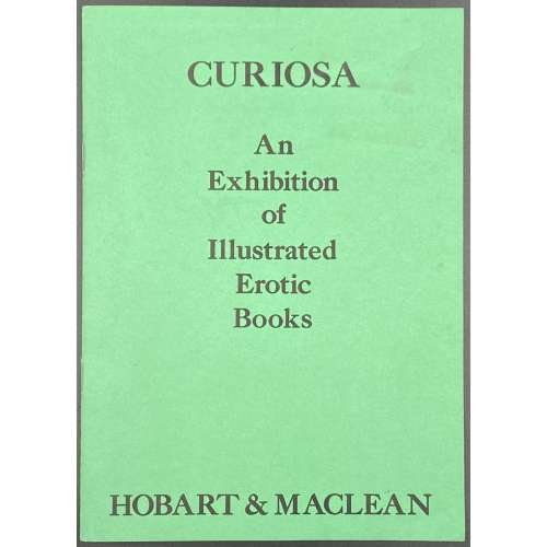 Title: CURIOSA | An | Exhibition | of | Illustrated | Erotic | Books | HOBART & MACLEAN || Pagination: 16 unpaginated pages with bibliography of 49 editions with prices and 51 images. Stapled softcover, original green wrappers with lettering to front and illustration to back. Size: 21 x 15 cm.
 -
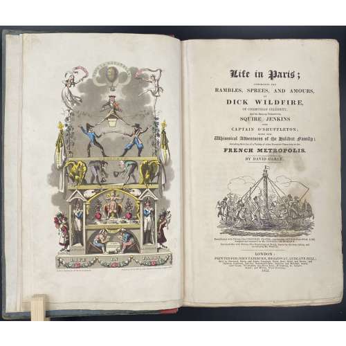
Title: Life in Paris ; | COMPRISING THE | RAMBLES, SPREES, AND AMOURS, | OF | DICK WILDFIRE, | OF CORINTHIAN CELEBRITY, | And his Bang-up Companions, SQUARE JENKINS | AND | CAPTAIN O’SHUFFLETON ; | WITH THE | Whimsical Adventures of the Halibut family ; | Including Sketches of a Variety of other Eccentric Characters in the | FRENCH METROPOLIS. | BY DAVID CAREY |[Vignette]| Embellished with Twenty-One COLOURED PLATES, representing SCENES from REAL LIFE, | designed and engraved by Mr. GEORGE CRUIKSHANK. | Enriched also with Twenty-Two Engravings on Wood, drawn by the same Artist, and | executed by Mr. WHITE. | LONDON : | PRINTED FOR JOHN FAIRBURN, BROADWAY, LUDGATE HILL; | Sold by Sherwood, Neely, and Jones ; Langman, Hurst, Rees, Orme, and Brown ; and | Baldwin, Craddoc, and Joy ; Paternoster-Row ; Simpkin and Marshall, Statio- | ners’ Court ; Whittakers Ave-Maria-Lane ; Humphrey, St. James’s | Street ; and Wilson, Royal Exchange. | 1822. ||
Edition: 1st edition in book form, 1st issue; large-paper copy bound from the parts in original blue paper boards, "most scarce" (Cohn).
Pagination: ffl, [i, ii] – h.t. ‘LIFE IN PARIS’ / ‘MARCHANT, Printer, Ingram-Court, London’, [2] – blank / Frontispiece (Ville la Bagatelle!!) hand-coloured, [iii, iv] – t.p. with vignette / blank, [v] vi-xxiv, [1] 2-489 [490 blank], [2] – 'TO THE BINDER' and 'Marchant, Printer, Ingram-Court, Fenchurch Street' "considered indispensable to a complete copy" (Cohn) / blank, bfl watermarked 1800; 21 hand-coloured aquatints and 22 wood-engraved text vignettes; cancelled leaves 143/4 and 335/6; pinholes from printing visible in most gatherings.
Collation: 4to; [a]-c4, B-Z4 Aa-Zz4 3A-3Q4 3R1 + [Ω]1
Binding: Original boards sometime re-backed with red paper, binder's end leaf watermarked 1800; red hard-grained morocco clamshell box.
Catalogue raisonné: Albert M. Cohn, 1924: № 109 p. 37/8; Abbey, J. R. (Life in England), 112; Tooley (Some English Books with Coloured Plates) 129; Hardie (English coloured books) 199.
Description of Shapero Rare Books, London: Of the copies that have come to auction since 1975 only one has been a large-paper copy in original boards. "The pictures are extremely spirited and true and are all the more wonderful in view of the fact that the artist’s continental experiences were limited to one day spent in Boulogne." (Hardie). In 1821, the journalist Pierce Egan published Life in London, an immediate success illustrated by the Cruikshank brothers, George and Robert. In order to capitalise on this success, another journalist, David Carey, decided to publish his own Life in Paris in monthly instalments (just like Life in London) and with a very similar frontispiece to the one that appears in Egan’s work; Life in Paris, however, was illustrated only by George Cruikshank. One of the earliest and most notable examples of the work of George Cruikshank, with fine, clean plates. -
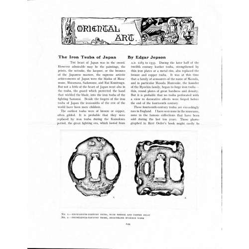 Magazine article by Edgar Jepson: The Iron Tsuba of Japan (Section: Oriental Art), published in volume Vol. 70 (September–December) of The Connoisseur: An Illustrated Magazine for Collectors, Vol. 70 (September–December); pp. 143-152 / C. Reginald Grundy [ed.] — London: Published by the Proprietor, W. CLAUSE JOHNSON, at the Editorial and Advertisement Offices of The Connoisseur, 1924. Owner's half black morocco, gilt lettering to spine, blue cloth boards. Two volumes bound together without original covers. Size 28.5 x 22 cm. Vol. 1: The Connoisseur | An Illustrated Magazine | For Collectors | Edited by C. Reginald Grundy | Vol. LXIX. | (MAY—AUGUST, 1924) | LONDON | Published by the Proprietor, W. CLAUSE JOHNSON, at the | Editorial and Advertisement Offices of The Connoisseur, | at 1, Duke Street, St. James's, S.W. 1 | 1924 || Pp.: [i-ii] iii-xviii [xix] [1, 2 - plate] 3-249 [250]. Vol. 2: The Connoisseur | An Illustrated Magazine | For Collectors | Edited by C. Reginald Grundy | Vol. LXX. | (SEPTEMBER—DECEMBER, 1924) | LONDON | Published by the Proprietor, W. CLAUSE JOHNSON, at the | Editorial and Advertisement Offices of The Connoisseur, | at 1, Duke Street, St. James's, S.W. 1 | 1924 || Pp.: [i-ii] iii-xxii [2 blanks] [1, 2 - plate] 3-261 [262]. The Iron Tsuba of Japan by Edgar Jepson The heart of Japan was in the sword. However admirable may be the paintings, the prints, the netsuke, the lacquer, or the bronzes of the Japanese masters, the supreme artistic achievements of Japan were the blades of Masamune, Muramasa, Sadamune, and Rai Kunitsugu. But not a little of the heart of Japan went also in the tsuba, the guard which protected the hand that wielded the blade, into the iron tsuba of the fighting Samurai. Beside the forgers of the iron tsuba of Japan the ironsmiths of the rest of the world have been mere children. The earliest tsuba were of bronze or copper, often gilded. It is probable that they were replaced by iron tsuba during the Kamakura period, the great fighting era, which lasted from A.D. 1185 to 1333. During the later half of the twelfth century leather tsuba, strengthened by thin iron plates or a metal rim, also replaced the bronze and copper tsuba. It was at this time that a family of armourers of the name of Masuda, and in particular Masuda Munesuke, the founder of the Myochin family, began to forge iron tsuba — thin, round plates of great hardness and density. But it is probable that no tsuba perforated with a view to decorative effects were forged before the end of the fourteenth century. These fourteenth-century tsuba are exceedingly rare in England. I have seen none in the museums, none in the famous collections that have been sold during the last ten years. Those photographed in Herr Oeder's book might easily be the fifteenth century. No. 1 is a curious cup-shape tsuba decorated with a bronze and copper inlay. No. 2, with its edges curiously twisted in the forging, looks like Myochin work. But it is not of the Myochin iron. The Myochin family produced some of the greatest ironsmiths of Japan. Armourers first of all, tsubasmiths, forgers of sake-kettles, articulated reptiles, crustacea, and insects — everything that can be done with iron they did; they pushed their medium to its limit. They were forging iron tsuba in 1160, and they were still forging them in 1860. And it was their own iron, or rather their own steel. They discovered the secret of it early, and they kept that secret in the family for all those hundreds of years. There is no mistaking a Myochin tsuba: balance it on your finger and tap it with a piece of metal, always it gives forth a clear bell-like ring that you get from the work of no other ironsmith, Japanese or European. Always the Myochin tsuba is before everything a protection to the hand of the swordsman; to that everything is, as it should be, subordinated. No. 3 is a Myochin tsuba of the fifteenth century, and probably of the early fifteenth century. No. 4, by Myochin Munetaka, perforated with a grotesque figure, is an example of that twisting and twisting of the iron in the forging till it forms a pattern like the grain of wood. The Myochin smiths invented these wood-grain tsuba, and no other smiths equalled them in their forging. In the sixteenth century, the fighting tsuba was probably at its best. It was a century of great tsubasmiths. Then the first Nobuiye, whose tsuba fetched £100 apiece, circa 1800, in Japan, and the first Kaneiye flourished. No. 5 is a tsuba forged by a great smith, Iyesada of Sotome, in the manner of Nobuiye I, decorated with the karakusa tendrils that Nobuiye delighted in, with lightning and clouds. No. 6 is a guard of Sanada Tembo, the chief smith of the Tembo family, stamped, punning fashion, with the character Tembo. Akin to the Tembo tsuba were those of the Kiami and Hoan smiths. Then also the Heianjo smiths and the Owari smiths, especially those of Nagoya and the Yamakichi family, forged their strongest tsuba. Those of the Yamakichi were tested after the forging by being pounded in iron mortars — at least, so the legend runs. But they were a sternly utilitarian family, and I have never seen a Yamakichi tsuba of any beauty. In the later half of the fifteenth century arose the fashion of decorating tsuba with an inlay, zogan, of bronze. The Heianjo tsuba, forged at Kyoto in the latter half of the fifteenth and the beginning of the sixteenth century, were often thus inlaid. The earliest of them were called "Onin", of which No. 7 is an example. In addition to the bronze inlay around the edge, it is inlaid with a representation, some say, of snow; others say, of the duckweed on a pond. No. 8 is probably a Heianjo tsuba, but I am not quite sure about it. The inlaid acacia branches might be very early Shoami work. But to judge by the iron, it is a fifteenth-century tsuba; and the authorities place the beginning of the Shoami school not later than early in the sixteenth century. No. 10 is an example of the Fushimi-zogan, a flat inlay of a light-coloured bronze. These tsuba took their name from the fact that they were first forged at Fushimi, in Yamashiro, in the sixteenth century. It is of the type known as Mon-zukashi, perforated with crests (mon) à jour. The Yoshiro-zogan tsuba were also first forged at Fushimi by Yoshiro Naomasa. They were distinguished from the Fushimi-zogan by the fact that their inlay was generally a little raised-not always-for the inlay of No. 9, a tsuba forged by a later nineteenth-century Yoshiro, is quite flat. It is an interesting tsuba, for, with its decoration grown florid and excessive, it marks the intermediate stage between the simple and delightful designs of the genuine fighting tsuba and the elaborate pictures in gold and silver on the tsuba of the eighteenth-century smiths of Awa and Kyoto, which have become mere ornaments of the goldsmith. The Gomoku-zogan (No. 11) tsuba were probably first forged earlier than the Fushimi and Yoshiro-zogan tsuba. This inlay, in slight relief, is a representation in a light-coloured bronze and copper of twigs caught in the eddies of streams. The seventeenth century and early eighteenth century were the great periods of perforated tsuba. The designs, and they are often admirable, are for the most part in plain fretwork; but they are also chased. No. 12, a crane under an acacia, is a tsuba of a Higo smith, great forgers of fighting tsuba during this period. These smiths also excelled in nunome zogan, a very thin gold and silver inlay, with which they further decorated their perforated guards. The smiths of the Umetada and Shoami families also forged iron tsuba during this period; but their designs, though sometimes pleasing enough, are rarely fine. The best work of Myoju Umetada is in sentoku, not iron. The Choshu smiths, coming later, surpass the perforated guards of both the Umetada and Shoami smiths in beauty of design. No. 13, a lotus in the round, not only fretwork, but also engraved, is a good example of the admirable balance they so often attained in their designs. It is a sufficiently realistic lotus, but yet of a delightful simplicity. In considerable contrast is No. 14, the dragon by Soheishi Soten — one of the only two authentic tsuba of his forging known — the first forger of hikone-bori tsuba, which were in extraordinary favour in Japan during the eighteenth century, and illustrated every important event in Japanese history. It is on the elaborate side, but fine, strong work, and an excellent guard to the hand, for the lighter and more open part, which gives the design its admirable balance, is on the inside, and not exposed to the full swing of an opponent's blade. A few years ago there was a tendency to decry the Namban tsuba as having sprung too directly from foreign sources. But though the original suggestion may have been Chinese, or, as some say, Portuguese, the Japanese made it entirely their own, as characteristically Japanese as anything can well be, but, it must be admitted, of a decadent period. The school took its rise at the beginning of the seventeenth century, and the early tsuba were forged of a specially hard iron, the Wootz, imported from Southern India. No. 15, the signs of the Zodiac, is an excellent tsuba from the fighting point of view. Both it and No. 16 are of quite charming, if elaborate, design, and both of them, with their delicate scroll-work, so astonishingly undercut, are the very last word in the work of the ironsmith-veritable iron lace. To return to the simpler perforated tsuba, the smiths of Akasaka, a suburb of Tokyo, produced probably the most charming designs. Their style derives considerably from the Higo smiths, and their earlier fighting tsuba are very like the Higo tsuba. But always their work was just a little lighter than that of the Higo smiths, and in the end they moved right away from them and became the forgers of very light guards indeed. No. 17, is a representation of the Hiyokudori, the fabulous double bird, in which were reincarnated the souls of the two lovers, Gompachi and Komurasaki; and No. 18, “the tsuba of a hundred ducks "— there are about forty — are characteristic designs of the school. In the work of the Akasaka smiths the balance, which makes the design of a good tsuba so admirable and delightful, attains its height. This admirable balance seems often to be obtained by a deliberate sacrifice of symmetry. About nine hundred and ninety-nine European ironsmiths out of a thousand would have made the right and left sides of the Hiyoku-dori line by line, and perforation by perforation, exactly alike; he would have cut out exactly as many ducks on the one side of “the tsuba of a hundred ducks” as on the other, and made each duck on the right side correspond exactly in position and attitude with a duck on the left side. By variations the tsubasmith attained a finer balance, almost a higher symmetry. No. 19, often called by collectors the "rose-window" tsuba, but really a stylised chrysanthemum, is a favourite design of the Akasaka smiths, but Hizen work and inlaid in the Hizen manner with gold nunome. No. 20 is a Satsuma tsuba of the middle period. The Satsuma smiths of the nineteenth century produced probably the most ornate of all the iron guards, for the most part calibashes and beans with their leaves and tendrils realistic in the extreme, but of charming design. Few crafts have been carried further than that of the tsubasmith; few crafts working in a difficult medium have handled more subjects with greater feeling for beauty or greater liveliness of fancy. It is interesting to note again and again how school influences school, and smith influences smith. But, as in all the applied arts, the finest tsuba were forged by men who never lost sight of the purpose of a tsuba, that it is before everything a protection to the hand, and never subjected that purpose to a passion for virtuosity. Illustrations: No 1. FOURTEENTH-CENTURY TSUBA, WITH BRONZE AND COPPER INLAY No. 2. FOURTEENTH-CENTURY TSUBA, RESEMBLING MYOCHIN WORK No. 3. MYOCHIN TSUBA, FIFTEENTH CENTURY No. 4. MYOCHIN TSUBA, NINETEENTH CENTURY No. 5. SIXTEENTH-CENTURY TSUBA No. 6. SIXTEENTH-CENTURY TSUBA BY IYESADA OF SOTOME BY SANADA TEMBO No. 7. ONIN TSUBA No. 8. HEIANJO (?) TSUBA No. 9. YOSHIRO TSUBA, NINETEENTH CENTURY No. 10. FUSHIMI-ZOGAN, NINETEENTH CENTURY No. 11.- GOMOKU-ZOGAN, SIXTEENTH CENTURY No. 12. HIGO TSUBA, SEVENTEENTH CENTURY No. 13. CHOSHU TSUBA, SEVENTEENTH CENTURY No. 14. SOTEN TSUBA, SEVENTEENTH CENTURY No. 15. NAMBAN TSUBA, EIGHTEENTH CENTURY No. 16. NAMBAN TSUBA, NINETEENTH CENTURY Nos. 17. AND 18. AKASAKA TSUBA, EIGHTEENTH CENTURY No. 19. HIZEN TSUBA, EIGHTEENTH CENTURY No. 20. SATSUMA TSUBA, EIGHTEENTH CENTURY
 -
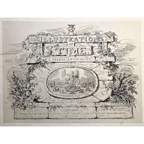
Engraved title page: ILLUSTRATION | OF | TIME. | GEORGE CRUIKSHANK. | "THERE IS A TIME FOR ALL THINGS". | TEMPUS EDAX RERUM. | LONDON | Published May 1st 1827 by the Artist - 22 Myddelton Terrace Pentonville. - Sold by Js. Robins & Co. Ivy Lane Paternoster Row.
Oblong folio, 33.5 x 44 cm. Engraved vignette title page and six not-coloured engraved plates with multiple images showing thirty-five humorous scenes.
First edition, first issue. Uncoloured. Pristine condition.
Half-leather bound in marbled cardboard and red morocco and gild lettering and arabesque. Frontispiece and 6 plates with protective tissues.
Content:1. Time-Called & Time-Come (five sketches)
2. Behind Time (seven sketches)
3. Time Thrown Away (six sketches)
4. Hard Times [&] Term Time (five sketches)
5. Time Badly Employed (five sketches)
6. Christmas Time (seven sketches)
British Museum № 1978,U.3026.1. BM description: "Frontispiece, the title on a background of symmetrical but dilapidated and grass-grown masonry. On the summit stands a little laughing gnome, with a wide hat and a body formed of an hour-glass; Inset is an oval bordered by a serpent with its tail in its mouth (emblem of eternity), in which is an aged and all-devouring Time (bald except for a forelock), seated behind a table whose surface is the base of the design. He puts to his mouth a fork on which is speared an elephant with a castle on its back containing tiny figures with spears. In his r. hand is a spoon containing a country church. His table is covered with dishes, and at his r. hand is a sickle. The central and biggest dish is heaped with a jumble of tiny objects: crown, table, chair, wheelbarrow, picture; round the room sit little figures: a soldier, parson, lady and child, &c. The ten other dishes contain: an antique glass coach with horses and footmen; an overladen camel beside a palm-tree; ruins of a castle; a farmhouse; a shepherd and sheep; a dismantled cannon and balls, cattle, a man-of-war in full sail; a ruinous Gothic cathedral; a clump of trees (the last two are dominated by a large decanter). Below Time are two (Egyptian) pyramids. Above: 'There Is A Time For All Things'; below: 'Tempus Edax Rerum'. 1 May 1827. Etching."Bibliography:- Reid, G W, A descriptive catalogue of the works of George Cruikshank, London, 1871.
- Stephens, Frederic George; George, Mary Dorothy, Catalogue of Political and Personal Satires in the Department of Prints and Drawings in the British Museum, 11 vols, London, BMP, 1870.
- Cohn, A M, George Cruikshank, catalogue raisonné, London, 1924.
-
![George Cruikshank. George Cruikshank's Fairy Library. Hop-O'-My Thumb. Jack and the Bean-Stalk. Cinderella. Puss in Boots. — London: George Bell and Sons, 1885. — pp.: [2] blank, [2] first half-title with blank verso, [i-ii] second half-title with blank verso, [2] frontispiece plate with blank recto, [iii-viii] title, colophone, editor's note, list of illustr. [2] title with blank verso, [1] 2-101 [3] blank, 24 plates with protective tissue, unpag. — Colophon: This edition is limited to 500 copies, with India paper impressions. The former editions have been from lithographic transfers. The plates were retouched under Mr. Cruikshank's direction shortly before his death, and have not been used since until now.](https://varshavskycollection.com/wp-content/uploads/2021/02/LIB-2454.2020-f-1-500x500.jpeg) Title: GEORGE CRUIKSHANK'S FAIRY LIBRARY. | HOP-O'-MY THUMB. | JACK AND THE BEAN-STALK. | CINDERELLA. | PUSS IN BOOTS. | [DEVICE] | LONDON: | GEORGE BELL AND SONS, YORK STREET, COVENT GARDEN. Pagination: [2] – blanks, [2] – first half-title with blank verso, [i-ii] – second half-title with blank verso, [2] – blank / frontispiece, [iii-viii] title, colophon, editor's note, list of illustrations, [2] – title with blank verso, [1] 2-101 [3] – blank; 24 plates with protective tissue. Colophon: This edition is limited to 500 copies, with India paper impressions. The former editions have been from lithographic transfers. The plates were retouched under Mr. Cruikshank's direction shortly before his death, and have not been used since until now. Binding: 4to, 22.2 x 17.5 cm, hardcover; 3/4 black calf ruled in gilt, brown calf spine with raised bands decorated in gilt, with gilt title lettering. Green marbled boards and end-papers. Abel E. Berland's bookplate pasted to front pastedown. Professionally rebound, re-backed with the original spine laid down, corners bumped. Catalogue Raisonné: Not in Alan M. Cohen's. As writes the British Library: "George Cruikshank’s [...] illustrations for the first English translation of Grimm’s Fairy Tales were praised widely, but his own rewriting of fairytales was criticised, most prominently by Charles Dickens. This was not due to the quality of the illustrations, but because, in line with his temperance beliefs, Cruikshank rewrote aspects of the fairytales to warn the reader against the evils of alcohol. Thus, for instance, the preparations for Cinderella’s marriage include the court throwing all alcohol in the palace on a bonfire; and in ‘Jack and the Beanstalk’, the giant is an alcoholic. Dickens, a friend of Cruikshank, was outraged at what he considered to be a betrayal of the essence of fairytales and, in protest, he published an essay in his weekly magazine Household Words entitled ‘Frauds on the Fairies’ in protest (1853)."
Title: GEORGE CRUIKSHANK'S FAIRY LIBRARY. | HOP-O'-MY THUMB. | JACK AND THE BEAN-STALK. | CINDERELLA. | PUSS IN BOOTS. | [DEVICE] | LONDON: | GEORGE BELL AND SONS, YORK STREET, COVENT GARDEN. Pagination: [2] – blanks, [2] – first half-title with blank verso, [i-ii] – second half-title with blank verso, [2] – blank / frontispiece, [iii-viii] title, colophon, editor's note, list of illustrations, [2] – title with blank verso, [1] 2-101 [3] – blank; 24 plates with protective tissue. Colophon: This edition is limited to 500 copies, with India paper impressions. The former editions have been from lithographic transfers. The plates were retouched under Mr. Cruikshank's direction shortly before his death, and have not been used since until now. Binding: 4to, 22.2 x 17.5 cm, hardcover; 3/4 black calf ruled in gilt, brown calf spine with raised bands decorated in gilt, with gilt title lettering. Green marbled boards and end-papers. Abel E. Berland's bookplate pasted to front pastedown. Professionally rebound, re-backed with the original spine laid down, corners bumped. Catalogue Raisonné: Not in Alan M. Cohen's. As writes the British Library: "George Cruikshank’s [...] illustrations for the first English translation of Grimm’s Fairy Tales were praised widely, but his own rewriting of fairytales was criticised, most prominently by Charles Dickens. This was not due to the quality of the illustrations, but because, in line with his temperance beliefs, Cruikshank rewrote aspects of the fairytales to warn the reader against the evils of alcohol. Thus, for instance, the preparations for Cinderella’s marriage include the court throwing all alcohol in the palace on a bonfire; and in ‘Jack and the Beanstalk’, the giant is an alcoholic. Dickens, a friend of Cruikshank, was outraged at what he considered to be a betrayal of the essence of fairytales and, in protest, he published an essay in his weekly magazine Household Words entitled ‘Frauds on the Fairies’ in protest (1853)." -
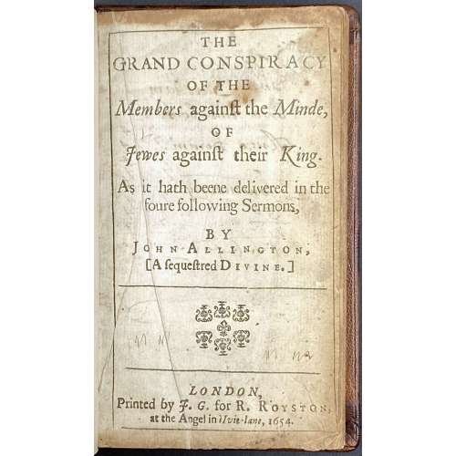 Title: THE | GRAND CONSPIRACY | OF THE | Members again∫t the Minde, | OF | Jewes again∫t their King. | As it hath beene delivered in the | foure following Sermons, | BY | John Allington, [A ∫eque∫tered Divine.] | — | {ornament} | — | LONDON, | Printed by J.G. for R. Royston, | at the Angel in Ivie-lane, 1654.|| Contents: Grand conspiracy of Jewes against their King. A sermon preached in August 1647; Grand conspiracy of Jewes against their King. A sermon preached in January 1649; Grand conspiracy of Jewes against their King. A demonstration of the highest insolencies proceed from men of the lowest and most base extractions Pagination: [2] – t.p. / blank; 1-214. Collation: 12mo; A-I12. Binding: Hardcover; 15 x 9.5 cm, later blind-stamped morocco, raised bands, gilt lettering in compartments. Inscription: Ink by hand by John Bartham, January 30, 1665, to t.p. verso; Pencil by hand to front pastedown: Wing A 1209A.
 -
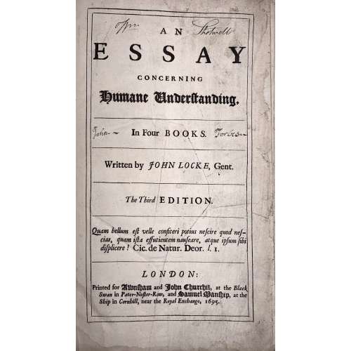 Title: AN | ESSAY | CONCERNING | HUMANE UNDERSTANDING, |—| In Four BOOKS. |—| Written by JOHN LOCKE, Gent. |—| The Third EDITION. |—| Quam bellum est velle confiteri potius nescire quod nes- | cias, quam ista effutientem nauseare, atque ipsum sibi | displicere! Cic. De Natur. Deor. l. I. |—| LONDON: | Printed for Awnsham and John Churchil, at the Black | Swan in Pater-Noster-Row, and Samuel Manship, at the | Ship in Cornhill, near the Royal Exchange, 1695. Collation: [π2]-b6, a-c4, B-Z4 Aa-Zz4 Aaa-Fff4 Ggg-Iii2 Pagination: [40] 1-407 [13]. Catalogue raisoné: The works of John Locke; a comprehensive bibliography from the seventeenth century to the present. Compiled by John C. Attig. Series: Bibliographies and Indexes in Philosophy, Number 1. Greenwood Press, Westport, CT & London, England, 1985. p. 42, №230 provides for pagination [40] 407, [13]p. Page by page reprint of 1694 edition. Regarding the epigraph on t.p.: The correct citation from , De Natura Deorum: "Quam bellum erat, Vellei, confiteri potius nescire, quod nescires, quam ista effutientem nauseare atque ipsum sibi displicere." [How delightful it would be, Velleius, if when you did not know a thing you would admit your ignorance, instead of uttering this drivel, which must make even your own gorge rise with disgust!] This life-time edition was presented as a gift to Dr Elisha Atkins (1949 – 2019), professor at Yale University School of Medicine, on July 1st, 1967, by his students, namely Carolyn Wells [Bush] (1923 – 2013), John Mooney (now a psychiatrist in Boston), and Charles Dinarello. Size: 32 x 23 cm Binding: Fill modern morocco, panelled and ruled gilt, raised bands, gilt in compartments, red label with gilt lettering; in a slipcase.
 -
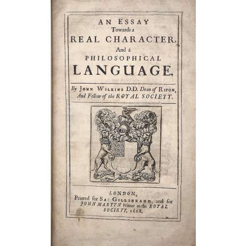 Title: AN ESSAY | Towards a | REAL CHARACTER, | And a | PHILOSOPHICAL | LANGUAGE. | By John Wilkins D.D. Dean of Ripon, | And Fellow of the ROYAL SOCIETY. |—| [armorial device] |—| LONDON, | Printed for Sa: Gellibrand, and for | JOHN MARTYN Printer to the ROYAL | SOCIETY, 1668. Pagination: [2] blank/order, [2] t.p./blank, [16], 1-454; + 79 leaves of Dictionary, unpaginated (158 pages); Illustrations: folding plates before pp. 167, 187, and two folding plates before p. 443. Collation: π2 a-d2 B-Z4 Aa-Zz4 Aaa-Lll4 Mmm3 aaa4 Aaa-Sss4 ttt3 Size: 4to, 32 x 20 x 5 cm; Binding: Full speckled calf, later polished calf spine with raised bands, double fillet ruled gilt compartments, crimson label with gilt lettering, margins sprinkled red. The work of John Wilkins is dedicated to the problem of the universal language. Wilkins was the Dean of Ripon from 1663 to 1672 and one of the founders of the Royal Society.
 -
![Jules Verne. Michael Strogoff : The courier of the Czar. (The story of the film). — London: The Readers Library Publishing Company Ltd., [1927]. — pp.: [1-13] 14-251 [252: printer's imprint] [253-256: blank], note: [note: first and last leaves used as front and rear paste-downs].](https://varshavskycollection.com/wp-content/uploads/2021/02/LIB-2460.2020-a-1-500x500.jpeg) First MGM edition, original maroon cloth, front and spine panels stamped in gold with decorations and lettering, partially darkened, wrap-around dust-jacket, chipped and torn near the head of spine with some loss, small chip and larger closed tear to lower panel. Photoplay edition. Film tie in edition for the 1926 French silent film which does not exist at this time in a full version. The front and rear panels depict scenes from the film. Bleiler (1978), p. 161. Not in Reginald (1979; 1992). Pagination: [2] – blank / advert., [2] – t.p. / coloph., [4] –advert. / editor's note, [2] – advert. / blank, [13] 14-251 [252: printer's imprint] [2] – blanks, note: [first and last leaves used as front and rear paste-downs]. Dimensions: 17 x 10.7 cm. Publisher: The Readers Library Publishing Company Ltd. (London). Publishing Year: 1927 (not indicated). Description of Shapero Rare Books, London: An attractive copy from this popular series of film editions, notable for their use of actors and scenes from the film version in question on the wrap-around dust-jacket, and sometimes photographic plates. A number of the film-makers involved were exiles from the Russian Revolution of 1917. The film's art direction was by Eduardo Gosch (Russian, American, 1890 – ?), César Lacca, Alexandre Lochakoff (Russian, French, fl. 1918–1939), Vladimir Meingard and Pierre Schild [Lakka Schildknecht] (Russian, Spanish, 1897 – 1968) who recreated the atmosphere of mid-nineteenth century Tsarist Russia. “Jules Verne has written no better book than this, in fact, it is deservedly ranked as one of the most thrilling tales ever written." Leonard S. Davidow, Classic Romances of Literature, 1937.
First MGM edition, original maroon cloth, front and spine panels stamped in gold with decorations and lettering, partially darkened, wrap-around dust-jacket, chipped and torn near the head of spine with some loss, small chip and larger closed tear to lower panel. Photoplay edition. Film tie in edition for the 1926 French silent film which does not exist at this time in a full version. The front and rear panels depict scenes from the film. Bleiler (1978), p. 161. Not in Reginald (1979; 1992). Pagination: [2] – blank / advert., [2] – t.p. / coloph., [4] –advert. / editor's note, [2] – advert. / blank, [13] 14-251 [252: printer's imprint] [2] – blanks, note: [first and last leaves used as front and rear paste-downs]. Dimensions: 17 x 10.7 cm. Publisher: The Readers Library Publishing Company Ltd. (London). Publishing Year: 1927 (not indicated). Description of Shapero Rare Books, London: An attractive copy from this popular series of film editions, notable for their use of actors and scenes from the film version in question on the wrap-around dust-jacket, and sometimes photographic plates. A number of the film-makers involved were exiles from the Russian Revolution of 1917. The film's art direction was by Eduardo Gosch (Russian, American, 1890 – ?), César Lacca, Alexandre Lochakoff (Russian, French, fl. 1918–1939), Vladimir Meingard and Pierre Schild [Lakka Schildknecht] (Russian, Spanish, 1897 – 1968) who recreated the atmosphere of mid-nineteenth century Tsarist Russia. “Jules Verne has written no better book than this, in fact, it is deservedly ranked as one of the most thrilling tales ever written." Leonard S. Davidow, Classic Romances of Literature, 1937. -
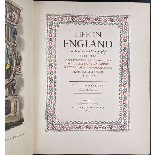 Title in black and red: LIFE IN ENGLAND | in Aquatint and Lithography | 1770—1860 | ARCHITECTURE • DRAWING BOOKS | ART COLLECTIONS • MAGAZINES | NAVY AND ARMY • PANORAMAS ETC. | FROM THE LIBRARY OF J. R. ABBEY | — | A BIBLIOGRAPHICAL | CATALOGUE | — | LONDON | PRIVATELY PRINTED | AT THE CURWEN PRESS | 1953 || Pagination: 2 blank leaves, [2] – limited edition 114 of 400 / blank, [i, ii] – h.t. / blank, [2] blank / frontis., [iii, iv] – t.p. / printer, v – contents, [vi] –blank, vii-ix – list of plates, [x] – blank, xi-xiii – list of ill., [xiv] – blank, xv-xxi – preface, xxii – blank; [1, 2] f.t. / blank, 3-427 [428], 2 blank leaves. Binding: Hardcover, 32 x 25.5 x 6.5 cm; brown cloth, red label with gilt lettering to spine, tan DJ with lettering to front and spine.
 -
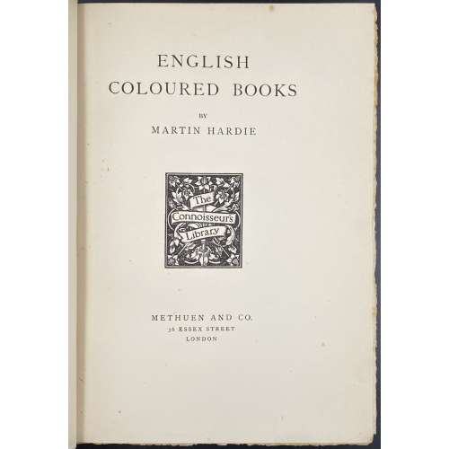 Half-title: THE CONNOISSEURS LIBRARY | GENERAL EDITOR : CYRIL DAVENPORT | […] | ENGLISH COLOURED BOOKS || Title: ENGLISH | COLOURED BOOKS | BY | MARTIN HARDIE | [device: THE CONNOISSEURS LIBRARY] | METHUEN AND CO. | 36 ESSEX STREET | LONDON || Dedication: TO MY WIFE | LOVE’S LABOUR : LOVE’S GIFT Pagination: ffl [i, ii] – h.t. / blank, [2] – blank / frontis. In colour, [iii, iv] – t.p. / First Published in 1906, [v, vi] – dedication / blank, vii-xxiv; 1-339 [340] bfl; 27 sheets of plates, colour and b/w. Collation: 8vo; a8 b4 A-X8 Y2. Binding: Hardcover, 26.3 x 19 x 5.7 cm; red cloth, blind-stamped with repeated fleuron, gilt floral designs and lettering in the frame to front cover, elaborate gilt floral design and lettering to spine; top margin gilt, other untrimmed, some pages uncut; plates w/guards. Printed on laid paper. Printed in Scotland by T. and A. Constable, at the Edinburgh university press. Contributors: Martin Hardie (British, 1875 – 1952) – Author Cyril Davenport (British, 1848 – 1941) – Editor of the series Sir Algernon Methuen (British, 1856 – 1924) – Publisher Thomas Constable (British, 1812 – 1881); Archibald Constable (British, 1774 – 1827) – Founders of the Publishing House "T. and A. Constable".