-
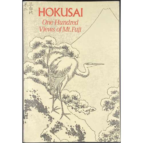 Softcover, 24 x 16.5 cm, publisher's pictorial wrappers, lettering to spine, pp.: [6] 7-224. Full reproduction of Katsushika Hokusai's [葛飾 北斎] (Japanese, 1760 – 1849) series of three illustrated books [絵本, e-hon] One Hundred Views of Mount Fuji [富嶽百景, Fugaku hyakkei], published in Japan in 1834-1849, with commentaries.
 -
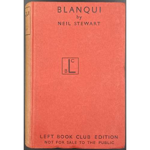 Title: BLANQUI | by | NEIL STEWART | [blank] | LONDON | VICTOR GOLLANCZ LTD | 1939 || Pagination: [1-7] 8-352. Binding: 20 x 13.5 cm; Red cardstock boards with black lettering, the front board: BLANQUI | by | NEIL STEWART | {BCL device} | LEFT BOOK CLUB EDITION | NOT FOR SALE TO THE PUBLIC ||; Spine with black lettering in the frame, sunned.
 -
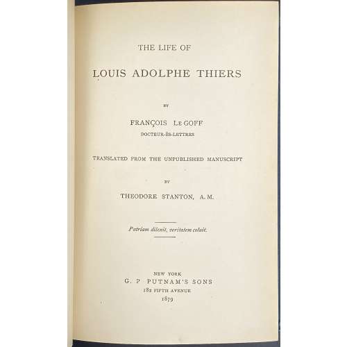 Title: THE LIFE OF LOUIS ADOLPHE THIERS | BY | FRANCOIS Le GOFF | DOCTEUR-ÈS-LETTRES | TRANSLATED FROM THE UNPUBLISHED MANUSCRIPT | BY | THEODORE STANTON, A. M. | {motto: Patriam dilexit, veritatem coluit.} | NEW YORK | G. P Putnam's Sons, 1879 | 182 FIFTH AVENUE | 1879 || Pagination: 2 blank leaves, frontis.: portrait of A. Thiers engraved on wood by J.I. Pease w/ tissue guard, [2] fac-simile of Thiers’s handwriting / blank, [2] - t.p. / copyright, [2] – dedication / blank, [2] – translators note / blank, [2] contents / blank, [vii] viii-xi [xii], [1] 2-353 [354 blank], [4] advert., 2 blank leaves; ill.: frontis., 1 woodcut plate, 1 folding manuscript fac-simile. Binding: dark-green cloth with bevelled margins, a gilt fac-simile of Thiers’s handwriting to front board, gilt lettering to spine. Note: The motto on the title page (Patriam dilexit, veritatem coluit) is taken from A. Thiers tomb on Père-Lachaise cemetery in Paris: "He cherished his homeland and worshipped the truth".
 -
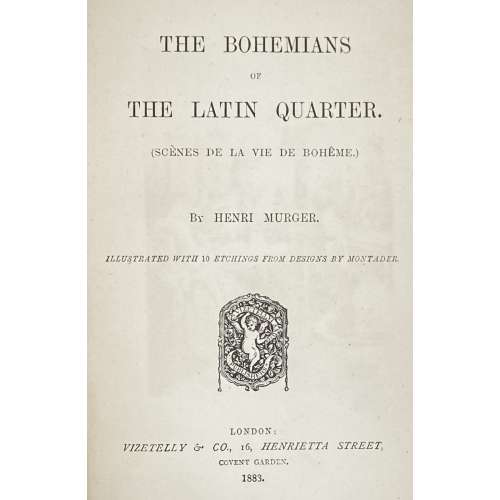 Title: THE BOHEMIANS | OF | THE LATIN QUARTER. | (SCÈNES DE LA VIE DE BOHÊME.) | By HENRI MURGER. | ILLUSTRATED WITH 10 ETCHINGS FROM DESIGNS BY MONTADER. |{publisher’s device}| LONDON: | VIZETELLY & CO., 16, HENRIETTA STREET, | COVENT GARDEN. | 1888. || Pagination: [i-v] vi-xxxiv, [1] 2-317 [318 blank]; collation: 8vo, π1 (h.t.), [a]-b8, B-U8 X7 + 10 etchings by Charles Courtry after Alfred Montader (incl. frontispiece and portrait of Henri Murger). Binding: 23 x 14.5 cm, olive cloth, black lettering to cover and gilt lettering to spine. Contributors: Murger, Henri [Henry] (French, 1822 – 1861) – original text (French). Montader, Pierre Marie Alfred (French, fl. c. 1881 – 1925) – artist. Courtry, Charles Jean Louis (French, 1846 – 1897) – engraver. Vizetelly, Henry Richard (British, 1820 – 1894) – publisher.
 -
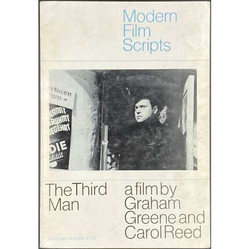 Title page: MODERN | FILM | SCRIPTS | THE THIRD MAN | a film by | Graham Greene | and Carol Reed | Simon and Schuster, New York. Pagination: [1-4] 5-134 [2] blank. Binding: publisher’s pictorial wrappers with the film still and lettering in blue and black to front, back, and spine. Size: 20.2 x 14 cm. The Third Man is a 1949 British film directed by Carol Reed, written by Graham Greene and starring Joseph Cotten, Alida Valli, Orson Welles, and Trevor Howard. Contributors: Graham Greene (British, 1904 – 1991) – author. Carol Reed (British, 1906 – 1976) – film director. Simon & Schuster (NY) – publisher. Villiers Publications, Ltd. (London) – printer.
 -
 Title page: THE | VISION; | OR | HELL, PURGATORY, AND PARADISE, | OF | DANTE ALIGHIERI. | TRANSLATED BY | THE REV. HENRY FRANCIS CARY, A. M. | IN THREE VOLUMES. | THE SECOND EDITION CORRECTED. | WITH THE LIFE OF DANTE, ADDITIONAL NOTES, | AND AN INDEX. | VOL. I. (–II, –III.) | — | LONDON: | PRINTED FOR | TAYLOR AND HESSEY, FLEET STREET. | 1819. || Pagination: (I) [2] – t.p. / blank, [4] – preface, [2] – contents / blank, [2] – errata / blank, [i] ii-lii – life of Dante, [1-3] 4-303+colophon [304 blank]; (II) [2] – t.p. / blank, [v] vi-xi [xii blank] – chronological view, [1-3] 4-309 [310 colophon]; (3) [2] – t.p. / blank, [1-3] 4-297 [298 blank], [28 index, colophon]; as called for by Royal Academy. Collation: 8vo; (1) π5 b-d8 e2 B-U8; (2) π5 B-U8 X2 Y1; (3) π1 B-U8 X8 X3. Binding: 22 x 14 cm each, three volumes uniformly bound by Morrell (stamp-signed on FEP verso) in slightly marbled polished calf, gilt dentelle border to boards and inside, gilt ornamental spine with red morocco labels, peacock marbled endpapers, extra vergé flyleaves in front and back, AEG. Edition: 2nd, corrected. The 1st edition was published by J. Barfield in 1814. Contributors: Dante Alighieri (Italian, 1265 – 1321) – author. Henry Francis Cary (British, 1772 – 1844) – translator. James Augustus Hessey (British, 1785 – 1870), Taylor and Hessey (London) – publisher. Thomas Miller (British, fl. 1815 – 1819) – printer.
 -
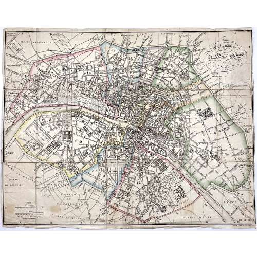 Upper right: Galignani's | PLAN OF PARIS | 1827 || in oval frame: Sauve sculpt. Bottom, under the frame: le Plan écrit par Lallemand. […] Gravé par E. Collin. Rue de la Harpe № 45. Dimensions: 36.5 x 46.5 cm. Armand Joseph Lallemand (French, c. 1810 - 1871) – cartographer. Charles-Étienne Collin (French, 1770 – 1840) – engraver. Étienne Collin II (French,1790 – 1852) – engraver. John Anthony Galignani (Italian, 1796 – 1873) – publisher. William Galignani (Italian, 1798 – 1882) – publisher.
 -
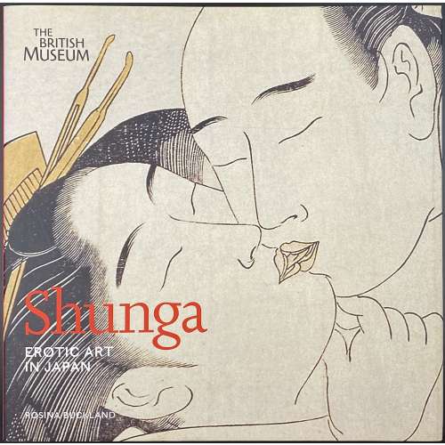 A hardcover pictorial album, 25 x 25.5 cm, bound in black buckram with silver lettering to spine, in pictorial dust jacket; pp.: [1-6] 7-175 [176 blank], total 88 leaves, illustrated in colour throughout. Title-page: Shunga | EROTIC ART | IN JAPAN | ROSINA BUCKLAND | THE BRITISH MUSEUM PRESS || Subject: Art, Japanese – Edo period, 1600-1868; Erotic art – Japan; Prints, Japanese – History. Contributor: Rosina Buckland (British, b. 1974)
 -
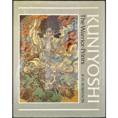 Title-page: KUNIYOSHI | The Warrior-Prints | B. W. Robinson | [space] | PHAIDON | OXFORD || Description: hardcover, 31.7 x 25 cm, bound in olive green cloth with gilt lettering to spine, white endpapers, pictorial olive dust jacket; pp.: [1-6] 7-208 incl. frontispiece, 64 plates, and 30 figs. in the text (total 104 leaves, 205 illustrations, including 32 in colour); catalogue with the list of illustrations, and index of characters portrayed. Inset: A.L.s. on Phaidon letterhead by Sue Moulton; ISBN 0714822272. Edition: 1st edition,1st printing (a review copy). Contributor: Robinson, Basil William (British, 1912 – 2005).
 -
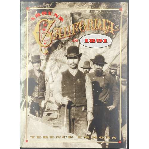 Softcover, 22.5 x 16.5 cm, pictorial paperback, pp.: [i-xi] xii-xix [xx blank] [2] [1] 2-179 [180] [6 advert.], total 206 pp plus cardstock Portable Stanford form. Nicholas Russel [Николай Константинович Судзиловский] (Russian-American, 1850 – 1930)
 -
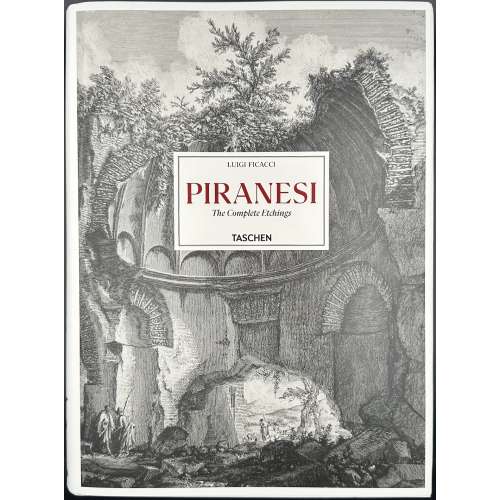 Hardcover volume, 35 x 26 cm, bound in pictorial paper boards with a lettered label to front cover, black lettering to spine, pictorial dust jacket, pictorial endpapers, pp.: [1-5] 6-787 [788], 1028 colour ils., trilingual edition (English, German, French). Title-page (red and black): LUIGI FICACCI | ISTITUTO NAZIONALE PER LA GRAFICA, ROME | Giovanni Battista | PIRANESI | Catalogue of the Complete Etchings | Gesamtkatalog der Radierungen | Catalogue raisonné des eaux-fortes | TASCHEN || Contributors: Luigi Ficacci (Italian, b. 1954) – author. Giovanni Battista [Giambattista] Piranesi (Italian, 1720 – 1778) – artist.
 -
 Hardcover, white lettered boards, pictorial DJ, pp.: [1-8] 9-359 [360 blank].
ISBN: 9789004191464.
-
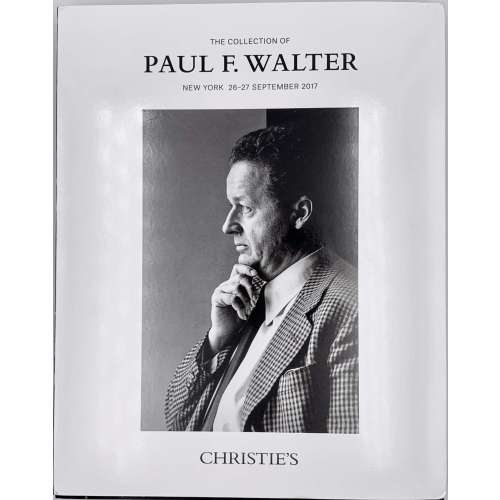 Christie's Auction Catalog; Sale WALTER-15785; New York, September 26-27, 2017; Publisher's pictorial wrappers, front cover: THE COLLECTION OF | PAUL F. WALTER | NEW YORK 26–27 SEPTEMBER 2917 | {profile chest portrait of Paul F. Walter} | CHRISTIE'S || 26.8 x 21.2 x 3 cm; 662 lots, illustrations in colour and b/w, pictorial dust jacket; pp: [2] 3-462.
Paul F. Walter (American, 1935 – 2017) – "Collector. Following studies in history and history of art Oberlin College, Ohio, and Columbia University, he began to collect in the1960s, starting with prints by Whistler and moving on to the Aesthetic Movement and the Arts & Crafts in Britain, as well as the arts of the Indian subcontinent and modern American painting. He was Trustee of the Museum of Modern Art from 1992-2006, and a benefactor to the Metropolitan Museum of Art, the Cooper-Hewitt Design Museum, the Morgan Library and Museum, the Brooklyn Museum, the Allen Memorial Art Museum at Oberlin College, and the Los Angeles County Museum of Art."
-
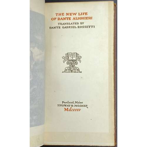 Title: THE NEW LIFE | OF DANTE ALIGHIERI | TRANSLATED BY | DANTE GABRIEL ROSSETTI | {Publisher's device} | Portland, Maine | THOMAS B. MOSHER | Mdccccv Pagination: Ffl [i-viii] ix-xii [xiii] [xiv blank], [1, 2] 3-97 [98] bfl; frontis. w/guard; Note: “This fourth edition on Van Gelder paper consists of 925 copies”. Binding: Hardcover, 18.2 x 10.2 cm, full brown morocco possibly by Sangorski & Sutcliffe, with embossed design elements, raised bands, gilt lettering to spine, TMG, other untrimmed; printed on laid paper with watermark.
 -
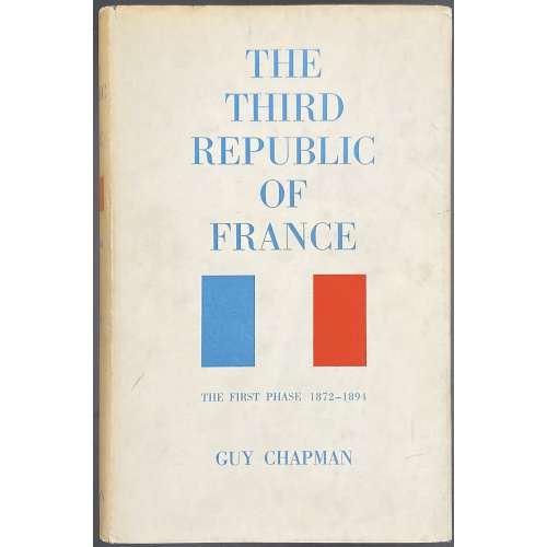 Title: THE | THIRD REPUBLIC | OF FRANCE | THE FIRST PHASE 1871–1894 | BY | GUY CHAPMAN | Sometime Professor of Modern History in the University of Leeds | LONDON | MACMILLAN & CO LTD | NEW YORK • ST. MARTIN’S PRESS | 1962 Pagination: [i-iv] v-xxii, [1] 2-433 [434 imprint]. Collation: 8vo; [A]8 B-Z8 2A-2D8 2E2 2E210. Binding: blue buckram, bronze lettering to spine, pictorial DJ. Publishing year 1963 according to worldcat. Author: Chapman, Guy Patterson (British, 1889 – 1972)
 -
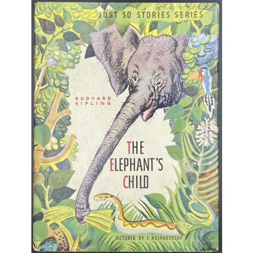 Hardcover volume, 24 x 18 cm, pictorial paper over cardboard boards, pictorial endpapers, and pictorial DJ; pp.: [2] – pictorial t.p. / copyrignt+imprint + [26] unpaginated pages (13 leaves); in-text photomechanical b/w and coloured illustrations after Feodor Rojankovsky. DJ and front cover (pictorial): JUST SO STORIES SERIES | RUDYARD KIPLING | THE | ELEPHANT'S | CHILD | PICTURED BY F. ROJANKOVSKY || Title-page (pictorial): JUST SO STORIES SERIES | THE | ELEPHANT'S | CHILD | RUDYARD KIPLING | ILLUSTRATED BY | F. ROJANKOVSKY | GARDEN CITY PUBLISHING COMPANY, INC., GARDEN CITY, N. Y. || Contributors: Rudyard Kipling (British, 1865 – 1936) Feodor Rojankovsky [Rojan; Фёдор Степанович Рожанковский] (Russian-American, 1891 – 1970)
 -
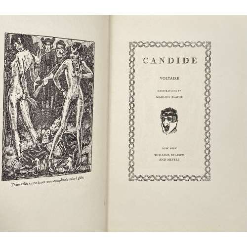 Title (chain border): CANDIDE | VOLTAIRE | ILLUSTRATIONS BY | MAHLON BLAINE | {vignette} | NEW YORK | WILLIAMS, BELASCO | AND MEYERS || Title verso: (top) COPYRIGHT, 1930, BY WILLIAMS, BELASCO & MEYERS || (bottom) PRINTED IN THE UNITED STATES OF AMERICA | BY J. J. LITTLE & IVES COMPANY, NEW YORK || Pagination:[1-6] 7-144, headpiece, frontispiece and 5 plates after Blaine’s pen drawings, within the pagination. Binding: 25 x 16.5 cm; blue cloth, blind-stamped frame, stamped-gilt lettering to front board and spine, thick wove paper, upper edge blue, fore-edge untrimmed, yellow vergé endpapers. Arouet, François-Marie [Voltaire] (French, 1694 – 1778)– author. Woolf, Herman Irwell [Chambers, Dorset] (British, 1890 – 1958) – translator. Blaine, Mahlon [Hudson, G. Christopher] (American, 1894 – 1969) – illustrator. Williams, Belasco and Meyers (NY) – publisher. J. J. Little & Ives Company (NY) – printer. See the Cameo Classic reprint [LIB-2777.2021].
 -
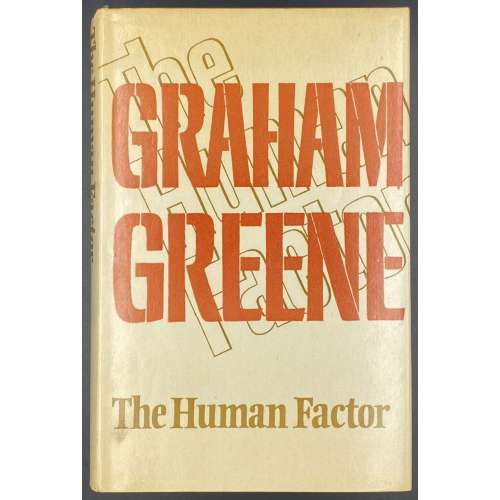 Title-page: THE HUMAN | FACTOR | Graham Greene | {citation from Joseph Conrad, 3 lines} | {publisher’s device} | THE BODLEY HEAD | LONDON SYDNEY | TORONTO || Green publisher’s cloth with gilt lettering to spine, cream dust jacket, lettered on front, back and spine, designed by Michael Harvey, unclipped (£4.50 NET | IN U.K. ONLY), [1-8] 9-338 [339] [340 blank]. Previous owners' inscriptions to FFEP. Printed by William Clowes & Sons Ltd. (Beccles). © Graham Greene 1978. Graham Greene (British, 1904 – 1991).