-
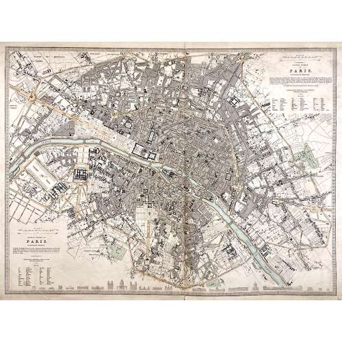 Top right: EASTERN DIVISION OF | PARIS. | Containing the Quartiers | {5 lines in italic} | Published under the Superintendence of the Society for the | Diffusion of Useful Knowledge || Bottom left: WESTERN DIVISION OF | PARIS. | Containing the Quartiers | {4 lines in italic} | Published under the Superintendence of the Society for the | Diffusion of Useful Knowledge || The map is framed, but there is no lettering beneath the frame to identify the cartographer, engraver, and publisher. However, we can attribute it to William Barnard Clarke (British, 1806 – 1865) and John Shury (fl. c. 1814-1844). The publisher is either Baldwin & Cradock or Chapman and Hall. Dimensions: Sheet: 40 x 60.8 cm; Image: 40 x 53.5 cm.
 -
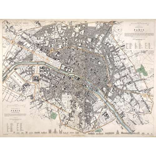 Top right: EASTERN DIVISION OF | PARIS. | Containing the Quartiers | {5 lines in italic} | Published under the Superintendence of the Society for the | Diffusion of Useful Knowledge || Bottom left: WESTERN DIVISION OF | PARIS. | Containing the Quartiers | {4 lines in italic} | Published under the Superintendence of the Society for the | Diffusion of Useful Knowledge || Under the frame: Drawn by W. B. Clarke, Archt. […] London: Published by Chapman and Hall, 186, Strand. April 1st, 1834. [...] Engraved by J. Shury || Dimensions: Sheet: 40.8 x 57 cm; Image: 38.7 x 52.5 cm. Contributors: William Barnard Clarke (British, 1806 – 1865) – artist. John Shury (fl. c. 1814-1844) – engraver. Chapman and Hall (London) – publisher. Society for the Diffusion of Useful Knowledge (SDUK) (British firm, 1826 – 1846).
 -
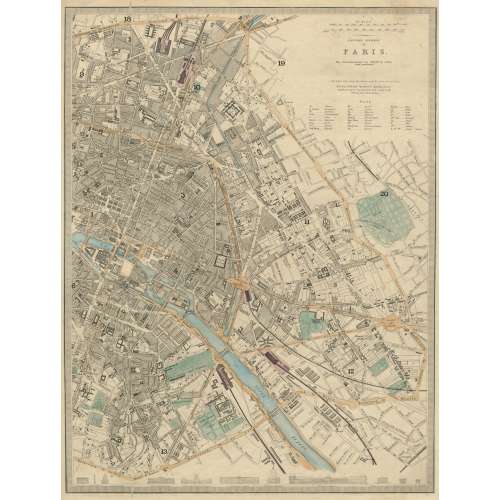 EASTERN DIVISION | OF | PARIS. | The Arrondissements are defined by colour | and numbered. || London, Edward Stanford 6 Charing Cross. | Published under the Superintendence of the Society for the Diffusion of Useful Knowledge. || Dimensions: Sheet: 43.5 x 35.5 cm; Image: 39.5 x 30 cm. Contributors: Edward Stanford (British, 1827 – 1904) – cartographer, engraver, publisher. Society for the Diffusion of Useful Knowledge (SDUK) (British firm, 1826 – 1846).
 -
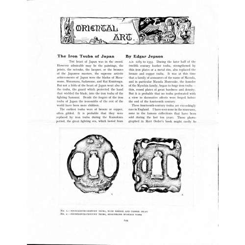 Magazine article by Edgar Jepson: The Iron Tsuba of Japan (Section: Oriental Art), published in volume Vol. 70 (September–December) of The Connoisseur: An Illustrated Magazine for Collectors, Vol. 70 (September–December); pp. 143-152 / C. Reginald Grundy [ed.] — London: Published by the Proprietor, W. CLAUSE JOHNSON, at the Editorial and Advertisement Offices of The Connoisseur, 1924. Owner's half black morocco, gilt lettering to spine, blue cloth boards. Two volumes bound together without original covers. Size 28.5 x 22 cm. Vol. 1: The Connoisseur | An Illustrated Magazine | For Collectors | Edited by C. Reginald Grundy | Vol. LXIX. | (MAY—AUGUST, 1924) | LONDON | Published by the Proprietor, W. CLAUSE JOHNSON, at the | Editorial and Advertisement Offices of The Connoisseur, | at 1, Duke Street, St. James's, S.W. 1 | 1924 || Pp.: [i-ii] iii-xviii [xix] [1, 2 - plate] 3-249 [250]. Vol. 2: The Connoisseur | An Illustrated Magazine | For Collectors | Edited by C. Reginald Grundy | Vol. LXX. | (SEPTEMBER—DECEMBER, 1924) | LONDON | Published by the Proprietor, W. CLAUSE JOHNSON, at the | Editorial and Advertisement Offices of The Connoisseur, | at 1, Duke Street, St. James's, S.W. 1 | 1924 || Pp.: [i-ii] iii-xxii [2 blanks] [1, 2 - plate] 3-261 [262]. The Iron Tsuba of Japan by Edgar Jepson The heart of Japan was in the sword. However admirable may be the paintings, the prints, the netsuke, the lacquer, or the bronzes of the Japanese masters, the supreme artistic achievements of Japan were the blades of Masamune, Muramasa, Sadamune, and Rai Kunitsugu. But not a little of the heart of Japan went also in the tsuba, the guard which protected the hand that wielded the blade, into the iron tsuba of the fighting Samurai. Beside the forgers of the iron tsuba of Japan the ironsmiths of the rest of the world have been mere children. The earliest tsuba were of bronze or copper, often gilded. It is probable that they were replaced by iron tsuba during the Kamakura period, the great fighting era, which lasted from A.D. 1185 to 1333. During the later half of the twelfth century leather tsuba, strengthened by thin iron plates or a metal rim, also replaced the bronze and copper tsuba. It was at this time that a family of armourers of the name of Masuda, and in particular Masuda Munesuke, the founder of the Myochin family, began to forge iron tsuba — thin, round plates of great hardness and density. But it is probable that no tsuba perforated with a view to decorative effects were forged before the end of the fourteenth century. These fourteenth-century tsuba are exceedingly rare in England. I have seen none in the museums, none in the famous collections that have been sold during the last ten years. Those photographed in Herr Oeder's book might easily be the fifteenth century. No. 1 is a curious cup-shape tsuba decorated with a bronze and copper inlay. No. 2, with its edges curiously twisted in the forging, looks like Myochin work. But it is not of the Myochin iron. The Myochin family produced some of the greatest ironsmiths of Japan. Armourers first of all, tsubasmiths, forgers of sake-kettles, articulated reptiles, crustacea, and insects — everything that can be done with iron they did; they pushed their medium to its limit. They were forging iron tsuba in 1160, and they were still forging them in 1860. And it was their own iron, or rather their own steel. They discovered the secret of it early, and they kept that secret in the family for all those hundreds of years. There is no mistaking a Myochin tsuba: balance it on your finger and tap it with a piece of metal, always it gives forth a clear bell-like ring that you get from the work of no other ironsmith, Japanese or European. Always the Myochin tsuba is before everything a protection to the hand of the swordsman; to that everything is, as it should be, subordinated. No. 3 is a Myochin tsuba of the fifteenth century, and probably of the early fifteenth century. No. 4, by Myochin Munetaka, perforated with a grotesque figure, is an example of that twisting and twisting of the iron in the forging till it forms a pattern like the grain of wood. The Myochin smiths invented these wood-grain tsuba, and no other smiths equalled them in their forging. In the sixteenth century, the fighting tsuba was probably at its best. It was a century of great tsubasmiths. Then the first Nobuiye, whose tsuba fetched £100 apiece, circa 1800, in Japan, and the first Kaneiye flourished. No. 5 is a tsuba forged by a great smith, Iyesada of Sotome, in the manner of Nobuiye I, decorated with the karakusa tendrils that Nobuiye delighted in, with lightning and clouds. No. 6 is a guard of Sanada Tembo, the chief smith of the Tembo family, stamped, punning fashion, with the character Tembo. Akin to the Tembo tsuba were those of the Kiami and Hoan smiths. Then also the Heianjo smiths and the Owari smiths, especially those of Nagoya and the Yamakichi family, forged their strongest tsuba. Those of the Yamakichi were tested after the forging by being pounded in iron mortars — at least, so the legend runs. But they were a sternly utilitarian family, and I have never seen a Yamakichi tsuba of any beauty. In the later half of the fifteenth century arose the fashion of decorating tsuba with an inlay, zogan, of bronze. The Heianjo tsuba, forged at Kyoto in the latter half of the fifteenth and the beginning of the sixteenth century, were often thus inlaid. The earliest of them were called "Onin", of which No. 7 is an example. In addition to the bronze inlay around the edge, it is inlaid with a representation, some say, of snow; others say, of the duckweed on a pond. No. 8 is probably a Heianjo tsuba, but I am not quite sure about it. The inlaid acacia branches might be very early Shoami work. But to judge by the iron, it is a fifteenth-century tsuba; and the authorities place the beginning of the Shoami school not later than early in the sixteenth century. No. 10 is an example of the Fushimi-zogan, a flat inlay of a light-coloured bronze. These tsuba took their name from the fact that they were first forged at Fushimi, in Yamashiro, in the sixteenth century. It is of the type known as Mon-zukashi, perforated with crests (mon) à jour. The Yoshiro-zogan tsuba were also first forged at Fushimi by Yoshiro Naomasa. They were distinguished from the Fushimi-zogan by the fact that their inlay was generally a little raised-not always-for the inlay of No. 9, a tsuba forged by a later nineteenth-century Yoshiro, is quite flat. It is an interesting tsuba, for, with its decoration grown florid and excessive, it marks the intermediate stage between the simple and delightful designs of the genuine fighting tsuba and the elaborate pictures in gold and silver on the tsuba of the eighteenth-century smiths of Awa and Kyoto, which have become mere ornaments of the goldsmith. The Gomoku-zogan (No. 11) tsuba were probably first forged earlier than the Fushimi and Yoshiro-zogan tsuba. This inlay, in slight relief, is a representation in a light-coloured bronze and copper of twigs caught in the eddies of streams. The seventeenth century and early eighteenth century were the great periods of perforated tsuba. The designs, and they are often admirable, are for the most part in plain fretwork; but they are also chased. No. 12, a crane under an acacia, is a tsuba of a Higo smith, great forgers of fighting tsuba during this period. These smiths also excelled in nunome zogan, a very thin gold and silver inlay, with which they further decorated their perforated guards. The smiths of the Umetada and Shoami families also forged iron tsuba during this period; but their designs, though sometimes pleasing enough, are rarely fine. The best work of Myoju Umetada is in sentoku, not iron. The Choshu smiths, coming later, surpass the perforated guards of both the Umetada and Shoami smiths in beauty of design. No. 13, a lotus in the round, not only fretwork, but also engraved, is a good example of the admirable balance they so often attained in their designs. It is a sufficiently realistic lotus, but yet of a delightful simplicity. In considerable contrast is No. 14, the dragon by Soheishi Soten — one of the only two authentic tsuba of his forging known — the first forger of hikone-bori tsuba, which were in extraordinary favour in Japan during the eighteenth century, and illustrated every important event in Japanese history. It is on the elaborate side, but fine, strong work, and an excellent guard to the hand, for the lighter and more open part, which gives the design its admirable balance, is on the inside, and not exposed to the full swing of an opponent's blade. A few years ago there was a tendency to decry the Namban tsuba as having sprung too directly from foreign sources. But though the original suggestion may have been Chinese, or, as some say, Portuguese, the Japanese made it entirely their own, as characteristically Japanese as anything can well be, but, it must be admitted, of a decadent period. The school took its rise at the beginning of the seventeenth century, and the early tsuba were forged of a specially hard iron, the Wootz, imported from Southern India. No. 15, the signs of the Zodiac, is an excellent tsuba from the fighting point of view. Both it and No. 16 are of quite charming, if elaborate, design, and both of them, with their delicate scroll-work, so astonishingly undercut, are the very last word in the work of the ironsmith-veritable iron lace. To return to the simpler perforated tsuba, the smiths of Akasaka, a suburb of Tokyo, produced probably the most charming designs. Their style derives considerably from the Higo smiths, and their earlier fighting tsuba are very like the Higo tsuba. But always their work was just a little lighter than that of the Higo smiths, and in the end they moved right away from them and became the forgers of very light guards indeed. No. 17, is a representation of the Hiyokudori, the fabulous double bird, in which were reincarnated the souls of the two lovers, Gompachi and Komurasaki; and No. 18, “the tsuba of a hundred ducks "— there are about forty — are characteristic designs of the school. In the work of the Akasaka smiths the balance, which makes the design of a good tsuba so admirable and delightful, attains its height. This admirable balance seems often to be obtained by a deliberate sacrifice of symmetry. About nine hundred and ninety-nine European ironsmiths out of a thousand would have made the right and left sides of the Hiyoku-dori line by line, and perforation by perforation, exactly alike; he would have cut out exactly as many ducks on the one side of “the tsuba of a hundred ducks” as on the other, and made each duck on the right side correspond exactly in position and attitude with a duck on the left side. By variations the tsubasmith attained a finer balance, almost a higher symmetry. No. 19, often called by collectors the "rose-window" tsuba, but really a stylised chrysanthemum, is a favourite design of the Akasaka smiths, but Hizen work and inlaid in the Hizen manner with gold nunome. No. 20 is a Satsuma tsuba of the middle period. The Satsuma smiths of the nineteenth century produced probably the most ornate of all the iron guards, for the most part calibashes and beans with their leaves and tendrils realistic in the extreme, but of charming design. Few crafts have been carried further than that of the tsubasmith; few crafts working in a difficult medium have handled more subjects with greater feeling for beauty or greater liveliness of fancy. It is interesting to note again and again how school influences school, and smith influences smith. But, as in all the applied arts, the finest tsuba were forged by men who never lost sight of the purpose of a tsuba, that it is before everything a protection to the hand, and never subjected that purpose to a passion for virtuosity. Illustrations: No 1. FOURTEENTH-CENTURY TSUBA, WITH BRONZE AND COPPER INLAY No. 2. FOURTEENTH-CENTURY TSUBA, RESEMBLING MYOCHIN WORK No. 3. MYOCHIN TSUBA, FIFTEENTH CENTURY No. 4. MYOCHIN TSUBA, NINETEENTH CENTURY No. 5. SIXTEENTH-CENTURY TSUBA No. 6. SIXTEENTH-CENTURY TSUBA BY IYESADA OF SOTOME BY SANADA TEMBO No. 7. ONIN TSUBA No. 8. HEIANJO (?) TSUBA No. 9. YOSHIRO TSUBA, NINETEENTH CENTURY No. 10. FUSHIMI-ZOGAN, NINETEENTH CENTURY No. 11.- GOMOKU-ZOGAN, SIXTEENTH CENTURY No. 12. HIGO TSUBA, SEVENTEENTH CENTURY No. 13. CHOSHU TSUBA, SEVENTEENTH CENTURY No. 14. SOTEN TSUBA, SEVENTEENTH CENTURY No. 15. NAMBAN TSUBA, EIGHTEENTH CENTURY No. 16. NAMBAN TSUBA, NINETEENTH CENTURY Nos. 17. AND 18. AKASAKA TSUBA, EIGHTEENTH CENTURY No. 19. HIZEN TSUBA, EIGHTEENTH CENTURY No. 20. SATSUMA TSUBA, EIGHTEENTH CENTURY
 -
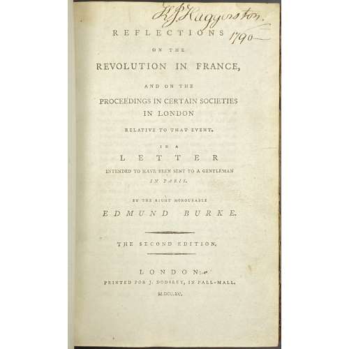 Title: REFLECTIONS | ON THE | REVOLUTION IN FRANCE, | AND ON THE | PROCEEDINGS IN CERTAIN SOCIETIES | IN LONDON | RELATIVE TO THAT EVENT. | IN A | LETTER | INTENDED TO HAVE BEEN SENT TO A GENTLEMAN | IN PARIS. | BY THE RIGHT HONOURABLE | EDMUND BURKE. | — | {in lozenges} THE SECOND EDITION. | —| LONDON: | PRINTED FOR J. DODSLEY, IN PALL-MALL. | M.DCC.XC. || Pagination: [4 blanks] [i-iii] iv, 1-356 [4 blanks]. Collation: 8vo; π2 B-Z8, Aa2. Binding: Quarter calf with marbled boards, gilt fillets, red label with gilt lettering to spine. "King John Haggerston, 1790" handwritten ink inscription to front endpaper, t.p. and p. iii. Seems like Sir John Haggerston, 9th Baronet.
 -
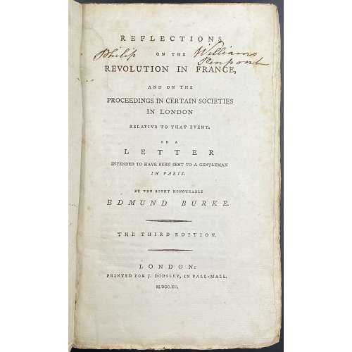 Title: REFLECTIONS | ON THE | REVOLUTION IN FRANCE, | AND ON THE | PROCEEDINGS IN CERTAIN SOCIETIES | IN LONDON | RELATIVE TO THAT EVENT. | IN A | LETTER | INTENDED TO HAVE BEEN SENT TO A GENTLEMAN | IN PARIS. | BY THE RIGHT HONOURABLE | EDMUND BURKE. | — | {in lozenges} THE THIRD EDITION. | —| LONDON: | PRINTED FOR J. DODSLEY, IN PALL-MALL. | M.DCC.XC. || Pagination: [i-iii] iv, [1] 2-364, total 368 pages. Collation: 8vo; π2 B-Z8 Aa6 (plus one blank flyleaf in the front and one in the back), total 184 leaves. Binding: 23 x 14.5 cm, publisher’s paper-backed binding in blue boards with handwritten title to spine (illegible), laid paper, margins untrimmed. Housed in a modern brown cloth clamshell box with brown gilt-lettered label. Note: The second edition same year has a total of 360 pages (iv, 356); see LIB-2590.2021. Inscription to title page: Philip [ON THE] Williams Penpont – that is probably of Philip Williams Esq., of Penpont, Breconshire, Wales. (c. 1742 – 1794).
 -
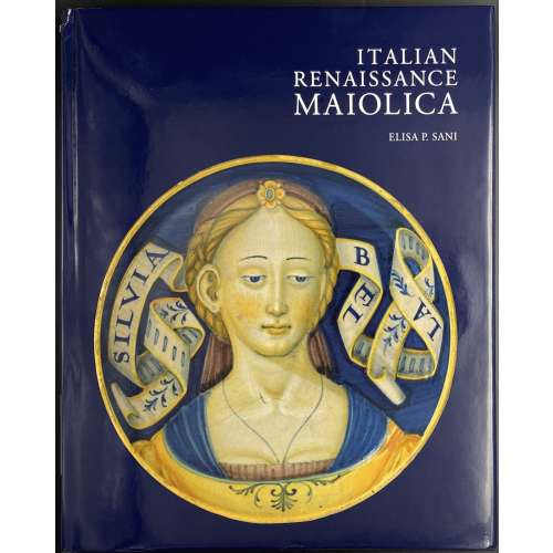 Title page: ITALIAN | RENAISSANCE | MAIOLICA | ELISA P. SANI | with a preface by J.V.G. Mallet and | contributions from Reino Liefkes | V&A PUBLISHING || Pagination: [1-6] 7-192, ils. Binding: Black cloth, gilt lettering to spine; pictorial DJ. Mint/New. Size: 27.7 x 22.2 cm.
 -
 Hardcover, 23.5 x 23.5 cm, publisher's navy cloth, gilt-stamped lettering to spine, pictorial DJ; pp.: [1-6] 7-143 [144 blank].
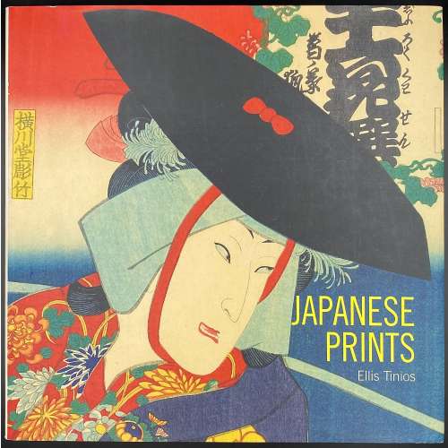
Japanese woodblock prints of the Edo period (1615-1868) were the products of a highly commercialised and competitive publishing industry. Their content was inspired by the vibrant popular culture that flourished in Edo (Tokyo). At any given time scores of publishers competed for the services of the leading artists of the day. Publishers and artists displayed tremendous ingenuity in finding ways to sustain demand for prints and to circumvent the restrictions placed on the industry through government censorship. Although Japanese prints have long been appreciated in the West for their graphic qualities, their content has not always been fully understood. This book draws on recent scholarship that makes possible a more subtle appreciation of the imagery encountered in the prints and how they would have been read when first made. Through stunning new photography of both well-known and rarely published works in the collection of the British Museum, including many recent acquisitions, the author explores how and why such prints were made, providing a fascinating introduction to a much-loved but little-understood art form.
-
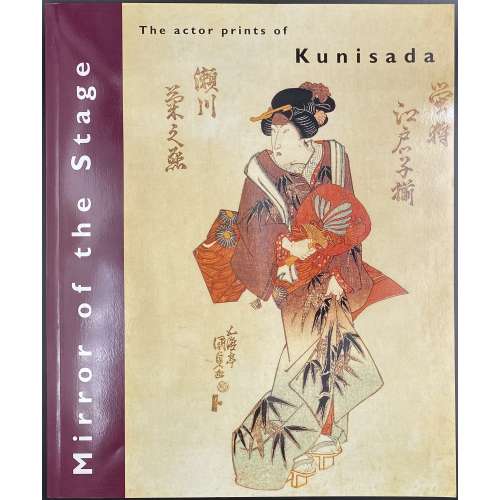 Thin booklet in glossy pictorial wrappers, 29.8 x 24.7 cm, pp.: [1-4] 5-48, 24 leaves total, illustrated. Errata tipped in after the front wrapper. Title-page: Mirror | of the stage | The actor prints of | Kunisada | Ellis Tinios | The University Gallery Leeds || Colophon: Published in March 1996 for the exhibition Mirror of the Stage held at the University Gallery Leeds 24 April-30 May 1996. Introduction: "This book [exhibition catalogue] has been written as an introduction to nineteenth-century Japanese colour woodblock actor prints and to the achievements of the artist Kunisada in that field [as well as to accompany the exhibition of the same name]. It is divided into three sections. In the first, I examine four topics: the social and cultural milieu that gave rise to the production of prints as items of mass consumption; the aesthetic of the actor print; the economics of print production (including consideration of the numbers issued, the prices at which they were sold and their rates of survival); and the process by which prints were produced. The second section consists of sixteen colour plates with commentaries. In the final section, I survey Kunisada's career." Subject: Utagawa, Kunisada, — 1786-1864 — Exhibitions; Ukiyo-e — Exhibitions; Colour prints, Japanese — Edo period, 1600-1868 — Exhibitions. Contributors: Ellis Tinios Utagawa Kunisada [歌川 国貞] a.k.a. Utagawa Toyokuni III [三代歌川豊国] (Japanese, 1786 – 1865). Select illustrations (references in this collection):
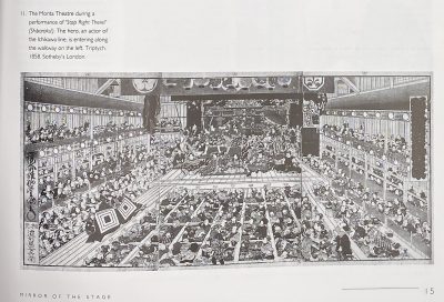
SVJP-0226.2016: Superb Edo pictures illustrating dances, 1858.
-
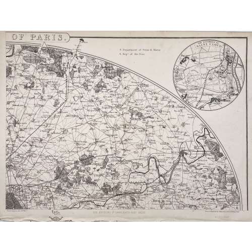 Four maps 34 x 47.5 cm each. Include insets of Versailles, Fontainebleau, Saint Cloud and St. Germain en Laye. Lithograph by Edward Weller after a map drawn and engraved by John Dower. "These maps originally appeared in the Weekly Dispatch newspaper from 1856 to 1862. They were reissued between 1863 and 1867 by Cassell, Petter and Galpin and then published collectively as Cassell's Atlas. The plates were acquired by G.W. Bacon & Co., and reissued in 1876 under the title Bacon's New Quarto Atlas ... of the Counties of England, and many times since under various titles." [WorldCat]
Dimensions: 34 x 47.5 cm each.
Contributors: Weller, Edward (British, 1819 – 1884) – lithographer. Dower, John Crane (British, 1791 – 1847) – artist, engraver. Dower, John James (British, 1825 – 1901) – artist, engraver (son of John Crane Dower). -
 Description: Oblong volume, 19.3 x 24.2 cm, hardcover in velvet with pasted image, in a pictorial slipcase; printed on glossy paper, unpaginated. Title-page (in frame): ERATO | GRAPHIKEN VON MIHÁLY ZICHY || Collation: (2) h.t., t.p., (30) leaves of plates (4) text by Éva Bros, bibliography, colophon; total 36 leaves. The plates are photomechanical offset copies made from the photogravures of 1911 Leipzig private press edition [SVE-0501.2021], which photogravures made from the original watercolours and crayon drawings produced by Zichy in 1874-1879; the original album of 51 compositions was sold at Christie’s sale of Gérard Nordmann collection on December 14-15, 2006 in Paris. See a copy of the Leipzig album № 285 in this collection [SVE-0501.2021].
 -
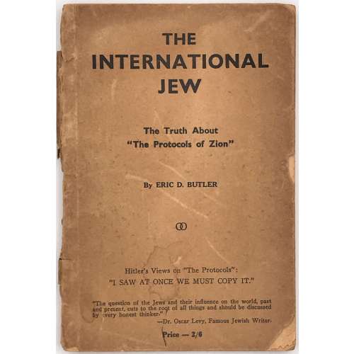 Front wrapper and t.p.: THE | INTERNATIONAL | JEW | The Truth About | "The Protocols of Zion" | By ERIC D. BUTLER | ∞ | Hitler’s Views on “The Protocols”: | “I SAW AT ONCE WE MUST COPY IT.” | “The question of the Jews and their influence on the world, past and present, cuts to the root of all things and should be discussed by every honest thinker” | — Dr. Oscar Levy, Famous Jewish Writer. | Price — 2/6 || (T.p.: same with the full stop (.) after 2/6. Stamp to t.p.: Women’s Voice | 537 SO. DEARBORN ST. | ROOM 800 | CHICAGO 5. ILL. || [2] 3-167 [168]. Binding: Lettered publisher’s wrappers, 18 x 12 cm. Butler, Eric Dudley (Australian, 1916 – 2006) Osborne, Robert Martin (British-Australian, 1862 – 1931) — Australian printer and publisher. Levy, Oscar (German-Jewish, 1867 – 1946) Hitler, Adolf (German, 1889 – 1945)
 -
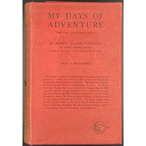 Description: Hardcover volume bound in red cloth with black lettering to front cover and spine, in a red dustjacket with black lettered, bookplate to front pastedown “ from the library of | DAVID. D. LEVINE | Militaria” in triple fillet frame, bookseller’s label to front fep “CHAS. E. LAURIAT CO. | IMPORTERS & BOOKSELLERS | 385 Wash’n St. Boston”. Title-page in red and black: MY DAYS OF ADVENTURE | THE FALL OF FRANCE, 1870-71 | BY ERNEST ALFRED VIZETELLY | LE PETIT HOMME ROUGE | AUTHOR OF “THE COURT OF THE TUILERIES 1852-70” ETC. | {publisher’s device} | WITH A FRONTISPIECE | LONDON | CHATTO & WINDUS | 1914 || Pagination: [2] advert., [i-vii] viii-xi [xii] [2] contents/blank, [1] 2-337 [338] [2], 340 pages total plus photo frontis. Collation: [A8] B-Y8 Z2, 170 leaves total plus one leaf of plates. Provenance: David D. Levine Contributors: Ernest Alfred Vizetelly (British, 1853 – 1922) – author. Charles E. Lauriat Company, Booksellers and Importers, Boston, Massachusetts. Charles Emelius Lauriat, Jr. (American, 1874 – 1937) – collector of rare books and prints Chatto & Windus (London) – publisher. David Daniel Levine (Australian, 1944 – 2020) – Australian judge and book collector
 -
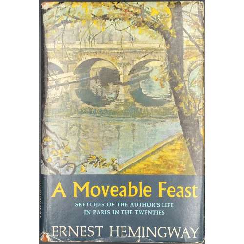 ERNEST HEMINGWAY | A Moveable Feast | {Citation} | CHARLES SCRIBNER'S SONS, | New York || Pagination: [12] – incl: advert., h.t., t.p., colophon, contents, preface, and note, [1, 2] - f.t. / blank, 3-211 [212]. Publisher’s cloth-backed stamped boards, original dust jacket. Ref.: Hanneman A31a.
 -
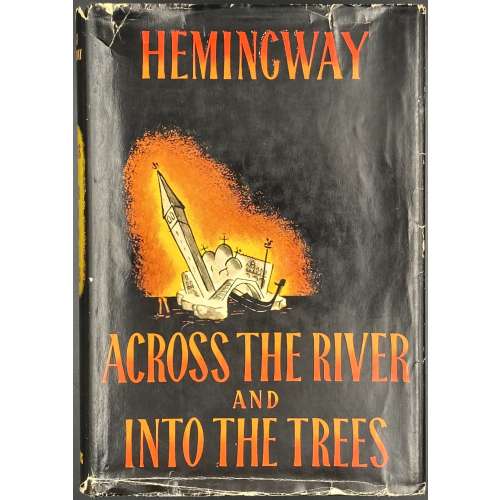 Title page: ACROSS THE RIVER | AND | INTO THE TREES | BY | ERNEST HEMINGWAY | CHARLES SCRIBNER'S SONS | NEW YORK | 1950 || Pagination: [12] 1-308; total 160 leaves. Binding: black cloth, gilt Hemingway's fac-simile to front board, lettering to spine, pictorial dust jacket designed by A. Ivancich; $3.00 price clipped from top of front flap. Bookplate of Feodor Rojankovsky to front pastedown. Size: 21.5 x 15 cm. Edition: 1st edition, 1st printing; DJ with yellow on spine (later copies have orange); letter “A” and the Scribner’s device to copyright page. Provenance: Rojankovsky, Feodor [Rojan; Рожанковский, Фёдор Степанович] (Russian-American, 1891 – 1970) Contributors: Ernest Hemingway (American, 1899 – 1961) – author. Adriana Ivancich (Italian, 1930 – 1983) – artist of the dust jacket (Ivancich inspired the figure of Renata in the novel). Charles Scribner's Sons – publisher.
 -
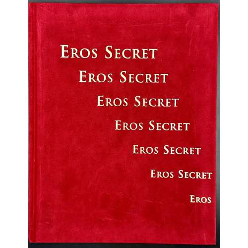 Hardcover volume, 290 x 225 mm, bound in scarlet velveteen with gilt lettering to front and spine, gilt vignette and lettering to back; pp.: [1-8] 9-204 [4], profusely illustrated; text in French and English. ISBN : 2-940127-37-9. Title-page (yellow on red paper): EROS SECRET | OBJETS EROTIQUES A TRANSFORMATION | EROTIC TRANSFORMATION OBJECTS | Photographies et chorégraphie : Véronique Willemin | Photographer and choreography || “The ensemble of 150 objects presented belongs to one single collector. The manner in which the author met him at the airport of Larnaca, then on a yacht in the Mediterranean sea, resembles more a novel by Gérard de Villiers than the preface of a curator but has its own touch of spice” [Art of the day Weekly].
 -
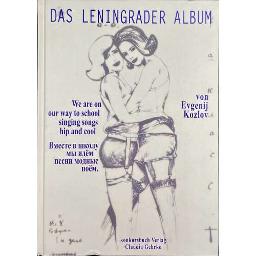 Hardcover volume, 24.5 x 17.5 cm, pictorial boards and endpapers, pp. [2] 3-167 [168]; 2 t.p., 129 pp. of plates, 33 pp. of text, 4 pp. of thumbnails, 1 colophon. Front cover (grey vignette, blue lettering): Das Leningrader Album | We are on | our way to school | singing songs | hip and cool | Вместе в школу | мы идём | песни модные | поём. | von | Evgenij | Kozlov | konkursbuch Verlag | Claudia Gehrke || ISBN: 3-88769-315-9. Evgenij Kozlov (Russian-German, b. 1955) – artist.
 -
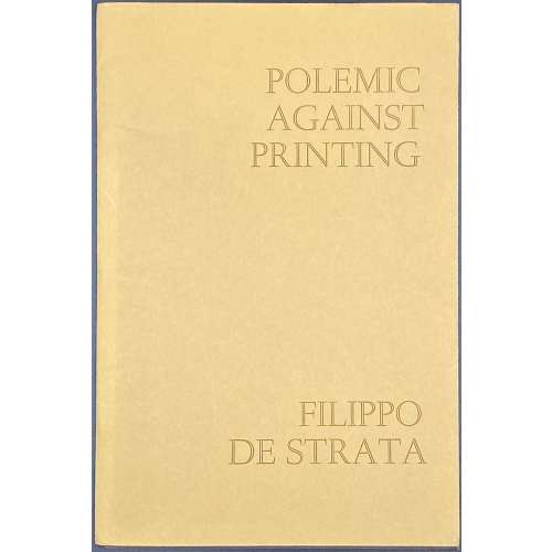 POLEMIC AGAINST PRINTING | by | FILIPPO DE STRATA | Translated by SHELAGH GRIER | Edited and | Introduced by MARTIN LOWRY | University of Warwick | The Hayloft Press | 1986 || Publisher’s mustard wrappers w/ lettering, 18.5 x 12.5 cm, 20 unnumbered pages of parallel Latin text and English translation with English introduction; limited edition of 350 copies, 100 for private circulation and 250 numbered copies for sale of which this is №3, with ink inscription to the last page: To Beryl | on her birthday, 1986 | with love from | David ||