

George Kearsley the elder (British, 1739 – 1790) (Kearsley, Catharine and George – publishers)
-
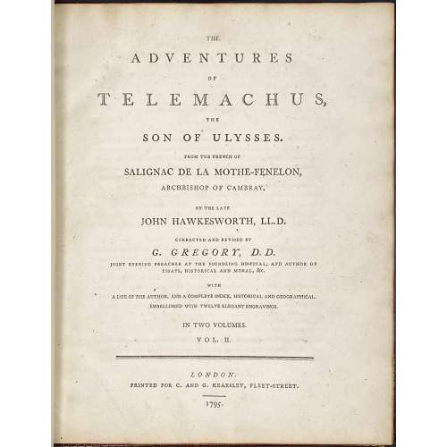 Title page: THE | ADVENTURES | OF | TELEMACHUS, | THE | SON OF ULYSSES. | FROM THE FRENCH OF | SALIGNAC DE LA MOTHE–FENELON, | ARCHBISHOP OF CAMBRAY. | BY THE LATE | JOHN HAWKESWORTH, LL. D. | CORRECTED AND REVISED BY | G. GREGORY, D. D. | JOINT EVENING PREACHER AT THE FOUNDLING HOSPITAL, AND AUTHOR OF | ESSAYS, HISTORICAL AND MORAL, &C. | WITH | A LIFE OF THE AUTHOR, AND A COMPLETE INDEX, HISTORICAL AND GEOGRAPHICAL. | EMBELLISHED WITH TWELVE ELEGANT ENGRAVINGS. | IN TWO VOLUMES. | VOL. I. [VOL. II] | — | LONDON: | PRINTED FOR C. AND G. KEARSLEY, FLEET-STREET. | 1795. || Vol. 1: collation: 2 blank leaves, π6, a-d4, B-Z4 Aa-Ff4, 2 blank leaves, 7 coloured engravings; pagination: [i-v] vi-xxxv [xxxvi], [1] 2-223 [224 blank]. Vol. 2: collation: 2 blank leaves, π4, Gg-Zz4, 3A-3K4 [a]4 b2, 2 blank leaves, 5 coloured engravings; pagination: [i-iii] iv-vii [viii], [225] 226-439, [440-452]. Exterior: 2-volume set, uniformly bound in full crimson linen morocco, key fret inside, gilt-ruled with a floral pattern between fillets to boards, flat spine decorated in gilt, with gilt lettering, marbled endpapers, AEG, 4to, 28 x 22.5 cm; printed on wove paper with watermark “WS”. Blind stamp to ffl by previous owner: "B. J. WIJNVELDT". Engravings: 12 tinted stipple engravings à la poupée: one by James Neagle (British, 1760? – 1822), four by William Bromley (British, 1769 – 1842), four by William Skelton (British, 1763 – 1848), one by John Ogborne (British, 1755 – 1837), and two by James Parker (1750 – 1805) after Thomas Stothard (British, 1755 – 1834). Ref.: Lewine (1898), p. 183: "The 1795 edition, 2 vols., 4to., with 12 engravings after Stothard, has a nominal value." Not in Cohen De Ricci, 1912. Original: François Fénelon. Les Aventures de Télémaque, fils d’Ulysse. See №№ LIB-2522-2020 and LIB-2683.2021 in this collection. John Hawkesworth (British, c. 1715 – 1773). George Gregory (British, 1754 – 1808).
 -
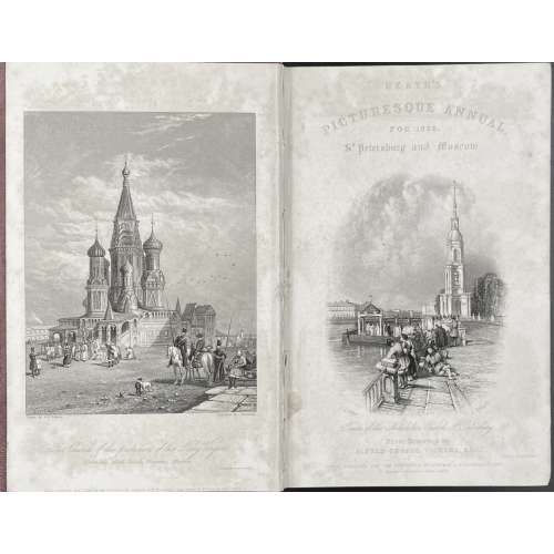 Engraved title: HEATH'S | PICTURESQUE ANNUAL, | FOR 1836. | St. Petersburg and Moscow. | {vignette Nikolskoi church signed: A.G. Vickers — E. Radclyffe} | Tower of the Nikolskoi church St. Petersburg | From Drawings by | ALFRED GEORGE VICKERS, ESQ. | Printed by Arnold & Fisher | LONDON, PUBLISHED FOR THE PROPRIETOR, BY LONGMAN & Co. PATERNOSTER ROW: | RITTNER & Co. PARIS: & ASHER, BERLIN. || Title page: A JOURNEY | TO ST. PETERSBURG AND MOSCOW | THROUGH COURLAND AND LIVONIA. | BY | LEITCH RITCHIE, Esq. | AUTHOR OF “TURNER’S ANNUAL TOUR”, “SCHINDERHANNES,” &c. | WITH TWENTY-FIVE SPLENDID ENGRAVINGS, | BY THE FIRST ARTISTS, AFTER DRAWINGS, | BY A.G. VICKERS, Esq. | LONDON: | LONGMAN, REES, BROWN, GREEN, AND LONGMAN. | PARIS: RITTNER AND GOUPILL. BERLIN: A. ASHER. | 1836. || Imprint: LONDON: | PRINTED BY J. HADDON AND CO., DOCTORS’ COMMONS. Pagination: [i-iii] iv [4] [1] 2-256, total 264 pages + 25 plates. Collation: 12mo; π4, B-Y6 Z2; total 132 leaves + frontispiece, engraved title and 23 leaves of steel-engraved plates w/tissue guards, extraneous to collation. Binding: full red morocco, blind-stamped boards, gilt-lettered spine, all edges gilt, 12mo, 20 x 13 cm. Note: Schinderhannes – real name Johannes Bückler (German, c.1778 – 1803): Leitch Ritchie. Schinderhannes: the Robber of the Rhine. (Library of Romance). — London: Smith, Elder, and Co., 1833. Contributors:
Author: Leitch Ritchie (British, 1800 – 1865).
Illustrator: Alfred Gomersal Vickers (British, 1810 – 1837).
Publisher: Longman, Rees, Orme, Brown, Green and Longman (London).
Engravers: Turnbull, Thomas (British, fl. 1830s); Radclyffe, Edward (British, 1810 – 1863); Jorden, Henry (British, fl. 1829 – 1838); Fisher, Samuel (British, 1806 – 1851); Willmore, James Tibbits (British, 1800 – 1863); Higham, Thomas (British, 1795 – 1844); Appleton, J. W. (British, fl. 1834 – 1843); Wallis, Robert William (British, 1794 – 1878); Chevalier, William (British, 1804 – 1866); Kernot, James Harfield (British, 1802 – 1858); Lewis, James (British, 1782 – 1858); Carter, James (British, 1798 – 1855). Printer: John Haddon & Co. (London). Reference: Metropolitan Museum (NY); Royal Collection Trust (London). -
 Title page: A DESCRIPTIVE CATALOGUE | OF THE | MILTON COLLECTION | IN THE ALEXANDER | TURNBULL LIBRARY, | WELLINGTON, | NEW ZEALAND |Describing works printed before 1801 | held in the Library at December 1975 | COMPILED BY | K. A. COLERIDGE | Published for the Alexander Turnbull Library, | National Library of New Zealand, | by OXFORD UNIVERSITY PRESS | 1980. Pagination: [i-v] vi-xxv [xxvi blank], [1] 2-536, plus 27 leaves with 60 plates. Printer: Printed in Great Britain at the Pitman Press, Bath. Size: 22.5 x 14.5 cm. Binding: Black cloth, gilt lettering to spine, lettered maroon dust-jacket, unclipped (£35.00 net in UK). Contributor: Kathleen A. Coleridge (New Zealand, b. 1944).
 -
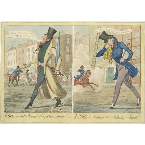 Description by British Museum (1865,1111.2128): "Two designs, side by side. [1] A dandy (probably a portrait), florid, whiskered, and bearded, steps jauntily from the pavement, hand extended, saying: Ah! my dear fellow — How are you? Devilish glad to see ye!— He holds a closed umbrella, ferrule erect, and wears a long tight-waisted coat to the heels, unbuttoned, tight pantaloons and spurred boots. In the middle distance, another dandy grasps the hand of a friend on horseback. Behind are houses with shop-fronts. A man raises his hat to a lady who curtseys. [2] The same dandy steps from the roadway onto the pavement, his handkerchief to his nose; he stoops, trying to conceal himself from a dandy cantering past in a cloud of dust, his eye-glass to his eye. He is without gloves, extraordinary for a dandy, and his trousers are strapped over pumps; he says: Con-found it! — Didn't expect to meet Him!! The street is otherwise empty; against the (large) houses are scaffolding and a tall ladder." Lettered with title, text within image including production details: 'Ego. delt / Etched by G. Ck / Pubd by J Fairburn Broadway Ludgate Hill August 18 1826'. Dimensions: Sheet: 25.5 x 36 cm, Image: 21.7 x 33.8 cm. Catalogue raisonné: A. M. Cohn (1924): № 1001, p. 262.: "A wretched plate. Difficult to believe G. C. had anything to do with it." — Bruton. Value.— £1.
 -
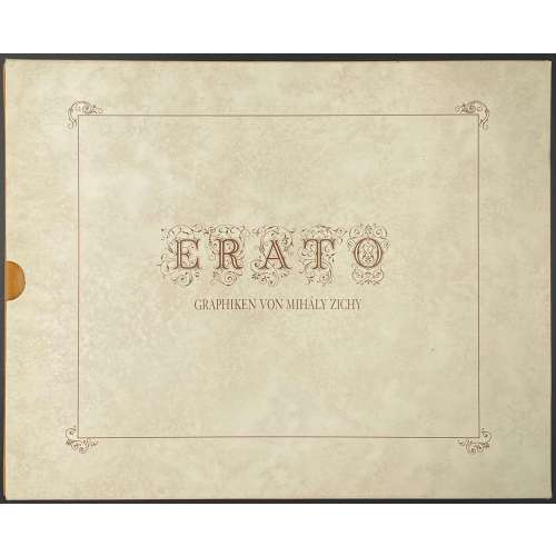 Description: Oblong volume, 19.3 x 24.2 cm, hardcover in velvet with pasted image, in a pictorial slipcase; printed on glossy paper, unpaginated. Title-page (in frame): ERATO | GRAPHIKEN VON MIHÁLY ZICHY || Collation: (2) h.t., t.p., (30) leaves of plates (4) text by Éva Bros, bibliography, colophon; total 36 leaves. The plates are photomechanical offset copies made from the photogravures of 1911 Leipzig private press edition [SVE-0501.2021], which photogravures made from the original watercolours and crayon drawings produced by Zichy in 1874-1879; the original album of 51 compositions was sold at Christie’s sale of Gérard Nordmann collection on December 14-15, 2006 in Paris. See a copy of the Leipzig album № 285 in this collection [SVE-0501.2021].
 -
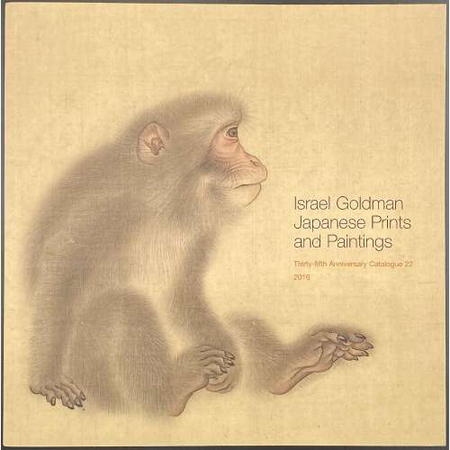 Softcover, pictorial wrappers, square 21 x 21 cm, 42 leaves, unpaginated, with illustrations in colour, 83 entries, with price list laid in; limited edition of 700 copies. Contributor: Israel Goldman In this collection:
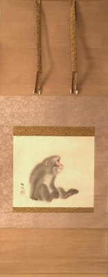
JPD-0010.2016: Mori Sosen. Ink and colour on silk.
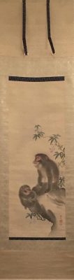
JPD-0009.2016: Mori Sosen. Ink and colour on silk.
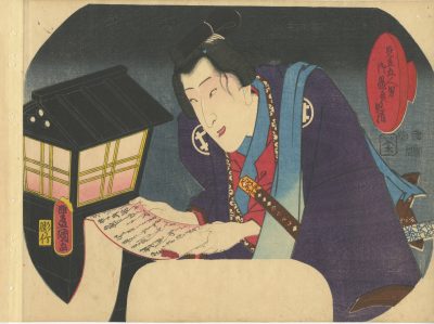
SVJP-0301.2019: Kunisada, 1852. Bando Shuka I as Shirai Gonpachi.
-
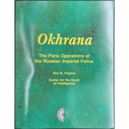 Paperback reprint on demand, 28 x 22 cm, in green malachite wrappers with yellow lettering to both covers; pp. [i-ii] iii-v[vi] 1-122 [4]. Title-page: Okhrana | The Paris Operations of | the Russian Imperial Police | Ben B. Fischer | History Staff | Center for the Study | of Intelligence | Central Intelligence Agency | 1997 || ISBN-10: 1907521992 Benjamin B. Fischer Contents. Foreword. Preface. Okhrana: The Paris Operations of the Russian Imperial Police. From Paris to Palo Alto. CIA Interest in the Okhrana Files. Origins of the Okhrana and Its Paris Office. Foreign Operations. Change and Continuity Dramatis Personae Conclusions Rita T. Kronenbitter Paris Okhrana 1885-1905. The Illustrious Career of Arkadiy Harting. The Sherlock Holmes of the Revolution. Okhrana Agent Dolin. The Okhrana's Female Agents: Part I: Russian Women. The Okhrana's Female Agents: Part II: Indigenous Recruits. Review of Edward Ellis Smith, The Young Stalin, by Harry Gelman. Commentary by Rita T. Kronenbitter.
 -
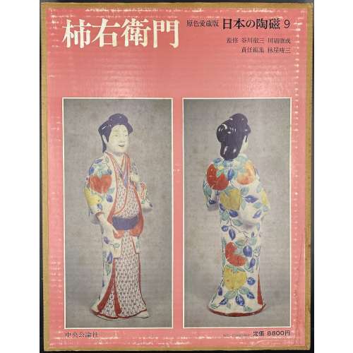 Hardcover volume, 35.2 x 27 cm, bound in grey cloth, blind stamped characters to front, brown characters to spine, in a glassine dust jacket, in a double slipcase, the outer case pictorial paper over cardboard, 36 x 28 cm, pp.: [4] [1] 2-104 (plates with photographs of 206 items), [2] 107-138 [4]. Kakiemon [柿右衛門] – book title. 日本の陶磁 – Japanese ceramics, series title. Contributors: Yasunari Kawabata [川端 康成] (Japanese, 1924 – 1972) – author. Tetsuzo Tanikawa [谷川 徹三] (Japanese, 1895 – 1989) – author. Seizo Hayashiya [林屋晴三] (Japanese, 1928 – 2017) – editor. Chūōkōron-sha [中央公論社] – publisher.
 -
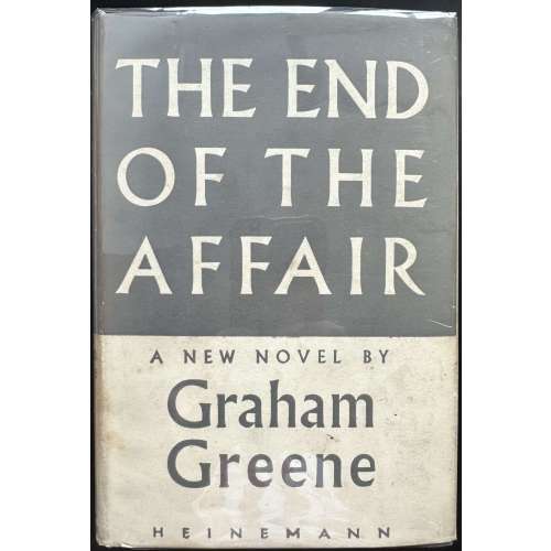 Hardcover volume, 19 x 13 cm, grey cloth with gilt lettering to spine, grey/cream dust jacket lettered throughout, price “10s 6d | NET” unclipped. Covers rubbed, dust jacket has a purple ink stain on the back bottom. Black ink inscription to recto ffl. Collation: a-o8 p10, total 122 leaves; pp.: [6] 1-237 [238]. 1st edition, 1st issue / Great Britain. Title-page: THE END OF THE | AFFAIR | by | GRAHAM GREENE | {publisher’s device} | — | WILLIAM HEINEMANN LTD | MELBOURNE :: LONDON :: TORONTO || Imprint: FIRST PUBLISHED 1951 | PRINTED IN GREAT BRITAIN | AT THE WINDMILL PRESS | KINGSWOOD, SURREY || Dedication: To C. (Catherine Walston, nee Crompton, American, 1925 – 1978) Contributors: Graham Greene (British, 1904 – 1991) William Henry Heinemann (Jewish-British, 1863 – 1920)
 -
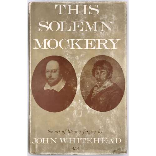 Title: This Solemn | Mockery | THE ART OF LITERARY FORGERY | John Whitehead, A.L.A. | Arlington Books {device} London Pagination: [2] – h.t. / blank, [2] – t.p. / imprint, [2] –contents / acknowledgement, 1-177 [178 blank]; 4 leaves of plates (total 96 leaves). Binding: 22.2 x 14.2 cm; hardcover, aubergine cloth, silver lettering to spine, pictorial dust jacket. ISBN-10: 0851402127
 -
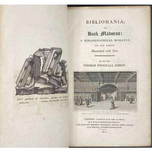 Title: BIBLIOMANIA; | OR | Book Madness: | A BIBLIOGRAPHICAL ROMANCE, | IN SIX PARTS. | Illustrated with Cuts. | BY THE REV. | THOMAS FROGNALL DIBDIN. | {vignette} | INTERIOR OF THE BODLEIAN LIBRARY | I pity all our great ones and rich men that know not this happiness. HEINSIUS. | LONDON: PRINTED FOR THE AUTHOR, | By J. McCreery, Blackhorse-court, Fleet-street; | AND SOLD BY MESSRS. LONGMAN, HURST, REES, ORME, | AND BROWN, PATERNOSTER-ROW. | 1811.|| Pagination: ffl, [i, ii] - ht, frontis., [iii, iv] - t.p., blank, [v]vi-ix - to the reader, [x] - blank, [2] - contents, [1, 2] - part 1 fl. t.p., blank, [3] - woodcut frame and capital I, 4-782 (imprint to p. 782) [2] - errata, blank, bfl; 1 plate op. p. 158. Collation: [A]6 B-Z8 2A-2Z8, 3A-3B8, 3C-3F4. Binding: 8vo, 23 x 14 cm, modern full dark brown calf by Period Binders (Bath, England), gilt fillet border to boards, raised bands with gilt ornaments and lettering to spine, pp. 685-688 an open tear in upper 1/8 of lateral margin, all margins marbled. Substantially revised 1st edition ("so much altered and enlarged, as to assume the character of a new work"). Author: Thomas Frognall Dibdin (British, 1776 – 1847).
 -
 Title: MEMOIRS OF M. THIERS | 1870—1873 | Translated by | F. M. ATKINSON | {publisher’s device} | LONDON: GEORGE ALLEN & UNWIN LTD. | RUSKIN HOUSE 40 MUSEUM STREET, W.C. Pagination: [6] 7-384. Collation: 8vo; [1]-248. Size: 23 x 15 cm Binding: Blue cloth, top and bottom ruled in blind, gilt lettering to front cover and spine. Original: Adolphe Thiers. Notes et souvenirs de M. Thiers, 1870-1873: voyage diplomatique, proposition d'un armistice, préliminaires de la paix, présidence de la République. — Paris : [s.n.], 1901. — 465 p. The preface and editing signed "F. D." [Félicie Dosne]. Félicie Dosne (French, 1823 – 1906) was Thiers's sister-in-law.
 -
 Dust jacket (black lettering, sanguine vignettes over light blue) : {vignette} | P. M. HANDOVER | PRINTING | IN LONDON | from Caxton to | Modern Times | {vignette} || Title page: PRINTING IN LONDON | FROM 1476 TO MODERN TIMES | COMPETITIVE PRACTICE AND | TECHNICAL INVENTION | IN THE TRADE OF | BOOK AND BIBLE PRINTING | PERIODICAL PRODUCTION | JOBBING &C |—| P. M. HANDOVER | M.A. F.R.HIST.S. | HARVARD UNIVERSITY PRESS | CAMBRIDGE, MASSACHUSETTS | 1960 || Pagination: [1, 2] – h.t. / blank ; frontispiece; [3, 4] – t.p. / imprint; [5, 6] – dedication / blank; [7] 8-224, inset: 7 sheets of plates between pp. 112-113 extraneous to collation, other illustrations in text; insert: invitation card "Publication date JUL 11 1960 Handover". Collation: 8vo; [A]8 B-O8. Binding: publisher’s blue cloth, red label to spine, silver lettering, DJ.
 -
 Title page: THE THIRD MAN | and | THE FALLEN IDOL | by | GRAHAM GREENE | {publisher’s device with lettering} |WILLIAM HEINEMANN LTD | MELBOURNE : : LONDON : : TORONTO || Title verso: FIRST PUBLISHED 1950 | PRINTED IN GREAT BRITAIN | AT THE WINDMILL PRESS | KINGSWOOD, SURREY || Pagination:[6] [1, 2] 3-188 [2] blank. Binding: publisher’s black cloth, silver lettering to spine, blind-stamped publisher’s device to back cover in the lower-right corner without lettering; publisher's pictorial dust jacket with lettering (white and read on b/w photo): The | THIRD | MAN | and | THE FALLEN IDOL | The entertainments by | GRAHAM | GREENE | With forewords by the author ||, price clipped. Size: 19 x 13 cm. Edition: 1st edition, 1st printing. Contributors: Graham Greene (British, 1904 – 1991) – author. William Henry Heinemann (British-Jewish, 1863 – 1920); William Heinemann Limited – publisher. The Windmill Press (Kingswood, Surrey) – printer.
 -
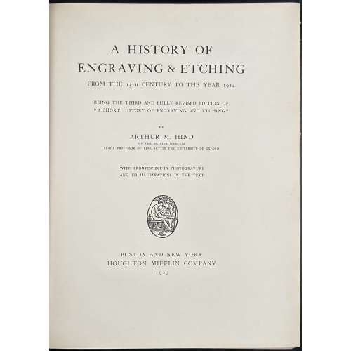 Title: A HISTORY OF | ENGRAVING & ETCHING | FROM THE 15TH CENTURY TO THE YEAR 1914 | BEING THE THIRD AND FULLY REVISED EDITION OF | “A SHORT HISTORY OF ENGRAVING AND ETCHING” | BY | ARTHUR M. HIND | OF THE BRITISH MUSEUM | SLADE PROFESSOR OF FINE ART IN THE UNIVERSITY OF OXFORD | WITH FRONTISPIECE IN PHOTOGRAVURE | AND 110 ILLUSTRATIONS IN THE TEXT | {publisher’s device} | BOSTON AND NEW YORK | HOUGHTON MIFFLIN COMPANY | 1923 || Pagination: [i-iv] v-xiii. [2] – blank / abbrev., [2] 3-487 [488], frontis. w/tissue guard, ills.; Appendices: I. Classified list of engravers (p. 343-392); II. General bibliography (p. 393-419); III. Index of engravers and individual bibliography (p. 420-487). Collation: π10 B-2H8 2I4, frontispiece (extr.), 110 in-text illustrations. Binding: 25.8 x 20 cm, crimson cloth, blind triple-fillet to top and bottom of the front board, same in gilt to spine, gilt lettering to spine, top edge gilt, fore-edge untrimmed. Contributors: Arthur Mayger Hind (British, 1880 – 1957) – author. Houghton Mifflin Company (Boston, 1864) – publisher. R & R. Clark, Ltd. (Edinburgh, 1846) – printer. Note: It is marked as the 3rd edition of A short history of engraving and etching. Indeed, A short history of engraving & etching for the use of collectors and students with full bibliography, classified list and index of engravers was published by Constable in London and Houghton Mifflin Co. in Boston, in 1908 and then in 1911. However, it is hard to consider an almost completely new book "a 3rd edition".
 -
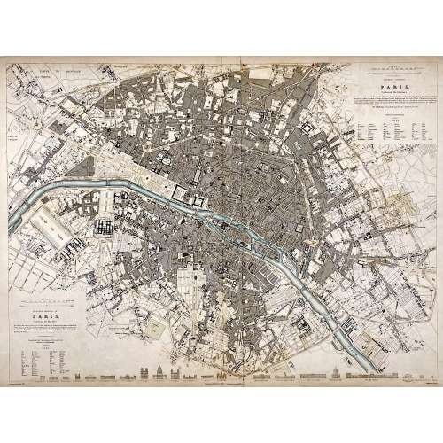 Top right: EASTERN DIVISION OF | PARIS. | Containing the Quartiers | {5 lines in italic} | Published under the Superintendence of the Society for the | Diffusion of Useful Knowledge || Bottom left: WESTERN DIVISION OF | PARIS. | Containing the Quartiers | {4 lines in italic} | Published under the Superintendence of the Society for the | Diffusion of Useful Knowledge || Under the frame: Drawn by W. B. Clarke, Archt. […] Published by Baldwin & Cradock, 47 Paternoster Row, A April 1st, 1834. [...] Engraved by J. Shury || Dimensions: Sheet: 40.8 x 57 cm; Image: 38.7 x 52.5 cm. Contributors: William Barnard Clarke (British, 1806 – 1865) – artist. John Shury (fl. c. 1814-1844) – engraver. Baldwin & Cradock (London) – publisher. Society for the Diffusion of Useful Knowledge (SDUK) (British firm, 1826 – 1846).
 -
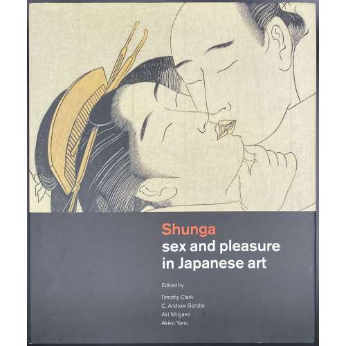 Hardcover volume, 29.6 x 25 x 4 cm, in red cloth with black lettering to spine, in pictorial dust jacket, profusely illustrated in colour; pp.: [1-6] 7-536, total 268 leaves and 2 folding plates extraneous to collation. Title-page: {Hotei's device} Hotei Publishing | Shunga | sex and pleasure in Japanese art | Edited by | Timothy Clark | C. Andrew Gerstle | Aki Ishigami | Akiki Yano || Contents: The Cultural Historical Significance and Importance of Japanese Shunga / Kobayashi Tadashi. Introduction: What Was Shunga? / C. Andrew Gerstle; Who Were the Audiences for Shunga? / Hayakawa Monta. (1) Early Shunga before 1765: Shunga Paintings before the `Floating World' / Akiko Yano; Chinese Chunhua and Japanese Shunga / Ishigami Aki; Shunga and the Rise of Print Culture / Asano Shugo. (2) Masterpieces of Shunga 1765-1850: The Essence of Ukiyo-e Shunga / Kobayashi Tadashi; Erotic Books as Luxury Goods / Ellis Tinios; Listening to the Voices in Shunga / Hayakawa Monta; The Tale of Genji in Shunga / Sato Satoru. (3) Censorship: Timeline of Censorship; Shunga and Censorship in the Edo Period (1600-1868) / Jennifer Preston; Graph of approximate output of shunga print series and books; The Censorship of Shunga in the Modern Era / Ishigami Aki; Shunga Studies in the Showa Era (1926-89) / Shirakura Yoshihiko. (4) Contexts for Shunga: Traditional Uses of Shunga / Yamamoto Yukari; The Distribution and Circulation of Erotic Prints and Books in the Edo Period Laura Moretti; Shunga and Parody / C. Andrew Gerstle; Popular Cults of Sex Organs in Japan / Suzuki Kenko; Grotesque Shunga / Ishigami Aki; Violence in Shunga / Higuchi Kazutaka; Foreign Connections in Shunga / Timon Screech; Children in Shunga / Akiko Yano; Shunga and the Floating World / Matsuba Ryoko. (5) Shunga in the Meiji Era: Erotic Art of the Meiji Era (1868-1912) / Rosina Buckland; The Modern West's Discovery of Shunga / Ricard Bru. Published to accompany the exhibition Shunga: sex and pleasure in Japanese art at the British Museum from 3 October 2013 to 5 January 2014. Abstract: This catalogue aims to answer some key questions about what is shunga and why it was produced. In particular, the social and cultural contexts for sex art in Japan are explored. Erotic Japanese art was heavily suppressed in Japan from the 1870s onwards as part of a process of cultural 'modernisation' that imported many contemporary western moral values. Only in the last twenty years or so has it been possible to publish unexpurgated examples in Japan and this landmark book places erotic Japanese art in its historical and cultural context for the first time. This book looks at painted and printed erotic images produced in Japan during the Edo period (1600-1868) and early Meiji era (1868-1912). These are related to the wider contexts of literature, theatre, the culture of the pleasure quarters, and urban consumerism; and interpreted in terms of their sensuality, reverence, humour and parody. Contributors: Timothy Clark (British, b. 1959) Timothy Clark (British, b. 1959) C. Andrew Gerstle (American, 1951) Aki Ishigami [石上阿希] (Japanese) Akiki Yano
 -
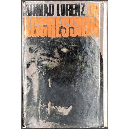 Description: One volume, 8vo, 22 x 14.5 cm, in brown paper boards with orange and black lettering to spine, pictorial dust jacket, unclipped “PRICE | 30s net | IN U.K. ONLY”, collated [A]-S8, pp.: [i-vi] vii-xiii [xiv blank], 1-273 [274 blank], 144 leaves total. Edition: 1st English edition. Original title: Das Sogenannte Böse: zur Naturgeschichte der Aggression. — Wien : Dr. G. Borotha-Schoeler, 1963. Contributors: Konrad Zacharias Lorenz (Austrian, 1903 – 1989) – author. Sir Julian Sorell Huxley (British, 1887 – 1975) – author of the foreword. Marjorie Latzke [Kerr Wilson] (American, 20th century) – translator from German. Methuen & Co Ltd. (London) – publisher. Cox & Wyman Ltd. (Fakenham, Norfolk) – printer.
