

Size: Height:20cm; Width: 21cm; Depth: 20cm.
Probably Taishō period (1912-1926), or later. Certain information is provided at http://www.sengokudaimyo.com/garb/garb.html In a wooden box without inscriptions.-
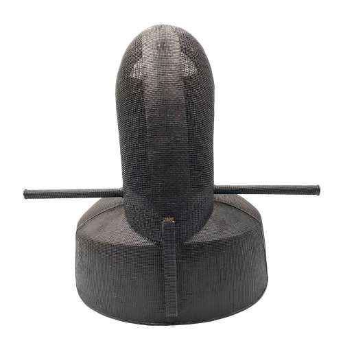 Kanmuri - a classic court cap, made of lacquered wood and paper. It is traditionally made by creating a skeleton, or harinuki, of paper on a wooden form. The outside of the hari-nuki is lacquered so as to keep its shape, and then the body of ra silk is layed on top. The entire thing is lacquered stiff.
 -
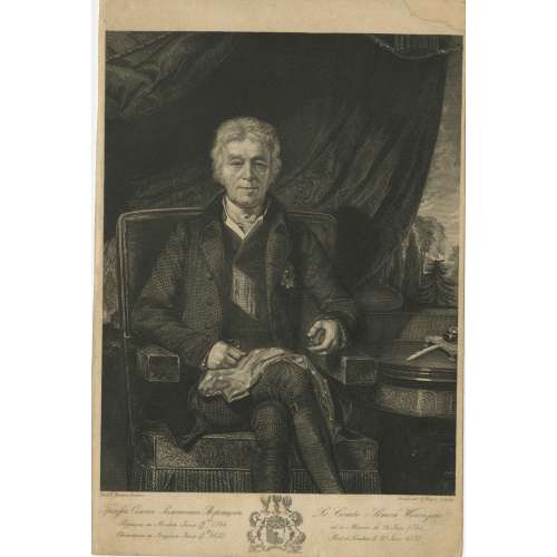
Seated portrait of Russian diplomat Count Semyon Romanovich Vorontsov (Семён Романович Воронцо́в; 26 June 1744 – 9 July 1832). Engraved by August Weger (Born: 1823 in Nürnberg; died: 1892 in Leipzig) from the portrait painted by Richard Evans (1784–1871). Circa 1825-50. Semyon Romanovich Vorontsov, the son of Count Roman Illarionovich and Marfa Ivanovna Surmina, was born on June 15, 1744; Active Privy Councillor; Ambassador to Venice and London from 1784, for over 20 years. Died in London on June 26, 1832.
Inscription: Графъ Семенъ Романовичь Воронцовъ. Родился въ Москвѣ Iюня 15-го/26 1744, Скончался въ Лондонѣ Iюня 9-го/21 1822. | Le Comte Simon Woronzow. né à Moscou le 26 Juin 1744, Mort à Londres le 21 Juin 1832. | Richd. Evans, Peintre. - Gravé par A. Weger, Leipzig. Vorontsov family coat of arms in the middle.
Dimensions: 23 x 15 cm. Ref.: Подробный словарь русских гравированных портретов Д. А. Ровинского, том. 1, 534-540. -
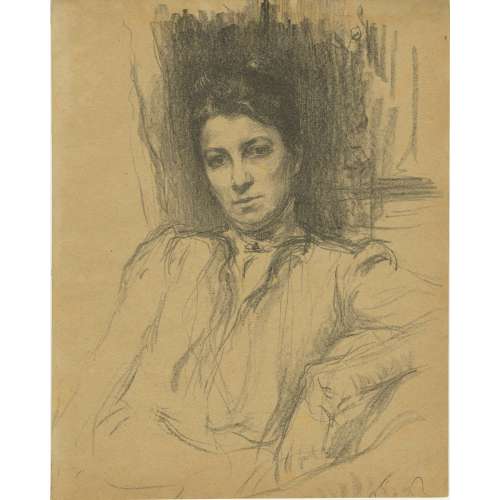
Portrait of Russian actress Maria Gavrilovna Savina, a lithograph on tan paper, by artist Osip Braz, 1900.
Maria Gavrilovna Savina (Мария Гавриловна Савина), a renowned Russian stage actress, born as Maria Podramentsova (Подраменцова) on April 11, 1854 in Kamianets-Podilskyi (Ukraine, Russian Empire) and died on September 21, 1915, in Saint Petersburg. Osip Emmanuilovich Braz (Осип Эммануилович Браз; 16 January 1873 in Odessa - 6 November 1936 near Paris) was a Russian painter of Jewish descent. Imprisoned by the Soviets in 1924 (the Solovki special prison-camp), released in 1926 and emigrated to Germany in 1928. Married to Lola Landshoff. http://russia-ic.com/people/culture_art/b/805/ "All his family members suffered from severe tuberculosis. After losing his wife Lola Lantsgof and both sons, he spent the last year of his life alone. Osip Braz passed away on November 6, 1936, and was laid down to rest at the Bagneux Cemetery in Paris." Buried at Bagneux, Hauts-de-Seine, Île-de-France, France. -
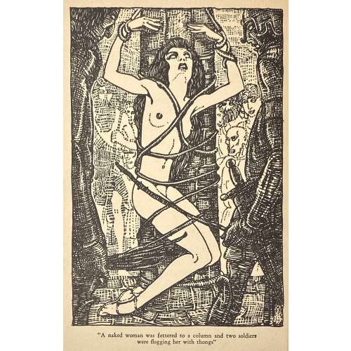
Album of 20 hand-coloured lithographs with a title page and a 'justification du tirage' page in an original snakeskin-clothed cardboard binder. Drawn on stone by Anonymous, attributed to Santippa. The theme of these pictures can be described as erotic humour.
Edition: 200 copies printed in Bruxelles, c. 1938; this copy without a number.
Watermarked wove paper: Word "Marais" and a flower.
Dimensions: 24.3 x 29.3 cm According to J.-P. Dutel, the author of these images is Georges Hoffmann under the pseudonym Santippa. Honesterotica provides a different name: Gaston Hoffmann [Santippa] (French, 1883 – 1977), which seems adequate. Catalogue raisonné: Dutel (1920-70): 2496. -
The edition consists of two albums:
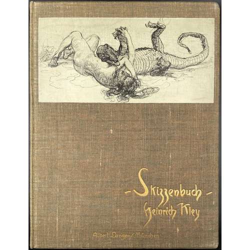
1) Skizzenbuch: Hundert Federzeichnungen von Heinrich Kley. — München: Albert Langen, [1909]. — pp.: [1-4] 5-63 [64], illustr. Printed by Hesse & Becker in Leipzig. Bound in the original brown moire covered boards, with a paste-down drawing on the front, gilt cover titles, original patterned endpapers.
2) Skizzenbuch II. Hundert Federzeichnungen von Heinrich Kley. — München: Albert Langen, [1910]. — pp.: [1-4] 5-64, illustr. Printed by Hesse & Becker in Leipzig; paper by Bohnenberger & Cie.; binding by E. A. Enders, Leipzig. Bound in the original bluish-gray moire covered boards, with a paste-down drawing on the front, gilt cover titles, original patterned endpapers.
The number of printed copies unknown. Reproduction of ink drawings by Heinrich Kley, 1st edition.
Dimensions of each album: 32 x 24.5 cm; Quarto. Heinrich Kley (April 15, 1863 in Karlsruhe – 1945? in Munich) was a German illustrator, editorial illustrator and painter. -
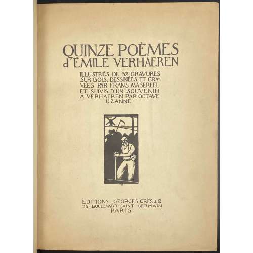 Quinze poèmes d'Emile Verhaeren. Illustrés de 57 gravures sur bois dessinées et gravées par Frans Masereel et suivis d'un 'Souvenir à Verhaeren' par Octave Uzanne. — Paris: Éditions Georges Crès, 1917. Authors: Emile Verhaeren (text), Frans Masereel (illustrations), Octave Uzanne (text). Publisher: Éditions Georges Crès. [Georges-Célestin Crès (1875 - 1935) was a French publisher and bookseller. Address: 116 boulevard Saint-Germain, Paris]. Printer: Sonor S.A. - Geneve, under the direction of Auguste Jordanis. The number of copies printed: 1555 of which 15 (1-15) on Japan paper, 190 (16-205) on Fabriano paper, and 1350 (206-1555) on English paper (1506-1555 not for trade). This copy № 1312. Pagination: [i] - front cover, [ii] - half-title, [iii] - title, [iv] - printrun justification, [v] - table of contents, [vi] - blank, [i-vii] viii-ciii, [civ] - printer statement, [cv] - back cover; one-side (recto) printing and pagination. Owner's contemporary red half-Morocco with marbled boards; spine with four raised bands, gilt lettering and design elements. Original printed paper wrappers preserved. Marbled endpapers. Trimmed unevenly.
 -
 A two-volume set: (1) Thomas Hugo. The Bewick Collector. A Descriptive Catalogue of the Works of Thomas and John Bewick; Including cuts, in various states, for Books and Pamphlets, Private Gentlemen, Public Companies, Exhibitions, Races, Newspapers, Shop Cards, Invoice Heads, Bar Bills, Coal Certificates, Broadsides, and other miscellaneous purposes, and Wood Blocks. With an Appendix of Portraits, Autographs, Works of Pupils, etc., etc. The whole described from the Originals contained in the largest and most perfect collection ever formed, and illustrated with a hundred and twelve cuts. — London: Lovell Reeve and Co., MDCCCLXVI [1866]. — [Printed by] J. E. Taylor and Co., printers. — pp.: [i-v] vi-xxiii [xxiv], [1] 2-562. (2) Thomas Hugo. The Bewick Collector. A Supplement to a Descriptive Catalogue of the Works of Thomas and John Bewick; Consisting of additions to the various divisions of cuts, wood blocks. etc., enumerated in that work. The whole described from the Originals contained in the largest and most perfect collection ever formed, and illustrated with a hundred and eighty cuts. — London: L. Reeve and Co, MDCCCLXVIII [1868]. — [Printed by] J. E. Taylor and Co., printers. — pp.: [i-vii] viii-xxxii, [1] 2-353. Both volumes in 8vo, 22.5 x 14.5 cm, hardcover. Contemporary dark brown half morocco, gilt-ruled, with 5 raised bands, gilt titles and decoration to spine, and marbled paper over boards. Top edge gilt; marbled endpapers. Binding splitting at pp.80/81 of the 1st volume. Armorial bookplate of Ralph Hart Tweddle to front pastedown. Ralph Hart Tweddle (1843 – 1895) was a British mechanical engineer, known particularly for inventing the portable hydraulic riveter, which greatly facilitated the construction of boilers, bridges and ships.
 -
 Title (in a frame): THE TEMPTATION | OF ST. ANTHONY | BY | GUSTAVE FLAUBERT | TRANSLATED BY | LAFCADIO HEARN | ILLUSTRATED BY | MAHLON BLAINE | {vignette} | NEW YORK | WILLIAMS, BELASCO | AND MEYERS || Pagination: ffl, [1, 2 - ht, blank] [2 - blank, frontis.] [3, 4 - t.p., colophon] [5, 6 - plate, blank] [7, 8 - list of ill., blank] [9 'argument'] 10-189 [190] bfl; frontispiece and 4 plates reproduced from Blaine's pen drawings in "woodcut" manner. Binding:25.5 x 17 cm., original black cloth, front cover and spine stamped in gilt; printed on thick paper, margins trimmed unevenly; pink pictorial DJ. Contributors: Gustave Flaubert (French, 1821 – 1880) – author. Mahlon Blaine (American, 1894 – 1969) – artist. Patrick Lafcadio Hearn [Koizumi Yakumo; 小泉 八雲] ( Greek-Irish, 1850 – 1904) – translator. Williams, Belasco and Meyers – publisher. J. J. Little & Ives, Co., NY – printer.
 -
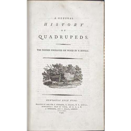 Title: A GENERAL | HISTORY | OF | QUADRUPEDS. | – | THE FIGURES ENGRAVED ON WOOD BY THOMAS BEWICK. | {vignette} | — | NEWCASTLE UPON TYNE : | PRINTED BY AND FOR S. HODGSON, R. BEILBY, & T. BEWICK, | NEWCASTLE: SOLD BY THEM, BY G. G. J. & | J. ROBINSON, AND C. DILLY, LONDON. | 1790. Pagination: [4 blanks], [i, ii] – t.p. / blank, [iii, iv] – advertisement / index, v-viii – index, [1] 2-456 [4 blanks]. Collation: demi 8vo; a⁴ A-Ee⁸ Ff⁴. A3 unsigned, catchword at p.375 THE instead of WE. Variant A (with a fly facing upward). Size: 21.8 x 14 cm; page 21.2 x 13 cm. Woodcuts: 260 descriptions of quadrupeds; 200 figures of quadrupeds, 104 vignettes, tailpieces, etc. Binding: Full marbled calf, gilt double border, black label with gilt lettering to flat spine. There were 1,500 copies Demy copies printed. Catalogue raisonné: S. Roscoe (1953): pp. 5-11; Hugo (1866): pp. 22-23.
 -
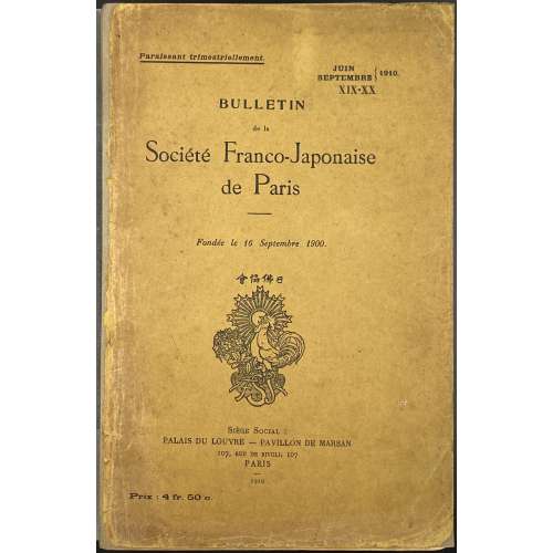 Comte de Tressan. L'évolution de la garde de sabre japonaise de la fin du XVe siècle au commencement du XVIIe (suite), 34 illustr. – pp. 7-35. // Bulletin de la Société Franco-Japonaise de Paris; №№ 19-20, Juin–Septembre 1910, 216 p. — Paris: Société Franco-Japonaise de Paris, Siège Social, 1910. Publisher's original green wrappers with black lettering: On top: Paraissant trimestriellement. | JUIN | SEPTEMBRE | } 1920 | XIX-XX | In the middle: BULLETIN | de la | Société Franco-Japonaise | de Paris | [—] Fondée le 16 Septembre 1900 | [device] | Bottom: Siège Social : | PALAIS DU LOUVRE — PAVILLON DE MARSAN | 107, RUE DE RIVOLI, 107 | Paris | 1910 | Prix : 4 fr 50 c || — Pp.: [4] [1-5] 6-216 [2 - errata / blank] [2 - imprim./ blank] [6]. Size: 27 x 17.5 cm.
 -
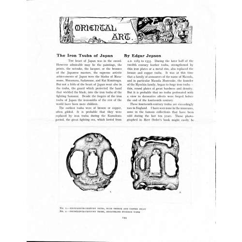 Magazine article by Edgar Jepson: The Iron Tsuba of Japan (Section: Oriental Art), published in volume Vol. 70 (September–December) of The Connoisseur: An Illustrated Magazine for Collectors, Vol. 70 (September–December); pp. 143-152 / C. Reginald Grundy [ed.] — London: Published by the Proprietor, W. CLAUSE JOHNSON, at the Editorial and Advertisement Offices of The Connoisseur, 1924. Owner's half black morocco, gilt lettering to spine, blue cloth boards. Two volumes bound together without original covers. Size 28.5 x 22 cm. Vol. 1: The Connoisseur | An Illustrated Magazine | For Collectors | Edited by C. Reginald Grundy | Vol. LXIX. | (MAY—AUGUST, 1924) | LONDON | Published by the Proprietor, W. CLAUSE JOHNSON, at the | Editorial and Advertisement Offices of The Connoisseur, | at 1, Duke Street, St. James's, S.W. 1 | 1924 || Pp.: [i-ii] iii-xviii [xix] [1, 2 - plate] 3-249 [250]. Vol. 2: The Connoisseur | An Illustrated Magazine | For Collectors | Edited by C. Reginald Grundy | Vol. LXX. | (SEPTEMBER—DECEMBER, 1924) | LONDON | Published by the Proprietor, W. CLAUSE JOHNSON, at the | Editorial and Advertisement Offices of The Connoisseur, | at 1, Duke Street, St. James's, S.W. 1 | 1924 || Pp.: [i-ii] iii-xxii [2 blanks] [1, 2 - plate] 3-261 [262]. The Iron Tsuba of Japan by Edgar Jepson The heart of Japan was in the sword. However admirable may be the paintings, the prints, the netsuke, the lacquer, or the bronzes of the Japanese masters, the supreme artistic achievements of Japan were the blades of Masamune, Muramasa, Sadamune, and Rai Kunitsugu. But not a little of the heart of Japan went also in the tsuba, the guard which protected the hand that wielded the blade, into the iron tsuba of the fighting Samurai. Beside the forgers of the iron tsuba of Japan the ironsmiths of the rest of the world have been mere children. The earliest tsuba were of bronze or copper, often gilded. It is probable that they were replaced by iron tsuba during the Kamakura period, the great fighting era, which lasted from A.D. 1185 to 1333. During the later half of the twelfth century leather tsuba, strengthened by thin iron plates or a metal rim, also replaced the bronze and copper tsuba. It was at this time that a family of armourers of the name of Masuda, and in particular Masuda Munesuke, the founder of the Myochin family, began to forge iron tsuba — thin, round plates of great hardness and density. But it is probable that no tsuba perforated with a view to decorative effects were forged before the end of the fourteenth century. These fourteenth-century tsuba are exceedingly rare in England. I have seen none in the museums, none in the famous collections that have been sold during the last ten years. Those photographed in Herr Oeder's book might easily be the fifteenth century. No. 1 is a curious cup-shape tsuba decorated with a bronze and copper inlay. No. 2, with its edges curiously twisted in the forging, looks like Myochin work. But it is not of the Myochin iron. The Myochin family produced some of the greatest ironsmiths of Japan. Armourers first of all, tsubasmiths, forgers of sake-kettles, articulated reptiles, crustacea, and insects — everything that can be done with iron they did; they pushed their medium to its limit. They were forging iron tsuba in 1160, and they were still forging them in 1860. And it was their own iron, or rather their own steel. They discovered the secret of it early, and they kept that secret in the family for all those hundreds of years. There is no mistaking a Myochin tsuba: balance it on your finger and tap it with a piece of metal, always it gives forth a clear bell-like ring that you get from the work of no other ironsmith, Japanese or European. Always the Myochin tsuba is before everything a protection to the hand of the swordsman; to that everything is, as it should be, subordinated. No. 3 is a Myochin tsuba of the fifteenth century, and probably of the early fifteenth century. No. 4, by Myochin Munetaka, perforated with a grotesque figure, is an example of that twisting and twisting of the iron in the forging till it forms a pattern like the grain of wood. The Myochin smiths invented these wood-grain tsuba, and no other smiths equalled them in their forging. In the sixteenth century, the fighting tsuba was probably at its best. It was a century of great tsubasmiths. Then the first Nobuiye, whose tsuba fetched £100 apiece, circa 1800, in Japan, and the first Kaneiye flourished. No. 5 is a tsuba forged by a great smith, Iyesada of Sotome, in the manner of Nobuiye I, decorated with the karakusa tendrils that Nobuiye delighted in, with lightning and clouds. No. 6 is a guard of Sanada Tembo, the chief smith of the Tembo family, stamped, punning fashion, with the character Tembo. Akin to the Tembo tsuba were those of the Kiami and Hoan smiths. Then also the Heianjo smiths and the Owari smiths, especially those of Nagoya and the Yamakichi family, forged their strongest tsuba. Those of the Yamakichi were tested after the forging by being pounded in iron mortars — at least, so the legend runs. But they were a sternly utilitarian family, and I have never seen a Yamakichi tsuba of any beauty. In the later half of the fifteenth century arose the fashion of decorating tsuba with an inlay, zogan, of bronze. The Heianjo tsuba, forged at Kyoto in the latter half of the fifteenth and the beginning of the sixteenth century, were often thus inlaid. The earliest of them were called "Onin", of which No. 7 is an example. In addition to the bronze inlay around the edge, it is inlaid with a representation, some say, of snow; others say, of the duckweed on a pond. No. 8 is probably a Heianjo tsuba, but I am not quite sure about it. The inlaid acacia branches might be very early Shoami work. But to judge by the iron, it is a fifteenth-century tsuba; and the authorities place the beginning of the Shoami school not later than early in the sixteenth century. No. 10 is an example of the Fushimi-zogan, a flat inlay of a light-coloured bronze. These tsuba took their name from the fact that they were first forged at Fushimi, in Yamashiro, in the sixteenth century. It is of the type known as Mon-zukashi, perforated with crests (mon) à jour. The Yoshiro-zogan tsuba were also first forged at Fushimi by Yoshiro Naomasa. They were distinguished from the Fushimi-zogan by the fact that their inlay was generally a little raised-not always-for the inlay of No. 9, a tsuba forged by a later nineteenth-century Yoshiro, is quite flat. It is an interesting tsuba, for, with its decoration grown florid and excessive, it marks the intermediate stage between the simple and delightful designs of the genuine fighting tsuba and the elaborate pictures in gold and silver on the tsuba of the eighteenth-century smiths of Awa and Kyoto, which have become mere ornaments of the goldsmith. The Gomoku-zogan (No. 11) tsuba were probably first forged earlier than the Fushimi and Yoshiro-zogan tsuba. This inlay, in slight relief, is a representation in a light-coloured bronze and copper of twigs caught in the eddies of streams. The seventeenth century and early eighteenth century were the great periods of perforated tsuba. The designs, and they are often admirable, are for the most part in plain fretwork; but they are also chased. No. 12, a crane under an acacia, is a tsuba of a Higo smith, great forgers of fighting tsuba during this period. These smiths also excelled in nunome zogan, a very thin gold and silver inlay, with which they further decorated their perforated guards. The smiths of the Umetada and Shoami families also forged iron tsuba during this period; but their designs, though sometimes pleasing enough, are rarely fine. The best work of Myoju Umetada is in sentoku, not iron. The Choshu smiths, coming later, surpass the perforated guards of both the Umetada and Shoami smiths in beauty of design. No. 13, a lotus in the round, not only fretwork, but also engraved, is a good example of the admirable balance they so often attained in their designs. It is a sufficiently realistic lotus, but yet of a delightful simplicity. In considerable contrast is No. 14, the dragon by Soheishi Soten — one of the only two authentic tsuba of his forging known — the first forger of hikone-bori tsuba, which were in extraordinary favour in Japan during the eighteenth century, and illustrated every important event in Japanese history. It is on the elaborate side, but fine, strong work, and an excellent guard to the hand, for the lighter and more open part, which gives the design its admirable balance, is on the inside, and not exposed to the full swing of an opponent's blade. A few years ago there was a tendency to decry the Namban tsuba as having sprung too directly from foreign sources. But though the original suggestion may have been Chinese, or, as some say, Portuguese, the Japanese made it entirely their own, as characteristically Japanese as anything can well be, but, it must be admitted, of a decadent period. The school took its rise at the beginning of the seventeenth century, and the early tsuba were forged of a specially hard iron, the Wootz, imported from Southern India. No. 15, the signs of the Zodiac, is an excellent tsuba from the fighting point of view. Both it and No. 16 are of quite charming, if elaborate, design, and both of them, with their delicate scroll-work, so astonishingly undercut, are the very last word in the work of the ironsmith-veritable iron lace. To return to the simpler perforated tsuba, the smiths of Akasaka, a suburb of Tokyo, produced probably the most charming designs. Their style derives considerably from the Higo smiths, and their earlier fighting tsuba are very like the Higo tsuba. But always their work was just a little lighter than that of the Higo smiths, and in the end they moved right away from them and became the forgers of very light guards indeed. No. 17, is a representation of the Hiyokudori, the fabulous double bird, in which were reincarnated the souls of the two lovers, Gompachi and Komurasaki; and No. 18, “the tsuba of a hundred ducks "— there are about forty — are characteristic designs of the school. In the work of the Akasaka smiths the balance, which makes the design of a good tsuba so admirable and delightful, attains its height. This admirable balance seems often to be obtained by a deliberate sacrifice of symmetry. About nine hundred and ninety-nine European ironsmiths out of a thousand would have made the right and left sides of the Hiyoku-dori line by line, and perforation by perforation, exactly alike; he would have cut out exactly as many ducks on the one side of “the tsuba of a hundred ducks” as on the other, and made each duck on the right side correspond exactly in position and attitude with a duck on the left side. By variations the tsubasmith attained a finer balance, almost a higher symmetry. No. 19, often called by collectors the "rose-window" tsuba, but really a stylised chrysanthemum, is a favourite design of the Akasaka smiths, but Hizen work and inlaid in the Hizen manner with gold nunome. No. 20 is a Satsuma tsuba of the middle period. The Satsuma smiths of the nineteenth century produced probably the most ornate of all the iron guards, for the most part calibashes and beans with their leaves and tendrils realistic in the extreme, but of charming design. Few crafts have been carried further than that of the tsubasmith; few crafts working in a difficult medium have handled more subjects with greater feeling for beauty or greater liveliness of fancy. It is interesting to note again and again how school influences school, and smith influences smith. But, as in all the applied arts, the finest tsuba were forged by men who never lost sight of the purpose of a tsuba, that it is before everything a protection to the hand, and never subjected that purpose to a passion for virtuosity. Illustrations: No 1. FOURTEENTH-CENTURY TSUBA, WITH BRONZE AND COPPER INLAY No. 2. FOURTEENTH-CENTURY TSUBA, RESEMBLING MYOCHIN WORK No. 3. MYOCHIN TSUBA, FIFTEENTH CENTURY No. 4. MYOCHIN TSUBA, NINETEENTH CENTURY No. 5. SIXTEENTH-CENTURY TSUBA No. 6. SIXTEENTH-CENTURY TSUBA BY IYESADA OF SOTOME BY SANADA TEMBO No. 7. ONIN TSUBA No. 8. HEIANJO (?) TSUBA No. 9. YOSHIRO TSUBA, NINETEENTH CENTURY No. 10. FUSHIMI-ZOGAN, NINETEENTH CENTURY No. 11.- GOMOKU-ZOGAN, SIXTEENTH CENTURY No. 12. HIGO TSUBA, SEVENTEENTH CENTURY No. 13. CHOSHU TSUBA, SEVENTEENTH CENTURY No. 14. SOTEN TSUBA, SEVENTEENTH CENTURY No. 15. NAMBAN TSUBA, EIGHTEENTH CENTURY No. 16. NAMBAN TSUBA, NINETEENTH CENTURY Nos. 17. AND 18. AKASAKA TSUBA, EIGHTEENTH CENTURY No. 19. HIZEN TSUBA, EIGHTEENTH CENTURY No. 20. SATSUMA TSUBA, EIGHTEENTH CENTURY
 -
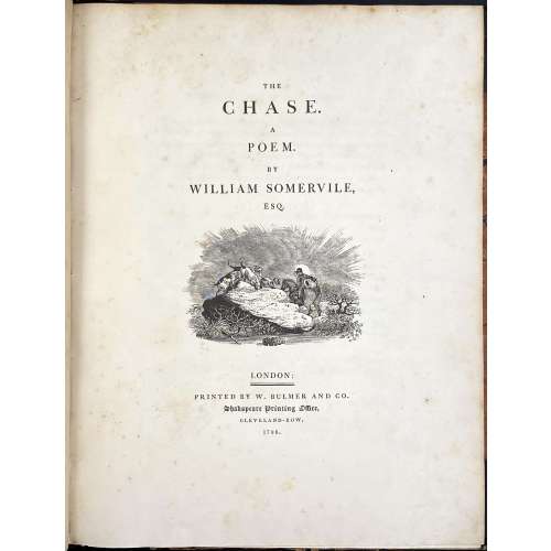 Royal 4to, 29.8 x 23.5 cm, contemporary half brown morocco, marbled boards gilt ruled, spine with gilt-ruled raised bands, gilt title lettering; "William Gore" armorial bookplate to front pastedown. Title page: THE | CHASE. | A | POEM. | BY | WILLIAM SOMERVILLE, | ESQ. | [VIGNETTE] | LONDON : | PRINTED BY W. BULMER AND CO. | Shakespeare Printing Office, | CLEVELAND-ROW. | 1796. Collation: without signatures. — Pagination: [i-v] vi-xv [xvi], [i] ii-vii [viii], [1-5] 6-126; illustrations: engraved title, 4 running titles, 4 headpieces, 4 tailpieces – 13 altogether, all drafted by John Bewick, 12 executed by Thomas Bewick and the last one by Charlton Nesbit. Catalogue Raisonné: Thomas Hugo. The Bewick Collector, vol. 1 (1866): p. 38, № 94: "The first edition... was printed in royal 4to". John Bewick made all the drawing on the blocks but was not able to execute the engravings himself "because of ill-health. They were engraved by Thomas Bewick, with the exception of the tail-piece at the end of the volume, which was engraved by Nesbit". Thomas Bewick (c. 11 August 1753 – 8 November 1828); John Bewick (1760 – 1795), the younger brother of Thomas, died at the age of 35. Christie's, who sold a similar copy on 29 Oct 2012, provides for the size 2°.
 -
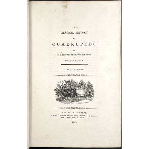 Title: A | GENERAL HISTORY | OF | QUADRUPEDS. | – | THE FIGURES ENGRAVED ON WOOD | BY | THOMAS BEWICK. | — | THE FIFTH EDITION | {vignette} | NEWCASTLE UPON TYNE: | PRINTED BY EDWARD WALKER, FOR T. BEWICK AND S. HODGSON: | SOLD BY THEM, AND ALL BOOKSELLERS. | 1807. Pagination: [2 blanks], [i, ii] – t.p. / blank], [iii, iv] – advertisement, [v] vi-x – index, [1] 2-525 [526 advert. of British Birds] [2 blanks]. Collation: Royal 8vo in fours; π (engraved title), a4 A-3T4 χ3T3. F2 signed 2F, 2E2 unsigned, p. 131 numbered correctly, p. 257 numbered 572. Size: 26 x 17 cm; page 24.5 x 16 cm (royal). Woodcuts: 302 descriptions of quadrupeds, 225 figures and 112 vignettes, tail-pieces, etc. Binding: Full diced brown calf, embossed blind corner fleurons, gilt-tooled border inside and outside, AEG, spine with raised bands, gilt in compartments, lettering; binding restored; armorial bookplate "Thorpe" to front pastedown. Likely to be Thomas Thorpe (1791 – 1851), a prominent bookseller in London: Bedford Street, Covent Garden; started in 1818, went bankrupt on Dec. 31, 1825. Thorpe's family coat of arms: stag standing on a crown and a lion rampant. Catalogue raisonné: S. Roscoe (1953): pp. 23-27. Hugo (1866): pp. 22-24.
 -
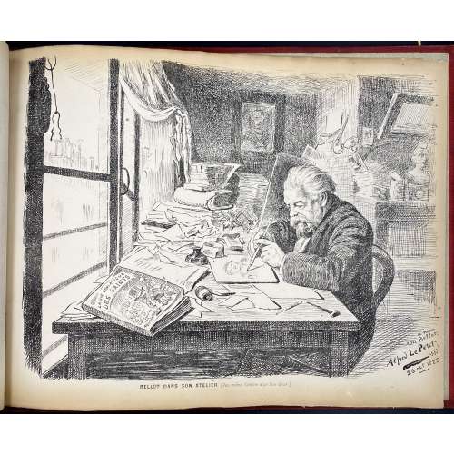 An album of the "Le Bon-Bock" dinners for the year 1884. Author, designer and publisher – Emile Bellot (French, 1831 – 1886), a Parisian artist and engraver. "Le Bon-Bock" was a monthly dinner of artists and men of letters, who gathered in Paris for good food, good company, and artistic performances, from 1875 to at least 1925. The story behind these gatherings as told by Emile Bellot, the founder, is this:
In February 1875, Pierre Cottin1 came to me and said: 'I discovered a poet and tragedian of immense talent and who interprets the poems of the Great Victor Hugo in an astonishing way. Monsieur Gambini. I promised him that I would make it heard by an audience of artists and men of letters. I am counting on you who have many connections to keep my promise to him'. I gathered about 25 of my friends and acquaintances in a picnic dinner which took place at a restaurant 'Krauteimer' on the rue Rochechouart in Montmartre. They heard from Mr Gambini first, then my friends Étienne Carjat2, J. Gros3, Adrien Dézamy4, etc. performed. These gentlemen completed the evening so brilliantly that it was unanimously decided that we would start a similar dinner every month. Poets, musicians, men of letters, singers would be invited to this dinner. I was in charge of the organization of this little party and as it was the dream of my life to bring together old comrades, I was careful not to refuse and I pursued this good idea. Cottin and René Tener5 were kind enough to help me in this joyous task and especially my old friend Carjat. The following March began our 1st monthly dinner.
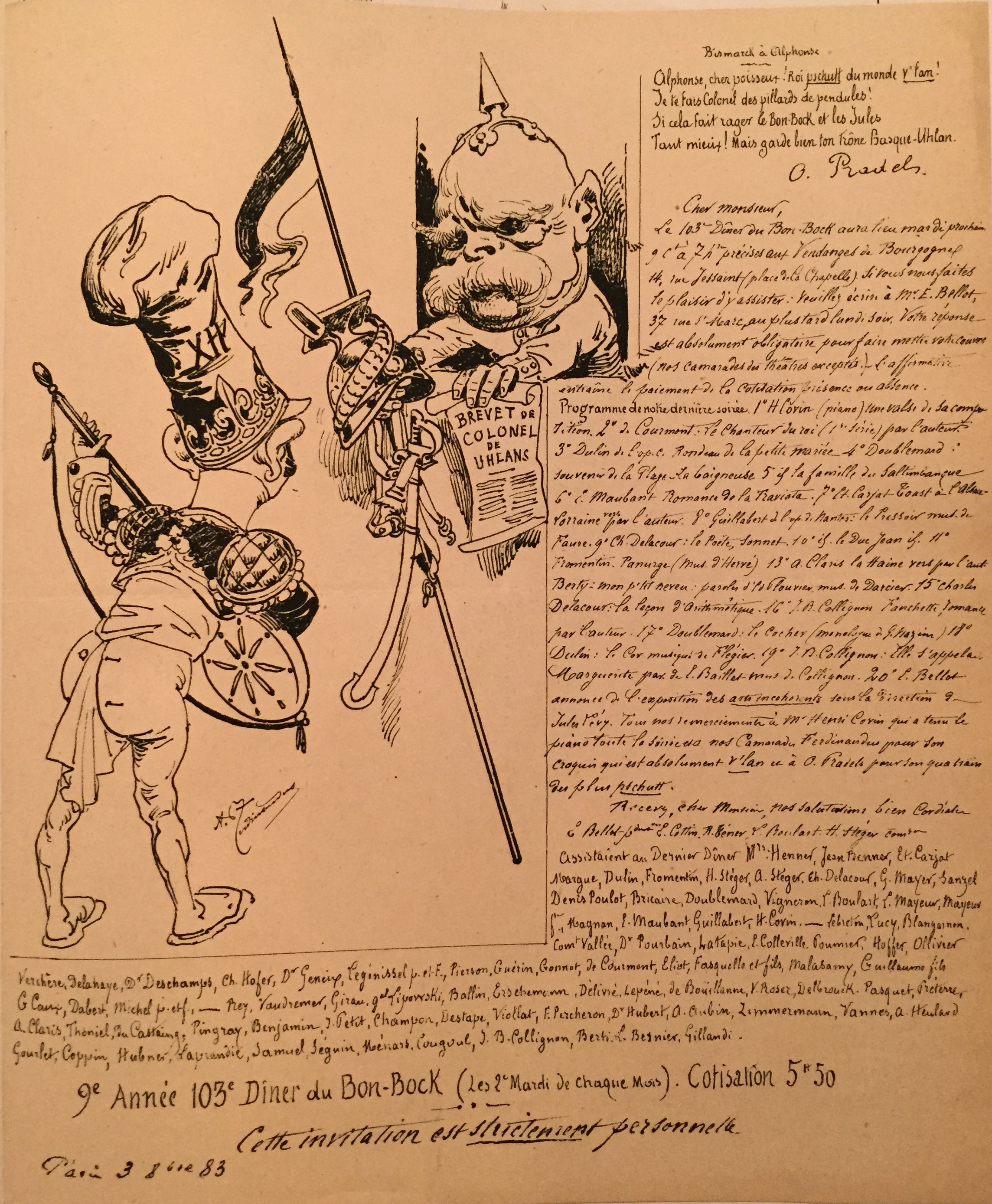
The name "Le Bon-Bock" means "The Good Bock", whilst Bock is a kind of beer, a dark, malty, lightly hopped ale. The dinner was named "Le Bon-Bock" in honour of the Éduard Manet painting (1873), a famous portrait of Emile Bellot, called "Le Bon-Bock".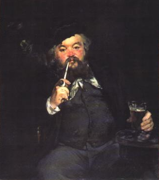 The invitations to the dinner were also produced by the artists and looked like this one by Alexandre Ferdinandus (October 3, 1883).
 Besides this sketch of the Parisian social and artistic life at the end of the 19th century, the provenance of the album in our collection generates additional interest. The ink stamp to the front flyleaf reads: "Docteur Henry Uzan, 29 Avenue Perrichont, Paris XVI".
Doctor Henry Uzan was Jewish. He was arrested by the Pétain police on October 1, 1941, and interned in Drancy. With the few means at his disposal, he undertook to treat the sick whom he then saw leaving, week after week, towards their terrible destiny in the extermination camps. In October 1943 doctor Uzan was deported to the island of Alderney. After the Normandy Landing of June 6, 1944, Nazis evacuated the island detainees and transfer them to the Neuengamme camp, via northern France and Belgium. During the transfer, doctor Uzan managed to escape from the train on the night of September 3 to 4 around Dixmude in Flanders. He was taken in by the Belgian Resistance, which he joined before being repatriated to France.
In France, he continued working as a physician and was one of the founders of Association des internés et déportés politiques (AIDP). In 1945, together with his friends, the doctor designed the symbol for the Fédération nationale des déportés et internés résistants et patriotes:
Besides this sketch of the Parisian social and artistic life at the end of the 19th century, the provenance of the album in our collection generates additional interest. The ink stamp to the front flyleaf reads: "Docteur Henry Uzan, 29 Avenue Perrichont, Paris XVI".
Doctor Henry Uzan was Jewish. He was arrested by the Pétain police on October 1, 1941, and interned in Drancy. With the few means at his disposal, he undertook to treat the sick whom he then saw leaving, week after week, towards their terrible destiny in the extermination camps. In October 1943 doctor Uzan was deported to the island of Alderney. After the Normandy Landing of June 6, 1944, Nazis evacuated the island detainees and transfer them to the Neuengamme camp, via northern France and Belgium. During the transfer, doctor Uzan managed to escape from the train on the night of September 3 to 4 around Dixmude in Flanders. He was taken in by the Belgian Resistance, which he joined before being repatriated to France.
In France, he continued working as a physician and was one of the founders of Association des internés et déportés politiques (AIDP). In 1945, together with his friends, the doctor designed the symbol for the Fédération nationale des déportés et internés résistants et patriotes:
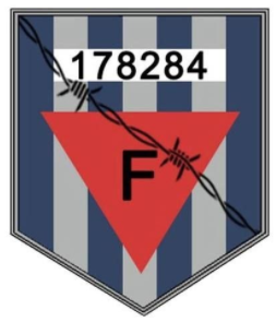 The story behind the number on the emblem (178284) is fascinating but it is out of the scope of this material.
1. Pierre Cottin (French, 1823 – c. 1887) – Engraver, mezzotinter, genre and landscape painter; born in Chappelle-Saint-Denis (near Paris), a pupil of Jazet. Exhibited at the Salon from 1845, also in London from 1876 to 1879.↩ 2. Étienne Carjat (French, 1828 – 1906) – Journalist, caricaturist and photographer. ↩ 3. Jean Baptiste Louis Gros (French, 1793 – 1870) – Painter. ↩ 4. Adrien Dézamy (French, 1844 – 1891) – Writer, poet, general secretary of the Théâtre des Bouffes in Paris. ↩ 5. Rene Tener (French, 1846 – 1925) – Painter. ↩ Sources:Auguste Lepage. Les dîners artistiques et littéraires de Paris / Bibliothèque des Deux mondes (2e éd.) – Paris: Frinzine, Klein et Cie., 1884. [Accession № LIB-2606.2021 in this collection]
-
 Title: A SENTIMENTAL | JOURNEY | THROUGH FRANCE AND ITALY | BY | LAURENCE STERNE | ILLUSTRATED BY | MAHLON BLAINE | {vignette} | Illustrated library | HALCYON HOUSE | GARDEN CITY, NEW YORK || Pagination: [1-6] – first leaf blank, h.t., t.p., 7-192, total 192 pages; frontispiece plus 4 plates within collation, and a headpiece, all photomechanical reproductions of Mahlon Blaine’s pen drawings. Binding: 20.5 x 14 cm, off-white pictorial paper boards decorated with black ivy-clad pink lattice, black lettering in a pink frame to spine, pink pictorial dust jacket with spine sunned to beige. Contributors: Sterne, Laurence (British-Irish, 1713 – 1768) – author of the text. Blaine, Mahlon (American, 1894 – 1969) – illustrator (pseudonym: G. Christopher Hudson). The Illustrated library series was started by Halcyon House, a reprint division of Doubleday Publishers, in 1950. This edition of Sterne with Blaine’s illustrations is a reprint of the same, published by Three Sirens Press of New York in 1930. Blaine's illustrations of this kind are pen drawings, not wood engravings.
 -
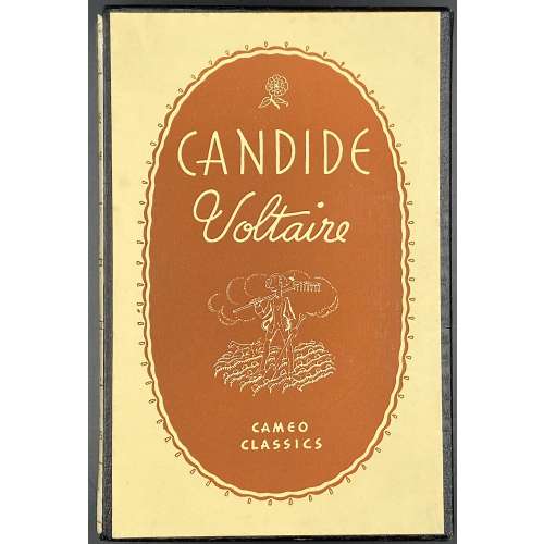 Title (historiated border, three-compartment): CAMEO CLASSICS | {rule} | CANDIDE | BY | Voltaire | WITH ILLUSTRATIONS | BY | Mahlon Blaine | {rule} | GROSSET AND DUNLAP | NEW YORK || Pagination: [1-6] 7-144, total 144 pages; frontispiece plus 4 plates within collation, head- and tailpieces – reproductions of Mahlon Blaine’s pen drawings. Binding: 21 x 14 cm, cream cloth with the cameo of Johann Gutenberg to front cover, gilt lettering to front cover and spine, in acetate dust jacket, in a pictorial slipcase. Arouet, François-Marie [Voltaire] (French, 1694 – 1778)– author. Woolf, Herman Irwell [Chambers, Dorset] (British, 1890 – 1958) – translator. Blaine, Mahlon [Hudson, G. Christopher] (American, 1894 – 1969) – illustrator. Grosset and Dunlap (NY) – publisher. J. J. Little & Ives Company (NY) – printer. Cameo Classics series was published by Grosset & Dunlap (New York) in 1935 – 1948 as a cheap reprint of illustrated classic editions, in this case – of Williams, Belasco and Meyers publication of Candide in 1930 (see LIB-2792.2021). The Cameo Classics books had a clear, acetate dust jacket and were boxed in a buckram alligator skin patterned slipcase with an illustrated cover. The price per volume started at 69 cents and was gradually lowered to 59 and 50 cents per volume by the late 1930s. Candide was translated into English quite a few times, starting from Tobias George Smollett (British-Scottish, 1721 – 1771) and up to today's translators. For some reason, the translator's name is almost never indicated. This translation, published by Williams, Belasco and Meyers in 1930 and reprinted by Grosset and Dunlap in c. 1935, was performed by Herman Irwell Woolf under the pseudonym of Dorset Chambers and first published in London by F.B. Neumayer in 1919. This edition was mentioned in the letter from Joseph Conrad to his son Borys in 1922, May 10.
 -
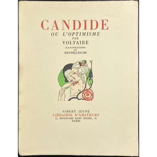 Title (in red and black): CANDIDE | OU L'OPTIMISME | PAR | VOLTAIRE | ILLUSTRATIONS | DE | BRUNELLESCHI | {vignette} | GIBERT JEUNE | LIBRAIRIE D'AMATEURS | 61, BOULEVARD SAINT-MICHEL, 61 | PARIS || Pagination : [6] 1-163 [164][2], with 23 black tailpieces, plus 16 colour plates extraneous to collation, incl. frontispiece, printed by A. Dantan and stencil-coloured (au pochoir) by E. Charpentier after gouache and watercolour drawings by Umberto Brunelleschi; total 102 leaves. Limited edition of 2500 copies, this is № 39. Printed at Imprimerie Coulouma, Argenteuil (H. Barthélemy, director) on July 15, 1933. Binding: 26.5 x 20.5 cm, publisher’s pictorial wrappers, vignettes and lettering to front wrapper and spine, publisher’s device to back wrapper. Description of the stensil (au pochoir) technique.
 -
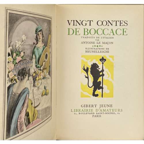 Cover and title, in green and black: VINGT CONTES | DE BOCCACE / TRADUITS DE L’ITALIEN |PAR | ANTOINE LE MAÇON | ILLUSTRATIONS DE | BRUNELLESCHI | {vignette} | GIBERT JEUNE | LIBRAIRIE D’AMATEURS | 61, BOULEVARD SAINT-MICHEL, 61 | PARIS || Pagination : [4] 1-165 [7] with 19 black head- and tailpieces, plus 16 colour plates extraneous to collation, incl. frontispiece, printed by J. Dumoulin and stencil-coloured (au pochoir) by E. Charpentier after gouache and watercolour drawings by Umberto Brunelleschi, plus 2 blank flyleaves; total 106 leaves. Limited edition of 3,000 copies, this is № 1630. Printed by Louis Malexis at Imprimerie J. Dumoulin, Paris (H. Barthélemy, director) on May 28, 1941. Binding: 20.5 x 13.5 cm, publisher’s pictorial wrappers, vignettes and lettering to front wrapper and spine, publisher’s device to back wrapper. Contributors: Giovanni Boccaccio (Italian, 1313 – 1375) – author Antoine Le Maçon (French, c. 1500 – 1559) – translator Umberto Brunelleschi (Italian, 1879 – 1949) – artist Joseph Dumoulin (French, 1875 – 1953) – printer The first, 2-volume limited edition (2,500 copies) of Les Contes de Boccace Decameron (les cinq premières journées, les cinq dernières journées) was published by Gibert Jeune, Librairie d’Amateurs in 1934 with 70 black and 32 colour designs after Brunelleschi – see [LIB-2813.2021]. Description of the stensil (au pochoir) technique.
