-
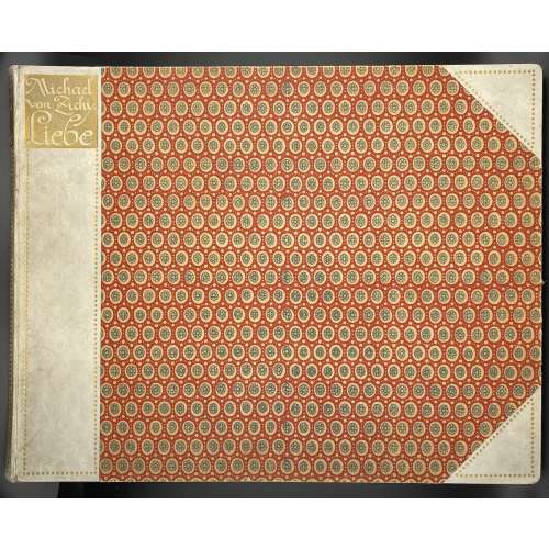 Oblong album of forty photogravures printed on wove paper in sanguine after drawings by Mihály Zichy; 31.5 x 40.5 cm gilt-decorated half-parchment over red boards with a gilt diaper design; embossed gilt label in the top left corner “Michael | von Zichy. | Liebe”. Anonymous edition. Bookplate to front pastedown: “P•U•H | EX | LIBRIS”. Photogravures made from the original watercolours and crayon drawings produced in 1874-1879; the original album consisted of 51 compositions was sold at Christie’s sale of Gérard Nordmann collection on December 14-15, 2006 in Paris. Some of these photogravures were reproduced photomechanically and printed in 1869 [LIB-2244.2019] and 1989 [LIB-2242.2019]. Limitation: 300 copies were privately printed in Leipzig in 1911 for subscribers only; photogravure copper plates were destroyed. This is copy № 285. Title-page (brown and black): MICHAEL VON ZICHY | LIEBE | VIERZIG ZEICHNUNGEN | PRIVATDRUCK LEIPZIG 1911 || Dimensions: album: 31.5 x 40.5 cm; sheets 31 x 40 cm, uncut. Catalogue raisonné: Bibliothèque érotique: Gérard Nordmann; Livres, manuscrits, dessins, photographies du XVIe au XXe siècle / Catalogues de ventes, seconde partie. — Paris: Christie’s, 2006; p. 280, № 564 (drawings); № 565 photogravures [LIB-2810.2021]. Contributors: Mihály Zichy [Michael von Zichy; Михаил Александрович Зичи] (Hungarian, 1827 – 1906).
 -
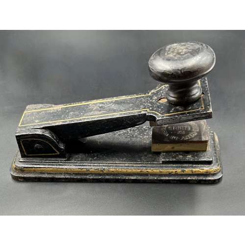 Iron pliers painted black and outlined in gilt lacquer, with wooden handle and bronze seals, "Ex Libris Comte Tony de Vibraye", L17.1 x W6.9 x H7.5 cm. Provenance: Antoine Henri Gaston Hurault de Vibraye [Comte Tony de Vibraye] (French, 1893 – 1951). The book with such a stamp in this library: [LIB-3243.2023] Crébillon fils. La Nuit et le moment ou Les Matinées de Cythère / Illustrations de Sylvain Sauvage. — Paris: Au dépens d’un amateur, 1924.
 -
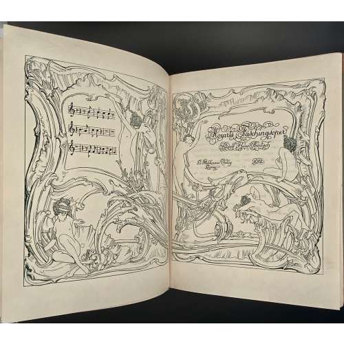 Of the limited edition of 1150 copies, this is №54 (on Japan paper, signed by Bartsch and by von Bayros). Owner's binding imitating quarter-morocco, a red label with gilt lettering to spine (possibly by Ms Hunt, who was an amateur bookbinder). Bookplate on front pastedown: "Ex libris Rachel McMasters Miller Hunt | S. B. Hill Dec 1913 | A.J. Downey Sc." Alfred James Downey (1882-1944). Rachel McMasters Miller Hunt (1882-1963). Sarah B. Hill had done lettering for Ms Hunt. On back pastedown: Stamp "Hunt Libraries CMU" and sticker "Gotham Book Mart | 128 West 45th street | New York". This is from an edition of Carcassonne:
-
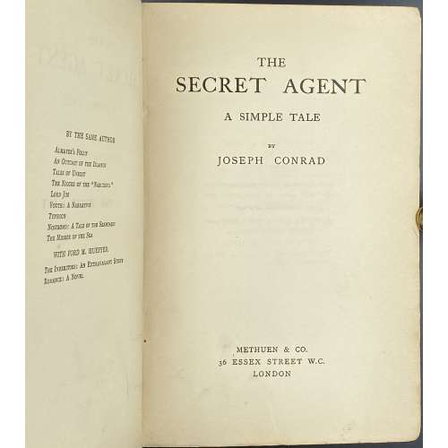 Title page: THE | SECRET AGENT | A SIMPLE TALE | BY | JOSEPH CONRAD | METHUEN & CO. | 36 ESSEX STREET W.C. | LONDON || Imprint on t.p. verso: First Published in 1907 Dedication: To H. G. Wells. Pagination: [2] – blank, [6] – h.t., t.p., dedication; 1-442, [2] colophon: THE RIVERSIDE PRESS LIMITED, EDINBURGH / blank; [1-2] 3-40 – Catalogue of books published by Methuen and company, September 1907; total 492 pages. Collation: 8vo; π4, A-Z8 2A-2D8, 2E6, + 20 leaves of advertisement: signed A2 on leaf 5 and A3 on leaf 9, other unsigned, 2E2 signed; total 246 leaves. Binding: Publisher’s burgundy cloth with gilt lettering and elements to spine, lower margin untrimmed, 19.5 x 13.5 cm. Edition: 1st edition, 1st printing ("be be" on the last line of page 117) of 2,500 copied printed. Contributors: Conrad, Joseph (Polish-British, 1857 – 1924) – author. Methuen & Co. (London) – publisher. The Riverside Press Limited (Edinburgh) – printer. Herbert George Wells (British, 1866 – 1946) – dedicatee.
 -
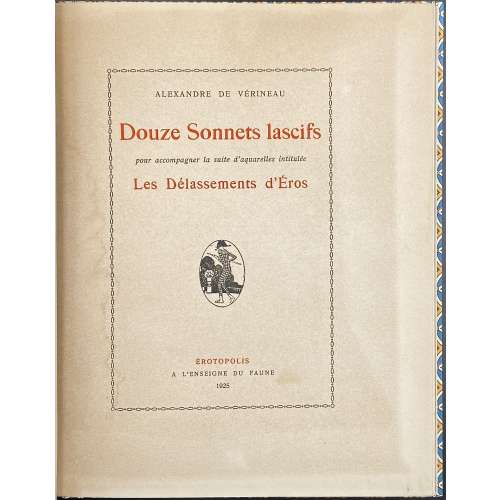 Volume bound by Boichot (signed on front pastedown), 25.3 x 20.2 cm in a 25.9 x 20.3 slipcase, the book and the case uniformly in beige, brown, and blue diaper paper with a navy blue label with gilt lettering to book's spine, top edge gilt, J.-P. Dutel’s bookplate to fep, portfolio cover preserved. Pp.: [1-4] 5-37 [38 blank]; collated 4to, 13 2-54; total 19 leaves (38 pages), plus 12 plates coloured in stencil technique (pochoir), produced after watercolours by Gerda Wegener in c. 1917 on Arches or Whatman laid paper, watermarked. Each illustration bears a small masquerade mask at the bottom as a signature. Text printed on laid paper without a watermark; starting from 2nd gathering, the text printed on recto only; minor traces of water stain to some pages. Title-page (red and black): ALEXANDRE DE VÉRINEAU | Douze Sonnets lascifs | pour accompagner la suite d’aquarelles intitulée | Les Délassements d’Éros | {vignette medallion} | ÉROTOPOLIS | A L’ENSEIGNE DU FAUNE | 1925 || First edition, first printing (incl. plates); clandestine. Catalogue raisonné: Dutel 1356, 1434; Pia 363/4; Noedmann I 310; Fekete 221. Contributors: Louis Perceau (French, 1883 – 1942) – author (see LIB-2633.2021: Guillaume Apollinaire, Fernand Fleuret, Louis Perceau. L'enfer de la Bibliothèque Nationale. — Paris: Mercure de France, 1913). Gerda Wegener (Danish, 1886 – 1940) – artist. Maurice Duflou (French, 1885 – 1951) – publisher. Boichot – bookbinder.
 -
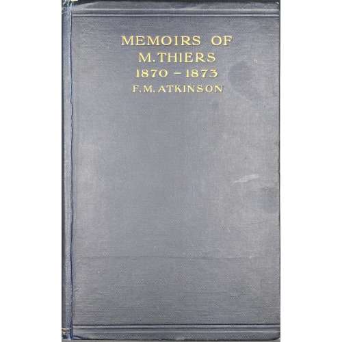 Title: MEMOIRS OF M. THIERS | 1870—1873 | Translated by | F. M. ATKINSON | {publisher’s device} | LONDON: GEORGE ALLEN & UNWIN LTD. | RUSKIN HOUSE 40 MUSEUM STREET, W.C. Pagination: [6] 7-384. Collation: 8vo; [1]-248. Size: 23 x 15 cm Binding: Blue cloth, top and bottom ruled in blind, gilt lettering to front cover and spine. Original: Adolphe Thiers. Notes et souvenirs de M. Thiers, 1870-1873: voyage diplomatique, proposition d'un armistice, préliminaires de la paix, présidence de la République. — Paris : [s.n.], 1901. — 465 p. The preface and editing signed "F. D." [Félicie Dosne]. Félicie Dosne (French, 1823 – 1906) was Thiers's sister-in-law.
 -
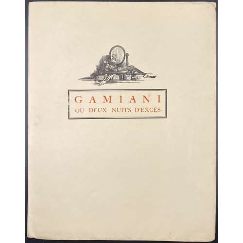 Description: Softcover volume 27 x 21.3 cm in publisher’s French flapped cream wrappers, with a vignette and lettered in red within a black frame to front "GAMIANI | OU DEUX NUITS D'EXCÈS". Printed on unmarked wove paper, outer and lower margins untrimmed. Illustrated with full-page frontispiece, 10 headpieces, and 5 smaller woodcuts (one repeated on the front wrapper and on t.p.) by Pierre Aubert after Jean-Gabriel Daragnès [pseud. Jean de Guethary], some with inlaid tissue guards. Copy enriched with one graphite pencil drawing signed "J. de Guethary", tipped in before h.t. Title-page (red and black): GAMIANI | OU DEUX NUITS D'EXCÈS | PAR A. DE M. | Avec | des vignettes | de | JEAN DE GUETHARY | {VIGNETTE} | — | CHEZ UN BOURGEOIS DE PARIS | Rue du Coq Hardi | 1845 || Pagination: [i-vi] (orig. drawing, h.t. / vignette, t.p./limit.) [vii] viii-xx, [1-3] 4-64 [4]; total 88 pages. Limitation: Edition limited to 110 copies. According to Dutel, 110 copies were printed on Japon ancient, 3 on Japon Impérial, and 3 on Whatman. This copy is № 115. Catalogue raisonné: Dutel (1920-1970): № 1630, p. 183; Pia (Enfer) 527, p. 286. Alfred de Musset (French, 1810 – 1857) – author. Jean-Gabriel Daragnès (French, 1886 – 1950) – artist, publisher. Pierre Aubert (Swiss, 1910 – 1987) – engraver.
 -
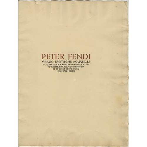 Six in-folio leaves, 2o, incl. title-page, engraved portrait of P. Fendi after Josef Danhauser, 4 pages of printed text, and 10 of 40 colour photomechanical reproductions of Fendi’s watercolour plates (205 x 140 mm), mounted on vellum paper with blind stamp (398 x 305 mm) in a parchment-backed flapped album (defective), gilt-stamped, with straps. Limited edition of 600 copies. The publisher is not stated but is sometimes attributed to C. W. Stern in Vienna. Limitation statement and imprint missing. Title-page (brown and black): PETER FENDI | VIERZIG EROTISCHE AQUARELLE | IN FAKSIMILEREPRODUKTION. MIT EINEM PORTRÄT | PETER FENDIS VON JOSEF DANHAUSER | UND EINER EINFÜHRUNG | VON KARL MERKER || Catalogue Raisonné: Nordmann II № 198, p.96. Contributors: Peter Fendi (Austrian, 1796 – 1842) Josef Danhauser (Austian, 1805 – 1845) Karl Merker – author/introduction.
 -
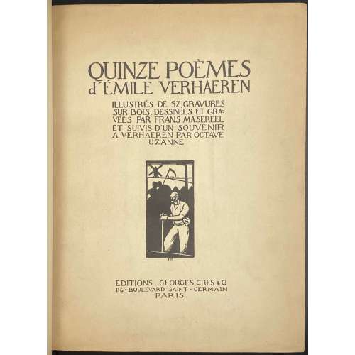 Quinze poèmes d'Emile Verhaeren. Illustrés de 57 gravures sur bois dessinées et gravées par Frans Masereel et suivis d'un 'Souvenir à Verhaeren' par Octave Uzanne. — Paris: Éditions Georges Crès, 1917. Authors: Emile Verhaeren (text), Frans Masereel (illustrations), Octave Uzanne (text). Publisher: Éditions Georges Crès. [Georges-Célestin Crès (1875 - 1935) was a French publisher and bookseller. Address: 116 boulevard Saint-Germain, Paris]. Printer: Sonor S.A. - Geneve, under the direction of Auguste Jordanis. The number of copies printed: 1555 of which 15 (1-15) on Japan paper, 190 (16-205) on Fabriano paper, and 1350 (206-1555) on English paper (1506-1555 not for trade). This copy № 1312. Pagination: [i] - front cover, [ii] - half-title, [iii] - title, [iv] - printrun justification, [v] - table of contents, [vi] - blank, [i-vii] viii-ciii, [civ] - printer statement, [cv] - back cover; one-side (recto) printing and pagination. Owner's contemporary red half-Morocco with marbled boards; spine with four raised bands, gilt lettering and design elements. Original printed paper wrappers preserved. Marbled endpapers. Trimmed unevenly.
 -
 Title: OLD DUTCH | POTTERY AND TILES | BY ELISABETH | NEURDENBURG | LITT. D., READER IN THE HISTORY OF ART AT | THE UNIVERSITY OF GRONINGEN. TRANSLATED | WITH ANNOTATIONS BY | Bernard Rackham | DEPUTY KEEPER, DEPARTMENT | OF CERAMICS, VICTORIA AND | ALBERT MUSEUM | […] | WITH ONE HUNDRED AND TWELVE | ILLUSTRATIONS OF WHICH NINE | ARE IN COLOUR | LONDON: BENN BROTHERS, LIMITED | 8 BOUVERIE STREET, E.C. 4 | 1923 || Verso to half-title: Of this book 100 copies only for sale have been printed on English | hand-made paper, bound in pigskin and signed by the Authoress | and Translator. These copies also contain an extra colour plate. | This in Number “7” (in manuscript) | Two signatures (ink, manuscript) || Pagination: [i, ii] – h.t. / tirage, [iii, iv] – t.p. / imprint, [v, vi] – dedication to Dr. A. Pit / blank, vii-xv [xvi blank] [1, 2] 3-155 [156 blank], frontispiece (colour) and 59 leaves of plates (9 colour) with 112 figures, with lettered protective sheets. Collation: 4to in 8th; [A]8 [B]8 C-K8 L6; frontis., +59 leaves of plates. Binding: 30 x 24 cm, Full dark brown pigskin with gilt ornament to front board and gilt lettering to spine; printed on thick wove paper, top edge gilt, others untrimmed. Contributors: Neurdenburg, Elisabeth (Dutch, 1882 – 1957) – author [autograph]. Rackham, Bernard (British, 1876 – 1964) – translator [autograph]. Brendon, William (British, 1845 – 1928) – printer. Mayflower Press (Plymouth), William Brendon & Son, Ltd. – printer Benn Brothers Ltd. (British company, 1880 – 1987) Benn, Sir John, 1st Baronet (British, 1850 – 1922)
 -
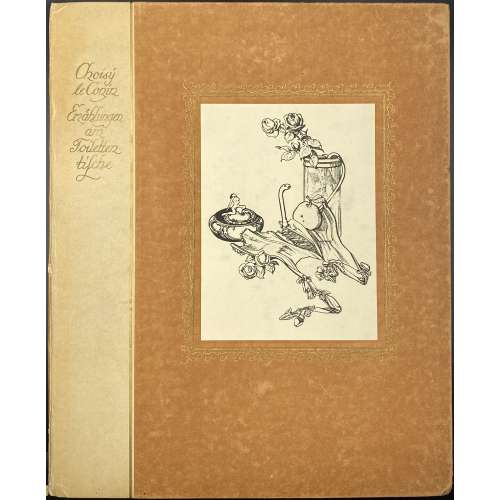 Publisher's flapped portfolio 32.8 x 26.8 cm, gilt-ruled and gilt-lettered quarter faux-parchment waxed paper over brown paper boards with pasted illustration after von Bayros within gilt arabesque frame. Possibly published in Vienna by Heinrich Conrad in 1905 or 1908. The portfolio contains the title page with a vignette and 15 loose wove paper sheets 32 x 26.2 cm of collotype reproductions after drawings by Franz von Bayros. Cover gilt lettering: Choisÿ | le Conin | Erzählungen | am | Toiletten- | tische || Title-page: Erzählungen | am Toilettentische | von | CHOISY LE CONIN | {vignette} || Title-page verso: Inhalt: | 1. Die Tabaksdose | 2. Viola de Gamba | 3. Der Bote | 4. Nicht drängeln, Kinder! | 5. Die blaue Feder | 6. O what a pretty like-place! | 7. Die Sonnenuhr |8. Der Temel der der Cotÿs | 9. Der Fetischist | 10. Jupiter und Europa | 11. Die Witwe | 12. Paroxÿsme-erotique | 13. Der Rivale | 14. Die rote Lehrerin | 15. Tantalus | Nicht im Handel. || Catalogue raisonné: The amorous drawings of the Marquis von Bayros / Part I and II. — NY: Cythera Press, 1968; pp. 95-111 [LIB-2246.2019]
 -
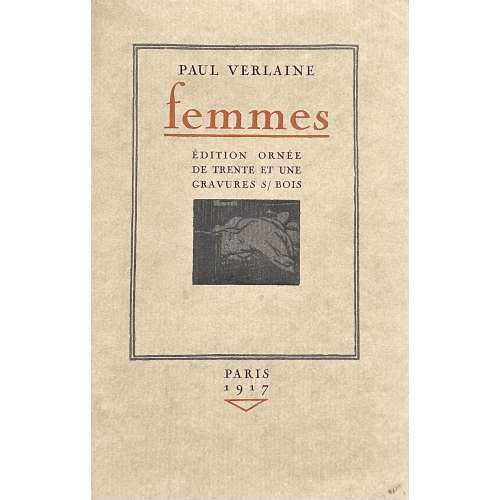 Softcover, 258 x 166 mm, publisher’s olive French flapped wrappers in owner’s glassine dustcover, edges untrimmed, some pages uncut, printed on thick wove paper with watermark “Hollande van Gelder Zonen”, in a slipcase. Pp.: [1-10] 11-129 [5], pages in wrappers included in the count, total 67 leaves; two-tone woodcuts by Jean-Gabriel Daragnès within the pagination. Title-page (red and black, in a double-fillet frame): PAUL VERLAINE | femmes | ÉDITION ORNÉE | DE TRENTE ET UNE | GRAVURES S/ BOIS | {vignette} | (under the bottom frame) PARIS | 1917 | {red triangle} || Limitation: Il a été tiré de cet ouvrage : 11 15 Exemplaires sur vieux papier de Japon numérotés de I à XV; 15 20 Exemplaires sur papier de Chine numérotés de XVI à XXXV; auxquels on a joint une suite des fumés sur même papier. 250 Exemplaires sur papier vélin de Hollande Van Gelder Zonen numérotés de 1 à 250. Après le tirage les bois ont été détruits. № 1. Numbers “15” and “20” corrected manually by Daragnès (per Dutel). This is copy № 1 of vélin de Hollande print run. Catalogue raisonné: Dutel II: № 295; Nordmann II № 544. Seller’s description: Un volume broché in-8° sous couverture illustrée et rempliée. Etui cartonné. Illustré de 31 gravures sur bois en camaïeu, attribuées à DARAGNES, la plupart très libres, dont 18 à pleine page. Tiré à [226 ou 285] ex. numérotés. 1 des [200 ou 250] sur Hollande Van Gelder Zonen. Le nôtre porte le n°1. (Dutel : 295. Pia : 501. Carteret : IV, 392 : Belle édition rare, très estimée ». Monod : 11086). Dorgelès commenta ainsi ces illustrations : « Dans ces nus voluptueux et tragiques, qui semblent à la fois s’aimer et se haïr, on retrouve la même frénésie amère qui tourmente les poèmes interdits de Verlaine » (in Catalogue de livres... Daragnès, Drouot 1924, n°55). Très rares rousseurs. TRES BON EXEMPLAIRE, toujours recherché. Contributors: Paul Verlaine (French, 1844 – 1896) – author. Jean-Gabriel Daragnès (French, 1886 – 1950) – artist/publisher.
 -
![Insel-Almanach auf das Jahr 1907. Kalender für 1907. (with illustration by Franz von Bayros on p. 50). — 150 + [2] pp.](https://varshavskycollection.com/wp-content/uploads/2021/02/LIB-2250.2019-a-500x500.jpeg) Half-title: ÜBERREICHT VON | GILHOFER UND RANSCHBURG | SORTIMENT–, BÜCHER– UND KUNST– | ANTIQUARIAT | WIEN 1, BOGNERGASSE 2 || Title: Red letterpress lettering in black ornamental frame: Insel- | Almanach | auf das Jahr | 1907 || Pagination: [6] – h.t., frontis., title; [1-16] 17-150 [2], + 2 folding plates (op. p. 30 and 32), and 2 plates op. p. 50 (Franz von Bayros "Francine" for Die Bohème by Henri Murger) and 112 (colour). Binding: 17.3 x 9.9 cm; original olive paper wrappers with gilt lettering and elements to cover, lettering to spine. Catalogue raisonné: Heinz Sarkowski (1999): № 1986, pp. 329-30, with contents. Contributors: Gilhofer und Ranschburg – antiquarian bookstore in Vienna. Schröder, Rudolf Alexander (German, 1878 – 1962) – title and cover. Wieynk, Heinrich (German, 1874 – 1931) – typeset. Kippenberg, Anton Hermann Friedrich (German, 1874 – 1950) – editor. Brandstetter, Oscar (German, 1844 – ?) – printer.
Half-title: ÜBERREICHT VON | GILHOFER UND RANSCHBURG | SORTIMENT–, BÜCHER– UND KUNST– | ANTIQUARIAT | WIEN 1, BOGNERGASSE 2 || Title: Red letterpress lettering in black ornamental frame: Insel- | Almanach | auf das Jahr | 1907 || Pagination: [6] – h.t., frontis., title; [1-16] 17-150 [2], + 2 folding plates (op. p. 30 and 32), and 2 plates op. p. 50 (Franz von Bayros "Francine" for Die Bohème by Henri Murger) and 112 (colour). Binding: 17.3 x 9.9 cm; original olive paper wrappers with gilt lettering and elements to cover, lettering to spine. Catalogue raisonné: Heinz Sarkowski (1999): № 1986, pp. 329-30, with contents. Contributors: Gilhofer und Ranschburg – antiquarian bookstore in Vienna. Schröder, Rudolf Alexander (German, 1878 – 1962) – title and cover. Wieynk, Heinrich (German, 1874 – 1931) – typeset. Kippenberg, Anton Hermann Friedrich (German, 1874 – 1950) – editor. Brandstetter, Oscar (German, 1844 – ?) – printer. -
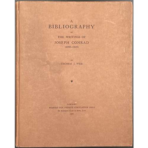 Title page: A | BIBLIOGRAPHY | OF | THE WRITINGS OF | JOSEPH CONRAD (1895–1920) | BY THOMAS J. WISE | ❦ | LONDON: | PRINTED FOR PRIVATE CIRCULATION ONLY | By Richard Clay & Sons, Ltd. | 1920 || Pagination: [i-viii] ix-xiii [xiv-xvi], [1, 2] 3-105 [106-112], frontispiece with tissue guard in collation; 128 pages total. Collation: 8vo; [A]-H8, 64 leaves total. Binding: 22.5 x 18 cm; terracotta paper boards, black lettering to front and spine; uncut. The device on the recto of the last leaf inscribed: The Ashley library. Privately printed. 1920. Insert: ALS from Thomas J. Wise dated 22/3/21 on watermarked paper (King of Kent | Extra Fine) with letterhead “Kirkstead”, 25 Heath Drive, Hampstead, N.W.3. The letter is a response to a request for two copies of Volume II of Wise’s Swinburne bibliography, which Wise promises to supply the next day to Stevens & Brown (founded in 1864, Literary and Fine Arts Agents). Limitation: 150 copies, private printing. Contributors: Joseph Conrad [Józef Teodor Konrad Korzeniowski] (British-Polish, 1857 – 1924) Wise, Thomas James (British, 1859 – 1937) – compiler, bibliographer. R. Clay & Sons Ltd. (London); Clay, Richard (British, 1789 – 1877) – publisher. The Ashley Library (London) – printer.
 -
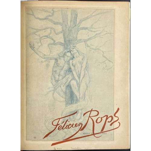 One volume in-4o, 26.5 x 21 x 4.4 cm, bound by Durvand (signed) in yellow ¾ morocco over marbled boards outlined in gilt, spine with raised bands, gilt lettering, vignettes after Félicien Rops in compartments, top margin gilt, marbled endpapers, publisher’s wrappers preserved; enriched with 57 original prints after Félicien Rops and an etched portrait of Félicien Rops by Robert Kastor. Collation: 3 blanks, π4 (orig. front wrapper ‘En souscription…./Etudes sur…’, La tentation…/Érastène Ramiro..., h.t./justification, t.p/blank), 1-274 (paginated 1-215 [216]) χ2 plus 58 leaves of bound-in original prints by various printers on different papers, some on India paper pasted on vergé, with tissue guards, and 1 leave of manuscript ‘Table de gravures dans le texte’; back wrapper with ‘Table des gravures ajoutées’ manuscript to recto, original spine, 2 blanks. Title-page (red and black): Études sur quelques Artistes originaux | — | FÉLICIEN ROPS | par | ÉRASTÈNE RAMIRO | {fleuron} | PARIS | (left): G. PELLET | 51, Rue Le Peletier, 51 | (right): H. FLOURY | 1, Boulevard des Capucines, 1 | 1905 || Limitation: 125 copies, of which 100 copies on Japon à la forme and 25 copies 0n papier de Chine. Photographs here represent the original prints only. Contributors: Eugène Rodrigues-Henriques [Eugène Rodrigues, Erastène Ramiro] (French, 1853 –1928) – author. Félicien Rops (Belgian, 1833 – 1898) – artist. Robert Kastor (French, 1872 – 1935) – artist. Imprimerie Charles Hérissey (Évreux) – printer Gustave Pellet (French, 1859 – 1919) – publisher. Henri Floury (French, 1862 –1961) – publisher. Lucien Durvand (French, 1852 – 1924) – bookbinder.
 -
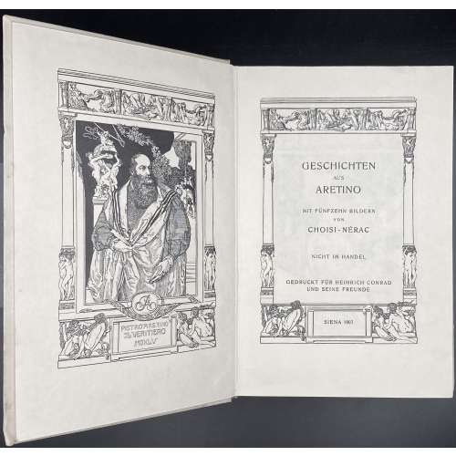 Title: GESCHICHTEN | AUS | ARETINO | MIT FÜNFZEHN BILDERN | VON | CHOISI-NÉRAC | NICHT IM HANDEL | GEDRUCKT FÜR HEINRICH CONRAD | UND SEINE FREUNDE | SIENA 1907 || Collation: 8vo; 1-128 137; frontispiece, t.p. and 14 plates, extraneous to collation. Pagination: [2] f.t. / blank, 3-203 [2], il. Binding: Full cream vellum, ruled with gilt double-fillet, grey label with gilt lettering to spine. Bookplate by von Bayros Par Avi Cigno to front pastedown. Note: Private edition of Aretino's Ragionamenti in German as Geschichten aus Aretino by translater and publisher Heinrich Conrad (German, 1866 – 1918), whose real name was Hugo Storm, this copy №394, illustrated by Franz von Bayros (Austrian, 1866 – of Choisi-Nérac.
 -
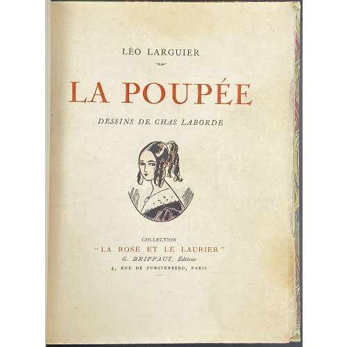 Description: owner’s quarter green morocco over marbled boards, 21.5 x 16.5 cm, collated 8vo, illustrated with numerous in-text and 5 full-page coloured etchings after drawings by Chas Laborde. Original publisher’s wrappers preserved, enriched with a set of 17 plates in black and white (bound in). Front wrapper (black and red): LÉO LARGUIER | LA POUPÉE | DESSINS DE CHAS LABORDE | {vignette} | COLLECTION | “LA ROSE ET LE LAURIER” | G. BRIFFAUT, Éditeur | 4, RUE DE FURSTENBERG, PARIS || Title-page: LÉO LARGUIER | — | LA POUPÉE | DESSINS DE | CHAS LABORDE | {vignette} | COLLECTION DE | “LA ROSE ET LE LAURIER” | G. BRIFFAUT, Éditeur | 4, RUE DE FURSTENBERG, PARIS (VIe) | M CM XXV || Collation: Three binder’s blanks, 1 front wrapper, 1 blank, 1 h.t./limit., 1 t.p., 1 epigraph, 1-68 74 (last blank), plates within collation, 1 back wrapper, three binder’s blanks, plus 17 leaves of b/w plates. Pagination: not counting wrappers, [6] (h.t., t.p., epigraph) 1-99 [100] [4], ils. Limitation: A print run of 770 copies on April 25, 1925, by Coulouma (Argenteuil) under the direction of H. Barthélemy , of which 10 copies on Japon Impérial (№ 1-10) + one drawing + one b/w suite, 10 copies on Japon Impérial (№ 11-20) + one drawing, 750 copies on Vélin (№ 21-770). This is copy № 1 (on Japon Impérial with b/w suite of plates but without the drawing). Contributors: Léo Larguier (French, 1878 – 1950) – author. Chas Laborde [Charles Laborde] (French, 1886 – 1941) – artist. Georges Briffaut (French, 1886 – 1973) – publisher.
 -
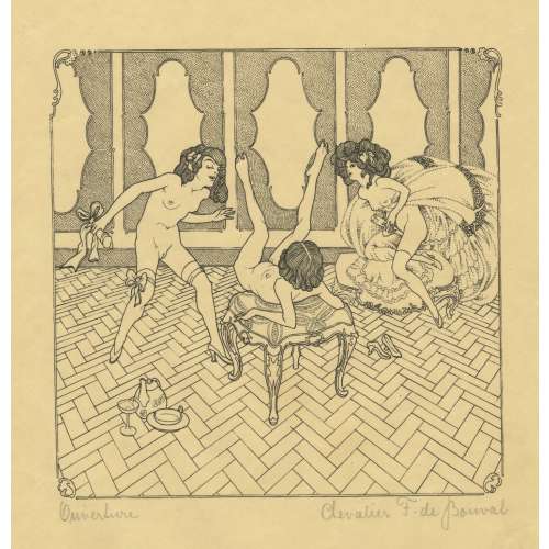 A set of sixteen planographic prints, signed and titled in pencil by owner “Chevalier F. de Bouval” (pseudonym of Franz von Bayros (Austrian, 1866 – 1924). Titles include: 1) Ouverture, 2) champagne brut, 3) maternité, 4) piano, 5) crudité délicieuse, 6. la belle vue, 7) au pensionnat, 8) le collier, 9) languelles pénètrelles, 10) introduction, 11) le sourrogat, 12) variation amoureuse, 13) la surprise, 14) le clef délicat, 15) le monstre gomme, 16) fruits de sud. Printed on wove paper, possibly engraved on wood after ink drawings by Franz von Bayros (Austrian, 1866 – 1924) under the pseudonym Chevalier F. de Bouval. Size: sheet 30 x 24 cm, image 18 x 17.5 cm. In another source, there are two more images from the same set: le passe-partout and la doublette, making 18 images altogether; the set is titled “Lesbia: XVIII sujets”, signed by Chevalier François René de Bouval.