

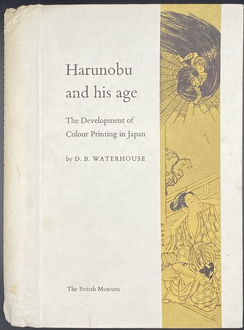
Pictorial cloth boards, spiral-bound, pp.: 3 leaves: h.t., frontis., t.p., 1-326; 123 black & white plates within the pagination.
-
-
 Title: CURIOSA | An | Exhibition | of | Illustrated | Erotic | Books | HOBART & MACLEAN || Pagination: 16 unpaginated pages with bibliography of 49 editions with prices and 51 images. Stapled softcover, original green wrappers with lettering to front and illustration to back. Size: 21 x 15 cm.
 -
 Казанова Д. Истрия моей жизни. — М.: Моск. рабочий, 1991. — 734 с. Составление, вступительная статья, комментарии А. Ф. Строева. Перевод И. К. Стаф, А. Ф. Строева, 1990. ISBN: 5—239—00590—7 Original title: Giacomo Casanova. Histoire de ma vie.
 -
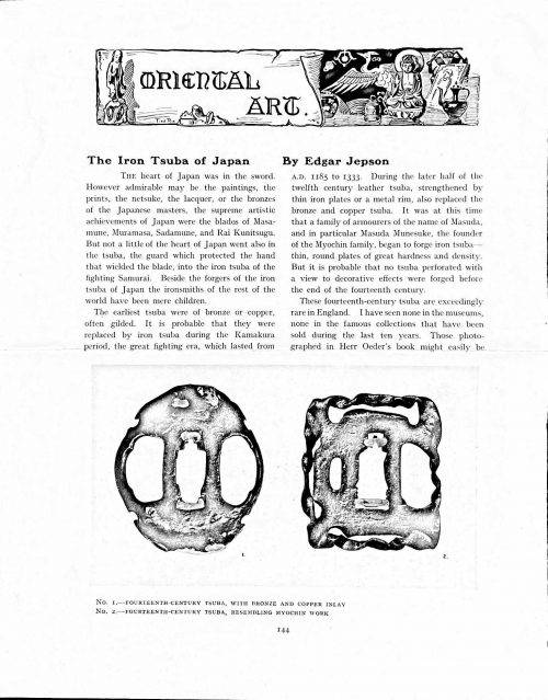 Magazine article by Edgar Jepson: The Iron Tsuba of Japan (Section: Oriental Art), published in volume Vol. 70 (September–December) of The Connoisseur: An Illustrated Magazine for Collectors, Vol. 70 (September–December); pp. 143-152 / C. Reginald Grundy [ed.] — London: Published by the Proprietor, W. CLAUSE JOHNSON, at the Editorial and Advertisement Offices of The Connoisseur, 1924. Owner's half black morocco, gilt lettering to spine, blue cloth boards. Two volumes bound together without original covers. Size 28.5 x 22 cm. Vol. 1: The Connoisseur | An Illustrated Magazine | For Collectors | Edited by C. Reginald Grundy | Vol. LXIX. | (MAY—AUGUST, 1924) | LONDON | Published by the Proprietor, W. CLAUSE JOHNSON, at the | Editorial and Advertisement Offices of The Connoisseur, | at 1, Duke Street, St. James's, S.W. 1 | 1924 || Pp.: [i-ii] iii-xviii [xix] [1, 2 - plate] 3-249 [250]. Vol. 2: The Connoisseur | An Illustrated Magazine | For Collectors | Edited by C. Reginald Grundy | Vol. LXX. | (SEPTEMBER—DECEMBER, 1924) | LONDON | Published by the Proprietor, W. CLAUSE JOHNSON, at the | Editorial and Advertisement Offices of The Connoisseur, | at 1, Duke Street, St. James's, S.W. 1 | 1924 || Pp.: [i-ii] iii-xxii [2 blanks] [1, 2 - plate] 3-261 [262]. The Iron Tsuba of Japan by Edgar Jepson The heart of Japan was in the sword. However admirable may be the paintings, the prints, the netsuke, the lacquer, or the bronzes of the Japanese masters, the supreme artistic achievements of Japan were the blades of Masamune, Muramasa, Sadamune, and Rai Kunitsugu. But not a little of the heart of Japan went also in the tsuba, the guard which protected the hand that wielded the blade, into the iron tsuba of the fighting Samurai. Beside the forgers of the iron tsuba of Japan the ironsmiths of the rest of the world have been mere children. The earliest tsuba were of bronze or copper, often gilded. It is probable that they were replaced by iron tsuba during the Kamakura period, the great fighting era, which lasted from A.D. 1185 to 1333. During the later half of the twelfth century leather tsuba, strengthened by thin iron plates or a metal rim, also replaced the bronze and copper tsuba. It was at this time that a family of armourers of the name of Masuda, and in particular Masuda Munesuke, the founder of the Myochin family, began to forge iron tsuba — thin, round plates of great hardness and density. But it is probable that no tsuba perforated with a view to decorative effects were forged before the end of the fourteenth century. These fourteenth-century tsuba are exceedingly rare in England. I have seen none in the museums, none in the famous collections that have been sold during the last ten years. Those photographed in Herr Oeder's book might easily be the fifteenth century. No. 1 is a curious cup-shape tsuba decorated with a bronze and copper inlay. No. 2, with its edges curiously twisted in the forging, looks like Myochin work. But it is not of the Myochin iron. The Myochin family produced some of the greatest ironsmiths of Japan. Armourers first of all, tsubasmiths, forgers of sake-kettles, articulated reptiles, crustacea, and insects — everything that can be done with iron they did; they pushed their medium to its limit. They were forging iron tsuba in 1160, and they were still forging them in 1860. And it was their own iron, or rather their own steel. They discovered the secret of it early, and they kept that secret in the family for all those hundreds of years. There is no mistaking a Myochin tsuba: balance it on your finger and tap it with a piece of metal, always it gives forth a clear bell-like ring that you get from the work of no other ironsmith, Japanese or European. Always the Myochin tsuba is before everything a protection to the hand of the swordsman; to that everything is, as it should be, subordinated. No. 3 is a Myochin tsuba of the fifteenth century, and probably of the early fifteenth century. No. 4, by Myochin Munetaka, perforated with a grotesque figure, is an example of that twisting and twisting of the iron in the forging till it forms a pattern like the grain of wood. The Myochin smiths invented these wood-grain tsuba, and no other smiths equalled them in their forging. In the sixteenth century, the fighting tsuba was probably at its best. It was a century of great tsubasmiths. Then the first Nobuiye, whose tsuba fetched £100 apiece, circa 1800, in Japan, and the first Kaneiye flourished. No. 5 is a tsuba forged by a great smith, Iyesada of Sotome, in the manner of Nobuiye I, decorated with the karakusa tendrils that Nobuiye delighted in, with lightning and clouds. No. 6 is a guard of Sanada Tembo, the chief smith of the Tembo family, stamped, punning fashion, with the character Tembo. Akin to the Tembo tsuba were those of the Kiami and Hoan smiths. Then also the Heianjo smiths and the Owari smiths, especially those of Nagoya and the Yamakichi family, forged their strongest tsuba. Those of the Yamakichi were tested after the forging by being pounded in iron mortars — at least, so the legend runs. But they were a sternly utilitarian family, and I have never seen a Yamakichi tsuba of any beauty. In the later half of the fifteenth century arose the fashion of decorating tsuba with an inlay, zogan, of bronze. The Heianjo tsuba, forged at Kyoto in the latter half of the fifteenth and the beginning of the sixteenth century, were often thus inlaid. The earliest of them were called "Onin", of which No. 7 is an example. In addition to the bronze inlay around the edge, it is inlaid with a representation, some say, of snow; others say, of the duckweed on a pond. No. 8 is probably a Heianjo tsuba, but I am not quite sure about it. The inlaid acacia branches might be very early Shoami work. But to judge by the iron, it is a fifteenth-century tsuba; and the authorities place the beginning of the Shoami school not later than early in the sixteenth century. No. 10 is an example of the Fushimi-zogan, a flat inlay of a light-coloured bronze. These tsuba took their name from the fact that they were first forged at Fushimi, in Yamashiro, in the sixteenth century. It is of the type known as Mon-zukashi, perforated with crests (mon) à jour. The Yoshiro-zogan tsuba were also first forged at Fushimi by Yoshiro Naomasa. They were distinguished from the Fushimi-zogan by the fact that their inlay was generally a little raised-not always-for the inlay of No. 9, a tsuba forged by a later nineteenth-century Yoshiro, is quite flat. It is an interesting tsuba, for, with its decoration grown florid and excessive, it marks the intermediate stage between the simple and delightful designs of the genuine fighting tsuba and the elaborate pictures in gold and silver on the tsuba of the eighteenth-century smiths of Awa and Kyoto, which have become mere ornaments of the goldsmith. The Gomoku-zogan (No. 11) tsuba were probably first forged earlier than the Fushimi and Yoshiro-zogan tsuba. This inlay, in slight relief, is a representation in a light-coloured bronze and copper of twigs caught in the eddies of streams. The seventeenth century and early eighteenth century were the great periods of perforated tsuba. The designs, and they are often admirable, are for the most part in plain fretwork; but they are also chased. No. 12, a crane under an acacia, is a tsuba of a Higo smith, great forgers of fighting tsuba during this period. These smiths also excelled in nunome zogan, a very thin gold and silver inlay, with which they further decorated their perforated guards. The smiths of the Umetada and Shoami families also forged iron tsuba during this period; but their designs, though sometimes pleasing enough, are rarely fine. The best work of Myoju Umetada is in sentoku, not iron. The Choshu smiths, coming later, surpass the perforated guards of both the Umetada and Shoami smiths in beauty of design. No. 13, a lotus in the round, not only fretwork, but also engraved, is a good example of the admirable balance they so often attained in their designs. It is a sufficiently realistic lotus, but yet of a delightful simplicity. In considerable contrast is No. 14, the dragon by Soheishi Soten — one of the only two authentic tsuba of his forging known — the first forger of hikone-bori tsuba, which were in extraordinary favour in Japan during the eighteenth century, and illustrated every important event in Japanese history. It is on the elaborate side, but fine, strong work, and an excellent guard to the hand, for the lighter and more open part, which gives the design its admirable balance, is on the inside, and not exposed to the full swing of an opponent's blade. A few years ago there was a tendency to decry the Namban tsuba as having sprung too directly from foreign sources. But though the original suggestion may have been Chinese, or, as some say, Portuguese, the Japanese made it entirely their own, as characteristically Japanese as anything can well be, but, it must be admitted, of a decadent period. The school took its rise at the beginning of the seventeenth century, and the early tsuba were forged of a specially hard iron, the Wootz, imported from Southern India. No. 15, the signs of the Zodiac, is an excellent tsuba from the fighting point of view. Both it and No. 16 are of quite charming, if elaborate, design, and both of them, with their delicate scroll-work, so astonishingly undercut, are the very last word in the work of the ironsmith-veritable iron lace. To return to the simpler perforated tsuba, the smiths of Akasaka, a suburb of Tokyo, produced probably the most charming designs. Their style derives considerably from the Higo smiths, and their earlier fighting tsuba are very like the Higo tsuba. But always their work was just a little lighter than that of the Higo smiths, and in the end they moved right away from them and became the forgers of very light guards indeed. No. 17, is a representation of the Hiyokudori, the fabulous double bird, in which were reincarnated the souls of the two lovers, Gompachi and Komurasaki; and No. 18, “the tsuba of a hundred ducks "— there are about forty — are characteristic designs of the school. In the work of the Akasaka smiths the balance, which makes the design of a good tsuba so admirable and delightful, attains its height. This admirable balance seems often to be obtained by a deliberate sacrifice of symmetry. About nine hundred and ninety-nine European ironsmiths out of a thousand would have made the right and left sides of the Hiyoku-dori line by line, and perforation by perforation, exactly alike; he would have cut out exactly as many ducks on the one side of “the tsuba of a hundred ducks” as on the other, and made each duck on the right side correspond exactly in position and attitude with a duck on the left side. By variations the tsubasmith attained a finer balance, almost a higher symmetry. No. 19, often called by collectors the "rose-window" tsuba, but really a stylised chrysanthemum, is a favourite design of the Akasaka smiths, but Hizen work and inlaid in the Hizen manner with gold nunome. No. 20 is a Satsuma tsuba of the middle period. The Satsuma smiths of the nineteenth century produced probably the most ornate of all the iron guards, for the most part calibashes and beans with their leaves and tendrils realistic in the extreme, but of charming design. Few crafts have been carried further than that of the tsubasmith; few crafts working in a difficult medium have handled more subjects with greater feeling for beauty or greater liveliness of fancy. It is interesting to note again and again how school influences school, and smith influences smith. But, as in all the applied arts, the finest tsuba were forged by men who never lost sight of the purpose of a tsuba, that it is before everything a protection to the hand, and never subjected that purpose to a passion for virtuosity. Illustrations: No 1. FOURTEENTH-CENTURY TSUBA, WITH BRONZE AND COPPER INLAY No. 2. FOURTEENTH-CENTURY TSUBA, RESEMBLING MYOCHIN WORK No. 3. MYOCHIN TSUBA, FIFTEENTH CENTURY No. 4. MYOCHIN TSUBA, NINETEENTH CENTURY No. 5. SIXTEENTH-CENTURY TSUBA No. 6. SIXTEENTH-CENTURY TSUBA BY IYESADA OF SOTOME BY SANADA TEMBO No. 7. ONIN TSUBA No. 8. HEIANJO (?) TSUBA No. 9. YOSHIRO TSUBA, NINETEENTH CENTURY No. 10. FUSHIMI-ZOGAN, NINETEENTH CENTURY No. 11.- GOMOKU-ZOGAN, SIXTEENTH CENTURY No. 12. HIGO TSUBA, SEVENTEENTH CENTURY No. 13. CHOSHU TSUBA, SEVENTEENTH CENTURY No. 14. SOTEN TSUBA, SEVENTEENTH CENTURY No. 15. NAMBAN TSUBA, EIGHTEENTH CENTURY No. 16. NAMBAN TSUBA, NINETEENTH CENTURY Nos. 17. AND 18. AKASAKA TSUBA, EIGHTEENTH CENTURY No. 19. HIZEN TSUBA, EIGHTEENTH CENTURY No. 20. SATSUMA TSUBA, EIGHTEENTH CENTURY
 -
 Comte de Tressan. L'évolution de la garde de sabre japonaise de la fin du XVe siècle au commencement du XVIIe (suite), 34 illustr. – pp. 7-35. // Bulletin de la Société Franco-Japonaise de Paris; №№ 19-20, Juin–Septembre 1910, 216 p. — Paris: Société Franco-Japonaise de Paris, Siège Social, 1910. Publisher's original green wrappers with black lettering: On top: Paraissant trimestriellement. | JUIN | SEPTEMBRE | } 1920 | XIX-XX | In the middle: BULLETIN | de la | Société Franco-Japonaise | de Paris | [—] Fondée le 16 Septembre 1900 | [device] | Bottom: Siège Social : | PALAIS DU LOUVRE — PAVILLON DE MARSAN | 107, RUE DE RIVOLI, 107 | Paris | 1910 | Prix : 4 fr 50 c || — Pp.: [4] [1-5] 6-216 [2 - errata / blank] [2 - imprim./ blank] [6]. Size: 27 x 17.5 cm.
 -
 Title (in a frame): THE TEMPTATION | OF ST. ANTHONY | BY | GUSTAVE FLAUBERT | TRANSLATED BY | LAFCADIO HEARN | ILLUSTRATED BY | MAHLON BLAINE | {vignette} | NEW YORK | WILLIAMS, BELASCO | AND MEYERS || Pagination: ffl, [1, 2 - ht, blank] [2 - blank, frontis.] [3, 4 - t.p., colophon] [5, 6 - plate, blank] [7, 8 - list of ill., blank] [9 'argument'] 10-189 [190] bfl; frontispiece and 4 plates reproduced from Blaine's pen drawings in "woodcut" manner. Binding:25.5 x 17 cm., original black cloth, front cover and spine stamped in gilt; printed on thick paper, margins trimmed unevenly; pink pictorial DJ. Contributors: Gustave Flaubert (French, 1821 – 1880) – author. Mahlon Blaine (American, 1894 – 1969) – artist. Patrick Lafcadio Hearn [Koizumi Yakumo; 小泉 八雲] ( Greek-Irish, 1850 – 1904) – translator. Williams, Belasco and Meyers – publisher. J. J. Little & Ives, Co., NY – printer.
 -
 Herni Cohen. Guide de l'amateur de livres à gravures du XVIIIe siècle (6e édition) / Revue, corrigée et considérablement augmentée par Seymour de Ricci, préface par R. Portalis; 2 Volumes. – Paris: Librairie A. Rouquette, 1912. – Achevé d'Imprimer à Melun par Émile Legrand le 25 juin MDCCCCXII [1912]. Vol. 1, Première partie – ABAA-LUY: ffl [4 blanks] [2 - orig. grey front wrapper w/title, verso blank] [2 blanks] [2 - ht, tirage] [2 - blank, frontis. w/protect. sheet] [2 - blank, frontis. w/protect. sheet] (double frontis. - correct), [2 - t.p., blank] [i - avant-propos w/vignette] ii-vi, [vii - préface w/vignette] viii-xxvi; [1-2 - Tome 1, I] 2-668 (two numbers per page), [2 - fin, blank] [2 blanks] [2 - orig. grey back wrapper, recto blank] [orig. spine strip] [4 blanks] bfl. Vol. 2, Seconde partie – MAB-ZUR : ffl [4 blanks] [2 - orig. grey front wrapper w/title, verso blank] [2 blanks] [2 - ht, blank] [2 - t.p., blank] [2 - blank, frontis. w/protect. sheet] [2 - blank, frontis. w/protect. sheet] (double frontis. - correct), [1-2 - Tome II, 22] 671-1248 (two numbers per page), [2 - printer, blank] [2 blanks] [2 - orig. grey back wrapper, recto imprim.] [orig. spine strip] [4 blanks] bfl. Size: Super Royal 8vo, 26.2 x 17.2 x 5.1 cm. Binding: Contemporary blue half morocco over marbled boards, marbled end-papers, top margin gilt, gilt lettering to spine (title, owner: P. R.).; bookplate pasted to verso of the first blank leaf: " Ex Libris R. Decamps Scrive." – for bibliophile René Descamps-Scrive (French, 1853 –1924). Original wrappers preserved. Printed on Hollande paper, copy № 2 of the first 50; total print-run 1050 copies. Catalogue raisonné of French illustrated books of the 18th century.
 -
 Елизавета Николаевна Данилова. "Завещание" Петра Великого / Под ред. Александр Игнатьевич Андреева. // В сборнике: Труды Историко-архивного института, том 2, 1946. (Кафедра вспомогательных исторических дисциплин). – с. 202-270. Москва: Главное архивное управление МВД Союза ССР. Историко-архивный институт, 1946. Тираж: 3000 экз.
 -
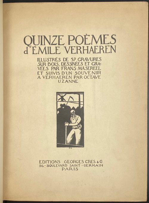 Quinze poèmes d'Emile Verhaeren. Illustrés de 57 gravures sur bois dessinées et gravées par Frans Masereel et suivis d'un 'Souvenir à Verhaeren' par Octave Uzanne. — Paris: Éditions Georges Crès, 1917. Authors: Emile Verhaeren (text), Frans Masereel (illustrations), Octave Uzanne (text). Publisher: Éditions Georges Crès. [Georges-Célestin Crès (1875 - 1935) was a French publisher and bookseller. Address: 116 boulevard Saint-Germain, Paris]. Printer: Sonor S.A. - Geneve, under the direction of Auguste Jordanis. The number of copies printed: 1555 of which 15 (1-15) on Japan paper, 190 (16-205) on Fabriano paper, and 1350 (206-1555) on English paper (1506-1555 not for trade). This copy № 1312. Pagination: [i] - front cover, [ii] - half-title, [iii] - title, [iv] - printrun justification, [v] - table of contents, [vi] - blank, [i-vii] viii-ciii, [civ] - printer statement, [cv] - back cover; one-side (recto) printing and pagination. Owner's contemporary red half-Morocco with marbled boards; spine with four raised bands, gilt lettering and design elements. Original printed paper wrappers preserved. Marbled endpapers. Trimmed unevenly.
 -
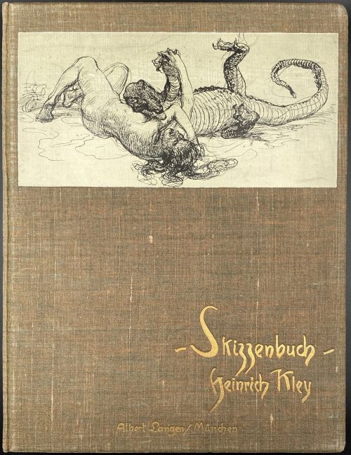
The edition consists of two albums:
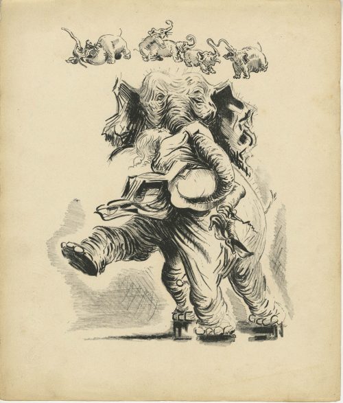
1) Skizzenbuch: Hundert Federzeichnungen von Heinrich Kley. — München: Albert Langen, [1909]. — pp.: [1-4] 5-63 [64], illustr. Printed by Hesse & Becker in Leipzig. Bound in the original brown moire covered boards, with a paste-down drawing on the front, gilt cover titles, original patterned endpapers.
2) Skizzenbuch II. Hundert Federzeichnungen von Heinrich Kley. — München: Albert Langen, [1910]. — pp.: [1-4] 5-64, illustr. Printed by Hesse & Becker in Leipzig; paper by Bohnenberger & Cie.; binding by E. A. Enders, Leipzig. Bound in the original bluish-gray moire covered boards, with a paste-down drawing on the front, gilt cover titles, original patterned endpapers.
The number of printed copies unknown. Reproduction of ink drawings by Heinrich Kley, 1st edition.
Dimensions of each album: 32 x 24.5 cm; Quarto. Heinrich Kley (April 15, 1863 in Karlsruhe – 1945? in Munich) was a German illustrator, editorial illustrator and painter. -
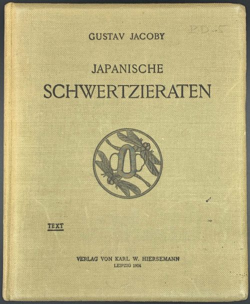
Book size: 25.5 x 21 cm. Hardbound: original olive cloth, lettering and elements on FC and lettering on Sp.
Ex Libris Dr. H. Smidt, with the motto: "Sapienti sat" and a naked bold man at the seashore, holding a fruit behind his back.
Full title: Japanische Schwertzieraten. Beschreibung einer kunstgeschichtlich geordneten Sammlung, mit Charakteristiken der Künstler und Schulen von Gustav Jacoby. Hierzu siebenunddreissig Tafeln in Heliogravüre. [The second volume, which conteined 'heliogravures' is missing and had not be found elsewhere].
-
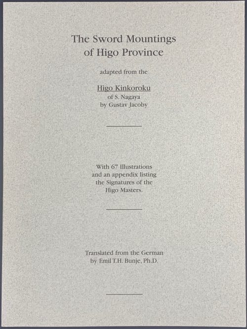
The sword mountings of Higo Province adapted from the Higo Kinkoroku of S. Nagaya by Gustav Jacoby, with 67 illustrations and an appendix listing the signatures of the Higo masters. Translated from the German by Emil T. H. Bunje, PhD.
Book size: 24.5 x 18.4 cm/
Softbound, original grey paper wrappers with black lettering.
Higo Kinkoroku, or Register of Metalworkers of Higo Province, published in 1902 in Tokyo by the Japanese Colonel Nagaya Shigena with a preface by viscount Nagaoka Moriyoshi, scion of the Hoshikawa family, Daimyo of Kumamoto in Higo Province.
Translated from the orignial: Die schwertzieraten der provinz Higo. Bearbeitet nach dem japanischen werke Higo Kinkoroku des S. Nagaya, von Gustav Jacoby. Mit 67 Abbildungen und einem Anhang: Die bezeichnungen der Higo-meister. 5. beiheft zum Jahrbuch der hamburgischen wissenschaftlichen anstalten. XXII. 1904. Hamburg, Lucas Gräfe & Sillem, 1905. - 62 p. illus., pl. [LIB-1947.2019] -
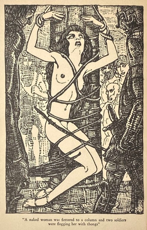
Album of 20 hand-coloured lithographs with a title page and a 'justification du tirage' page in an original snakeskin-clothed cardboard binder. Drawn on stone by Anonymous, attributed to Santippa. The theme of these pictures can be described as erotic humour.
Edition: 200 copies printed in Bruxelles, c. 1938; this copy without a number.
Watermarked wove paper: Word "Marais" and a flower.
Dimensions: 24.3 x 29.3 cm According to J.-P. Dutel, the author of these images is Georges Hoffmann under the pseudonym Santippa. Honesterotica provides a different name: Gaston Hoffmann [Santippa] (French, 1883 – 1977), which seems adequate. Catalogue raisonné: Dutel (1920-70): 2496. -
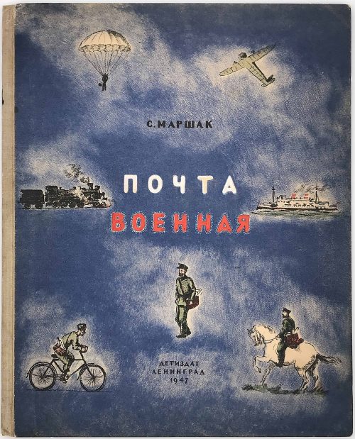 С. Маршак. Почта военная. Детиздат : Ленинград, 1947.
Hard-bound Quatro (304 x 246 mm) printed in lithography with hand-colored details on cover.
The name of artist hardly legible on a stamp on frontispiece: скворцов.
The text repeats itself on multiple pages. Most probably the book is a pilot run, never went to mass printing and distribution. -
Unbound Quatro (246 x 321 mm) album in softcover with inscription:
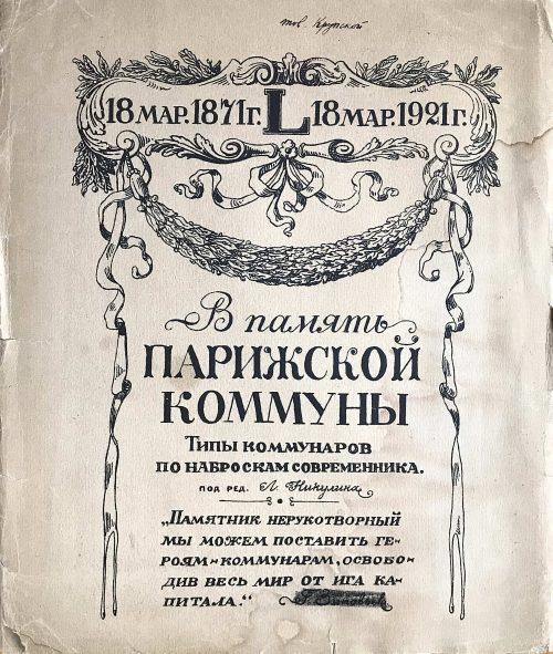
В память Парижской коммуны. 18 мар. 1871 - 18 мар. 1921. L. Типы комунаров по наброскам современника. Под ред. Л. Никулина. "Памятник нерукотворный мы можем поставить героям-коммунарам, освободив весь мир от ига капитала." Г. Зиновьев.
Надписано от руки: Экз. тов. Крупской.
17 отпечатков с измененных литографий Берталя (без ссылки). Издание Политотдела Балтийского Флота и Петроградского губ. Отд. народн. Образования. Петроград.
Translation from Russian: In memory of the Paris Commune. March 18, 1871 - March 18, 1921. (L*). Types of the communards from the sketches of contemporaries. Edited by L. Nikulin. "Not-made-by-hand monument we will erect to the heroic Communards by freeing the world from the yoke of capital". G. Zinoviev. Handwritten inscription in black ink: Copy of (or for) comrade Krupskaya. The album consists of 17 unnumbered prints with captions in Russian. The prints are altered images made by Bertall, with no reference to the artist. The album is published by Political division of Baltic Navy and Petrograd district of public education. Printed in Petrograd (Saint Petersburg). *Roman letter L - Fifty (Fifty year anniversary) -
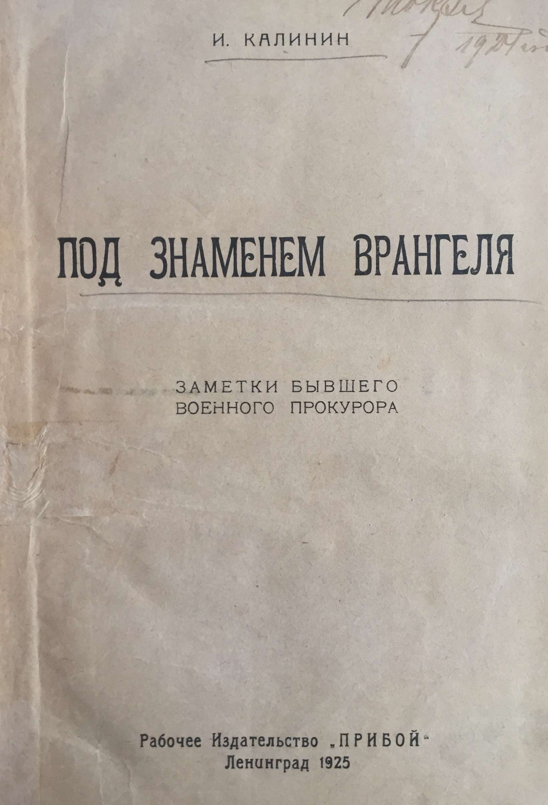
И. М. Калинин. Под знаменем Врангеля. Заметки бывшего военного прокурора. - Л.: Рабочее из-во "Прибой", 1925. - 273 с.
Тираж 7125 экз.
Об авторе: «К моменту февральской революции я занимал должность помощника военного прокурора Кавказского военно-окружного суда... Я не был политиком, но не переносил Союза русского народа. Падение монархии приветствовал. В 1917 году в г. Эрзеруме, занимая довольно приличный пост, работал в самом тесном содружестве с Советом солдатских и рабочих депутатов. Меньшевики, эсэры, большевики постоянно навещали меня, зная, что я хотя и внепартийный, но искренно предан делу революции». В 1918-м Калинину удалось перебраться в занятый Добровольческой армией Екатеринодар, откуда в конце сентября 1918 г. он выехал на Дон. «Здесь тоже мобилизовали всех офицеров. Мне ничего другого не оставалось, как поступить на службу в только что сорганизованный Донской военно-окружной суд». Будучи профессиональным военным юристом Калинин в дальнейшем состоял прокурором при временном Донском военном суде.
По возвращении из эмиграции полковник Калинин, как и многие другие репатрианты, пытался избавиться от клейма «бывшего белогвардейца». 5 октября 1937 г. И. М. Калинин, в то время преподаватель рабочего факультета Ленинградского автодорожного института, был арестован по решению Комиссии НКВД и Прокуратуры СССР . 2 ноября 1937 г. он был приговорен по ст. 58-6-8-11 УК РСФСР к высшей мере наказания и расстрелян в Ленинграде 10 ноября 1937 года.
-
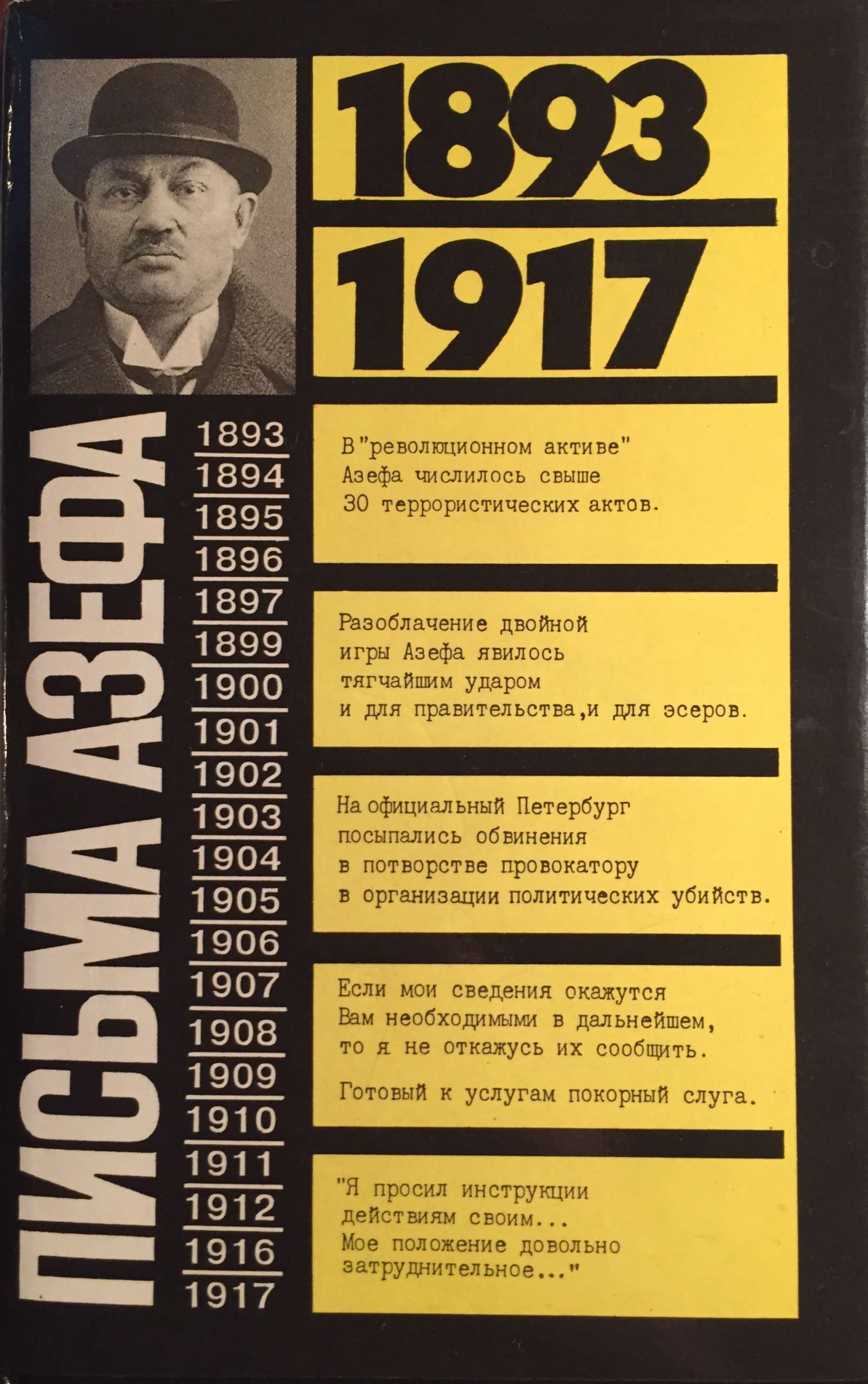 Hardcover volume 20.7 x 13.4 cm, bound in black buckram with blind and grey lettering to front and grey lettering to spine, in a pictorial dust jacket, yellow pictorial endpapers, pp.: [2] 3-287 [1], collated in 16mo, 1-916, 144 leaves, 288 pages. Title-page: ПИСЬМА АЗЕФА | — | 1893 – 1917 | — | [blank] | {publisher’s device} | МОСКВА | «ТЕРРА» — «TERRA» | 1994 || Print run: 10,000 copies. Азеф, Евгений Филиппович [Евно Фишелевич], [Azef, Yevno] (Jewish-Russian-German, 1869 – 1918) Павлов, Дмитрий Борисович (Russian, b. 1954) Перегудова, Зинаида Ивановна (Russian, b. 1934)
ISBN: 5-85255-395-6. Azef Letters (Rus).
-
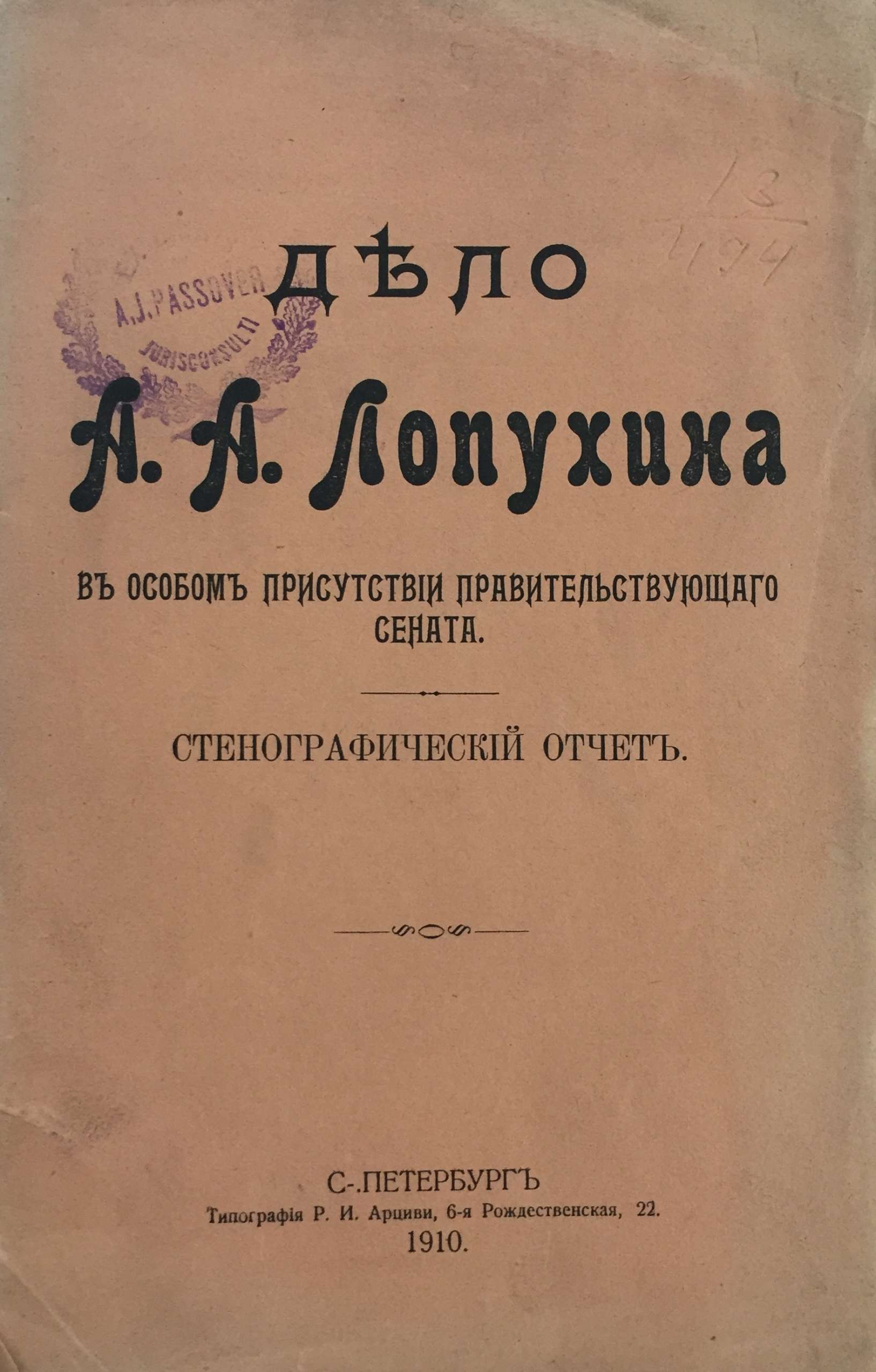
Дело А. А. Лопухина в особом присутствии правительствующего сената. Стенографический отчет. С.-Петербург, типография Р. И. Арциви, 1910. С.116. Из библиотеки А. Я. Пассовера.
Суд проходил в марте 1909 года. Бывший директор департамента полиции А. А. Лопухин обвиняется в том, что выдал провокатора Е. Ф. Азефа партии социалистов-революционеров. А. Я. Пассовер защищал Лопухина на этом суде. Суд присудил Лопухина (1 мая 1909 г.) к 5 годам каторжных работ с лишением всех прав состояния. Решением Общего собрания кассационных департаментов правительствующего сената, в виду смягчающих вину обстоятельств, каторга была заменена ссылкой на поселение.
