-
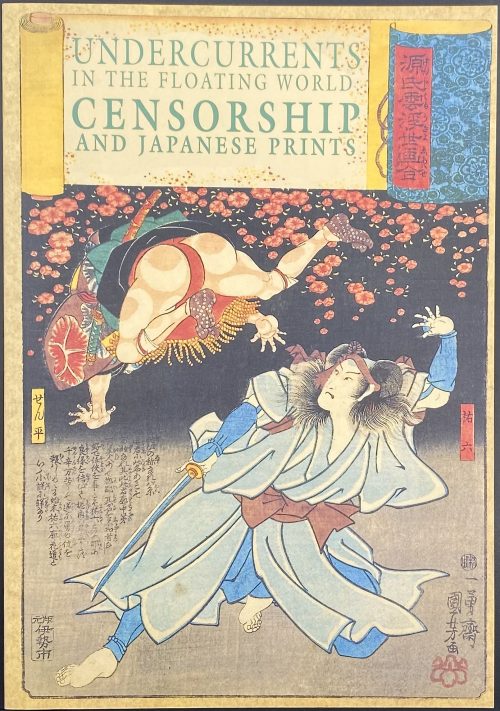 Paperback, 27.5 x 19 cm, pictorial wrappers, lettering to front wrapper and spine, pp.: [i-iv] v-viii, 1-104, ils.: 50 figures; catalogue, notes, and bibliography. Title-page: UNDERCURRENTS | IN THE FLOATING WORLD: | CENSORSHIP | AND JAPANESE PRINTS | Sarah E. Thompson | H. D. Harootunian | {kiwame seal} | THE ASIA SOCIETY GALLERIES | NEW YORK || Exhibition in NY: October 9, 1991 – January 5, 1992. Authors: Sarah E. Thompson (American, b. 1951) Harry D. Harootunian (Armenian-American, b. 1929)
 -
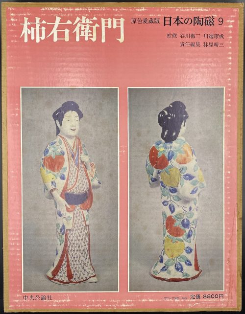 Hardcover volume, 35.2 x 27 cm, bound in grey cloth, blind stamped characters to front, brown characters to spine, in a glassine dust jacket, in a double slipcase, the outer case pictorial paper over cardboard, 36 x 28 cm, pp.: [4] [1] 2-104 (plates with photographs of 206 items), [2] 107-138 [4]. Kakiemon [柿右衛門] – book title. 日本の陶磁 – Japanese ceramics, series title. Contributors: Yasunari Kawabata [川端 康成] (Japanese, 1924 – 1972) – author. Tetsuzo Tanikawa [谷川 徹三] (Japanese, 1895 – 1989) – author. Seizo Hayashiya [林屋晴三] (Japanese, 1928 – 2017) – editor. Chūōkōron-sha [中央公論社] – publisher.
 -
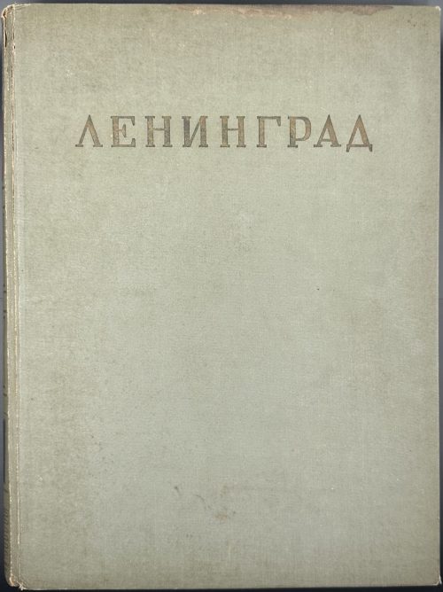 Hardcover volume 36 x 27.5 cm, bound in grey cloth, gilt lettering ЛЕНИНГРАД to front board, red and black labels with gilt lettering, gilt compartments to flat spine, red endpapers with black and white border, pp.: [1-6] 7-402 [2], total 202 leaves with numerous b/w illustrations, plus frontispiece with pasted in b/w plate. Bookplate of Feodor Rojankovsky to front pastedown, ms inscription: “Дорогой Федя, дарю Вам на Ваше рождение эту книгу” signed “Ф. Рожанковский” Half-title (red on tan): ИЗДАНО В ЛЕНИНГРАДЕ | В ДНИ ВЕЛИКОЙ | ОТЕЧЕСТВЕННОЙ ВОЙНЫ || Half-title verso (red on tan): ЛЕНИНГРАДСКИЙ ГОРОДСКОЙ СОВЕТ | ДЕПУТАТОВ ТРУДЯЩИХСЯ | ИСПОЛНИТЕЛЬНЫЙ КОМИТЕТ | {vignette «plan»} | АРХИТЕКТУРНО-ПЛАНИРОВОЧНОЕ | УПРАВЛЕНИЕ | 1943 || Title-page (red on tan) ЛЕНИНГРАД | {vignette «Admiralty»} | ГОСУДАРСТВЕННОЕ ИЗДАТЕЛЬСТВО | «ИСКУССТВО» | ЛЕНИНГРАД – 1943 – МОСКВА || Blue ink stamp to bottom right: Printed in Soviet Union. Title-page verso: РЕДАКЦИОННАЯ | КОЛЛЕГИЯ | Ответственный редактор | БАРАНОВ Н. В. | КАМЕНСКИЙ В. А. | МОРОЗОВ М. В. | РУБАНЕНКО Б. Р. | ФОМИН И. И. | Художник издания | КАМЕНСКИЙ В. А. | Технический редактор | АНИСИМОВ М. Н. Contents (red on tan): АРХИТЕКТУРНО-ПЛАНИРОВОЧНЫЙ | ОБЗОР РАЗВИТИЯ ГОРОДА | РАЗВИТИЕ ГОРОДА В XVIII ВЕКЕ | С. М. ЗЕМЦОВ | РАЗВИТИЕ ГОРОДА В XIX ВЕКЕ | А. Г. ЯЦЕВИЧ | РАЗВИТИЕ ГОРОДА С 1917 ПО 1935 г. | Б. Р. РУБАНЕНКО | ГЕНЕРАЛЬНЫЙ ПЛАН РАЗВИТИЯ | ЛЕНИНГРАДА | Н. В. БАРАНОВ | ИЛЛЮСТРАЦИИ | ГОРОДА || verso: {vignette} | ГЕНЕРАЛЬНЫЙ ПЛАН ГОРОДА ЛЕНИНГРАДА. || Print run: 2,500 copies. Provenance: Feodor Rojankovsky [Rojan, Фёдор Степанович Рожанковский] (Russian-American, 1891 – 1970). Contributors: Каменский, Валентин Александрович (Russian, 1907 – 1975) Земцов, Станислав [Исай] Маркович (1906 – ?) Яцевич, Андрей Григорьевич (Russian, 1887 – 1942) Рубаненко, Борис Рафаилович (Russian-Jewish, 1910 – 1985) Баранов, Николай Варфоломеевич (Russian, 1909 – 1989) Фомин, Игорь Иванович (Russian, 1904 – 1989)
 -
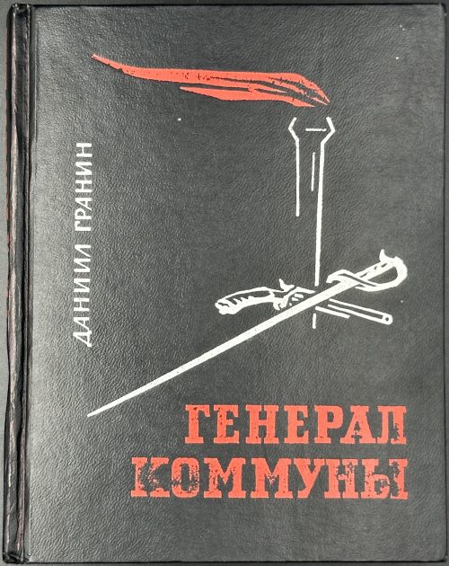 Hardcover, 17 x 13.4 cm, black buckram with red and silver vignette, lettering to front and spine, price and publisher's name embossed to back, pictorial endpapers with white lettering to red strips; pp.: [1-4] 5-268 [4], ils., collation: 16mo: 116 28 3-616 7-88 9-1016, total 136 leaves plus 3 photo plates after p. 32, 48, and 208. Frontispiece and in-text woodcuts after И. И. Старосельский. Title-page (red and black): ДАНИИЛ ГРАНИН | ГЕНЕРАЛ КОММУНЫ | (ЯРОСЛАВ ДОМБРОВСКИЙ) | — | Издательство | «СОВЕТСКАЯ РОССИЯ» | Москва — 1965 || Print run: 50,000 copies. Contributors: Даниил Александрович Гранин (Russian, 1919 – 2017) – author. Илья Израилевич Старосельский (Russian-Jewish, 1918 – 1968) – artist. Jaroslaw Dombrowski [Jarosław Dąbrowski] (Polish-French, 1836 – 1871) – character.
 -
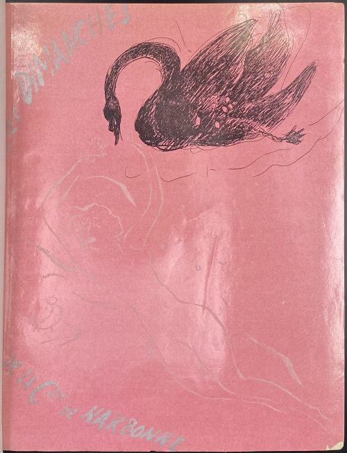 Description: Bound in brown ¾ morocco over marbled boards by R. et R. Mativet (ink stamp to ffep verso), collated 4to, 26.4 x 20.7 cm, raised bands, gilt arabesque and lettering to spine, original glossy pink pictorial wrappers preserved, marbled endpapers, bookplate to front pastedown “ML”, to front fep “EX-LIBRIS | Jacques | Crépineau”; A.L.s. of Marcel Vertès pasted to one of the feps: "Biblis [6] rue Jacques Callot. Cher Monsieur Le Bodo, Voudriez-vous avoir l’amabilité et de céder un exemplaire de « Dimanche » à M. Risler à un prix très réduit? Merci d’avance. Bien à vous, Vertès". Jean Le Bodo – abord gérant de la Librairie Biblis (20, rue du Vieux-Colombier, Paris 6e), et en 1946, libraire au Livre de France, Paris 16e; Risler – probablement Jean-François Risler (1910-1952), fils d’un pianiste Joseph-Édouard Risler (1873 – 1929). Title-page: DAISY FELLOWES | Les | Dimanches | de la | Csse de Narbonne | ILLUSTRATIONS | DE | VERTÈS | ÉDITIONS DE France | 20, AVENUE RAPP, PARIS || Collation: 1 blank, front wrapper, π4 (2 blanks with A.L.s. pasted to the 2nd, h.t., t.p.), 1-244 χ4 (table, colophon, 2 blanks) back wrapper, 1 blank; total 104 leaves within the wrappers, numerous in-text and 7 full-page prints after drawings by Marcel Vertès, within collation. Pagination: [8] [1-2] 3-191 [192] [8], total 208 pages, ils. Limitation: printed on June 25, 1935 by Coulouma (Argenteuil) under the direction of H. Barthélemy, 20 copies (№1-20) on Japon blanc super-nacré + two suites, 80 copies on Japon a la forme (№21-100) + one suite, 900 (№101-1000) on Vélin blanc. This is copy № 598. Catalogue raisonné: Vokaer (Vertès) № 34, p. 15. Provenance: Jacques Crepineau (French, 1932 – 2017). Contributors: Daisy Fellowes [Marguerite Séverine Philippine Decazes de Glücksberg] (French, 1890 – 1962) – author Marcel Vertès [Marcell Vértes] (Jewish-Hungarian-French, 1895 – 1961) – artist.
 -
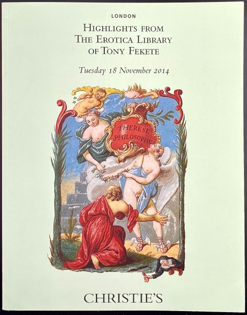 Front cover: LONDON | Highlights from | the Erotica Library | of Tony Fekete | Tuesday 18 November 2014 | {vignette in colour} | CHRISTIE'S || Pagination: [2] 3-134 [2], total 136 pages, 221 lot. Binding: 16.7 x 21 cm, publisher’s pictorial wrappers, red spine with white lettering.
 -
Поль Дельтуф. Жизнь и творения Макиавелли. // "Записки для чтения, издаваемые К. Трубниковым", 1867, NN 8-9, с. 73-77. Ежемесячное приложение к Биржевым ведомостям. Август и Сентябрь. Санктпетербург. Тип. Товарищества "Общественная польза".
"Essai sur les oeuvres et la doctrine de Machiavel, avec la traduction littérale du Prince et de quelques fragments historiques et littéraires", par Paul Deltuf, Paris, 1867.
-
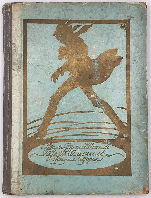
Шамиссо, Адальбертъ фонъ. Петеръ Шлемиль. Чудесная исторiя. Пер. П.Потемкина. Рис., виньетки и перепет Эмиля Преторiуса по 1-му нѣм. изд. 1814 г. — СПб.: Книгоиздательство "Пантеонъ", 1910. — 107 стр. Отпечатано в типографии акц. о-ва типографск. дела в СПБ (Герольд), 7 рота, 26.
Cardboard binding, 8vo, 20 x 15 cm. Russian translation of Adelbert von Chamisso book Peter Schlemihl, from the German by Peter Potemkine. With illustrations from 1814 original German first edition by Emil Preetorius. [SV: the latest statement seems strange as Emil Preetorius lived from 1883 to 1973]. -
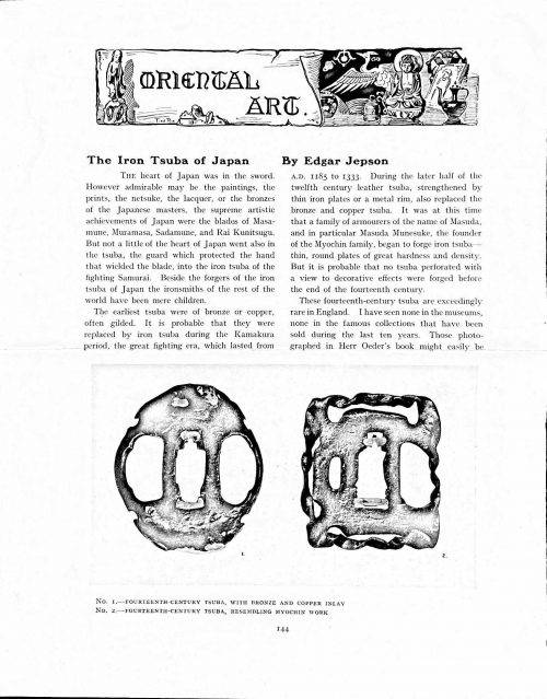 Magazine article by Edgar Jepson: The Iron Tsuba of Japan (Section: Oriental Art), published in volume Vol. 70 (September–December) of The Connoisseur: An Illustrated Magazine for Collectors, Vol. 70 (September–December); pp. 143-152 / C. Reginald Grundy [ed.] — London: Published by the Proprietor, W. CLAUSE JOHNSON, at the Editorial and Advertisement Offices of The Connoisseur, 1924. Owner's half black morocco, gilt lettering to spine, blue cloth boards. Two volumes bound together without original covers. Size 28.5 x 22 cm. Vol. 1: The Connoisseur | An Illustrated Magazine | For Collectors | Edited by C. Reginald Grundy | Vol. LXIX. | (MAY—AUGUST, 1924) | LONDON | Published by the Proprietor, W. CLAUSE JOHNSON, at the | Editorial and Advertisement Offices of The Connoisseur, | at 1, Duke Street, St. James's, S.W. 1 | 1924 || Pp.: [i-ii] iii-xviii [xix] [1, 2 - plate] 3-249 [250]. Vol. 2: The Connoisseur | An Illustrated Magazine | For Collectors | Edited by C. Reginald Grundy | Vol. LXX. | (SEPTEMBER—DECEMBER, 1924) | LONDON | Published by the Proprietor, W. CLAUSE JOHNSON, at the | Editorial and Advertisement Offices of The Connoisseur, | at 1, Duke Street, St. James's, S.W. 1 | 1924 || Pp.: [i-ii] iii-xxii [2 blanks] [1, 2 - plate] 3-261 [262]. The Iron Tsuba of Japan by Edgar Jepson The heart of Japan was in the sword. However admirable may be the paintings, the prints, the netsuke, the lacquer, or the bronzes of the Japanese masters, the supreme artistic achievements of Japan were the blades of Masamune, Muramasa, Sadamune, and Rai Kunitsugu. But not a little of the heart of Japan went also in the tsuba, the guard which protected the hand that wielded the blade, into the iron tsuba of the fighting Samurai. Beside the forgers of the iron tsuba of Japan the ironsmiths of the rest of the world have been mere children. The earliest tsuba were of bronze or copper, often gilded. It is probable that they were replaced by iron tsuba during the Kamakura period, the great fighting era, which lasted from A.D. 1185 to 1333. During the later half of the twelfth century leather tsuba, strengthened by thin iron plates or a metal rim, also replaced the bronze and copper tsuba. It was at this time that a family of armourers of the name of Masuda, and in particular Masuda Munesuke, the founder of the Myochin family, began to forge iron tsuba — thin, round plates of great hardness and density. But it is probable that no tsuba perforated with a view to decorative effects were forged before the end of the fourteenth century. These fourteenth-century tsuba are exceedingly rare in England. I have seen none in the museums, none in the famous collections that have been sold during the last ten years. Those photographed in Herr Oeder's book might easily be the fifteenth century. No. 1 is a curious cup-shape tsuba decorated with a bronze and copper inlay. No. 2, with its edges curiously twisted in the forging, looks like Myochin work. But it is not of the Myochin iron. The Myochin family produced some of the greatest ironsmiths of Japan. Armourers first of all, tsubasmiths, forgers of sake-kettles, articulated reptiles, crustacea, and insects — everything that can be done with iron they did; they pushed their medium to its limit. They were forging iron tsuba in 1160, and they were still forging them in 1860. And it was their own iron, or rather their own steel. They discovered the secret of it early, and they kept that secret in the family for all those hundreds of years. There is no mistaking a Myochin tsuba: balance it on your finger and tap it with a piece of metal, always it gives forth a clear bell-like ring that you get from the work of no other ironsmith, Japanese or European. Always the Myochin tsuba is before everything a protection to the hand of the swordsman; to that everything is, as it should be, subordinated. No. 3 is a Myochin tsuba of the fifteenth century, and probably of the early fifteenth century. No. 4, by Myochin Munetaka, perforated with a grotesque figure, is an example of that twisting and twisting of the iron in the forging till it forms a pattern like the grain of wood. The Myochin smiths invented these wood-grain tsuba, and no other smiths equalled them in their forging. In the sixteenth century, the fighting tsuba was probably at its best. It was a century of great tsubasmiths. Then the first Nobuiye, whose tsuba fetched £100 apiece, circa 1800, in Japan, and the first Kaneiye flourished. No. 5 is a tsuba forged by a great smith, Iyesada of Sotome, in the manner of Nobuiye I, decorated with the karakusa tendrils that Nobuiye delighted in, with lightning and clouds. No. 6 is a guard of Sanada Tembo, the chief smith of the Tembo family, stamped, punning fashion, with the character Tembo. Akin to the Tembo tsuba were those of the Kiami and Hoan smiths. Then also the Heianjo smiths and the Owari smiths, especially those of Nagoya and the Yamakichi family, forged their strongest tsuba. Those of the Yamakichi were tested after the forging by being pounded in iron mortars — at least, so the legend runs. But they were a sternly utilitarian family, and I have never seen a Yamakichi tsuba of any beauty. In the later half of the fifteenth century arose the fashion of decorating tsuba with an inlay, zogan, of bronze. The Heianjo tsuba, forged at Kyoto in the latter half of the fifteenth and the beginning of the sixteenth century, were often thus inlaid. The earliest of them were called "Onin", of which No. 7 is an example. In addition to the bronze inlay around the edge, it is inlaid with a representation, some say, of snow; others say, of the duckweed on a pond. No. 8 is probably a Heianjo tsuba, but I am not quite sure about it. The inlaid acacia branches might be very early Shoami work. But to judge by the iron, it is a fifteenth-century tsuba; and the authorities place the beginning of the Shoami school not later than early in the sixteenth century. No. 10 is an example of the Fushimi-zogan, a flat inlay of a light-coloured bronze. These tsuba took their name from the fact that they were first forged at Fushimi, in Yamashiro, in the sixteenth century. It is of the type known as Mon-zukashi, perforated with crests (mon) à jour. The Yoshiro-zogan tsuba were also first forged at Fushimi by Yoshiro Naomasa. They were distinguished from the Fushimi-zogan by the fact that their inlay was generally a little raised-not always-for the inlay of No. 9, a tsuba forged by a later nineteenth-century Yoshiro, is quite flat. It is an interesting tsuba, for, with its decoration grown florid and excessive, it marks the intermediate stage between the simple and delightful designs of the genuine fighting tsuba and the elaborate pictures in gold and silver on the tsuba of the eighteenth-century smiths of Awa and Kyoto, which have become mere ornaments of the goldsmith. The Gomoku-zogan (No. 11) tsuba were probably first forged earlier than the Fushimi and Yoshiro-zogan tsuba. This inlay, in slight relief, is a representation in a light-coloured bronze and copper of twigs caught in the eddies of streams. The seventeenth century and early eighteenth century were the great periods of perforated tsuba. The designs, and they are often admirable, are for the most part in plain fretwork; but they are also chased. No. 12, a crane under an acacia, is a tsuba of a Higo smith, great forgers of fighting tsuba during this period. These smiths also excelled in nunome zogan, a very thin gold and silver inlay, with which they further decorated their perforated guards. The smiths of the Umetada and Shoami families also forged iron tsuba during this period; but their designs, though sometimes pleasing enough, are rarely fine. The best work of Myoju Umetada is in sentoku, not iron. The Choshu smiths, coming later, surpass the perforated guards of both the Umetada and Shoami smiths in beauty of design. No. 13, a lotus in the round, not only fretwork, but also engraved, is a good example of the admirable balance they so often attained in their designs. It is a sufficiently realistic lotus, but yet of a delightful simplicity. In considerable contrast is No. 14, the dragon by Soheishi Soten — one of the only two authentic tsuba of his forging known — the first forger of hikone-bori tsuba, which were in extraordinary favour in Japan during the eighteenth century, and illustrated every important event in Japanese history. It is on the elaborate side, but fine, strong work, and an excellent guard to the hand, for the lighter and more open part, which gives the design its admirable balance, is on the inside, and not exposed to the full swing of an opponent's blade. A few years ago there was a tendency to decry the Namban tsuba as having sprung too directly from foreign sources. But though the original suggestion may have been Chinese, or, as some say, Portuguese, the Japanese made it entirely their own, as characteristically Japanese as anything can well be, but, it must be admitted, of a decadent period. The school took its rise at the beginning of the seventeenth century, and the early tsuba were forged of a specially hard iron, the Wootz, imported from Southern India. No. 15, the signs of the Zodiac, is an excellent tsuba from the fighting point of view. Both it and No. 16 are of quite charming, if elaborate, design, and both of them, with their delicate scroll-work, so astonishingly undercut, are the very last word in the work of the ironsmith-veritable iron lace. To return to the simpler perforated tsuba, the smiths of Akasaka, a suburb of Tokyo, produced probably the most charming designs. Their style derives considerably from the Higo smiths, and their earlier fighting tsuba are very like the Higo tsuba. But always their work was just a little lighter than that of the Higo smiths, and in the end they moved right away from them and became the forgers of very light guards indeed. No. 17, is a representation of the Hiyokudori, the fabulous double bird, in which were reincarnated the souls of the two lovers, Gompachi and Komurasaki; and No. 18, “the tsuba of a hundred ducks "— there are about forty — are characteristic designs of the school. In the work of the Akasaka smiths the balance, which makes the design of a good tsuba so admirable and delightful, attains its height. This admirable balance seems often to be obtained by a deliberate sacrifice of symmetry. About nine hundred and ninety-nine European ironsmiths out of a thousand would have made the right and left sides of the Hiyoku-dori line by line, and perforation by perforation, exactly alike; he would have cut out exactly as many ducks on the one side of “the tsuba of a hundred ducks” as on the other, and made each duck on the right side correspond exactly in position and attitude with a duck on the left side. By variations the tsubasmith attained a finer balance, almost a higher symmetry. No. 19, often called by collectors the "rose-window" tsuba, but really a stylised chrysanthemum, is a favourite design of the Akasaka smiths, but Hizen work and inlaid in the Hizen manner with gold nunome. No. 20 is a Satsuma tsuba of the middle period. The Satsuma smiths of the nineteenth century produced probably the most ornate of all the iron guards, for the most part calibashes and beans with their leaves and tendrils realistic in the extreme, but of charming design. Few crafts have been carried further than that of the tsubasmith; few crafts working in a difficult medium have handled more subjects with greater feeling for beauty or greater liveliness of fancy. It is interesting to note again and again how school influences school, and smith influences smith. But, as in all the applied arts, the finest tsuba were forged by men who never lost sight of the purpose of a tsuba, that it is before everything a protection to the hand, and never subjected that purpose to a passion for virtuosity. Illustrations: No 1. FOURTEENTH-CENTURY TSUBA, WITH BRONZE AND COPPER INLAY No. 2. FOURTEENTH-CENTURY TSUBA, RESEMBLING MYOCHIN WORK No. 3. MYOCHIN TSUBA, FIFTEENTH CENTURY No. 4. MYOCHIN TSUBA, NINETEENTH CENTURY No. 5. SIXTEENTH-CENTURY TSUBA No. 6. SIXTEENTH-CENTURY TSUBA BY IYESADA OF SOTOME BY SANADA TEMBO No. 7. ONIN TSUBA No. 8. HEIANJO (?) TSUBA No. 9. YOSHIRO TSUBA, NINETEENTH CENTURY No. 10. FUSHIMI-ZOGAN, NINETEENTH CENTURY No. 11.- GOMOKU-ZOGAN, SIXTEENTH CENTURY No. 12. HIGO TSUBA, SEVENTEENTH CENTURY No. 13. CHOSHU TSUBA, SEVENTEENTH CENTURY No. 14. SOTEN TSUBA, SEVENTEENTH CENTURY No. 15. NAMBAN TSUBA, EIGHTEENTH CENTURY No. 16. NAMBAN TSUBA, NINETEENTH CENTURY Nos. 17. AND 18. AKASAKA TSUBA, EIGHTEENTH CENTURY No. 19. HIZEN TSUBA, EIGHTEENTH CENTURY No. 20. SATSUMA TSUBA, EIGHTEENTH CENTURY
 -
![Война мышей и лягушек. Батрахомиомахия / Пер. с древнегреческого, вводн. стат. и коммент. М.С.Альтмана. Иллюстр. А. И. Порет, переплет и обложка по ее же рисункам. С суперобложкой. — М.-Л.: Academia, 1936. — XV, [I], 21, [2] стр. (Античная литература под общей ред. Д. А. Горбова и В. О. Нилендера.](https://varshavskycollection.com/wp-content/uploads/2021/02/LIB-0985.2016-a-500x706.jpeg) Description: white paper hardcover, lettered to front, 25.8 x 18 cm, in pictorial dust jacket; pagination: [i-vi] vii-xv [xvi] [2] 3-21 [3], errata slip bound in; one folding plate bound in after p.8. Title-page: ВОЙНА | МЫШЕЙ И ЛЯГУШЕК | (БАТРАХОМИОМАХИЯ) | Перевод с древнегреческого, | вводная статья | и комментарии | М. С. АЛЬТМАНА | ACADEMIA | 1936 || Opposite title: АНТИЧНАЯ ЛИТЕРАТУРА | под общей редакцией | Д. А. ГОРБОВА И В. О. НИЛЕНДЕРА | БАТРАХОМИОМАХИЯ | ACADEMIA | Москва – Ленинград || Title verso: ΒΑΤΡΑΧΟΜΥΟΜΑΧΊΑ | Иллюстрация А. И. Порет | Переплет и суперобложка | по ее же рисункам || Print run: 10,300 copies. Catalogue raisonné: Крылов-Кичатова № 798, p. 274. Contributors: Альтман, Моисей Семёнович (Russian-Jewish, 1896—1986) – translator, author Порет, Алиса Ивановна (Russian, 1902 – 1984) – artist.
Description: white paper hardcover, lettered to front, 25.8 x 18 cm, in pictorial dust jacket; pagination: [i-vi] vii-xv [xvi] [2] 3-21 [3], errata slip bound in; one folding plate bound in after p.8. Title-page: ВОЙНА | МЫШЕЙ И ЛЯГУШЕК | (БАТРАХОМИОМАХИЯ) | Перевод с древнегреческого, | вводная статья | и комментарии | М. С. АЛЬТМАНА | ACADEMIA | 1936 || Opposite title: АНТИЧНАЯ ЛИТЕРАТУРА | под общей редакцией | Д. А. ГОРБОВА И В. О. НИЛЕНДЕРА | БАТРАХОМИОМАХИЯ | ACADEMIA | Москва – Ленинград || Title verso: ΒΑΤΡΑΧΟΜΥΟΜΑΧΊΑ | Иллюстрация А. И. Порет | Переплет и суперобложка | по ее же рисункам || Print run: 10,300 copies. Catalogue raisonné: Крылов-Кичатова № 798, p. 274. Contributors: Альтман, Моисей Семёнович (Russian-Jewish, 1896—1986) – translator, author Порет, Алиса Ивановна (Russian, 1902 – 1984) – artist. -
![Memoirs, Illustrating the History of Jacobinism, written in French by the Abbé Barruel, And Translated into English by the Hon. Robert Clifford, F. R. S. & A. S. / 2nd edition, revised and corrected. Printed for the Translator. — T. Burton. London, 1798. — Vol. 1-4. Vol. 1: Part I. The Antichristian Conspiracy: pp. (xvi) 401; Vol. 2: Part II. The Antimonarchical Conspiracy: pp.479; Vol. 3: Part III. The Antisocial Conspiracy: pp. (xviii) 414; Vol. 4: Part IV. Antisocial Conspiracy; Historical Part: pp. (xviii) 601 [50].](https://varshavskycollection.com/wp-content/uploads/2021/02/LIB-2195.2019-500x796.jpeg) Vol. 1. PART I. | THE ANTICHRISTIAN CONSPIRACY. || Title page: MEMOIRS, | Illustrating the | HISTORY of JACOBINISM, | Written in French by | THE ABBÉ BARRUEL, | And translated into English by | THE HON. ROBERT CLIFFORD, F. R. S. & A. S. | — | Princes and Nations shall disappear from the face of the Earth… and this | REVOLUTION shall be the WORK OF SECRET SOCIETIES. | Weishaupt’s Discourse for the Mysteries. | — | PART I. | THE ANTICHRISTIAN CONSPIRACY. | Second Edition, revised and corrected. | LONDON: | Printed for the Translator, | By T. Burton, No. 11 Gate-street, Lincoln’s-Inn Fields. | Sold by E. Booker, No. 56, New Bond-street. | 1798. || Pagination: [2] – t.p. / imprint, [2] – contents / contents, [i] ii-xvi, [1] 2-401 [402 blank]. Collation : 2 blank leaves, π2 b8, B-Z8 Aa-Bb8 Cc9, 2 blank leaves. Vol. 2: Same as Vol. 1, but: PART II. THE ANTIMONARCHICAL CONSPIRACY. || Pagination: [2] – t.p. / imprint, [2] – contents / contents, [1] 2-479 [480 blank]. Collation: 2 blank leaves, π2 B-Z8 Aa-Gg8 Hh3, 2 blank leaves. Vol. 3.: Same as Vol. 1, but: PART III. THE ANTISOCIAL CONSPIRACY. || Pagination: [i,ii] – t.p. / imprint, [iii] iv-xviii, [1] 2-414; one plate. Collation : 2 blank leaves, π1 A-Z8 Aa-Cc8 D7. Vol. 4: PART IV. ANTISOCIAL CONSPIRACY; HISTORICAL PART. || Pagination: [i,ii] – t.p. / imprint, iii-xviii, [1] 2-601 [602 blank], [1] 2-50; one folding plate. Collation: 2 blank leaves, a8 B-Z8 Aa-Pp8 Qq5, a-c8 d1. Binding: All four volumes uniformly bound in full polished calf, gilt roll-and-rule border, black and green labels with gilt lettering, gilt filigree to spine; marbled endpapers and all edges; printed on wove paper, with long “s”. The original French title: Mémoires pour servir à l'histoire du Jacobinisme par M. l'abbé Barruel. Author: Augustin Barruel (French, 1741 – 1820). Translator: The Honourable Robert Edward Clifford (British, 1767 – 1817). LIB-2195-1.2019; LIB-2195-2.2019; LIB-2195-3.2019; LIB-2195-4.2019.
Vol. 1. PART I. | THE ANTICHRISTIAN CONSPIRACY. || Title page: MEMOIRS, | Illustrating the | HISTORY of JACOBINISM, | Written in French by | THE ABBÉ BARRUEL, | And translated into English by | THE HON. ROBERT CLIFFORD, F. R. S. & A. S. | — | Princes and Nations shall disappear from the face of the Earth… and this | REVOLUTION shall be the WORK OF SECRET SOCIETIES. | Weishaupt’s Discourse for the Mysteries. | — | PART I. | THE ANTICHRISTIAN CONSPIRACY. | Second Edition, revised and corrected. | LONDON: | Printed for the Translator, | By T. Burton, No. 11 Gate-street, Lincoln’s-Inn Fields. | Sold by E. Booker, No. 56, New Bond-street. | 1798. || Pagination: [2] – t.p. / imprint, [2] – contents / contents, [i] ii-xvi, [1] 2-401 [402 blank]. Collation : 2 blank leaves, π2 b8, B-Z8 Aa-Bb8 Cc9, 2 blank leaves. Vol. 2: Same as Vol. 1, but: PART II. THE ANTIMONARCHICAL CONSPIRACY. || Pagination: [2] – t.p. / imprint, [2] – contents / contents, [1] 2-479 [480 blank]. Collation: 2 blank leaves, π2 B-Z8 Aa-Gg8 Hh3, 2 blank leaves. Vol. 3.: Same as Vol. 1, but: PART III. THE ANTISOCIAL CONSPIRACY. || Pagination: [i,ii] – t.p. / imprint, [iii] iv-xviii, [1] 2-414; one plate. Collation : 2 blank leaves, π1 A-Z8 Aa-Cc8 D7. Vol. 4: PART IV. ANTISOCIAL CONSPIRACY; HISTORICAL PART. || Pagination: [i,ii] – t.p. / imprint, iii-xviii, [1] 2-601 [602 blank], [1] 2-50; one folding plate. Collation: 2 blank leaves, a8 B-Z8 Aa-Pp8 Qq5, a-c8 d1. Binding: All four volumes uniformly bound in full polished calf, gilt roll-and-rule border, black and green labels with gilt lettering, gilt filigree to spine; marbled endpapers and all edges; printed on wove paper, with long “s”. The original French title: Mémoires pour servir à l'histoire du Jacobinisme par M. l'abbé Barruel. Author: Augustin Barruel (French, 1741 – 1820). Translator: The Honourable Robert Edward Clifford (British, 1767 – 1817). LIB-2195-1.2019; LIB-2195-2.2019; LIB-2195-3.2019; LIB-2195-4.2019. -
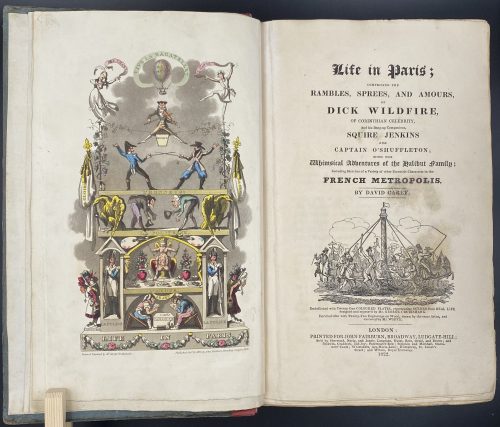
Title: Life in Paris ; | COMPRISING THE | RAMBLES, SPREES, AND AMOURS, | OF | DICK WILDFIRE, | OF CORINTHIAN CELEBRITY, | And his Bang-up Companions, SQUARE JENKINS | AND | CAPTAIN O’SHUFFLETON ; | WITH THE | Whimsical Adventures of the Halibut family ; | Including Sketches of a Variety of other Eccentric Characters in the | FRENCH METROPOLIS. | BY DAVID CAREY |[Vignette]| Embellished with Twenty-One COLOURED PLATES, representing SCENES from REAL LIFE, | designed and engraved by Mr. GEORGE CRUIKSHANK. | Enriched also with Twenty-Two Engravings on Wood, drawn by the same Artist, and | executed by Mr. WHITE. | LONDON : | PRINTED FOR JOHN FAIRBURN, BROADWAY, LUDGATE HILL; | Sold by Sherwood, Neely, and Jones ; Langman, Hurst, Rees, Orme, and Brown ; and | Baldwin, Craddoc, and Joy ; Paternoster-Row ; Simpkin and Marshall, Statio- | ners’ Court ; Whittakers Ave-Maria-Lane ; Humphrey, St. James’s | Street ; and Wilson, Royal Exchange. | 1822. ||
Edition: 1st edition in book form, 1st issue; large-paper copy bound from the parts in original blue paper boards, "most scarce" (Cohn).
Pagination: ffl, [i, ii] – h.t. ‘LIFE IN PARIS’ / ‘MARCHANT, Printer, Ingram-Court, London’, [2] – blank / Frontispiece (Ville la Bagatelle!!) hand-coloured, [iii, iv] – t.p. with vignette / blank, [v] vi-xxiv, [1] 2-489 [490 blank], [2] – 'TO THE BINDER' and 'Marchant, Printer, Ingram-Court, Fenchurch Street' "considered indispensable to a complete copy" (Cohn) / blank, bfl watermarked 1800; 21 hand-coloured aquatints and 22 wood-engraved text vignettes; cancelled leaves 143/4 and 335/6; pinholes from printing visible in most gatherings.
Collation: 4to; [a]-c4, B-Z4 Aa-Zz4 3A-3Q4 3R1 + [Ω]1
Binding: Original boards sometime re-backed with red paper, binder's end leaf watermarked 1800; red hard-grained morocco clamshell box.
Catalogue raisonné: Albert M. Cohn, 1924: № 109 p. 37/8; Abbey, J. R. (Life in England), 112; Tooley (Some English Books with Coloured Plates) 129; Hardie (English coloured books) 199.
Description of Shapero Rare Books, London: Of the copies that have come to auction since 1975 only one has been a large-paper copy in original boards. "The pictures are extremely spirited and true and are all the more wonderful in view of the fact that the artist’s continental experiences were limited to one day spent in Boulogne." (Hardie). In 1821, the journalist Pierce Egan published Life in London, an immediate success illustrated by the Cruikshank brothers, George and Robert. In order to capitalise on this success, another journalist, David Carey, decided to publish his own Life in Paris in monthly instalments (just like Life in London) and with a very similar frontispiece to the one that appears in Egan’s work; Life in Paris, however, was illustrated only by George Cruikshank. One of the earliest and most notable examples of the work of George Cruikshank, with fine, clean plates. -
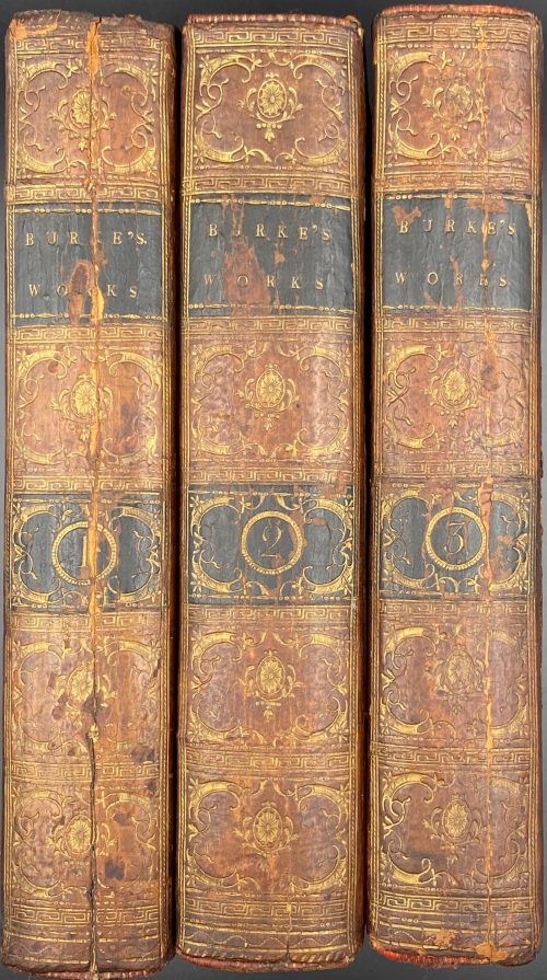 Vol. 1: THE | WORKS | OF THE | RIGHT HONOURABLE | EDMUND BURKE, | COLLECTED IN THREE VOLUMES. | VOL. I. | DUBLIN: | PRINTED FOR R. CROSS, W. WILSON, P. WO-| GAN, L. WHITE, P. BYRNE, A. GRUEBER, J. MOORE, | W. JONES, W. M’KENZIE, H. WATTS, J. RICE, | AND G. FOLINGSBY. | 1792.|| Pagination: 2 blank leaves, [2] - t.p. /blank, [2] - contents / blank, [2] - f.t. / blank, [3] 4-61 [62] - blank, [2] - f.t / blank, [4] contents, 65-580, 1 blank leaf. Collation: 8vo; π2 B-Z8 Aa-Oo8 Pp4. Vol. 2: THE | WORKS | OF THE | RIGHT HONOURABLE | EDMUND BURKE, | COLLECTED IN THREE VOLUMES. | VOL. II. | DUBLIN: | Printed by William Porter, | For R. Cross, W. Wilson, P. Wogan, L. White, P. Byrne, W. M’kenzie, J. Moore, A. Grueber, W. Jones, H. Watts, J. Rice, And G. Folingsby. | M.DCC.XCIII.|| Pagination: 2 blank leaves, [2] - t.p. /blank, [2] - contents / cont., [2] - f.t. / blank, [3] 4-655 [656 blank], 2 blank leaves. Collation: 8vo; π2 B-Z8 Aa-Tt8. Vol. 3: THE | WORKS | OF THE | RIGHT HONOURABLE | EDMUND BURKE, | COLLECTED IN THREE VOLUMES. | VOL. III. | DUBLIN: | PRINTED FOR R. CROSS, W. WILSON, P. WO-| GAN, L. WHITE, P. BYRNE, A. GRUEBER, J. MOORE, | W. JONES, W. M’KENZIE, H. WATTS, J. RICE, | AND G. FOLINGSBY. | 1792.|| Pagination: 2 blank leaves, [2] - t.p. /blank, [2] - contents / blank, [2] - f.t. / blank, 3-602, 3 blank leaves. Collation: 8vo; A-Z8 Aa-Pp8. Binding: Full contemporary calf ruled in gilt, leather spine labels gilt, gilt scrollwork in compartments framed in Greek–key rolls, marbled endpapers, hinges cracked, central vertical split to spine panel to vol. 1 and 3, early ownership signature to titles.
 -
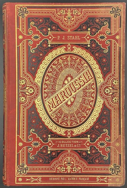 Title: MAROUSSIA | PAR | P.-J. STAHL | D'APRÈS UNE LÉGENDE DE MARKOWOVZOK | DESSINS PAR TH. SCHULER | GRAVURES PAR PANNEMAKER | {vignette} | BIBLIOTHÈQUE | D'ÉDUCATION ET DE RÉCRÉATION | J. HETZEL ET Cie, 18, RUE JACOB | PARIS | Tous droits de reproduction et de traduction réservés || Pagination: [2] – t.p. / blank, [1, 2] – dedication / blank, [3] 4-272, [1] 2-11 [12] – publisher’s advert.; Frontispiece and 22 leaves of wood-engraved plates by F. Pannemaker after Th. Schuler, extraneous to collation, woodcut head- and tailpieces, vignettes in the text by Charles Baude. Collation: 4to; 1-344, + 6 leaves of publisher's advertisement. Binding: “Cartonnage Hetzel” – red cloth stamped in gilt and black with the elements of design to spine, front and back, publisher's device to back, AEG. Author and publisher: Pierre-Jules Hetzel [P.-J. Stahl] (French, 1814 – 1886). Artist: Jules Théophile Schuler (French, 1821 – 1878). Engravers: Adolphe François Pannemaker (Belgian-French, 1822 – 1900) and Charles Baude (French, 1853 – 1935). Author of the legend: Markowovzok [Marko Vovchok; Марко́ Вовчо́к, real name Mariya Vilinskаya; Мария Александровна Вилинская] (Ukrainian, 1833 – 1907). Series: Collection Hetzel (stamped on the front board). Typographie A. Lahure (Paris), Alexis Lahure (French, 1849 – 1929). MAROUSSIA – The French version of the Ukrainian name Маруся.
 -
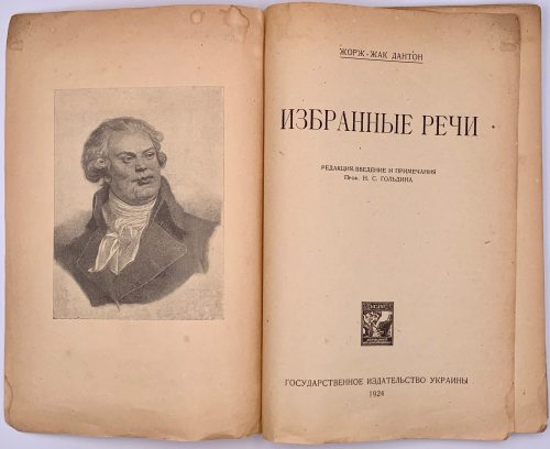 Title page: ЖОРЖ-ЖАК ДАНТОН | ИЗБРАННЫЕ РЕЧИ | РЕДАКЦИЯ, ВВЕДЕНИЕ И ПРИМЕЧАНИЯ | Проф. Н. С. ГОЛЬДИНА | {publisher’s device} | ГОСУДАРСТВЕННОЕ ИЗДАТЕЛЬСТВО УКРАИНЫ | 1924 Lacking wrappers, [2] – blank / frontispiece portrait of Danton, [2] t.p., / imprint, v-xviii, [2] –f.t / blank, 1-111 [112], collation: π2 *8 1-78. Danton, Georges Jacques [Дантон, Жорж Жак] (French, 1759 – 1794). Гольдин, Николай Сергеевич (Ukrainian-Jewish, 1877 – after 1924). Translator unknown.
 -
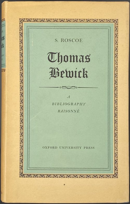 Title: S. ROSCOE | THOMAS BEWICK | A BIBLIOGRAPHY RAISONNÉ | OF EDITIONS OF THE | GENERAL HISTORY OF QUADRUPEDS | THE HISTORY OF BRITISH BIRDS | AND THE | FABLES OF AESOP | ISSUED IN HIS LIFETIME | GEOFFREY CUMBERLEGE | OXFORD UNIVERSITY PRESS | LONDON NEW YORK TORONTO | 1953 || Pagination: [2], [i-iv] v-xxx, 1-198 [2]; collation: 8vo, [a]-b8, B-N8, O4, all plates within collation. Binding: 25.5 x 16.5 cm, tan cloth, black babel with gilt lettering, letterpress dust jacket. Contributors: Roscoe, Sydney – author. Cumberlege, Geoffrey Fenwick Jocelyn (British, 1891 – 1979) – publisher. Batey, Charles – printer
 -
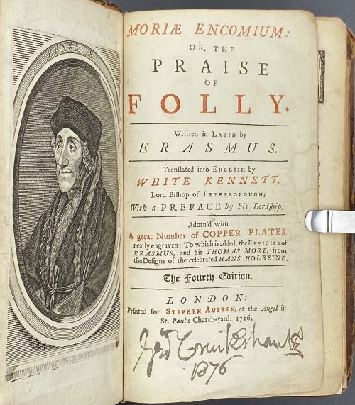 Erasmus. The praise of folly / Translated by White Kennett. — London: Stephen Austen, 1726. Title page in black and red: MORIÆ ENCOMIUM: | OR, THE | PRAISE | OF | FOLLY. |—| Written in Latin by | ERASMUS. |—| Translated into English by | WHITE KENNETT, | Lord Bishop of Peterborough; | With a PREFACE by his Lordship. |—| Adorn’d with | A great Number of COPPER PLATES | neatly engraven: To which is added, the Effigies of | ERASMUS, and Sir THOMAS MORE, from | theDesigns of the celebrated HANS HOLBEINE. |—| (in gothic letters) The Fourth Edition. |—| LONDON: | Printed for Stephen Austen, at the Angel in | St. Pauls’ Church-yard. 1726. || Pagination: modern endpapers and flyleaves, [2] – blank / frontis. (engraved portrait of Erasmus, [2] – t.p. in black and red with George Cruikshank’s signature in the bottom, dated 1876 / blank, [14] – to the reader, i-xiv – commendatory verses, [2] – John Wilford advert., folding portrait of Thomas More, i-v, [vi] - epistle, 1-168 – panegyrick, [4] – index.; 46 copper-engraved illustrations after Hans Holbein the Younger; pp. 17-20 detached. Collation: 12mo; π2 A6, a-b6, B-P6 Q2 (B3 unsigned), 13 in-text engravings + 26 plates + 7 folding plates; total 106 leaves and 33 plates, extraneous to collation. Edition: 4th, thus. Binding: 16.5 x 10.5 cm; rebacked with a modern spine, modern endpapers and flyleaves, contemporary boards sprinkled and tooled in a style of Cambridge panel. Provenance: Cruikshank, George (British, 1792 – 1878) [1876]; Stephen Whitehead (Oakland, CA) [2021]. Catalogue raisonné: J. Lewine (1898) p. 171 — 1st edition thus of 1709, in-8vo, with portrait and 46 plates after Holbein. Contributors: Desiderius Erasmus Roterodamus (Dutch, c. 1469 – 1536) – author of the original text in Latin.
White Kennett (British, 1660 – 1728) – translator from Latin into English.
Hans Holbein the Younger (German, 1497/8 – 1543) – artist.
Stephen Austen (fl. c. 1727 – 1746) – publisher. Linked items: Engraved portrait of Erasmus of Rotterdam in an octagonal frame, 1757 by Flipart after Holbein.Эразм Роттердамский. Похвальное слово глупости. — М.-Л.: Academia, 1932.
-
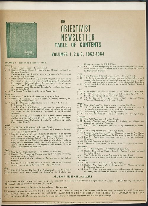 The Objectivist Newsletter, vol. 1 – 1962 (12 issues), vol. 2 – 1963 (12 issues), vol. 3 – 1964 (12 issues), vol. 4 – 1965 (12 issues) / 48 issues total (complete run). — New York: The Objectivist, Inc., 1962–1965. In green buckram publisher’s springback binder with stamped THE | OBJECTIVIST | NEWSLETTER to front board in the lower right corner, with remnants of gilt. Loose inserts: two order form pamphlets with a table of contents. Pagination: 8 pages table of contents, 56 + 50 + 52 + 62, total 228 pages (114 leaves). Size: Binder 29 x 24 cm, leaves 28 x 22 cm. Contributors: Rand, Ayn [O'Connor, Alice; Розенбаум, Алиса Зиновьевна] (Russian-American, 1905 – 1982) – editor, author. Branden [Blumenthal], Nathaniel (Canadian–American 1930 – 2014) – editor, author.