///Periodicals
  • The Colophon, A Book Collectors' Quarterly

    1. The colophon (new series): A quarterly for bookmen / Summer 1935, № 1, vol. 1. — NY: Pynson Printers, 1935. Hardcover, 24 x 16 cm, paper boards, serial pictorial design; pp: [4 blanks] [6] 7-159 [160] [4 blanks]. THE | COLOPHON | new series | A QUARTERLY FOR BOOKMEN | {woodcut vignette} | — | SUMMER 1935 | VOLUME I • NEW SERIES • NUMBER 1 | NEW YORK, N. Y. ||
    2. The colophon (new series): A quarterly for bookmen / Autumn 1935, № 2, vol. 1. — NY: Pynson Printers, 1935. (2 copies). Hardcover, 24 x 16 cm, paper boards, serial pictorial design; pp: [4 blanks] [6] 167-315 [315] [4 blanks]. THE | COLOPHON | new series | A QUARTERLY FOR BOOKMEN | {woodcut vignette} | — | AUTUMN 1935 | VOLUME I • NEW SERIES • NUMBER 2 | NEW YORK ||
    3. The colophon (new series): A quarterly for bookmen / Autumn 1936, № 1, vol. 2. — NY: Pynson Printers, 1936. Hardcover, 24 x 16 cm, cloth serial design; pp: [4 blanks] [6] 7-157 [158] [4 blanks]. THE | COLOPHON | new series | A QUARTERLY FOR BOOKMEN | {woodcut vignette} | — | AUTUMN 1936 | VOLUME II • NEW SERIES • NUMBER 1 | NEW YORK ||
    4. The colophon (new series): A quarterly for bookmen / Winter 1936, № 3, vol. 1. — NY: Pynson Printers, 1936. (2 copies) Hardcover, 24 x 16 cm, paper boards, serial pictorial design; pp: [4 blanks] [6] 323-480 [4 blanks]. THE | COLOPHON | new series | A QUARTERLY FOR BOOKMEN | {woodcut vignette} | — | WINTER 1936 | VOLUME I • NEW SERIES • NUMBER 3 | NEW YORK ||
    5. The colophon (new series): A quarterly for bookmen / Autumn 1937, № 4, vol. 2. — NY: Pynson Printers, 1937. Hardcover, 24 x 16 cm, cloth serial design; pp: [4 blanks] [6] 487-628 [4 blanks]. THE | COLOPHON | new series | A QUARTERLY FOR BOOKMEN | {woodcut vignette} | — | AUTUMN 1937 | VOLUME II • NEW SERIES • NUMBER 4 | NEW YORK ||
    6. The colophon (new series): A quarterly for bookmen / Summer 1938, № 3, vol. 3. — NY: Pynson Printers, 1938. Hardcover, 24 x 16 cm, cloth new serial design; pp: [4 blanks] [6] 335-476 [4 blanks]. THE | COLOPHON | new series | A QUARTERLY FOR BOOKMEN | {woodcut vignette} | — | SUMMER 1938 | VOLUME III • NEW SERIES • NUMBER 3 | NEW YORK ||
    7. The colophon (new series): A quarterly for bookmen / Autumn 1938, № 4, vol. 3. — NY: Pynson Printers, 1938. Hardcover, 24 x 16 cm, cloth new serial design; pp: [4 blanks] [6] 483-632 [4 blanks]. THE | COLOPHON | new series | A QUARTERLY FOR BOOKMEN | {woodcut vignette} | — | AUTUMN 1938 | VOLUME III • NEW SERIES • NUMBER 4 | NEW YORK ||  
  • 26 issues of American political humourous magazine published by Joseph Keppler (Austrian-American, 1838 – 1894) and Adolph Schwarzmann (German-American, 1838 – 1904) with caricatures by Frederick Burr Opper (American, 1857 – 1937); 35 x 27 cm, bound in faux shagreen with half green buckram backing, gilt vignette and lettering to front board: ‘What fools these Mortals be!” | MIDSUMMER NIGHT'S DREAM | PUCK ||
  • 129 issues of L'Éclipse, French weekly political magazine; published in Paris, 49 x 34 cm, bound in rebacked green quarter morocco over marbled boards, with gilt fillets and lettering to spine, peacock marbled endpapers, illustrated by André Gill (French, 1840 – 1885). Founder and editor-in-chief François Polo (French, 1838 – 1874). 1874: 271-322 (52 issues) 1875: 323-374 (52 issues) 1876: 375-399 (25 issues)
  • 52 issues of French weekly Gil Blas illustré, 1892: №№ 1-52; published in Paris, 39 x 29 cm, bound in red half cloth over marbled boards, with gilt fillets and lettering to spine, marbled endpapers, profusely illustrated by Théophile Steinlen (Swiss-French, 1859 – 1923) and Albert Guillaume (French, 1873 – 1942).
  • An essay by Sergei Petrovich Varshavsky [Сергей Петрович Варшавский] (Jewish-Russian, 1906 – 1980) about a poem Жди меня (Wait for Me, Zhdi meniawritten by Konstantin Simonov [Константин Михайлович Симонов] (Russian, 1915 – 1979) in August 1941. Magazine, softcover, publisher’s wrappers, 20 x 12.5 cm, collated 16mo: [1]-916 (total 144 leaves), pp.: [2] 3-286 [2] (total 288 pages). Bimonthly (6 times a year) magazine "Вопросы литературы" (Questions of Literature, Voprosy literatury) published from 1957; circulation of 15,640 copies. Editor-in-Chief (1979-87): Мстислав Борисович Козьмин (Russian, 1920 – 1992).
  • Softcover, original wrappers, 16 x 11 cm, collated 8vo: 48, 54, total 36 leaves, pp.: [2] 3-71 [72]. Front wrapper (lettered in black and white): {photo} | Б. РЕСТ. | КНИГИ | И | ЛЮДИ | ГОСЛИТИЗДАТ || Title-page (black and red): Б. РЕСТ | КНИГИ И ЛЮДИ | ОЧЕРКИ ИЗ ИСТОРИИ ГОСУДАРСТВЕННОЙ | ПУБЛИЧНОЙ БИБЛИОТЕКИ | имени | М. Е. САЛТЫКОВА-ЩЕДРИНА | 1814 — 1939 | {vignette} | — | Государственное издательство | “ХУДОЖЕСТВЕННАЯ ЛИТЕРАТУРА” | Ленинград 1939 || Print run: 7,500 copies. B. Rest [Б. Рест; Юлий Исаакович Шапиро] (Jewish-Russian, fl. 1940 – 1980).
  • Sergei Petrovich Varshavsky [Сергей Петрович Варшавский] (Jewish-Russian, 1906 – 1980). B. Rest [Б. Рест; Юлий Исаакович Шапиро] (Jewish-Russian, fl. 1940 – 1980). Monthly magazine Star ("Звезда", Zvezda) published from 1924; circulation of 60,000 copies. Editor-in-Chief: Валерий Павлович Друзин (Russian, 1903 – 1980). Softcover, original wrappers, 25.3 x 16.8 cm, pp.: [2] 3-190 [2], total 192 pages; collated 8vo: [1]-128, total 96 leaves.
  • Description: Owner’s quarter calf over marbled boards, 14.5 x 10.5 x 4.5 cm, spine with raised bands, gilt-lettered brown label “H. ROCHEFORT | LA LANTERNE | 1868 | LÉON NOËL”, marbled endpapers; first 11 issues of Henri Rochefort’s journal bound together with original front and back red pictorial wrappers. Front wrapper (first two issues white of red, subsequent issues black on orange background, the text is similar): La | Lanterne | par | {vignette of the lantern} Henri Rochefort | Prix: 40 centes | Bureaux : | 3 rue Rossini & rue Coq Héron, 5 | PARIS || Back wrapper (first two issues white of red, subsequent issues black on orange background, the text is similar): La Lanterne | PARTAIT TOUS LES SAMEDIS | (52 fois par an). | — | Prix d’Abonnement | Un An 20 fr | Six Mois 10 fr | Trois Mois 5 fr | — | Les Mandats doivent être adresses | A Mr. Dumont ADMINISTRATEUR | ❦ | Imprimerie Central des Chemins de Fer A. Chaix & Cie | 20, rue Bergère, à Paris_4608 _ 8 || Collation/pagination: 3 blanks, № 1: fw [1] 2-56 [8] bw; № 2: fw, [57] 58-115 [116] [2] bw; № 3: fw [117] 178 bw; № 4: fw [179] 180-238 [4] bw; № 5: fw [239] 240-298 [4] bw; № 6:  fw [299] 300-361 [362] bw; № 7: fw [363] 364-423 [424] [2] bw; № 8: fw [425] 426-483 [484] [4] bw; № 9: fw [1] 2-58 [6] bw; № 10: fw [1] 2-58 [6] bw; № 11: fw [1] 2-59 [60] [4] bw; 3blanks. Contributors: Victor Henri Rochefort, Marquis de Rochefort-Luçay (French, 1831 – 1913) – editor. Alban Chaix (French, 1860 – 1930); Napoléon Chaix (French, 1807 – 1865) – publishers. Dubuisson et Cie (Paris) – printer.
  • Front wrapper and title page : AVRIL – JUIN 1961 […] Numéro 35 |LE MOUVEMENT SOCIAL | Bulletin trimestriel de l'Institut français d'Histoire sociale | (Association reconnue d’utilité publique) | Le mouvement des Universités Populaires | par L. Dintzer, F. Robin et L. Grelaud | La vie de Blanqui sous le second empire | par M. Dommanget | Aperçu des fonds de l'Institut | par C. Chambelland | LES ÉDITIONS OUVRIÈRES | 12 avenue Sœur-Rosalie, Paris (13e) || Pagination : [1, 2] 3-48. Publisher’s wrappers, 24 x 16 cm. The paper by Maurice Dommanget (French, 1888 – 1976) La vie de Blanqui sous le Second Empire : de la sortie de Belle-ile à la sortie de Sainte-Pélagie (1er décembre 1857 – 12 mars 1864), pp. 30–41.
  • Title: LA | BELLE ASSEMBLÉE | OR, | BELL'S | COURT AND FASHIONABLE | MAGAZINE, | ADDRESSED PARTICULARLY TO | THE LADIES. | VOL. XI.—NEW SERIES. | FROM JANUARY 1, TO JUNE 30, 1815. | LONDON: | Printed for J. BELL, GALLERY OF FINE ARTS, | Clare-Court, Drury-Lane. | 1815. || Pagination: [2] – 11th volume wood-engraved pictorial title page, [1, 2] – January faux-title and table of content, [3] 4-284 [2] – index to 11th vol. Notes: February f.t. not paginated, but within the collation; the last page of the index at the very end paginated [iii]/iv, so pages i/ii missing (the gathering Nn lacking one sheet) Collation: 4to; π1 A-Mm4 Nn3, 28 plates extraneous to collation (lacking 2 plates). Binding: Half brown morocco over marbled boards, flat spine, compartments gilt-ruled with double-fillet and gilt-lettered. Contents: Jan: pp. 1-48, 5 plates. Feb: pp. 51-96, 5 plates. Mar: pp. 97-144, 5 plates. Apr: pp. 145-192, 5 plates. May: pp. 193-240, 5 plates. Jun: pp. 241-284, 3 plates (lacking 2 colour prints). Fashion plates, two per issue, are hand-coloured copperplate engravings, unsigned. Stipple engraved portraits, one per issue as frontispiece: (1) Actress Catherine Stephens, Countess of Essex (British, 1794 – 1882) by James Hopwood the Elder [James Hopwood Senior] (British, c. 1740s/50s – 1819) after Sir George Hayter (British, 1792 – 1871); (2) Madame de Talleyrand, Princesse De Bénévent (Danish-French, 1761– 1834), unsigned, but can be attributed to François Gérard (French, 1770 – 1837); (3) Actress Miss Sarah Booth (1793 – 30 December 1867), unsigned; (4) Group portrait of the French Royal family (Louis XVI, Louis XVII, Marie Antoinette, Madam Elizabeth, Louis Antoine de Bourbon, Duke d'Enghien, and Marie Thérèse Louise of Savoy, Princesse de Lamballe), unsigned, (5) Actress, Miss Sarah Blanche Matthews (b.1794) by Thomas Burke (Irish, 1749 – 1815) after George Hayter. The sixth print, in the March issue, is a lithographic portrait of Napoléon Bonaparte (French, 1769 – 1821), unsigned.  
  • HUMAN PHYSIOGNOMY | EXPLAIN'D: | IN THE | Crounian LECTURES | ON MUSCULAR MOTION. | For the Year MDCCXLVI. | Read before the | ROYAL SOCIETY: | By James Parsons, M.D. and F.R.S. | Being a SUPPLEMENT to the Philosophical | Transactions for that Year. | {Citation in the Greek from Aristotle, 6 lines} | LONDON: | Printed for C. Davis, over against Gray's Inn Gate | in Holbourn; Printer to the Royal Society. | M. DCC. XLVII. || Pagination: [4] i-viii [8] 1-82 [4]; collation: 4to; [a]4 b4 c2 <inset> B-L4 M3, wanting 1 leaf with An Index For the Lectures of the Years 1744, and 1745; Inset: 5 folding plates engraved by J. Mynde after J. Parsons ('I. Ps. MD del.'). Page 22.5 x 16.5 cm; plates 22.5 x 34 cm. Printed on laid paper, with tall "s". Binding: 23 x 17 cm, modern hardcover in marbled paper, modern endpapers, white paper label with black lettering to spine. Crounian Lectures (i.e. Croonian Lectures), named after William Croone (British, 1633 – 1684). Contributors: James Parsons (British, 1705 – 1770). James Mynde (British, 1702 – 1771). Davis, Printer to the Royal Society of London (British, 1665 – 1775). Ref.: Royal Academy, The Royal Society, Wellcome Collection.
  • Pagination: [2] – letterpress title / blank, t.p. with contents / to readers, [1] 2-376 + 7 b/w and 16 coloured plates (total 23); this differs to Abbey’s description of 372 pages + 4 pages index, and 41 plates (lacking 18 plates). In No 73 lacking 3 plates: Quadrant Regent st., Morning dress and Full dress. In No 74 lacking 5 plates: Charles str., Brienz, head dresses, full dress, and muslin patterns. In No 75 lacking 5 plates: 4 with bank notes and Castle of Rinkenberg. In No 76 lacking 1 plate: Cavern St. Beat. In No 77 lacking 2 plates: Wetzar and Lake Thun. In No 78 lacking 2 plates: Crescent at Portland Place and Environs of Thun. Collation: 4to; letterpress title, [A]1 B-Z4 Aa-Zz4 3A-3C4 3D2. Binding: 23.5 x 15.5 cm; double fillet blind-ruled half-calf over pebbled cloth boards, raised bands ruled blind, crimson label with gilt lettering to spine. References: Martin Hardie (1906), p.310 [LIB-2623.2021]; R. V. Tooley (1935), p. 26 [LIB-2641.2021]; J. R. Abbey (1953), Cat. № 212, p. 174 [LIB-2622.2021].
  • Pagination: [2] – letterpress title / blank, t.p. contents / to readers, [1] 2-368 [4 index], + 6 b/w (one folding) and 28 coloured plates (total 34). Collation: 4to; letterpress title, [A]1 B-Z4 Aa-Zz4 3A-3B4 3C3. Binding: 25 x 16 cm; gilt-ruled half-calf over marbled boards, flat spine, gilt-ruled compartments, gilt lettering. 5 aquatints by Thomas Rowlandson (British, 1757 – 1827): Table D'Hote; Consulting the Prophet; The Prophet discovering himself and exposing the deception; The Arrival in Paris; Liberality to infirm beggars on leaving Yrvi. References: Martin Hardie (1906), p.310 [LIB-2623.2021]; R. V. Tooley (1935), p. 26 [LIB-2641.2021]; J. R. Abbey (1953), Cat. № 212, p. 167 [LIB-2622.2021].
  • Pagination: [2] – letterpress title / blank, [2] – t.p. contents / to readers, [1] 2-368 [4 index], + 9 b/w and 27 coloured plates. Collation: 4to; letterpress title, [A]1 B-Z4 Aa-Zz4 3A-3B4 3C3. Binding: 25 x 16 cm; gilt-ruled half-calf over marbled boards, flat spine, gilt-ruled compartments, gilt lettering; front board almost detached. References: Martin Hardie (1906), p.310 [LIB-2623.2021]; R. V. Tooley (1935), p. 26 [LIB-2641.2021]; J. R. Abbey (1953), Cat. № 212, p. 166 [LIB-2622.2021].
  • Convolute with three editions, dedicated to the Commune of Paris, 1871. (1) LES | Publications de la Rue | pendant | LE SIEGE ET LA COMMUNE | SATIRES — CANARDS — COMPLAINTES — CHANSONS | PLACARDS ET PAMPHLETS | BIBLIOGRAPHIE | PITTORESQUE ET ANECDOTIQUE | Par Firmin MAILLARD |{publisher’s device}| PARIS | AUGUSTE AUBRY, ÉDITEUR | 18, RUE SÉGUIER, 18 | 1874 || Pagination: ffl, original pictorial wrapper, [2] – blank / advert., [2] – h.t. / blank, [2] – h.t. / colophon imprim. PILLET FILS AINÉ, frontis. similar to front wrapper without '1874', [2] – t.p. / blank, [v] vi-xii, [1] 2-198, three blank leaves, back wrapper. (2) VILLE DE SAINT-DENIS | EXPOSITION D'ART & D'HISTOIRE | La Commune de Paris |18 Mars 1871 28 Mai | AVANT-PROPOS DE Lucien DESCAVES | de l’Académie Goncourt | PREFACE DE Jacques DORIOT | Député de la Seine, Maire de Saint-Denis | Du 17 Mars au 26 Mai 1935 | au Musée Municipal | 4, place de la Légion d’Honneur – Saint-Denis || Pagination: original pictorial wrapper in black and red, frontis., [2] - t.p. / blank, [2] – commité, v-xiii [xiv] 1-113 [114], 26 plates (13 leaves), blank back wrapper, spine tipped-in. (3) J. LEMONNYER | LES | JOURNAUX DE PARIS | PENDANT | LA COMMUNE | REVUE BIBLIOGRAPHIQUE COMPLETE | DE LA PRESSE PARISIENNE | du 19 Mars au 27 Mai | AVEC |{7 lines of text}| ET | UNE TABLE ALPHABÉTIQUE | DONNANT LE PRIX-COURANT DE CHAQUE COLLECTION | PARIS : J. LEMONNYER, Librarire | 73, Rue de Provence, 73 || Pagination: [2] - t.p. / blank, [2] – preface, [7] 8-94, green back wrapper w/advert., bfl. (lacks original front wrapper). Binding: Modern (20th century) red cloth, black label with gilt lettering to spine, matching marbled endpapers. Size: 18.5 x 13 cm; 12mo.
  • Magazine article by Edgar Jepson: The Iron Tsuba of Japan (Section: Oriental Art), published in volume Vol. 70 (September–December) of The Connoisseur: An Illustrated Magazine for Collectors, Vol. 70 (September–December); pp. 143-152 / C. Reginald Grundy [ed.] — London: Published by the Proprietor, W. CLAUSE JOHNSON, at the Editorial and Advertisement Offices of The Connoisseur, 1924. Owner's half black morocco, gilt lettering to spine, blue cloth boards. Two volumes bound together without original covers. Size 28.5 x 22 cm. Vol. 1: The Connoisseur | An Illustrated Magazine | For Collectors | Edited by C. Reginald Grundy | Vol. LXIX. | (MAY—AUGUST, 1924) | LONDON | Published by the Proprietor, W. CLAUSE JOHNSON, at the | Editorial and Advertisement Offices of The Connoisseur, | at 1, Duke Street, St. James's, S.W. 1 | 1924 || Pp.: [i-ii] iii-xviii [xix] [1, 2 - plate] 3-249 [250]. Vol. 2: The Connoisseur | An Illustrated Magazine | For Collectors | Edited by C. Reginald Grundy | Vol. LXX. | (SEPTEMBER—DECEMBER, 1924) | LONDON | Published by the Proprietor, W. CLAUSE JOHNSON, at the | Editorial and Advertisement Offices of The Connoisseur, | at 1, Duke Street, St. James's, S.W. 1 | 1924 || Pp.: [i-ii] iii-xxii [2 blanks] [1, 2 - plate] 3-261 [262]. The Iron Tsuba of Japan by Edgar Jepson The heart of Japan was in the sword. However admirable may be the paintings, the prints, the netsuke, the lacquer, or the bronzes of the Japanese masters, the supreme artistic achievements of Japan were the blades of Masamune, Muramasa, Sadamune, and Rai Kunitsugu. But not a little of the heart of Japan went also in the tsuba, the guard which protected the hand that wielded the blade, into the iron tsuba of the fighting Samurai. Beside the forgers of the iron tsuba of Japan the ironsmiths of the rest of the world have been mere children. The earliest tsuba were of bronze or copper, often gilded. It is probable that they were replaced by iron tsuba during the Kamakura period, the great fighting era, which lasted from A.D. 1185 to 1333. During the later half of the twelfth century leather tsuba, strengthened by thin iron plates or a metal rim, also replaced the bronze and copper tsuba. It was at this time that a family of armourers of the name of Masuda, and in particular Masuda Munesuke, the founder of the Myochin family, began to forge iron tsuba — thin, round plates of great hardness and density. But it is probable that no tsuba perforated with a view to decorative effects were forged before the end of the fourteenth century. 
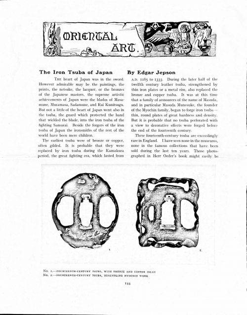
These fourteenth-century tsuba are exceedingly rare in England. I have seen none in the museums, none in the famous collections that have been sold during the last ten years. Those photographed in Herr Oeder's book might easily be the fifteenth century. No. 1 is a curious cup-shape tsuba decorated with a bronze and copper inlay. No. 2, with its edges curiously twisted in the forging, looks like Myochin work. But it is not of the Myochin iron. The Myochin family produced some of the greatest ironsmiths of Japan. Armourers first of all, tsubasmiths, forgers of sake-kettles, articulated reptiles, crustacea, and insects — everything that can be done with iron they did; they pushed their medium to its limit. They were forging iron tsuba in 1160, and they were still forging them in 1860. And it was their own iron, or rather their own steel. They discovered the secret of it early, and they kept that secret in the family for all those hundreds of years. There is no mistaking a Myochin tsuba: balance it on your finger and tap it with a piece of metal, always it gives forth a clear bell-like ring that you get from the work of no other ironsmith, Japanese or European. Always the Myochin tsuba is before everything a protection to the hand of the swordsman; to that everything is, as it should be, subordinated. No. 3 is a Myochin tsuba of the fifteenth century, and probably of the early fifteenth century. No. 4, by Myochin Munetaka, perforated with a grotesque figure, is an example of that twisting and twisting of the iron in the forging till it forms a pattern like the grain of wood. The Myochin smiths invented these wood-grain tsuba, and no other smiths equalled them in their forging. In the sixteenth century, the fighting tsuba was probably at its best. It was a century of great tsubasmiths. Then the first Nobuiye, whose tsuba fetched £100 apiece, circa 1800, in Japan, and the first Kaneiye flourished. No. 5 is a tsuba forged by a great smith, Iyesada of Sotome, in the manner of Nobuiye I, decorated with the karakusa tendrils that Nobuiye delighted in, with lightning and clouds. No. 6 is a guard of Sanada Tembo, the chief smith of the Tembo family, stamped, punning fashion, with the character Tembo. Akin to the Tembo tsuba were those of the Kiami and Hoan smiths. Then also the Heianjo smiths and the Owari smiths, especially those of Nagoya and the Yamakichi family, forged their strongest tsuba. Those of the Yamakichi were tested after the forging by being pounded in iron mortars — at least, so the legend runs. But they were a sternly utilitarian family, and I have never seen a Yamakichi tsuba of any beauty. In the later half of the fifteenth century arose the fashion of decorating tsuba with an inlay, zogan, of bronze. The Heianjo tsuba, forged at Kyoto in the latter half of the fifteenth and the beginning of the sixteenth century, were often thus inlaid. The earliest of them were called "Onin", of which No. 7 is an example. In addition to the bronze inlay around the edge, it is inlaid with a representation, some say, of snow; others say, of the duckweed on a pond. No. 8 is probably a Heianjo tsuba, but I am not quite sure about it. The inlaid acacia branches might be very early Shoami work. But to judge by the iron, it is a fifteenth-century tsuba; and the authorities place the beginning of the Shoami school not later than early in the sixteenth century. No. 10 is an example of the Fushimi-zogan, a flat inlay of a light-coloured bronze. These tsuba took their name from the fact that they were first forged at Fushimi, in Yamashiro, in the sixteenth century. It is of the type known as Mon-zukashi, perforated with crests (mon) à jour. The Yoshiro-zogan tsuba were also first forged at Fushimi by Yoshiro Naomasa. They were distinguished from the Fushimi-zogan by the fact that their inlay was generally a little raised-not always-for the inlay of No. 9, a tsuba forged by a later nineteenth-century Yoshiro, is quite flat. It is an interesting tsuba, for, with its decoration grown florid and excessive, it marks the intermediate stage between the simple and delightful designs of the genuine fighting tsuba and the elaborate pictures in gold and silver on the tsuba of the eighteenth-century smiths of Awa and Kyoto, which have become mere ornaments of the goldsmith. The Gomoku-zogan (No. 11) tsuba were probably first forged earlier than the Fushimi and Yoshiro-zogan tsuba. This inlay, in slight relief, is a representation in a light-coloured bronze and copper of twigs caught in the eddies of streams. The seventeenth century and early eighteenth century were the great periods of perforated tsuba. The designs, and they are often admirable, are for the most part in plain fretwork; but they are also chased. No. 12, a crane under an acacia, is a tsuba of a Higo smith, great forgers of fighting tsuba during this period. These smiths also excelled in nunome zogan, a very thin gold and silver inlay, with which they further decorated their perforated guards. The smiths of the Umetada and Shoami families also forged iron tsuba during this period; but their designs, though sometimes pleasing enough, are rarely fine. The best work of Myoju Umetada is in sentoku, not iron. The Choshu smiths, coming later, surpass the perforated guards of both the Umetada and Shoami smiths in beauty of design. No. 13, a lotus in the round, not only fretwork, but also engraved, is a good example of the admirable balance they so often attained in their designs. It is a sufficiently realistic lotus, but yet of a delightful simplicity. In considerable contrast is No. 14, the dragon by Soheishi Soten — one of the only two authentic tsuba of his forging known — the first forger of hikone-bori tsuba, which were in extraordinary favour in Japan during the eighteenth century, and illustrated every important event in Japanese history. It is on the elaborate side, but fine, strong work, and an excellent guard to the hand, for the lighter and more open part, which gives the design its admirable balance, is on the inside, and not exposed to the full swing of an opponent's blade. A few years ago there was a tendency to decry the Namban tsuba as having sprung too directly from foreign sources. But though the original suggestion may have been Chinese, or, as some say, Portuguese, the Japanese made it entirely their own, as characteristically Japanese as anything can well be, but, it must be admitted, of a decadent period. The school took its rise at the beginning of the seventeenth century, and the early tsuba were forged of a specially hard iron, the Wootz, imported from Southern India. No. 15, the signs of the Zodiac, is an excellent tsuba from the fighting point of view. Both it and No. 16 are of quite charming, if elaborate, design, and both of them, with their delicate scroll-work, so astonishingly undercut, are the very last word in the work of the ironsmith-veritable iron lace. To return to the simpler perforated tsuba, the smiths of Akasaka, a suburb of Tokyo, produced probably the most charming designs. Their style derives considerably from the Higo smiths, and their earlier fighting tsuba are very like the Higo tsuba. But always their work was just a little lighter than that of the Higo smiths, and in the end they moved right away from them and became the forgers of very light guards indeed. No. 17, is a representation of the Hiyokudori, the fabulous double bird, in which were reincarnated the souls of the two lovers, Gompachi and Komurasaki; and No. 18, “the tsuba of a hundred ducks "— there are about forty — are characteristic designs of the school. In the work of the Akasaka smiths the balance, which makes the design of a good tsuba so admirable and delightful, attains its height. This admirable balance seems often to be obtained by a deliberate sacrifice of symmetry. About nine hundred and ninety-nine European ironsmiths out of a thousand would have made the right and left sides of the Hiyoku-dori line by line, and perforation by perforation, exactly alike; he would have cut out exactly as many ducks on the one side of “the tsuba of a hundred ducks” as on the other, and made each duck on the right side correspond exactly in position and attitude with a duck on the left side. By variations the tsubasmith attained a finer balance, almost a higher symmetry. No. 19, often called by collectors the "rose-window" tsuba, but really a stylised chrysanthemum, is a favourite design of the Akasaka smiths, but Hizen work and inlaid in the Hizen manner with gold nunome. No. 20 is a Satsuma tsuba of the middle period. The Satsuma smiths of the nineteenth century produced probably the most ornate of all the iron guards, for the most part calibashes and beans with their leaves and tendrils realistic in the extreme, but of charming design. Few crafts have been carried further than that of the tsubasmith; few crafts working in a difficult medium have handled more subjects with greater feeling for beauty or greater liveliness of fancy. It is interesting to note again and again how school influences school, and smith influences smith. But, as in all the applied arts, the finest tsuba were forged by men who never lost sight of the purpose of a tsuba, that it is before everything a protection to the hand, and never subjected that purpose to a passion for virtuosity. Illustrations: No 1. FOURTEENTH-CENTURY TSUBA, WITH BRONZE AND COPPER INLAY No. 2. FOURTEENTH-CENTURY TSUBA, RESEMBLING MYOCHIN WORK No. 3. MYOCHIN TSUBA, FIFTEENTH CENTURY No. 4. MYOCHIN TSUBA, NINETEENTH CENTURY No. 5. SIXTEENTH-CENTURY TSUBA No. 6. SIXTEENTH-CENTURY TSUBA BY IYESADA OF SOTOME BY SANADA TEMBO No. 7. ONIN TSUBA No. 8. HEIANJO (?) TSUBA No. 9. YOSHIRO TSUBA, NINETEENTH CENTURY No. 10. FUSHIMI-ZOGAN, NINETEENTH CENTURY No. 11.- GOMOKU-ZOGAN, SIXTEENTH CENTURY No. 12. HIGO TSUBA, SEVENTEENTH CENTURY No. 13. CHOSHU TSUBA, SEVENTEENTH CENTURY No. 14. SOTEN TSUBA, SEVENTEENTH CENTURY No. 15. NAMBAN TSUBA, EIGHTEENTH CENTURY No. 16. NAMBAN TSUBA, NINETEENTH CENTURY Nos. 17. AND 18. AKASAKA TSUBA, EIGHTEENTH CENTURY No. 19. HIZEN TSUBA, EIGHTEENTH CENTURY No. 20. SATSUMA TSUBA, EIGHTEENTH CENTURY    
  • Конволют из 3-х номеров журнала "Иртыш, превращающийся в Ипокрену". Ежемесячное сочинение издаваемое от Тобольского Главного Народного Училища. — В типографии у В. Корнильева. — Тобольск: Тобольское главное народное училище, 1791 г. — 60, 62, 54 с. (Дореформ. орф.). July (Июль) 1791. — pp.: Missing title, table of content unpag., verso blank, [1] 2-60. June (Июнь) 1791. — pp.: Title with censor stat. on verso, table of content unpag., verso blank, [1] 2-62. August (Август) 1791. — pp.: Title, table of content unpag., verso blank, [1] 2-54. Bound in this order. "The Irtysh river turning into Hippocrene" was the first monthly magazine in Russian Siberia published in 1789 — 1791 in Tobolsk. It was featuring journalism, commentary, poetry, the fiction of provincial and metropolitan authors, as well as translations of various articles from foreign journals. It was published by Department of Tobolsk Public Education and printed in the establishment of Kornil'ev (Корнильев), a local merchant.  The idea of publication belonged to Pankraty Sumarokov (1765 — 1814), a grandnephew of Alexander Sumarokov, distinguished Russian humanist and homme de lettres of Catherine the Great epoch. Pankraty was also the chief editor of the publication. Initially, the print run was 300 copies; reduced in 1791 to 106 copies only.