

Dimensions: 34 x 47.5 cm each.
Contributors: Weller, Edward (British, 1819 – 1884) – lithographer. Dower, John Crane (British, 1791 – 1847) – artist, engraver. Dower, John James (British, 1825 – 1901) – artist, engraver (son of John Crane Dower).-
 Four maps 34 x 47.5 cm each. Include insets of Versailles, Fontainebleau, Saint Cloud and St. Germain en Laye. Lithograph by Edward Weller after a map drawn and engraved by John Dower. "These maps originally appeared in the Weekly Dispatch newspaper from 1856 to 1862. They were reissued between 1863 and 1867 by Cassell, Petter and Galpin and then published collectively as Cassell's Atlas. The plates were acquired by G.W. Bacon & Co., and reissued in 1876 under the title Bacon's New Quarto Atlas ... of the Counties of England, and many times since under various titles." [WorldCat]
 -
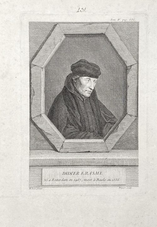 The portrait of Erasmus of Rotterdam (1466 – 1536), half-length, head to the right, body facing right, looking away, in a trompe-l'oeil octagonal frame. Inscriptions: Top right: Tom IV, pag. 686. Center of the image: DIDIER ERASME / Ne a Rotterdam en 1467, mort a Basle en 1536. Bottom of the plate: Holbein pinxit | Flipart Sculp. From the book Histoire générale des Provinces-Unies by Bénigne Dujardin (French, 1689 – 1771?) and Gottfried Sellius (real name Gottfried Sell) (1704? – 1767), published in 1757 in Paris by P. G. Simon. Volume 4, facing p. 686. Size: Sheet: 25 x 17.5 cm; Plate: 19.5 x 13.5 cm; Image: 18 x 12 cm. References: (1) Van Someren v.2, p.249, №1688; (2) https://archive.org/details/histoiregnra04duja/page/n714/mode/2up. Inscription above the plate: nut ink, hand, "231".
 -
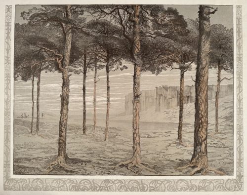 Colour (tone) lithography, image 396 x 508 mm, sheet 532 x 654 mm; before signature, undated; pencil ms inscription: Föhrenhain — E. Pelikan / 200M to the lower-right corner of the sheet. Contributor: Emilie Mediz-Pelikan (Austrian, 1861 – 1908) – artist. Seller's description: Austrian-German painter and graphic artist. Emilie Mediz-Pelikan was born in Vöcklabruck in 1861. She studied at the Vienna Academy and followed her teacher Albert Zimmermann to Salzburg and in 1885 to Munich. In 1891 she married the painter and graphic artist Karl Mediz (1868 - 1945), with whom she lived in Vienna and from 1894 in Dresden. She was in contact with the Dachau Artists' Colony and went on study trips to Paris, Belgium, Hungary and Italy. In the Dachau artists' colony she was friends with Adolf Hölzel and Fritz von Uhde. In 1889 and 1890 she spent time in Paris and in the Belgian artists' colony Knokke. In 1898 she was represented at the first art exhibition of the Vienna Secession, and in 1901 at the International Art Exhibition in Dresden. In 1903 she and her husband had a group exhibition, at the Hagenbund in Vienna. In 1904, she showed graphic works at the Dresden royal court art dealer Richter, and in 1905 and 1906 she exhibited at the Berlin Künstlerhaus. It was not until around 1900 that she achieved her artistic breakthrough with her landscape paintings. Since the estate of the artist, who died prematurely in Dresden in 1908, was lost in the former GDR until the 1980s, it was quite late that the artist was rediscovered and revalued both in Austrian art history and on the art market. In 1986, the first major exhibitions took place at the Upper Austrian State Museum and the University of Applied Arts in Vienna, followed by numerous smaller exhibitions in private galleries in Vienna, Linz and Munich. The artist received recognition during her lifetime from numerous prominent fellow painters as well as from the art critic Ludwig Hevesi. Together with Tina Blau, Herbert Boeckl, Marie Egner, Theodor von Hörmann, Franz Jaschke, Eugen Jettel, Ludwig Heinrich Jungnickel, Rudolf Junk, Gustav Klimt, Oskar Kokoschka, Johann Victor Krämer, Heinrich Kühn, Carl Moll, Rudolf Quittner, Rudolf Ribarz, Emil Jakob Schindler, Max Suppantschitsch, Max Weiler, Olga Wisinger-Florian and Alfred Zoff, she was a protagonist of the reception of Impressionism in Austria. This style went down in Austrian art history under the term "Stimmungsimpressionismus".
 -
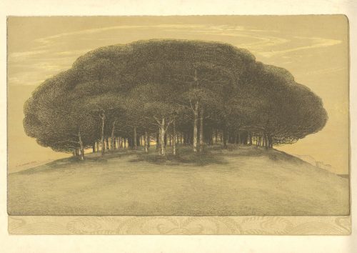 Colour (tone) lithography, image 268 x 410 mm, sheet 317 x 470 mm; signed on bottom-left of the image “Pelikan 1905”, and pencil ms inscription: E. Pelikan to the lower-right corner of the sheet. Contributor: Emilie Mediz-Pelikan (Austrian, 1861 – 1908) – artist. Seller's description: Austrian-German painter and graphic artist. Emilie Mediz-Pelikan was born in Vöcklabruck in 1861. She studied at the Vienna Academy and followed her teacher Albert Zimmermann to Salzburg and in 1885 to Munich. In 1891 she married the painter and graphic artist Karl Mediz (1868 - 1945), with whom she lived in Vienna and from 1894 in Dresden. She was in contact with the Dachau Artists' Colony and went on study trips to Paris, Belgium, Hungary and Italy. In the Dachau artists' colony she was friends with Adolf Hölzel and Fritz von Uhde. In 1889 and 1890 she spent time in Paris and in the Belgian artists' colony Knokke. In 1898 she was represented at the first art exhibition of the Vienna Secession, and in 1901 at the International Art Exhibition in Dresden. In 1903 she and her husband had a group exhibition, at the Hagenbund in Vienna. In 1904, she showed graphic works at the Dresden royal court art dealer Richter, and in 1905 and 1906 she exhibited at the Berlin Künstlerhaus. It was not until around 1900 that she achieved her artistic breakthrough with her landscape paintings. Since the estate of the artist, who died prematurely in Dresden in 1908, was lost in the former GDR until the 1980s, it was quite late that the artist was rediscovered and revalued both in Austrian art history and on the art market. In 1986, the first major exhibitions took place at the Upper Austrian State Museum and the University of Applied Arts in Vienna, followed by numerous smaller exhibitions in private galleries in Vienna, Linz and Munich. The artist received recognition during her lifetime from numerous prominent fellow painters as well as from the art critic Ludwig Hevesi. Together with Tina Blau, Herbert Boeckl, Marie Egner, Theodor von Hörmann, Franz Jaschke, Eugen Jettel, Ludwig Heinrich Jungnickel, Rudolf Junk, Gustav Klimt, Oskar Kokoschka, Johann Victor Krämer, Heinrich Kühn, Carl Moll, Rudolf Quittner, Rudolf Ribarz, Emil Jakob Schindler, Max Suppantschitsch, Max Weiler, Olga Wisinger-Florian and Alfred Zoff, she was a protagonist of the reception of Impressionism in Austria. This style went down in Austrian art history under the term "Stimmungsimpressionismus".
 -
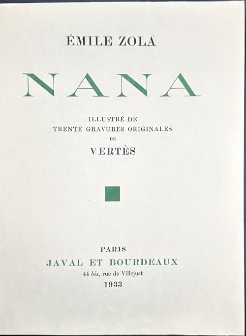 Publisher’s olive French flapped wrappers, in-4to, 33 x 25.3 x 6 cm, green and black lettering to front and spine, in a glassine dust jacket, in a marbled double slipcase 34.5 x 25.5 cm, unbound; pp.: [8] 1-436 [4], plus 30 colour plates with guard tissue, extraneous to collation; edition enriched with a set of 30 uncoloured etchings with guard tissue in a lettered paper folder. Title-page: ÉMILE ZOLA | NANA | ILLUSTRÉ DE | TRENTE GRAVURES ORIGINALES | DE | VERTÈS |◾| PARIS | JAVAL ET BOURDEAUX | 44 bis, rue de Villejust | 1933 || Justification du tirage: il a été tiré de «Nana » d'Émile Zola. Soixante exemplaires sur japon impérial, numérotés de 1 a 60, avec un état en couleurs colorié a la main et un état en noir des trente gravures originales de Vertès. [Edition limited to 60 copies, this is copy № 54]. Colophon: « NANA », D'ÉMILE ZOLA, ÉTÉ ACHEVÉ D'IMPRIMER LE TRENTE AVRIL MIL NEUF CENT TRENTE-TROIS, EN CARACTÈRES ROMAIN ANGLAIS DU CORPS 16, SUR LES PRESSES DU MAITRE IMPRIMEUR COULOUMA, À ARGENTEUIL, H. BARTHÉLEMY, DIRECTEUR. LES COMPOSITIONS DE VERTÈS ONT ÉTÉ REPRODUITES EN FAC-SIMILÉ PAR D. JACOMET & Cie. Printed on April 30, 1933 by Coulouma in Argenteuil, H. Barthélemy, director; illustrations reproduced in facsimile by D. Jacomet & Co. Catalogue raisonné: Vokaer 30. Contributors: Émile Zola (French, 1840 – 1902) – author. Marcel Vertès [Marcell Vértes] (Jewish-Hungarian-French, 1895 – 1961) – artist. Javal et Bourdeaux – publisher. Daniel Jacomet (French, 1894 – 1966) – printer. Seller's description: Nana. Paris, Javal et Bourdeaux, 1933. 2 volumes in-4, en feuilles, non coupé, non rogné, chemise et étui. Ouvrage illustré de 30 gravures originales en couleurs de Marcel Vertès. Tirage à 60 exemplaires sur japon impérial contenant un état des illustrations coloriées à la main en couleurs et un état en noir. Chemise et emboîtage insolés.
 -
 Thin booklet in glossy pictorial wrappers, 29.8 x 24.7 cm, pp.: [1-4] 5-48, 24 leaves total, illustrated. Errata tipped in after the front wrapper. Title-page: Mirror | of the stage | The actor prints of | Kunisada | Ellis Tinios | The University Gallery Leeds || Colophon: Published in March 1996 for the exhibition Mirror of the Stage held at the University Gallery Leeds 24 April-30 May 1996. Introduction: "This book [exhibition catalogue] has been written as an introduction to nineteenth-century Japanese colour woodblock actor prints and to the achievements of the artist Kunisada in that field [as well as to accompany the exhibition of the same name]. It is divided into three sections. In the first, I examine four topics: the social and cultural milieu that gave rise to the production of prints as items of mass consumption; the aesthetic of the actor print; the economics of print production (including consideration of the numbers issued, the prices at which they were sold and their rates of survival); and the process by which prints were produced. The second section consists of sixteen colour plates with commentaries. In the final section, I survey Kunisada's career." Subject: Utagawa, Kunisada, — 1786-1864 — Exhibitions; Ukiyo-e — Exhibitions; Colour prints, Japanese — Edo period, 1600-1868 — Exhibitions. Contributors: Ellis Tinios Utagawa Kunisada [歌川 国貞] a.k.a. Utagawa Toyokuni III [三代歌川豊国] (Japanese, 1786 – 1865). Select illustrations (references in this collection):
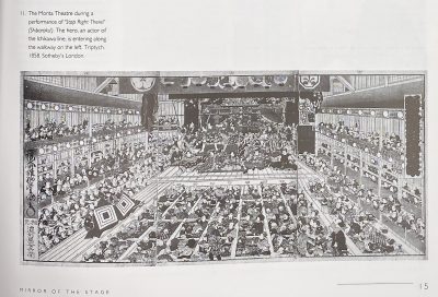
SVJP-0226.2016: Superb Edo pictures illustrating dances, 1858.
-
 Hardcover, 23.5 x 23.5 cm, publisher's navy cloth, gilt-stamped lettering to spine, pictorial DJ; pp.: [1-6] 7-143 [144 blank].
Japanese woodblock prints of the Edo period (1615-1868) were the products of a highly commercialised and competitive publishing industry. Their content was inspired by the vibrant popular culture that flourished in Edo (Tokyo). At any given time scores of publishers competed for the services of the leading artists of the day. Publishers and artists displayed tremendous ingenuity in finding ways to sustain demand for prints and to circumvent the restrictions placed on the industry through government censorship. Although Japanese prints have long been appreciated in the West for their graphic qualities, their content has not always been fully understood. This book draws on recent scholarship that makes possible a more subtle appreciation of the imagery encountered in the prints and how they would have been read when first made. Through stunning new photography of both well-known and rarely published works in the collection of the British Museum, including many recent acquisitions, the author explores how and why such prints were made, providing a fascinating introduction to a much-loved but little-understood art form.
-
 Title page: ITALIAN | RENAISSANCE | MAIOLICA | ELISA P. SANI | with a preface by J.V.G. Mallet and | contributions from Reino Liefkes | V&A PUBLISHING || Pagination: [1-6] 7-192, ils. Binding: Black cloth, gilt lettering to spine; pictorial DJ. Mint/New. Size: 27.7 x 22.2 cm.
 -
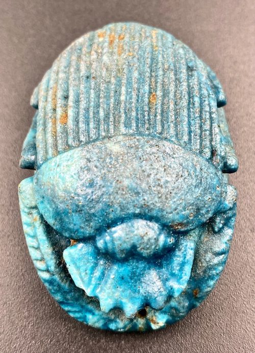 Egypt, Late Period. The oval amulet with multiple pierced holes for stitching to the outer garments of a mummy or the mummy wrappings, reeded wings and braided claws, marine blue in colour. According to the Brooklyn Museum, such faience amulets formed part of the beadwork pattern and served to protect the mummy through their magical properties. It served as a substitute heart that would ensure continued existence in the hereafter. A similar example at the Brooklyn Museum dated ca. 712-342 BC. Dimensions: 55 x 37 mm Provenance: The Collection of Erwin Harvith (1918 – 2011) and Sylvia Redblatt Harvith (1920 – 2015), Detroit, MI, acquired in 1972 directly from the Collection of Moshe Dayan, (משה דיין; 1915 – 1981), an Israeli military leader and politician. Exhibited: Jewish Museum, New York, NY, "Culture and Continuity – The Jewish Journey", 1975.
 -
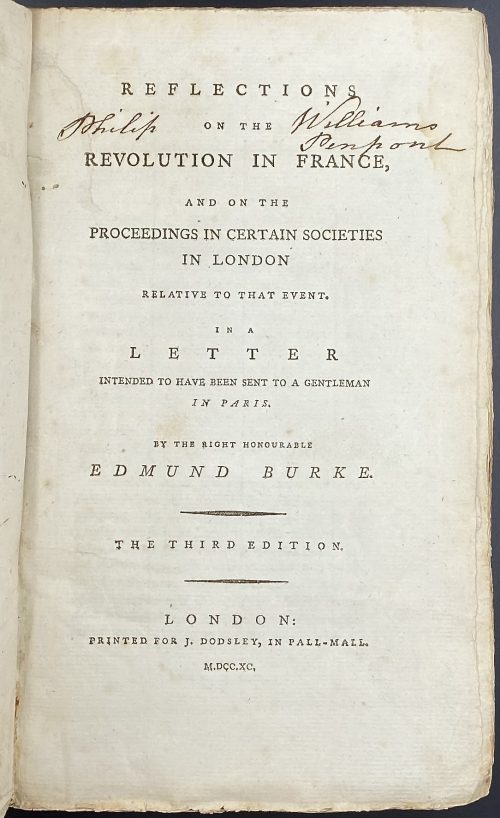 Title: REFLECTIONS | ON THE | REVOLUTION IN FRANCE, | AND ON THE | PROCEEDINGS IN CERTAIN SOCIETIES | IN LONDON | RELATIVE TO THAT EVENT. | IN A | LETTER | INTENDED TO HAVE BEEN SENT TO A GENTLEMAN | IN PARIS. | BY THE RIGHT HONOURABLE | EDMUND BURKE. | — | {in lozenges} THE THIRD EDITION. | —| LONDON: | PRINTED FOR J. DODSLEY, IN PALL-MALL. | M.DCC.XC. || Pagination: [i-iii] iv, [1] 2-364, total 368 pages. Collation: 8vo; π2 B-Z8 Aa6 (plus one blank flyleaf in the front and one in the back), total 184 leaves. Binding: 23 x 14.5 cm, publisher’s paper-backed binding in blue boards with handwritten title to spine (illegible), laid paper, margins untrimmed. Housed in a modern brown cloth clamshell box with brown gilt-lettered label. Note: The second edition same year has a total of 360 pages (iv, 356); see LIB-2590.2021. Inscription to title page: Philip [ON THE] Williams Penpont – that is probably of Philip Williams Esq., of Penpont, Breconshire, Wales. (c. 1742 – 1794).
 -
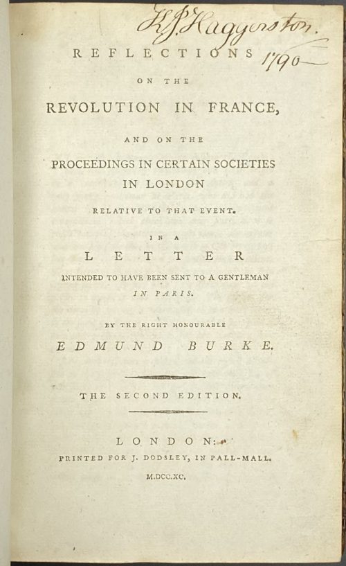 Title: REFLECTIONS | ON THE | REVOLUTION IN FRANCE, | AND ON THE | PROCEEDINGS IN CERTAIN SOCIETIES | IN LONDON | RELATIVE TO THAT EVENT. | IN A | LETTER | INTENDED TO HAVE BEEN SENT TO A GENTLEMAN | IN PARIS. | BY THE RIGHT HONOURABLE | EDMUND BURKE. | — | {in lozenges} THE SECOND EDITION. | —| LONDON: | PRINTED FOR J. DODSLEY, IN PALL-MALL. | M.DCC.XC. || Pagination: [4 blanks] [i-iii] iv, 1-356 [4 blanks]. Collation: 8vo; π2 B-Z8, Aa2. Binding: Quarter calf with marbled boards, gilt fillets, red label with gilt lettering to spine. "King John Haggerston, 1790" handwritten ink inscription to front endpaper, t.p. and p. iii. Seems like Sir John Haggerston, 9th Baronet.
 -
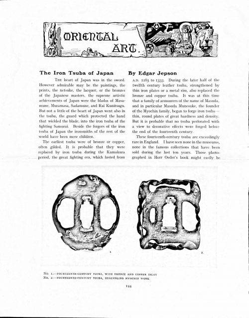 Magazine article by Edgar Jepson: The Iron Tsuba of Japan (Section: Oriental Art), published in volume Vol. 70 (September–December) of The Connoisseur: An Illustrated Magazine for Collectors, Vol. 70 (September–December); pp. 143-152 / C. Reginald Grundy [ed.] — London: Published by the Proprietor, W. CLAUSE JOHNSON, at the Editorial and Advertisement Offices of The Connoisseur, 1924. Owner's half black morocco, gilt lettering to spine, blue cloth boards. Two volumes bound together without original covers. Size 28.5 x 22 cm. Vol. 1: The Connoisseur | An Illustrated Magazine | For Collectors | Edited by C. Reginald Grundy | Vol. LXIX. | (MAY—AUGUST, 1924) | LONDON | Published by the Proprietor, W. CLAUSE JOHNSON, at the | Editorial and Advertisement Offices of The Connoisseur, | at 1, Duke Street, St. James's, S.W. 1 | 1924 || Pp.: [i-ii] iii-xviii [xix] [1, 2 - plate] 3-249 [250]. Vol. 2: The Connoisseur | An Illustrated Magazine | For Collectors | Edited by C. Reginald Grundy | Vol. LXX. | (SEPTEMBER—DECEMBER, 1924) | LONDON | Published by the Proprietor, W. CLAUSE JOHNSON, at the | Editorial and Advertisement Offices of The Connoisseur, | at 1, Duke Street, St. James's, S.W. 1 | 1924 || Pp.: [i-ii] iii-xxii [2 blanks] [1, 2 - plate] 3-261 [262]. The Iron Tsuba of Japan by Edgar Jepson The heart of Japan was in the sword. However admirable may be the paintings, the prints, the netsuke, the lacquer, or the bronzes of the Japanese masters, the supreme artistic achievements of Japan were the blades of Masamune, Muramasa, Sadamune, and Rai Kunitsugu. But not a little of the heart of Japan went also in the tsuba, the guard which protected the hand that wielded the blade, into the iron tsuba of the fighting Samurai. Beside the forgers of the iron tsuba of Japan the ironsmiths of the rest of the world have been mere children. The earliest tsuba were of bronze or copper, often gilded. It is probable that they were replaced by iron tsuba during the Kamakura period, the great fighting era, which lasted from A.D. 1185 to 1333. During the later half of the twelfth century leather tsuba, strengthened by thin iron plates or a metal rim, also replaced the bronze and copper tsuba. It was at this time that a family of armourers of the name of Masuda, and in particular Masuda Munesuke, the founder of the Myochin family, began to forge iron tsuba — thin, round plates of great hardness and density. But it is probable that no tsuba perforated with a view to decorative effects were forged before the end of the fourteenth century. These fourteenth-century tsuba are exceedingly rare in England. I have seen none in the museums, none in the famous collections that have been sold during the last ten years. Those photographed in Herr Oeder's book might easily be the fifteenth century. No. 1 is a curious cup-shape tsuba decorated with a bronze and copper inlay. No. 2, with its edges curiously twisted in the forging, looks like Myochin work. But it is not of the Myochin iron. The Myochin family produced some of the greatest ironsmiths of Japan. Armourers first of all, tsubasmiths, forgers of sake-kettles, articulated reptiles, crustacea, and insects — everything that can be done with iron they did; they pushed their medium to its limit. They were forging iron tsuba in 1160, and they were still forging them in 1860. And it was their own iron, or rather their own steel. They discovered the secret of it early, and they kept that secret in the family for all those hundreds of years. There is no mistaking a Myochin tsuba: balance it on your finger and tap it with a piece of metal, always it gives forth a clear bell-like ring that you get from the work of no other ironsmith, Japanese or European. Always the Myochin tsuba is before everything a protection to the hand of the swordsman; to that everything is, as it should be, subordinated. No. 3 is a Myochin tsuba of the fifteenth century, and probably of the early fifteenth century. No. 4, by Myochin Munetaka, perforated with a grotesque figure, is an example of that twisting and twisting of the iron in the forging till it forms a pattern like the grain of wood. The Myochin smiths invented these wood-grain tsuba, and no other smiths equalled them in their forging. In the sixteenth century, the fighting tsuba was probably at its best. It was a century of great tsubasmiths. Then the first Nobuiye, whose tsuba fetched £100 apiece, circa 1800, in Japan, and the first Kaneiye flourished. No. 5 is a tsuba forged by a great smith, Iyesada of Sotome, in the manner of Nobuiye I, decorated with the karakusa tendrils that Nobuiye delighted in, with lightning and clouds. No. 6 is a guard of Sanada Tembo, the chief smith of the Tembo family, stamped, punning fashion, with the character Tembo. Akin to the Tembo tsuba were those of the Kiami and Hoan smiths. Then also the Heianjo smiths and the Owari smiths, especially those of Nagoya and the Yamakichi family, forged their strongest tsuba. Those of the Yamakichi were tested after the forging by being pounded in iron mortars — at least, so the legend runs. But they were a sternly utilitarian family, and I have never seen a Yamakichi tsuba of any beauty. In the later half of the fifteenth century arose the fashion of decorating tsuba with an inlay, zogan, of bronze. The Heianjo tsuba, forged at Kyoto in the latter half of the fifteenth and the beginning of the sixteenth century, were often thus inlaid. The earliest of them were called "Onin", of which No. 7 is an example. In addition to the bronze inlay around the edge, it is inlaid with a representation, some say, of snow; others say, of the duckweed on a pond. No. 8 is probably a Heianjo tsuba, but I am not quite sure about it. The inlaid acacia branches might be very early Shoami work. But to judge by the iron, it is a fifteenth-century tsuba; and the authorities place the beginning of the Shoami school not later than early in the sixteenth century. No. 10 is an example of the Fushimi-zogan, a flat inlay of a light-coloured bronze. These tsuba took their name from the fact that they were first forged at Fushimi, in Yamashiro, in the sixteenth century. It is of the type known as Mon-zukashi, perforated with crests (mon) à jour. The Yoshiro-zogan tsuba were also first forged at Fushimi by Yoshiro Naomasa. They were distinguished from the Fushimi-zogan by the fact that their inlay was generally a little raised-not always-for the inlay of No. 9, a tsuba forged by a later nineteenth-century Yoshiro, is quite flat. It is an interesting tsuba, for, with its decoration grown florid and excessive, it marks the intermediate stage between the simple and delightful designs of the genuine fighting tsuba and the elaborate pictures in gold and silver on the tsuba of the eighteenth-century smiths of Awa and Kyoto, which have become mere ornaments of the goldsmith. The Gomoku-zogan (No. 11) tsuba were probably first forged earlier than the Fushimi and Yoshiro-zogan tsuba. This inlay, in slight relief, is a representation in a light-coloured bronze and copper of twigs caught in the eddies of streams. The seventeenth century and early eighteenth century were the great periods of perforated tsuba. The designs, and they are often admirable, are for the most part in plain fretwork; but they are also chased. No. 12, a crane under an acacia, is a tsuba of a Higo smith, great forgers of fighting tsuba during this period. These smiths also excelled in nunome zogan, a very thin gold and silver inlay, with which they further decorated their perforated guards. The smiths of the Umetada and Shoami families also forged iron tsuba during this period; but their designs, though sometimes pleasing enough, are rarely fine. The best work of Myoju Umetada is in sentoku, not iron. The Choshu smiths, coming later, surpass the perforated guards of both the Umetada and Shoami smiths in beauty of design. No. 13, a lotus in the round, not only fretwork, but also engraved, is a good example of the admirable balance they so often attained in their designs. It is a sufficiently realistic lotus, but yet of a delightful simplicity. In considerable contrast is No. 14, the dragon by Soheishi Soten — one of the only two authentic tsuba of his forging known — the first forger of hikone-bori tsuba, which were in extraordinary favour in Japan during the eighteenth century, and illustrated every important event in Japanese history. It is on the elaborate side, but fine, strong work, and an excellent guard to the hand, for the lighter and more open part, which gives the design its admirable balance, is on the inside, and not exposed to the full swing of an opponent's blade. A few years ago there was a tendency to decry the Namban tsuba as having sprung too directly from foreign sources. But though the original suggestion may have been Chinese, or, as some say, Portuguese, the Japanese made it entirely their own, as characteristically Japanese as anything can well be, but, it must be admitted, of a decadent period. The school took its rise at the beginning of the seventeenth century, and the early tsuba were forged of a specially hard iron, the Wootz, imported from Southern India. No. 15, the signs of the Zodiac, is an excellent tsuba from the fighting point of view. Both it and No. 16 are of quite charming, if elaborate, design, and both of them, with their delicate scroll-work, so astonishingly undercut, are the very last word in the work of the ironsmith-veritable iron lace. To return to the simpler perforated tsuba, the smiths of Akasaka, a suburb of Tokyo, produced probably the most charming designs. Their style derives considerably from the Higo smiths, and their earlier fighting tsuba are very like the Higo tsuba. But always their work was just a little lighter than that of the Higo smiths, and in the end they moved right away from them and became the forgers of very light guards indeed. No. 17, is a representation of the Hiyokudori, the fabulous double bird, in which were reincarnated the souls of the two lovers, Gompachi and Komurasaki; and No. 18, “the tsuba of a hundred ducks "— there are about forty — are characteristic designs of the school. In the work of the Akasaka smiths the balance, which makes the design of a good tsuba so admirable and delightful, attains its height. This admirable balance seems often to be obtained by a deliberate sacrifice of symmetry. About nine hundred and ninety-nine European ironsmiths out of a thousand would have made the right and left sides of the Hiyoku-dori line by line, and perforation by perforation, exactly alike; he would have cut out exactly as many ducks on the one side of “the tsuba of a hundred ducks” as on the other, and made each duck on the right side correspond exactly in position and attitude with a duck on the left side. By variations the tsubasmith attained a finer balance, almost a higher symmetry. No. 19, often called by collectors the "rose-window" tsuba, but really a stylised chrysanthemum, is a favourite design of the Akasaka smiths, but Hizen work and inlaid in the Hizen manner with gold nunome. No. 20 is a Satsuma tsuba of the middle period. The Satsuma smiths of the nineteenth century produced probably the most ornate of all the iron guards, for the most part calibashes and beans with their leaves and tendrils realistic in the extreme, but of charming design. Few crafts have been carried further than that of the tsubasmith; few crafts working in a difficult medium have handled more subjects with greater feeling for beauty or greater liveliness of fancy. It is interesting to note again and again how school influences school, and smith influences smith. But, as in all the applied arts, the finest tsuba were forged by men who never lost sight of the purpose of a tsuba, that it is before everything a protection to the hand, and never subjected that purpose to a passion for virtuosity. Illustrations: No 1. FOURTEENTH-CENTURY TSUBA, WITH BRONZE AND COPPER INLAY No. 2. FOURTEENTH-CENTURY TSUBA, RESEMBLING MYOCHIN WORK No. 3. MYOCHIN TSUBA, FIFTEENTH CENTURY No. 4. MYOCHIN TSUBA, NINETEENTH CENTURY No. 5. SIXTEENTH-CENTURY TSUBA No. 6. SIXTEENTH-CENTURY TSUBA BY IYESADA OF SOTOME BY SANADA TEMBO No. 7. ONIN TSUBA No. 8. HEIANJO (?) TSUBA No. 9. YOSHIRO TSUBA, NINETEENTH CENTURY No. 10. FUSHIMI-ZOGAN, NINETEENTH CENTURY No. 11.- GOMOKU-ZOGAN, SIXTEENTH CENTURY No. 12. HIGO TSUBA, SEVENTEENTH CENTURY No. 13. CHOSHU TSUBA, SEVENTEENTH CENTURY No. 14. SOTEN TSUBA, SEVENTEENTH CENTURY No. 15. NAMBAN TSUBA, EIGHTEENTH CENTURY No. 16. NAMBAN TSUBA, NINETEENTH CENTURY Nos. 17. AND 18. AKASAKA TSUBA, EIGHTEENTH CENTURY No. 19. HIZEN TSUBA, EIGHTEENTH CENTURY No. 20. SATSUMA TSUBA, EIGHTEENTH CENTURY
 -
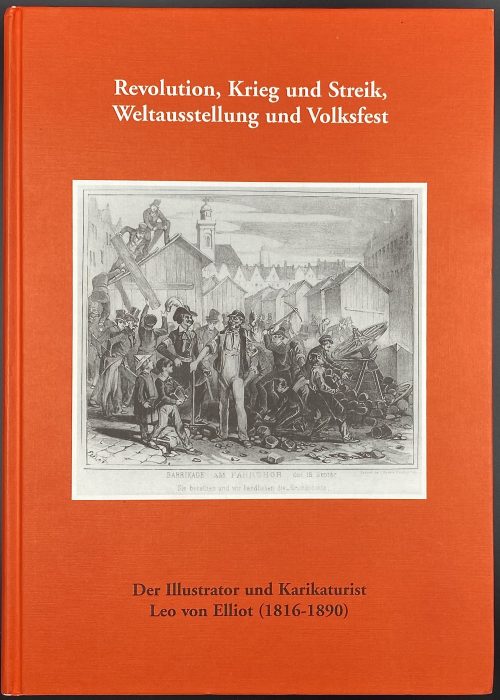 Title: Revolution, Krieg und Streik, | Weltausstellung und Volksfest | Der Illustrator und Karikaturist | Leo von Elliot (1816–1890) | von Eckhart G. Franz | Hessische Historische Kommission Darmstadt 2000 || Series: Arbeiten der Hessischen Historischen Kommission, Neue Folge Band 17. Pagination: [1-6] 7-340, 458 b/w illustration. Binding: hardcover, red pictorial boards, 30 x 21.5 cm.
 -
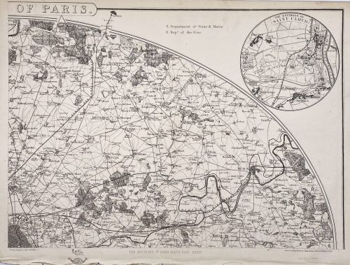
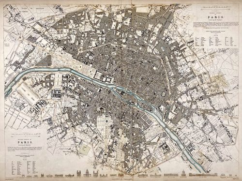
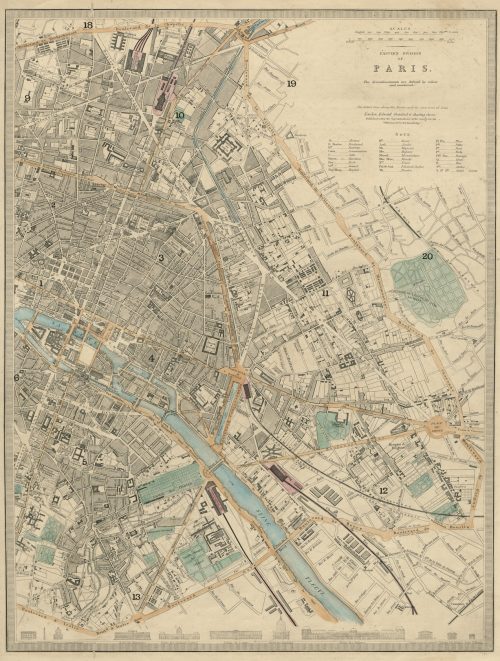 EASTERN DIVISION | OF | PARIS. | The Arrondissements are defined by colour | and numbered. || London, Edward Stanford 6 Charing Cross. | Published under the Superintendence of the Society for the Diffusion of Useful Knowledge. || Dimensions: Sheet: 43.5 x 35.5 cm; Image: 39.5 x 30 cm. Contributors: Edward Stanford (British, 1827 – 1904) – cartographer, engraver, publisher. Society for the Diffusion of Useful Knowledge (SDUK) (British firm, 1826 – 1846).
 -
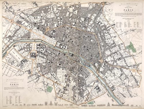 Top right: EASTERN DIVISION OF | PARIS. | Containing the Quartiers | {5 lines in italic} | Published under the Superintendence of the Society for the | Diffusion of Useful Knowledge || Bottom left: WESTERN DIVISION OF | PARIS. | Containing the Quartiers | {4 lines in italic} | Published under the Superintendence of the Society for the | Diffusion of Useful Knowledge || Under the frame: Drawn by W. B. Clarke, Archt. […] London: Published by Chapman and Hall, 186, Strand. April 1st, 1834. [...] Engraved by J. Shury || Dimensions: Sheet: 40.8 x 57 cm; Image: 38.7 x 52.5 cm. Contributors: William Barnard Clarke (British, 1806 – 1865) – artist. John Shury (fl. c. 1814-1844) – engraver. Chapman and Hall (London) – publisher. Society for the Diffusion of Useful Knowledge (SDUK) (British firm, 1826 – 1846).
 -
 Top right: EASTERN DIVISION OF | PARIS. | Containing the Quartiers | {5 lines in italic} | Published under the Superintendence of the Society for the | Diffusion of Useful Knowledge || Bottom left: WESTERN DIVISION OF | PARIS. | Containing the Quartiers | {4 lines in italic} | Published under the Superintendence of the Society for the | Diffusion of Useful Knowledge || The map is framed, but there is no lettering beneath the frame to identify the cartographer, engraver, and publisher. However, we can attribute it to William Barnard Clarke (British, 1806 – 1865) and John Shury (fl. c. 1814-1844). The publisher is either Baldwin & Cradock or Chapman and Hall. Dimensions: Sheet: 40 x 60.8 cm; Image: 40 x 53.5 cm.
 -
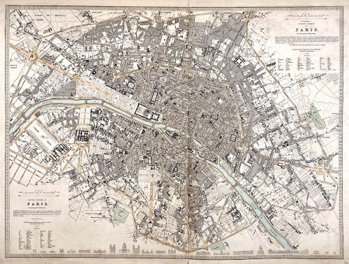
 Top right: EASTERN DIVISION OF | PARIS. | Containing the Quartiers | {5 lines in italic} | Published under the Superintendence of the Society for the | Diffusion of Useful Knowledge || Bottom left: WESTERN DIVISION OF | PARIS. | Containing the Quartiers | {4 lines in italic} | Published under the Superintendence of the Society for the | Diffusion of Useful Knowledge || Under the frame: Drawn by W. B. Clarke, Archt. […] Published by Baldwin & Cradock, 47 Paternoster Row, A April 1st, 1834. [...] Engraved by J. Shury || Dimensions: Sheet: 40.8 x 57 cm; Image: 38.7 x 52.5 cm. Contributors: William Barnard Clarke (British, 1806 – 1865) – artist. John Shury (fl. c. 1814-1844) – engraver. Baldwin & Cradock (London) – publisher. Society for the Diffusion of Useful Knowledge (SDUK) (British firm, 1826 – 1846).
 -
 Softcover, in pictorial wrappers, 28 x 21.8 cm, 37 entries, with colour illustrations. Catalogue of the sales exhibition on March 3 - April 5, 2008 in NY; pagination: [1-3] 4-102 [2], ils. Contributor: Sebastian Izzard
 -
 Title: OLD DUTCH | POTTERY AND TILES | BY ELISABETH | NEURDENBURG | LITT. D., READER IN THE HISTORY OF ART AT | THE UNIVERSITY OF GRONINGEN. TRANSLATED | WITH ANNOTATIONS BY | Bernard Rackham | DEPUTY KEEPER, DEPARTMENT | OF CERAMICS, VICTORIA AND | ALBERT MUSEUM | […] | WITH ONE HUNDRED AND TWELVE | ILLUSTRATIONS OF WHICH NINE | ARE IN COLOUR | LONDON: BENN BROTHERS, LIMITED | 8 BOUVERIE STREET, E.C. 4 | 1923 || Verso to half-title: Of this book 100 copies only for sale have been printed on English | hand-made paper, bound in pigskin and signed by the Authoress | and Translator. These copies also contain an extra colour plate. | This in Number “7” (in manuscript) | Two signatures (ink, manuscript) || Pagination: [i, ii] – h.t. / tirage, [iii, iv] – t.p. / imprint, [v, vi] – dedication to Dr. A. Pit / blank, vii-xv [xvi blank] [1, 2] 3-155 [156 blank], frontispiece (colour) and 59 leaves of plates (9 colour) with 112 figures, with lettered protective sheets. Collation: 4to in 8th; [A]8 [B]8 C-K8 L6; frontis., +59 leaves of plates. Binding: 30 x 24 cm, Full dark brown pigskin with gilt ornament to front board and gilt lettering to spine; printed on thick wove paper, top edge gilt, others untrimmed. Contributors: Neurdenburg, Elisabeth (Dutch, 1882 – 1957) – author [autograph]. Rackham, Bernard (British, 1876 – 1964) – translator [autograph]. Brendon, William (British, 1845 – 1928) – printer. Mayflower Press (Plymouth), William Brendon & Son, Ltd. – printer Benn Brothers Ltd. (British company, 1880 – 1987) Benn, Sir John, 1st Baronet (British, 1850 – 1922)
 -
![E. de Crauzat. L'Œuvre gravé et lithographié de Steinlen: Catalogue descriptif et analytique suivi d'un essai de bibliographie et d'Iconographie de son œuvre illustré / Préface de Roger Marx. — San Francisco: Alan Wofsy Fine Arts, 1983. — Fac similé de l'édition originale de 1913. — pp.: [i-ix] x-xv [1-3] 4-228 [229-234]. — [Ernest de Crauzat].](https://varshavskycollection.com/wp-content/uploads/2021/02/LIB-2289.2019-d-500x707.jpeg) Title: DE CRAUZAT | L'ŒUVRE | Gravé et Lithographié | DE | STEINLEN | Catalogue descriptif et analytique | suivi d'un essai de bibliographie et d'Iconographie | de son œuvre illustré. | PRÉFACE | DE ROGER MARX | San Francisco | Alan Wofsy Fine Arts | 1983. Edition: Fac-similé de l'édition originale de 1913. Pagination: [i-ix] x-xv [1-3] 4-228 [229-234]. Size: 32 x 24 cm.
Title: DE CRAUZAT | L'ŒUVRE | Gravé et Lithographié | DE | STEINLEN | Catalogue descriptif et analytique | suivi d'un essai de bibliographie et d'Iconographie | de son œuvre illustré. | PRÉFACE | DE ROGER MARX | San Francisco | Alan Wofsy Fine Arts | 1983. Edition: Fac-similé de l'édition originale de 1913. Pagination: [i-ix] x-xv [1-3] 4-228 [229-234]. Size: 32 x 24 cm. -
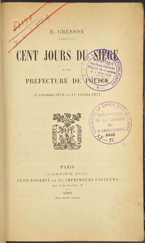 Title-page: E. CRESSON |—| CENT JOURS DE SIÈGE | A LA | PRÉFECTURE DE POLICE | 2 NOVEMBRE 1870 — 11 FÉVRIER 1871 | {publisher’s device} | PARIS | LIBRAIRIE PLON | PLON-NOURRIT ET Cie, IMPRIMEURS-ÉDITEURS | RUE GARANCIÈRE, 8 | 1901 | Tous droits réservés || Description: 8vo, 22 x 14.5 cm, quarter brown calf over marbled boards, flat spine with gilt fillets, gilt lettering, marbled endpapers; inscriptions to t.p.: 2117 A | Ba V –1 1bis 3; ink stamps to t.p.: (1) « LÉGION DE LA GARDE REPUBLICAINE | BIBLIOTÈQUE | des Sous-Officiers | Brigadiers et Gardes | DE L’INFANTERIA | NAPOLEON » ; (2) « LÉGION DE LA GARDE REPUBLICAINE | BIBLIOTÈQUE | DE LA CASERNE | DU | PRINCE-EUGÈNE | (hand) XIII | XX—86 » Collation: 8vo; π6 1-248 252, total 200 leaves. Pagination: [2] [i-v] vi-x, [1] 2-385 [3], total 400 pages. BNF: ark:/12148/bpt6k4936n Author: Ernest Cresson (French, 1824 – 1902)
 -
 Publisher’s blue wrapper: DÜRERS | KUPFERSTICHE UND HOLZSCHNITTE. | EIN KRITISCHES VERZEICHNIS | VON | R. v. RETBERG. | MÜNCHEN. | THEODOR ACKERMANN. | 1871. || Title page: similar to front wrapper, 2.5 cm cut at the bottom, text not affected. Pagination: front wrapper with lettering in a frame, flyleaf, [4] 1-169 [170 blank] [2], flyleaf, back wrapper with imprint plus 2 plates (frontis., Il. entry №129, and op. p., il. entry 100 № 260, printed on laid paper without watermark). Collation: π2 1-88 9-134 142, plus 2 plates extraneous to collation, incl. frontispiece. Binding: 26.4 x 17.5 cm, quarter green morocco over marbled boards, black compartment fillets and lettering to spine, publisher’s wrappers preserved. Marks: bookplate 6 x 9 cm to front pastedown: “БИБЛИОТЕКА | ГОСУДАРСТВЕННОГО | ЭРМИТАЖА ИЗ СОБРАНИЯ | СТЕПАНА ПЕТРОВИЧА | ЯРЕМИЧА | (1869 – 1939)”, purple ink stamp “В ПРОДАЖУ”. To front wrapper: Ink manuscript on top “Dr. Lichtenstein”… etc., black ink seal of rampant lion and pencil number “949” in the middle; pencil marks to p. 162.
Contents: Inhalt - Berichtigungen - Vorwort und Einleitendes - Dürers Lebenskizze - [Text] - Nachtrag zu Dürers "Lebenskizze". A critical directory of Albrecht Dürer (German, 1471 – 1528) copperplate engravings and woodcuts by Ralf von Retberg (German, 1812 – 1885): the description of 167 woodcuts and 103 copperplate engravings.
Provenance: From the collection of a Russian artist Stepan Petrovich Yaremich, sold by Hermitage Museum in St. Petersburg. Ref: Royal Academy. -
 Title page: LES | BAISERS , | PRÉCÉDES | DU MOIS DE MAI, | POËME. | [vignette] | A LA HAYE , | Et se trouve à Paris | Chez Lambert , Imprimeur, rue de la Harpe. | Et Delalain , rue de la Comédie Françoise. | M. DCC. LXX Size: 8vo; 24.5 x 15.5 cm; Binding by Hippolyte Duru – stamp at the back of the front end paper DURU, 1855; full red calf, boards decorated in gilt, raised bands and gilt decorations in compartments, gilt lettering, AEG, peacock marbled end papers, text and illustrations printed on Holland paper. Collation: 2 ffls, engraved half-title by N. Ponce after Ch. Eisen, frontispiece by Etienne Fessard after Claude-Jean-Baptiste Hoin (French, 1750 – 1817) w/guard tissue, t.p. by J. Aliamet after Ch. Eisen, Réflexions préliminaires: A8, B4; 'Le Mois de Mai' half-title, imprim. note on verso, frontispice by De Longueil after Ch. Eisen w/guard tissue, A4 C-F(8) H4; 2bfls. Frontispiece by Etienne Fessard is unique in this edition. Pagination: [2] 3-24, [27]/28, 5/6, 31/32 31/34 11/12 37-119 [120], 22 head-pieces after Ch. Eisen and 22 end-pieces after Marillier, engraved by Baquoy, Binet, Delaunay, Lingée, De Longueil, Masquelier, Massard, and Née. Mistakes in pagination likely confirms first printing first edition. Catalogue raisonné: Cohen, De Ricci (1912): 308-311). Artists: Charles Eisen (French, 1720–1778); Clément Pierre Marillier (French, 1740–1808), and Claude-Jean-Baptiste Hoin (French, 1750–1817). Engravers: Jacques Aliamet (French, 1726–1788); Jean Charles Baquoy (French, 1721–1777); Louis Binet (French, 1744–about 1800); Nicolas Delaunay (French, 1739–1792); Etienne Fessard (French, 1714–1777); Charles Louis Lingée (French, 1748–1819); Joseph de Longueil (French, 1730–1792); Louis Joseph Masquelier (French, 1741–1811); Jean Massard (1740–1822); François Denis Née (French, 1735–1818); Nicholas Ponce (French, 1746–1831).
 -
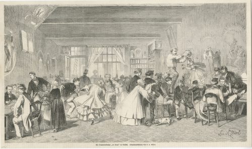
A woodcut illustration after drawing by Leo von Elliot, published at Illustrirte Zeitung, 17 January 1863. English translation: Student bar "The Hole" in Brussels.
The official name of this bar, located at Rue des Sols in Bussels, was "À la vue de l'Université" (In sight of the University). This was the place where the students of the Université libre de Bruxelles (Free University of Brussels), and especially the members of Société, ou Cercle, des Crocodiles (The Crocodile Society, or Circle), gathered in the 1860s. -
GALIANI, Ferdinando, Abbé. Dialogue sur le commerce des bleds. Londres, 1770. L'Abbé Roubaud, Pierre Joseph André. Récréations économiques ou lettres de l'auteur des représentations aux magistrats, a M. le chevalier Zanobi, principal interlocuteur des Dialogues sur le commerce des bleds; Amsterdam & Paris, Delalain, 1770. Béguillet, Edme. De principiis vegetationis et agreculturae et de causis triplicis culturae in Burgundia disquisitio physica. Auctore E.B.D. ex Societate Œconomica Lugdunensi; Divione, 1768.
-
 Erasmus. The praise of folly / Translated by White Kennett. — London: Stephen Austen, 1726. Title page in black and red: MORIÆ ENCOMIUM: | OR, THE | PRAISE | OF | FOLLY. |—| Written in Latin by | ERASMUS. |—| Translated into English by | WHITE KENNETT, | Lord Bishop of Peterborough; | With a PREFACE by his Lordship. |—| Adorn’d with | A great Number of COPPER PLATES | neatly engraven: To which is added, the Effigies of | ERASMUS, and Sir THOMAS MORE, from | theDesigns of the celebrated HANS HOLBEINE. |—| (in gothic letters) The Fourth Edition. |—| LONDON: | Printed for Stephen Austen, at the Angel in | St. Pauls’ Church-yard. 1726. || Pagination: modern endpapers and flyleaves, [2] – blank / frontis. (engraved portrait of Erasmus, [2] – t.p. in black and red with George Cruikshank’s signature in the bottom, dated 1876 / blank, [14] – to the reader, i-xiv – commendatory verses, [2] – John Wilford advert., folding portrait of Thomas More, i-v, [vi] - epistle, 1-168 – panegyrick, [4] – index.; 46 copper-engraved illustrations after Hans Holbein the Younger; pp. 17-20 detached. Collation: 12mo; π2 A6, a-b6, B-P6 Q2 (B3 unsigned), 13 in-text engravings + 26 plates + 7 folding plates; total 106 leaves and 33 plates, extraneous to collation. Edition: 4th, thus. Binding: 16.5 x 10.5 cm; rebacked with a modern spine, modern endpapers and flyleaves, contemporary boards sprinkled and tooled in a style of Cambridge panel. Provenance: Cruikshank, George (British, 1792 – 1878) [1876]; Stephen Whitehead (Oakland, CA) [2021]. Catalogue raisonné: J. Lewine (1898) p. 171 — 1st edition thus of 1709, in-8vo, with portrait and 46 plates after Holbein. Contributors: Desiderius Erasmus Roterodamus (Dutch, c. 1469 – 1536) – author of the original text in Latin.
White Kennett (British, 1660 – 1728) – translator from Latin into English.
Hans Holbein the Younger (German, 1497/8 – 1543) – artist.
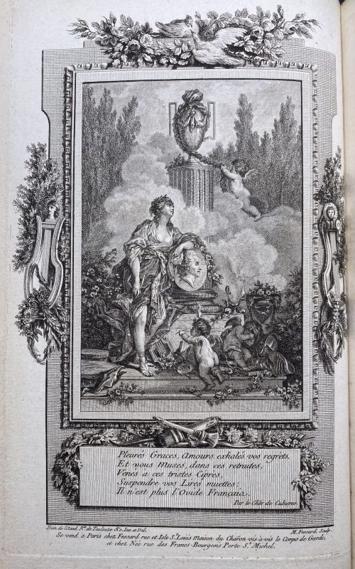
Stephen Austen (fl. c. 1727 – 1746) – publisher. Linked items: Engraved portrait of Erasmus of Rotterdam in an octagonal frame, 1757 by Flipart after Holbein.Эразм Роттердамский. Похвальное слово глупости. — М.-Л.: Academia, 1932.
-
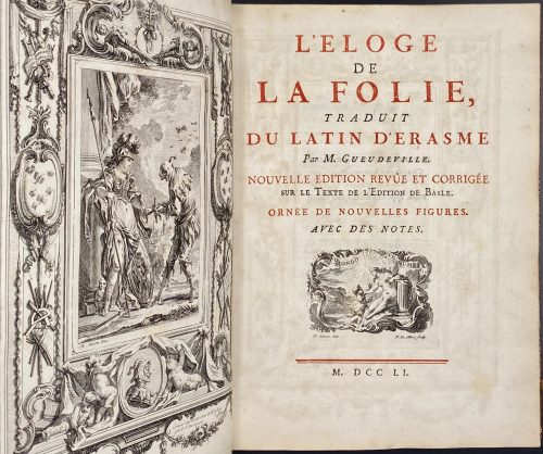 Title: L'ELOGE | DE | LA FOLIE, | TRADUIT | DU LATIN D'ERASME | Par M. Gueudeville. | NOUVELLE EDITION REVÛE & CORRIGÉE | sur le Texte de l'Edition de Basle. | ORNÉE DE NOUVELLES FIGURES. | AVEC DES NOTES. | {vignette Eisen / Le Mire} | — | M. DCC LI. || Pagination: [2 blank] [2] – h.t. / blank, [2] – t.p. / {citation*} | [4] – explication des figures; [i] ii-xxiv, [1] 2-222, [2] – table, [2 blank], plus frontispiece and 13 plates by various engravers after Charles Eisen, total number of pages 10+24+222+4=260, ils. Collation: 4to; [1 blank], π4 a-c4 A-Ee4 [1 blank], total number of leaves 130 plus frontispiece and 13 plates. Plates printed in black, paper 24 x 17.8 cm (grand papeir, 9.5 x 7 inches). Binding: Contemporary mottled calf, triple fillet gilt border with pomegranate corner pieces to boards, spine with raised bands, gilt foliage and pomegranates in compartments, red morocco spine label, all edges gilt, rebacked preserving the original spine and peacock marbled endpapers. Size: 24.8 x 18.8 cm; leaves 24 x 17.8 cm; text printed area: 10 x 6 cm. * Citattion: Admonere voluimus, non lædere: | Consulere moribus Hominum, | non officere. | Erasm. Epist. ad Mart. Dorpium Theolog. Usually, the citation is "Admonere voluimus, non mordere; prodesse, non laedere…", etc. Rococo-framed frontispiece engraved by Martinasie under the supervision of Le Bas. Contributors: Erasmus, Desiderius [Roterodamus] (Dutch, 1466 – 1536) – author. Gueudeville, Nicolas (French, 1652 – 1721) – translator. Meusnier de Querlon, Anne-Gabriel (French, 1702 – 1780) – notes. Eisen, Charles (French, 1720 – 1778) – artist. Engravers: Aliamet, Jacques (French, 1726 – 1788) Flipart, Charles Joseph (French, 1721 – 1797) Beauvais, Nicolas Dauphin de (French, 1687 – 1736) Pinssio [Pincio], Sébastien (French, 1721 – after 1744) Martenasie, Pierre François (French-Flemish, 1729 – 1789) Le Bas [Lebas], Jacques-Philippe (French, 1707 – 1783) Provenance: Bishop, Cortlandt Field (American, 1870 – 1935) – bookplate. Mary S. Collins – bookplate by J. H. Fincken. Robin F. Satinsky (American, 1919 – 2008) – Robin Collection bookplate. Catalogue raisonné: Cohen–deRichi 348-349; Lewine, p. 170; Ray (French) № 24, pp. 52-54.
 -
 One volume, collated 8vo, 19.5 x 13 cm, later bound in brown full morocco by Pouillet, gilt-bordered covers, raised bands to spine, gilt in compartments, gilt-lettered, double-fillet on cover edges, gilt dentelle inside, signed, all edges gilt, marbled endpapers. Title-page: ŒUVRES | PHILOSOPHIQUES | DE MR. D ***. | — | LES BIJOUX INDISCRETS | — | TOME CINQUIEME | {vignette} | A AMSTERDAM, | Chez Marc-Michel Rey. | — | M. DCC. LXXII. || Pagination: [8] [1] 2-389 [390], total 398 pages, frontis., vignette, plates. Collation: 3 blank leaves at front and rear, π2 a2 A-Aa8 Bb3, total 199 leaves plus 7 unsigned engraved plates incl. frontispiece, and engraved vignette to t.p. Catalogue raisonné: Cohen-DeRicci 303; Lewine 145-6: …with the plates which have been copied and reduced in the undated Cazin edition (1771 and 1785). Contributors: Marc-Michel Rey (Dutch, 1720 – 1780) – publisher. Denis Diderot (French, 1713 – 1784) – author.
 -
 Title-page: DELLE | NOVELLE ITALIANE | IN PROSA | BIBLIOGRAFIA | DI | BARTOLOMMEO GAMBA | BASSANESE | EDIZIONE SECONDA | CON CORREZIONI ED AGGIUNTE | {publisher’s device} | FIRENZE | TIPOGRAFIA ALL’INSEGNA DI Dante | M.DCCC.XXXV. || Collation: 8vo; π8 1-198; an extra leaf between 18 and 19 (189, pp. 289-10, errata), leaf 11 unsigned, leaf 12 signed 11. Total 161 leaves plus 6 leaves of plates extraneous to collation; Plates (copperplate engravings): (1) Giovanni Boccaccio, (2) Angelo Firezuola (i.e. Agnolo Firenzuola), (3) Lorenzo Magalotti, (4) Gasparo Gozzi, and (5) Michele Colombo by Marco Comirato, and (6) Franco Sacchetti by Francesco Bosa. Pagination: [i-iii] iv-xv [xvi] [1-3] 4-290, index [16], total 322 pages plus 6 plates, unpaginated. Binding: 22.4 x 15 cm, modern brown half-morocco over green sprinkled boards, red label with gilt lettering, publisher’s yellow wrappers preserved. Edition: 2nd; the 1st edition was published in 1833. Contributors: Bartolommeo Gamba (Italian, 1766 – 1841) – author, complier. Marco Comirato (Italian, c. 1800 – 1869) – engraver. Francesco Bosa (Italian, ? – ?) – engraver. Sitters: Giovanni Boccaccio (Italian, 1313 –1375) Franco Sacchetti (Italian, c. 1335 – c. 1400) Agnolo Firenzuola] (Italian, 1493 – 1543) Lorenzo Magalotti (Italian, 1637 – 1712) Gasparo Gozzi (Italian, 1713 – 1786) Michele Colombo (Italian, 1747 – 1838)
 -
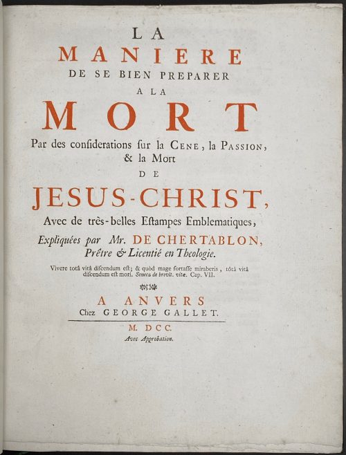 M. de Chertablon. La maniere de se bien preparer a la Mort par des Considerations sur la Cene, la Passion, et la Mort de Jesu-Christ. – Antwerp: George Gallet, 1700. Pagination: ff, [2 - blanks] [2 - t.p., blank] [3 - advert.] 4-63 [64]; 42 copper etched plates by Romeyn de Hooghe: A, B, C, 1-39; [20 - Dutch plate description of the David de la Vigne's Miroir de la bonne mort], bf. Full title: La maniere de se bien preparer a la Mort par des Considerations sur la Cene, la Passion, et la Mort de Jesu-Christ, Avec de très-belles Estampes Emblematiques, Expliquées par Mr. de Chertablon, Piêtre & Licentié en Theologie. Vivere totâ vitâ discendum est; & quòd mage fortasse miraberis, tôtâ vitâ discendum est mori. Seneca de brevit. vitæ. Cap. VII. A Anvers, Chez George Gallet. M DCC, Avec Approbation. / David de La Vigne. Spiegel om wel te sterven, annwyzende met beeltenissen van het lyden onses zaligmaakers Jesu Christi. Verzierd met 42 fyne Geërste Kopere Platen, Door Romain de Hooghe; Te Amsterdam, Voor dezen gedrukt by J. Stigter. Size: 4to, 27.2 x 21.6 cm. Binding: Late 19th century brown calf over marbled boards, spine with gilt lettering, raised bands, double fillet blind panels in compartments; marbled end-papers; bookplate of Samuel Ashton Thompson Yates library, AD 1894. Book illustrated with 42 copperplate etched engravings by Romeyn de Hooghe (Dutch, Amsterdam 1645–1708 Haarlem). According to Bonhams: the plates were "first printed for David de la Vigne's Miroir de la bonne mort. Each of the plates depicts a man contemplating a religious image in order to ease the passing of death, accompanied by commentary and an appropriate verse of scripture for each plate. The present French edition is bound with, as issued, the Dutch translation of David de La Vigne's aforementioned work."
 -
 Two volumes in blue cloth, 30.3 x 25.2 cm each, in a matching slipcase 31.5 x 25.5 x 6.5 cm, with silver lettering. Vol. 1: Text, pp.: [1-8] 9-502 [2 blank]; Vol. 2: Plates, 240 unpaginated pages (721 entries). Suzuki Harunobu (Japanese, 1725 – 1770) David B. Waterhouse (British, 1936 – 2017)
 -
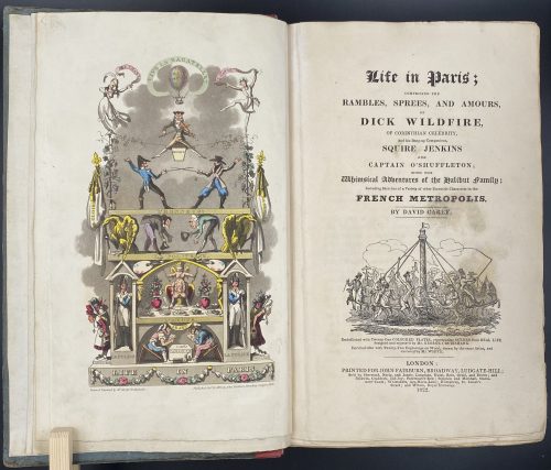
Title: Life in Paris ; | COMPRISING THE | RAMBLES, SPREES, AND AMOURS, | OF | DICK WILDFIRE, | OF CORINTHIAN CELEBRITY, | And his Bang-up Companions, SQUARE JENKINS | AND | CAPTAIN O’SHUFFLETON ; | WITH THE | Whimsical Adventures of the Halibut family ; | Including Sketches of a Variety of other Eccentric Characters in the | FRENCH METROPOLIS. | BY DAVID CAREY |[Vignette]| Embellished with Twenty-One COLOURED PLATES, representing SCENES from REAL LIFE, | designed and engraved by Mr. GEORGE CRUIKSHANK. | Enriched also with Twenty-Two Engravings on Wood, drawn by the same Artist, and | executed by Mr. WHITE. | LONDON : | PRINTED FOR JOHN FAIRBURN, BROADWAY, LUDGATE HILL; | Sold by Sherwood, Neely, and Jones ; Langman, Hurst, Rees, Orme, and Brown ; and | Baldwin, Craddoc, and Joy ; Paternoster-Row ; Simpkin and Marshall, Statio- | ners’ Court ; Whittakers Ave-Maria-Lane ; Humphrey, St. James’s | Street ; and Wilson, Royal Exchange. | 1822. ||
Edition: 1st edition in book form, 1st issue; large-paper copy bound from the parts in original blue paper boards, "most scarce" (Cohn).
Pagination: ffl, [i, ii] – h.t. ‘LIFE IN PARIS’ / ‘MARCHANT, Printer, Ingram-Court, London’, [2] – blank / Frontispiece (Ville la Bagatelle!!) hand-coloured, [iii, iv] – t.p. with vignette / blank, [v] vi-xxiv, [1] 2-489 [490 blank], [2] – 'TO THE BINDER' and 'Marchant, Printer, Ingram-Court, Fenchurch Street' "considered indispensable to a complete copy" (Cohn) / blank, bfl watermarked 1800; 21 hand-coloured aquatints and 22 wood-engraved text vignettes; cancelled leaves 143/4 and 335/6; pinholes from printing visible in most gatherings.
Collation: 4to; [a]-c4, B-Z4 Aa-Zz4 3A-3Q4 3R1 + [Ω]1
Binding: Original boards sometime re-backed with red paper, binder's end leaf watermarked 1800; red hard-grained morocco clamshell box.
Catalogue raisonné: Albert M. Cohn, 1924: № 109 p. 37/8; Abbey, J. R. (Life in England), 112; Tooley (Some English Books with Coloured Plates) 129; Hardie (English coloured books) 199.
Description of Shapero Rare Books, London: Of the copies that have come to auction since 1975 only one has been a large-paper copy in original boards. "The pictures are extremely spirited and true and are all the more wonderful in view of the fact that the artist’s continental experiences were limited to one day spent in Boulogne." (Hardie). In 1821, the journalist Pierce Egan published Life in London, an immediate success illustrated by the Cruikshank brothers, George and Robert. In order to capitalise on this success, another journalist, David Carey, decided to publish his own Life in Paris in monthly instalments (just like Life in London) and with a very similar frontispiece to the one that appears in Egan’s work; Life in Paris, however, was illustrated only by George Cruikshank. One of the earliest and most notable examples of the work of George Cruikshank, with fine, clean plates. -
Pictorial cloth boards, spiral-bound, pp.: 3 leaves: h.t., frontis., t.p., 1-326; 123 black & white plates within the pagination.
-
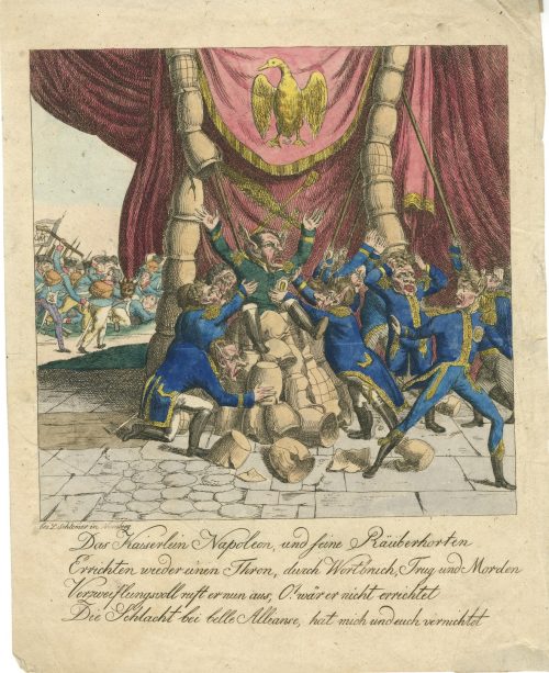 Hand-coloured etching by L. Schlemer from Nürnberg, printed in c. 1815. Napoleon, with long ears, is seated on a throne made of a pile of crockery, which is falling over. Referring to the Battle of Waterloo. See p. 134 in vol. 2 of A. M. Broadley. Napoleon in caricature, 1795-1821. — London, New York: John Lane, 1911.
 -
A limited-edition (№26/500) set of 42 etchings and drypoints after Félicien Rops (Belgian, 1833 – 1898), each mounted in a numbered passe-partout, printed posthumously by an anonym in Germany in 1905; in a flapped half faux suede-backed cardboard portfolio with straps, 442 x 335 mm, red embossed lettering to the front cover, bookplate of Richard Teschner (Austrian, 1879 – 1948) pasted inside.
Title-page (in a red frame): Das erotische Werk | des Felicien Rops | Zweiundvierzig Radie- | rungen des Meisters | in schwarzem und | farbigem Lichtdruck | 1905 | Privatdruk ||
Limitation (in a red two-section frame) : Dieses Werk wurde in einer | einmaligen Auflage von | 500 numerierten Exemplaren | hergestellt. — Ein Nachdruck | findet nicht statt, die Platten | == sind vernichtet == | Exemplar Nr. 26 ||
Verzeichnis der Tafeln (Table of Contents): 1. Initiation sentimentale; 2. La croix; 3. Entre-acte; 4. Holocauste; 5. La bonne hollandaise; 6. Étude; 7. La femme au pantin; 8. L’amour de Satan; 9. Au pays des féminies; 10. La volupté; 11. Evocation; 12. De castitate; 13. Joujou; 14. Vengeance d’une femme; 15. Phantasies; 16. Indolence; 17. Théâtre gaillard; 18. Appel au peuple; 19. Masques modernes; 20. Tout est grand chez les rois; 21. Marie-Madeleine; 22. L’amante du Christ; 23. Feuille de vigne; 24. La messe de Guide; 25 Viol et prostitution; 26. Le maillot; 27. Les jeunes France; 28. Les diaboliques; 29. Coquetterie au miroir; 30. Jeune homme; 31. La femme et la mort; 32. Confidence; 33. La bergère; 34. La mère aux satyrions; 35. Les exercices de dévotion de Mr. Henri Roch; 36. Mademoiselle de Maupin; 37. Le bonheur dans le crime; 38. La sirène; 39. Les cabotinages de l’amour; 40. Document sur l’impuissance d’aimer; 41. A cœur perdu; 42. Curieuse.
-
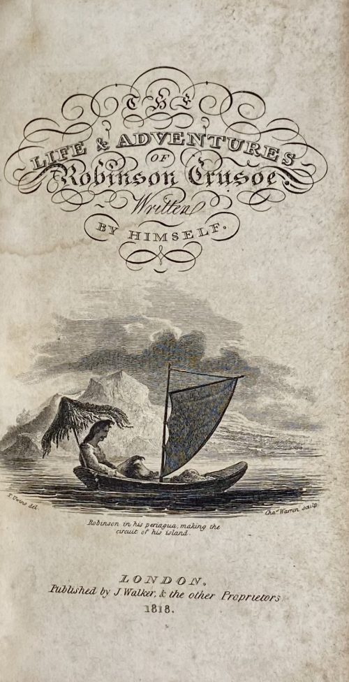 Description: 12mo, full calf, 12.9 x 7.4 cm, boards chain-bordered in gilt, front board gilt-lettered with the name of the owner “T. D. TOWNSEND”, flat spine, adorned in gilt, black label with gilt lettering, red endpapers, bookstore ticket to front pastedown: SOLD BY | ASH & MASON, | 139 Chesnut st.; ink ms inscription to ffep: Presented to | T. D. Townsend by | Mrs. Rebecca Cole of Burlington, N. Y. | Septr 29th 1827. Note: Ash & Mason bookstore and printing house in Philadelphia, PA. Engraved title-page: THE | LIFE & ADVENTURES | OF | Robinson Crusoe | Written | BY HIMSELF. | {vignette by C. Warren after T. Uwins, inscribed “Robinson on his periagua, making the circuit of his island”} | LONDON. | J. Walker & the other Proprietors | 1818. || Frontispiece: seated portrait of Robinson Crusoe in his bungalow with a dog and a cat by C. Warren after T. Uwins, inscribed below: ROBINSON CRUSOE | surrounded by his domestics || under the frame: T. Uwins del — C. Warren sculp.; beneath: London. Pub. by Walker & the other Proprietors || Title-page: THE | LIFE & ADVENTURES | OF | ROBINSON CRUSOE; | WRITTEN BY HIMSELF. | — | LONDON: | Printed for J. Walker; | 8 lines of names… and B. Reynolds. | 1818. || Collation: A6 (A1 torn out, A2 blank), B-Z12, 2A-2D12, 2E10 (2E8-10 blank); total 328 leaves plus two plates (engraved frontispiece and engraved title). Pagination: [2 torn out] [2 blank], [i-iii] iv-vi [2 blank] [1] 2-638 [6 blank]; total 656 pages, ill. Contributors: Daniel Defoe [Daniel De Foe] (British, 1660 – 1731) – author. Thomas Uwins (British, 1782 – 1857) – artist. Charles Warren (British, 1762 – 1823) – engraver. J Walker & Co. [Walker & Edwards] (London) – publisher. Ellerton and Henderson, Printers (London) – printer.
