-
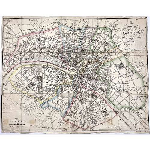 Upper right: Galignani's | PLAN OF PARIS | 1827 || in oval frame: Sauve sculpt. Bottom, under the frame: le Plan écrit par Lallemand. […] Gravé par E. Collin. Rue de la Harpe № 45. Dimensions: 36.5 x 46.5 cm. Armand Joseph Lallemand (French, c. 1810 - 1871) – cartographer. Charles-Étienne Collin (French, 1770 – 1840) – engraver. Étienne Collin II (French,1790 – 1852) – engraver. John Anthony Galignani (Italian, 1796 – 1873) – publisher. William Galignani (Italian, 1798 – 1882) – publisher.
 -
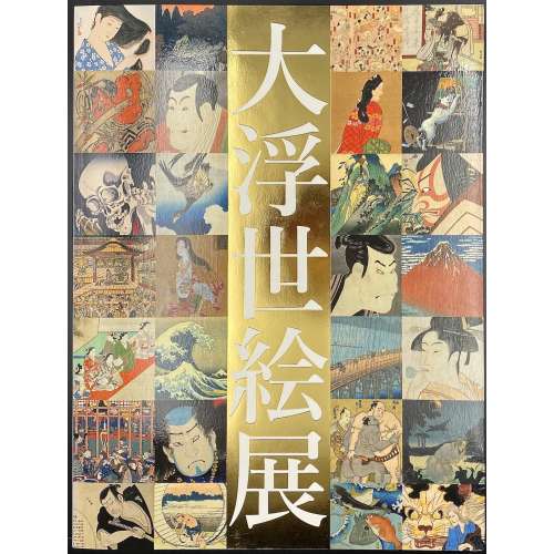
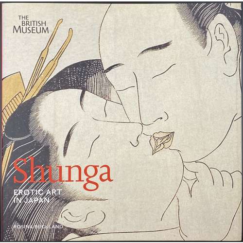 A hardcover pictorial album, 25 x 25.5 cm, bound in black buckram with silver lettering to spine, in pictorial dust jacket; pp.: [1-6] 7-175 [176 blank], total 88 leaves, illustrated in colour throughout. Title-page: Shunga | EROTIC ART | IN JAPAN | ROSINA BUCKLAND | THE BRITISH MUSEUM PRESS || Subject: Art, Japanese – Edo period, 1600-1868; Erotic art – Japan; Prints, Japanese – History. Contributor: Rosina Buckland (British, b. 1974)
 -
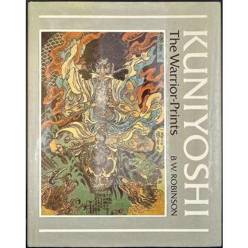 Title-page: KUNIYOSHI | The Warrior-Prints | B. W. Robinson | [space] | PHAIDON | OXFORD || Description: hardcover, 31.7 x 25 cm, bound in olive green cloth with gilt lettering to spine, white endpapers, pictorial olive dust jacket; pp.: [1-6] 7-208 incl. frontispiece, 64 plates, and 30 figs. in the text (total 104 leaves, 205 illustrations, including 32 in colour); catalogue with the list of illustrations, and index of characters portrayed. Inset: A.L.s. on Phaidon letterhead by Sue Moulton; ISBN 0714822272. Edition: 1st edition,1st printing (a review copy). Contributor: Robinson, Basil William (British, 1912 – 2005).
 -
 Softcover, 22.5 x 16.5 cm, pictorial paperback, pp.: [i-xi] xii-xix [xx blank] [2] [1] 2-179 [180] [6 advert.], total 206 pp plus cardstock Portable Stanford form. Nicholas Russel [Николай Константинович Судзиловский] (Russian-American, 1850 – 1930)
 -
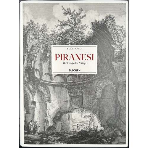 Hardcover volume, 35 x 26 cm, bound in pictorial paper boards with a lettered label to front cover, black lettering to spine, pictorial dust jacket, pictorial endpapers, pp.: [1-5] 6-787 [788], 1028 colour ils., trilingual edition (English, German, French). Title-page (red and black): LUIGI FICACCI | ISTITUTO NAZIONALE PER LA GRAFICA, ROME | Giovanni Battista | PIRANESI | Catalogue of the Complete Etchings | Gesamtkatalog der Radierungen | Catalogue raisonné des eaux-fortes | TASCHEN || Contributors: Luigi Ficacci (Italian, b. 1954) – author. Giovanni Battista [Giambattista] Piranesi (Italian, 1720 – 1778) – artist.
 -
 Hardcover, white lettered boards, pictorial DJ, pp.: [1-8] 9-359 [360 blank].
ISBN: 9789004191464.
-
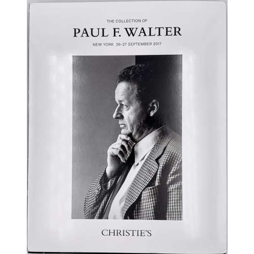 Christie's Auction Catalog; Sale WALTER-15785; New York, September 26-27, 2017; Publisher's pictorial wrappers, front cover: THE COLLECTION OF | PAUL F. WALTER | NEW YORK 26–27 SEPTEMBER 2917 | {profile chest portrait of Paul F. Walter} | CHRISTIE'S || 26.8 x 21.2 x 3 cm; 662 lots, illustrations in colour and b/w, pictorial dust jacket; pp: [2] 3-462.
Paul F. Walter (American, 1935 – 2017) – "Collector. Following studies in history and history of art Oberlin College, Ohio, and Columbia University, he began to collect in the1960s, starting with prints by Whistler and moving on to the Aesthetic Movement and the Arts & Crafts in Britain, as well as the arts of the Indian subcontinent and modern American painting. He was Trustee of the Museum of Modern Art from 1992-2006, and a benefactor to the Metropolitan Museum of Art, the Cooper-Hewitt Design Museum, the Morgan Library and Museum, the Brooklyn Museum, the Allen Memorial Art Museum at Oberlin College, and the Los Angeles County Museum of Art."
-
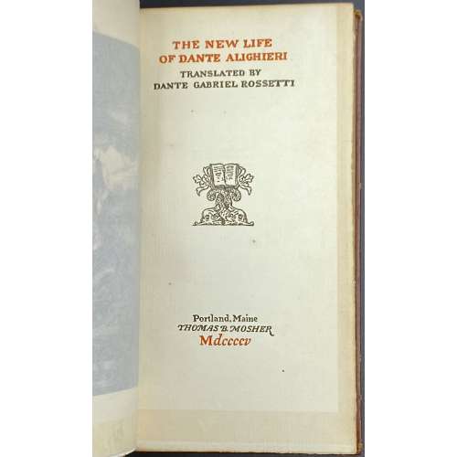 Title: THE NEW LIFE | OF DANTE ALIGHIERI | TRANSLATED BY | DANTE GABRIEL ROSSETTI | {Publisher's device} | Portland, Maine | THOMAS B. MOSHER | Mdccccv Pagination: Ffl [i-viii] ix-xii [xiii] [xiv blank], [1, 2] 3-97 [98] bfl; frontis. w/guard; Note: “This fourth edition on Van Gelder paper consists of 925 copies”. Binding: Hardcover, 18.2 x 10.2 cm, full brown morocco possibly by Sangorski & Sutcliffe, with embossed design elements, raised bands, gilt lettering to spine, TMG, other untrimmed; printed on laid paper with watermark.
 -
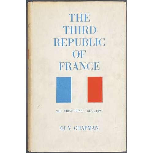 Title: THE | THIRD REPUBLIC | OF FRANCE | THE FIRST PHASE 1871–1894 | BY | GUY CHAPMAN | Sometime Professor of Modern History in the University of Leeds | LONDON | MACMILLAN & CO LTD | NEW YORK • ST. MARTIN’S PRESS | 1962 Pagination: [i-iv] v-xxii, [1] 2-433 [434 imprint]. Collation: 8vo; [A]8 B-Z8 2A-2D8 2E2 2E210. Binding: blue buckram, bronze lettering to spine, pictorial DJ. Publishing year 1963 according to worldcat. Author: Chapman, Guy Patterson (British, 1889 – 1972)
 -
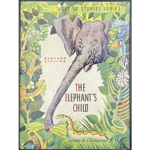 Hardcover volume, 24 x 18 cm, pictorial paper over cardboard boards, pictorial endpapers, and pictorial DJ; pp.: [2] – pictorial t.p. / copyrignt+imprint + [26] unpaginated pages (13 leaves); in-text photomechanical b/w and coloured illustrations after Feodor Rojankovsky. DJ and front cover (pictorial): JUST SO STORIES SERIES | RUDYARD KIPLING | THE | ELEPHANT'S | CHILD | PICTURED BY F. ROJANKOVSKY || Title-page (pictorial): JUST SO STORIES SERIES | THE | ELEPHANT'S | CHILD | RUDYARD KIPLING | ILLUSTRATED BY | F. ROJANKOVSKY | GARDEN CITY PUBLISHING COMPANY, INC., GARDEN CITY, N. Y. || Contributors: Rudyard Kipling (British, 1865 – 1936) Feodor Rojankovsky [Rojan; Фёдор Степанович Рожанковский] (Russian-American, 1891 – 1970)
 -
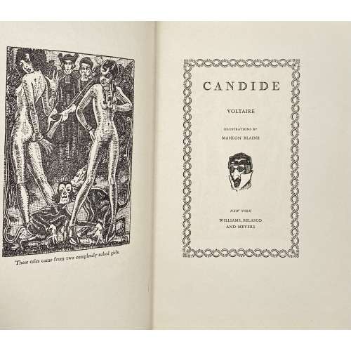 Title (chain border): CANDIDE | VOLTAIRE | ILLUSTRATIONS BY | MAHLON BLAINE | {vignette} | NEW YORK | WILLIAMS, BELASCO | AND MEYERS || Title verso: (top) COPYRIGHT, 1930, BY WILLIAMS, BELASCO & MEYERS || (bottom) PRINTED IN THE UNITED STATES OF AMERICA | BY J. J. LITTLE & IVES COMPANY, NEW YORK || Pagination:[1-6] 7-144, headpiece, frontispiece and 5 plates after Blaine’s pen drawings, within the pagination. Binding: 25 x 16.5 cm; blue cloth, blind-stamped frame, stamped-gilt lettering to front board and spine, thick wove paper, upper edge blue, fore-edge untrimmed, yellow vergé endpapers. Arouet, François-Marie [Voltaire] (French, 1694 – 1778)– author. Woolf, Herman Irwell [Chambers, Dorset] (British, 1890 – 1958) – translator. Blaine, Mahlon [Hudson, G. Christopher] (American, 1894 – 1969) – illustrator. Williams, Belasco and Meyers (NY) – publisher. J. J. Little & Ives Company (NY) – printer. See the Cameo Classic reprint [LIB-2777.2021].
 -
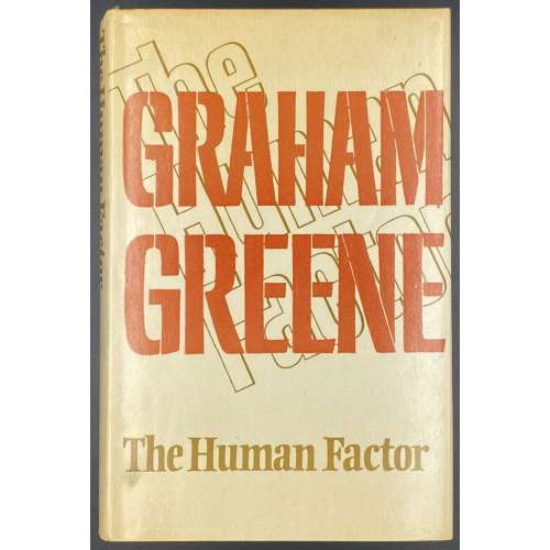 Title-page: THE HUMAN | FACTOR | Graham Greene | {citation from Joseph Conrad, 3 lines} | {publisher’s device} | THE BODLEY HEAD | LONDON SYDNEY | TORONTO || Green publisher’s cloth with gilt lettering to spine, cream dust jacket, lettered on front, back and spine, designed by Michael Harvey, unclipped (£4.50 NET | IN U.K. ONLY), [1-8] 9-338 [339] [340 blank]. Previous owners' inscriptions to FFEP. Printed by William Clowes & Sons Ltd. (Beccles). © Graham Greene 1978. Graham Greene (British, 1904 – 1991).
 -
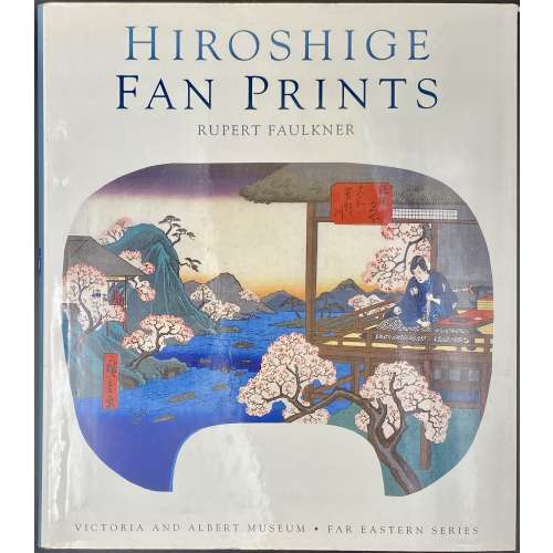 Hardbound, 25.3 x 22 cm, blue cloth, pictorial dust jacket lettered: HIROSHIGE | FAN PRINTS | RUPERT FAULKNER | {image} | VICTORIA AND ALBERT MUSEUM • FAR EASTERN SERIES ||; silver lettering to spine, green endpapers, description of 136 items with colour illustrations; pagination: [1-6] 7-160, ils. Utagawa Hiroshige [歌川 広重] a.k.a. Andō Hiroshige [安藤 広重] (Japanese, 1797 – 1858).
 -
 Softcover, in flapped pictorial wrappers, 28 x 21.7 cm, 16 entries, with colour illustrations. Catalogue # 5 of the sales exhibition on September 17-22, 2001 in NY; pagination: [1-3] 4-33 [3], ils. Contributor: Sebastian Izzard
 -
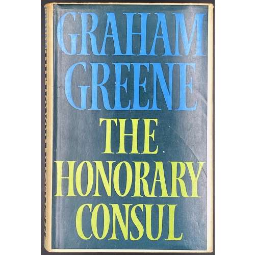 Hardcover, 20.2 x 13.6 cm, green cloth, gilt lettering to spine, in unclipped dust jacket, pp.: [1-8] 9-334 [2]. Title-page: THE HONORARY CONSUL | GRAHAM GREENE | {4 line citation} | {publisher’s device} | THE BODLEY HEAD | LONDON SYDNEY | TORONTO || © Graham Greene 1973. Printed by: William Clowes & Sons Ltd. (Beccles). Graham Greene (British, 1904 – 1991).
 -
 Softcover, in pictorial wrappers, 28 x 21.7 cm, 70 entries, with colour illustrations. Catalogue of the sales exhibition on March 17-24, 2023 in NY; pagination: [1-3] 4-142 [2], ils. Invitation card laid in. Contributor: Sebastian Izzard
 -
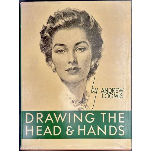 Hardcover volume, 31 x 23.5 cm, peach cloth, with peach lettering to the green label on front board, green lettering to spine, pictorial dust jacket, price unclipped ($4.95); text to flaps; pp.: [1-6] 7-154 [155 plate] [5 blanks], ils. (photomechanical reproductions); magazine clipping laid in. Title-page: Drawing | THE HEAD AND HANDS | BY | ANDREW LOOMIS | {vignette} | NEW YORK • THE VIKING PRESS || Imprint: COPYRIGHT © 1956 BY ANDREW LOOMIS | FIRST PUBLISHED BY THE VIKING PRESS IN JANUARY 1956 | PUBLISHED ON THE SAME DAY IN THE DOMINION OF CANADA | BY THE MACMILLAN COMPANY OF CANADA LIMITED | SECOND PRINTING 1958 | {two paragraphs of copyright statement} | LITHOGRAPHED IN U.S.A, BY W. S. KONECKY ASSOCIATES || Edition: 1st edition, 2nd printing. Andrew Loomis (American, 1892 – 1959)
 -
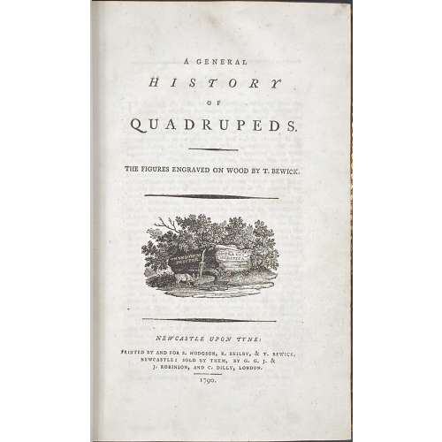 Title: A GENERAL | HISTORY | OF | QUADRUPEDS. | – | THE FIGURES ENGRAVED ON WOOD BY THOMAS BEWICK. | {vignette} | — | NEWCASTLE UPON TYNE : | PRINTED BY AND FOR S. HODGSON, R. BEILBY, & T. BEWICK, | NEWCASTLE: SOLD BY THEM, BY G. G. J. & | J. ROBINSON, AND C. DILLY, LONDON. | 1790. Pagination: [4 blanks], [i, ii] – t.p. / blank, [iii, iv] – advertisement / index, v-viii – index, [1] 2-456 [4 blanks]. Collation: demi 8vo; a⁴ A-Ee⁸ Ff⁴. A3 unsigned, catchword at p.375 THE instead of WE. Variant A (with a fly facing upward). Size: 21.8 x 14 cm; page 21.2 x 13 cm. Woodcuts: 260 descriptions of quadrupeds; 200 figures of quadrupeds, 104 vignettes, tailpieces, etc. Binding: Full marbled calf, gilt double border, black label with gilt lettering to flat spine. There were 1,500 copies Demy copies printed. Catalogue raisonné: S. Roscoe (1953): pp. 5-11; Hugo (1866): pp. 22-23.
 -
![George Cruikshank. George Cruikshank's Fairy Library. Hop-O'-My Thumb. Jack and the Bean-Stalk. Cinderella. Puss in Boots. — London: George Bell and Sons, 1885. — pp.: [2] blank, [2] first half-title with blank verso, [i-ii] second half-title with blank verso, [2] frontispiece plate with blank recto, [iii-viii] title, colophone, editor's note, list of illustr. [2] title with blank verso, [1] 2-101 [3] blank, 24 plates with protective tissue, unpag. — Colophon: This edition is limited to 500 copies, with India paper impressions. The former editions have been from lithographic transfers. The plates were retouched under Mr. Cruikshank's direction shortly before his death, and have not been used since until now.](https://varshavskycollection.com/wp-content/uploads/2021/02/LIB-2454.2020-f-1-500x500.jpeg) Title: GEORGE CRUIKSHANK'S FAIRY LIBRARY. | HOP-O'-MY THUMB. | JACK AND THE BEAN-STALK. | CINDERELLA. | PUSS IN BOOTS. | [DEVICE] | LONDON: | GEORGE BELL AND SONS, YORK STREET, COVENT GARDEN. Pagination: [2] – blanks, [2] – first half-title with blank verso, [i-ii] – second half-title with blank verso, [2] – blank / frontispiece, [iii-viii] title, colophon, editor's note, list of illustrations, [2] – title with blank verso, [1] 2-101 [3] – blank; 24 plates with protective tissue. Colophon: This edition is limited to 500 copies, with India paper impressions. The former editions have been from lithographic transfers. The plates were retouched under Mr. Cruikshank's direction shortly before his death, and have not been used since until now. Binding: 4to, 22.2 x 17.5 cm, hardcover; 3/4 black calf ruled in gilt, brown calf spine with raised bands decorated in gilt, with gilt title lettering. Green marbled boards and end-papers. Abel E. Berland's bookplate pasted to front pastedown. Professionally rebound, re-backed with the original spine laid down, corners bumped. Catalogue Raisonné: Not in Alan M. Cohen's. As writes the British Library: "George Cruikshank’s [...] illustrations for the first English translation of Grimm’s Fairy Tales were praised widely, but his own rewriting of fairytales was criticised, most prominently by Charles Dickens. This was not due to the quality of the illustrations, but because, in line with his temperance beliefs, Cruikshank rewrote aspects of the fairytales to warn the reader against the evils of alcohol. Thus, for instance, the preparations for Cinderella’s marriage include the court throwing all alcohol in the palace on a bonfire; and in ‘Jack and the Beanstalk’, the giant is an alcoholic. Dickens, a friend of Cruikshank, was outraged at what he considered to be a betrayal of the essence of fairytales and, in protest, he published an essay in his weekly magazine Household Words entitled ‘Frauds on the Fairies’ in protest (1853)."
Title: GEORGE CRUIKSHANK'S FAIRY LIBRARY. | HOP-O'-MY THUMB. | JACK AND THE BEAN-STALK. | CINDERELLA. | PUSS IN BOOTS. | [DEVICE] | LONDON: | GEORGE BELL AND SONS, YORK STREET, COVENT GARDEN. Pagination: [2] – blanks, [2] – first half-title with blank verso, [i-ii] – second half-title with blank verso, [2] – blank / frontispiece, [iii-viii] title, colophon, editor's note, list of illustrations, [2] – title with blank verso, [1] 2-101 [3] – blank; 24 plates with protective tissue. Colophon: This edition is limited to 500 copies, with India paper impressions. The former editions have been from lithographic transfers. The plates were retouched under Mr. Cruikshank's direction shortly before his death, and have not been used since until now. Binding: 4to, 22.2 x 17.5 cm, hardcover; 3/4 black calf ruled in gilt, brown calf spine with raised bands decorated in gilt, with gilt title lettering. Green marbled boards and end-papers. Abel E. Berland's bookplate pasted to front pastedown. Professionally rebound, re-backed with the original spine laid down, corners bumped. Catalogue Raisonné: Not in Alan M. Cohen's. As writes the British Library: "George Cruikshank’s [...] illustrations for the first English translation of Grimm’s Fairy Tales were praised widely, but his own rewriting of fairytales was criticised, most prominently by Charles Dickens. This was not due to the quality of the illustrations, but because, in line with his temperance beliefs, Cruikshank rewrote aspects of the fairytales to warn the reader against the evils of alcohol. Thus, for instance, the preparations for Cinderella’s marriage include the court throwing all alcohol in the palace on a bonfire; and in ‘Jack and the Beanstalk’, the giant is an alcoholic. Dickens, a friend of Cruikshank, was outraged at what he considered to be a betrayal of the essence of fairytales and, in protest, he published an essay in his weekly magazine Household Words entitled ‘Frauds on the Fairies’ in protest (1853)." -
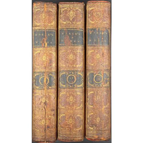 Vol. 1: THE | WORKS | OF THE | RIGHT HONOURABLE | EDMUND BURKE, | COLLECTED IN THREE VOLUMES. | VOL. I. | DUBLIN: | PRINTED FOR R. CROSS, W. WILSON, P. WO-| GAN, L. WHITE, P. BYRNE, A. GRUEBER, J. MOORE, | W. JONES, W. M’KENZIE, H. WATTS, J. RICE, | AND G. FOLINGSBY. | 1792.|| Pagination: 2 blank leaves, [2] - t.p. /blank, [2] - contents / blank, [2] - f.t. / blank, [3] 4-61 [62] - blank, [2] - f.t / blank, [4] contents, 65-580, 1 blank leaf. Collation: 8vo; π2 B-Z8 Aa-Oo8 Pp4. Vol. 2: THE | WORKS | OF THE | RIGHT HONOURABLE | EDMUND BURKE, | COLLECTED IN THREE VOLUMES. | VOL. II. | DUBLIN: | Printed by William Porter, | For R. Cross, W. Wilson, P. Wogan, L. White, P. Byrne, W. M’kenzie, J. Moore, A. Grueber, W. Jones, H. Watts, J. Rice, And G. Folingsby. | M.DCC.XCIII.|| Pagination: 2 blank leaves, [2] - t.p. /blank, [2] - contents / cont., [2] - f.t. / blank, [3] 4-655 [656 blank], 2 blank leaves. Collation: 8vo; π2 B-Z8 Aa-Tt8. Vol. 3: THE | WORKS | OF THE | RIGHT HONOURABLE | EDMUND BURKE, | COLLECTED IN THREE VOLUMES. | VOL. III. | DUBLIN: | PRINTED FOR R. CROSS, W. WILSON, P. WO-| GAN, L. WHITE, P. BYRNE, A. GRUEBER, J. MOORE, | W. JONES, W. M’KENZIE, H. WATTS, J. RICE, | AND G. FOLINGSBY. | 1792.|| Pagination: 2 blank leaves, [2] - t.p. /blank, [2] - contents / blank, [2] - f.t. / blank, 3-602, 3 blank leaves. Collation: 8vo; A-Z8 Aa-Pp8. Binding: Full contemporary calf ruled in gilt, leather spine labels gilt, gilt scrollwork in compartments framed in Greek–key rolls, marbled endpapers, hinges cracked, central vertical split to spine panel to vol. 1 and 3, early ownership signature to titles.
 -
 Pagination: [2] – letterpress title / blank, t.p. contents / to readers, [1] 2-368 [4 index], + 6 b/w (one folding) and 28 coloured plates (total 34). Collation: 4to; letterpress title, [A]1 B-Z4 Aa-Zz4 3A-3B4 3C3. Binding: 25 x 16 cm; gilt-ruled half-calf over marbled boards, flat spine, gilt-ruled compartments, gilt lettering. 5 aquatints by Thomas Rowlandson (British, 1757 – 1827): Table D'Hote; Consulting the Prophet; The Prophet discovering himself and exposing the deception; The Arrival in Paris; Liberality to infirm beggars on leaving Yrvi. References: Martin Hardie (1906), p.310 [LIB-2623.2021]; R. V. Tooley (1935), p. 26 [LIB-2641.2021]; J. R. Abbey (1953), Cat. № 212, p. 167 [LIB-2622.2021].
 -
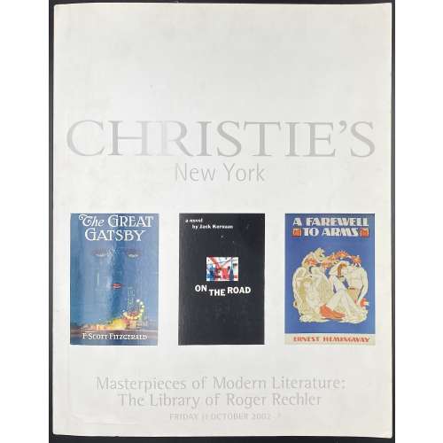 Publisher’s pictorial wrappers: CHRISTIE'S | NEW YORK | {three book covers} | Masterpieces of Modern Literature: | The Library of Roger Rechler | FRIDAY 11 OCTOBER 2002 || Red spine with white lettering from top to bottom, multiple illustrations in colour, 26.8 x 21 x 3 cm. Pagination: [1-4] 5-451 [452]. 375 lots, prices realized handwritten next to each lot and on 6 loose leaves inserted.
 -
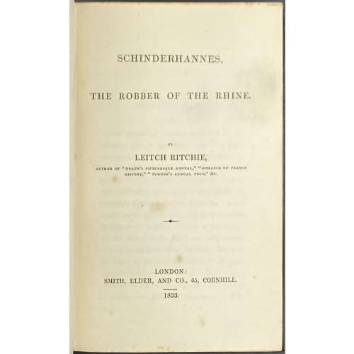 Serial title: THE | LIBRARY OF ROMANCE. | EDITED | BY LEITCH RITCHIE. | VOL. II. | — | SCHINDERHANNES, | THE ROBBER OF THE RHINE. | BY THE EDITOR. | — | LONDON: | SMITH, ELDER, AND CO., 65, CORNHILL. | — | 1833. || Title page: SCHINDERHANNES, | THE ROBBER OF THE RHINE. | BY | LEITCH RITCHIE, | AUTHOR OF “HEATH’S PICTURESQUE ANNUAL,” “ROMANCE OF FRENCH | HISTORY,” “TURNER’S ANNUAL TOUR,” &c. | — | LONDON: | SMITH, ELDER, AND CO., 65, CORNHILL. | — | 1833. || Pagination: [1] 2 – prospectus, [i, ii] – serial title / imprint, [iii-iv] – t.p. / blank, [v] vi (mispaged iv) – advert. [vii] viii – contents, [2] f.t. / blank; [1] 2-314 – text, [2] – advert. vol. I and III; total number of pages 12+314+2=328 Collation: 8vo; π6 B-U8 X4 Y2, total number of leaves 164. Binding: 18 x 11.5 cm, dark green buckram (faux morocco), gilt lettering and design elements to spine, printer’s imprint to π4: Bradbury and Evans, moiré endpapers. Cat. raisonné: Sadleir (v.2) 3760a, p. 171. Contributors: Leitch Ritchie (British-Scottish, 1800 – 1865) – author. Schinderhannes [Johannes Bückler] (German, c.1778 – 1803) – character. Bradbury & Evans (est.1830) – printer. Smith, Elder, and Company (1816 - 1917) – publisher. George Smith (British-Scottish, 1789 – 1846) – publisher. George Murray Smith (British, 1824 – 1901) – publisher. Alexander Elder (British, 1790 – 1876) – publisher.
 -
 Four maps 34 x 47.5 cm each. Include insets of Versailles, Fontainebleau, Saint Cloud and St. Germain en Laye. Lithograph by Edward Weller after a map drawn and engraved by John Dower. "These maps originally appeared in the Weekly Dispatch newspaper from 1856 to 1862. They were reissued between 1863 and 1867 by Cassell, Petter and Galpin and then published collectively as Cassell's Atlas. The plates were acquired by G.W. Bacon & Co., and reissued in 1876 under the title Bacon's New Quarto Atlas ... of the Counties of England, and many times since under various titles." [WorldCat]
Dimensions: 34 x 47.5 cm each.
Contributors: Weller, Edward (British, 1819 – 1884) – lithographer. Dower, John Crane (British, 1791 – 1847) – artist, engraver. Dower, John James (British, 1825 – 1901) – artist, engraver (son of John Crane Dower). -
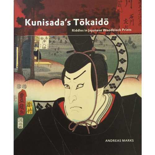
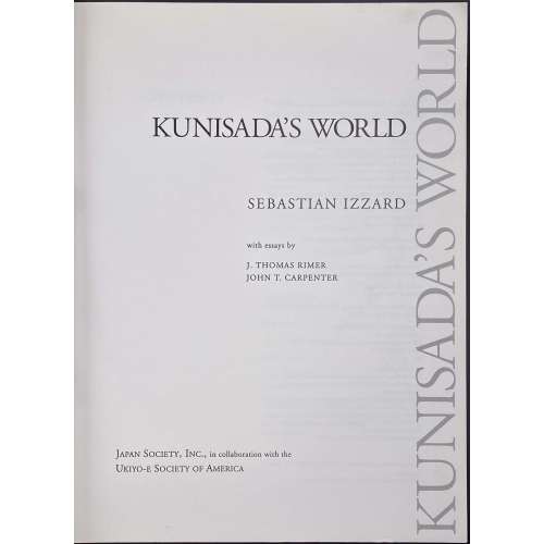 Glossy softcover, publisher’s pictorial wrappers, 30 x 23 cm, pp.: [i-v] vi-xi [xii blank], [2] 3-199 [200 blank], ils.; total 106 leaves. Title-page: Vertical from bottom to top along the outer margin in grey: KUNISADA'S WORLD; horizontally: KUNISADA'S WORLD | SEBASTIAN IZZARD | with essays by | J. THOMAS RIMER | JOHN T. CARPENTER | JAPAN SOCIETY, INC., in collaboration with the | UKIYO-E SOCIETY OF AMERICA || Published in conjunction with an exhibition held at the Japan Society Gallery, New York, September 30 - November 14, 1993. Contents: (1) Kunisada: in and out of his times; Kabuki at the time of Kunisada / J. Thomas Rimer. (2) Popular fiction in the age of Kunisada; Kunisada and the art of comic poetry / John T. Carpenter. (3) Kunisada the artist / Sebastian Izzard. Contributors: Sebastian Izzard J. Thomas Rimer (American, b. 1933) John T. Carpenter (American) Utagawa Kunisada [歌川 国貞] a.k.a. Utagawa Toyokuni III [三代歌川豊国] (Japanese, 1786 – 1865) Select illustrations (references in this collection):
SVJP-0179-3.2014: The Hour of the Tiger, Seventh Hour of Night from the series Twelve Hours of a Modern Clock.

SVJP-0222.2016: A view of the dressing room of a Theater in Dōtonbori, Ōsaka.

SVJP-0105.2014: Ichikawa Danjūrō VIII as the ghost of Seigen.
-
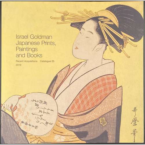 Softcover, pictorial wrappers, square 21 x 21 cm, 42 leaves, unpaginated, with illustrations in colour, 80 entries, with price list laid in; limited edition of 700 copies. Contributor: Israel Goldman
 -
 Hardcover, 28 x 19 cm, black cloth with gilt lettering to spine, red pictorial dust jacket; pp.: [i-vii] viii-x [2] [1] 2-540 [8], total 560 pages, profusely illustrated. Title-page: The private library | ~ | Being a More or Less Compendious Disquisition | on | The History of the Architecture and | Furnishing of the Domestic Bookroom | ☙ ❧ | Reid Byers | {publisher’s device} | New Castle, Delaware | 2021 || ISBN: 9781584563884 Author: Reid Byers (American).
 -
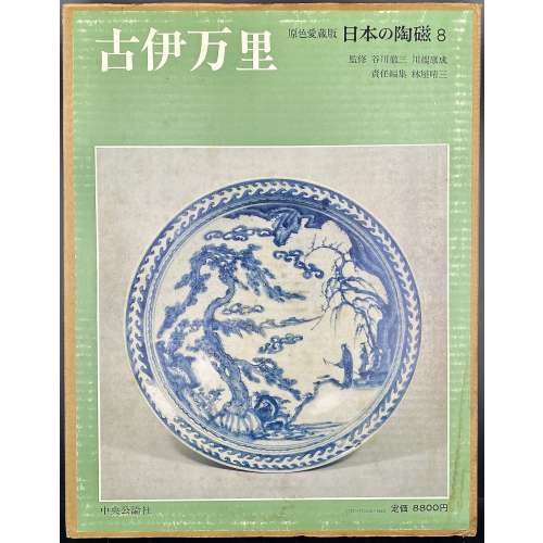 Hardcover volume, 35.1 x 27 cm, bound in grey cloth, blind stamped characters to front, brown characters to spine, in a glassine dust jacket, in a double slipcase, the outer case pictorial paper over cardboard, 36 x 27.8 cm, pp.: [4] [1] 2-108 (plates with photographs of 217 items), [2] [111] 112-150 [3]. Imari ware [伊万里焼] (Imari-yaki) – ceramics produced in and around the area of Arita, in the former Hizen Province, northwestern Kyūshū. 日本の陶磁 – Japanese ceramics, series title. Old imari [古伊万里] (koimari) – book title. Contributors: Yasunari Kawabata [川端 康成] (Japanese, 1924 – 1972) – author. Tetsuzo Tanikawa [谷川 徹三] (Japanese, 1895 – 1989) – author. Seizo Hayashiya [林屋晴三] (Japanese, 1928 – 2017) – editor. Chūōkōron-sha [中央公論社] – publisher.
 -
![[ROSCOE, Thomas, translator]. Tales of Humour, Gallantry, & Romance, selected and translated from the Italian. With sixteen illustrative Drawings by George Cruikshank. London, Printed for Charles Baldwyn, 1827.](https://varshavskycollection.com/wp-content/uploads/2021/02/LIB-1079-2-scaled-500x500.jpg) Title: TALES | OF | Humour, Gallantry, & Romance, | SELECTED AND TRANSLATED | FROM THE ITALIAN. | Vignette "The Elopement, p. 183" | With sixteen illustrative Drawings by George Cruikshank. | — | LONDON : | PRINTED FOR CHARLES BALDWYN, | NEWGATE STREET. | MDCCCXXVII. Pagination: [2], [v]-vi [2] – Contents (Cohn's collation calls for this at the end) 3-253, [1]; title-page a cancel with vignette 'The Elopment', sixteen other plates by Cruikshank; as per HathiTrust: vi, 253, [3] p. (last p. blank), [16] leaves of plates: ill. Binding: 8vo, 20 x 13 cm, later polished calf, gilt, t.e.g. others untrimmed, by Rivière for H. Sotheran. Note: 1st edition, very rare 3rd issue, with a cancel title-page replacing that of 1824 issue when there were two issues and the work was entitled Italian Tales. Cohn notes the rarity of the 1827 edition, which restores one of the plates 'The Dead Rider', suppressed in the second issue, and also includes the plate done to replace it. "The rarest edition of this work is that published in 1827 in green paper boards [...]. This issue has no edition stated on the title. It has seventeen woodcuts, inclusive of the "Elopement" vignette upon the title. The suppressed plate "The Dear Rider" is restored, and the plate done to replace it is also included. The woodcut in other editions upon the title page is "The Pomegranate Seed". Probably compiled and translated by Thomas Roscoe (cf. National union catalog) from a variety of authors 'out of materials not generally accessible', but also ascribed to J. Y. Akerman and to one "Southern". Two or three tales that furnished plots for Shakespeare. Catalogue Raisonné: Cohn 444; this issue not found in OCLC or COPAC.
Title: TALES | OF | Humour, Gallantry, & Romance, | SELECTED AND TRANSLATED | FROM THE ITALIAN. | Vignette "The Elopement, p. 183" | With sixteen illustrative Drawings by George Cruikshank. | — | LONDON : | PRINTED FOR CHARLES BALDWYN, | NEWGATE STREET. | MDCCCXXVII. Pagination: [2], [v]-vi [2] – Contents (Cohn's collation calls for this at the end) 3-253, [1]; title-page a cancel with vignette 'The Elopment', sixteen other plates by Cruikshank; as per HathiTrust: vi, 253, [3] p. (last p. blank), [16] leaves of plates: ill. Binding: 8vo, 20 x 13 cm, later polished calf, gilt, t.e.g. others untrimmed, by Rivière for H. Sotheran. Note: 1st edition, very rare 3rd issue, with a cancel title-page replacing that of 1824 issue when there were two issues and the work was entitled Italian Tales. Cohn notes the rarity of the 1827 edition, which restores one of the plates 'The Dead Rider', suppressed in the second issue, and also includes the plate done to replace it. "The rarest edition of this work is that published in 1827 in green paper boards [...]. This issue has no edition stated on the title. It has seventeen woodcuts, inclusive of the "Elopement" vignette upon the title. The suppressed plate "The Dear Rider" is restored, and the plate done to replace it is also included. The woodcut in other editions upon the title page is "The Pomegranate Seed". Probably compiled and translated by Thomas Roscoe (cf. National union catalog) from a variety of authors 'out of materials not generally accessible', but also ascribed to J. Y. Akerman and to one "Southern". Two or three tales that furnished plots for Shakespeare. Catalogue Raisonné: Cohn 444; this issue not found in OCLC or COPAC. -
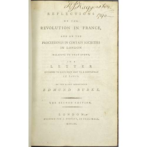 Title: REFLECTIONS | ON THE | REVOLUTION IN FRANCE, | AND ON THE | PROCEEDINGS IN CERTAIN SOCIETIES | IN LONDON | RELATIVE TO THAT EVENT. | IN A | LETTER | INTENDED TO HAVE BEEN SENT TO A GENTLEMAN | IN PARIS. | BY THE RIGHT HONOURABLE | EDMUND BURKE. | — | {in lozenges} THE SECOND EDITION. | —| LONDON: | PRINTED FOR J. DODSLEY, IN PALL-MALL. | M.DCC.XC. || Pagination: [4 blanks] [i-iii] iv, 1-356 [4 blanks]. Collation: 8vo; π2 B-Z8, Aa2. Binding: Quarter calf with marbled boards, gilt fillets, red label with gilt lettering to spine. "King John Haggerston, 1790" handwritten ink inscription to front endpaper, t.p. and p. iii. Seems like Sir John Haggerston, 9th Baronet.
 -
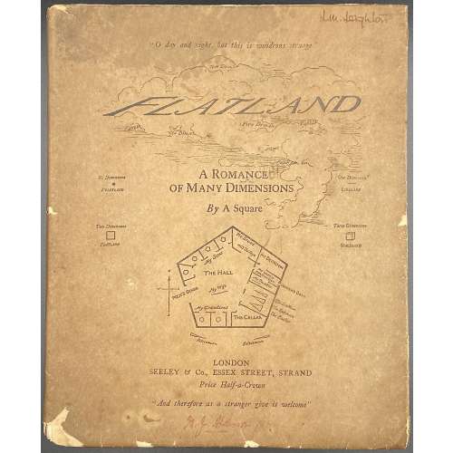 Title: FLATLAND | A Romance of Many Dimensions | With Illustrations | by the Author, A SQUARE | “fie, fie, how franticly I square may talk!” | NEW AND REVISED EDITION | LONDON | SEELEY & Co., 46, 47 & 48, ESSEX STREET, STRAND | (Late of 54 Fleet Street) | 1884 || Pagination: 2 blank leaves, [2] – h.t. / blank, [2] – t.p. / imprint., [2] – dedication / blank, [ix] x-xvi, [1, 2] f.t. / blank, [3] 4-102, 2 blank leaves; in-text woodcuts. Collation: [A]8 B-H8. Binding: original wrappers in pictorial parchment jacket, printed on laid paper, lower and lateral margins untrimmed. Note: This is the 2nd edition published the same year as the 1st, revised, as stated. I did not compare the two, neither I am planning to acquire the first 1st edition in a foreseeable future. This is a lifetime edition, handled by the Author himself, and that's enough for me to be quite happy.
 -
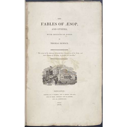 Title: THE | FABLES OF ÆSOP, | AND OTHERS, | WITH DESIGNS ON WOOD, | BY | THOMAS BEWICK. | “The wisest of the Ancients delivered their Conceptions of the Deity, and their Lessons of Morality, in Fables and Parables.” | {vignette} | NEWCASTLE: | PRINTED BY E. WALKER, FOR T. BEWICK AND SON. | SOLD BY THEM, LONGMAN AND CO. LONDON, AND ALL BOOKSELLERS. | 1818. || Pagination: [2] – blank / receipt with thumbprint, [i, ii] – t.p. / blank, [iii] iv-xvi – introduction with “Auld Clouty” vignette, [xvii] xviii-xxiv – table of contents, [1] 2-376; 188 wood-engraved head-pieces to the fables and 136 other vignettes, tail-pieces, etc. Collation: demy 8vo( octavo in fours); π1 (receipt), a-c4, B-3B4; A and 2P2 unsigned. Binding: Original blue boards, rebacked, original spine laid down, with original paper spine label ("Demy Paper/Price 15 s."); wove paper, top edge trimmed, the others are not; round book-plate to front paste-down “TWM, The Whitehead Library”; in a clamshell case, also book-plated inside. Size: case: 24.2 x 16.2 cm; boards: 22.8 x 14.2 cm; 22 x 14 cm. Note from seller: First copy in boards to ever appear at auction. Edition: First edition (one of 1,000 copies printed in demy 8vo), with Bewick's thumbprint and signature in facsimile, “Demy” and “15” in manuscript on receipt (page facing title-page), variant A (with "Auld Clouty" wood-engraving at bottom of p. XVI, and with the last line in p. 248 reading "road of honour and honesty"). "According to Roscoe, demy 8vo copies were apparently the first to be issued". There is 1 copy at the University Library, Cambridge and 1 at Liverpool public libraries. Catalogue raisonné: Roscoe: pp. 155-165, 45c for Variant A [see LIB-2714.2021]; Hugo (I vol.): p. 261; Ray: p. 35; Steedman: №№ 99-104, pp. 34-35 (№ 103 for Variant A).
 -
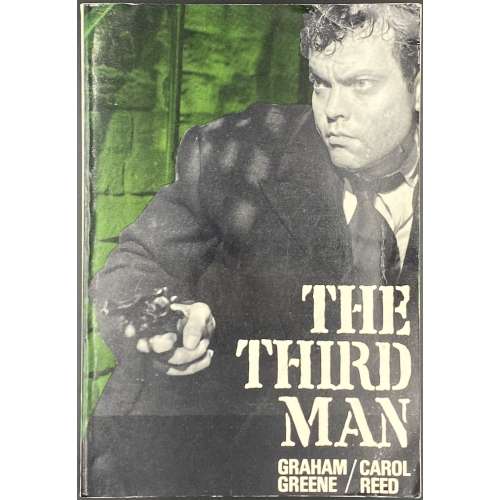 Title page: Title page: MODERN | FILM | SCRIPTS | THE THIRD MAN | a film by | Graham Greene | and Carol Reed | Lorrimer, London. Pagination: [1-4] 5-134 [2] blank; pasted into the last page: The film The Third Man is owned and distributed by British | Lion Films Ltd. Binding: publisher’s pictorial wrappers with the film still and lettering in white to front, and in black to back, and spine. Size: 20.2 x 14 cm. The Third Man is a 1949 British film directed by Carol Reed, written by Graham Greene and starring Joseph Cotten, Alida Valli, Orson Welles, and Trevor Howard. Contributors: Graham Greene (British, 1904 – 1991) – author. Carol Reed (British, 1906 – 1976) – film director. Lorrimer Publishing Limited (London) – publisher. Villiers Publications, Ltd. (London) – printer.
 -
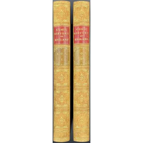 Vol. 1: Title page (red and black): THE | COMIC HISTORY OF ENGLAND • | BY GILBERT ABBOTT A'BECKETT. | {vignette with one line caption} | WITH TEN COLOURED ETCHINGS AND ONE HUNDRED AND TWENTY | WOODCUTS, | BY JOHN LEECH. | VOL. I. | PUBLISHED AT THE PUNCH OFFICE, 85, FLEET STREET. | MDCCCXLVII. || Pagination: [iii-iv] – t.p. / imprint., [v]-vi – preface, [vii]-viii – contents, [ix]-xii – list of ills. [1] 2-320, lacking half-title otherwise as called for by Tooley (1935) p. 161. Collation: 8vo; π3 b2 B-X8 plus 10 plates, incl. frontispiece, of hand-coloured steel engravings and 120 in-text woodcuts by John Leech. Vol. 2: Title page: similar but “VOL. II.” And “MDCCCXLVIII”; typeface “with ten coloured…” is different (sans serif). Pagination: [iii-iv] – t.p. / imprint., [v]-vi – advert., [vii]-viii – contents, [ix]-xii – list of ills. [1] 2-304, lacking half-title otherwise as called for by Tooley (1935) p. 161. Collation: 8vo; π3 b2 B-U8 X2 plus 10 plates, incl. frontispiece, of hand-coloured steel engravings and 120 in-text woodcuts by John Leech. Binding: two volumes 22 x 14.5 cm each uniformly bound in full tan calf with gilt double-fillet border, spine gilt in compartments with red and green morocco labels lettered in gilt, blind-stamped dentelle inside, blue marbled endpapers, all edges marbled, additional flyleafs at the front and end. Catalogue raisonné: Hardie p. 210-11; Abbey, Life № 434, p. 362; Tooley (1935) p. 161 Contributors: Gilbert Abbott à Beckett (British, 1811 – 1856) – author. John Leech (British, 1817 – 1864) – artist. Bradbury & Evans (Whitefriars); William Bradbury (British, 1799 – 1869); Frederick Mullett Evans (British, 1804 – 1870) – printer. Punch – publisher.
 -
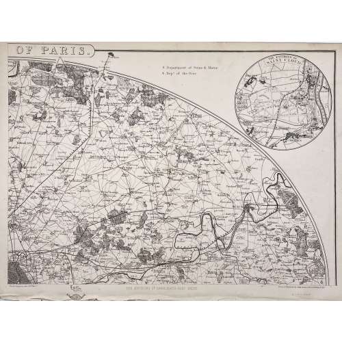
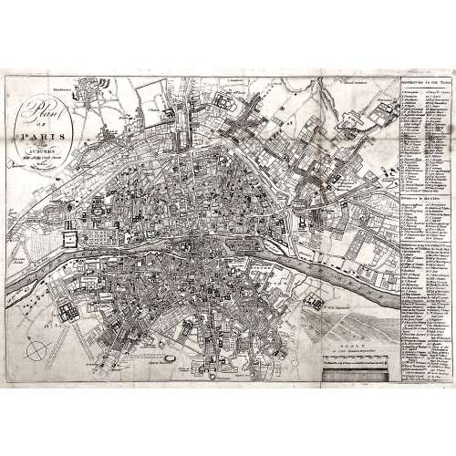 Oval cartouche in the upper-left corner, with tall “s”: Plan | OF | PARIS | and | SUBURBS | With all the Cross Streets | Before | THE REVOLUTION. || No indication of the makers. Dimensions: Sheet: 32.5 x 44.3 cm; Image: 28.5 x 41.3 cm.
 -
 Softcover volume 29.8 x 22.7 cm in publisher’s flapped pictorial wrappers, lettered in Japanese; pp.: [1-4] 5-365 [3], total 184 leaves; pp. 26-267 present 438 illustrations, text in Japanese and English. Reference in this collection: SVJP-0234.2018 – here it is also described as a diptych.
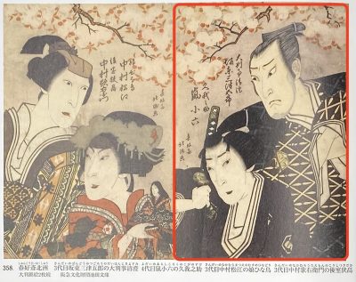
№ 358, p. 226. Bandō Mitsugorō III as Grand arbiter Kiyosumi and Arashi Koroku IV as Koganosuke.