-
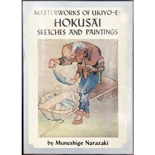 Hardcover volume from the series Masterworks of ukiyo-e, 26.1 x 19 cm, bound in canvas, red characters on black strip to front, red and black lettering to spine, tan embossed endpapers, in a pictorial slipcase with series design (black lettering on silver spine); pp: [1-6]: h.t./frontis. (colour plate pasted in), t.p./imprint, contents/acknowledgements), 7-16 text, 17-96 (79 plates w/captions). Title-page (in frame): MASTERWORKS OF UKIYO-E | HOKUSAI | SKETCHES AND PAINTINGS | by Muneshige Narazaki | English adaptation by John Bester | {publisher’s device} | KODANSHA INTERNATIONAL LTD. | Tokyo, Japan & Palo-Alto, Calif., U.S.A | {vertical, between rules 漫画肉筆画} || Series: Masterworks of ukiyo-e, № 7. Muneshige Narazaki [楢崎 宗重] (Japanese, 1904 – 2001) – author. Katsushika Hokusai [葛飾 北斎] (Japanese, 1760 – 1849) – artist. John Bester (British, 1927 – 2010) – adaptation.
 -
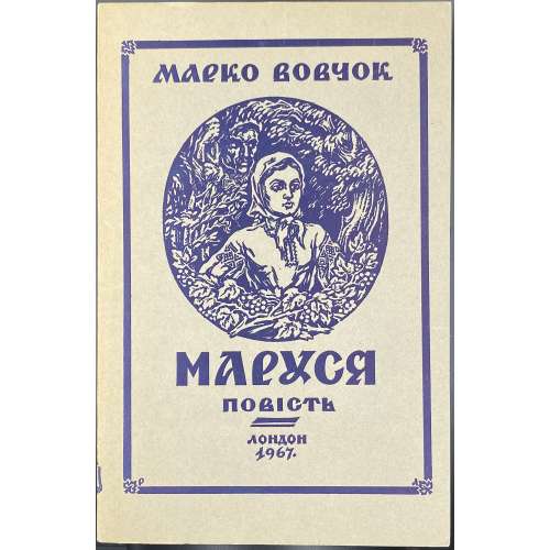 Paperback, 21.3 x 14 cm, original grey wrappers, vignette and lettering in frame, lettering to spine, publisher’s device to back, all in blue; pp.: [1-4] 5-112. Title-page: МАРКО ВОВЧОК | МАРУСЯ | ПОВIСТЬ | {fleuron} | ВИДАННЯ | СОЮЗУ УКРАÏНЦIВ У ВЕЛИКIЙ БРИТАНIÏ | ЛОНДОН 1967 || Title-page verso: “MARUSIA” | by | MARKO VOVCHOK | NOVEL IN UKRAINIAN LANGUAGE | — | REPRINT | — | Republished by | ASSOCIATION OF UKRAINIANS IN GREAT BRITAIN LTD. | (PUBLISHING DEPARTMENT) | {four lines of text in double-rules} | Printed in the United Kingdom for Association of Ukrainians | in Great Britain Ltd. by | Ukrainian Publishers Limited, 200 Liverpool Rd., London, N. 1. || The French version of the Ukrainian name Маруся —> MAROUSSIA. The French version of the book: LIB-2674.2021; another copy of the Ukrainian edition (1943): LIB-3136.2023. Other variants of the author's name Марко Вовчок: Markowovzok and Marko Vovtchok. Contributors: Марко Вовчок [Marko Vovchok; Марія Олександрівна Вілінська] (Ukrainian, 1833 – 1907) – author. Василь Миколайович Доманицький [Василий Николаевич Доманицкий; Vasyl Domanytskyi] (1877 – 1910) – translator from Russian to Ukrainian. Святомир Фостун (Ukrainian, 1924 – 2004) – foreword.
 -
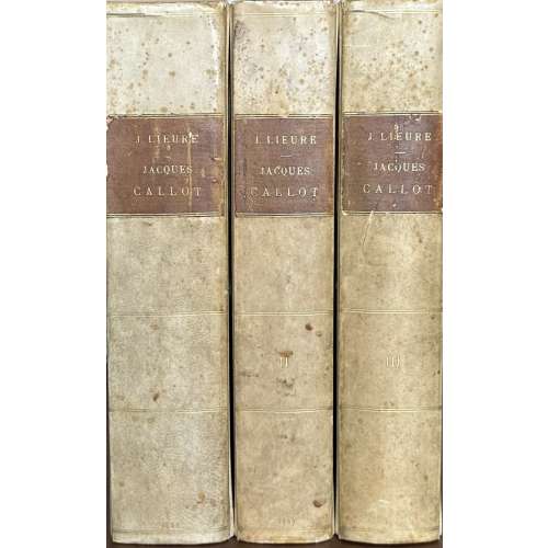 Three volumes, 33 x 26.5 x 7 cm each, uniformly bound in 2/3 vellum over marbled boards, outlined with gilt fillet, brown label with gilt lettering to flat spine with double fillet faux-bands, marbled endpapers, top edge gilt, other untrimmed, publisher’s wrappers preserved, incl. spine; collotype plates with captioned glassine guards; armorial bookplate of Comte Alain de Suzannet to front pastedown in each volume. Two volumes of Première partie, wanting, contain La vie artistique : texte and La vie artistique : planches. Title-page (red and black): JACQUES CALLOT | PAR | J. LIEURE | Introduction de F. Courboin | Conservateur du Cabinet des Estampes à la Bibliothèque Nationale | — | DEUXIÈME PARTIE | CATALOGUE DE L’ŒUVRE GRAVÉ | TOME I (II, III) | — | PARIS | ÉDITIONS DE LA GAZETTE DES BEAUX-ARTS | 106, Boulevard Saint-Germain (6e) | 1924 (1927, 1927) || Vol. 1 (1924): [4] [1] 2-122 [2], wrappers, plates 1-299; printed on September 15, 1924, by André Lesot (Nemours) and D. Jacomet et Cie (Paris). Vol. 2 (1927): [4] [1] 2-106 [2], wrappers, plates 300-652. Vol. 3 (1927): [4] [1] 2-128 [4], wrappers, plates 653-1428; printed on September 5, 1926, by Imprimerie moderne des Beaux-Arts (Bois-Colombes) and D. Jacomet et Cie (Paris). Contributors: Jules Lieure (French, 1866 – 1948) – author. Jacques Callot (French, c. 1592 – 1635) – artist. Gazette des Beaux-Arts (f. 1859) – publisher. François Courboin (French, 1865 – 1926) – author. D. Jacomet et Cie (Paris) – printer. Daniel Jacomet (French, 1894 – 1966) – printer. André Lesot (French, 1874-1951) – printer. Imprimerie moderne des Beaux-Arts (Bois-Colombes) Comte Alain de Suzannet (French, 1882 – 1950) – provenance.
 -
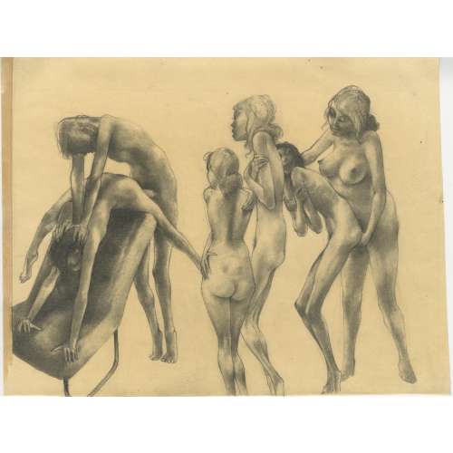 Graphite on wove paper, 217 x 284 mm, black ink stamp to verso: “Prof O. R. Schatz | Wien II, Gr. Mohreng 3b | Tel.: 55 82 566”. Unsigned, attributed to Otto Rudolf Schatz (Austrian, 1900 – 1961).
 -

Б. Л. Модзалевский. Библиотека А.С.Пушкина. Библиографическое описание. Отдѣльный оттискъ из изданiя "Пушкинъ и его современники", вып. IX-X. -- СПб.: Тип. Императорской Академiи Наук, 1910. - 442 стр. [РЕПРИНТ 1988 года.]
Библиотека А. С. Пушкина. Б. Л. Модзалевский. Приложение к репринтному изданию. -- М.: Книга, 1988. - 115 стр. Тираж 10 000 экз.
Л. Б. Модзалевский. Библиотека Пушкина. Новые материалы.
Список условных сокращений.
Л. С. Сидяков. Библиотека Пушкина и ее описание.
Примечание к работам Б. Л. и Л. Б. Модзалевских.
-
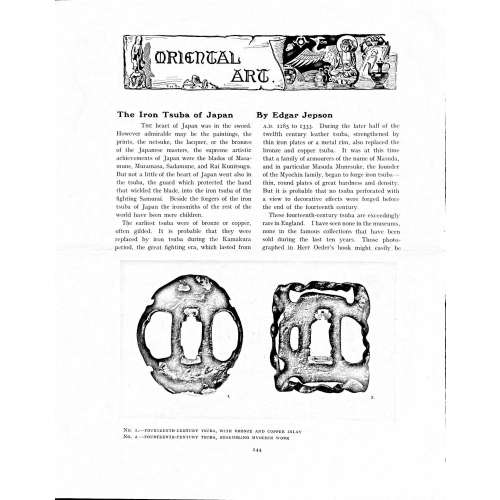 Magazine article by Edgar Jepson: The Iron Tsuba of Japan (Section: Oriental Art), published in volume Vol. 70 (September–December) of The Connoisseur: An Illustrated Magazine for Collectors, Vol. 70 (September–December); pp. 143-152 / C. Reginald Grundy [ed.] — London: Published by the Proprietor, W. CLAUSE JOHNSON, at the Editorial and Advertisement Offices of The Connoisseur, 1924. Owner's half black morocco, gilt lettering to spine, blue cloth boards. Two volumes bound together without original covers. Size 28.5 x 22 cm. Vol. 1: The Connoisseur | An Illustrated Magazine | For Collectors | Edited by C. Reginald Grundy | Vol. LXIX. | (MAY—AUGUST, 1924) | LONDON | Published by the Proprietor, W. CLAUSE JOHNSON, at the | Editorial and Advertisement Offices of The Connoisseur, | at 1, Duke Street, St. James's, S.W. 1 | 1924 || Pp.: [i-ii] iii-xviii [xix] [1, 2 - plate] 3-249 [250]. Vol. 2: The Connoisseur | An Illustrated Magazine | For Collectors | Edited by C. Reginald Grundy | Vol. LXX. | (SEPTEMBER—DECEMBER, 1924) | LONDON | Published by the Proprietor, W. CLAUSE JOHNSON, at the | Editorial and Advertisement Offices of The Connoisseur, | at 1, Duke Street, St. James's, S.W. 1 | 1924 || Pp.: [i-ii] iii-xxii [2 blanks] [1, 2 - plate] 3-261 [262]. The Iron Tsuba of Japan by Edgar Jepson The heart of Japan was in the sword. However admirable may be the paintings, the prints, the netsuke, the lacquer, or the bronzes of the Japanese masters, the supreme artistic achievements of Japan were the blades of Masamune, Muramasa, Sadamune, and Rai Kunitsugu. But not a little of the heart of Japan went also in the tsuba, the guard which protected the hand that wielded the blade, into the iron tsuba of the fighting Samurai. Beside the forgers of the iron tsuba of Japan the ironsmiths of the rest of the world have been mere children. The earliest tsuba were of bronze or copper, often gilded. It is probable that they were replaced by iron tsuba during the Kamakura period, the great fighting era, which lasted from A.D. 1185 to 1333. During the later half of the twelfth century leather tsuba, strengthened by thin iron plates or a metal rim, also replaced the bronze and copper tsuba. It was at this time that a family of armourers of the name of Masuda, and in particular Masuda Munesuke, the founder of the Myochin family, began to forge iron tsuba — thin, round plates of great hardness and density. But it is probable that no tsuba perforated with a view to decorative effects were forged before the end of the fourteenth century. These fourteenth-century tsuba are exceedingly rare in England. I have seen none in the museums, none in the famous collections that have been sold during the last ten years. Those photographed in Herr Oeder's book might easily be the fifteenth century. No. 1 is a curious cup-shape tsuba decorated with a bronze and copper inlay. No. 2, with its edges curiously twisted in the forging, looks like Myochin work. But it is not of the Myochin iron. The Myochin family produced some of the greatest ironsmiths of Japan. Armourers first of all, tsubasmiths, forgers of sake-kettles, articulated reptiles, crustacea, and insects — everything that can be done with iron they did; they pushed their medium to its limit. They were forging iron tsuba in 1160, and they were still forging them in 1860. And it was their own iron, or rather their own steel. They discovered the secret of it early, and they kept that secret in the family for all those hundreds of years. There is no mistaking a Myochin tsuba: balance it on your finger and tap it with a piece of metal, always it gives forth a clear bell-like ring that you get from the work of no other ironsmith, Japanese or European. Always the Myochin tsuba is before everything a protection to the hand of the swordsman; to that everything is, as it should be, subordinated. No. 3 is a Myochin tsuba of the fifteenth century, and probably of the early fifteenth century. No. 4, by Myochin Munetaka, perforated with a grotesque figure, is an example of that twisting and twisting of the iron in the forging till it forms a pattern like the grain of wood. The Myochin smiths invented these wood-grain tsuba, and no other smiths equalled them in their forging. In the sixteenth century, the fighting tsuba was probably at its best. It was a century of great tsubasmiths. Then the first Nobuiye, whose tsuba fetched £100 apiece, circa 1800, in Japan, and the first Kaneiye flourished. No. 5 is a tsuba forged by a great smith, Iyesada of Sotome, in the manner of Nobuiye I, decorated with the karakusa tendrils that Nobuiye delighted in, with lightning and clouds. No. 6 is a guard of Sanada Tembo, the chief smith of the Tembo family, stamped, punning fashion, with the character Tembo. Akin to the Tembo tsuba were those of the Kiami and Hoan smiths. Then also the Heianjo smiths and the Owari smiths, especially those of Nagoya and the Yamakichi family, forged their strongest tsuba. Those of the Yamakichi were tested after the forging by being pounded in iron mortars — at least, so the legend runs. But they were a sternly utilitarian family, and I have never seen a Yamakichi tsuba of any beauty. In the later half of the fifteenth century arose the fashion of decorating tsuba with an inlay, zogan, of bronze. The Heianjo tsuba, forged at Kyoto in the latter half of the fifteenth and the beginning of the sixteenth century, were often thus inlaid. The earliest of them were called "Onin", of which No. 7 is an example. In addition to the bronze inlay around the edge, it is inlaid with a representation, some say, of snow; others say, of the duckweed on a pond. No. 8 is probably a Heianjo tsuba, but I am not quite sure about it. The inlaid acacia branches might be very early Shoami work. But to judge by the iron, it is a fifteenth-century tsuba; and the authorities place the beginning of the Shoami school not later than early in the sixteenth century. No. 10 is an example of the Fushimi-zogan, a flat inlay of a light-coloured bronze. These tsuba took their name from the fact that they were first forged at Fushimi, in Yamashiro, in the sixteenth century. It is of the type known as Mon-zukashi, perforated with crests (mon) à jour. The Yoshiro-zogan tsuba were also first forged at Fushimi by Yoshiro Naomasa. They were distinguished from the Fushimi-zogan by the fact that their inlay was generally a little raised-not always-for the inlay of No. 9, a tsuba forged by a later nineteenth-century Yoshiro, is quite flat. It is an interesting tsuba, for, with its decoration grown florid and excessive, it marks the intermediate stage between the simple and delightful designs of the genuine fighting tsuba and the elaborate pictures in gold and silver on the tsuba of the eighteenth-century smiths of Awa and Kyoto, which have become mere ornaments of the goldsmith. The Gomoku-zogan (No. 11) tsuba were probably first forged earlier than the Fushimi and Yoshiro-zogan tsuba. This inlay, in slight relief, is a representation in a light-coloured bronze and copper of twigs caught in the eddies of streams. The seventeenth century and early eighteenth century were the great periods of perforated tsuba. The designs, and they are often admirable, are for the most part in plain fretwork; but they are also chased. No. 12, a crane under an acacia, is a tsuba of a Higo smith, great forgers of fighting tsuba during this period. These smiths also excelled in nunome zogan, a very thin gold and silver inlay, with which they further decorated their perforated guards. The smiths of the Umetada and Shoami families also forged iron tsuba during this period; but their designs, though sometimes pleasing enough, are rarely fine. The best work of Myoju Umetada is in sentoku, not iron. The Choshu smiths, coming later, surpass the perforated guards of both the Umetada and Shoami smiths in beauty of design. No. 13, a lotus in the round, not only fretwork, but also engraved, is a good example of the admirable balance they so often attained in their designs. It is a sufficiently realistic lotus, but yet of a delightful simplicity. In considerable contrast is No. 14, the dragon by Soheishi Soten — one of the only two authentic tsuba of his forging known — the first forger of hikone-bori tsuba, which were in extraordinary favour in Japan during the eighteenth century, and illustrated every important event in Japanese history. It is on the elaborate side, but fine, strong work, and an excellent guard to the hand, for the lighter and more open part, which gives the design its admirable balance, is on the inside, and not exposed to the full swing of an opponent's blade. A few years ago there was a tendency to decry the Namban tsuba as having sprung too directly from foreign sources. But though the original suggestion may have been Chinese, or, as some say, Portuguese, the Japanese made it entirely their own, as characteristically Japanese as anything can well be, but, it must be admitted, of a decadent period. The school took its rise at the beginning of the seventeenth century, and the early tsuba were forged of a specially hard iron, the Wootz, imported from Southern India. No. 15, the signs of the Zodiac, is an excellent tsuba from the fighting point of view. Both it and No. 16 are of quite charming, if elaborate, design, and both of them, with their delicate scroll-work, so astonishingly undercut, are the very last word in the work of the ironsmith-veritable iron lace. To return to the simpler perforated tsuba, the smiths of Akasaka, a suburb of Tokyo, produced probably the most charming designs. Their style derives considerably from the Higo smiths, and their earlier fighting tsuba are very like the Higo tsuba. But always their work was just a little lighter than that of the Higo smiths, and in the end they moved right away from them and became the forgers of very light guards indeed. No. 17, is a representation of the Hiyokudori, the fabulous double bird, in which were reincarnated the souls of the two lovers, Gompachi and Komurasaki; and No. 18, “the tsuba of a hundred ducks "— there are about forty — are characteristic designs of the school. In the work of the Akasaka smiths the balance, which makes the design of a good tsuba so admirable and delightful, attains its height. This admirable balance seems often to be obtained by a deliberate sacrifice of symmetry. About nine hundred and ninety-nine European ironsmiths out of a thousand would have made the right and left sides of the Hiyoku-dori line by line, and perforation by perforation, exactly alike; he would have cut out exactly as many ducks on the one side of “the tsuba of a hundred ducks” as on the other, and made each duck on the right side correspond exactly in position and attitude with a duck on the left side. By variations the tsubasmith attained a finer balance, almost a higher symmetry. No. 19, often called by collectors the "rose-window" tsuba, but really a stylised chrysanthemum, is a favourite design of the Akasaka smiths, but Hizen work and inlaid in the Hizen manner with gold nunome. No. 20 is a Satsuma tsuba of the middle period. The Satsuma smiths of the nineteenth century produced probably the most ornate of all the iron guards, for the most part calibashes and beans with their leaves and tendrils realistic in the extreme, but of charming design. Few crafts have been carried further than that of the tsubasmith; few crafts working in a difficult medium have handled more subjects with greater feeling for beauty or greater liveliness of fancy. It is interesting to note again and again how school influences school, and smith influences smith. But, as in all the applied arts, the finest tsuba were forged by men who never lost sight of the purpose of a tsuba, that it is before everything a protection to the hand, and never subjected that purpose to a passion for virtuosity. Illustrations: No 1. FOURTEENTH-CENTURY TSUBA, WITH BRONZE AND COPPER INLAY No. 2. FOURTEENTH-CENTURY TSUBA, RESEMBLING MYOCHIN WORK No. 3. MYOCHIN TSUBA, FIFTEENTH CENTURY No. 4. MYOCHIN TSUBA, NINETEENTH CENTURY No. 5. SIXTEENTH-CENTURY TSUBA No. 6. SIXTEENTH-CENTURY TSUBA BY IYESADA OF SOTOME BY SANADA TEMBO No. 7. ONIN TSUBA No. 8. HEIANJO (?) TSUBA No. 9. YOSHIRO TSUBA, NINETEENTH CENTURY No. 10. FUSHIMI-ZOGAN, NINETEENTH CENTURY No. 11.- GOMOKU-ZOGAN, SIXTEENTH CENTURY No. 12. HIGO TSUBA, SEVENTEENTH CENTURY No. 13. CHOSHU TSUBA, SEVENTEENTH CENTURY No. 14. SOTEN TSUBA, SEVENTEENTH CENTURY No. 15. NAMBAN TSUBA, EIGHTEENTH CENTURY No. 16. NAMBAN TSUBA, NINETEENTH CENTURY Nos. 17. AND 18. AKASAKA TSUBA, EIGHTEENTH CENTURY No. 19. HIZEN TSUBA, EIGHTEENTH CENTURY No. 20. SATSUMA TSUBA, EIGHTEENTH CENTURY
 -
 Hardcover in blue cloth with gilt lettering to spine, pictorial dust jacket, 25.5 x 19.5 cm, pp.: [1-4] 5-452, +12 colour plates; 576 b/w plates within the pagination.
 -
 Publisher’s original wrappers, with VIDBERGS to front (bordered) and to spine, size 25 x 18 cm. Title page: O. LIEPIŅŠ | SIGISMUNDS | VIDBERGS | MONOGRAFIJA | K. RASIŅA APGĀDS | RIGĀ 1942 || Imprint: ATTĒLI MĀKSLINIEKA IZRAUDZĪTI UN SAKĀRTOTI (pictures selected and arranged by the artist) Pagination: [1-6] (incl. 1st blank leaf), 7-149 [150] [2] blank; 44 pages of text with in-text illustrations, pp. 47-149 – plates on odd pages, titles on even pages, 51 full-page illustrations. Circulation: 4,000 copies. Contributors: Liepiņš, Olģerts (Latvian, 1906 – 1983) – author. Sigismunds Vidbergs (Latvian-American, 1890 – 1970) – artist. Kārlis Rasiņš (Latvian, 1886 – 1974) – publisher.
 -
 Title page: ЛОНГ | ДАФНИС И ХЛОЯ | Вступительная статья, | перевод и комментарии | С. П. Кондратьева | ACADEMIA | 1935 || Opposite title: АНТИЧНАЯ ЛИТЕРАТУРА | под общей редакцией | Д. А. Горбова, В. О. Нилендера | и П. Ф. Преображенского | ЛОНГ | (III—IV век н. э.) | ACADEMIA | Москва—Ленинград || Title verso: ΛΌΓΓΟΥ | Ποιμενικών των κατά Δάφνιν και Χλόην | Λόγοι τέτταρες | LONGI | Pastoralium de Daphnide et Chloë | libri quattuor | Рисунки, заставки, концовки, переплет и супер-обложка В. Г. Бехтеева || Pagination: [i-vi] vii-xx [2], [1, 2] 3-196 [2], 220 pages total, plus frontispiece in colour extra to collation; and 13 b/w plates within collation, headpieces after Бехтеев, Владимир Георгиевич (Russian, 1878 – 1971). Collation: i8 ii3, 1-128 133 = 110 leaves plus 1 plate. Binding: 17.5 x 13 cm, grey cloth, vignette to front board, lettering to spine, pictorial dust-jacket. Print run: 5,300 copies. Catalogue raisonné: В. В. Крылов, Е. В. Кичатова (2004): № 744, p. 265. Contributors: Longus [Лонг, Λόγγος] (Greek, 2nd century AD) – author. Кондратьев, Сергей Петрович (Russian, 1872 – 1964) – translator. Бехтеев, Владимир Георгиевич (Russian, 1878 – 1971) – artist. Other titles: Daphnis and Chloe (en), Daphnis et Chloé (fr), Daphnis und Chloe (de), Dafnis y Cloe (es), Gli amori pastorali di Dafni e Cloe (it).
 -
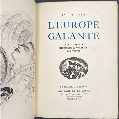 Front wrapper (in black and blue): PAUL MORAND | L'EUROPE | GALANTE | QUINZE LITHOGRAPHES | HORS TEXTE ORIGINALES | DE VERTÈS | {vignette} | LE MIROIR DES MŒURS | LES ARTS ET LE LIVRE | =| M. CM. XXVII || Title-page (in black and blue): PAUL MORAND | L'EUROPE | GALANTE | ORNÉ DE QUINZE | LITHOGRAPHES ORIGINALES | PAR VERTÈS | {vignette} | LE MIROIR DES MŒURS | LES ARTS ET LE LIVRE | 17 Rue Froidevaux (XIVe) | =| M. CM. XXVII || Pagination: [1-9] 10-245 [7], and 2 leaves under the wrappers, ils. Collation: 8vo; [1]8 2-168; first and last leaves under wrappers; total 128 leaves and 17 plates extraneous to collation (two more than the declared 15). Binding: 20.5 x 14.5, French flapped tan wrappers with lettering and vignette, lettering to spine. Printed on May 30, 1927 at l'Imprimerie du Livre, Rueil (Henri Filipacchi, director); under supervision of Georges-Célestin Crès. Edition: 3rd book is the series "Le miroir des mœurs", limited to 1165 copies of which 65 on Papier d'Annam, 15 of them not for sale, numbered 1-50 and 51-65, respectively; 1100 copies on Vélin teinté de Rives (100 of them not for sale), numbered 66-1065 and 1066-1165, respectively. This copy is № 474. Contributors: Paul Morand (French, 1888 – 1976) – author. Marcel Vertès [Marcell Vértes] (Jewish-Hungarian-French, 1895 – 1961) – artist. Les arts et le livre; Georges-Célestin Crès (French, 1875 – 1935) – publisher. l'Imprimerie du Livre (Rueil); Henri Élie Michel Filipacchi [Flippaki] (French, 1900 – 1961) – printer. Other names: Marcel Vertès, Marcel Vertes, Marcell Vértes
 -
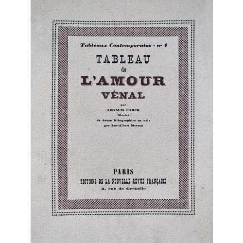 Description: Softcover, French flapped wrappers, lettered front, back (advert.) and spine, collated in-4to, 24.3 x 20.2 cm, printed on thick wove paper Vélin pur fil Lafuma-Navarre, print run limited to 335 copies from which this is copy № 219; outer margin untrimmed, some leaves uncut, glassine DJ. Limitation: 1 copy (A) on Japon Impérial + double suite of plates + suite of original drawings, 4 copies (B-E) on Japon Impérial + double suite of plates, 15 copies on on Japon Impérial + suite of plates on Vieux Japon teinté (F-T), 315 copies on Vélin pur fil Lafuma-Navarre, of which 15 (I-XV) not for sale. Copyright: Libraire Gallimard, 1924. Printed: March 10, 1924 – text by Coulouma (Argenteuil) under direction of H. Barthélemy, lithographs printed by Marchizet (Paris). Front wrapper (in letterpress two-colour border): Tableaux Contemporains – no 4 | . TABLEAU | de | L'AMOUR | VÉNAL | par | FRANCIS CARCO | Illustré | de douze lithographies en noir | par Luc-Albert Moreau | PARIS | ÉDITIONS DE LA NOUVELLE REVUE FRANÇAISE | 3, rue de Grenelle || Title-page: Same, without a frame, in black, L'AMOUR | VÉNAL in brown. Collation: 4to; 14 a4 2-164, total 68 leaves with wrappers included in collation plus 12 plates, incl. frontispiece, extraneous to collation. Pagination: [2 wrapper] [6] [i] ii-vii [viii blank] [9] 10-122 [2 colophon] [2 blank] [2 wrapper]; total 136 pages incl. wrappers, plus ils. Contributors: Francis Carco [François Carcopino-Tusoli] (French, 1886 – 1958) – author. Luc-Albert Moreau (French, 1882 – 1948) – artist. La Nouvelle Revue Française (nrf) (Paris)– publisher. Gaston Gallimard (French, 1881 – 1975) – publisher.
 -
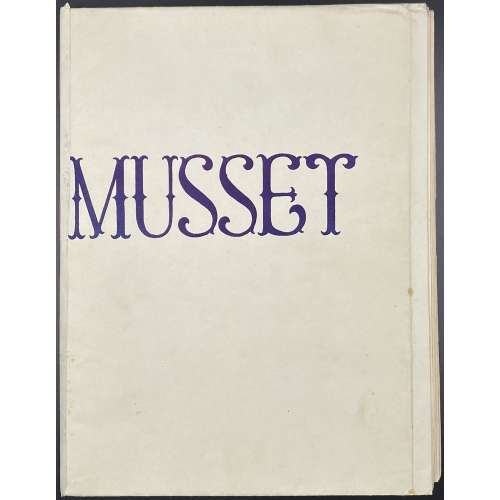 Description: one volume in French flapped wrappers 25.3 x 19 cm, lettered “MUSSET” to front, 5 gatherings of 4 and one of 6 leaves, 26 leaves total, pp.: [4] [2] 3-43 [44] [4], total 52 pages, incl. those in wrappers, unbound; plus coloured and uncoloured suites of 12 lithographs, in a paper folder; in a cardboard tan slipcase 2.8 x 19.3 cm. Artist unknown, publisher unknown, published at the end of 1940s (per J.-P. Dutel). Illustrations are a loose interpretation of original lithographs by Devéria and Henri Grévedon or Octave Tassaert for the 1833 edition ((1926 re-print LIB-3135.2023). Limitation: Edition limited to 250 copies printed on Vélin Chiffon numbered 1 -250 and 24 copies marked by letters A to Z. This is copy № 246, with two suites of plates, one coloured and one b/w. Catalogue raisonné: Dutel (1920-1970) № 1657, p. 189. Alfred de Musset (French, 1810 – 1857) – author.
 -
 Book title: Kabuki fan-prints from Edo: Genroku to Enkyō periods (1688-1748) [江戸歌舞伎団扇絵] (Edo kabuki uchiwa-e: Genroku - Enkyō hen). Author: Shigeo Miyao [宮尾しげを] (Japanese, 1902 – 1982). Comments by: Sutezō Kimura [木村仙集] (Japanese, 20th century). Publisher: Inoue Shobō [井上書房] (Tokyo). Oblong volume bound in black washi paper with silver kabuki face design to front and silver lettering to spine and silver publisher’s name to back; three-colour title, folding frontispiece, second frontispiece, pp.: [6] foreword, contents, [2] f.t.p./blank, 3-134 [2], 43 full-page black & white illustrations, colophon slip pasted, bookstore label to back pastedown, in a pink slipcase with black lettering. Primitive fan prints from the Kaga collection, from 1691 to 1747. Edition: 1st edition, limited to 500 copies.
 -
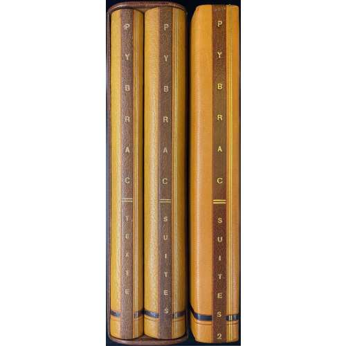 A three-volume unique copy of Louÿs’s poetical work ‘Pybrac’; edition published in 1928 by Marcel Vertès limited to 30 copies; contains 31 drypoints by Marcel Vertès, incl. frontispiece, nine full-page plates and twenty in-text vignettes; enriched with a volume of three suites of plates (first state b/w on Van Gelder paper, final state b/w on Japon nacré paper, final state hand-coloured on Van Gelder paper) plus 5 refused plates; and with a volume of one original watercolour, five ink drawings, three suites of plates (first state b/w on Van Gelder paper, final state b/w on Japon nacré paper, final state hand-coloured on Van Gelder paper) plus similar 5 refused plates, one b/w plate and one coloured plate, and a drypoint metal plate; two volumes of three are in a slipcase. Same edition in this collection: LIB-2919.2022. Details: (1) The ‘Texte’ volume, collated in-4to, 26 x 20.5 cm bound by Creuzevault (signed inside the front cover, in the bottom) in full tan morocco, blind fillets and a brown strip in the bottom to boards, double gilt fillet and a brown label along the spine, gilt-lettered vertically “PYBRAC | TEXTE”; gilt on black faux marbled endpapers, printed on watermarked Van Gelder Zonen laid paper; collated as follows: [3] blank flyleaves, [1] wrapper ‘PYBRAC’, [5] leaves with pasted original ink drawings on white paper, [1] leaf with pasted original hand-coloured ink drawings on blue paper, [1] drypoint frontispiece, [2] blank leaves, [1] half-title/limitation, [1] t.p., [2] blank leaves, 1-104 (pp. 1-78 [2]), [4] blank leaves plus nine full-page drypoint plates; total 70 leaves. Title-page: PYBRAC | ILLUSTRE DE TRENTE POINT SÈCHES | D’UN | ARTISTE INCONNU | PARIS | AUX DÉPENS D’UN AMATEUR | — | M. CM. XXVIII || Limitation: Edition limited to 30 copies; 1 copy unique on Japon Nacré with 30 original sketches, one suite in colour, two suites in black and 5 cancelled plates; 29 copies on Hollande Van Gelder, with one original watercolour, four original sketches, one suite in colour, two suites in black and 5 cancelled plates. This is copy № 12. (2) The ‘Suites’ volume, 26 x 20.5 cm, uniformly bound in quarter tan morocco over faux marbled paper, blind fillets, horizontal brown strip in the bottom, a vertical brown strip along the border, double gilt fillet and a brown label along the spine, gilt-lettered vertically “PYBRAC | SUITES”; gilt on black faux marbled endpapers; collated as follows: [3] blank flyleaves, three suites of prints: first state on Van Gelder paper, the final state on ‘Japon nacré’ paper, and hand-coloured final state on Van Gelder (31 x 3 = 93 leaves) plus [5] refused plates and [3] blank leaves; total 104 leaves. ‘Texte’ and ‘Suites’ volumes are placed in a faux marbled slipcase. (3) The ‘Suites 2’ volume, 26 x 21.5 cm, bound similarly to the ‘Suites’ volume (quarter morocco), gilt-lettered vertically “PYBRAC | SUITES 2” to spine; front cover with a hollow placement with the drypoint metal plate inside (plate #3), [3] blank wove paper leaves, [1] section title (s.t.) ‘AQUARELLE ORIGINALE’, [1] ink and crayon drawing, [1] s.t. ‘CROQUIS ORIGINAUX’, [5] ink drawings, [1] s.t. ‘PREMIER ÉTAT DES PLANCHES’, [31] plates on Van Gelder, [1] s.t. ‘SUITE EN NOIR SUR JAPON NACRÉ’, [31] plates, s.t. ‘SUITE COLORIÉE A LA MAIN’, [31] plates, [1] s.t. ‘PLANCHES REFUSÉS’, [5] plates, [1] coloured plate #13, [1] uncoloured plate #10, [3] wove paper blank leaves; total 118 leaves. Catalogue raisonné: Dutel (1920-70) № 2279 ; Fekete № 216; Nordmann (I) № 235; Vokaer 23. Ref.: honesterotica.com Contributors: Pierre Louÿs (French, 1870 – 1925) – author. Marcel Vertès [Marcell Vértes] (Jewish-Hungarian-French, 1895 – 1961) – artist. Henri Creuzevault (French, 1905 – 1971) – bookbinder. Seller's description: [ENRICHI & HORS-COMMERCE NON JUSTIFIÉ] Pierre LOUŸS - Marcel VERTÈS. Pybrac, illustré de trente pointes sèches d’un artiste inconnu. Paris, aux dépens d’un amateur, 1928. 3 volumes in-4 de 79 pages, 98 et 76 feuillets. Le volume contenant le texte est relié d'un plein chagrin havane à dos lisse, une pièce de titre en long et un filet doré à froid en bas (Creuzevault). Les deux autres volumes sont reliés à l'identiques, demi chagrin havane, dos lisse, pièce de titre en long, filets dorés sur le dos et filet doré à froid sur le bas et le long du mors. Le cuivre est placé dans le plat intérieur du volume 3, les suites dans le 2. Les deux premiers volumes sont rassemblés dans un étui. Illustré de 31 gravures originales dont 11 hors-texte par Marcel Vertès pour l’une des premières publications obscènes de Pierre Louÿs. Tirage à 30 exemplaires. La justification indique : "Il a été tiré de ce livre 30 exemplaires : 1 exemplaire unique sur Japon nacré avec trente croquis originaux, une suite en couleur, deux suites en noir et une épreuve des cinq planches refusées ; 29 exemplaires sur grand papier de Hollande Van Gelder avec une aquarelle originale, quatre croquis originaux, une suite en couleur, deux suites en noir et une épreuve des cinq planches refusées.". Exemplaire n°12 (Volume 1 Texte). Cet exemplaire est composé différemment soit : Volume 1, Texte : La couverture conservée, 5 dessins originaux à l'encre, 1 dessin sur papier bleu à l'estompe de couleur, le texte, les gravures in-texte et hors-texte. — Volume 2, Suites : les 31 planches en 3 états (1 en couleur et 2 en noir) et une épreuve des 5 planches refusées. — Volume 3, Suites 2 : 1 cuivre, 1 aquarelle, 5 dessins originaux à l'encre, 2 suites en noir, 1 suite coloriée à la main, 1 épreuve des 5 planches refusées, 1 dessin refusé à l'encre et à l'aquarelle et 1 dessin refusé à l'encre. Dutel précise : « Elle est ornée de 11 gravures originales hors-texte dont un titre et 20 gravures dans le texte par Marcel Vertès qui fut aussi l’éditeur de cet ouvrage. Il s’agit d’une des plus belles et des plus rares productions bibliophiliques de l’artiste. » Et surtout la plus rare… (Dutel 2279, pas à l’Enfer de la BnF).
 -
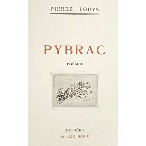 Description: Softcover, French flapped wrappers, 19.7 x 14.5 cm, printed on thick wove paper watermarked “J. PERRIGOT ARCHES MBM”; engraved vignette by Foujita to t.p.; some pages towards the end uncut. Illustrated by ten original watercolours, unsigned. Collation: Pink wrappers, lettered to front, in frame: “P. L. |—| PYBRAC |—| 1927”, 2 blank leaves (one in wrapper), [2] h.t./blank, [2] t.p. in red and black with engraved vignette by Foujita / blank, [2] (Sur la chemise...), [2] f.t. / watercolour on reverse, [5] 6-98 [2 colophon/blank], 2 blank leaves (one in wrapper). Title-page (red and black): PIERRE LOUŸS | PYBRAC | POESIES | {vignette} | CYTHÈRE | AU COQ HARDI || Edition: Limited edition of 105 copies, of which this is copy № 28 on Arches paper, unique as enhanced with 10 colour drawings by an anonymous artist, presumably by Feodor Rojankovsky (dit Rojan), a unique copy. Cat. raisonné: Dutel III № 2278 p. 334; Dutel describes two unique copies of the edition, one with 6 and another with 24 original watercolours by Rojan. Contributors: Pierre Louÿs (French, 1870 – 1925) – author. Léonard Tsuguharu Foujita (Japanese-French, 1886 – 1968) – artist (t.p. vignette). Feodor Rojankovsky [Rojan, Фёдор Степанович Рожанковский] (Russian-American, 1891 – 1970). René Bonnel (French, 1884 – 1975) – publisher. Another unique copy of the same edition illustrated by an anonymous artist in this collection LIB-3061.2022.
 -
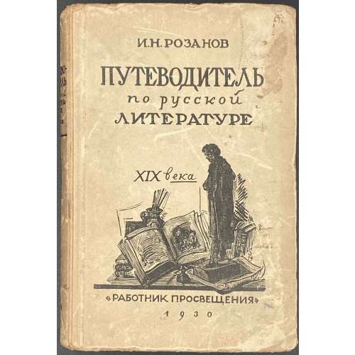 Hardcover, 17 x 12 cm, tan paper over cardboard, black lettering and vignette to front cover "И. Н. РОЗАНОВ | ПУТЕВОДИТЕЛЬ | по русской | ЛИТЕРАТУРЕ | XIX века | {vignette} | «РАБОТНИК ПРОСВЕЩЕНИЯ» | 1930", design of the cover by А. Суворов (woodcut), lettering to spine. Blue ink oval stamp “Из КНИГ | Д.С.НЕСТЕРОВ | и | ЖУРНАЛОВ”. Collation/pagination: 8vo: 1-218, total 168 leaves; pp.: [1-8] 9-336. Title-page: Double rule | Путеводитель | по русской | литературе | XIX века СОСТАВИЛ ИВ. РОЗАНОВ ИЗДАНИЕ ТРЕТЬЕ | РАБОТНИК ПРОСВЕЩЕНИЯ | МОСКВА – 1930 – ЛЕНИНГРАД || Print run: 5,100 copies. Contributors: Иван Никанорович Розанов (Russian, 1874 – 1959) Анатолий Андреевич Суворов (Russian, 1890—1943)
 -
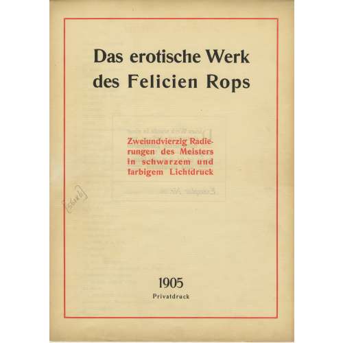
A limited-edition (№26/500) set of 42 etchings and drypoints after Félicien Rops (Belgian, 1833 – 1898), each mounted in a numbered passe-partout, printed posthumously by an anonym in Germany in 1905; in a flapped half faux suede-backed cardboard portfolio with straps, 442 x 335 mm, red embossed lettering to the front cover, bookplate of Richard Teschner (Austrian, 1879 – 1948) pasted inside.
Title-page (in a red frame): Das erotische Werk | des Felicien Rops | Zweiundvierzig Radie- | rungen des Meisters | in schwarzem und | farbigem Lichtdruck | 1905 | Privatdruk ||
Limitation (in a red two-section frame) : Dieses Werk wurde in einer | einmaligen Auflage von | 500 numerierten Exemplaren | hergestellt. — Ein Nachdruck | findet nicht statt, die Platten | == sind vernichtet == | Exemplar Nr. 26 ||
Verzeichnis der Tafeln (Table of Contents): 1. Initiation sentimentale; 2. La croix; 3. Entre-acte; 4. Holocauste; 5. La bonne hollandaise; 6. Étude; 7. La femme au pantin; 8. L’amour de Satan; 9. Au pays des féminies; 10. La volupté; 11. Evocation; 12. De castitate; 13. Joujou; 14. Vengeance d’une femme; 15. Phantasies; 16. Indolence; 17. Théâtre gaillard; 18. Appel au peuple; 19. Masques modernes; 20. Tout est grand chez les rois; 21. Marie-Madeleine; 22. L’amante du Christ; 23. Feuille de vigne; 24. La messe de Guide; 25 Viol et prostitution; 26. Le maillot; 27. Les jeunes France; 28. Les diaboliques; 29. Coquetterie au miroir; 30. Jeune homme; 31. La femme et la mort; 32. Confidence; 33. La bergère; 34. La mère aux satyrions; 35. Les exercices de dévotion de Mr. Henri Roch; 36. Mademoiselle de Maupin; 37. Le bonheur dans le crime; 38. La sirène; 39. Les cabotinages de l’amour; 40. Document sur l’impuissance d’aimer; 41. A cœur perdu; 42. Curieuse.
-
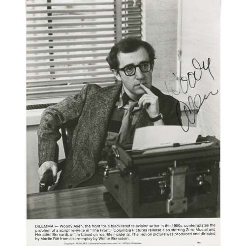 Three-quarter half-length seated portrait of American filmmaker and actor Woody Allen in a scene from the drama film The Front (1976), shot by Columbia Pictures in 1976, autographed on a light area of the image. Dimensions: 245 x 192 mm; image 217 x 192 mm.