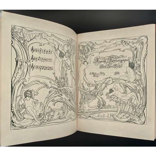
Society of Arts (Great Britain)
Charles George Lyttleton Cobham (British, 1842 – 1922)
Henry Trueman Wood (British, 1879 – 1917), Secretary of the Royal Society of Arts (1879–1917).
George Bell & Sons – publisher. William Clowes and Sons – printer.

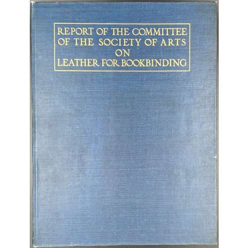
Society of Arts (Great Britain)
Charles George Lyttleton Cobham (British, 1842 – 1922)
Henry Trueman Wood (British, 1879 – 1917), Secretary of the Royal Society of Arts (1879–1917).
George Bell & Sons – publisher. William Clowes and Sons – printer.
![George Cruikshank : A Catalogue Raisonné Of The Work Executed During The Years 1806-1877; With Collations, Notes, Approximate Values, Facsimiles, And Illustrationsby Albert M. Cohn, author of a bibliographical catalogue of the printed works illustrated by George Cruikshank, etc. London : Office of "The Bookman's Jounral", 1924. [Cohn, Albert M.]](https://varshavskycollection.com/wp-content/uploads/2021/02/LIB-1650-c-scaled-500x500.jpg)
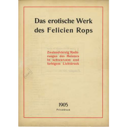
A limited-edition (№26/500) set of 42 etchings and drypoints after Félicien Rops (Belgian, 1833 – 1898), each mounted in a numbered passe-partout, printed posthumously by an anonym in Germany in 1905; in a flapped half faux suede-backed cardboard portfolio with straps, 442 x 335 mm, red embossed lettering to the front cover, bookplate of Richard Teschner (Austrian, 1879 – 1948) pasted inside.
Title-page (in a red frame): Das erotische Werk | des Felicien Rops | Zweiundvierzig Radie- | rungen des Meisters | in schwarzem und | farbigem Lichtdruck | 1905 | Privatdruk ||
Limitation (in a red two-section frame) : Dieses Werk wurde in einer | einmaligen Auflage von | 500 numerierten Exemplaren | hergestellt. — Ein Nachdruck | findet nicht statt, die Platten | == sind vernichtet == | Exemplar Nr. 26 ||
Verzeichnis der Tafeln (Table of Contents): 1. Initiation sentimentale; 2. La croix; 3. Entre-acte; 4. Holocauste; 5. La bonne hollandaise; 6. Étude; 7. La femme au pantin; 8. L’amour de Satan; 9. Au pays des féminies; 10. La volupté; 11. Evocation; 12. De castitate; 13. Joujou; 14. Vengeance d’une femme; 15. Phantasies; 16. Indolence; 17. Théâtre gaillard; 18. Appel au peuple; 19. Masques modernes; 20. Tout est grand chez les rois; 21. Marie-Madeleine; 22. L’amante du Christ; 23. Feuille de vigne; 24. La messe de Guide; 25 Viol et prostitution; 26. Le maillot; 27. Les jeunes France; 28. Les diaboliques; 29. Coquetterie au miroir; 30. Jeune homme; 31. La femme et la mort; 32. Confidence; 33. La bergère; 34. La mère aux satyrions; 35. Les exercices de dévotion de Mr. Henri Roch; 36. Mademoiselle de Maupin; 37. Le bonheur dans le crime; 38. La sirène; 39. Les cabotinages de l’amour; 40. Document sur l’impuissance d’aimer; 41. A cœur perdu; 42. Curieuse.