-
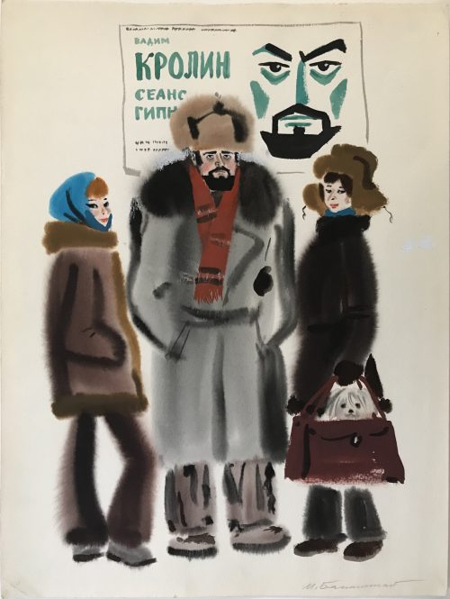 Mikhail Belomlinsky. Born 1934, Russia. Vadim Krolin, hypnosis session. Watercolor painting on paper from Chukotka expedition, ca. 1970s. Size: 36 x 48 cm.
 -
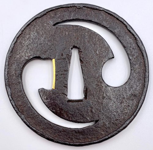
Circular tsuba (marugata ) with design of futatsu-domoe (twofold tomoe) in negative openwork (kage-sukashi), folded-over rim (uchikaeshi-mimi ). The ‘head’ of the left tomoe altered to form an opening for scabbard accessory (kata-hitsu-ana), adorned with gold ategane fitting with file marks (tate-yasurime). The hammer-blow finish of the surface (tsuchime-ji). Signed to the left of nakaga-ana: Yamakichibei (山吉兵). Attributed by Steve Waszak a the Second Generation (Nidai) master.
NBTHK paper [translated by Markus Sesko]:Tomoe-sukashi-tsuba (巴透し鐔).
KANTEI-SHO (鑑定書) - APPRAISAL No 451718
Futatsu-domoe sukashi-tsuba (二巴透鐔) ‒ Tsuba with two tomoe comma openwork design
Signed: Yamakichibei (山吉兵)
Round shape (marugata ), iron, hammerblow finish (tsuchime-ji ), negative openwork design (kage-sukashi ), folded-over rim (uchikaeshi-mimi ), one opening for scabbard accessory
(kata-hitsu-ana) (with gold ategane fitting)
According to the result of the shinsa committee of our society, we judge this work as authentic
and rank it as Hozon Tōsōgu.
February 20, 2007
[Foundation] Nihon Bijutsu Tōken Hozon Kyōkai, NBTHK (日本美術刀劍保存協會)
Diameter: 76 mm, thickness at center 3.9 mm, thickness at rim: 5.1 mm; weight: 102.5 g
Tomoe (Comma): The character 巴 (Chinese pronunciation bā). A pattern resembling the two-comma tomoe (futatsu-domoe) has been found in ancient cultures on all inhabited continents. ...aside from their military function, a ritual or fetish value, perhaps related to their testicular shape. It also has yin-yang connotation. The gold sekigane confirms the high value of the piece to the owner.
-
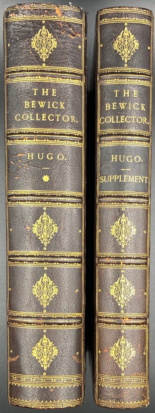 A two-volume set: (1) Thomas Hugo. The Bewick Collector. A Descriptive Catalogue of the Works of Thomas and John Bewick; Including cuts, in various states, for Books and Pamphlets, Private Gentlemen, Public Companies, Exhibitions, Races, Newspapers, Shop Cards, Invoice Heads, Bar Bills, Coal Certificates, Broadsides, and other miscellaneous purposes, and Wood Blocks. With an Appendix of Portraits, Autographs, Works of Pupils, etc., etc. The whole described from the Originals contained in the largest and most perfect collection ever formed, and illustrated with a hundred and twelve cuts. — London: Lovell Reeve and Co., MDCCCLXVI [1866]. — [Printed by] J. E. Taylor and Co., printers. — pp.: [i-v] vi-xxiii [xxiv], [1] 2-562. (2) Thomas Hugo. The Bewick Collector. A Supplement to a Descriptive Catalogue of the Works of Thomas and John Bewick; Consisting of additions to the various divisions of cuts, wood blocks. etc., enumerated in that work. The whole described from the Originals contained in the largest and most perfect collection ever formed, and illustrated with a hundred and eighty cuts. — London: L. Reeve and Co, MDCCCLXVIII [1868]. — [Printed by] J. E. Taylor and Co., printers. — pp.: [i-vii] viii-xxxii, [1] 2-353. Both volumes in 8vo, 22.5 x 14.5 cm, hardcover. Contemporary dark brown half morocco, gilt-ruled, with 5 raised bands, gilt titles and decoration to spine, and marbled paper over boards. Top edge gilt; marbled endpapers. Binding splitting at pp.80/81 of the 1st volume. Armorial bookplate of Ralph Hart Tweddle to front pastedown. Ralph Hart Tweddle (1843 – 1895) was a British mechanical engineer, known particularly for inventing the portable hydraulic riveter, which greatly facilitated the construction of boilers, bridges and ships.
 -
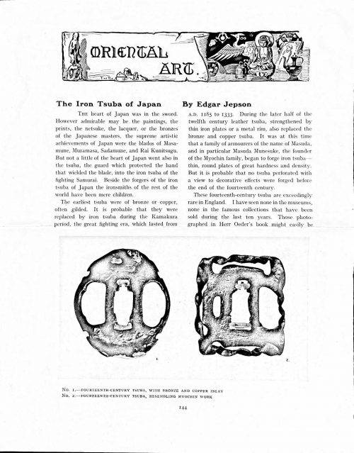 Magazine article by Edgar Jepson: The Iron Tsuba of Japan (Section: Oriental Art), published in volume Vol. 70 (September–December) of The Connoisseur: An Illustrated Magazine for Collectors, Vol. 70 (September–December); pp. 143-152 / C. Reginald Grundy [ed.] — London: Published by the Proprietor, W. CLAUSE JOHNSON, at the Editorial and Advertisement Offices of The Connoisseur, 1924. Owner's half black morocco, gilt lettering to spine, blue cloth boards. Two volumes bound together without original covers. Size 28.5 x 22 cm. Vol. 1: The Connoisseur | An Illustrated Magazine | For Collectors | Edited by C. Reginald Grundy | Vol. LXIX. | (MAY—AUGUST, 1924) | LONDON | Published by the Proprietor, W. CLAUSE JOHNSON, at the | Editorial and Advertisement Offices of The Connoisseur, | at 1, Duke Street, St. James's, S.W. 1 | 1924 || Pp.: [i-ii] iii-xviii [xix] [1, 2 - plate] 3-249 [250]. Vol. 2: The Connoisseur | An Illustrated Magazine | For Collectors | Edited by C. Reginald Grundy | Vol. LXX. | (SEPTEMBER—DECEMBER, 1924) | LONDON | Published by the Proprietor, W. CLAUSE JOHNSON, at the | Editorial and Advertisement Offices of The Connoisseur, | at 1, Duke Street, St. James's, S.W. 1 | 1924 || Pp.: [i-ii] iii-xxii [2 blanks] [1, 2 - plate] 3-261 [262]. The Iron Tsuba of Japan by Edgar Jepson The heart of Japan was in the sword. However admirable may be the paintings, the prints, the netsuke, the lacquer, or the bronzes of the Japanese masters, the supreme artistic achievements of Japan were the blades of Masamune, Muramasa, Sadamune, and Rai Kunitsugu. But not a little of the heart of Japan went also in the tsuba, the guard which protected the hand that wielded the blade, into the iron tsuba of the fighting Samurai. Beside the forgers of the iron tsuba of Japan the ironsmiths of the rest of the world have been mere children. The earliest tsuba were of bronze or copper, often gilded. It is probable that they were replaced by iron tsuba during the Kamakura period, the great fighting era, which lasted from A.D. 1185 to 1333. During the later half of the twelfth century leather tsuba, strengthened by thin iron plates or a metal rim, also replaced the bronze and copper tsuba. It was at this time that a family of armourers of the name of Masuda, and in particular Masuda Munesuke, the founder of the Myochin family, began to forge iron tsuba — thin, round plates of great hardness and density. But it is probable that no tsuba perforated with a view to decorative effects were forged before the end of the fourteenth century. These fourteenth-century tsuba are exceedingly rare in England. I have seen none in the museums, none in the famous collections that have been sold during the last ten years. Those photographed in Herr Oeder's book might easily be the fifteenth century. No. 1 is a curious cup-shape tsuba decorated with a bronze and copper inlay. No. 2, with its edges curiously twisted in the forging, looks like Myochin work. But it is not of the Myochin iron. The Myochin family produced some of the greatest ironsmiths of Japan. Armourers first of all, tsubasmiths, forgers of sake-kettles, articulated reptiles, crustacea, and insects — everything that can be done with iron they did; they pushed their medium to its limit. They were forging iron tsuba in 1160, and they were still forging them in 1860. And it was their own iron, or rather their own steel. They discovered the secret of it early, and they kept that secret in the family for all those hundreds of years. There is no mistaking a Myochin tsuba: balance it on your finger and tap it with a piece of metal, always it gives forth a clear bell-like ring that you get from the work of no other ironsmith, Japanese or European. Always the Myochin tsuba is before everything a protection to the hand of the swordsman; to that everything is, as it should be, subordinated. No. 3 is a Myochin tsuba of the fifteenth century, and probably of the early fifteenth century. No. 4, by Myochin Munetaka, perforated with a grotesque figure, is an example of that twisting and twisting of the iron in the forging till it forms a pattern like the grain of wood. The Myochin smiths invented these wood-grain tsuba, and no other smiths equalled them in their forging. In the sixteenth century, the fighting tsuba was probably at its best. It was a century of great tsubasmiths. Then the first Nobuiye, whose tsuba fetched £100 apiece, circa 1800, in Japan, and the first Kaneiye flourished. No. 5 is a tsuba forged by a great smith, Iyesada of Sotome, in the manner of Nobuiye I, decorated with the karakusa tendrils that Nobuiye delighted in, with lightning and clouds. No. 6 is a guard of Sanada Tembo, the chief smith of the Tembo family, stamped, punning fashion, with the character Tembo. Akin to the Tembo tsuba were those of the Kiami and Hoan smiths. Then also the Heianjo smiths and the Owari smiths, especially those of Nagoya and the Yamakichi family, forged their strongest tsuba. Those of the Yamakichi were tested after the forging by being pounded in iron mortars — at least, so the legend runs. But they were a sternly utilitarian family, and I have never seen a Yamakichi tsuba of any beauty. In the later half of the fifteenth century arose the fashion of decorating tsuba with an inlay, zogan, of bronze. The Heianjo tsuba, forged at Kyoto in the latter half of the fifteenth and the beginning of the sixteenth century, were often thus inlaid. The earliest of them were called "Onin", of which No. 7 is an example. In addition to the bronze inlay around the edge, it is inlaid with a representation, some say, of snow; others say, of the duckweed on a pond. No. 8 is probably a Heianjo tsuba, but I am not quite sure about it. The inlaid acacia branches might be very early Shoami work. But to judge by the iron, it is a fifteenth-century tsuba; and the authorities place the beginning of the Shoami school not later than early in the sixteenth century. No. 10 is an example of the Fushimi-zogan, a flat inlay of a light-coloured bronze. These tsuba took their name from the fact that they were first forged at Fushimi, in Yamashiro, in the sixteenth century. It is of the type known as Mon-zukashi, perforated with crests (mon) à jour. The Yoshiro-zogan tsuba were also first forged at Fushimi by Yoshiro Naomasa. They were distinguished from the Fushimi-zogan by the fact that their inlay was generally a little raised-not always-for the inlay of No. 9, a tsuba forged by a later nineteenth-century Yoshiro, is quite flat. It is an interesting tsuba, for, with its decoration grown florid and excessive, it marks the intermediate stage between the simple and delightful designs of the genuine fighting tsuba and the elaborate pictures in gold and silver on the tsuba of the eighteenth-century smiths of Awa and Kyoto, which have become mere ornaments of the goldsmith. The Gomoku-zogan (No. 11) tsuba were probably first forged earlier than the Fushimi and Yoshiro-zogan tsuba. This inlay, in slight relief, is a representation in a light-coloured bronze and copper of twigs caught in the eddies of streams. The seventeenth century and early eighteenth century were the great periods of perforated tsuba. The designs, and they are often admirable, are for the most part in plain fretwork; but they are also chased. No. 12, a crane under an acacia, is a tsuba of a Higo smith, great forgers of fighting tsuba during this period. These smiths also excelled in nunome zogan, a very thin gold and silver inlay, with which they further decorated their perforated guards. The smiths of the Umetada and Shoami families also forged iron tsuba during this period; but their designs, though sometimes pleasing enough, are rarely fine. The best work of Myoju Umetada is in sentoku, not iron. The Choshu smiths, coming later, surpass the perforated guards of both the Umetada and Shoami smiths in beauty of design. No. 13, a lotus in the round, not only fretwork, but also engraved, is a good example of the admirable balance they so often attained in their designs. It is a sufficiently realistic lotus, but yet of a delightful simplicity. In considerable contrast is No. 14, the dragon by Soheishi Soten — one of the only two authentic tsuba of his forging known — the first forger of hikone-bori tsuba, which were in extraordinary favour in Japan during the eighteenth century, and illustrated every important event in Japanese history. It is on the elaborate side, but fine, strong work, and an excellent guard to the hand, for the lighter and more open part, which gives the design its admirable balance, is on the inside, and not exposed to the full swing of an opponent's blade. A few years ago there was a tendency to decry the Namban tsuba as having sprung too directly from foreign sources. But though the original suggestion may have been Chinese, or, as some say, Portuguese, the Japanese made it entirely their own, as characteristically Japanese as anything can well be, but, it must be admitted, of a decadent period. The school took its rise at the beginning of the seventeenth century, and the early tsuba were forged of a specially hard iron, the Wootz, imported from Southern India. No. 15, the signs of the Zodiac, is an excellent tsuba from the fighting point of view. Both it and No. 16 are of quite charming, if elaborate, design, and both of them, with their delicate scroll-work, so astonishingly undercut, are the very last word in the work of the ironsmith-veritable iron lace. To return to the simpler perforated tsuba, the smiths of Akasaka, a suburb of Tokyo, produced probably the most charming designs. Their style derives considerably from the Higo smiths, and their earlier fighting tsuba are very like the Higo tsuba. But always their work was just a little lighter than that of the Higo smiths, and in the end they moved right away from them and became the forgers of very light guards indeed. No. 17, is a representation of the Hiyokudori, the fabulous double bird, in which were reincarnated the souls of the two lovers, Gompachi and Komurasaki; and No. 18, “the tsuba of a hundred ducks "— there are about forty — are characteristic designs of the school. In the work of the Akasaka smiths the balance, which makes the design of a good tsuba so admirable and delightful, attains its height. This admirable balance seems often to be obtained by a deliberate sacrifice of symmetry. About nine hundred and ninety-nine European ironsmiths out of a thousand would have made the right and left sides of the Hiyoku-dori line by line, and perforation by perforation, exactly alike; he would have cut out exactly as many ducks on the one side of “the tsuba of a hundred ducks” as on the other, and made each duck on the right side correspond exactly in position and attitude with a duck on the left side. By variations the tsubasmith attained a finer balance, almost a higher symmetry. No. 19, often called by collectors the "rose-window" tsuba, but really a stylised chrysanthemum, is a favourite design of the Akasaka smiths, but Hizen work and inlaid in the Hizen manner with gold nunome. No. 20 is a Satsuma tsuba of the middle period. The Satsuma smiths of the nineteenth century produced probably the most ornate of all the iron guards, for the most part calibashes and beans with their leaves and tendrils realistic in the extreme, but of charming design. Few crafts have been carried further than that of the tsubasmith; few crafts working in a difficult medium have handled more subjects with greater feeling for beauty or greater liveliness of fancy. It is interesting to note again and again how school influences school, and smith influences smith. But, as in all the applied arts, the finest tsuba were forged by men who never lost sight of the purpose of a tsuba, that it is before everything a protection to the hand, and never subjected that purpose to a passion for virtuosity. Illustrations: No 1. FOURTEENTH-CENTURY TSUBA, WITH BRONZE AND COPPER INLAY No. 2. FOURTEENTH-CENTURY TSUBA, RESEMBLING MYOCHIN WORK No. 3. MYOCHIN TSUBA, FIFTEENTH CENTURY No. 4. MYOCHIN TSUBA, NINETEENTH CENTURY No. 5. SIXTEENTH-CENTURY TSUBA No. 6. SIXTEENTH-CENTURY TSUBA BY IYESADA OF SOTOME BY SANADA TEMBO No. 7. ONIN TSUBA No. 8. HEIANJO (?) TSUBA No. 9. YOSHIRO TSUBA, NINETEENTH CENTURY No. 10. FUSHIMI-ZOGAN, NINETEENTH CENTURY No. 11.- GOMOKU-ZOGAN, SIXTEENTH CENTURY No. 12. HIGO TSUBA, SEVENTEENTH CENTURY No. 13. CHOSHU TSUBA, SEVENTEENTH CENTURY No. 14. SOTEN TSUBA, SEVENTEENTH CENTURY No. 15. NAMBAN TSUBA, EIGHTEENTH CENTURY No. 16. NAMBAN TSUBA, NINETEENTH CENTURY Nos. 17. AND 18. AKASAKA TSUBA, EIGHTEENTH CENTURY No. 19. HIZEN TSUBA, EIGHTEENTH CENTURY No. 20. SATSUMA TSUBA, EIGHTEENTH CENTURY
 -
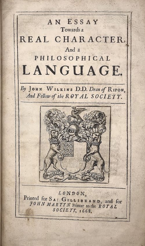 Title: AN ESSAY | Towards a | REAL CHARACTER, | And a | PHILOSOPHICAL | LANGUAGE. | By John Wilkins D.D. Dean of Ripon, | And Fellow of the ROYAL SOCIETY. |—| [armorial device] |—| LONDON, | Printed for Sa: Gellibrand, and for | JOHN MARTYN Printer to the ROYAL | SOCIETY, 1668. Pagination: [2] blank/order, [2] t.p./blank, [16], 1-454; + 79 leaves of Dictionary, unpaginated (158 pages); Illustrations: folding plates before pp. 167, 187, and two folding plates before p. 443. Collation: π2 a-d2 B-Z4 Aa-Zz4 Aaa-Lll4 Mmm3 aaa4 Aaa-Sss4 ttt3 Size: 4to, 32 x 20 x 5 cm; Binding: Full speckled calf, later polished calf spine with raised bands, double fillet ruled gilt compartments, crimson label with gilt lettering, margins sprinkled red. The work of John Wilkins is dedicated to the problem of the universal language. Wilkins was the Dean of Ripon from 1663 to 1672 and one of the founders of the Royal Society.
 -
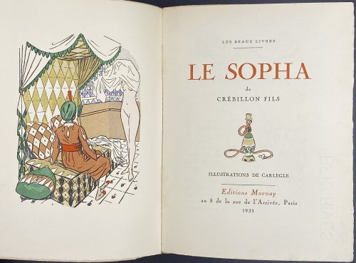 Title: LES BEAUX LIVRES | — | LE SOPHA | de | CRÉBILLON FILS |{vignette}| ILLUSTRATIONS DE CARLÈGLE | — | Éditions Mornay | au 8 de la rue de l’Arrivée, Paris | 1933 || Series: Les beaux livres Binding: Original pictorial wrappers, margins untrimmed, uncut; printed on BFK Rives paper (watermark); the number of copy blacked out. Justification of the print run on p. [329].Pagination: [1-8] 9-326 [327-331], ill., woodcuts in text. Size: 20.2 x 15.5 cm
 -
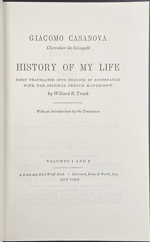 Title: GIACOMO CASANOVA | Chevalier de Seingalt | HISTORY OF MY LIFE | FIRST TRANSLATED INTO ENGLISH IN ACCORDANCE | WITH THE ORIGINAL FRENCH MANUSCRIPT | By Willard R. Trask | With an Introduction by the Translator | VOLUMES 1 AND 2 | A Helen and Kurt Wolff book • Harcourt, Brace & World, 1966 | NEW YORK || Stated 1st edition. Pagination: [2 blank] [i-iv] v-viii, [1, 2] 3-330 [8 blanks] + 32 ills. Two volumes in one.
 -
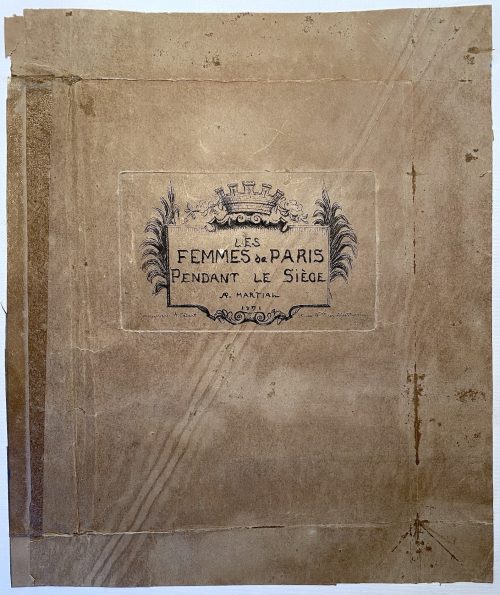 A suite of 12 etchings 160 x 118 mm each, in the first state, pasted on paper, 2 per sheet, with a cover (250 x 210 mm).0. Cover. Les femmes de Paris pendant le siège./R.Martial/1871.1. Lorsqu'à l'approche de l'ennemi on demandait l'éloignement des bouches inutiles [...] 2. L'Ennemi ! 3. No inscription 4. Quête pour les veuves. 5. Concert et quête pour les enfants blessés, malades, infirmes. 6. Au bastion/Et celles non moins précieuses qui dirigeaient ces ventes [...] 7. Vente pour les orphelins de la guerre. 8. No inscription 9. Une ration, bouillie romaine et Vin/Cantine municipale[...] 10. No inscription 11. No inscription 12. Les effets de cette union patriotique des femmes sont connus.[...]
 -
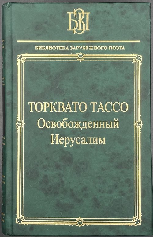 Hardcover, green publisher's paper boards, gilt lettering in the figural frame, black label with gilt lettering and gilt in compartments to spine. 21 x 13.5 cm, print run 2,500. pp.: [4] 5-714 [715/6] [4]. Title: ТОРКВАТО ТАССО | Освобожденный | Иерусалим | Перевод с итальянского | В. С. ЛИХАЧЕВА | Подготовка текста, предисловие, комментарии | А. О. ДЁМИНА | {publisher's device} | Санкт-Петербург | «НАУКА» | 2007 || ISBN 978-5-02-026954-5 Original: Torquato Tasso. La Gierusalemme Liberata.
 -
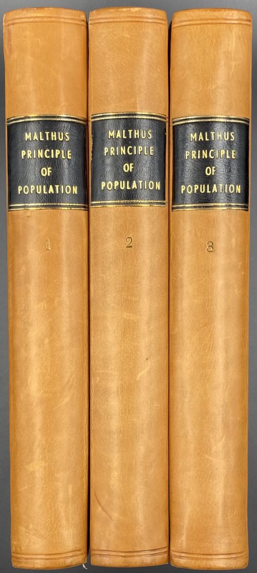 Title: AN ESSAY | ON THE | PRINCIPLE OF POPULATION; | OR, | A VIEW OF ITS PAST AND PRESENT EFFECTS | ON | HUMAN HAPPINESS; | WITH | AN INQUIRY INTO OUR PROSPECTS RESPECTING THE FUTURE | REMOVAL OR MITIGATION OF THE EVILS WHICH | IT OCCASIONS | BY T. R. MALTHUS, A. M. | Late Fellow of Jesus College, Cambridge, and Professor of History and Political Economy in the East-India College, Hertfordshire. | IN THREE VOLUMES. | VOL. I. [or II. or III.] | THE FIFTH EDITION, | WITH IMPORTANT ADDITIONS. | LONDON: | JOHN MURRAY, ALBEMARLE-STREET. | 1817. || Pagination and collation: Vol. 1: ffl, [i, ii] – t. p. / imprint., [iii] iv-xvi, [1] 2-496, bfl; A-Z8 2A-2I8. Vol. 2: ffl, [i, ii] – t. p. / imprint., [iii]-iv – contents, [1]-2-507 [508], bfl; [A]2 B-Z8 2A-2I8 2K6. Vol. 3: ffl, [i, ii] – t. p. / imprint., [iii]-iv – contents, [1]-2-500, bfl; [A]2 B-Z8 2A-2I8 2K2. Binding: Three volumes printed on wove paper, uniformly bound in quarter brown polished calf, blind-ruled, black label, ruled and lettered in gilt to spine, green buckram boards; 22.2 x 13.5 cm. Edition: 5th edition, corrected with a new preface, an updated appendix of Malthus’ responses to his critics, and addition of several chapters to the whole: on France, England, and on the poor laws. Lifetime edition. Ref.: Einaudi 3670; Goldsmiths’ 21761; Kress B.6974; Mattioli 2210. Printed by W. Clowes: William Clowes Ltd. (London). Clowes, William (British, 1779 – 1847). Malthus, Thomas Robert (British, 1766 – 1834). Murray, John (British, 1737 – 1793) Murray, John II (British, 1778 – 1843) John Murray (publishing house)
 -
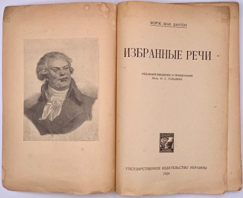 Title page: ЖОРЖ-ЖАК ДАНТОН | ИЗБРАННЫЕ РЕЧИ | РЕДАКЦИЯ, ВВЕДЕНИЕ И ПРИМЕЧАНИЯ | Проф. Н. С. ГОЛЬДИНА | {publisher’s device} | ГОСУДАРСТВЕННОЕ ИЗДАТЕЛЬСТВО УКРАИНЫ | 1924 Lacking wrappers, [2] – blank / frontispiece portrait of Danton, [2] t.p., / imprint, v-xviii, [2] –f.t / blank, 1-111 [112], collation: π2 *8 1-78. Danton, Georges Jacques [Дантон, Жорж Жак] (French, 1759 – 1794). Гольдин, Николай Сергеевич (Ukrainian-Jewish, 1877 – after 1924). Translator unknown.
 -
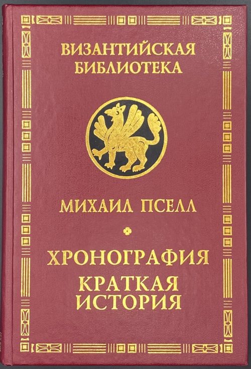 Title: МИХАИЛ ПСЕЛЛ | ХРОНОГРАФИЯ |Перевод, статья и примечания | Я. Н. Любарского | КРАТКАЯ ИСТОРИЯ | Перевод | Д. А. Черноглазова и Д. Р. Абдрахмановой | «АЛЕТЕЙЯ» | Санкт-Петербург | 2003 || Series: Византийская библиотека. Источники. Pagination: [1-8] 9-396 [4], frontis. Binding: 21.5 x 15 cm; hardcover, crimson buckram, gilt lettering in the border, gilt serial device on black, map endpapers. Print run: 1,000 copies. ISBN: 5-89329-594-3. Михаи́л Пселл [Μιχαήλ Ψελλός; Michael Psellos] (Byzantine, 1018 – c. 1078). Любарский, Яков Николаевич (Russian, 1929 – 2003).
 -
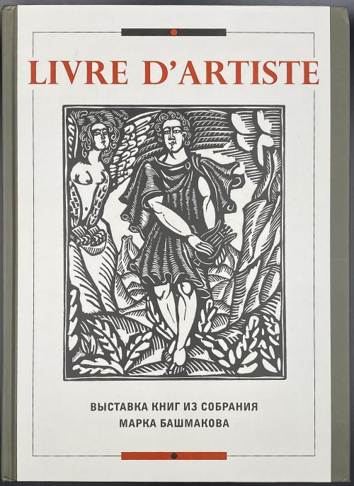 Title: Государственный Эрмитаж | LIVRE D’ARTISTE | ВЫСТАВКА КНИГ | ИЗ СОБРАНИЯ | МАРКА БАШМАКОВА | КАТАЛОГ | Санкт-Петербург | Издательство Государственного Эрмитажа | 2013 || Frontispiece: The State Hermitage Museum | LIVRE D’ARTISTE | AN EXHIBITION | OF BOOKS FROM | THE COLLECTION | OF MARK BASHMAKOV | CATALOGUE | St. Petersburg | The State Hermitage Publishers | 2013 || Pagination: [1-5] 6-319 [320]. Binding: pictorial over cardboard, black and red lettering to cover, white lettering to spine. Size: 31 x 23 cm.
 -
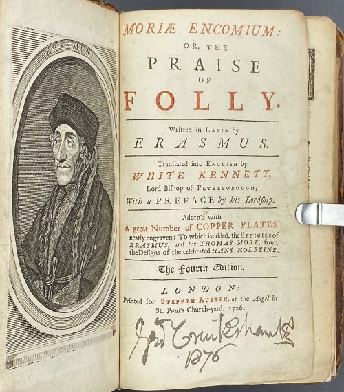 Erasmus. The praise of folly / Translated by White Kennett. — London: Stephen Austen, 1726. Title page in black and red: MORIÆ ENCOMIUM: | OR, THE | PRAISE | OF | FOLLY. |—| Written in Latin by | ERASMUS. |—| Translated into English by | WHITE KENNETT, | Lord Bishop of Peterborough; | With a PREFACE by his Lordship. |—| Adorn’d with | A great Number of COPPER PLATES | neatly engraven: To which is added, the Effigies of | ERASMUS, and Sir THOMAS MORE, from | theDesigns of the celebrated HANS HOLBEINE. |—| (in gothic letters) The Fourth Edition. |—| LONDON: | Printed for Stephen Austen, at the Angel in | St. Pauls’ Church-yard. 1726. || Pagination: modern endpapers and flyleaves, [2] – blank / frontis. (engraved portrait of Erasmus, [2] – t.p. in black and red with George Cruikshank’s signature in the bottom, dated 1876 / blank, [14] – to the reader, i-xiv – commendatory verses, [2] – John Wilford advert., folding portrait of Thomas More, i-v, [vi] - epistle, 1-168 – panegyrick, [4] – index.; 46 copper-engraved illustrations after Hans Holbein the Younger; pp. 17-20 detached. Collation: 12mo; π2 A6, a-b6, B-P6 Q2 (B3 unsigned), 13 in-text engravings + 26 plates + 7 folding plates; total 106 leaves and 33 plates, extraneous to collation. Edition: 4th, thus. Binding: 16.5 x 10.5 cm; rebacked with a modern spine, modern endpapers and flyleaves, contemporary boards sprinkled and tooled in a style of Cambridge panel. Provenance: Cruikshank, George (British, 1792 – 1878) [1876]; Stephen Whitehead (Oakland, CA) [2021]. Catalogue raisonné: J. Lewine (1898) p. 171 — 1st edition thus of 1709, in-8vo, with portrait and 46 plates after Holbein. Contributors: Desiderius Erasmus Roterodamus (Dutch, c. 1469 – 1536) – author of the original text in Latin.
White Kennett (British, 1660 – 1728) – translator from Latin into English.
Hans Holbein the Younger (German, 1497/8 – 1543) – artist.
Stephen Austen (fl. c. 1727 – 1746) – publisher. Linked items: Engraved portrait of Erasmus of Rotterdam in an octagonal frame, 1757 by Flipart after Holbein.Эразм Роттердамский. Похвальное слово глупости. — М.-Л.: Academia, 1932.
-
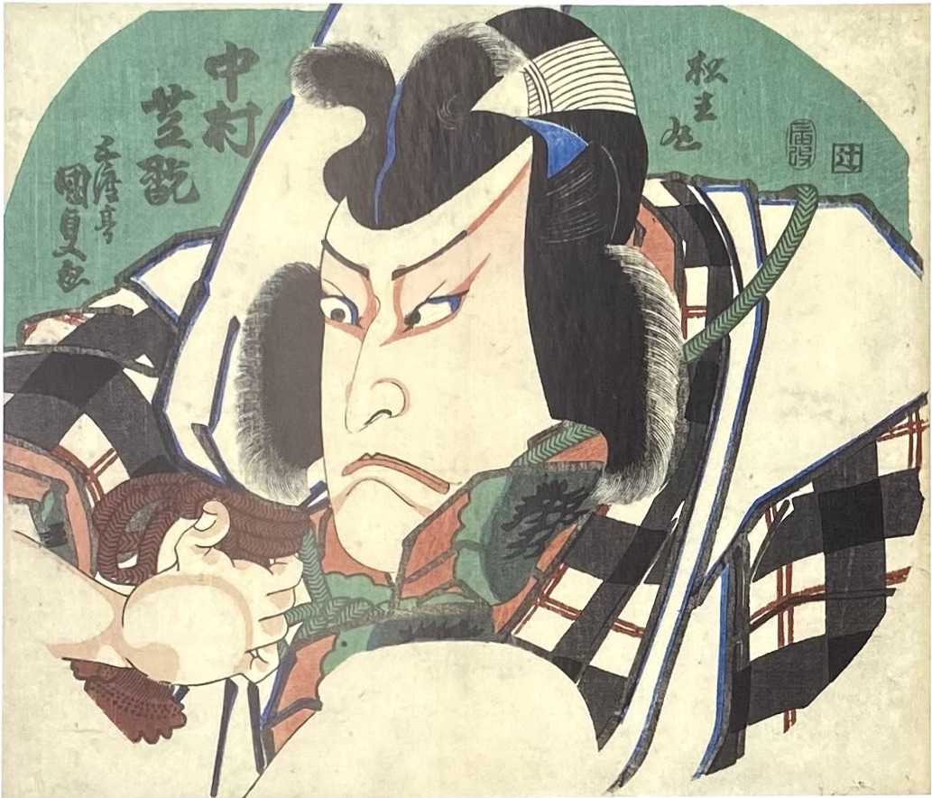
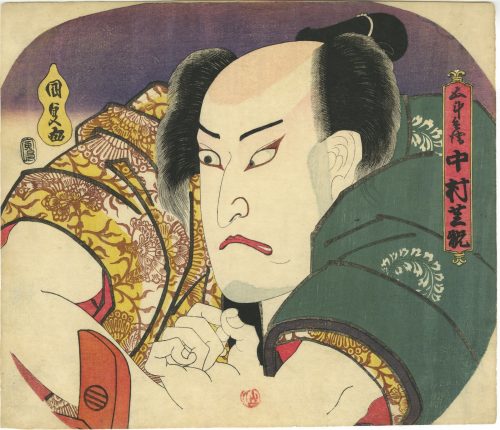 Artist: Utagawa Kunisada [歌川 国貞] a.k.a. Utagawa Toyokuni III [三代歌川豊国] (Japanese, 1786 – 1865). Signed: Kunisada ga [国貞画] in a yellow double-gourd cartouche. Publisher: Ibaya Senzaburo [伊場屋仙三郎] (Japanese, fl. c. 1845 – 1847). Date aratame seal: Bunsei 13 – Tenpō 1 (1830). Actor: Nakamura Utaemon IV [中村歌右衛門] (Japanese, 1796 – 1852); other names: Nakamura Shikan II [二代目中村芝翫], Nakamura Tsurusuke I, Nakamura Tōtarō. Play: Yoshitsune’s Letter at Koshigoe [義経腰越状] (Yoshitsune Koshigoe-jo). Uncut fan print (uchiwa-e, 団 扇 絵), 229 x 267 mm, depicting kabuki actor Nakamura Shikan [中村芝翫] as Gotobei [五斗兵衛]. Nakamura Utaemon IV held the name of Nakamura Shikan II from the 11th lunar month of 1825 to the 1st lunar month of 1836. He was born as Hirano Kichitarō in Edo in 1796. Another fan print with the same subject in this collection [SVJP-0344.2021]:
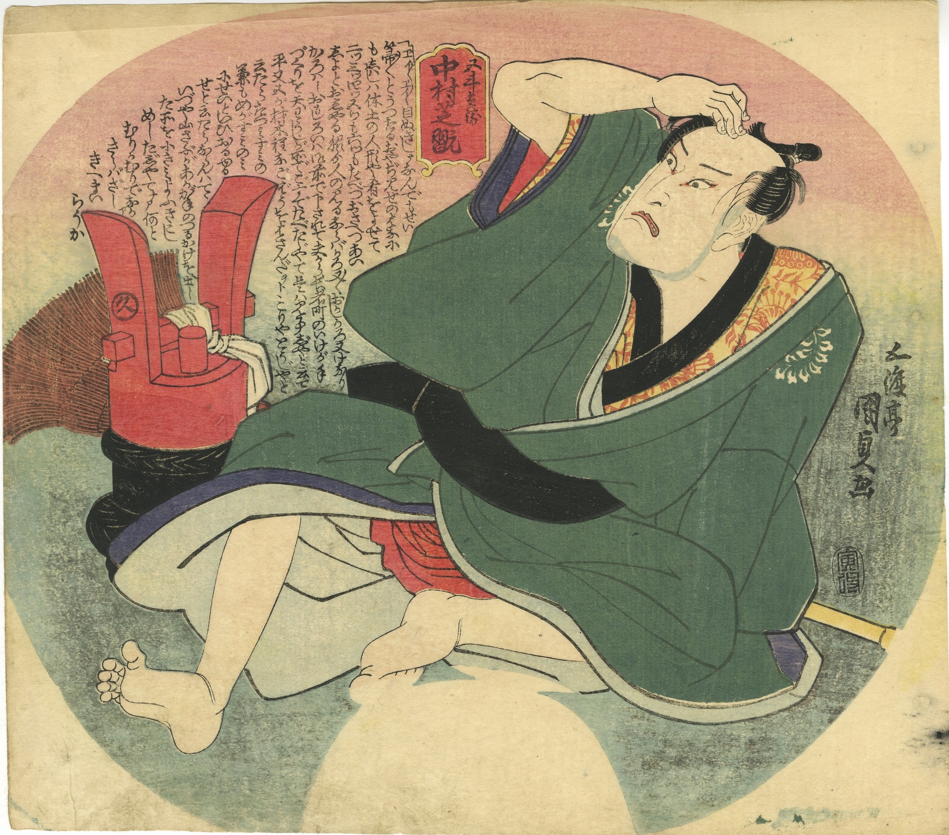 "...The play Yoshitsune Koshigoe-jo was originally written for the puppet theatre (Bunraku) and staged for the first time in the 7th lunar month of 1754 in Ôsaka at the Toyotakeza. It was a revision of two early plays, Namiki Sōsuke's Nanbantetsu Gotō no Menuki (1735) and Yoshitsune Shin Fukumijō (1744). The title, which suggested that the play focused on Minamoto no Yoshitsune, was in fact dealing with the siege of the Ōsaka Castle, led by Tokugawa Ieyasu to destroy the Toyotomi clan in 1614 and 1615. This play was quickly forbidden because of the 4th act in which Gotobei's wife fired a gun at Yoritomo (this was of course interpreted as an attack on the Shogunate). Yoshitsune Koshigoe-jo was revised in 1770 by Toyotake Ōritsu, who completely rewrote the 4th act for a puppet production at the Kitahorieza in Ōsaka". Yoshitsune Koshigoe-jo was staged for the first time in Edo, at the Ichimuraza on the 9th lunar month of 1790, and is still performed.
Gotobei [五斗兵衛] (Gotohei or Gotobē), one of Yoshitsune’s loyal retainers, is forced to choose between his son’s life or his loyalty to Yoshitsune. Nishikidō brothers, who do not want Gotobei to become Yoshitsune's chief strategist, forced him to drink sake and get asleep. To prove Gotobei's military abilities, Izumi no Saburō fires a gun next to Gotobei's ear, and "he jumps up immediately, in full possession of his senses, ready to repulse any enemy". See: [LIB-1193.2013] Samuel L. Leiter. Kabuki Encyclopedia: An English-language adaptation of Kabuki Jiten. — Westport, CT; London: Greenwood Press, 1979; pp. 266-7).
Ref: [LIB-2993.2022] Fig. 24 in Israel Goldman. Japanese prints and paintings / 40th anniversary; Catalogue 27, 2021.
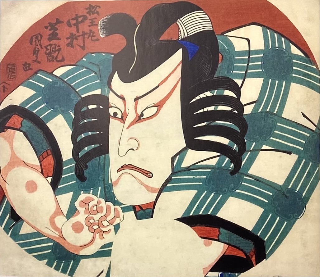
Two more Kunisada's fan prints (in Paul Griffith's collection), depicting the same actor Nakamura Shikan II as Toneri Matsuōmaru [舎人松王丸] were published in 1832 by Iseya Ichiemon. The play was Sugawara's Secrets of Calligraphy [菅原伝授手習鑑] (Sugawara Denju Tenarai Kagami). See: [LIB-1212.2017] Robert Schaap. Kunisada: Imaging, drama and beauty / Introduction by Sebastian Izzard, contributions by Paul Griffith and Henk. J. Herwig. — Leiden: Hotei Publishing, ©2016.
"...The play Yoshitsune Koshigoe-jo was originally written for the puppet theatre (Bunraku) and staged for the first time in the 7th lunar month of 1754 in Ôsaka at the Toyotakeza. It was a revision of two early plays, Namiki Sōsuke's Nanbantetsu Gotō no Menuki (1735) and Yoshitsune Shin Fukumijō (1744). The title, which suggested that the play focused on Minamoto no Yoshitsune, was in fact dealing with the siege of the Ōsaka Castle, led by Tokugawa Ieyasu to destroy the Toyotomi clan in 1614 and 1615. This play was quickly forbidden because of the 4th act in which Gotobei's wife fired a gun at Yoritomo (this was of course interpreted as an attack on the Shogunate). Yoshitsune Koshigoe-jo was revised in 1770 by Toyotake Ōritsu, who completely rewrote the 4th act for a puppet production at the Kitahorieza in Ōsaka". Yoshitsune Koshigoe-jo was staged for the first time in Edo, at the Ichimuraza on the 9th lunar month of 1790, and is still performed.
Gotobei [五斗兵衛] (Gotohei or Gotobē), one of Yoshitsune’s loyal retainers, is forced to choose between his son’s life or his loyalty to Yoshitsune. Nishikidō brothers, who do not want Gotobei to become Yoshitsune's chief strategist, forced him to drink sake and get asleep. To prove Gotobei's military abilities, Izumi no Saburō fires a gun next to Gotobei's ear, and "he jumps up immediately, in full possession of his senses, ready to repulse any enemy". See: [LIB-1193.2013] Samuel L. Leiter. Kabuki Encyclopedia: An English-language adaptation of Kabuki Jiten. — Westport, CT; London: Greenwood Press, 1979; pp. 266-7).
Ref: [LIB-2993.2022] Fig. 24 in Israel Goldman. Japanese prints and paintings / 40th anniversary; Catalogue 27, 2021.
Two more Kunisada's fan prints (in Paul Griffith's collection), depicting the same actor Nakamura Shikan II as Toneri Matsuōmaru [舎人松王丸] were published in 1832 by Iseya Ichiemon. The play was Sugawara's Secrets of Calligraphy [菅原伝授手習鑑] (Sugawara Denju Tenarai Kagami). See: [LIB-1212.2017] Robert Schaap. Kunisada: Imaging, drama and beauty / Introduction by Sebastian Izzard, contributions by Paul Griffith and Henk. J. Herwig. — Leiden: Hotei Publishing, ©2016.
-
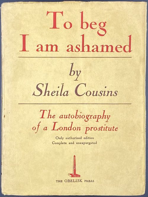 Title page: Sheila Cousins | TO BEG | I AM ASHAMED | {publisher’s device} | THE OBELISK PRESS | 16, PLACE VENDOME | PARIS || Pagination: [2] – blanks (in wrapper), [4] – h.t. / blank, t.p. / publisher's note (to first impression) & copyright, [1] 2-270, [4] uncut (in wrapper) with imprint "Imprimerie Frère Tourcoing", total 280 pages. Collation: 8vo; [A]8 B-Q8 R4 S8; total 140 leaves. Binding: Publisher’s yellow wrappers, lettering to spine:| TO BEG | I AM | ASHAMED |—| SHEILA | COUSINS | 8th | IMPRESSION | {publisher’s device} | THE | OBELISK PRESS | PARIS ||; lettered front wrapper in red and black: To beg | I am ashamed |—| by | Sheila Cousins |—| The autobiography | of a London prostitute | Only authorized edition | Complete and unexpurgated | {publisher’s device} | THE OBELISK PRESS ||, publisher’s device in red to back wrapper; margins untrimmed; in an owner slipcase. Edition: 1st edition, 8th impression, France, (in or after August 1838). Size: 19 x 14.5 cm. Contributors: Graham Greene (British, 1904 – 1991) – author. Ronald Matthews (British, 1903 – 1967) – author. The Obelisk Press (Paris) – publisher. Imprimerie Frère Tourcoing – printer. Compare to the presumably 1st impression of the same edition [LIB-2806.2021].
 -
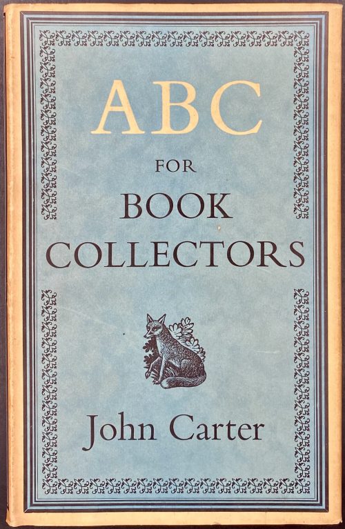 Title: ABC | FOR | BOOK-COLLECTORS | BY | JOHN CARTER | {publisher’s device} | RUPERT HART-DAVIS | SOHO SQUARE LONDON | 1952 | [TITLE-PAGE] || Pagination: [1-6] 7-191 [192 advert.], total number of pages 192. Collation: 8vo; [A]8 B-M8, total number of leaves 96. Binding: 21 x 13.5 cm, aubergine cloth, gilt lettering to spine, pictorial endpapers; cream unclipped (15s. net) dust-jacket with the sea-green panel in a border, with a fleuron frame, black and cream lettering, and publisher’s device to front; lettering to spine and back; folded prospectus insert loose. Edition: 1st. Contributors: Carter, John Waynflete (British, 1905 – 1975) – author Hart-Davis, Sir Rupert Charles (British, 1907 – 1999); Rupert Hart-Davis Ltd. (London) – publisher. Hazell, Watson and Viney, Ltd. – printer.
 -
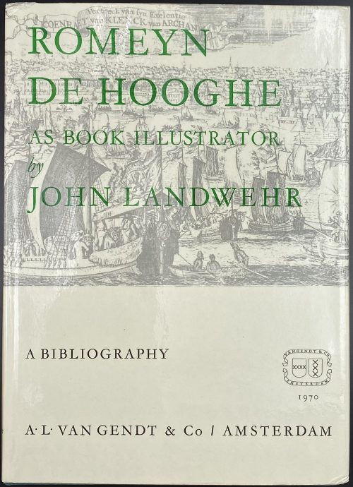 Title page: JOHN LANDWEHR | ROMEYN DE HOOGHE | (1645-1708) | AS BOOK ILLUSTRATOR | A BIBLIOGRAPHY | {space} | 1970 | AMSTERDAM: VANGENDT & CO | NEW YORK: ABNER SCHRAM || Pagination: [1-6] 7-247 [248 blank], ils. Content:109 entries, concordance table and 12 pp. of indices. Binding: 27.3 x 19.7 cm, green cloth, silver lettering to spine, pictorial dust jacket. ISBN: 90 6300 467 2. Contributors: Romeyn de Hooghe (Dutch, 1645 – 1708) John Landwehr – author.
Van Gendt & Co. (Amsterdam) – publisher.
Abner Schram Ltd. (NY) – publisher.